By Kyle Gallagher
Understanding the weird parts


When I first started learning Flexbox, the thing that struck me curious the most was “Why did they add this flex-basis in?” I mean, I have width…Why is there also a flex-basis?
“Dynamic Constraint”
I read multiple articles on the topic. All of which claimed some difference between width and flex-basis. None of which fully explained what the difference was supposed to be, though.
After a lot of experimentation and some good o’l fashion fiddling, I came to the conclusion that the primary purpose of flex-basis was to provide a “dynamic” constraint. What exactly do I mean by that, though? A “dynamic” constraint.

I am making the assumption that you are already familiar or at least generally acquainted with CSS and Flexbox.
I will not be going deeply into any details about CSS or Flexbox that will teach you the core concepts of either of them.
Need to know’s
I will also be utilizing SCSS, not native CSS, and the “ Block-Element-Modifier (BEM)” method. The reason for this is that I believe it is easier to be concise this way. So you will need to understand the basics of SCSS and nesting, BEM should be self descriptive in the examples.

The goal of this article is to simplify the enigma that seems to exist on the internet relating to flex-basis. I have often seen the response “you use flex-basis instead of width” as an answer to its purpose. Of course, this is totally acceptable for most cases, although it is possible to use it in more advanced ways. It seems that the potential of flex-basis has eluded many for some time now (of course not all) but I dare say many.
I want to try to convince you in this article, that Flexbox’s flex-basis is not a replacement for width (or height). It is a whole new tool entirely with its own set of possibilities.

The Meat and Potatoes
So now I have said these things… The next part is to explain and show exactly what I am talking about here. As you may know, when working with flex-box, you can use flex-basis in place of width.
Visual examples
In the above example, we have an “inner” element that will live inside the outer “element”. The outer element is our Flexbox and the inner has a flex-basis of 400px.
The HTML for the above could look something like this:
Resulting in a grey box that is exactly 400px wide by 250px tall in the center of our screen like so:
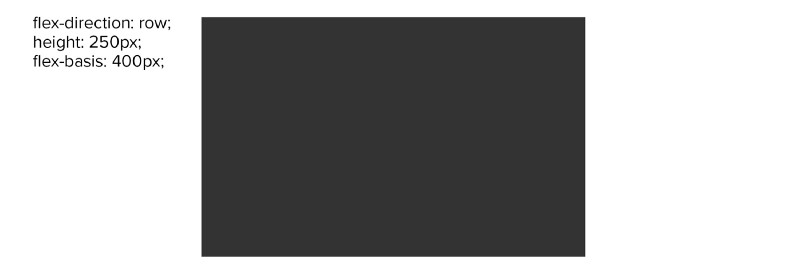
In the above example, our wrapper .element, auto defaults to a flex-direction that is row (left to right) and not column (top to bottom). Remember that. Soon we will change that to column and you will get to see what this whole article is all about. That dynamic nature of Flexbox’s flex-basis.
Lets get “dynamic”
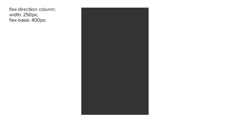
So let’s change the code to show that “dynamic nature”. To do this, all we need to do is change the outer element to have a (flex-direction: column) and change the height to width on the inner element (html does not change).
Changing the flex-direction changes the direction that flex-basis will effect. So effectively flex-basis is both width and height. In the example above, flex-basis will now result in the block being 400px tall vs the 400px wide rectangle we saw before.
If you want to play with this code yourself, here is a codepen with the above code in it.
Observation
Notice how in the first example, flex-basis is taking over the role of width, and in the second example, the role of height. Flex-basis is both width and height in a Flexbox, depending on the flex direction. Pretty cool!
Deeper understanding / Best practices
Here are some of the most important things I have learned about flex-basis during my use of Flexbox’s flex-basis.
- Flex-basis controls either “width” or “height” based on the flex-direction
- Flex-basis will override any other width: or height: properties if specifically declared anything other than flex-basis: auto (auto by default)
- The shorthand for flex basis is (flex: $grow, $shrink, $size) and is set to (flex: 0 1 auto) by default.
- When flex basis is set to auto, it first checks for a width or height property (based on direction) if none, it uses the elements content sizing
- Flex-basis will still obey any min / max-width: or height settings. Again, it is based on the flex-direction:
- Flex-basis in a column overrides height:, this is important because although width: will obey flex-shrink, height: will not. (This can cause confusing and unexpected results in your design.)
Important to note
Notice how auto is bold. By default, if you have a width set and did not declare a flex basis value, width will function normally on that element. There is no difference between how flex-basis: will function on your element and how width: will function on your element. Width will even obey flex-shrink when using Flexbox.
The divergent factor between width and flex-basis is the dynamic ability of flex-basis to change its effective direction based on the flex-direction.
The caveat
height: on the other hand acts a bit differently. The height property does not obey flex-shrink in the same way that width does. When using flex-direction column you should always use flex-basis to dynamically control your Flexbox’s sizing so that you have consistent and expected results.
Also take special note of bullet point number 4:
- When flex basis is set to auto, it first checks for a width or height property (based on direction) if none, it uses the elements content sizing
This means that flex basis will auto size the element based on the content sizing ( the size of the inner element ) when it is set to flex-basis: auto. Only if there is not a width: or a height: set on the element.
Best practices
I recommend that when you can, as a best practice use flex-basis over width or height, this way your results are always consistent. Considering that width: will obey flex-shrink and that height: will not, understand that there can be dramatic differences between how width and height will function in a Flexbox when you use other Flexbox properties in conjunction, like flex-wrap for example. Also use the shorthand of flex for convenience sake, consistency and readability.
The shorthand for flex-basis is (flex: $grow, $shrink, $size) and is set to (flex: 0 1 auto) by default.
flex: 0 1 200px;
There are some cases where you may need to use width or height over flex-basis. Some cases may include Flexbox bug workarounds. A good resource on that topic is Flexbugs. Flexbugs is also a good place to determine other best practices based on the browsers you intend to support.
Additional resources
In the following codepen example, I show flex-wrap to demonstrate a visual example of the above information from this article.
Use this codepen and thoroughly review the code. You will see how I am only using flex-basis once in the entire codebase to control multiple scenarios. This is just one tiny example of possible use cases.
Conclusion
Knowing that flex-basis is both a width and a height constraint is a good tool to have. It is dynamically shift-able. Using flex-basis you can create some very intuitive design elements. Some can even switch during a Flexbox’s flex-direction change at a crucial breakpoint in your design, hopefully giving you a cleaner solution. This knowledge should also help you design better and more confidently with Flexbox, since this functionality is key to using Flexbox to its fullest potential.
If you think there is anything I missed, found a typo, etc… please let me know!
I hope this short and sweet article was found useful to someone. If you appreciated the effort invested, please give the article a clap! ?
Get in touch ?
If you would like to talk shop then the best place to link up with me is on linkedin or by contacting me through my website.
I will try my best to respond to any comments or questions here on Medium.
If you do the social thing: Instagram or Facebook.
Photograph credits: ( Waterfall | Jared Erondu ) ( Chatter | Dan Wayman ) ( Disclaimer | Pop & Zebra ) ( Objective | Olav Ahrens Røtne ) and ( Let’s go | Goh Rhy Yan ). All photos from Unsplash.com