
By Preetish HS
CSS (Cascading Style Sheets) is one of the core technologies used for building webpages. Since it is the ONLY style sheet language that browsers can understand, it's important to learn CSS in depth to master web development.
It’s very easy to get started with CSS. With just a few hours of training, you can easily style texts, elements and layouts. However, it becomes progressively difficult and soon you’ll come to a situation where your code starts getting quite messy. The components which used to work before start breaking, and you google and find the fix which fixes your element but breaks 5 other elements, as the solution you found on google changed the display or position ?
Why learning CSS the right way is important
If you don’t have a deeper understanding of the basics, CSS becomes more like a trial and error method. You’ll try different values for different properties and finally keep the one which sort of works close to what you wanted without actually understanding how it works.
You’ll start googling basic things like “how to centre two divs” or “how to align a div and a text vertically” and copy paste the code from StackOverflow or codePen every time. Back in those days, when flexbox was not so popular, “how do you align a div both vertically and horizontally in a page?” was a classic CSS interview question. Many beginners could get the horizontal part right but only a few got the vertical part right too.
The Roadmap ??
1. The Basics ?
If you are just starting web development, learn some basics of HTML before starting CSS. In CSS, first read the theory on what CSS is, how it works in the browser, and its basic syntax and usage.
Learn about the different kinds of stylesheets available, their differences, selectors, and basic styling such as font-size, width, height etc.
You can get started by going through the tutorials at MDN.
2. CSS Box Model ?
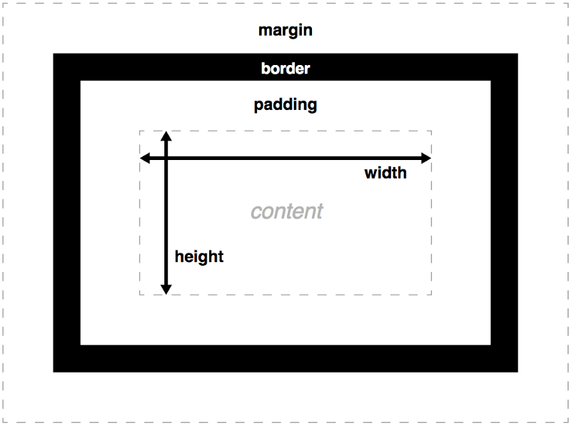 _credit: [https://developer.mozilla.org](https://developer.mozilla.org" rel="noopener" target="blank" title=")
Understand the basics of CSS box model and the properties associated with it such as margin, border, padding etc
3. Images and Background ?
Images make the webpage come alive. There are many ways to add an image such as image tags, adding background colours/gradients and background images to various other tags. You could also apply what you have learnt previously such as setting borders to images or use multiple images and develop a simple gallery.
<img src="../images/wallpaper.jpg" ><div class="image" > </div>
.image { background-image: url(../images/wallpaper.jpg);}
4. Display and Position ?
These two are some of the most import properties in CSS where you need to pay attention to understand them correctly. Knowing these two properties well can make your CSS journey a lot smoother.
display: block | inline | inline-block | table | etc
Understand how each of these display properties are used. You’ll start to notice some HTML elements such as <div> <p> or behave like display: block and some elementslike <img> <span&g`t; behave like display: inline.
position: static | absolute | relative | fixed | sticky
This is one of the properties where even experienced programmers make mistakes. Learn how each of them works, how the position of one element affects its siblings or parent, in what situations you use them, etc.
This step is so important that you can repeat it again and again till you understand!
float: left | right
Though float layouts are a bit old school now, there are many old websites which still uses float layouts.
5. Colours, Fonts, lists and Tables ☑️
Understand different colour formats such as HEX code, rgb, rgba, hsl, hsla, transparent etc
color: white;color: #fff;color: rgb(255, 255, 255);color: rgba(255, 255, 255, 1);color: hsl(0, 100%, 100%);color: hsla(0, 100%, 100%, 1);color: transparent;
Learn how to use different fonts. Some fonts are not available on all browsers, so you’ll need to learn to add fonts manually with woff or ttf files or importing google fonts.
CSS can turn a basic unordered list <ul> into a beautiful navigation bar! Years ago tables were used to create screen layouts, thank goodness we don’t do that anymore! ?
6. Pseudo-classes and Combinators ➕
A CSS pseudo-class is a keyword added to a selector that specifies a special state of the selected element(s). A pseudo-class can be as simple as :hover or :visited or something complex like :nth-last-of-type(odd)
Combinators help us apply styles to child elements or siblings easily without having to create new classes for each of them.
/* all the paragraph elements inside the container will have color red */
.container > p { color: yellow;}
7. Debugging and Dev tools ?
CSS doesn't throw any errors. It silently breaks the UI if you don’t get the styles correct ? so learning how to use Dev tools is very important.
Chrome Dev tools is an amazing tool for web developers. It's packed with a lot of great features for debugging your website in real-time and also has performance checking tools like lighthouse built into it.
8. Practice Practice Practice ?

The contents you learnt above are enough to develop a basic website, so at this point you should start practising by developing small websites. You’ll come across various challenges when you build a real application. For your practice, you can develop a simple website for a resort, or build an image gallery, or a blog, or you can also build a few basic features of your favourite social media such as Facebook or Instagram.
9. Responsive Web Design ??
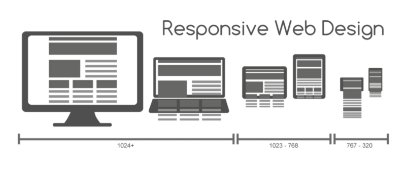 credit: Wikipedia
After learning web development for desktop there are a lot of other devices through which the websites are accessed. Supporting these devices is equally important. Before the Responsive design got popular, developers used to design a separate website for mobiles, a separate website for touch-enabled devices etc. remember m.facebook.com and touch.facebook.com?
There are 3 important things in Responsive web design:
Fluid Layouts:
Width set with px does not scale based on the browser window. To make the elements scale based on the browser size, we need to create fluid layouts by setting the sizes in % or rem units.
Media Queries:
A media query is a technique to include a block of CSS properties only if a certain condition is true. We set breakpoints based on our design and change the CSS depending on the browser width.
@media only screen and (max-width: 600px) {
body {
background-color: lightblue;
}}
Responsive images:
Images scale down as the width of the browser window decreases or if the website is viewed in mobile devices. Sometimes it would be difficult to focus on the important details on a particular image so we’d need to use different images for different screens.
10. Flexbox and Grid ◼️ ⬛ ?
It’s been around 10 years(!) since Flexbox was first introduced, but it was incorporated only recently in 2015. — source
Flexbox and Grid are the styles used to create flexible layouts, and they make our lives so much easier! This is one of the best things that has ever happened to CSS. ?
The layout shown below would have taken more than 300 lines of CSS code without Flexbox or Grid.
11. Transforms, transitions and animations ?
Learning basic transforms and transitions will come in handy if you want to create an interactive web page with moving parts on mouse events or keyboard events such as hover or click.
Before CSS3, animations were done mostly using jQuery — A JavaScript library. Now CSS has become so powerful that we can do complex animations without any JavaScript.
12. Preprocessors ✴️
CSS preprocessors are scripting languages that extend the default capabilities of CSS. They enable us to use logic in our CSS code, such as variables, nesting, inheritance, mixins, functions, and mathematical operations. Some of the popular ones are SASS, LESS, STYLUS and POSTCSS.
The SCSS format of SASS is more widely used, so it's good to get started with SASS for development.
The autoprefixer plugin of POSTCSS makes your CSS rules compatible across various browsers by adding extra rules such as -moz- and-webkit-.
13. Frameworks ?
Learning frameworks such as Bootstrap, Semantic-UI or Materialize is optional but very useful for faster development as they provide a lot of styles and layouts out of the box.
These Frameworks are tested across various browsers, so using these will avoid some of the compatibility issues. Most of the frameworks follow the responsive design pattern and lots of free 3rd party templates are be available to get started quickly.
14. Specificity ?
“tries to modify a button style of bootstrap but fails, googles for a solution, uses !important , gets all excited thinking that’s the right fix for all the problems!” And that's how you doomed your project! ? If you understand the concept of S[pecificity](https://developer.mozilla.org/en/docs/Web/CSS/Specificity) correctly, problems regarding overlapping rules in multiple stylesheets will be reduced significantly.
Specificity is a weight that is applied to a given CSS declaration, determined by the number of each selector type in the matching selector. Each selector has a different weight, and using multiple selectors can change the specificity. If the overall specificities are equal then the order is considered. See the example below:
<style>div.wrapper p.paragraph {
color: pink;}#container p{
color: violet;}p {
color: green;}.paragraph {
color: yellow;}</style><div class="wrapper" id="container">
<p class="paragraph"> This is a dummy text </p></div>
What do you think would be the colour of the paragraph? ?
15. CSS Architecture ?
Writing CSS code is easy, but writing maintainable CSS code is hard. A proper structure and method have to be followed to write good CSS code. Just following the best practices is not sufficient to write maintainable CSS.
Some of the Architecture patterns for CSS are BEM, OOCSS, SMACSS etc. You can go through the documentation and choose whichever pattern fits your tastes and project.
There you have it! ?
Mastering CSS takes patience and lots of practice. As you start practising you'll experience the awesomeness of CSS. 15 big steps might seem daunting at first but they’re actually not. I loved each and every step, and my experience got better every time. ?
Thanks for reading my article. I hope that you have found this useful. If so, be sure to leave lots of claps! ? (You can leave up to 50 ?)