By Erik Larsson
Google Lighthouse is the free, go-to SEO tool for determining your website's overall health.
Enter your URL, and Google Lighthouse will score the performance metrics of your website, including page-speed, accessibility, best-practices and on-page SEO.
With the release of Lighthouse version 6 earlier this year, many developers observed a drastic decrease in the performance metrics of their websites.
This especially came as a shock to the community of developers that use the popular React-based framework GatsbyJS, praised for its speed and performance.
As a GatsbyJS developer myself, I too, was puzzled. We had gotten used to seeing those sweet, green, 90+ performance ratings, without much effort on our part.
After the version 6 update, however, our site dropped into the orange, down to 60 points! And some us were even experiencing red, sub 40 points scores.
I want to share with you the steps I took in order to re-achieve a perfect 100 Google Lighthouse score.
Step 1. The quick and easy fix: switching to Preact
With the release of Lighthouse version 6, three new performance metrics were introduced: Largest Contentful Paint (LCP), Cumulative Layout Shift (CLS), and Total Blocking Time (TBT).
After scouring the Gatsby Github repo, as well as the Lighthouse docs, it seemed clear that Total Blocking Time (TBT) was the main culprit responsible for hampering the performance score for many sites.
Total Blocking Time (TBT) is defined as the total amount of time between First Contentful Paint (FCP) and Time to Interactive (TTI).
Simply put, TBT is a measurement of how long the browser's main thread is blocked by long tasks, such as parsing JavaScript (JS).
That being said, any steps taken to reduce the amount of JS, as well as JS execution time, will positively impact site performance by reducing TBT.
Preact is a small (3kb), fast alternative to React. And thanks to gatsby-plugin-preact, switching your Gatsby-site from running on React to Preact is incredibly easy.
Navigate to your project root and install the following packages using NPM:
npm install --save gatsby-plugin-preact preact preact-render-to-string
...or Yarn:
yarn add gatsby-plugin-preact preact preact-render-to-string
Then simply add
...
gatsby-plugin-preact,
...
to your gatsby-config.js
Then run
yarn gatsby build
If you use the webpack bundle analyzer, you should now be seeing a ~100kb smaller bundle size! Not bad, right.
Check out the difference this switch made to our bundle size in the image below.
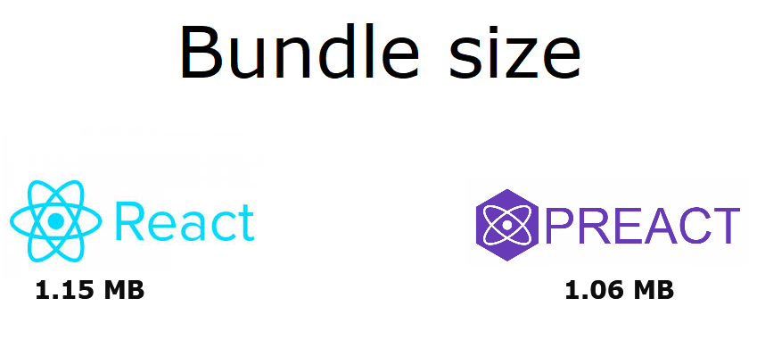 An 8 percent decrease in bundle size for one line of code - not bad!
Switching to Preact should bump your performance score about 5-10 points.
Step 2. Reconsider the necessity of the Hero-Image
Another metric that made our site, SmartRate, take a beating performance-wise was the Largest Contentful Paint (LCP).
LCP is a metric for measuring perceived load speed. And together with Total Blocking Time, LCP and TBT makes up 50% of the total Lighthouse Performance score.
With that in mind, it's not a big surprise that an image covering 80 percent of the fold negatively impacts the LCP-metric, even when optimized using the webp format.
We tweaked the hero image and achieved partial success by disabling fade-in and switching loading from the default parameter (lazy) to eager:
However, the improvements were only marginal and barely noticable in Lighthouse (about 2-4 points), so we decided to regroup and rethink.
What was the purpose of our hero-image, really?
The hero image is commonly used to grab the user's attention and convey a central message to strenghten your brand.
In our case however, that's not how we use the fold.
 A screenshot of the fold as it looks today, showing the hero-unit and user-input area.
As you can see from the image, the fold is dedicated to user-input. And the hero-image we were using before the current one was just a blurred photo in order to give some ambience to the fold.
After a bit of thinking, we realized we couldn't justify using a hero-image, given the negative impact it had on our performance metrics.
Instead, inspired by sites such as Spotify.com, we decided to go with an SVG background.
This single decision reduced the size of the initial page-load by a whooping 65kb!
From an optimized webp image of ~67kb down to a mere 2kb SVG for the same real estate.
Upon finding that this solution completely fixed our issues with the LCP metric, we quickly dropped the idea of using a hero-image from our most important subpage, företagslån - business loans - as well.
 Current sub-page design utilizing a hero-unit (although not a hero-image)
For this, and our other subpages, we opted for a subtle three-color CSS gradient instead, to make the hero-message stand out.
This solution was perhaps not as sleek as using a custom tailored image, but it did the trick and greatly improved the LCP for our subpages as well.
Which brings me to...
Key considerations if your site is using a hero-image
Dropping the hero-image in favor of a SVG or CSS background will, in our experience, solve the issues caused by a low LCP score.
However, depending on the purpose of your hero-unit, this solution may not be optimal for you.
So, before you decide what to do, you should consider a few things:
- Is the hero-image custom made for your site or a stock-photo?
- Does the hero-image add value to your brand?
- What is the purpose of the fold on your site?
If your hero-image adds great branding value for your site, perhaps the trade-off for better performance simply isn't worth it.
However, if you're ready to give my suggestions a try, you will be happy to hear about the following resources.
Great resources for SVG backgrounds
Below I've compiled a short list of valuable resources and tools for anyone who wants to switch from using a hero-image to using SVG/CSS patterns:
Hero Patterns by Steve Schoger A great tool providing multiple customizable SVG patterns.
SVG Patterns by Philip Rogers Another free SVG pattern gallery.
SVGOMG by Jake Archibald A great, free resource for minifying SVG-files. It's all about reducing those kb's, right?
The next step is a bit more situational, but will, for those of you who are using a UI library, still be very relevant. For us, this step was just as important as the first two steps in improving our metrics.
Step 3. Dropping Material UI for TailwindCSS
Let me state, right off the bat, that I'm a big, big fan of Material UI. And I'm not alone in thinking so. Until recently, MUI has been the most popular React UI library on Github (currently at second position).
When we started developing our site, the design was entirely based on MUI components.
The only problem was, it was slowing down the performance of the site.
A lot.
Especially for mobile users.
After the release of Lighthouse version 6, we simply couldn't get the mobile performance ratings above 70 points, due to a very high Total Blocking Time (TBT).
Nothing we did seemed to matter at first. We even tried code-splitting using Loadable Components, and lazy-loading non-essential payloads.
After some digging though, we identified Material UI as the source for the decrease in performance.
During page render, layout calculations (and re-calculations) seemed to occur all over the place, which contributed to an increased TBT.
We started removing MUI components, one by one, but this did little to improve the performance.
Finally, we were down to a single MUI component, and a near clean boilerplate website.
And we were still experiencing low performance ratings.
How could this be?
Well, as it appeared, importing a single MUI component would bring in the entire Material UI library into the bundle. And loading the landing-page would require the user to download the entire CSS and JS of Material UI.
But what about tree-shaking I can hear you say?
Well, to that I can only respond that we followed the MUI recommendations for minimizing the bundle size. Our efforts, however, did not pay off.
By removing the last MUI import, we noticed a staggering ~170kb drop in bundle size!
Finally, the performance of our site soared into the green, 90+ points, even on mobile!
The TBT was now non-existent, but so was the layout of our website.
We therefore started looking at alternatives, and I remembered reading about TailwindCSS integration into Gatsby some time earlier.
One phrase that caught my attention was "Purging your CSS".
PurgeCSS, which is now built-into TailwindCSS, does exactly what you think it does - removes unused CSS!
Perfect.
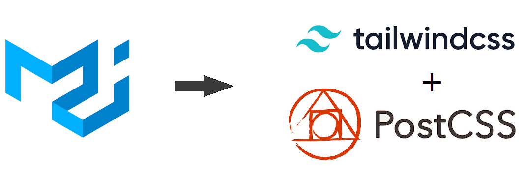 By transitioning from Material UI to TailwindCSS, we could obtain a material-ish design with a great performance score.
Simply following the Tailwind installation guide in the Gatsby docs was enough for us to get going. We slowly started designing material-ish looking components using Tailwind through PostCSS.
Not quite as nice looking as MUI components, but not far off. Given the huge performance boost though, it was totally worth it.
For being complete beginners, I must say designing components using Tailwind is surprisingly intuitive. You quickly get the hang of it.
Reconnecting to the first step
Another small perk of using Preact over React is the possibility to use the class parameter over the className parameter (which still works). This makes designing components a bit quicker - especially when copying markdown from their official website.
Should you decide to abandon Material UI, Bootstrap, or whatever other React-based UI library you're using in favor of Tailwind, you'll be happy to know about the following resources:
- Tailwind UI Made by the creators of TailwindCSS, Tailwind UI is a repo where you can find beautiful, pre-designed components. A few of them can be used for free.
- Tailwind Components is a repo of free-to-use community-made Tailwind components.
Bonus tip: Manage your bundle size going forward
As you probably can imagine, optimizing the bundle size and rebuilding the entire UI of our site was quite taxing. If I learned one important lesson during this process it was this:
Mind the bundle size!
As we grew more and more aware of how bundle size was impacting the performance of our site, we stumbled upon a tool called bundlephobia.
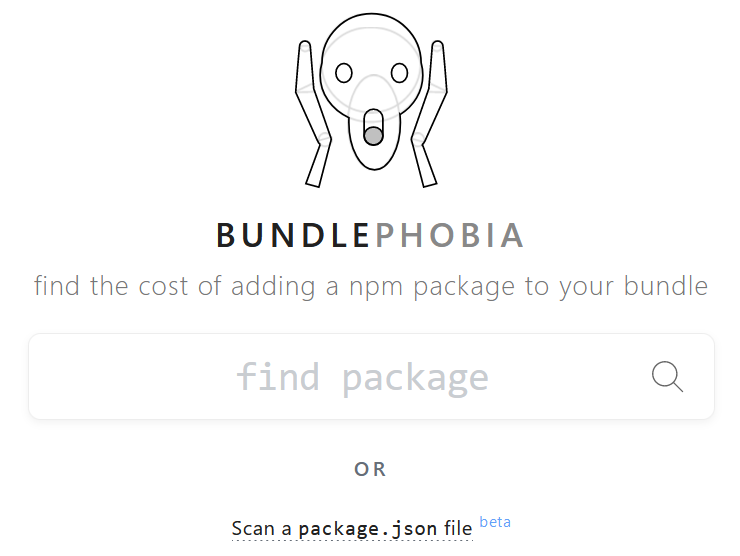 Bundlephobia landing page.
This great tool will "find the cost of adding a npm package to your bundle". Not only that, but it will show you similar packages, and how they relate in size to the one you're currently viewing.
This was truly useful for us when we developed the bolån (mortgages rates) sub-page. We required a charting library that would let us put together multiple line charts, showing the average mortgage rates for Sweden's largest banks over the last twelve months.
We couldn't find any other website doing this, so we thought it would be a great, free service to offer our visitors.
However, wiser from earlier experiences, we were not keen on simply using the first charting library that crossed our path.
Using bundlephobia, we compared the bundle size of different charting libraries and found that, based on our needs, chartist.js would be sufficient or us.
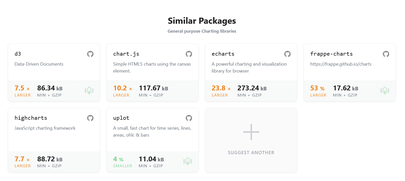 Bundlephobia showing similar libraries (and their respective package-size) to chartist.js
 And an image of the resulting line charts showing historical mortgage rates.
If our need was simply to display interactive line-charts, why pay more than we need?
In other words, if we have the option to get the desired function with minimal impact to performance, that option should be our default choice.
However, it's also important to recognize that decisions between design and performance almost always implicates a trade-off. And that trade-off should be considered wisely.
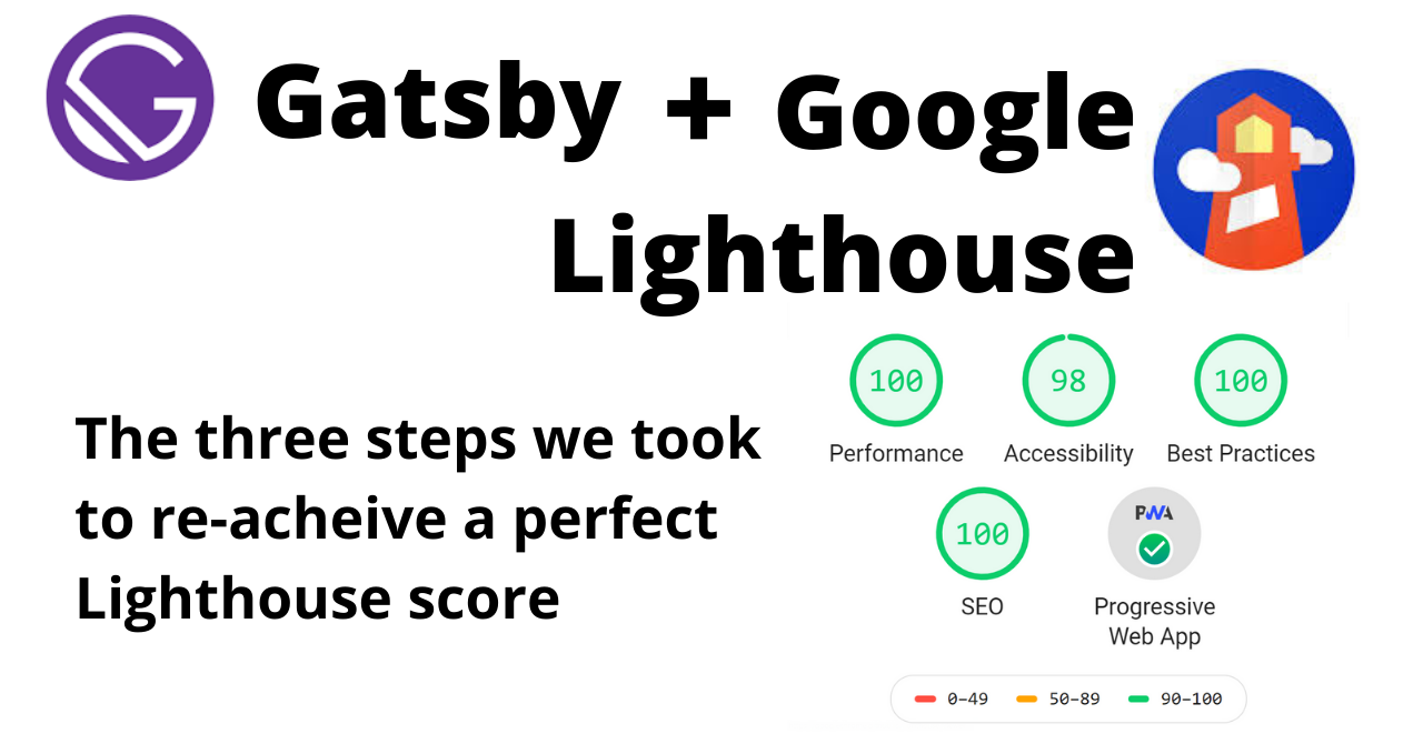
Our priority was performance, as shown by the results below:
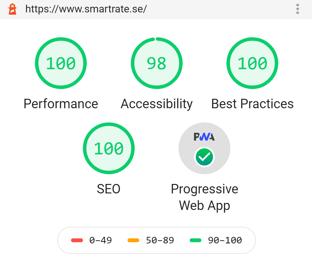 A near perfect Google Lighthouse score! Only two points off on Accessibility for having too low of a contrast ratio on some buttons. But hey, design has to prevail somewhere, right?
In this post we covered the steps we took in order to achieve a near-perfect Google Lighthouse score, by:
- Improving the metric Total Blocking Time by switching from React to Preact
- Improving the metric Largest Contentful Paint by optimizing the parameters of the hero-image, or switching the hero-image for a SVG-pattern
- Improving the metric Total Blocking Time by switching from Material UI to TailwindCSS, and purging unused CSS using PurgeCSS
- Reducing overall bundle size
I truly hope the lessons we learned will inspire and benefit you, too!