
By Anant Jain
A 7-minute guide to getting these three foundational components just right.

If you wanted to buy a new hammer from a hardware store, imagine how you would go about doing this:
- Option 1: you can either look through the store — there are aisles with department names on top and, within a department, there are signs at the end of each aisle.
- Option 2: you can find the nearest clerk and just ask them where they keep the hammers.
It could be a mixture of the two as well — you may try to navigate a bit to see how easy it is. If you don’t find what you’re looking for, you may ask a clerk.
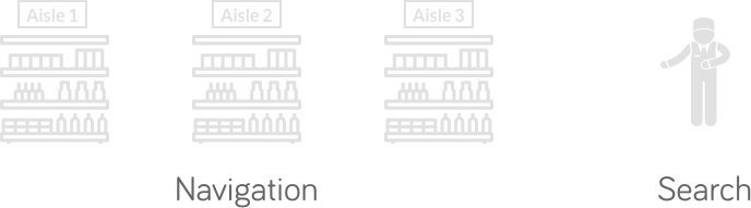
If you think about it, this is exactly how we use websites as well. We go looking around for a bit (Navigation) and, if we cannot find what we came looking for, we hit the Search functionality. These are the two critical components of your site. Minor usability flaws here can cause major annoyance to your users.
This short guide, in part based on Steve Krug’s seminal book “Don’t Make Me Think,” I will teach you how to design your website’s Navigation, Search, and Homepage. Let’s start with the Navigation.
Getting the navigation right
Why do we need Navigation?
Unlike our hardware store example, a website is not a physical space. It is different from a hardware store in three ways:
- A website does not provide the user with a sense of scale
- A website does not provide the user with a sense of direction
- A website does not provide the user with a sense of location
When we want to return to something on a website, we can’t rely on a physical sense of where it is. Instead, we have to remember where it is in the conceptual hierarchy of the website, and then retrace our steps.
Navigation puts this conceptual hierarchy up-front and center. It should ideally be a part of every page. It tells us what’s on the website and how to use it, making it a critical part of the user experience of your site.
How should you design the navigation?
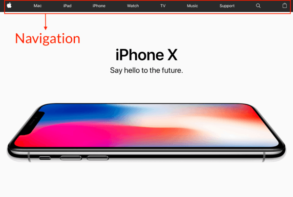
Persistent navigation is the set of elements that appear on top of every page. They follow certain conventions and, unless we have a substantial reason, we should stick to them:
- Site ID on the top-left — this tells the user which site they are on (the Apple logo in the screenshot above).
- Sections on top — a way to get around various parts of the site, with the current section highlighted to indicate where you are (for example, the Mac, iPad, and iPhon sections in the screenshot above).
- Tabs (optional) — tabs, when done right, are self-evident, hard to miss, and slick. An active tab should be a different color and physically connect with the space below it so it “pops” to the front.
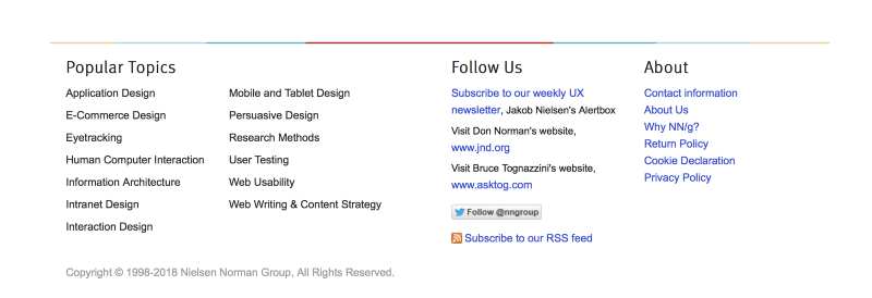
- Utilities like “My Account”, “Track Your Order”, and “Stores.” Don’t put more than five of these — the rest can go in the footer navigation.
- Breadcrumbs: this is another set of “You are here” indicators, like the highlighted section on top. Make breadcrumbs small and at the very top of a page, where they don’t interfere with the primary navigation. The best way to go about it is to use
> between levels, and boldface the last item (the item you’re currently on and — since you’re on it — it should not be a link).

- A page name: which page are you on? Every web page should ideally have a name that matches the words clicked to get there. It needs to be prominent and in the right place. In the visual hierarchy of the page, it should appear to be framing the content that is unique to this page.
- Local navigation on left sidebar (optional): these are the options available at the current level.
- Footer Navigation: this is where all other utilities go.
One of the most critical elements of navigation is a link to the Homepage, usually served by the Site ID (logo). It’s what the users click if they get lost — it’s the anchor that lets them return to the starting point if they want to start over.
Making search easy
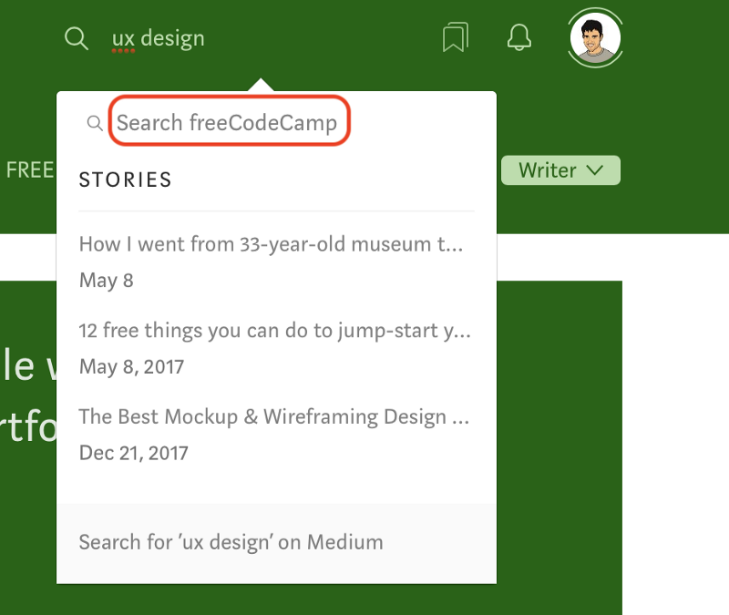
So how should we design the search functionality? Very simply, make the search box a simple box with no options, but allow limiting the scope of the search on the page of results.
Also, if scoping a search, add the word “for” so it reads like a sentence: “Search for .” Here is a good alternative example where the placeholder text indicates that the search is scoped to just the publication:
How do you know if you did a good job with the navigation?
Here’s a great test to run on your friends to see if you did a good job with the navigation. Leave them on a random page somewhere deep in your website and make sure they are able to answer these questions quickly, and without hesitation:
- what site is this? (Site ID)
- what page am I on?
- what are the major sections of this site?
- what are my options at this level?
- where am I in the scheme of things?
- how can I search?
Designing the homepage
For most websites, the homepage is the first page that the users land on. It is also the fixed north star that the users can return to if they get lost. Your Homepage has to answer these five questions that every user has in their head when they enter the site for the first time:
- What is this?
- What do they have here?
- What can I do here?
- Why should I be here — and not somewhere else?
- Where do I start…
…if I want to search?
…if I want to browse?
…if I want to sample their best stuff?
It’s the job of the homepage to answer these questions.
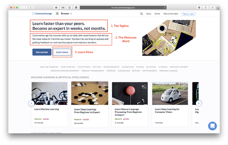
There are three crucial places on the homepage where users expect to find explicit statements about the site:
- The tagline: good taglines are clear and informative, and explain what your site or organization does. They are just long enough, but not too long, and convey differentiation — they don’t sound generic. It helps if they are personable, lively, and (sometimes) witty.
- The welcome blurb: make sure it’s something that conveys what the site does.
- The “Learn More”: innovative products tend to require a fair amount of explanation. People have become accustomed to watching short videos on their computers and mobile devices, and are often willing to watch one on the Homepage.
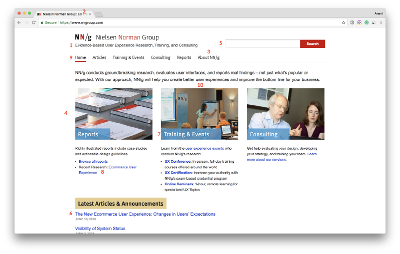
NN Group published the following list of 10 guidelines for homepage usability, which doubles up as a great checklist before you launch:
- Include a one-sentence tagline
- Write a page title with good visibility in search engines and bookmark lists
- Group all corporate information in one distinct area
- Emphasize the site’s top high-priority tasks
- Include a search input box
- Show examples of real site content
- Begin link names with the most important keyword
- Offer easy access to recent homepage features
- Don’t over-format critical content, such as navigation areas
- Use meaningful graphics
This is the list in action on their own site:
Remember that the homepage is a shared resource between all departments within a company — at least when it comes to what’s displayed first. Anything on top of the homepage gets promoted the most, so as a team you will have to focus and decide what needs to surface at the top.
Thanks for reading this quick guide. This was originally published as part of the UX Design course on Commonlounge. It’s a platform that has courses with small bite-sized lessons like these on topics ranging from Project Management to Machine Learning that deliver the most value for the time you put in.
You learn by working on real-world projects and getting feedback from industry mentors. You should check it out here!
