
Glassmorphism is a growing trend in user interface design. It makes your designs look modern and elegant.
In this article, we'll be learning about what glassmorphism means, how accessible it is, and how to design a simple glass card.
What is Glassmorphism?
Glassmorphism is a style which, as the name implies, uses properties of glass to enhance your designs. It gives a translucent or transparent look and feel to its elements.
Glassmorphic elements and shapes work really well on vibrant, colorful backgrounds which accentuate the glass effect. Glassmorphism helps you add visual hierarchy to your designs and puts focus on the content you want to highlight.
Accessibility of Glassmorphism
Glass designs aren't the best if you're designing for people who have vision problems. You'll have to be very careful when choosing colors and fonts to make sure screen readers and other devices can properly interpret the designs.
Also, using glassmorphism can cause your site to become slow and can also increase battery usage.
If you can work around these issues, however, glass designs do look really, really cool – so we'll learn how to make them here.
Here are some tips to help increase accessibility of your glass designs:
- Use the transparency or blur effect sparingly/moderately. Don't overuse it. The effect looks best when used on only two or three elements in your design.
- Establish a clear sense of hierarchy. The right spacing between the cards in the design layout and making sure the right elements stand out will help with accessibility issues. Remember, a strong visual hierarchy helps give users the right visual clues.
- Set the right background. Make sure the background isn't bland or dull. Using vibrant colors as backgrounds will help accentuate the effect. Of course, this will also achieve a very aesthetically pleasing look.
- Using larger fonts can make your glass designs more accessible. Also, choose fonts that contrast with the glass background.
Glassmorphic Design Examples
To give you a better idea of what glassmorphic designs look like, here are a few examples of websites that apply this technique:
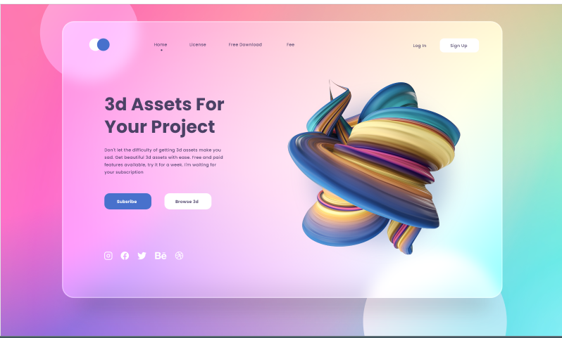 Glassmorphic Website by Sahid Aldi Susilo
 Glassmorphic design by Stefan Brown
You can see this design here.
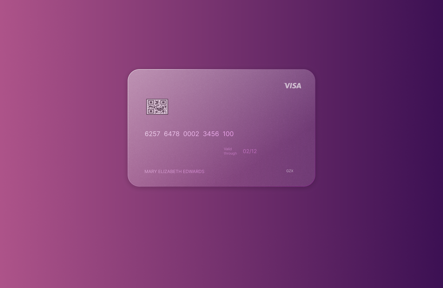
 Glass card by Pratheek Purohit
You can see this design here.
Let's see how we can recreate something similar to the last example.
How to Create a Glass Card in Figma
Glass cards are simply cards created using glassmorphism. The cards could be images of credit cards, profile cards, invoice cards, and more.
Follow the steps below to create a glass credit card in Figma.
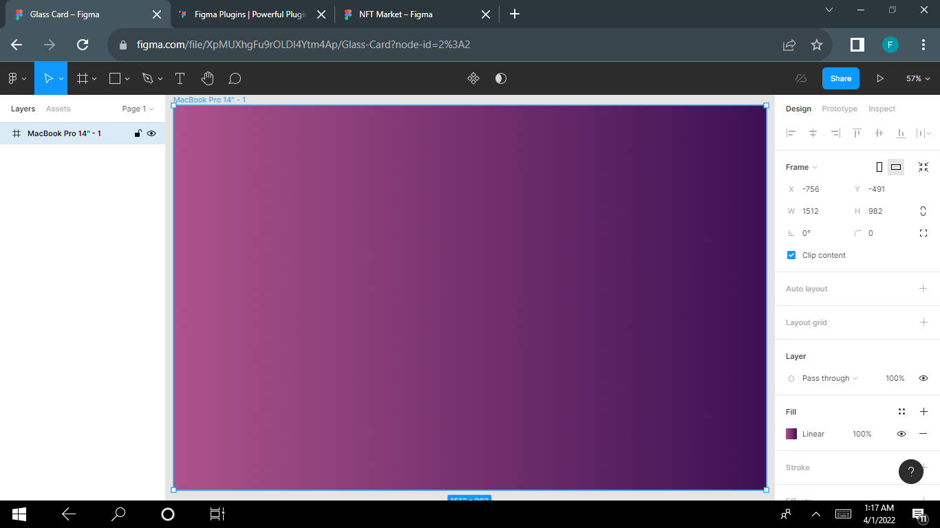
Step 1 – Set a Colorful Background
A colorful background is essential as it helps accentuate your glass design and make it stand out. You could just use the uiGradients plugin to select a gradient of your choice like I did below.
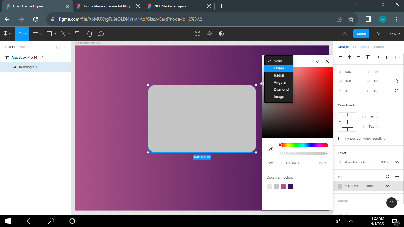
Step 2 – Draw a Shape
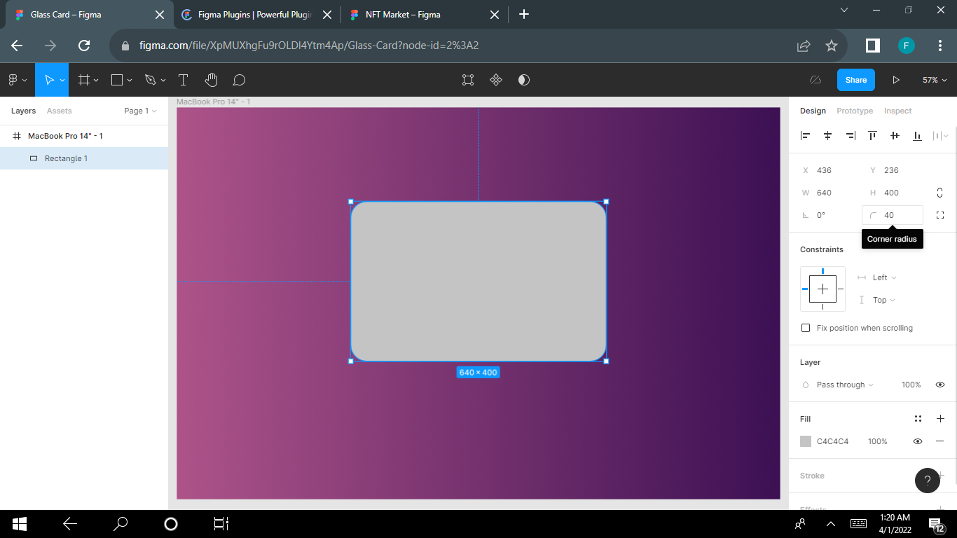
Here, we'll imitate the shape of a physical credit card, which looks like a rectangle.
Draw a rectangular shape with the dimensions 640×400, and set the corner radii to 40pt.
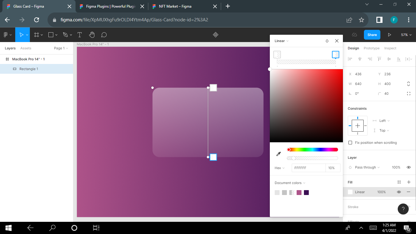
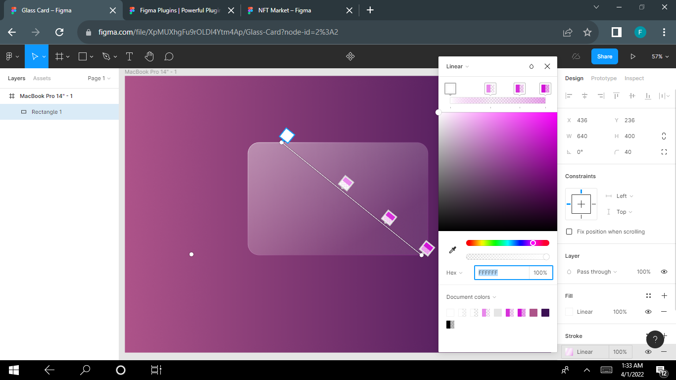
Step 3 – Apply Fill Using Gradient
Next, you need to fill the shape with translucent colors like white. Both colors of the gradient should be white but they should be set to different opacity levels.
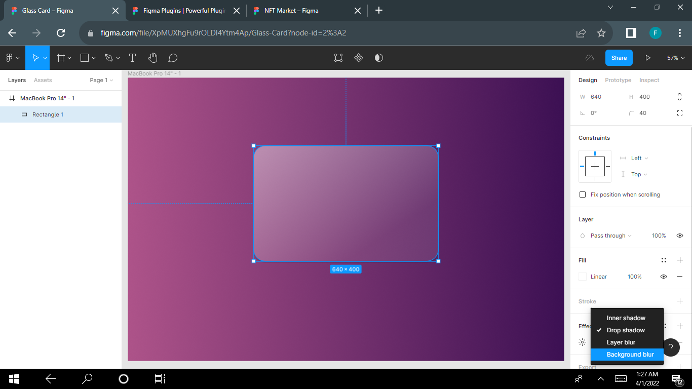
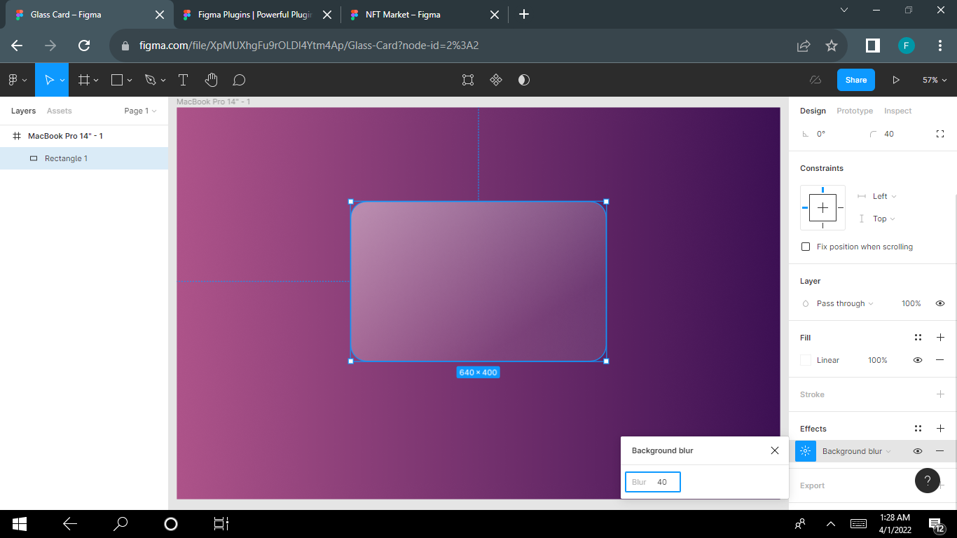
Step 4 – Apply Background Blur
Set the blur value to 40, or any value of your choice depending on how blurred you want it to look.
Step 5 – Add Strokes to Create Borders
Adding borders makes your card look more polished and elegant. It helps to have a sharper contrast through thicker and more distinguishable borders.
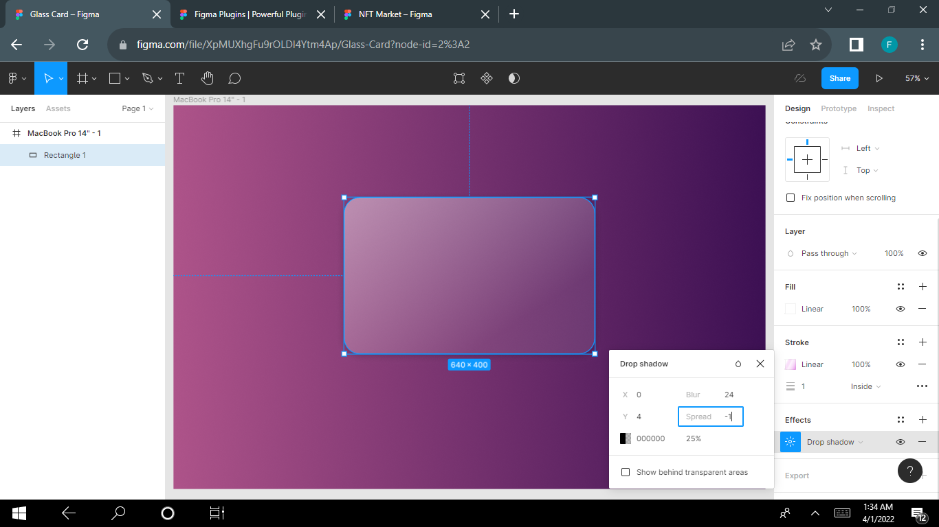
Step 6 – Apply a Drop Shadow
Using a drop shadow effect helps strengthen the visual hierarchy.
Set the blur value to 24 and the spread to -1.
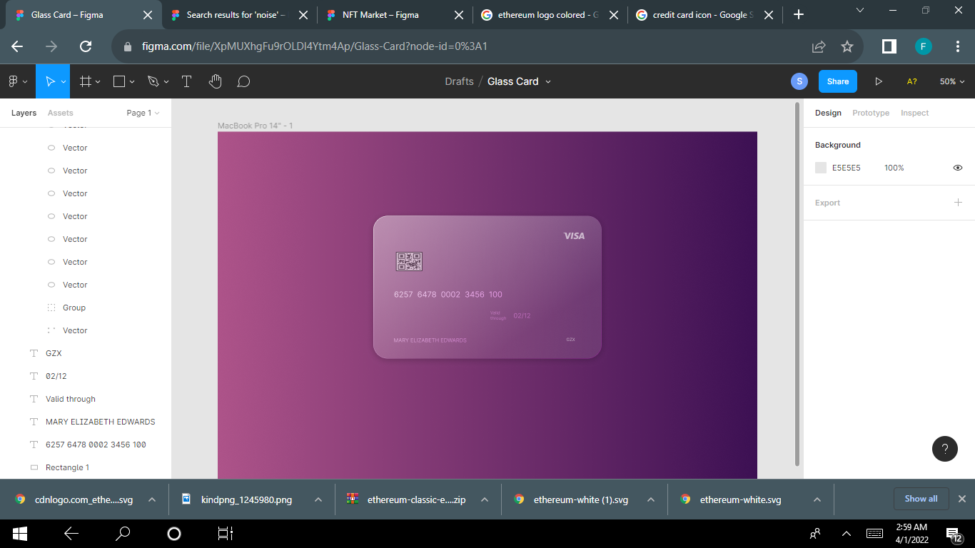
Step 7 – Add Your Content
You can now add content to your card like text, a logo, and so on. Using the Iconify plugin like I did to get your Visa logo and EMV chip will save you a whole lot of time.
Fill your content with the color white, decrease the opacity, and set the blending mode of the layer to Overlay.
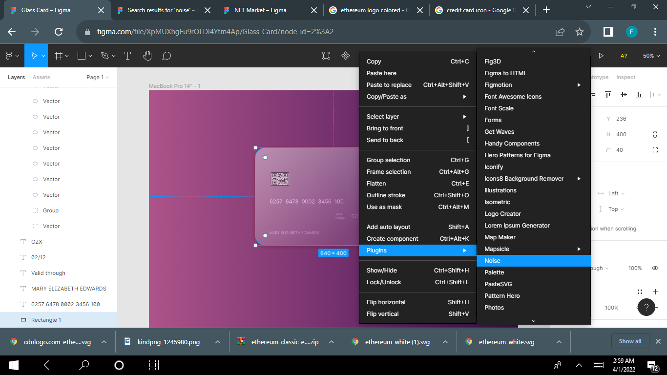
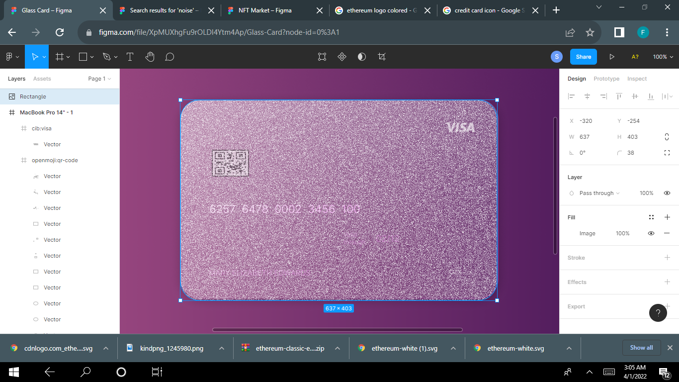
The frost effect adds polish to your design. To apply this effect, simply use the noise plugin to fill the image with noise.
If you already have the plugin installed, go straight to plugins and click on noise. If you don't, go to https://www.figma.com/community/plugins to install the plugin.
Once you installed and selected the plugin, set the blending mode of the layer to Overlay and decrease the opacity.
When you apply the noise plugin, the card will look like this:
Next, you change blending mode to Overlay.
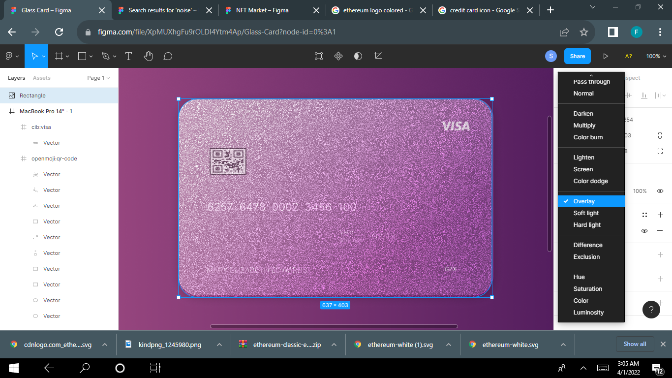
Decrease the opacity of your card. Play around with the opacity until it suits your taste.
You can reduce the opacity by clicking on any number on your keyboard – 2 for 20%, 3 for 30%, 4 for 40% and so on.
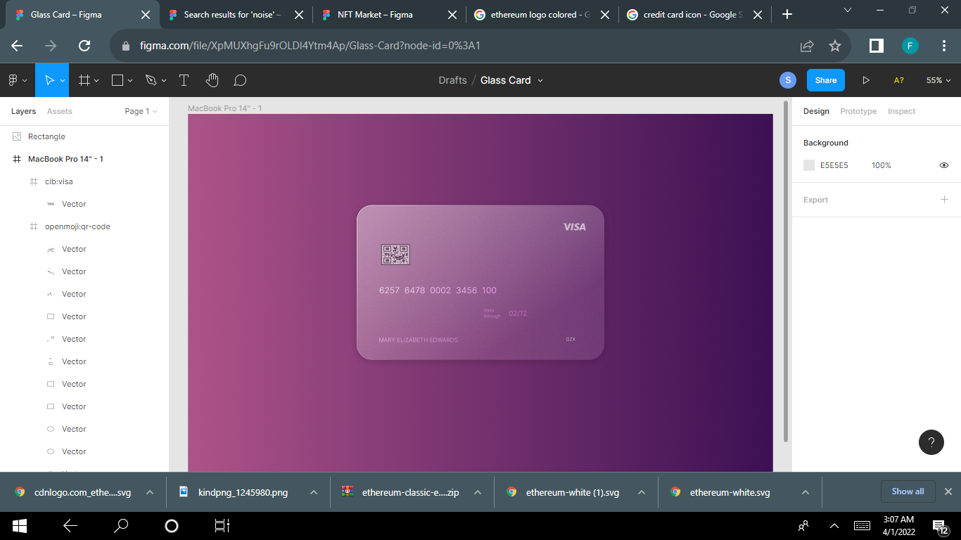
And there you have it – a beautiful and glassy-looking card.
Conclusion
Adding the glassmorphic affect to your designs is pretty simple. As the glassmorphism trend gets more popular, knowing how to create glass designs might really come in handy in the future.