
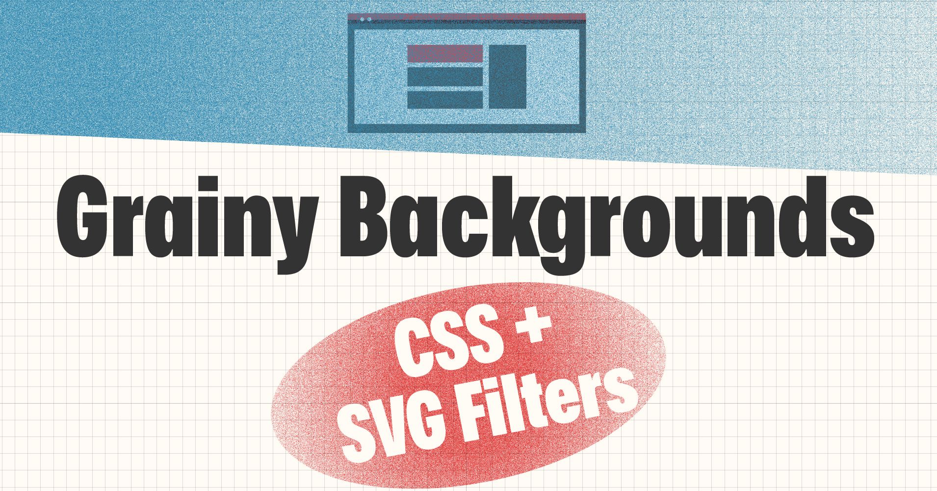
In this article we're going to create more interesting website backgrounds by using grainy effects.
There's a full video walkthrough at the bottom of the article 👇, as well as a 15 second video in the middle for those of you who just want a quick soundbite.
We'll cover this in two ways:
- Using a PNG image with transparency like on the site below.
- Using our own SVG image & code
How to Create a Grainy Background Using PNG Grainy Image
First, the PNG approach.
I came across this background the other day on Arc's site, and I was intrigued. I'd seen grainy type illustrations and colors before, and I'd even made a few in Illustrator. But it made me wonder how to produce the same effect as a background on a website.
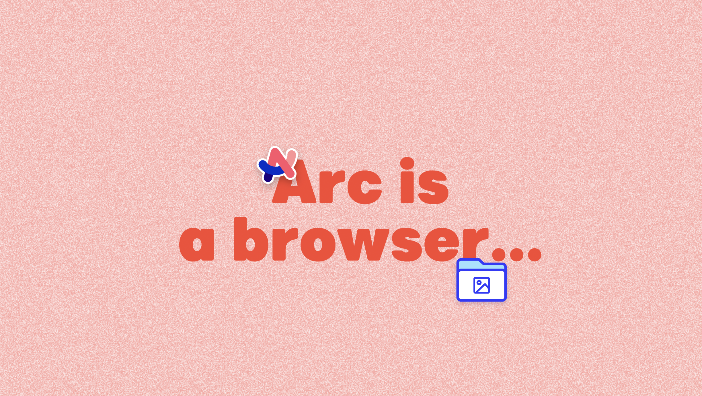 Screenshot of grainy background from https://arc.net/
Inspecting this showed me that they used two things: a background: var(--colors-primary3) and a background-image: url(noise.png);:
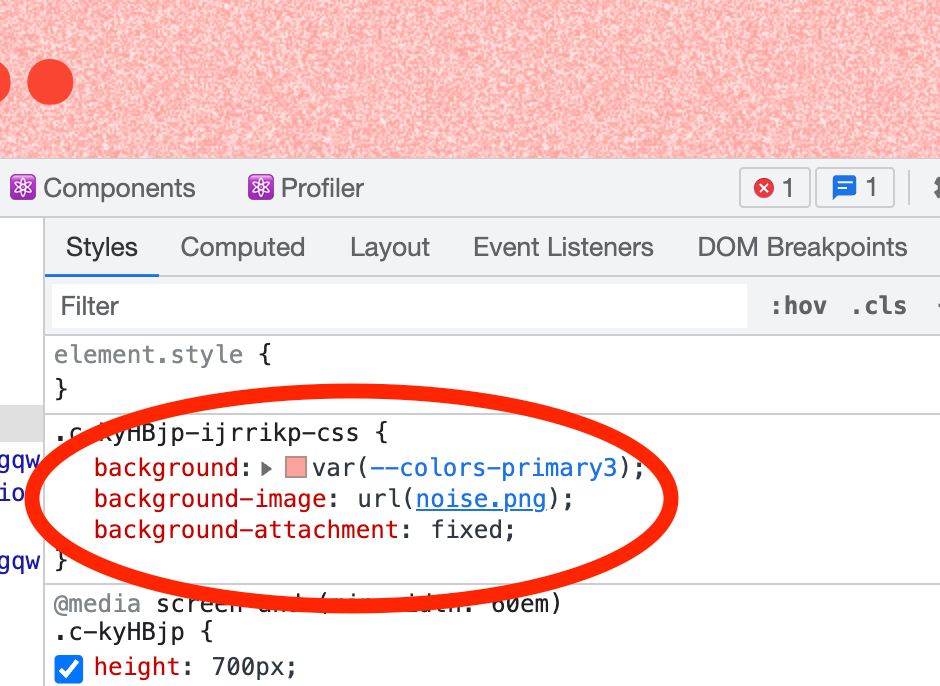
The .noise.png file was simply a grainy image with transparency so the solid color from the CSS background could come through:
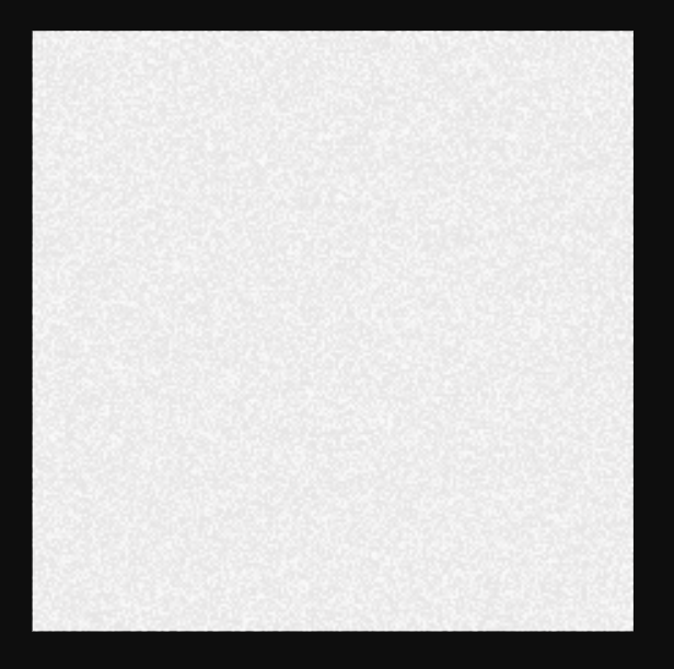 Screenshot of the noise.png image
How to Recreate the PNG Noise
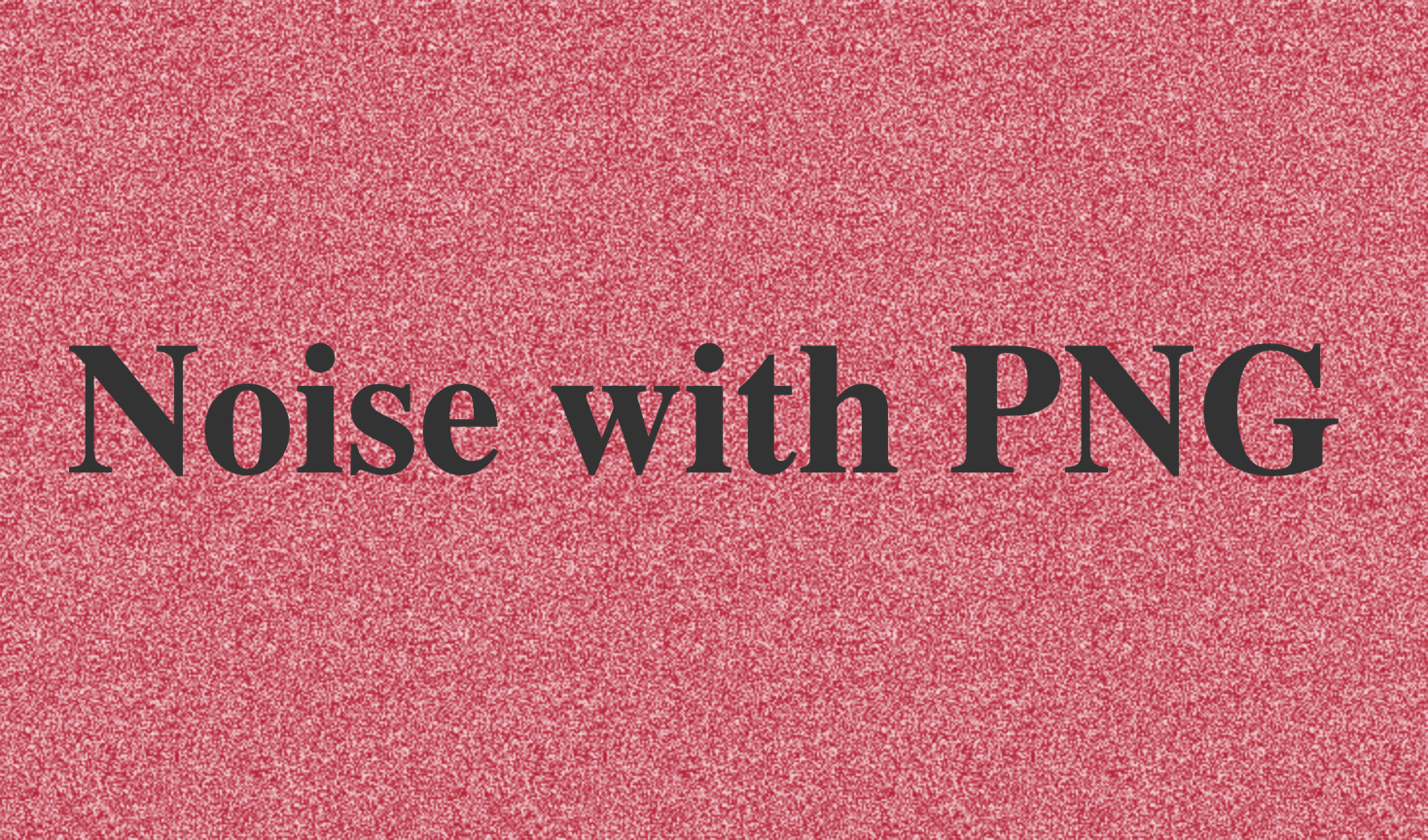
Let's download the noise.png file. Then create an HTML document. We'll add a section to display it:
<section class="container noise">
    <h1>Noise with PNG</h1>
</section>
In our CSS, we'll add some basic styling for the container:
.container{
    margin: 0 auto;
    display: flex;
    width: 100%;
    min-height: 33vh;
    justify-content: center;
    align-items: center;
}
Then, for our .noise class:
.noise{
    background: rgb(182, 34, 58);
    background-image: url(/assets/noise.png);
}
And voilà! We've got the same effect:
Pretty clever, but I dug further and found how to both create the noisy texture itself as well as generate it inline in our code.
What are SVGs? With Video Overview
First, a 15 second video summary of the inline part (full 10 min walkthrough is at the end of the article):
SVGs are Scalable Vector Graphics.
They are handy because they can scale up or down without losing quality. And they are versatile because you can mark them up with code just like you can use CSS to make stylistic changes to your HTML.
In fact, you can even hard code an SVG straight into your HTML or CSS.
Below I'll show you three things:
- How to create an SVG file to reference in similar fashion to the PNG above.
- How to use an SVG file to create a grainy background
- How to code the grainy SVG straight into CSS to apply the grainy-ness to elements in our HTML.
How to Create an SVG
The Grainy Gradient Playground has been very helpful during this research. It allows for the quick creation of these SVGs.
Let's look at the code for the SVG they're using:
<!-- svg: first layer -->
<svg viewBox='0 0 250 250' xmlns='http://www.w3.org/2000/svg'>
  <filter id='noiseFilter'>
    <feTurbulence
      type='fractalNoise'
      baseFrequency='1'
      numOctaves='3'
      stitchTiles='stitch'/>
  </filter>

  <rect width='100%' height='100%' filter='url(#noiseFilter)'/>
</svg>
The first line sets up the SVG with an initial viewBox.
<svg viewBox='0 0 250 250' xmlns='http://www.w3.org/2000/svg'>
Then, the filter is setup and given an id. We use the feTurbulence filter to create the grainy effect. MDN, as always, has more info on the details of feTurbulence.
<feTurbulence
      type='fractalNoise'
      baseFrequency='1'
      numOctaves='3'
      stitchTiles='stitch'/>
  </filter>
Then we're defining the shape (a rectangle), the size (100%) and applying the feTurbulence filter to it:
<rect width='100%' height='100%' filter='url(#noiseFilter)'/>
If we throw this in our HTML now, it'll display as plain noise:
 SVG feTurbulence noise image
How to Use an SVG as a Background-Image
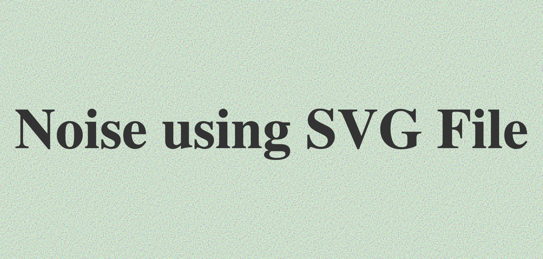
Because SVGs are essentially just code, we can create a noise.svg file in our project, and copy in the contents of the SVG example.
We'll create another div for this method in our HTML:
<section class="container noise2">
    <h1>Noise using SVG File</h1>
</section>
I changed the baseFrequency='1' in the SVG file for appearance's sake, and then added the following to our CSS:
.noise2{
    background: rgb(219, 255, 219);
    background-image: url(/assets/noise.svg);
}
This gives us a similar result for our green background section:
SVG Filter Inline CSS
Finally, we have the option to forego the separate noise file altogether by putting the SVG inline.
In the Gradient Playground, you'll see the option for this in the third CSS+Gradient+CSSFilter box, and there's a toggle switch to produce the inline CSS directly:
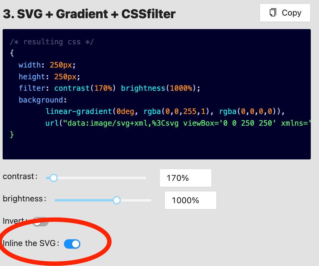 Screenshot from Grainy Gradient Playground
It uses gradients going from opaque to transparent to allow for the noise to show through. You can achieve the same effect on a solid color background by repeating some of our code from above.
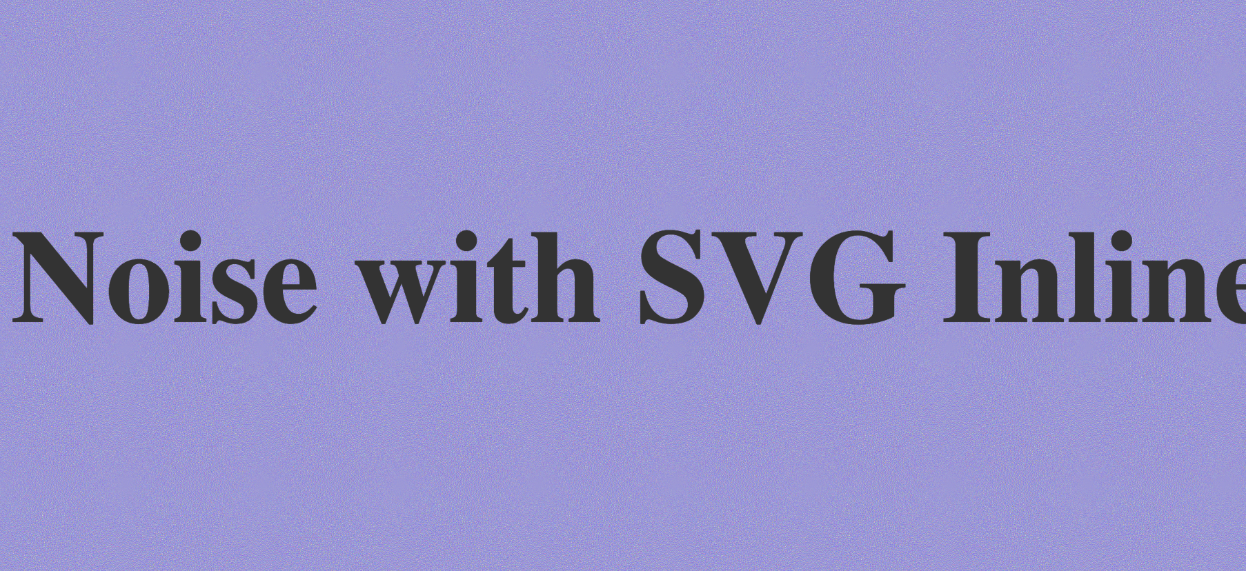
We'll create a third div for this example:
<section class="container noise3">
    <h1>Noise with SVG Inline</h1>
</section>
Then, we can convert the SVG into usable format in our CSS by using a URL-encoder like this one. (You can also copy from the Grainy Gradient Playground box where the same code is generated).
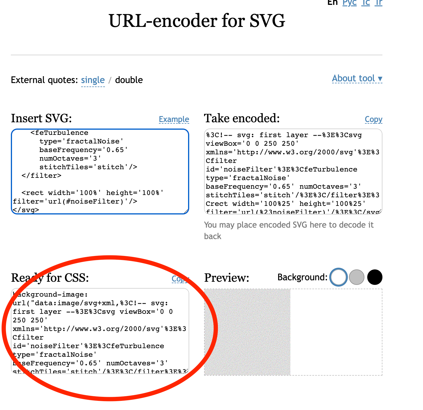 Screenshot of URL-encoder for SVG code
And just like that, we have within the URL parenthesis the code that we can use for our background-image. So the CSS for our div looks like this (I modified the baseFrequency more to get a more fine-grained look:
.noise3{
    background:rgb(68,0,255);
    background-image: url("data:image/svg+xml,%3C!-- svg: first layer --%3E%3Csvg viewBox='0 0 250 250' xmlns='http://www.w3.org/2000/svg'%3E%3Cfilter id='noiseFilter'%3E%3CfeTurbulence type='fractalNoise' baseFrequency='4' numOctaves='3' stitchTiles='stitch'/%3E%3C/filter%3E%3Crect width='100%25' height='100%25' filter='url(%23noiseFilter)'/%3E%3C/svg%3E");
}
The parameters are easily editable on all these SVGs and filters to produce different grainy effects. I hope this has been a helpful tutorial for you to easily spice up your backgrounds!
Video Walkthrough
Here's the video walkthrough of all the above:
Will you consider subscribing to my YouTube channel? I'm making more content like this, and having a blast!
You can find me on LinkedIn too 👋.
You're awesome; have a great one!