By Amy Lima
I wanted to test my limits as a young designer by improving the user experience of Clubhouse, the hottest new audio conversation app on the social media scene.
After speaking with both power users and novices on the app, I uncovered some specific pain points with wayfinding and discoverability in the app. These became the primary design challenges that guided my work throughout this project.
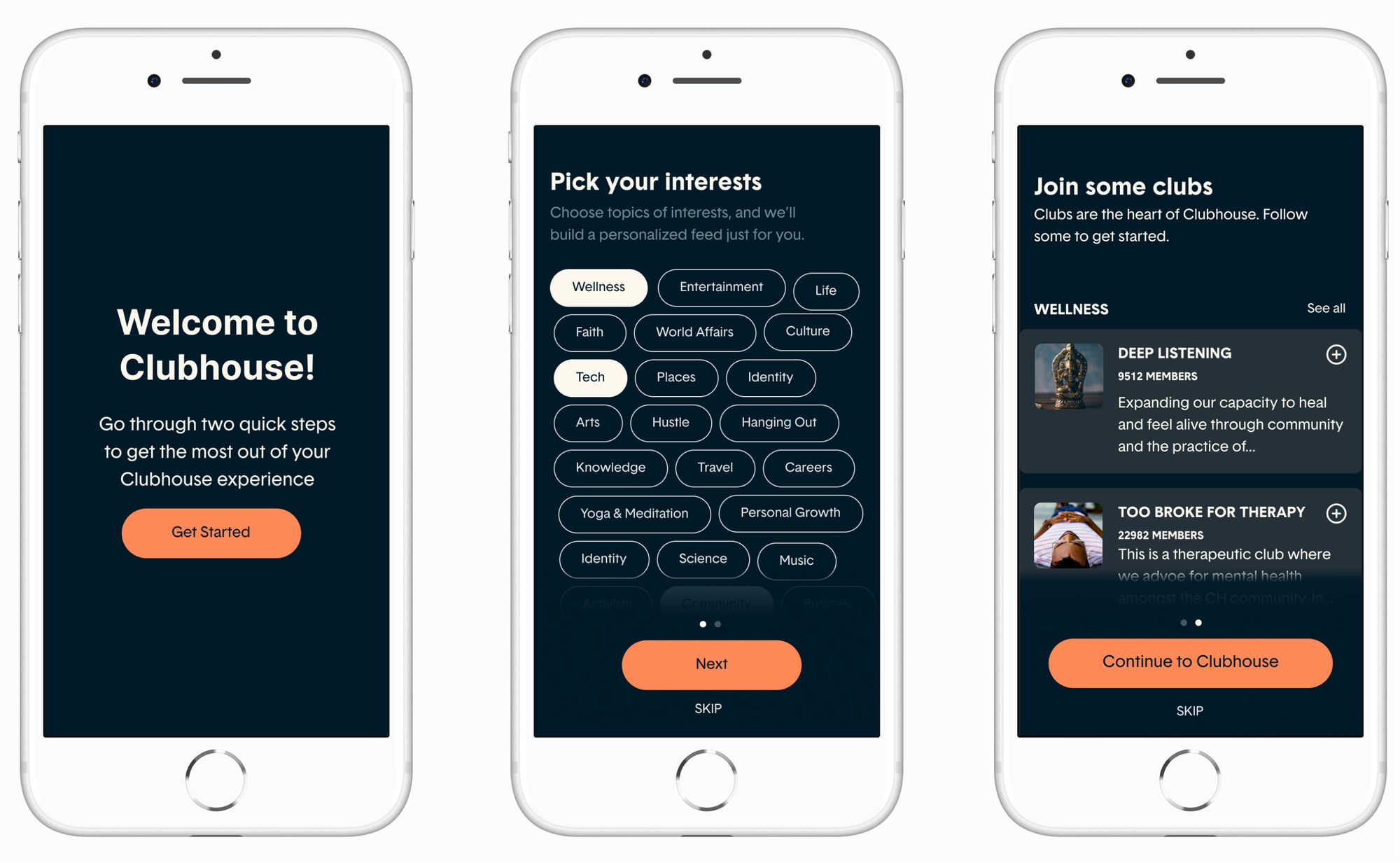 Onboarding Mockups
Disclaimer: I do not work for Clubhouse, and the views in this case study are strictly my own.
As a budding designer, I acknowledge that my vision for this project may be overly ambitious and at times reliant on assumptions of business goals and user data.
In a perfect world, I’d be working alongside the Clubhouse team with direct access to these resources to guide my work. Until then, this case study is meant to be an exploratory learning experience on a product I deeply admire.
The Brief
It’s difficult to understate the excitement around Clubhouse, the audio chat app where members can move around virtual rooms discussing topics ranging from culture to politics.
The app raised its first $100 million with only 1,500 users a month after its beta release. And at the time of this writing, Silicon Valley’s buzziest app has just been valued at $1 billion dollars, a mere 9 months after taking off and before even launching to the public.
Beyond its success with investors, Clubhouse has amassed a fiercely loyal user base, whose creativity has spanned from a 24-hour continuous room dedicated to new user onboarding to a live production of The Lion King.
As an early beta user on the invite-only platform, I had the unique perspective of following the product’s updates (and exponential success) in real-time. And I sought to challenge myself with my most ambitious project yet: redesigning Silicon Valley’s most exciting app in recent memory. No pressure.
The high-level goals of this project were:
- Improving discoverability within Clubhouse, allowing users to more easily find new rooms, people, and clubs to engage with
- Creating a more seamless Hallway experience, where users can filter and find the most relevant rooms to them
UX Challenges: Simplifying a complex information hierarchy
One of the main considerations I had to take into account was the hierarchy of the main components users can interact with inside the app:
- People (other users of the app)
- Rooms (a virtual meeting place for audio conversations), and
- Clubs (interest-based groups that rooms can be hosted under).
Beyond this, I had to consider how each of these components were connected, both interpersonally and through time.
Currently, a Clubhouse user’s Hallway (home screen) shows live rooms connected to the people and clubs they follow (which I’ll refer to throughout this case study as “in-network”). This makes it difficult for users to easily keep track of upcoming rooms in their network, as well as join new, out-of-network rooms.
This became a major dichotomy throughout my work: I needed to find a balance between making each of these individual parts of Clubhouse easily discoverable while maintaining – and simplifying – the web that weaves them together.
 Discovery task flow
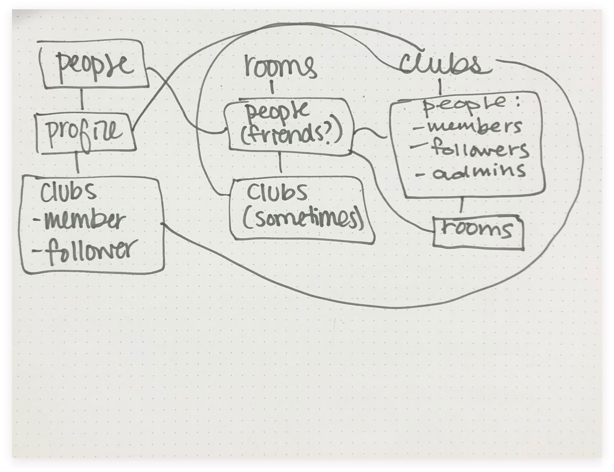 Mind map of the relationship between Clubhouse components
Research + Planning: A UX Researcher’s Dream
Another unique aspect of this project was the direct access beta users have to the Clubhouse founders, Paul Davison and Rohan Seth. Every Sunday, the pair host Clubhouse Townhall, an open forum where they share the week’s latest product updates, their upcoming roadmap, business goals, and top priorities, as well as holding space for user-submitted Q&As.
And thanks to Clubhouse’s enthusiastic user base, the official Townhalls are regularly followed by Townhall recap rooms (shoutout to Community Club), where power users would deep dive into the week’s updates and what features they’re most excited for.
Between Clubhouse Townhalls, recap rooms, and both official and community-run new member onboarding rooms (including FAQs, Q&As, and discussions), I spent on average 5 hours a week for 6 weeks gaining as many business insights and goals as I possibly could from my limited vantage point.
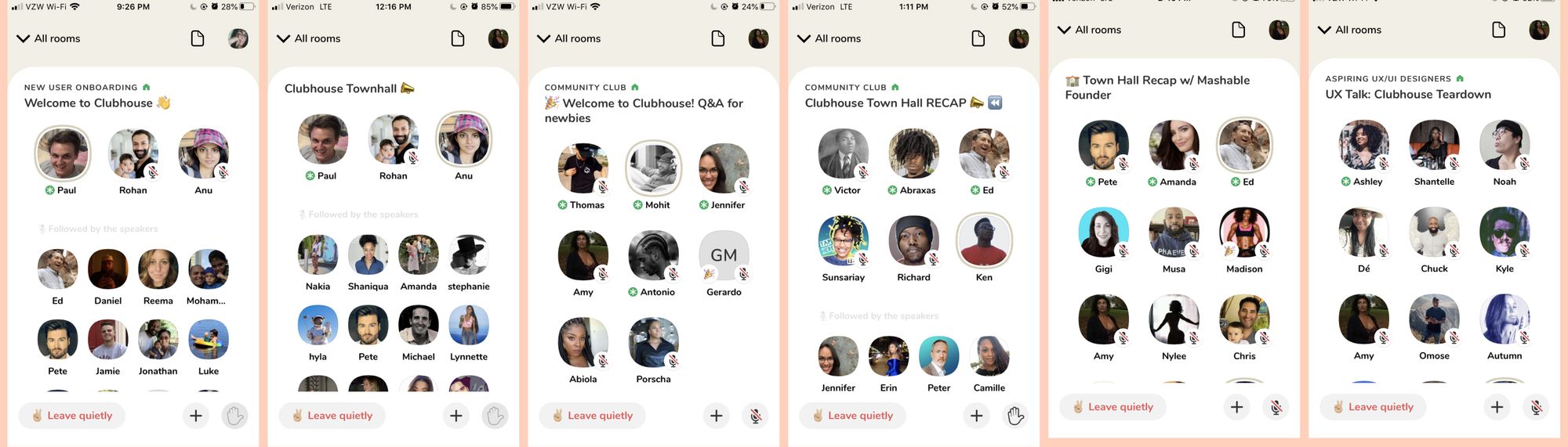 A compilation of some of the rooms that became a regular part of my UX Research
From these discussions, the overarching goals of the Clubhouse team are:
- Making Clubhouse accessible for everyone: Paul always made it clear that the team’s top priority was to scale Clubhouse as quickly as possible while not sacrificing quality
- Putting creators first: another point Paul never understated was the team’s prioritization of the platform’s creators, building tools that would allow for creator monetization
- Improving discoverability and suggested content: at the time of this project, Clubhouse was actively building out their topics directory and algorithms that would make finding relevant rooms progressively easier
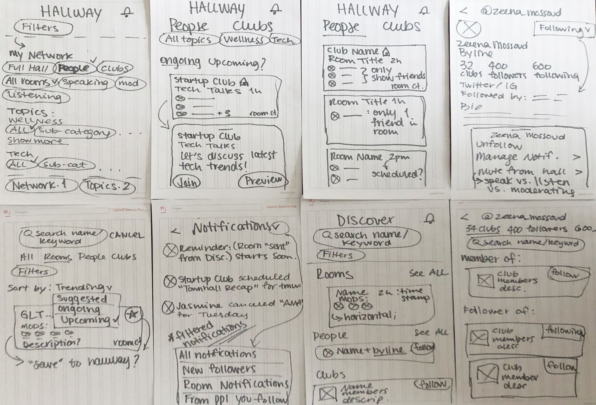 Early sketches of how different screens might behave
User Interviews, from power users to newbies
I spoke with Clubhouse users — both power users and more casual community members — to uncover friction points they currently had with the app’s discovery experience. These interviews showed gave me the following insights:
- Keep it lightweight: most users preferred room discovery to be a spontaneous experience, not necessarily wanting to schedule upcoming rooms in their personal calendars
- Cluttered Hallway: most users were confused by how the hallway was currently curated, and who of the people they followed were in any given room present
- Hallway as a source of discovery: despite the cluttered hallway experience, most users still relied on the hallway to find new rooms, despite there being an existing (but not yet robust) “Explore” tab
- Friends first: when deciding which rooms to join in the hallway, users unanimously wanted to see which of their friends were in any given room
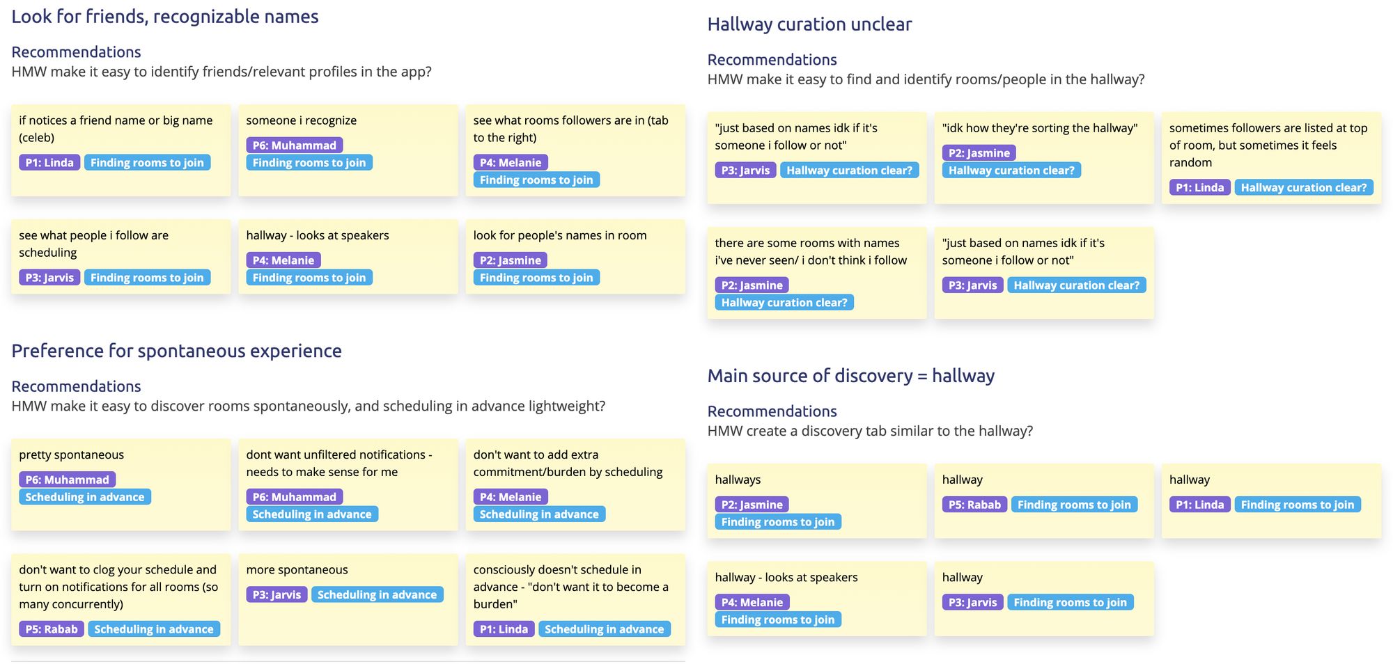 Affinity map of my user interviews (made using Evolve)
So how might we make the Hallway a clear and concise place for spontaneous interaction, while facilitating lightweight out-of-network discovery?
UX Solution: Streamlining the Discovery-to-Hallway pipeline
I developed a simple yet powerful UI that makes wayfinding within your hallway and rooms easier. It also makes bringing rooms found through the discover page into your hallway a breeze.
In order for this solution to feel cohesive and not siloed, I needed to implement a near-full redesign of Clubhouse, broken up into 5 main experiences.
Play with the final prototype here.
 Early Wireframes
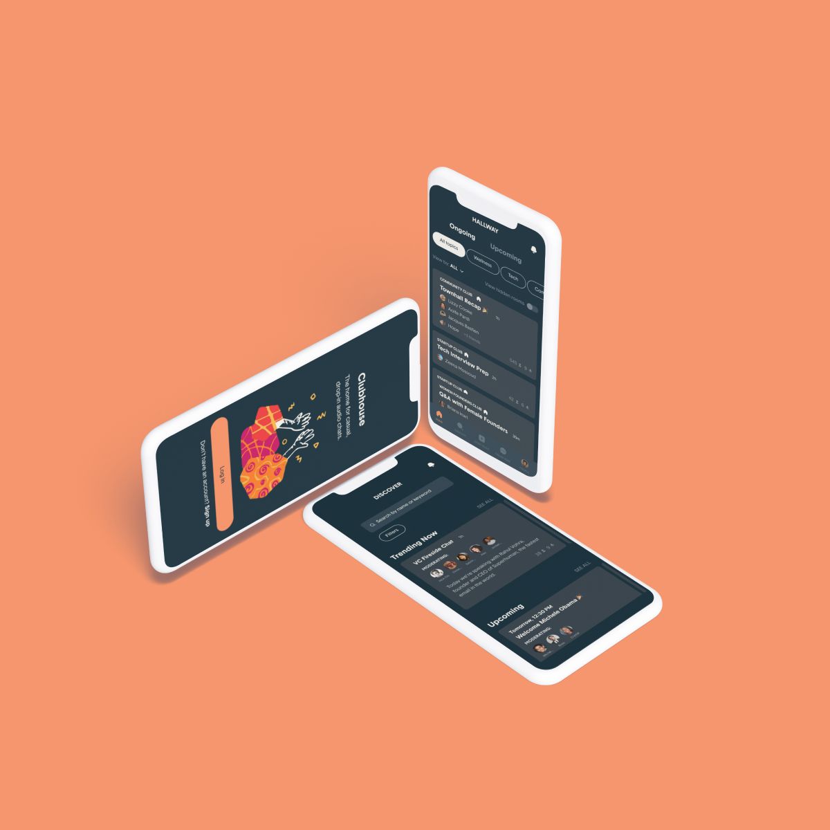
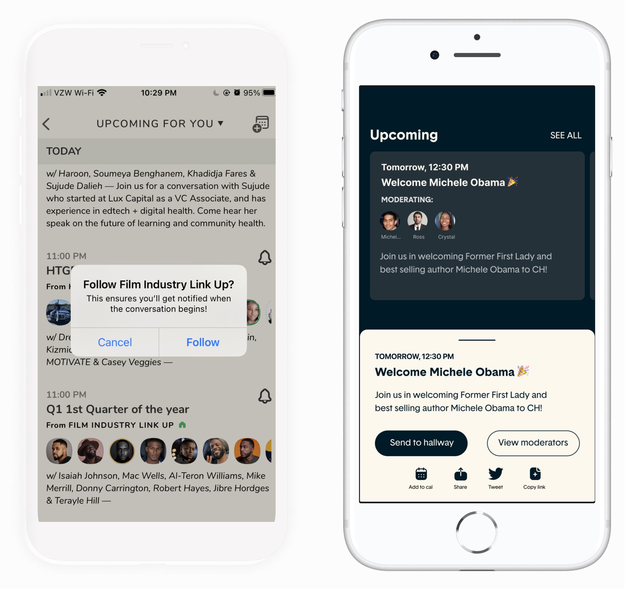
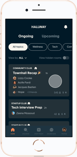
Experience 1: The Hallway
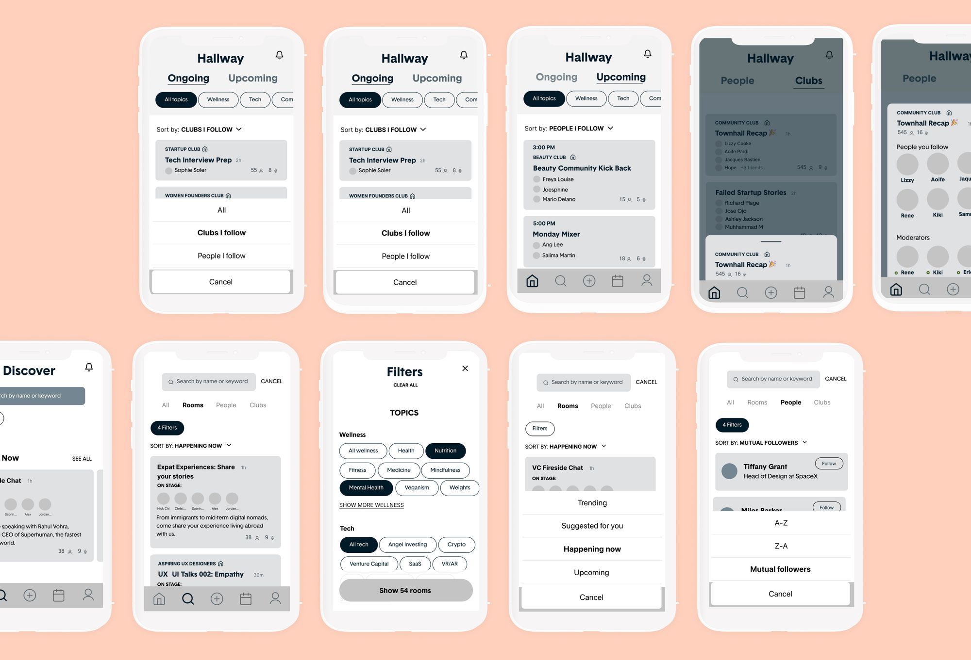
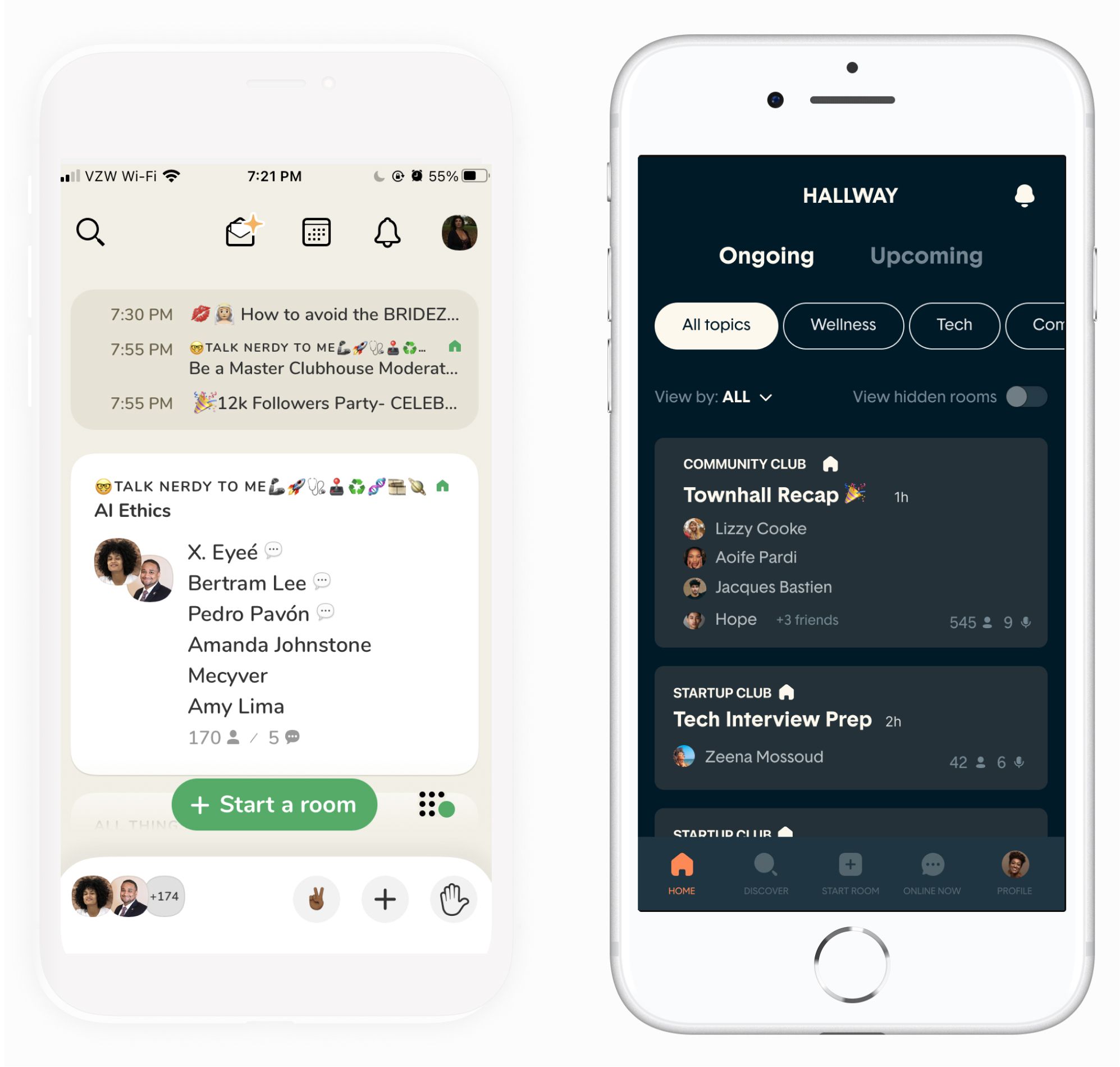 The Clubhouse Hallway currently (left), and reoptimized for more functionalities and access to controls (right)
Users wanted their hallway experience to feel more intentional and within their control. To achieve this, I established a top-level hierarchy of:
- ongoing vs. upcoming, to allow users to not only see active rooms but get a quick overview of scheduled rooms within their network
- filters by topics of interest, selected by the user during onboarding, and
- sort rooms in your hallway by people vs clubs you follow
An additional UI decision was to only present people you follow within the rooms in your hallway. This would alleviate the current issue of ambiguity surrounding the names users currently see in the room cards in their hallways.
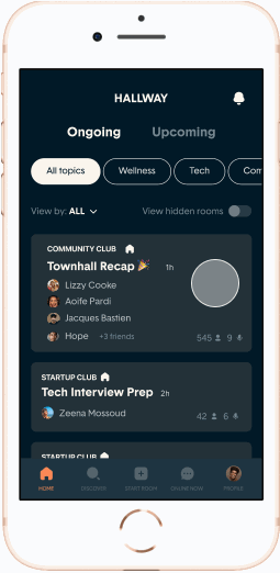
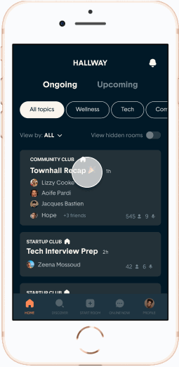 Navigating the reimagined Hallway
Experience 2: Room preview
 Room preview in action, where users can see a full list of which friends are inside any given room
Currently in Clubhouse, clicking on a room in a hallway immediately drops you into that room’s conversation.
Since identifying friends in any given room was a high decision factor for users joining a room, I wanted to design a way for users to see whom they know inside before committing to join.
Experience 3: Discovery
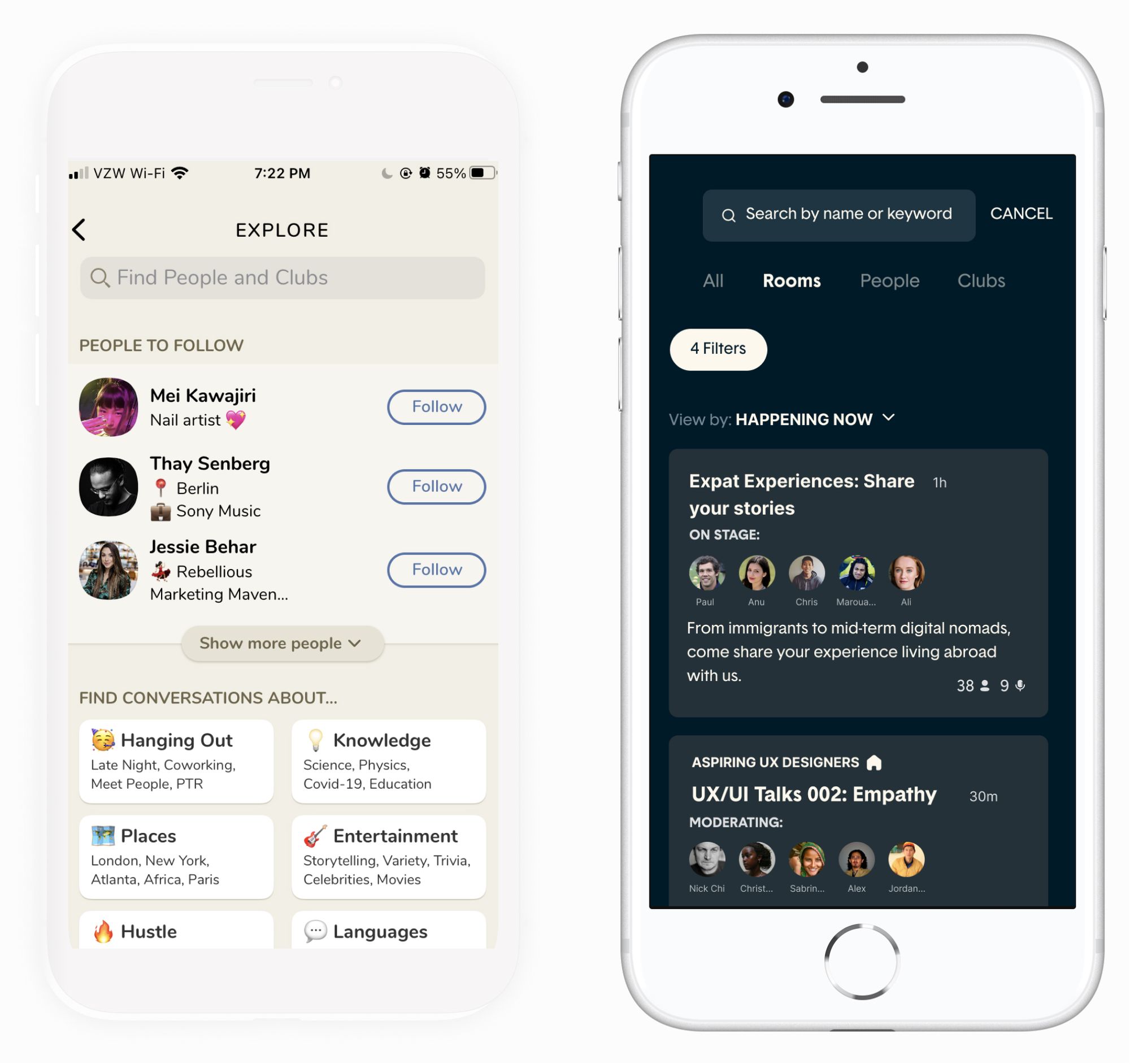 Clubhouse’s Explore tab currently (left), and redesigned as an immersive discovery experience (right)
Currently, discovery in Clubhouse is siphoned: users go to the Explore tab to discover people and clubs by categories and keywords, and they go to the calendar tab to discover both active and upcoming rooms across all of Clubhouse.
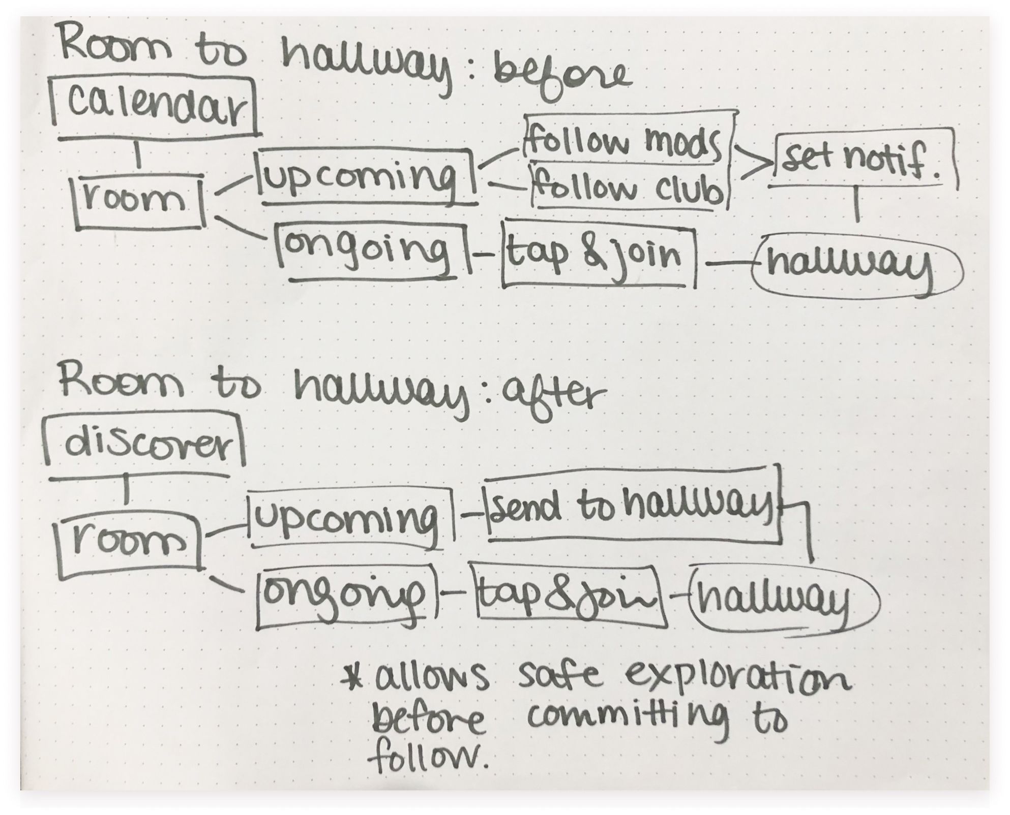
 Bringing a room to your hallway via Clubhouse’s Calendar tab currently (left), and reimagined as a simple bottom sheet function (right)
Most participants actually didn’t use these tabs to achieve their primary goal of discovery. Instead, they adopted workarounds such as discovering clubs through user profiles, discovering people through rooms, and discovering rooms primarily through their hallway, limiting the scope of content they were being exposed to.
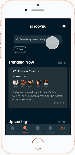 An immersive discovery experience with rich filter and sort options
While I designed UI solutions to make these workarounds more seamless, I wanted the discover page to be the go-to destination to accommodate for all these use cases, allowing users to search for people, clubs, and rooms by Clubhouse’s growing topics directory, in addition to keywords.
I also integrated an additional sort functionality to further facilitate discovery.
 Sending an out-of-network room to your Hallway
Users also wanted an easy, lightweight solution to discover and access out-of-network rooms.
The ability to send a room from the discover feed to your hallway without committing to following that room’s moderators, corresponding club, or scheduling in your personal calendar was the biggest challenge of this project, involving many iterations in order to feel intuitive.
Experience 4: Active Users
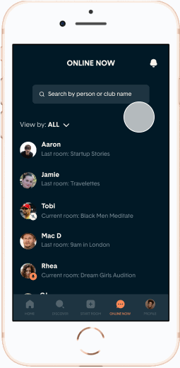
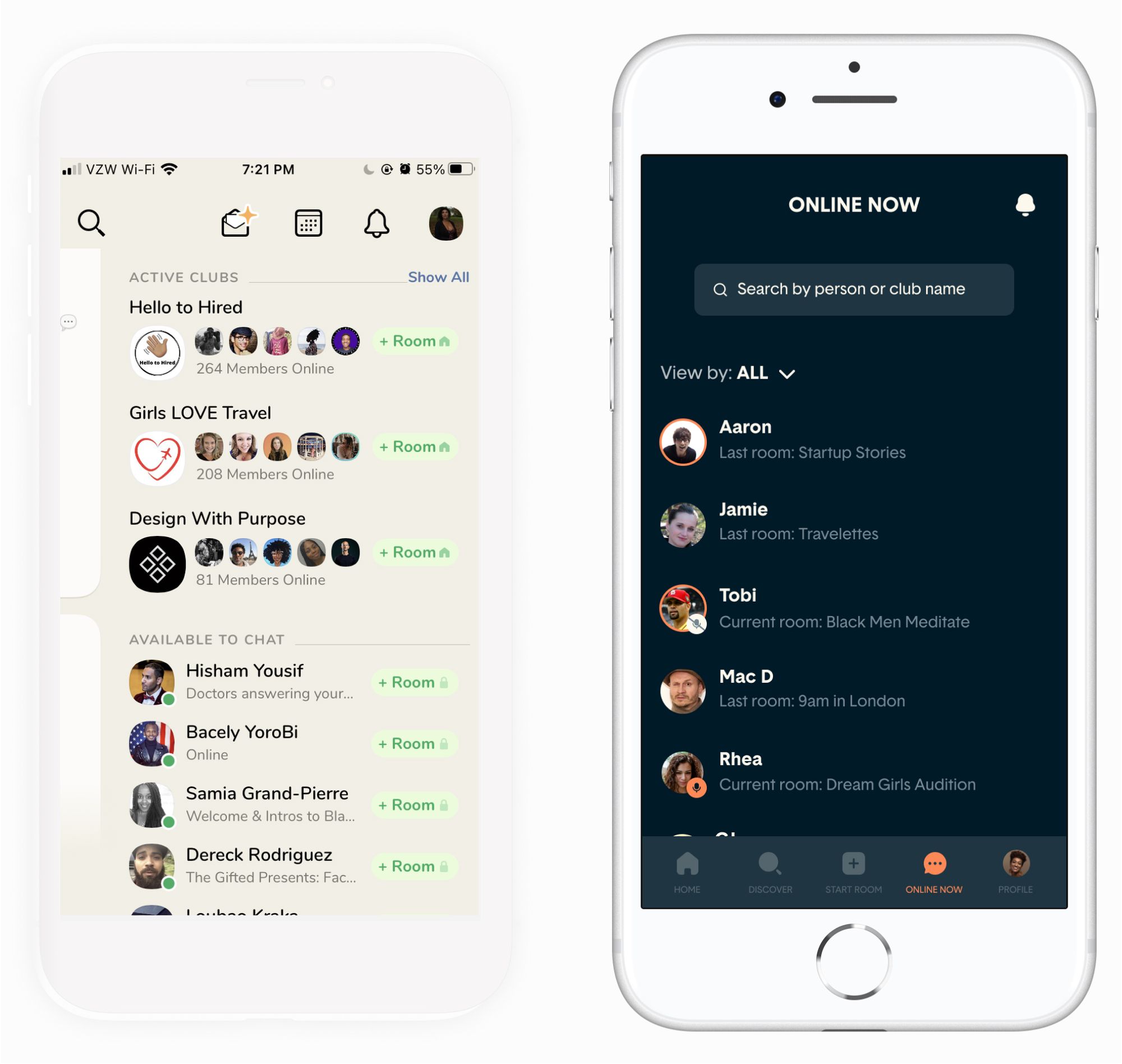 Clubhouse “Available to Chat” flyout currently (left), and reimagined as an “Online Now” tab (right)
A close cousin to the hallway, your active users screen is where all your Clubhouse people and clubs that are currently online live. 83% of users interviewed mentioned scanning this screen to quickly identify what rooms their friends were in.
I added a much-requested search bar to further facilitate friend-finding, as well as a sort drop-down menu to reach an even more important distinction: who’s actively participating in a room vs. just listening in.
 Discovering active users by different sort options
Experience 5: User and Club Profiles
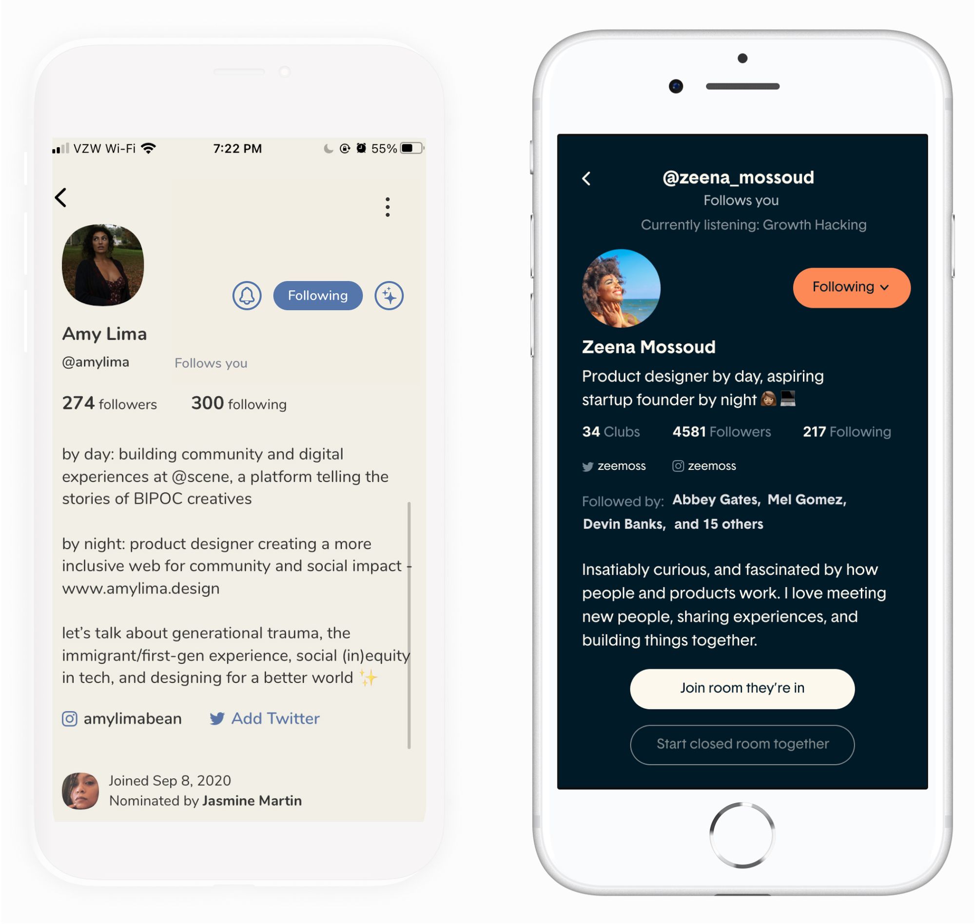 Clubhouse User Profiles currently (left), and after consolidating clubs as one metric (right)
87% of users discover suitable clubs to follow via user profiles directly. There exists a further hierarchy within clubs: followers (who receive notifications and see club-branded rooms in their hallway), and members (who, in addition to the above, can also start club-branded rooms themselves).
In Clubhouse’s current design, the clubs a user follows vs. clubs a user is a member of are in disparate locations: in the user’s following list and at the bottom of their user profile, respectively. This was confusing to users wanting scan all the clubs associated with a particular person.
 Navigating both User and Club Profiles
By making clubs associated with a user a consolidated metric, users visiting that profile can more easily see what clubs that person belongs to, and immediately follow without visiting a new screen.
On the club level, being able to access metadata such as previously held rooms, upcoming rooms, and club admins can help a user get a more effective overview of the club.
UI & Branding: A Case for Dark UI
In bringing all the pieces of this experience together, it became clear that adding too many visual elements would disrupt the visual hierarchy needed to move through the app with ease.
Additionally, the typical user experience on Clubhouse is already so immersive and emotive, often spanning all hours of the night — I wanted to take advantage of this use case and implement an elegant UI that emphasized Clubhouse’s few content types harmoniously.
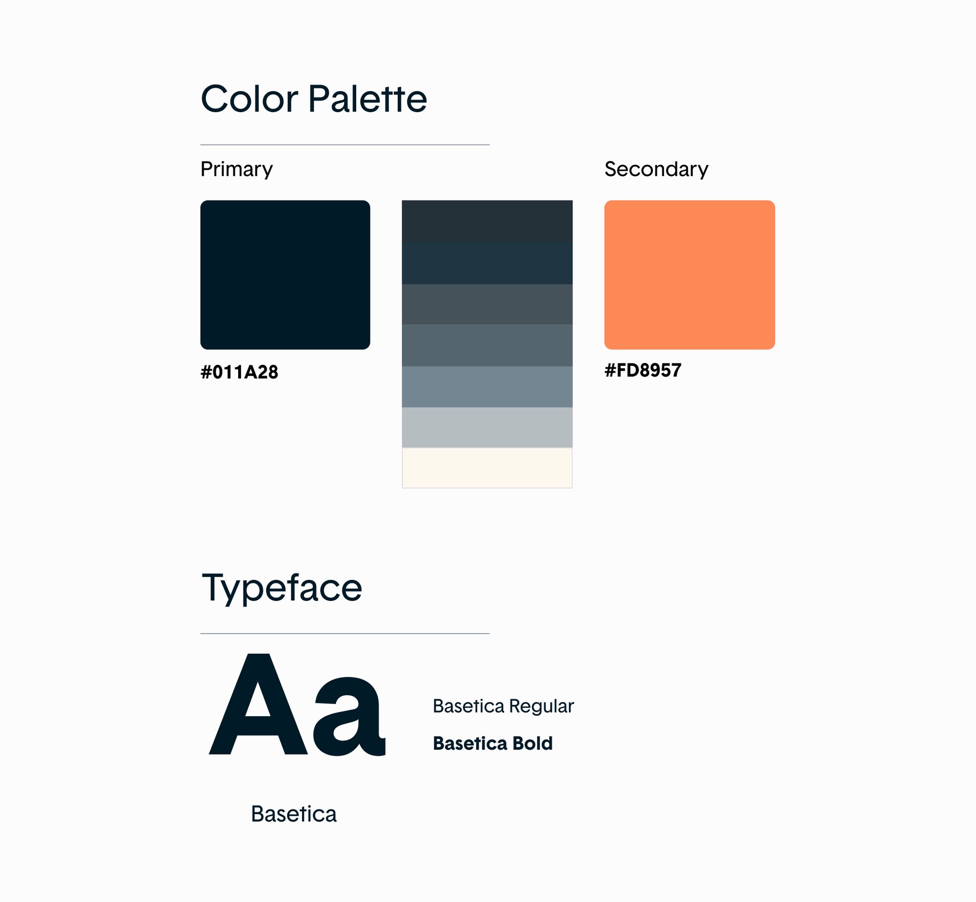 A snippet of the Style Guide that guided my work
Usability Testing: How effectively is findability and discoverability throughout the app?
After conducting my usability tests, I created an affinity map with insights, behaviors, and findings during the tests.
Most users moved through the app with little to no missteps, but for many participants, there was one main point of friction that disrupted a key pillar of this redesign:
It was still unclear how to access a room you saved from the Discovery page to your Hallway.
Usability Testing Insights & Priority Changes
Initially, I designed for upcoming out-of-network rooms found in the discover tab to appear in the hallway by the user starring the room. These would then appear in your hallway algorithmically, further discoverable via the “sort by” drop-down menu. There were a few problems with this:
- The original design essentially treated these rooms as saved items, which inadvertently (and incorrectly) prioritized these rooms over other rooms found in your hallway
- This treatment could have greater implications of disincentivizing spontaneous room creation, or unfairly prioritizing out-of-network rooms in general
- Beyond this, embedding a saved item in a sort drop-down wasn’t intuitive or an expected place to find this type of content
 Setting notifications on the room, club, and user level
Conclusion: Lessons learned & where we go from here
Going into this project, I knew this would be an ambitious challenge for a young designer. What I didn’t know was just how intricate and all-encompassing that challenge would be.
I learned that working on a highly publicized and highly beloved product comes with a lot of external pressure and internal emotions to do right by (seemingly) everyone.
There are the power users with fierce attachment to existing structures, and new users who can’t fully experience the nuance of an audio app as a static prototype.
Then there's the small but mighty Clubhouse team, who are actively iterating their product on a weekly basis, potentially launching imaginative solutions themselves for the same challenges I’m working on. And even others I haven’t imagined yet.
Against a constant stream of public conversation over an exciting product that felt almost ethereal, I’ll humbly admit that there were times where this pressure got the best of me and I felt like a total imposter who bit off way more than she could ever chew.
The biggest lessons this project taught me were the delicate balance between perseverance when faced with complex challenges, grace in the wake of perceived failure, and when to be okay with “good enough” (for this iteration, of course).
In the end, I’m extremely proud of what I was able to accomplish with this project at this stage in my design journey. And I often reminded myself of my favorite mantra that led me to product design in the first place:
“All I wanted was a job like a book so good I’d be finishing it for the rest of my life.”
Product design is that job for me, and I’m proud to say that while this project (and all my others) will never be fully finished, I breathed as much life into it as I could — I hope you enjoyed it!