
By Black Raven
When you build a bar chart race, you're creating many discrete pages of bar charts and then stringing them together. This is just like how traditional cartoon animation works.
In December 2019, Tableau released version 2020.1 beta with a new Animations feature for dynamic parameters. This means that the bar chart race below is now very easy to build.
 Watch it in action: [https://www.youtube.com/watch?v=3iZrMkZ3948](https://www.youtube.com/watch?v=3iZrMkZ3948" rel="noopener nofollow)
Pre-requisites
Download and install Tableau Public (version 2020.1.2 onward). It is totally free and has full functionality. The only snag that all of your work can only be published on the Tableau Public server, and not saved locally to your Desktop. This is alright if the data is not sensitive or private.
Download the latest COVID-19 data (in *.xlsx format) from the European Centre for Disease Prevention and Control website, and rename it using a generic filename like “COVID-19-geographic-distribution-worldwide.xlsx”. You can replace this file with updated data later, using the same filename.
Open the Tableau Public app, and on the "Connect" menu, click on “Microsoft Excel” and select the data file you downloaded. Click on the “Sheet 1” tab at the bottom left.
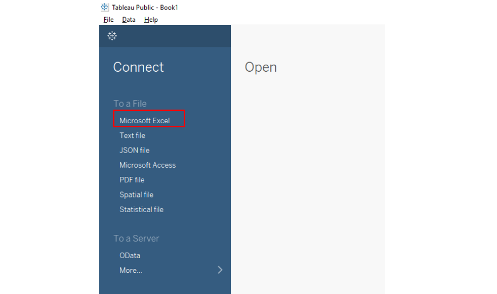 Connect Tableau Public to dataset
Identify the Quantity to Race
There are 2 useful quantities you can choose to race in this dataset:
- Daily Infected Cases, or
- Daily Deaths Cases.
To choose the race quantity as daily infected cases, drag “Cases” to Columns.
To label the bar chart with country names, drag “Countries And Territories” to Label.
To have the bars in various colors, drag “Countries And Territories” to Color.
Create Rank for Countries
This section requires a simple programming line of code.
Click on Dimensions → drop-down menu → Create Calculated Field.
Create a new field “Rank”, and key in the code below:
RANK_UNIQUE(Sum([Cases]))
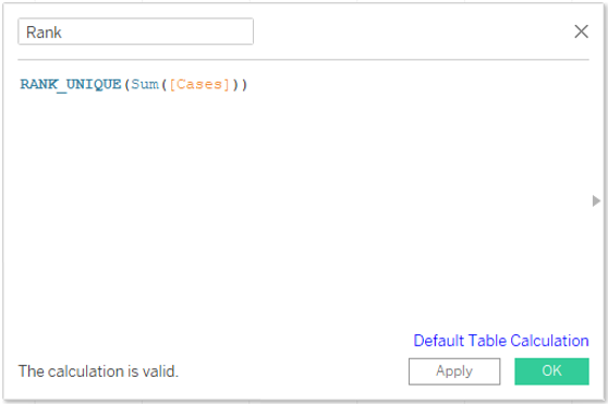 To code for Calculated Field “Rank”
Click on “Apply” to ensure that calculation is valid, then click “OK”.
Drag “Rank” to Rows.
Click on (Rows) Rank → drop down menu → Discrete.
Click on (Rows) Rank → drop down menu → Compute Using → “Countries And Territories”.
Configure Animation (New Feature for Version 2020.1)
To create a snapshot of animation frames, drag “Date Rep” to Pages.
Click on (Pages) Date Rep → drop down menu → Exact Date.
Turn on animations, select Format → Animations → On.
To set the transition duration: Duration → “1.00 seconds (Slow)”.
Close the Animations window by clicking “X”.
Look for a little Animations control which appears when the animations feature is turned on, then click the “forward play” icon. Drag the slider bar to a different date or use the left/right button to choose a date.
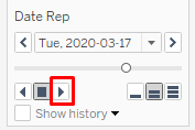 Animations control
Add Simple Customization
To improve colors:
Click on Label → ensure “Show mark labels” is checked.
Click on Color → Edit Colors -> replace similar colors if any.
(I have replaced the colors for USA, Spain, Italy)
You can hide the Countries legend card – no need for it anymore.
To add additional labels for the number of cases to the bars:
Drag “Cases” to Label.
Click on Label → Text → click on “3 dots”. This opens up the label editor.
Arrange labels to 1 line only.
Underline .
Bold , and use red font.
Click on “OK”.
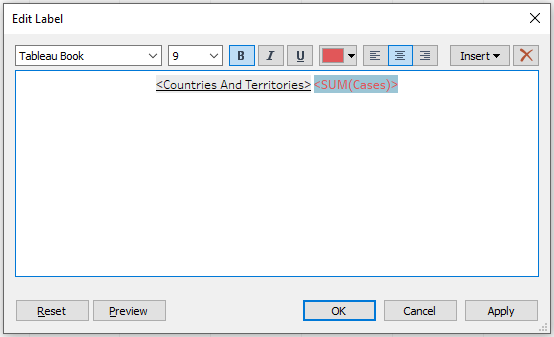 Label editor
To change the name of the sheet:
Double-click on “Sheet 1” and change it to “COVID-19 Daily Infected Cases”.
To change X-axis limits:
Double-click on the X-axis. This brings up the Axis menu. Choose the Range to be “Fixed”: Fixed start=0, Fixed end=40,000.
To display only the top 15 countries:
Drag “Rank” to Filters → click on “OK”.
Click on (Filters) Rank → drop down menu → Compute Using → “Countries And Territories” .
Replace “206” with “15”, and click on “OK”.
Change the Standard view to “Fit Height”.
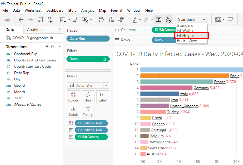 View chart using ‘Fit Height’
To increase the font size of the labels:
Click on Label → Font → drop down menu → change the font size to “15”.
To add a date label to the chart:
Right-click on the empty chart area → Annotate → Area.
This brings up the annotation editor.
Key in , and increase font size to “20”.
Click on “OK”.
Now that the date label was created, resize and move it to the bottom.
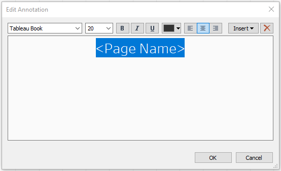 Annotation editor
Publish Visualization
When you are satisfied with the customization, the visualization is then ready to be published.
Click on File → Save to Tableau Public.
The work is now published on the Tableau Public server. You can then share it using the available link.
Here’s a video tutorial with a step-by-step guide for the entire process:
A bar chart race becomes very simple to build using the new Animations feature in Tableau Version 2020.1 onward. You can now try it on other country data with date/time series: GDP, Population, Life Expectancy, and so on.
Let your creativity flow!