
Everyone needs websites and web applications these days. So there are many opportunities for you if you work as a web developer.
But if you want to get a web developer job, you'll need a good portfolio website to showcase your skills and experience.
In this tutorial, I'll discuss some of the main reasons why you should make a portfolio website for yourself. Then, I'll walk you through how to build your own fully responsive portfolio website with HTML, CSS, and JavaScript.
Table of Content
- What is a Developer Portfolio Website?
- Why you should have a Portfolio Website
- Portfolio Project – How to Build Your Own Online Developer Portfolio
- The Project Folder Structure
- The Basic HTML Boilerplate
- The Navbar Section
- How to Style the Navbar
- How to Build the Hero Section
- How to Style the Hero Section
- How to Build the More About Me Section
- How to Build the Skills Section
- How to Style the Skills Section
- How to Build the Projects Section
- How to Style the Project Section
- How to Build the Contact Section
- How to Style the Contact Section
- How to Style the Social Icons
- How to Add the Scroll to Top Button
- The HTML for the Scroll to Top Button
- How to Style the Scroll to Top Icon
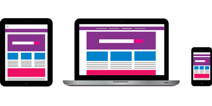
- How to Make Your Portfolio Website Responsive
- How to Create the Media Query for Tablets and Mobile Phones (max-width 720px)
- How to Build the Hamburger Menu
- The JavaScript for the Hamburger Menu
- How to Make the Hero Section Responsive
- How to Make the More About Me Section Responsive
- How to Make the Skills Section Responsive
- How to Make the Projects Section Responsive
- How to Make the Contact Form Responsive
- How to Make the Website Responsive on Small Phones
- Conclusion
What is a Developer Portfolio Website?
A developer portfolio website provides relevant information to potential employers about your skills, experience, and projects you've worked on.
You can consider your portfolio website to be your online résumé.
Why you should have a Portfolio Website
1. A Portfolio Website Increases Your Online Presence
As a developer, you need an online presence. You can cultivate this online presence on social media platforms such as Twitter, Facebook, and Instagram. But those are not entirely your own, as the moderators of those platforms have almost full control over your account.
With your own portfolio website, it's live on your own domain online. And people can easily find you when they search for your name on a search engine like Google, provided you put the right things in place when it comes to SEO.
2. A portfolio website is your online résumé
Your portfolio website is like your online résumé. Potential clients and hiring managers can easily find you online and check out your previous projects and skills.
This also means that when anyone wants to give you an opportunity to work for them, and they ask for your previous projects, you just give them one link to your website (your portfolio). It not only has your projects but your skillset and information about your past experience as well.
3. A Portfolio Website Shows Evidence of Expertise in your Field
Having (let alone building you own) portfolio website as a developer sends out a clear message that you're putting your skills into practice and that you know what you are doing.
A portfolio can also help build trust with clients because they have direct evidence of the quality of your work.
Portfolio Project – How to Build Your Own Online Developer Portfolio
You can make a cool portfolio website for yourself with HTML, CSS, and JavaScript. And that’s what we are going to do here.
I already did this some months ago and made it available to everyone as a free product on Gumroad, so I decided to create a tutorial on how I got it done.
This is the live demo of what we will be building.
To follow along with me, you can grab the starter files from Github.
The Project Folder Structure
To avoid confusion, I will be arranging the HTML, CSS, JavaScript, icons, and images of the project in their respective folders.
The HTML file goes in the root folder, and the image, icon, CSS, and JavaScript files will be in their separate subfolders in an asset folder. This is a common practice.

There is also a readme file containing all the tools I used in the project, with their respective links. It's available in the starter files.
The Basic HTML Boilerplate
Everyone has their preferences when coding out a whole project with HTML, CSS, and JavaScript. Some like to define the whole HTML boilerplate first and then the CSS later, but I like to do everything section by section.
So, I will be starting with the navbar section. But it’s good to show what the basic HTML boilerplate looks like first:
<!DOCTYPE html>
<html lang="en">
  <head>
    <meta charset="UTF-8" />
    <meta http-equiv="X-UA-Compatible" content="IE=edge" />
    <meta name="viewport" content="width=device-width, initial-scale=1.0" />

    <!--CSS Styles -->
    <link rel="stylesheet" href="assets/css/styles.css" />

    <!-- Favicons -->
    <link
      rel="apple-touch-icon"
      sizes="180x180"
      href="assets/icons/apple-touch-icon.png"
    />
    <link
      rel="icon"
      type="image/png"
      sizes="32x32"
      href="assets/icons/favicon-32x32.png"
    />

    <!-- Animate CSS CDN -->
    <link
      rel="stylesheet"
      href="https://cdnjs.cloudflare.com/ajax/libs/animate.css/4.1.1/animate.min.css"
    />
    <title>Jane Doe | Web Developer</title>
  </head>

  <body>
    <!-- Navbar -->

    <!-- Hero Section -->

    <!-- More about -->

    <!-- Skills section -->

    <!-- Projects section -->

    <!-- Contact section -->

    <!-- Social accounts - Fixed to the right -->

    <!-- Scroll to top -->

    <!-- Footer section -->

    <!-- Website scripts -->
    <script src="assets/js/app.js"></script>

    <!-- Ion icons scripts -->
    <script
      type="module"
      src="https://unpkg.com/ionicons@5.5.2/dist/ionicons/ionicons.esm.js"
    ></script>
    <script
      nomodule
      src="https://unpkg.com/ionicons@5.5.2/dist/ionicons/ionicons.js"
    ></script>
  </body>
</html>
I have all the sections in the HTML commented out so you can follow along better. In the boilerplate there are also the CDNs for animate CSS (A CSS animation library), and Ionic icons, the icon library I chose for the project.
I have a favicon made through Favicon IO and linked it in the head section. Favicon is the little image that shows on a browser tab.
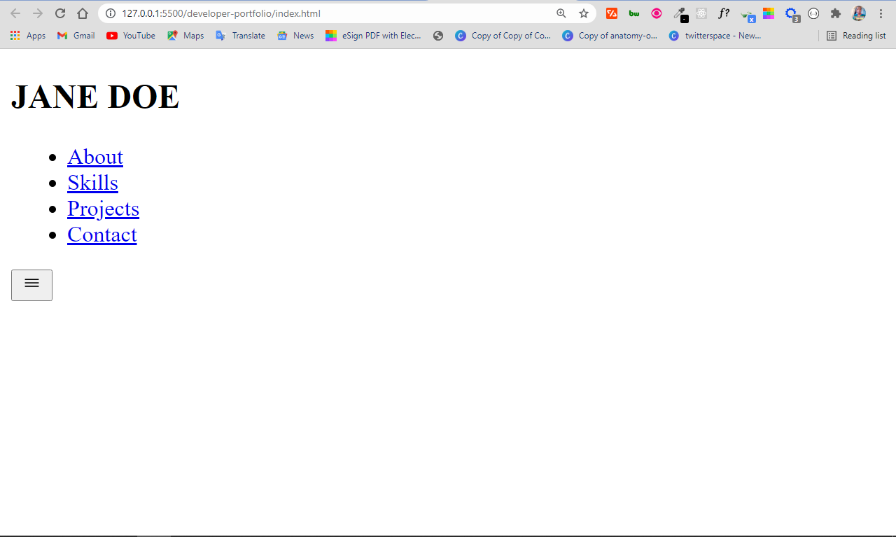
The Navbar Section
The Navbar section contains the simple logo of h1 text, and the nav menu:
 <nav>
      <h1>JANE DOE</h1>
      <ul class="navigation">
        <li><a href="#about" class="nav-link">About</a></li>
        <li><a href="#skills" class="nav-link">Skills</a></li>
        <li><a href="#projects" class="nav-link">Projects</a></li>
        <li><a href="#contact" class="nav-link">Contact</a></li>
      </ul>
      <button class="burger-menu" id="burger-menu">
        <ion-icon class="bars" name="menu-outline"></ion-icon>
      </button>
</nav>
If you are wondering what the button element represents, it’s the bars for toggling the nav menu on mobile (a hamburger menu). This will be hidden on desktop but shown on mobile.
I will also be linking the individual sections of the website to these nav items, so when the user clicks on any of the nav items, they are taken to the section that corresponds to the nav item they click.
That’s why I have the hyperlink reference (href) attributes set to #about, #skills, #projects, and #contacts, respectively. The individual section of the website will have these attributes as ids.
The navbar now looks like this:
How to Style the Navbar
The navbar definitely needs some styling to make it look a bit nicer.
Before styling the navbar properly, I will be declaring some CSS variables to make things easier later. This is because, with CSS variables, it is easier to avoid redundancy and repetition in your CSS file.
The syntax for declaring CSS variables looks like this:
:root {
  --variable-name: value;
}
To use the variable, you do this:
selector {
  property: var(--variable-name);
}
I will also import the Roboto font from Google, and declare some CSS resets to remove some default features such as margin and padding for elements, text-decoration for anchor tags, and list-style-type for lists.
@import url("https://fonts.googleapis.com/css2?family=Roboto:ital,wght@0,400;0,900;1,700&display=swap");

/* Variables */
:root {
  --font-family: "Roboto", sans-serf;
  --normal-font: 400;
  --bold-font: 700;
  --bolder-font: 900;
  --bg-color: #fcfcfc;
  --primary-color: #4756df;
  --secondary-color: #ff7235;
  --primary-shadow: #8b8eaf;
  --secondary-shadow: #a17a69;
  --bottom-margin: 0.5rem;
  --bottom-margin-2: 1rem;
  --line-height: 1.7rem;
  --transition: 0.3s;
}
/* Variables end */

html {
  scroll-behavior: smooth;
}

/* CSS Resets */
* {
  margin: 0;
  padding: 0;
  box-sizing: border-box;
}

ul {
  list-style-type: none;
}

a {
  text-decoration: none;
  color: var(--primary-color);
}

a:hover {
  color: var(--secondary-color);
}

body {
  font-family: var(--font-family);
}
If you notice, I set a hover state for all links on the website from line 39 to 41. When the user hovers on any link, it changes to the secondary color I set in the CSS variables.
Here's a good rule of thumb for declaring CSS variables: if you find yourself using the same property and value often in the same CSS file, you should declare a variable for it to avoid repetition.
You should also make your variable names are as descriptive as possible, like I did, in order to help others who might work with your code.
With the resets, there are some changes to the navbar in the browser:

To style the navbar and align the content in it, I will be using CSS Flexbox:
nav {
  position: sticky;
  top: 0;
  left: 0;
  z-index: 1;
  display: flex;
  align-items: center;
  justify-content: space-between;
  padding: 1.5rem 3.5rem;
  background-color: var(--bg-color);
  box-shadow: 0 3px 5px rgba(0, 0, 0, 0.1);
}
What's the CSS above doing?
I made the navbar sticky with the position property, so it remains at the top no matter what.
The z-index property with the value of 1 makes sure the navbar displays over any other element on the web page. That's how you make a sticky navbar.
In addition, I also applied a shadow to the bottom of the navbar with the box-shadow property.
The navbar has a new look:

But we're not finished yet. The nav menu items need to be side by side, not on top of each other. I will be doing that with Flexbox too.
I will also finish up the rest of the navbar styling by making the h1, nav items, and the hamburger menu button look nicer. I'll do this with some CSS variables initially declared.
nav h1 {
  color: var(--primary-color);
}

nav a {
  color: var(--primary-color);
  transition: var(--transition);
}
nav a:hover {
  color: var(--secondary-color);
  border-bottom: 2px solid var(--secondary-color);
}

nav ul {
  display: flex;
  gap: 1.9rem;
}

nav ul li {
  font-weight: var(--bold-font);
}
The hamburger menu bar also needs to be hidden. It has a class of .burger-menu, so we can set a display of none with it and also make the button look better.
.burger-menu {
  color: var(--primary-color);
  font-size: 2rem;
  border: 0;
  background-color: transparent;
  cursor: pointer;
  display: none;
}
Our navbar looks way nicer now:

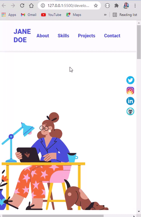
How to Build the Hero Section
The next section we'll work on is the hero section. This won’t take quite as much work as the navbar.
The HTML boilerplate for the hero section is in the code snippet below:
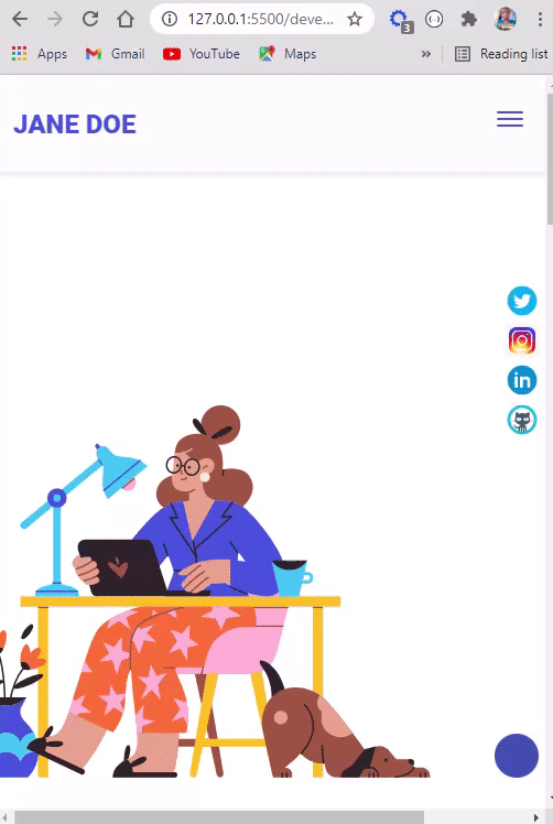
<section class="hero" id="about">
      <img
        src="assets/images/wfh_1.svg"
        alt="jane-doe"
        loading="lazy"
        class="hero-img"
      />
      <div class="bio animate__animated animate__shakeX">
        <h2 class="bio-title">About Me</h2>
        <p class="bio-text">
          Lorem ipsum dolor sit amet, consectetur adipisicing elit. Mollitia sed
          dolorem fugit sapiente porro veniam pariatur dolore nostrum delectus
          inventore tempore minus nemo, iste ullam illo laboriosam maiores
          repudiandae quos!
        </p>
      </div>
</section>
The only thing that's a bit strange are the classes of animate__animated animate__shakeX attached to the div containing the About Me text. The class names are from animate CSS and they serve to animate the About Me text container.
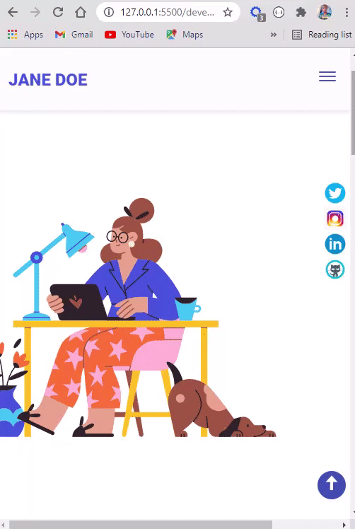
With this, the website gets a new look:

How to Style the Hero Section
Flexbox will come to the rescue once again! This section has two major sets of content – an image and text in a div. So we can use flexbox to display them side by side. You can see how it works in the CSS code snippet below:
.hero {
  display: flex;
  align-items: center;
  justify-content: center;
  gap: 2.5rem;
  max-width: 68.75rem;
  margin: auto;
}

Our Jane Doe image is too big, so we need to reduce its width and height. We also need to style the bio text (About Me text) for readability too. The CSS variables initially declared will be very instrumental here.
.hero img {
  height: 37.5rem;
  width: 37.5rem;
}

.bio {
  width: 25rem;
  padding: 0.625rem;
  border-radius: 6px;
  box-shadow: 0px 2px 15px 2px var(--primary-shadow);
}

.bio h1 {
  margin-bottom: var(--bottom-margin);
}

.bio p {
  line-height: var(--line-height);
  padding: 0.3rem 0;
}
The hero section now looks beautiful:

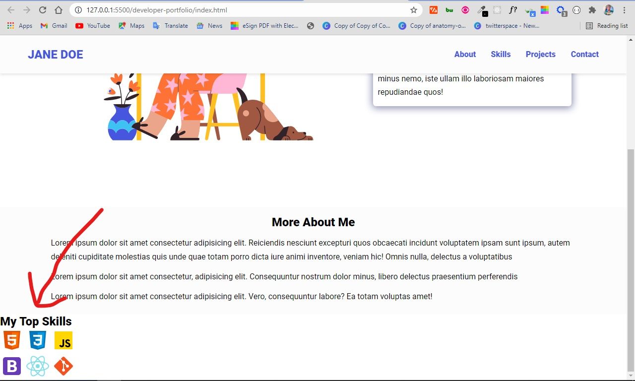
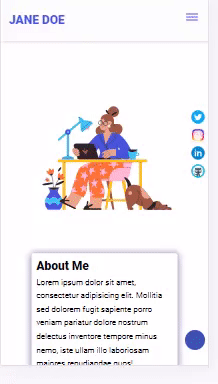
How to Build the More About Me Section
I included this section to include some more information about Jane Doe with some placeholder text.
You can take advantage of this to include information you were unable to put in the About Me section.
The HTML boilerplate for this section is quite short and simple:
    <section class="more-about">
      <h2>More About Me</h2>
      <p>
        Lorem ipsum dolor sit amet consectetur adipisicing elit. Reiciendis
        nesciunt excepturi quos obcaecati incidunt voluptatem ipsam sunt ipsum,
        autem deleniti cupiditate molestias quis unde quae totam porro dicta
        iure animi inventore, veniam hic! Omnis nulla, delectus a voluptatibus
      </p>
      <p>
        Lorem ipsum dolor sit amet consectetur, adipisicing elit. Consequuntur
        nostrum dolor minus, libero delectus praesentium perferendis
      </p>
      <p>
        Lorem ipsum dolor sit amet consectetur adipisicing elit. Vero,
        consequuntur labore? Ea totam voluptas amet!
      </p>
    </section>
The CSS is straightforward as well. All we'll do is set a background-color with the --bg-color CSS variable, make the section readable by setting the padding, margin, line-height, and aligning the h2 text to the center:
.more-about {
  background-color: var(--bg-color);
  padding: 1rem 6rem;
}

.more-about h2 {
  margin-bottom: var(--bottom-margin);
  text-align: center;
}

.more-about p {
  line-height: var(--line-height);
  padding: 0.4rem;
}
In the browser, the More About section looks like this:

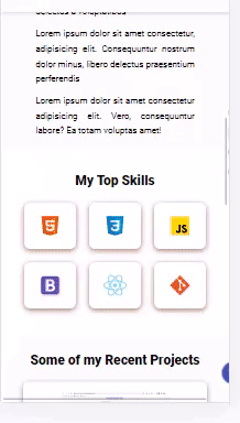
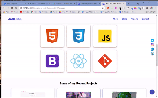
How to Build the Skills Section
From the live demo, you'll see that the skills section contains relevant skills such as HTML, CSS, JavaScript, and so on. I was able to get the icons of those languages as SVGs from Icons8.
The HTML boilerplate for this section is in the code snippet below:
 <section class="skills" id="skills">
      <h2 class="skill-header">My Top Skills</h2>

      <div class="skills-wrapper">
        <div class="first-set animate__animated animate__pulse">
          <img
            src="assets/icons/icons8-html-5.svg"
            alt=""
            loading="lazy"
            class="icon icon-card"
          />
          <img
            src="assets/icons/icons8-css3.svg"
            alt=""
            loading="lazy"
            class="icon icon-card"
          />
          <img
            src="assets/icons/icons8-javascript.svg"
            alt=""
            loading="lazy"
            class="icon icon-card"
          />
        </div>

        <div class="second-set animate__animated animate__pulse">
          <img
            src="assets/icons/icons8-bootstrap.svg"
            alt=""
            loading="lazy"
            class="icon icon-card"
          />
          <img
            src="assets/icons/icons8-react-native.svg"
            alt=""
            loading="lazy"
            class="icon icon-card"
          />
          <img
            src="assets/icons/icons8-git.svg"
            alt=""
            loading="lazy"
            class="icon icon-card"
          />
        </div>
      </div>
    </section>
There are six icons in total. And instead of having to align them with Flexbox, I grouped them in two places (3 teach), with the classes of first-set and second-set, so they stay on top of each other. This means that the stylings we'll apply will be more readable. Easy!
Notice that I’ve been attaching the loading attribute to the individual icons and images and setting it to lazy. This will make sure that the images are loaded only when the user scrolls to the sections containing them. This will subsequently speed up load time, because only what is needed will be loaded.
How to Style the Skills Section
Without styling, the skills section looks like this:
We should style the section a little bit because it doesn’t look good enough yet:
.skills {
  max-width: 68.75rem;
  margin: auto;
  text-align: center;
  margin-top: 2.5rem;
}

.skill-header {
  margin-bottom: 1rem;
}

.skills-wrapper img {
  padding: 1.25rem;
}

.icon {
  width: 11.875rem;
  height: 11.25rem;
}
In the CSS above, I defined a maximum width for the whole section to push things to the center for a better user experience.
Other stylings we applied relate to clarity and readability. For example, I increased the size of the icons to make them more visible with the width and height properties. I also applied a padding of 1rem (16 pixels) to all the icons to push them apart from each other a little bit.
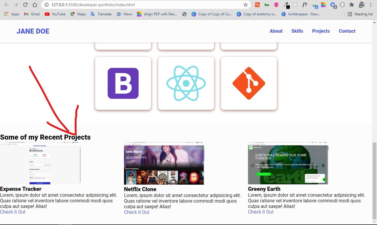
The skills section now looks cool:

Still, I think the section can be better, so I have decided to make some more tweaks with the box-shadow property.
Remember from the HTML that there is a class attribute called .icon-card attached to all the icons. I will be using the class name to put all the icons in a card:
.icon-card {
  background-color: #fff;
  border-radius: 11px;
  box-shadow: 0 3px 10px var(--secondary-shadow);
  padding: 20px;
  margin: 10px;
}
The skills section looks a lot better:
 Look at that!
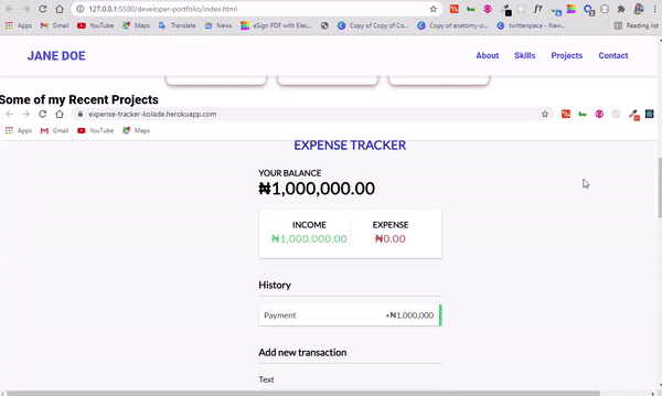
How to Build the Projects Section
One of the major purposes of a portfolio website is to show off your projects. So we'll need to build a section to showcase projects you've worked on in the past.
This section is probably the most tedious to style, but Flexbox won’t stop being our friend.
The HTML for this section is in the code snippet below:
<section class="projects" id="projects">
      <h2 class="projects-title">Some of my Recent Projects</h2>
      <div class="projects-container">
        <div class="project-container project-card">
          <img
            src="assets/images/expenseTracker.png"
            alt="expense-tracker"
            loading="lazy"
            class="project-pic"
          />
          <h3 class="project-title">Expense Tracker</h3>
          <p class="project-details">
            Lorem, ipsum dolor sit amet consectetur adipisicing elit. Quas
            ratione vel inventore labore commodi modi quos culpa aut saepe!
            Alias!
          </p>
          <a href="#" target="_blank" class="project-link">Check it Out</a>
        </div>
        <div class="project-container project-card">
          <img
            src="assets/images/netflixClone.png"
            alt="netflic-clone"
            loading="lazy"
            class="project-pic"
          />
          <h3 class="project-title">Netflix Clone</h3>
          <p class="project-details">
            Lorem, ipsum dolor sit amet consectetur adipisicing elit. Quas
            ratione vel inventore labore commodi modi quos culpa aut saepe!
            Alias!
          </p>
          <a href="#" target="_blank" class="project-link">Check it Out</a>
        </div>
        <div class="project-container project-card">
          <img
            src="assets/images/greenyEarth.png"
            alt="greeny-earth"
            loading="lazy"
            class="project-pic"
          />
          <h3 class="project-title">Greeny Earth</h3>
          <p class="project-details">
            Lorem, ipsum dolor sit amet consectetur adipisicing elit. Quas
            ratione vel inventore labore commodi modi quos culpa aut saepe!
            Alias!
          </p>
          <a href="#" target="_blank" class="project-link">Check it Out</a>
        </div>
      </div>
    </section>
Looking at the HTML, there are three projects in total, all in their individual divs with the class name of project-container and project-card. These class names will be instrumental in styling the projects consistently.
The containing section element itself has a class of projects, and an id attribute of projects as well. The class name is for styling, and the id is for linking it to the Projects link on the navbar.
The projects have their individual images with the class name of project-pic, their titles with a class of project-title, more details with the class name of project-details, and links with the class name of project-link.
The sole purpose of giving all of them unique class names is to style them.
These are a few of the projects I worked on myself when I was starting out as a developer.
The projects section looks like this in the browser:
The section doesn’t look good yet, though – there is even an annoying horizontal scrollbar caused by the images. So we have a lot to do with CSS.
How to Style the Project Section
First of all, I will give the whole section a background color by setting the greyish color (--bg-color) we declared in the CSS variables as the value.
I will also reduce the width and height of the project images by usung the project-pic class. Then I'll use Flexbox to put the projects side by side.
.projects {
  background-color: var(--bg-color);
  padding: 32px 0;
  margin-top: 2rem;
}

.project-pic {
  width: 65%;
  height: 60%;
}

.projects-container {
  display: flex;
  align-items: center;
  justify-content: center;
}
The section looks a lot better:
The images now look better, but the project title, project details, and project links need to be aligned nicely within their individual containers.
The whole project section also needs to be pushed to the center. You don’t need Flexbox to do this, though – it can be done by setting the text align property to the value of center:
.projects-title {
  text-align: center;
  margin-bottom: 1rem;
}

.project-container {
  text-align: center;
  width: 21.875rem;
  padding: 1rem;
}
Notice that I also set a width of 21.875rem (350 pixels) for the individual project containers. This will push them apart from the sides for a better user experience. In this case, the user would not need to look all the way across before they see everything.
The section now looks better:
We can still make this section better. The project titles, project details and project links look chunked together, so we should add some padding and margins.
The individual project containers also need to look more distinct. The box-shadow property will be instrumental here again, so I’m putting them in their individual cards.
.project-container p {
  padding: 0.4rem;
}

.project-title {
  margin-bottom: var(--bottom-margin);
}

.project-details {
  margin-bottom: var(--bottom-margin);
}

.project-card {
  background-color: #fff;
  border-radius: 11px;
  box-shadow: 0 3px 10px var(--primary-shadow);
  padding: 20px;
  margin: 10px;
}
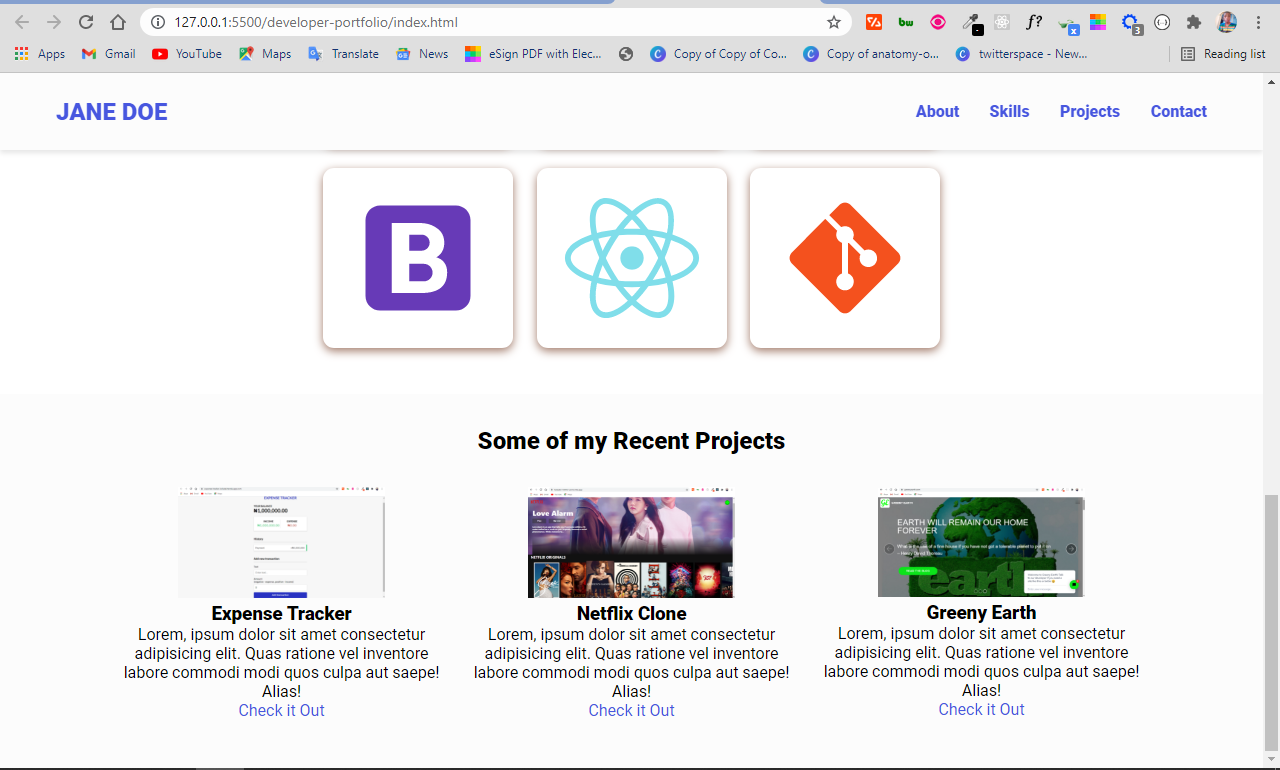
The project section looks way better now:

How to Build the Contact Section
If a potential employer or client finds your portfolio website attractive, they might want to contact you. So you'll want to have a contact form in this section, alongside links to your social media profiles.
The HTML for this section looks like this:
<section class="contact" id="contact">
      <h2>Get In Touch With Me</h2>
      <div class="contact-form-container">
        <div class="contact-form">
          <form action="https://formspree.io/f/xyylngw" method="POST">
            <div class="form-control">
              <label for="name">Name</label>
              <input
                type="text"
                id="name"
                name="sender-name"
                placeholder="Enter Your Name"
                class="input-field"
                required
              />
            </div>
            <div class="form-control">
              <label for="email">Email</label>
              <input
                type="email"
                id="email"
                name="sender-email"
                placeholder="Enter Your Email"
                class="input-field"
                required
              />
            </div>
            <div class="form-control">
              <label for="message">Message</label>
              <textarea
                id="message"
                cols="60"
                rows="10"
                placeholder="Enter Your Message"
                name="message"
                class="input-field"
                required
              ></textarea>
            </div>
            <input
              type="submit"
              value="Submit"
              id="submit-btn"
              class="submit-btn"
            />
          </form>
        </div>
      </div>
    </section>
Here we've built a contact form with input fields for name and email, a textarea so people can enter the message to be sent, and a submit button for submitting the message so you can see it.
If you take a good look at the form element, you’ll see I have an action attribute set to a URL from Formspree. This is what I chose for the form submission. With Formspree, you can get the message directly in your email inbox without having to set up a server with complex PHP or JavaScript.
Note that you can't use my URL – it won't work for you. You can easily setup your own on the Formspree website for free. I also attached a resource on how to set up Formspree to the readme file of the project.
I have set some id and class attributes for the individual inputs to style them. There is also a name attribute for all the input fields. This is required by the Formspree form submission service.
To get a basic validation, I attached a required attribute, so the form refuses to submit if the user leaves any of the input fields unfilled.
How to Style the Contact Section
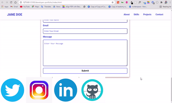
Without styling, the contact section doesn’t look good at all:
All I will do in the CSS is align the whole content to the center and make the input fields look better.
With the text align and margin properties, you can align the h2 and the container for the contact form to the center.
I will also put the whole form in a card with the box-shadow property.
.contact {
  margin-top: 2rem;
}

.contact h2 {
  text-align: center;
  margin-bottom: var(--bottom-margin-2);
}

.contact-form-container {
  max-width: 40.75rem;
  margin: 0 auto;
  padding: 0.938rem;
  border-radius: 5px;
  box-shadow: 0 3px 10px var(--secondary-shadow);
}

The input fields, textarea, labels and placeholders definitely need some styling as well to help with alignment and clarity:
.contact-form-container label {
  line-height: 2.7em;
  font-weight: var(--bold-font);
  color: var(--primary-color);
}

.contact-form-container textarea {
  min-height: 6.25rem;
  font-size: 14px;
}

.contact-form-container .input-field {
  width: 100%;
  padding-top: 10px;
  padding-bottom: 10px;
  border-radius: 5px;
  border: none;
  border: 2px outset var(--primary-color);
  font-size: 0.875rem;
  outline: none;
}
The form looks better now: 
But the placeholders are not consistent with the labels. So we need to give it a color and some padding. I will be giving it the primary color set in the CSS variable lists.
To select the placeholders for styling, you can use the placeholder pseudo-class:
.input-field::placeholder {
  padding: 0.5rem;
  color: var(--primary-color);
}

In the contact form, the only thing left is to style the button. Buttons are quite easy to style:
.submit-btn {
  width: 100%;
  padding: 10px;
  margin: 10px 0;
  background-color: #fff;
  border: 2px solid var(--primary-color);
  border-radius: 5px;
  font-size: 1rem;
  font-weight: var(--bold-font);
  transition: var(--transition);
}
In the CSS code snippet above, I made the button go all the way across in the form container by giving it a width of 100%. I also made it more visible with some padding, a margin, a border, and a bolder font weight.
The border-radius property with a value of 5px removes the sharp edges and the transition serves to slow things down a little when the button is in the hover state.
The hover state is defined in the CSS code snippet below:
.submit-btn:hover {
  background-color: var(--primary-color);
  border: 2px solid var(--primary-color);
  cursor: pointer;
}
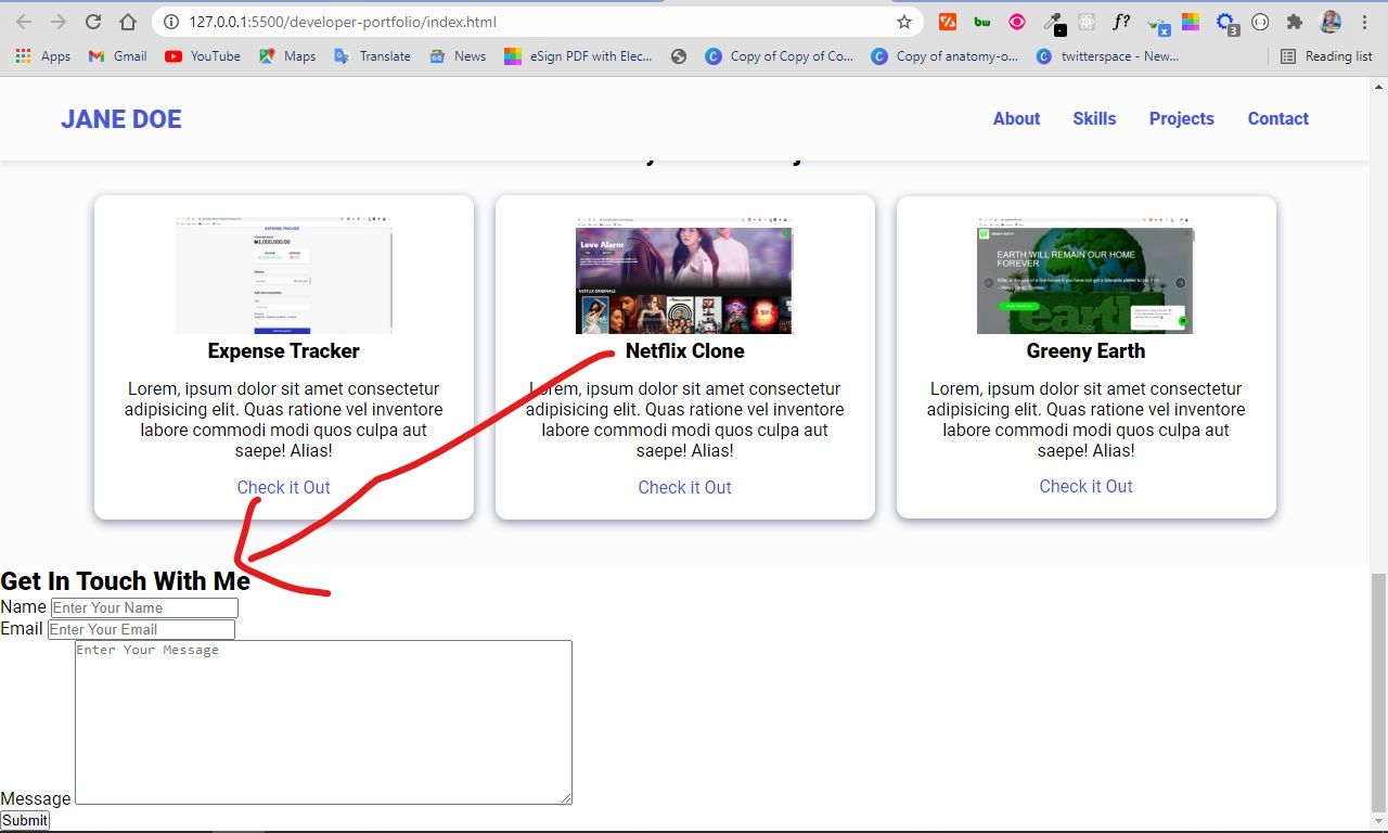
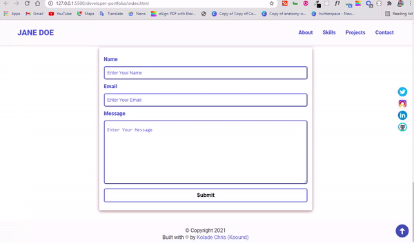
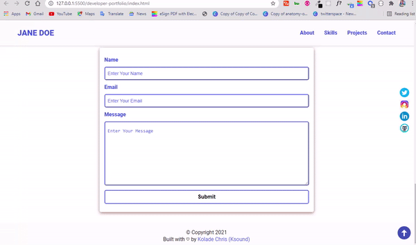
The form looks much better now:
Remember that having your social media links in your portfolio website is a plus for anyone who might want to contact you. That’s the next thing we are going to do, and we are going to do it in a unique way.
The HTML for the social buttons is in the code snippet below:
    <div class="socials">
      <a href="#" target="_blank"
        ><img
          src="assets/icons/icons8-twitter-circled.gif"
          alt="Twitter"
          loading="lazy"
          class="socicon"
      /></a>
      <a href="#" target="_blank"
        ><img
          src="assets/icons/icons8-instagram.gif"
          alt="Instagram"
          loading="lazy"
          class="socicon"
      /></a>
      <a href="#" target="_blank"
        ><img
          src="assets/icons/icons8-linkedin-circled.gif"
          alt="Linkedin"
          loading="lazy"
          class="socicon"
      /></a>
      <a href="#" target="_blank"
        ><img src="assets/icons/icons8-github.gif" alt="Github" class="socicon"
      /></a>
The social icons I chose are animated gif icons from icons8. I put all of them in a container with the class of socials, and gave them an individual class of socicon for styling.
Take a look at some animated social media icons winking at you below:
How to Style the Social Icons
.socials {
  display: flex;
  flex-direction: column;
  position: fixed;
  right: 1%;
  bottom: 50%;
}

.socicon {
  width: 2rem;
  height: 2rem;
}
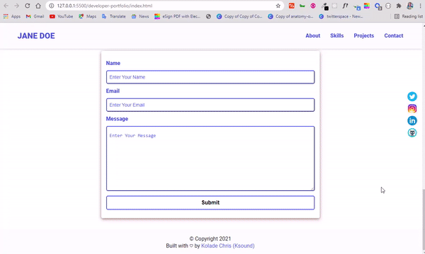
With the CSS above, the social icons will be fixed to the right on the web page, so anyone who visits the website sees them no matter where they scroll.
I also reduced the size of the icons by assigning them all reduced width and height property values.
Look at that!
The only thing left to do is the footer. There’s nothing complex in the footer HTML and CSS apart from the reserved character entity for copyright symbol and heart:
<footer>
<p class="copy">© Copyright 2021</p>
<p class="copy">
Built with ♡ by
<a href="https://twitter.com/koladechris" target="_blank"
>Kolade Chris (Ksound)</a
>
</p>
</footer>
footer {
  background-color: var(--bg-color);
  padding: 1.25rem;
  text-align: center;
  margin: 2rem 0 0;
}
We now have a full-fledged portfolio website!
But we need to make it responsive, because it doesn’t look good on smaller devices:
We need to make all the content of the individual sections display on section on top of the another (in a column layout). We can do this pretty easily with media queries and Flexbox.
Before adding the media queries for responsiveness, lets implement a scroll-to-top button with HTML, CSS, and JavaScript.
How to Add the Scroll to Top Button
The HTML for the Scroll to Top Button
For the HTML, I got an animated icon from Icons8 and decided to put it in an i tag.
The i tag has a class of scroll-up for styling and an id of scroll-up for selecting it with JavaScript. This is because in my projects, I like to use classes for styling and ids for JavaScript functionalities.
  <i class="scroll-up" id="scroll-up"
      ><img
        src="assets/icons/icons8-upward-arrow.gif"
        class="socicon up-arrow"
        alt="scroll-up"
    /></i>
How to Style the Scroll to Top Icon
I will make the scroll-to-top icon fixed just like the social icons. I'll also give it a cursor property of pointer, so the cursor changes when the user hovers on it.
With the class of up-arrow attached to the scroll-to-top icon, I will also increase the size of the icon for visibility:
.scroll-up {
  position: fixed;
  right: 0.5%;
  bottom: 3%;
  cursor: pointer;
}

.up-arrow {
  width: 3rem;
  height: 3rem;
}
The icon looks good:
But it doesn’t do anything yet. So we need to make it functional with a few lines of JavaScript:
// scroll to top functionality
const scrollUp = document.querySelector("#scroll-up");

scrollUp.addEventListener("click", () => {
  window.scrollTo({
    top: 0,
    left: 0,
    behavior: "smooth",
  });
});
What is the script above doing?
The first line selects the scroll-to-top button with the id attribute attached to it in the HTML. We used the querySelector() method here. You can also use the getElementById() method.
In the remaining lines, I used the click eventListener to get the user’s click action and exploit the scrollTo part of the windows object to make the button functional.
With this functionality, when the user clicks on the scroll-to-top button, the page scrolls to the top and left side of the website smoothly. I did this by setting top to 0, left to 0, and behavior to smooth.
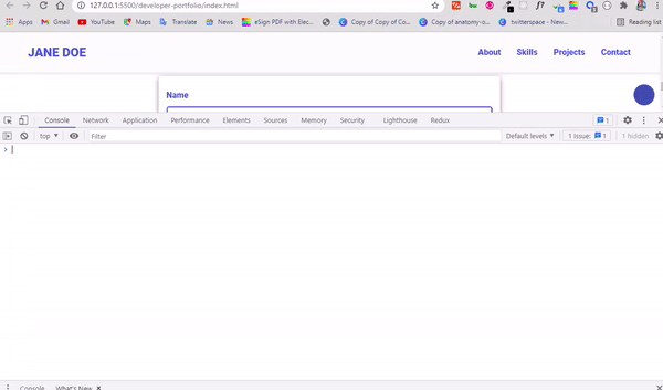
You can learn more about the windows object by opening up your browser’s developer tools console. Type in window and hit enter, then you see everything available in the windows object, like I did below:
How to Make Your Portfolio Website Responsive
To make the website responsive, we will be using CSS media queries and Flexbox.
First, we'll need to make the images and text look smaller, and then we'll make the content of each section display in a vertical layout by setting the flex-direction to column.
In the media query, I will be using 2 breakpoints – 720px and 420px.
The 720px breakpoint is for tablets and mobile phones, and 420px is for small phones like an iPhone 6, and small Android phones.
Media query Breakpoints are the points at which you want the content of a website to respond according to the width of a device. So, any code put under the 720px breakpoint reflects on devices with a screen less than or more than 720px, depending on whether you specify max-width or min-width.
In the case of a max-width of 720px, the media query syntax looks like this:
@media screen and (max-width: 720px) {
  /*changes reflects on screen with a width of 720px and below*/
}
How to Create the Media Query for Tablets and Mobile Phones (max-width 720px)
We will start making the website responsive right from the navbar, because the navbar doesn’t look good on smaller devices.

First, I’m going to reduce the padding of the navbar so the h1 logo and nav menu items fit in nicely:
nav {
    padding: 1.5rem 1rem;
  }
Things now look a bit better:

On small devices, the nav menu items need to be on top of one another, and they need to be hidden. So, its time to update the code so the hamburger menu is initially hidden.
How to Build the Hamburger Menu
To make the hamburger menu, we need to take the nav menu items out of the viewport. Then we need to set a class of show on the nav list items that will be toggled with few lines of JavaScript (remember the nav items are in an unordered list).
 nav ul {
    position: fixed;
    background-color: var(--bg-color);
    flex-direction: column;
    top: 86px;
    left: 10%;
    width: 80%;
    text-align: center;
    transform: translateX(120%);
    transition: transform 0.5s ease-in;
  }

   nav ul li {
    margin: 8px;
  }
In the CSS code snippet above, I set a position of fixed on the unordered list (ul) to make it float on the screen. I also pushed it down 86px from the top with top: 86px, and 10% to the left.
I gave it a width of 80% of its parent (the nav element from the HTML), pushed it to the center with text-align: center, and finally hid it with the transform property set to translateX(120%). This will push it to the right and force it out of the viewport.
And now, when the user clicks to show the nav items, they all slide in from the right. Awesome.
If you want the nav menu items to slide in from the left, change the transform property value to transform: translateX(-120%) (this is the direct opposite of transform: translateX(120%)). It's as easy as that, depending on your preference.
I also assigned a margin of 8px to the nav items to give them more space.
The navbar now looks like this:

The hamburger menu bar remains hidden. So we need to show it by giving it a display of block, setting a class of show to translate on the x-axis to 0 in order to show it, and then toggle it with JavaScript.
 .burger-menu {
    display: block;
  }

  nav ul.show {
    transform: translateX(0);
  }

Our hamburger menu bars now gets shown, but the nav items remain hidden. To show it, we need to toggle the show class on and off with JavaScript.
The JavaScript for the Hamburger Menu
To toggle the navbar nav menu items on and off with JavaScript, we first need to select all relevant items of the navbar and store them in some variables:
// Nav hamburgerburger selections

const burger = document.querySelector("#burger-menu");
const ul = document.querySelector("nav ul");
const nav = document.querySelector("nav");
- The
burgervariable select the hamburger menu bars - The
ulvariable selects the list items (the nav links altogether) - The
navvariable selects the container itself (the nav element)
What we need to do next is toggle the nav ul.show class when the user clicks the hamburger menu bar. We'll do this by adding a click eventListener to the hamburger menu bar, and then using the toggle method to remove and add the class of show.
Remember that we selected it and stored it in a variable called burger.
burger.addEventListener("click", () => {
  ul.classList.toggle("show");
});
Our nav items can now be toggled on and off:
But there is a problem – the mobile nav is not hidden any time any of the nav item links are clicked. So we need to remove the class of nav ul.show when any of the nav item links are clicked.
We can do this with a few lines of JavaScript too:
// Close hamburger menu when a link is clicked

// Select nav links
const navLink = document.querySelectorAll(".nav-link");

navLink.forEach((link) =>
  link.addEventListener("click", () => {
    ul.classList.remove("show");
  })
);
Remember that the nav links have a class of nav-link from the HTML. So I selected all of them with that class and put them in a variable called navLink. We did this with the querySelectorAll() method.
I then looped through all the links with the forEach array method and listened for a click event on all of them. Then I used the remove() method provided by the DOM to remove the class of show any time any of the nav menu items are clicked. This will take all the list items out of the viewport.
Look at that!
That’s a lot of work. With what we just covered you can make a hamburger menu for any website.
How to Make the Hero Section Responsive
The hero section doesn't look that great at the moment:

All we need to do is give it a flex direction of column in the media query, reduce the width and height of Jane Doe's image, and make the About Me text (bio text) readable.
.hero {
    margin-top: -4rem;
    flex-direction: column;
    gap: 0;
  }

  .hero img {
        height: 37.5rem;
        width: 30rem;
    }

  .bio {
    margin-top: -7rem;
    width: 20.5rem;
  }
The hero section looks better now:

How to Make the More About Me Section Responsive
The More About Me section doesn’t look bad, but we can certainly improve it:

I have the following CSS to make it readable and more presentable:
 .more-about {
    margin-top: 2rem;
    padding: 1rem 3.5rem;
  }

  .more-about h2 {
    text-align: center;
  }

  .more-about p {
    text-align: justify;
  }
I pushed the whole section down a little bit and increased the padding on all sides, aligned the h2 to center, and justified the text.

How to Make the Skills Section Responsive
The skill icons appear too big:

All we need to do in the media query is reduce the sizes of the icons with the width and height properties:
.icon {
    width: 5.875rem;
    height: 5.25rem;
  }

How to Make the Projects Section Responsive
In the projects section, we need to make the three projects stack on top of one another by setting the flex direction to column. I will also reduce the width of the individual containers a little bit.
 .projects-container {
    flex-direction: column;
  }

  .project-container {
    width: 20.875rem;
  }
How to Make the Contact Form Responsive
The width of the contact form needs to be reduced to push it away from the sides and make sure that the fixed social media icons are not on top of it.
All we need to do is set a maximum width:
 .contact-form-container {
    max-width: 23.75rem;
  }
The contact form now looks better:

How to Make the Website Responsive on Small Phones
On small phones such as the iPhone 6, 7, and 8 plus, the social icons and scroll-to-top icon are not showing. There is also a horizontal scrollbar.
To fix these quirks, I will be adding some media queries at the 420px breakpoint:
@media screen and (max-width: 420px) {
  .hero img {
    height: 37.5rem;
    width: 23rem;
  }

  .bio {
    width: 18.3rem;
  }

  .project-container {
    width: 17.875rem;
  }

  .contact-form-container {
    max-width: 17.75rem;
  }
}
I reduced the size of our Jane Doe image, and also reduced the width of the bio text (About Me text), the project container, and the contact form container as well.
All these changes will make the icons fixed to the right side of the website show – the social media and scroll-to-top icons.
Everything now looks good:
That’s the end of it all. We have a fully responsive portfolio website.
You can download the finished version as a zip file from this GitHub repo.
You can also check out the live demo of the portfolio website as well. It has a readme that contains information about the tools I used, and how you can customize the website.
Conclusion
In this tutorial, you learned what a developer portfolio website is and why you should have one.
You also learned how to make a fully responsive portfolio website with HTML, CSS, and JavaScript.
The different parts of this tutorial are each small projects that, when combined, turn into a giant one-page website. For example, you can make card design, a responsive menu bar, a functional contact form, and a scroll-to-top button as the tutorial covers them all.
Feel free to customize the website to your taste.
If you find this tutorial useful, you can share it with your friends and family. I would really appreciate that.