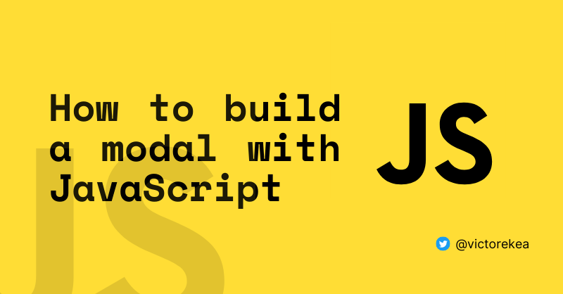
By Victor Eke
It's probably happened to you before: you unintentionally attempted to perform an action on a webpage, but luckily got a pop-up window asking you to confirm your decision.
This pop-up window is called a modal. It's a web page element that pops up and displays in front of other page content.
You can use modals for doing things like storing information you don't want to immediately see on a webpage, creating navigation menus, adding call-to-action elements, and more.
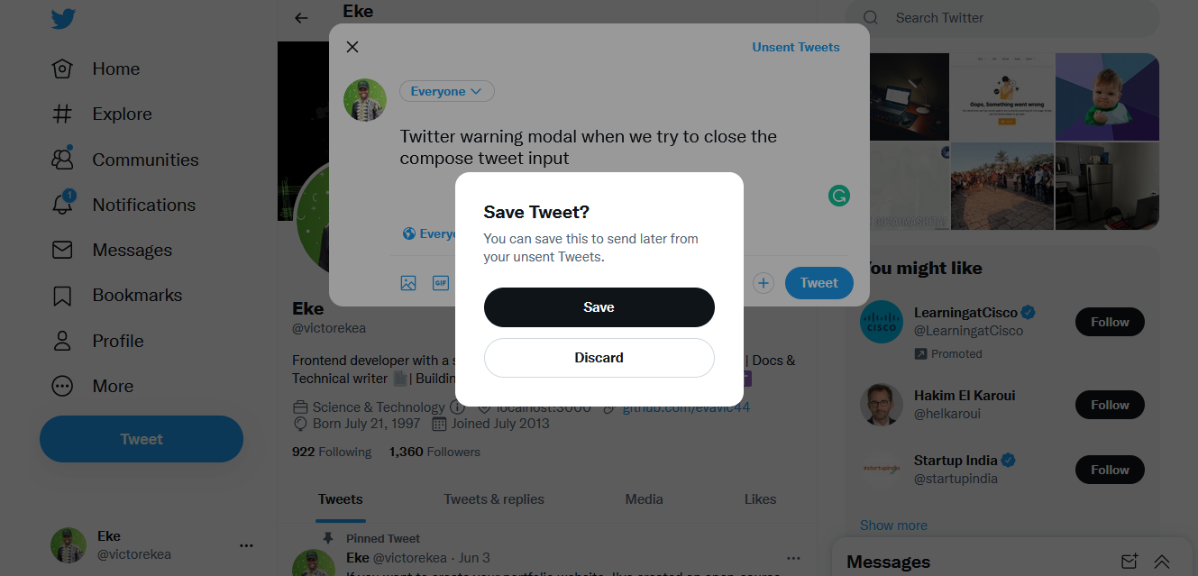
An excellent example is the modal that appears on Twitter when you attempt to close the compose tweet menu.
You can also use modals for other things like creating call-to-action elements, navigation menus, newsletter widgets, and more.
As a web developer, knowing how to build a modal can be an handy skill to have. In this tutorial, I'll walk you through the process of how you can create a simple modal using HTML, CSS, and JavaScript.
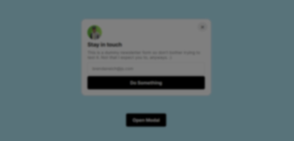
Here's a screenshot of what we’ll be building:

The steps are very easy to follow so you can customize the modal or build your own from scratch – it’s entirely up to you. At the end of this article, I'll provide the codepen file so you can play around with it.
Step 1 – Add the Markup
Alright, let's get started with the HTML.
First, you'll add a section element and give it two classes, modal and hidden. Under this element, you’ll also have a <div> element with a class of overlay and hidden. Then finally, you’ll add a <button> element with a class of btn and btn-open.
Here’s what that looks like:
<section class="modal hidden"></section>
<div class="overlay hidden"></div>
<button class="btn btn-open">Open Modal</button>
- The section element with a class of modal will serve as your modal container.
- The div with the class of
overlaywill serve as your overlay element. This is the dark blurred background you see when the modal is open. - The button with the class of
btnandbtn-openwill serve as your modal button so it fires up our modal when you click this button.
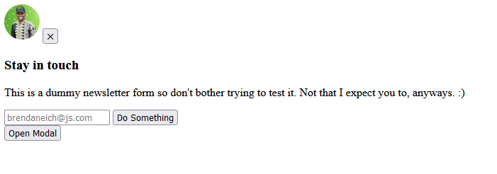
Now inside of your modal, add the markup, and also add the X button for closing the modal. This button will be assigned a btn-close class.
So here’s what your complete markup will look like at the end:
<section class="modal hidden">
  <div class="flex">
    <img src="user.png" width="50px" height="50px" alt="user" />
    <button class="btn-close">⨉</button>
  </div>
  <div>
    <h3>Stay in touch</h3>
    <p>
      This is a dummy newsletter form so don't bother trying to test it. Not
      that I expect you to, anyways. :)
    </p>
  </div>

  <input type="email" id="email" placeholder="brendaneich@js.com" />
  <button class="btn">Submit</button>
</section>

<div class="overlay hidden"></div>
<button class="btn btn-open">Open Modal</button>
Important ⚠️ Take note of the hidden class added to the modal and the overlay element. This is very important because you'll target these classes to hide your modal and overlay using CSS.
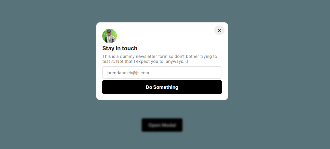
Here's the output:
Step 2 – Style the Modal
Let's start by resetting the default margin and padding of every element on the page, and then center both the modal and open-modal button.
Now jump over to your CSS and add the following styles:
* {
  margin: 0;
  padding: 0;
  box-sizing: border-box;
  font-family: "Inter", sans-serif;
}

body {
  display: flex;
  flex-direction: column;
  align-items: center;
  justify-content: center;
  color: #222;
  position: relative;
  min-height: 100vh;
}
The next step is styling the modal container itself and the elements inside the container. This process is a bit lenghty so I’ll just copy and paste the styling here and then explain it a bit after:
.modal {
  display: flex;
  flex-direction: column;
  justify-content: center;
  gap: 0.4rem;
  width: 450px;
  padding: 1.3rem;
  min-height: 250px;
  position: absolute;
  top: 20%;
  background-color: white;
  border: 1px solid #ddd;
  border-radius: 15px;
}

.modal .flex {
  display: flex;
  align-items: center;
  justify-content: space-between;
}

.modal input {
  padding: 0.7rem 1rem;
  border: 1px solid #ddd;
  border-radius: 5px;
  font-size: 0.9em;
}

.modal p {
  font-size: 0.9rem;
  color: #777;
  margin: 0.4rem 0 0.2rem;
}

button {
  cursor: pointer;
  border: none;
  font-weight: 600;
}

.btn {
  display: inline-block;
  padding: 0.8rem 1.4rem;
  font-weight: 700;
  background-color: black;
  color: white;
  border-radius: 5px;
  text-align: center;
  font-size: 1em;
}

.btn-open {
  position: absolute;
  bottom: 150px;
}

.btn-close {
  transform: translate(10px, -20px);
  padding: 0.5rem 0.7rem;
  background: #eee;
  border-radius: 50%;
}
And here's the output:
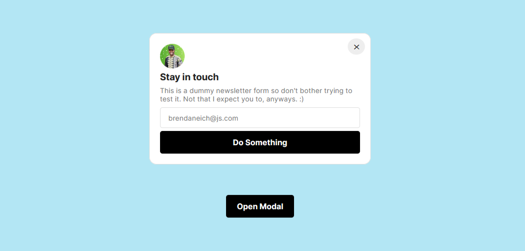
What you did was style the modal element and then position it using the absolute property. This works because you added a position relative property to the body element earlier.
You also styled the elements inside of the modal, but I won’t go deep into the details of that because that is not completely important to us here.
Step 3 – Add the Overlay
For the overlay, you want to position it over the entire page with a subtle dark background and blur.
Since you have the position relative to the body element, you can use the position fixed property to add the overlay over the body element. You'll overlay it 100% of the viewport width and height.
.overlay {
  position: fixed;
  top: 0;
  bottom: 0;
  left: 0;
  right: 0;
  width: 100%;
  height: 100%;
  background: rgba(0, 0, 0, 0.5);
  backdrop-filter: blur(3px);
  z-index: 1;
}
Here's the output:
The overlay works, but you only want it to affect the body element and not the modal. To fix this, add a higher z-index property to the modal container.
.modal {
  z-index: 2;
}
Now the modal should be on the overlay and not behind it.
You've successfully created the modal and added an overlay behind it! But you don't want to show the modal, at least not until the open-modal button is clicked.
To hide it, you need to target the .hidden class you added earlier to the modal and overlay element in your CSS. You'll also give it a display of none.
.hidden {
  display: none;
}
Now only the button is showing on the page. You can now work on the modal functionality using JavaScript.
Step 4 – Add Modal Functionality
Before we proceed, I believe it is best to explain how the modal works. Remember how you used the hidden class to hide the modal and overlay? To add or remove this class from the elements, you'll use the DOM's classList element.
But first, you need to select your classes using the DOM's querySelector method and store them in variables so they are reusable.
const modal = document.querySelector(".modal");
const overlay = document.querySelector(".overlay");
const openModalBtn = document.querySelector(".btn-open");
const closeModalBtn = document.querySelector(".btn-close");
How to Open the Modal
In other to show the modal, create a function called openModal. Inside this function, you'll use the DOM classList property which takes in different methods like .remove() and .add() to remove the hidden class from the modal and overlay.
const openModal = function () {
  modal.classList.remove("hidden");
  overlay.classList.remove("hidden");
};
And then you can use an eventListener to tie this function to the open modal button openModalBtn. That way, anytime this button is clicked, the function is executed, which shows the modal.
openModalBtn.addEventListener("click", openModal);
Now when you click on the open modal button, this will remove the hidden class from the modal element and you can see your modal.
Here's the output:

How to Close the Modal
For closing the modal, you’ll also create a function called closeModal. Inside the function, use the .add() method to add back the hidden class you removed.
The classList property also has an add() method which you'll use to add the hidden class back when you click the closeModal button. Just like you added an eventListener to the button to close the modal, you'll do the same to the x button – but this time, you'll add the hidden class back.
const closeModal = function () {
  modal.classList.add("hidden");
  overlay.classList.add("hidden");
};
To close the modal, add an eventListener to the close modal button to execute the function you just wrote now.
closeModalBtn.addEventListener("click", closeModal);
Now when you click the close button, the function will add back the hidden class to the modal and overlay components, thus closing the modal.
Here's the output

Usually, modals are also closed when you click outside of the modal container or on the body of the webpage. To do that, add an eventListener to close the modal when you click on the overlay.
overlay.addEventListener("click", closeModal);

How to Close the Modal on Key Press
In addition to closing the modal when you click the close button or the overlay, you can also attach an event listener to watch for keyboard events.
In this instance, you want the modal to close when you press the Escape key, much like in the Twitter compose modal example.
document.addEventListener("keydown");
But this time the type of event you want is not the “click” event – you want to use the “keydown” event to execute your function.
Next up, you'll write a condition that checks if the current key pressed is the Escape key and the modal does not contain the hidden class. So it’s open, and you want to execute the closeModal function (in essence, close the modal).
document.addEventListener("keydown", function (e) {
  if (e.key === "Escape" && !modal.classList.contains("hidden")) {
    modalClose();
  }
});
Now when the modal is open and you hit the <kbd>Esc</kbd> key, it will close the modal.
And with this, you’ve successfully created a modal component with HTML, CSS, and JavaScript and it works just as intended. 🥳
Here’s the codepen file to test this modal in action:
Conclusion
I sincerely hope you found this post interesting or useful. If you did, kindly share with your friends or subscribe to my blog so you won't miss any future postings. Thanks for reading.