
By Emmanuel Yusufu
Disclaimer: This was written for Gatsby Version 1, version 2 was just released and has some changes made. I’ll work on another tutorial for that.
Gatsby is a blazing fast static site generator based on ReactJS.
A static site generator (SSG) is a compromise between a hard-coded HTML static site and a full blown CMS (Content Management System), like Wordpress.
A SSG can be used to generate HTML pages for content-driven websites (such as blogs). All it requires is data for page content and the template to fill with content.
This post will be divided into five sections:
- Getting started.
- Creating layout components.
- Creating blog posts.
- Generating new pages from blog post data.
- Create a list of our site’s markdown files in landing page.
We’ll take a deep dive into Gatsby and some of its features by creating an imaginary static blog called CodeStack. Mockup is shown below. Let’s go! ✌️
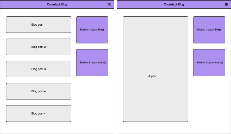 An blog listing page / A single blog post
1. Getting started
Prerequisites
First, make sure you have Node.js installed on your system. If not, go to nodejs.org and install a recent version for you operating system.
Also, this article assumes you have an understanding of ReactJS.
Install the CLI
Gatsby has a command line tool that provides helpful commands such as:
gatsby new: for scaffolding a new Gatsby project.gatsby develop: for launching a hot-reload-enabled web development server.gatsby build: for building a production-ready version of the project.
To install, type the following on your terminal and hit enter:
npm install --global gatsby-cli
Lets create a project folder codestack-blog and navigate the terminal to it.
gatsby new codestack-blog && cd $_
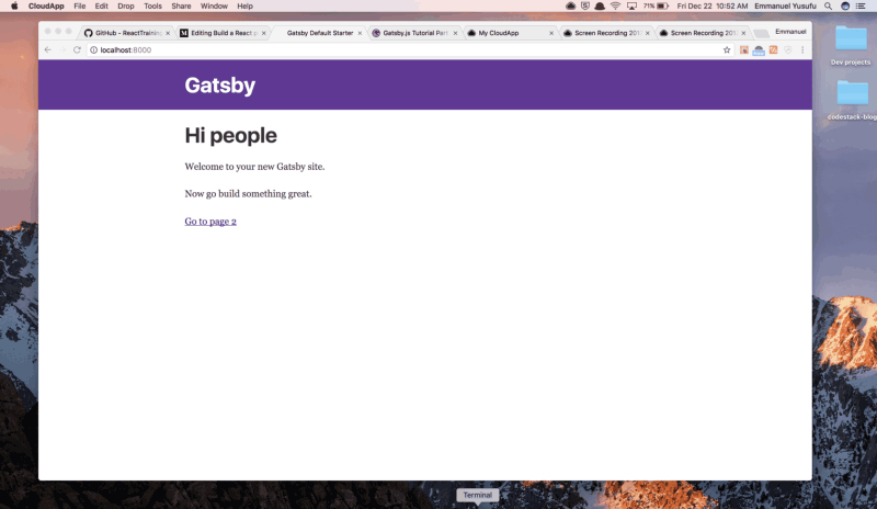
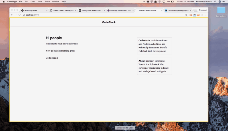
If you execute gatsby develop on the project folder, the scaffolded site should look like this:
Adding plugins
Gatsby has a large and growing set of plugins. They are essentially Node.js packages that interface with Gatsby’s APIs.
They can be installed via NPM (Node Package Manager) on the terminal, and generally have three categories: functional, source and transformer plugins.
Functional plugins
These plugins provide extra functionality in a Gatsby site or in its development environment. For our app, we will need:
gatsby-plugin-react-helmet: allows for modification of theheadtags. Notice that its already installed in our scaffolded project.gatsby-plugin-catch-links: Intercepts local links from markdown and other non-react pages, and does a client-side pushState to avoid the browser having to refresh the page.
Install the plugins, or just the second plugin only.
npm install gatsby-plugin-react-helmet gatsby-plugin-catch-links
Anytime we add a new plugin, we need to update the gatsby-config.js file with the new plugin so Gatsby recognizes and uses it. We use back-ticks.
module.exports = { siteMetadata: { title: `Gatsby Default Starter`, }, plugins: [ `gatsby-plugin-react-helmet`, `gatsby-plugin-catch-links`, ],}
Source plugins
These plugins “source” data from remote or local locations into what Gatsby calls nodes. To write our posts in Markdown on our local disk, we need:
gatsby-source-filesystem: sources data about files from your computer’s file system.
npm install gatsby-source-filesystem
Update the gatsby-config.js file:
module.exports = { siteMetadata: { title: `Gatsby Default Starter`, }, plugins: [ `gatsby-plugin-react-helmet`, `gatsby-plugin-catch-links`, { resolve: `gatsby-source-filesystem`, options: { path: `${__dirname}/src/pages`, name: 'pages', }, } ],}
What’s going on here? An options object can be passed to a plugin for more configuration. We’re passing the filesystem path (i.e. where our Markdown files will be located), and then a name for the source files, so that Gatsby knows about our source files and where to apply the transformer plugins.
Transformer plugins
These plugins transform raw data from nodes into usable data formats. For example, we will need:
gatsby-transformer-remark: this transforms blog posts written in markdown.mdfiles on the local disk into HTML for rendering.
npm install gatsby-transformer-remark
Update the gatsby-config.js file again.
module.exports = { siteMetadata: { title: `Gatsby Default Starter`, }, plugins: [ `gatsby-plugin-react-helmet`, `gatsby-plugin-catch-links`, { resolve: `gatsby-source-filesystem`, options: { path: `${__dirname}/src/pages`, name: 'pages', }, }, `gatsby-transformer-remark`, ],}
 _Well done! / Credit: [Nigel Payne](https://dribbble.com/nigelpayne" rel="noopener" target="blank" title=")
2. Creating Layout components
Gatsby lets you easily create “layout components.” Layout components are sections of your site that you want to share across multiple pages. For the blog we are building, these are the header and the sidebars.
From the root folder, take a look at src/layouts. You’ll discover an index.js file where we define layout components. index.css already came with styles.
After exploring the index.js file, you’ll see that two components have already been created: Header and TemplateWrapper. In TemplateWrapper, we wrap the contents of our site with layout components that we want to be present across multiple pages.
This is made possible by the children() props. It will render all non-layout components of our site where it is placed. Notice that unlike React children props, the children prop passed to layout components is a function and needs to be executed.
First of all, create a new folder and CSS file at src/styles/layout-overide.css. Add to the list of imports in the index.js file. We need to Import it after index.css to override some existing style rules.
import React from 'react'import PropTypes from 'prop-types'import Link from 'gatsby-link'import Helmet from 'react-helmet'
import './index.css'import "../styles/layout-overide.css";
Open layout-overide.css and paste the following styles rules. No need to figure these out.
* { background: #f5f5f5; color: black;}html { height: 100%;}
body { height: 100%; border: 5px solid #ffdb3a;}
h1 { font-size: 1.5rem; line-height: 0.5rem;}
p, div { font-size: 16px;}
Update the header component.
const Header = () => ( <div style={{ background: '#f5f5f5', marginBottom: '3rem', borderBottom: '2px solid #e6e6e6', }} > <div style={{ margin: '0 auto', maxWidth: 980, padding: '1.45rem 1.0875rem', }} > <h1 style={{margin: 0, textAlign: 'center',fontSize: '18px'}}> <Link to="/" style={{ color: 'black', textDecoration: 'none', }} > CodeStack </Link> </h1> </div> </div>);
Also, create a Sidebar component.
const Sidebar = (props) => (
<div style={{ border: '2px solid #e6e6e6', maxWidth: 960, padding: '0.5rem', marginBottom: '25px' }} > <strong>{props.title}.</strong> {props.description}</div>
);
We desire the Sidebar and rendered {children()} components to behave in a responsive way like this:
Since there’s no easy way to define media queries in React, I found a library called [react-media](https://github.com/ReactTraining/react-media), a CSS media query component for React. Install it.
npm install --save react-media
It provides a <Media> component that listens for matches to a CSS media query and renders stuff based on whether the query matches or not.
Add it to the list of imports in our file.
import Media from 'react-media'
Lets layout everything in ( Header, Sidebar, and children() components) the way we wish in TemplateWrapper. Make the following changes (pardon the shameless plug of my name):
const TemplateWrapper = ({ children }) => ( <div> <Helmet title="Gatsby Default Starter" meta={[ { name: "description", content: "Sample" }, { name: "keywords", content: "sample, something" } ]} /> <Header /> <div style={{ margin: "0 auto", maxWidth: 980, display: "flex", flexDirection: "row", justifyContent: "space-between", height: "100%" }} > <Media query={{ maxWidth: 848 }}> {matches => matches ? ( <div style={{ margin: "0 auto", maxWidth: 980, display: "flex", flexDirection: "row", justifyContent: "space-between", height: "100%", padding: "25px" }} > <div style={{ flex: 1 }}>{children()}</div> </div> ) : ( <div style={{ margin: "0 auto", maxWidth: 980, display: "flex", flexDirection: "row", justifyContent: "space-between", height: "100%", padding: "25px" }} > <div style={{ flex: 2.5, paddingRight: "30px" }}> {children()} </div>
<div style={{ flex: 1 }}> <Sidebar title="Codestack" description="Articles on React and Node.js. All articles are written by Me. Fullstack Web Development." /> <Sidebar title="About author" description="I am a Full-stack Web Developer specializing in React and Node.js based in Nigeria." /> </div> </div> ) } </Media> </div> </div>);
 _You got this! ? / Credit: L[evon ](https://dribbble.com/Uzunyan" rel="noopener" target="blank" title=")
Whats happening in that monolithic block of code? React media is using a Ternary operation to determine what to render based on a maxWidth of 848px . When the screen matches the width, only Header and children() components are rendered.
<Media query={{ maxWidth: 848 }}> {matches => matches ? ( ...stuff to render... ) : ( ...stuff to render... ) } </Media>
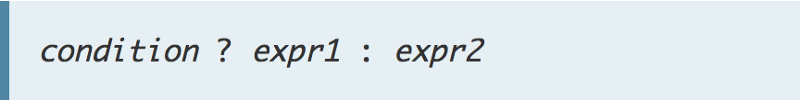 A Ternary refresher. If
 condition is **true**, the operator returns the value of **expr1**; otherwise, it returns the value of **expr2**.
If you noticed, we also used Flexbox to layout the positions of the children() and Sidebar components.
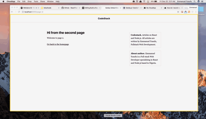
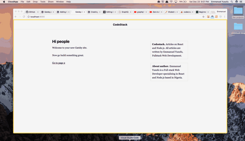
Run gatsby develop on the terminal and our static blog should look this way now:
 Taking shape ?
3. Creating Blog posts
Now lets get into creating actual blog posts. Gatsby utilizes GraphQL to fetch data from one or many sources such as your local disk, Wordpress API, and so on.
Personally, I like the fact that I can create a static blog and fetch content from a WordPress API. My client has access to the Wordpress Editor where he creates posts, and I avoid dealing with all the hassles of developing a Wordpress site.
In this post, we will load the data from Markdown files we will create on our local disk. The gatsby-source-filesystem plugin we configured earlier expects our content to be in src/pages, so that’s exactly where we’ll put it!
A typical practice for blog posts is to name the folder something like MM-DD-YYYY-title. You can name it whatever you like or just place a markdown file inside the /pages folder.
Let’s create a folder src/pages/12–22–2017-first-post, and place an index.md inside. Write:
---path: "/hello-world"date: "2017-07-12T17:12:33.962Z"title: "My First Gatsby Post"---
Oooooh-weeee, my first blog post!
First post Ipsum is a major key to success. Congratulations, you played yourself. Surround yourself with angels. Celebrate success right, the only way, apple. The key is to drink coconut, fresh coconut, trust me. Egg whites, turkey sausage, wheat toast, water. Of course they don’t want us to eat our breakfast, so we are going to enjoy our breakfast.
The block surrounded in dashes is referred to as frontmatter. The data we specify here, as well as other Markdown files, will be recognized by the [**gatsby-transformer-remark**](https://www.gatsbyjs.org/packages/gatsby-transformer-remark/) plugin.
The plugin will convert the frontmatter metadata part of your markdown file to frontmatter and the content part (Yippeeee, my first blog post!) to HTML.
When we begin generating blog pages directly from markdown files in section 4 (next section), path will be used to specify the URL path to render the file. For instance, the markdown file above will be rendered at localhost:8000/hello-world.
Before that, lets create a template that will render any markdown file into its own blog page. Create the file src/templates/blog-post.js (please create thesrc/templates folder).
import React from "react";import Helmet from "react-helmet";
export default function Template({ data }) { const post = data.markdownRemark; return ( <div className="blog-post-container"> <Helmet title={`CodeStack - ${post.frontmatter.title}`} /> <div className="blog-post"> <h1>{post.frontmatter.title}</h1> <div className="blog-post-content" dangerouslySetInnerHTML={{ __html: post.html }} /> </div> </div> );}
We’ve set up the Template component to receive a data object which will come from the GraphQL query we are about to write.
Once again, the GraphQL query is needed to fetch data into the component. The result of the query is injected by Gatsby into the Template component as data and markdownRemark.
We will find that the markdownRemark property contains all the details of the Markdown file.
Lets now actually make the query. It should be placed below the Template component:
export const pageQuery = graphql` query BlogPostByPath($path: String!) { markdownRemark(frontmatter: { path: { eq: $path } }) { html frontmatter { date(formatString: "MMMM DD, YYYY") path title } } }`;
If you’re not familiar with GraphQL, I’ll try to break down what’s going on here. To learn more about GraphQL, consider this excellent resource.
GraphQL is just Facebook’s idea of a certain type of server. They’ve written a specification on the kind of requests that can be sent to that server and how the server should respond. GraphQL’s API is better than REST, because you describe the exact data the client-side needs so there’s no more under-fetching or over-fetching of data.
This means you have to create your own GraphQL server. Fortunately for us, GatsbyJS comes with its own GraphQL server out of the box.
In the code above, BlogPostByPath is the underlying query which will result in a blog post being returned. It will be returned as data for injection into the Template component.
We pass BlogPostByPath the $path argument to return a blog post related to the path we are currently viewing.
Furthermore, recall markdownRemark transformed our markdown files. It will be treated as a property whose contents will be available via data.markdownRemark.
We could access the HTML via data.markdownRemark.html. Also, the frontmatter content we created with a block of dahes can be accessed via data.markdownRemark.title etc.
The entire blog-template.js should look like this:
import React from "react";import Helmet from "react-helmet";
export default function Template({ data }) { const post = data.markdownRemark; return ( <div className="blog-post-container"> <Helmet title={`CodeStack - ${post.frontmatter.title}`} /> <div className="blog-post"> <h1>{post.frontmatter.title}</h1> <div className="blog-post-content" dangerouslySetInnerHTML={{ __html: post.html }} /> </div> </div> );}
export const pageQuery = graphql` query BlogPostByPath($path: String!) { markdownRemark(frontmatter: { path: { eq: $path } }) { html frontmatter { date(formatString: "MMMM DD, YYYY") path title } } }`;
At this point:
- We have a bunch of plugins installed to perform some utilities as well as load files off of disk and transform Markdown to HTML.
- We have a single, lonely Markdown file that will be rendered as a blog post.
- We have a React template for rendering blog posts in a layout, as well as a wired up GraphQL to query for blog post data and inject the React template with the queried data.
Sweet!
4. Generating new pages from blog post data.
Gatsby provides a Node API, which provides functionality for creating dynamic pages from blog posts. This API is exposed in thegatsby-node.js file in the root directory of your project. This file could export several Node APIs but we are interested in the createPages API.
Utilize the following block of code snippet as provided in the official docs (Note that blogPostTemplate path was set to reflect ours):
const path = require('path');
exports.createPages = ({ boundActionCreators, graphql }) => { const { createPage } = boundActionCreators;
const blogPostTemplate = path.resolve(`src/templates/blog-post.js`);
return graphql(`{ allMarkdownRemark( sort: { order: DESC, fields: [frontmatter___date] } limit: 1000 ) { edges { node { excerpt(pruneLength: 250) html id frontmatter { date path title } } } } }`) .then(result => { if (result.errors) { return Promise.reject(result.errors); }
result.data.allMarkdownRemark.edges .forEach(({ node }) => { createPage({ path: node.frontmatter.path, component: blogPostTemplate, context: {} // additional data can be passed via context }); }); });}
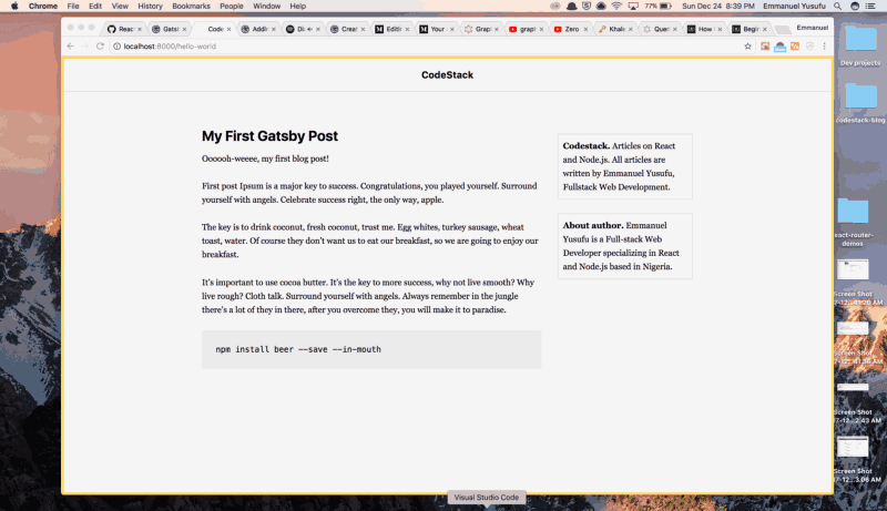
Check if it works. I recommend closing your broswer window, stoppingthe gatsby develop server from the terminal using ctrl c. Now run gatsby develop again and open [http://localhost:8000/hello-world](http://localhost:8000/hello-world).
 yess ?
Create another file src/pages/24–12–2017-learning-grid/index.md
---path: "/another-one"date: "2017-07-12T17:12:33.962Z"title: "My Second Gatsby Post"---
In life there will be road blocks but we will over come it. Special cloth alert. Don’t ever play yourself. The key to more success is to get a massage once a week, very important, major key, cloth talk.
<pre><code>// some css grid code </code></pre>
Again, close your broswer window, stop gatsby develop server. Run gatsby develop again and open [http://localhost:8000/another-](http://localhost:8000/hello-world)one. This is shown:
Go on if you wish and create your own pages. ✌
5. Create a list of our site’s markdown files in the landing page.
The default landing page that comes with the scaffolded Gatsby site is located at src/pages/index.js. This is where we would define a template, and make a query to inject it with data for the list of .md files. Do this:
import React from "react";import Link from "gatsby-link";import Helmet from "react-helmet";
import '../styles/blog-listing.css';
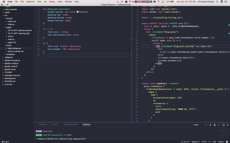
export default function Index({ data }) { const { edges: posts } = data.allMarkdownRemark; return ( <div className="blog-posts"> {posts .filter(post => post.node.frontmatter.title.length > 0) .map(({ node: post }) => { return ( <div className="blog-post-preview" key={post.id}> <h1> <Link to={post.frontmatter.path}>{post.frontmatter.title}</Link> </h1> <h2>{post.frontmatter.date}</h2> <p>{post.excerpt}</p> </div> ); })} </div> );}
export const pageQuery = graphql` query IndexQuery { allMarkdownRemark(sort: { order: DESC, fields: [frontmatter___date] }) { edges { node { excerpt(pruneLength: 250) id frontmatter { title date(formatString: "MMMM DD, YYYY") path } } } } }`;
I trust you are badass at this point and already familiar with whats going on. Note that we wrote an import above that does not exist. Now create the file /styles/blog-listing.css:
div.blog-post-preview { border-bottom: 2px solid #e6e6e6; padding-top: 1rem; padding-bottom: 1rem; margin-bottom: 1rem;}
h1 > * { font-size: 1.2rem; text-decoration-line: none;}
h2 { font-size: 0.8rem !important; font-weight: 100 !important;}
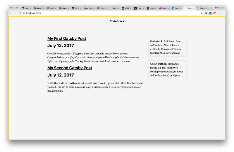
Restart the server, visit the landing page, and you should see the listing at work:
Conclusion
We have come to the end of this tutorial. Thank you for reading thus far.
This post is just the tip of the iceberg considering the amount of things you could do with Gatsby. Feel free to explore how you could implement:
- Search functionality
- The use of tags to categorize blog posts
- Deploying your Gatsby site
You can grab the final source code here. Feel free to support me (devapparel.co) and look good while at it. Also, Comment or Share this post. Thanks for reading!
P.S I am working on a React book with Ohans Emmanuel that would have you master React by building 30 small projects in 30 days. If you want to stay updated on this, join the mailing list. Thanks!