
In this tutorial we are going to build a real-life shopping cart 🛒 application.
We'll talk about the technology stack and the features it will have in a minute. I'll also walk you through the process step-by-step. But first, let me show you what it's going to look like.
Let’s sketch 🙃

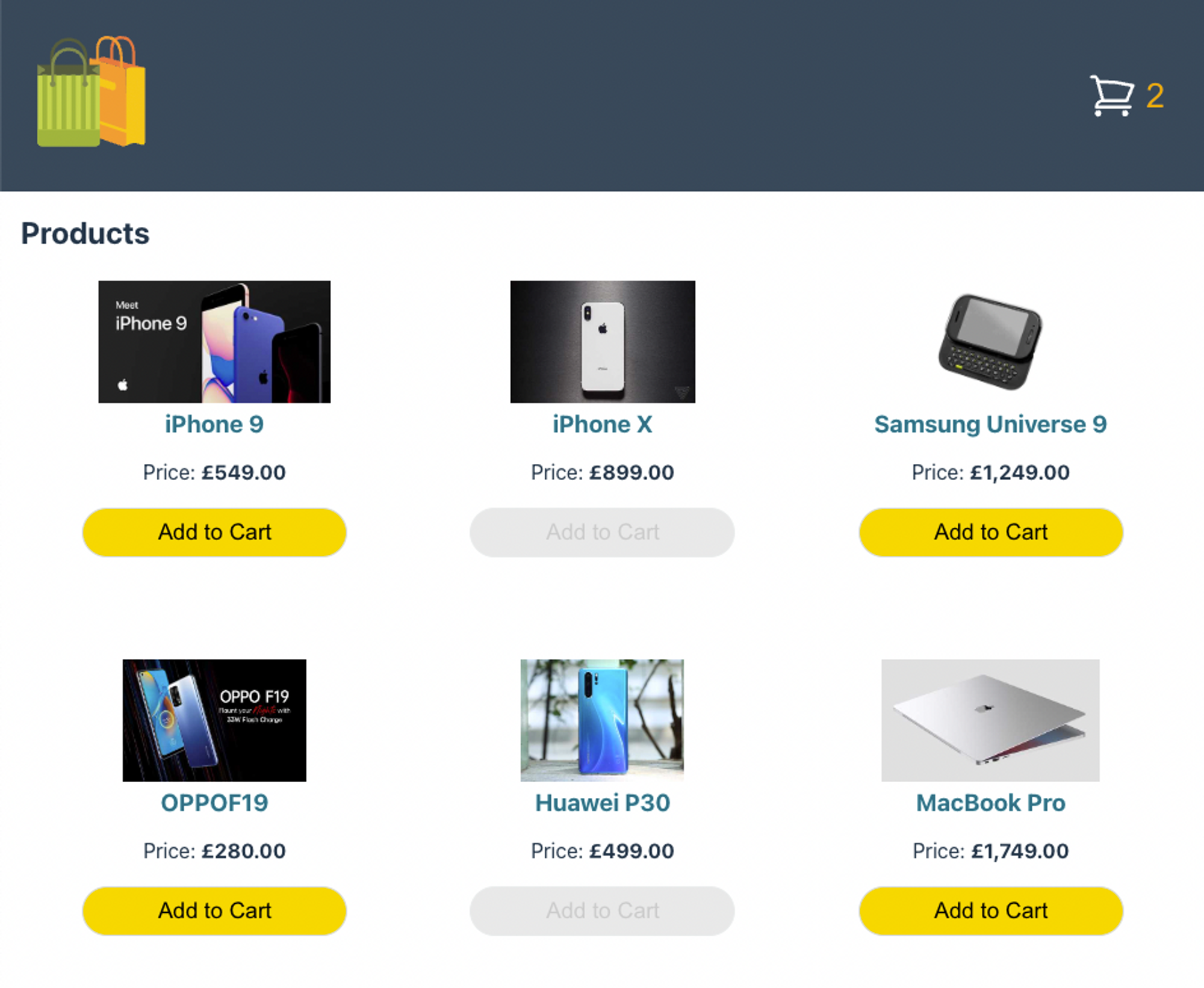
Product List
We are going to make our app mobile friendly by implementing a decent level of responsiveness.

Product List - Mobile
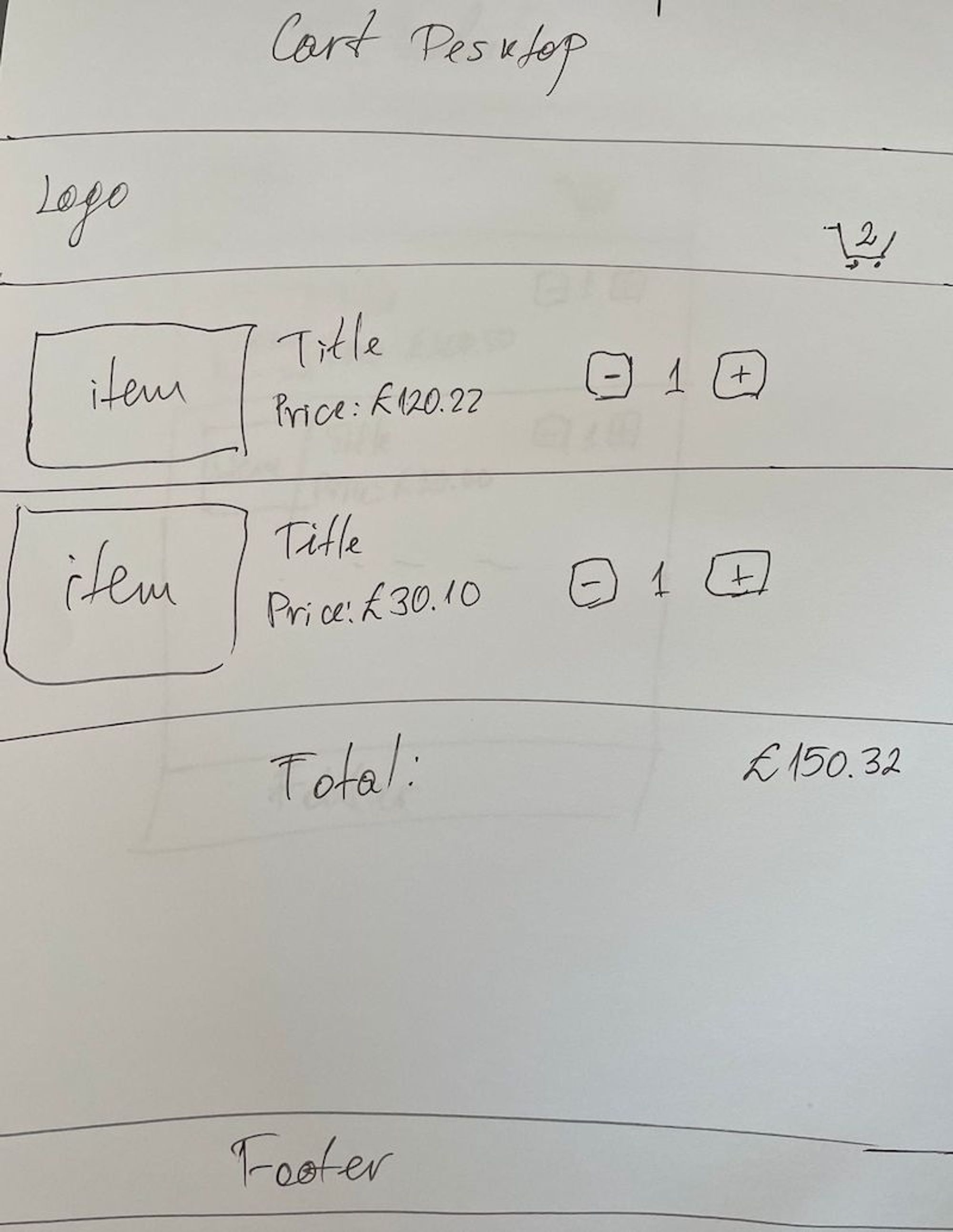
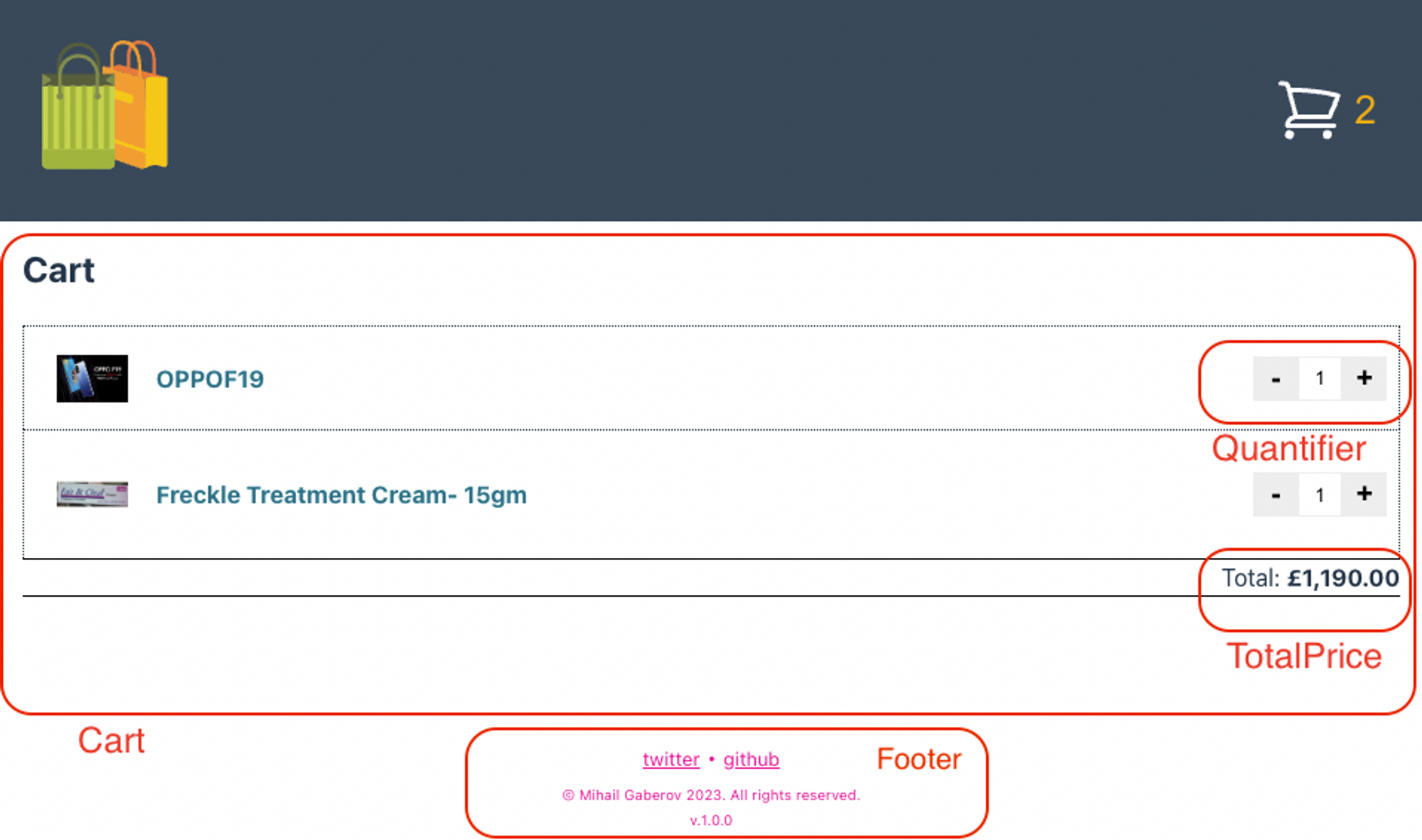
Cart Desktop

Cart Mobile
This time, before going directly into building this project, I decided to go more traditional. I took a pen and paper and drew these ugly sketches, just to make sure I had a visual idea of what I would be building.
And honestly, it really did the trick ✨. This technique helps when you are about to sit at your computer and ask the question:
What do I start with now?
TL;DR
💡 If you want to skip the reading, here 💁 is the GitHub repository with a detailed README 🙌, and here you can see the live demo.
What’s a Shopping Cart?

Shopping Carts
A shopping cart lets people carry or store their goods while they're shopping – either online or in real life.
In ecommerce apps, the shopping cart is a place where the user can store and view the items they are considering purchasing. Typically, this is a separate page or part of the page where people can view a list of the items they have chosen to buy before actually paying for them.
The Plan for Our App
We will build an application consisting of two pages: a product list page and a cart page.
The app will fetch the data from a 3rd party RESTful API and it'll use the browser’s localStorage to store selected items that should be displayed in the cart.
Application features
The shopping cart application must fetch and display products from the API endpoint https://dummyjson.com/products.
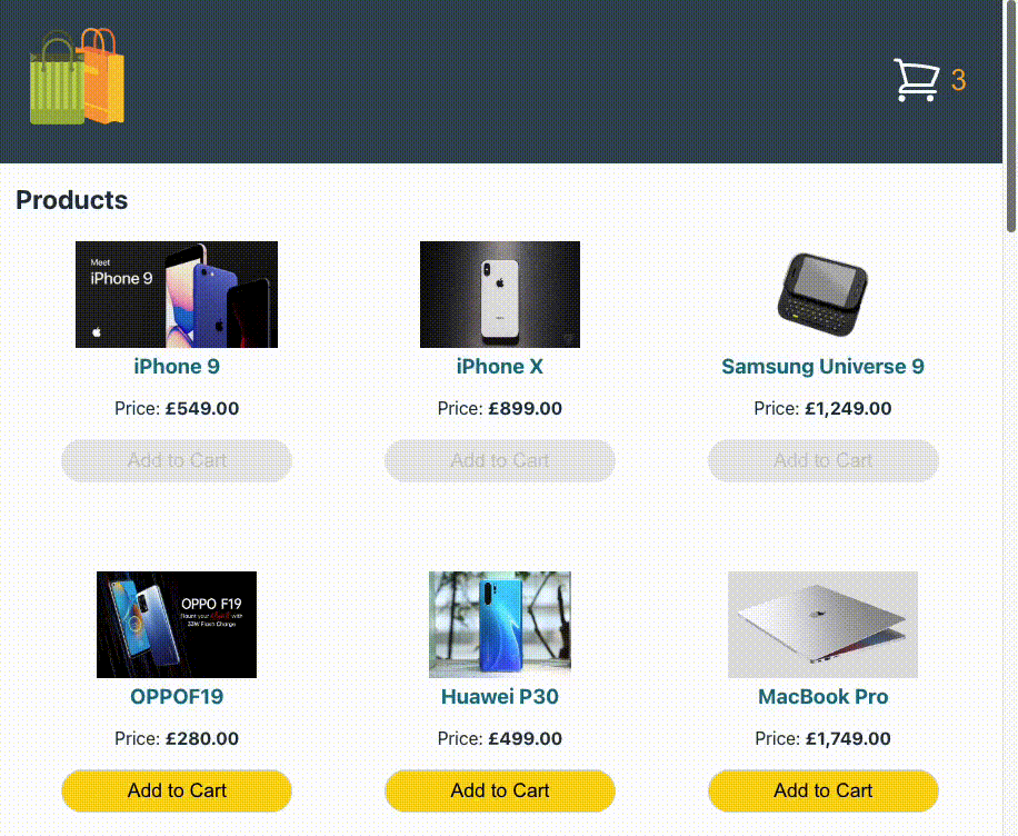
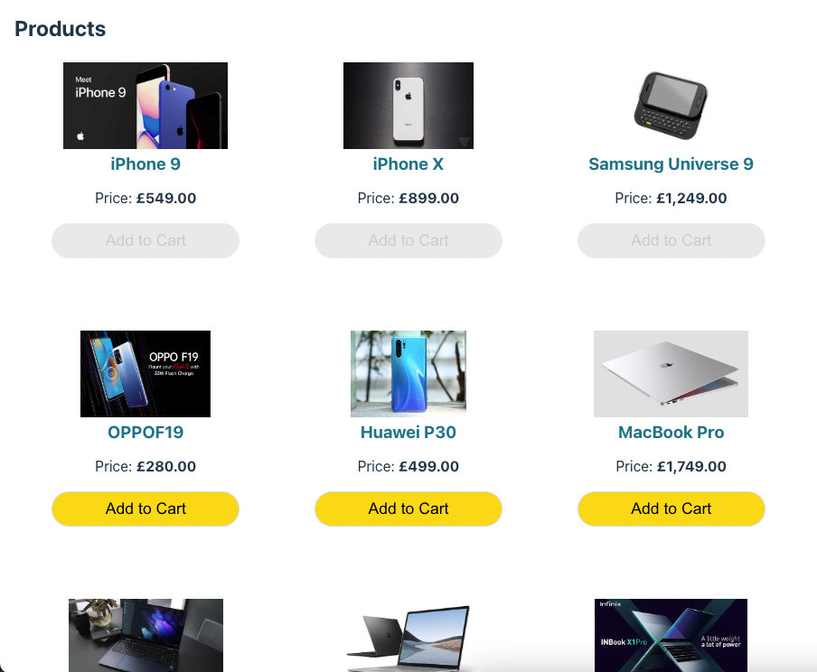
The Products List page should display the available items along with some specific information. For example, it should show 3 products per row for large viewports. Each item should display at least a thumbnail image, a title, the price (formatted as GBP, for example £100.23), and an “Add to Cart” button which adds the item to the cart.
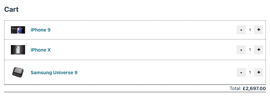
Cart page should display the customer's chosen items. Each item should display at least a thumbnail image, a title, plus and minus buttons (for adding/removing items) and the current quantity of the item in the cart, like this:
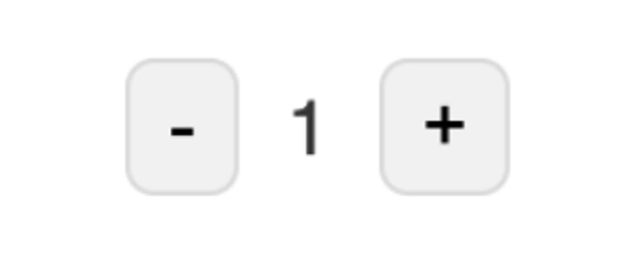
Plus and minus buttons
If there is a quantity of 1 item in the cart, hitting minus removes it from the cart. The cart should also display the total price of all items added (formatted as GBP, for example, £100.23).
In addition to these basic features, the UI/UX should be as sleek as possible. We also want to make sure we unit test the application.
Tech Stack
If you've had the chance to take a look at some of my others tutorials, the tech stack I chose won’t surprise you much.
I picked these technologies taking into account the requirements for the application – that it would be performant, well tested, and have a sleek look and feel.
React / TypeScript / Vite – for the UI library we're going again with a React and Vite development environment. But this time we will use it with TypeScript instead of JavaScript.
SASS / CSS Modules – for styling our app, we'll bet on the battle-tested solution of CSS Modules with SASS/SCSS.
react-testing-library / Vitest – for testing the app, we'll use react-testing-library and Vitest.
If you want to learn more about RTL, here is an insightful tutorial by a very knowledgable guy that can help you out.
How to Build the App
In this section we will take a look at the project structure and I'll explain why I chose it.
Then I'll go briefly through each of the components and describe its role.
Once you understand how the components work together to create a functioning application, we'll explore how to utilize the browser's local storage to store data that can be used in other parts of the app.
📦 Dependencies
Let's take a brief look at our project's dependencies. These are external packages we need to install in order to ensure the successful execution of our project.
Along with Vite and Vitest, I have installed SASS, React Testing Library, and use-local-storage-state. See below my package.json file.
{
  "name": "shopping-cart-app",
  "private": false,
  "version": "1.0.0",
  "author": "Mihail Gaberov",
  "type": "module",
  "scripts": {
    "dev": "vite",
    "test": "vitest",
    "build": "tsc && vite build",
    "lint": "eslint src --ext ts,tsx --report-unused-disable-directives --max-warnings 0",
    "preview": "vite preview"
  },
  "dependencies": {
    "react": "^18.2.0",
    "react-dom": "^18.2.0",
    "react-router-dom": "^6.13.0"
  },
  "devDependencies": {
    "@testing-library/jest-dom": "^5.16.5",
    "@testing-library/react": "^14.0.0",
    "@types/react": "^18.0.37",
    "@types/react-dom": "^18.0.11",
    "@typescript-eslint/eslint-plugin": "^5.59.0",
    "@typescript-eslint/parser": "^5.59.0",
    "@vitejs/plugin-react": "^4.0.0",
    "eslint": "^8.38.0",
    "eslint-plugin-react-hooks": "^4.6.0",
    "eslint-plugin-react-refresh": "^0.3.4",
    "jsdom": "^22.1.0",
    "sass": "^1.63.4",
    "typescript": "^5.0.2",
    "use-local-storage-state": "^18.3.3",
    "vite": "^4.3.9",
    "vitest": "^0.32.0"
  }
}
🧑🏻💻 Installation
In this step I assume you are starting from scratch. We are going to use Vite for scaffolding the project. In order to do that you need to have Node.js installed on your system – at least version 14.18. I suggest that you update it to the latest stable version. And as a package manager you may go with either npm or yarn.
Once you have one of these installed on your system, open your Terminal app and run the following:
yarn create vite your-app-name --template react-ts
This command will install the initial application files in a folder named 'your-app-name'. After that step you will be able to open it in your favorite IDE and start working on it.
One last thing you should do here is to install to additional packages I mentioned in the previous section. You can do that by running the following:
yarn add -D sass @testing-library/react use-local-storage-state
🏗️ Project Structure

Project Structure
This won't be much of a surprise for those of you who have some experience in building React applications. The structure I've chosen is pretty standard.
The root level of the app contains files related to configurations and setup, as well as the HTML index file. This is where the main JavaScript module is loaded and the app is launched.

index.html
The src folder (short for "source") contains two sub-folders: one for assets and one for components.
The public and screenshots folders have straightforward purposes. The .github folder contains the YAML configuration file that is used by GitHub Actions. We will discuss this in more detail later on.
🛠️Components

App Components
All components are organized into separate folders. Within each folder, you'll find an index.ts file that exports the component. This file uses named exports, as shown below.

Named export - Header component
We'll start by examining the components from a top-to-bottom approach, as they are seen and used within the application. To help clarify, let me provide a visualization.
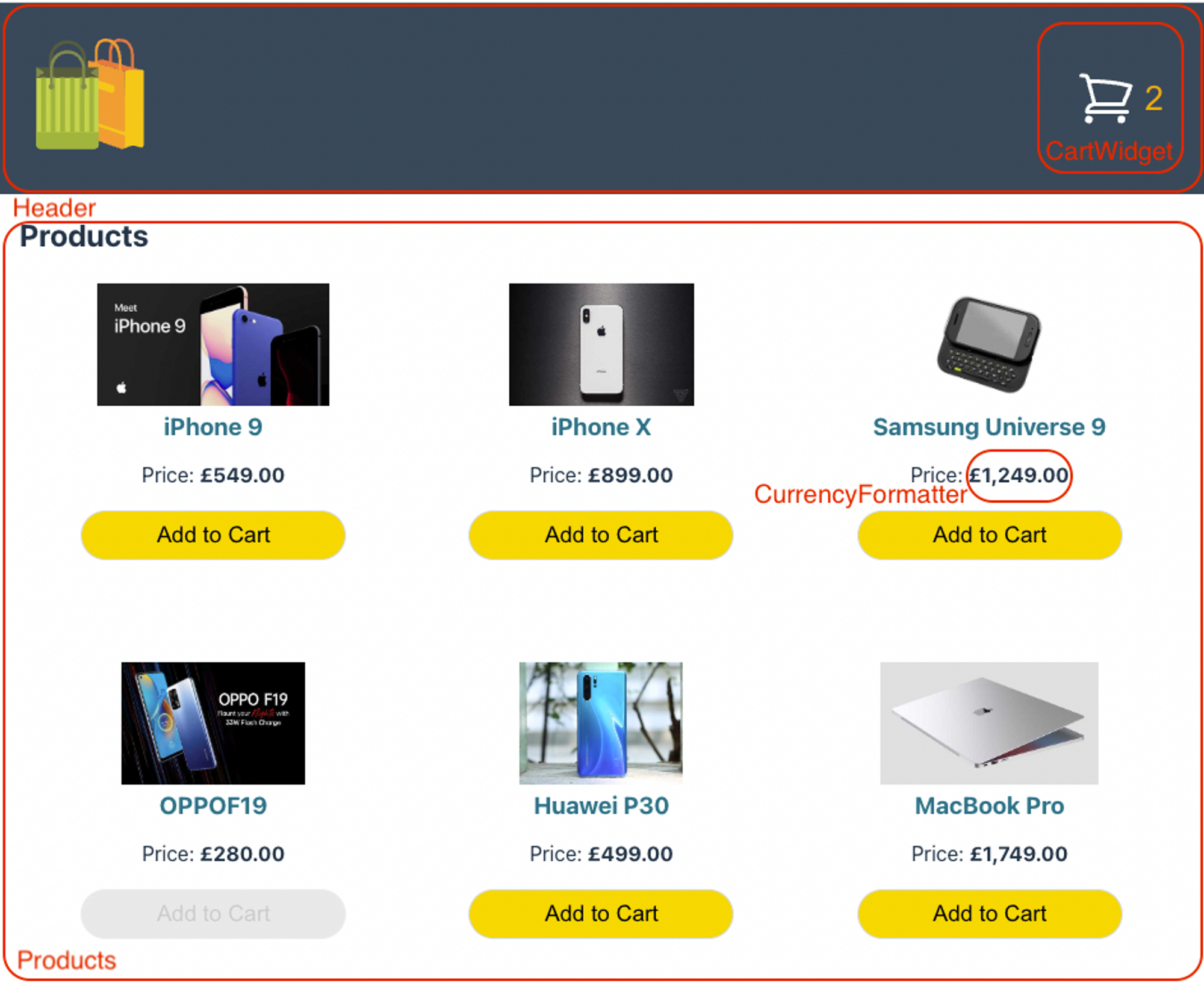
App Components Visualized in Order
Here's what each of these components does in more detail:
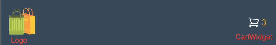
Header – holds the top part of the app. On the left side is the logo image, an SVG I have downloaded from Iconify. On the right side sits the CartWidget component.
CartWidget – renders a button composed of an SVG image depicting a shopping cart and a number value indicating the count of products currently added to the cart. When clicked, the button takes the user to the cart page.
Products – this component is responsible for rendering the main content of the page, which consists of a list of products. On larger viewports, the products are displayed in three columns per row. Each product is represented by a thumbnail image, a title, price information, and an "Add to Cart" button. The price of each product is formatted to GBP using the CurrencyFormatter component.
CurrencyFormatter – formats given numeric amount to GBP – that is, 499 would become £499.00.
App Components Visualized
Cart – this component is responsible for rendering the main content of the page. It displays one product per row and includes a quantifier component that allows the user to update the quantity of the product. At the bottom of the page, it also shows the total price of the selected products, which is formatted as GBP using the CurrencyFormatter component.
Quantifier – this component displays plus and minus buttons along with an input field positioned between them. It serves the purpose of indicating the current quantity of a product and enables the user to modify this value. Additionally, it offers functionality to remove the product entirely from the shopping cart.
Footer – this component is designed to provide a simple and visually representative way to display information about the author and copyrights.
Loader – this component is not visible on the screenshots above, but it represents a simple loading animation that becomes visible once the user opens the app for first time and the products data is still being loaded.
🧩 How to Build the Header
As mentioned earlier, the upper section of the application, commonly referred to as the 'hat', is known as the header. In our specific case, the header comprises two elements: the logo positioned on the left and the CartWidget on the right.
Application Header
Now, let's go through the process of constructing the application together 🙌. The steps outlined below are applicable to every component we incorporate into the app.
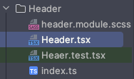
To begin, I create a dedicated folder for the component and include an index.ts file within it. This file will serve as the export module for the component.
Creating Header Component
This is where we export the actual component like that:
export { Header } from'./Header'
Then we implement the component itself. This code will go into a file named the same thing – Header.tsx
import { FunctionComponent } from 'react'


export const Header: FunctionComponent = () => {

  return (
    <header>
      header content here...
    </header>
  )
}
We're starting simple.
Currently, this component only displays the text 'header content here...' on the page. Our goal is to gradually enhance it until we achieve the final result depicted in the picture above.
To do this, it is important to incorporate styling into the process. By utilizing CSS Modules, we can import a separate SCSS file containing the styles required for our component.
import { FunctionComponent } from 'react'
import classes from './header.module.scss' // <---- imports the styles

export const Header: FunctionComponent = () => {

  return (
    <header>
      header content here...
    </header>
  )
}
This file must exist in our component's folder. After including the tests file, the folder structure for this component will resemble the following:
Header Component's Folder
Let's enhance the component's code by incorporating the necessary elements. On the left side, we'll add the logo element, which will function as a clickable link. We'll also include the CartWidget component that displays the count of the selected products.
import { FunctionComponent } from 'react'


export const Header: FunctionComponent = () => {

  return (
    <header className={classes.header}>
      <div>
        <Link to="/">
          <img src={logo} className={classes.logo} alt="Shopping Cart Application" />
        </Link>
      </div>
      <div>
        <CartWidget productsCount={productsCount} />
      </div>
    </header>
  )
}
To achieve a nice look and feel, and a decent level of responsiveness, we'll use the following styles:
.header {
  width: 100%;
  display: flex;
  align-items: center;
  background-color: #213547;
  transition: height 0.3s ease;
  position: fixed;
  right: 0;
  left: 0;
  top: 0;
  opacity: 0.9;
  backdrop-filter: saturate(180%) blur(20px);
  justify-content: space-between;
  z-index: 1;

  .logo {
    height: 6em;
    padding: 1.5em;
    will-change: filter;
    transition: filter 300ms;
    transform: scaleX(-1);


    &:hover {
      filter: drop-shadow(0 0 2em #646cffaa);
    }
  }
}
I will show you the code for the widget component below, but before that I want you to notice how we pass the products count value a prop. This way we can free ourselves from implementing any logic in the component itself and use it only for representational purposes.
That being said, here is the code of the component:
import { FunctionComponent } from 'react'
import { useNavigate } from 'react-router-dom'

import shoppingCart from '../../assets/shopping-cart.svg'
import classes from './cart-widget.module.scss'

interface Props {
  productsCount: number
}

export const CartWidget: FunctionComponent<Props> = ({ productsCount }) => {
  const navigate = useNavigate()

  const navigateToCart = () => {
    navigate('/cart')
  }

  return (
    <button className={classes.container} onClick={navigateToCart}>
      <span className={classes.productsCount}>{productsCount}</span>
      <img src={shoppingCart} className={classes.shoppingCart} alt="Go to Cart" />
    </button>
  )
}
And its styling:
.container {
  margin: 1rem;
  padding: 0 1rem;
  display: flex;
  border: none;
  background: none;
  cursor: pointer;
  align-items: center;
  flex-direction: row-reverse;
  justify-content: space-between;

  &:hover {
    outline: 1px solid white;
  }


  .shoppingCart {
    height: 3em;
    padding: 1.5rem .4rem;
    will-change: filter;
    transition: filter 300ms;
  }

  .productsCount {
    z-index: 1;
    font-size: 2em;
    top: 38px;
    color: orange;
  }
}
Header Shrinking
Before we proceed, there is one more aspect to discuss: the smooth shrinking animation of the header that you can see while scrolling down.
Header Shrinking
To accomplish this, I used React hooks along with a technique involving manual manipulation of styles for various DOM elements.
I implemented this functionality within a component method called shrinkHeader, which is invoked whenever a user scrolls. Within this method, I check if the current vertical scroll position exceeds a specified threshold value, DISTANCE_FROM_TOP, and accordingly apply different styles based on the outcome of this comparison.
One aspect we haven't discussed yet is using the hook for managing local storage, which we'll talk about later.
Here is the completed version of the component:
import { FunctionComponent, useEffect } from 'react'
import { Link } from 'react-router-dom'
import useLocalStorageState from 'use-local-storage-state'

import logo from '/logo.svg'
import { CartWidget } from '../CartWidget'
import { CartProps } from '../Products/Products.tsx'
import classes from './header.module.scss'

export const Header: FunctionComponent = () => {
  useEffect(() => {
    window.addEventListener("scroll", () => shrinkHeader(), false)

    return () => {
      window.removeEventListener("scroll", () => shrinkHeader())
    }
  }, [])

  const shrinkHeader = () => {
    const DISTANCE_FROM_TOP = 140
    const headerElement = document.querySelector("header") as HTMLElement
    const logoElement = document.querySelectorAll("img")[0] as HTMLElement
    const cartWidgetElement = document.querySelectorAll("img")[1] as HTMLElement
    const productsCountElement = document.querySelector("span") as HTMLElement
    const scrollY = document.body.scrollTop || document.documentElement.scrollTop

    if (scrollY > DISTANCE_FROM_TOP) {
      headerElement.style.transition = "height 200ms ease-in"
      headerElement.style.height = "80px"
      logoElement.style.transition = "height 200ms ease-in"
      logoElement.style.height = "4rem"
      cartWidgetElement.style.transition = "height 200ms ease-in"
      cartWidgetElement.style.height = "2rem"
      productsCountElement.style.transition = "font-size 200ms ease-in"
      productsCountElement.style.fontSize = "1.5em"
    } else {
      headerElement.style.height = "150px"
      logoElement.style.height = "6rem"
      cartWidgetElement.style.height = "3rem"
      productsCountElement.style.fontSize = "2em"
    }
  }
  const [cart,] = useLocalStorageState<CartProps>('cart', {})

  const productsCount: number = Object.keys(cart || {}).length

  return (
    <header className={classes.header}>
      <div>
        <Link to="/">
          <img src={logo} className={classes.logo} alt="Shopping Cart Application" />
        </Link>
      </div>
      <div>
        <CartWidget productsCount={productsCount} />
      </div>
    </header>
  )
}
🧩 How to Build the Product List
Product List
To construct the product list component, I followed the same approach as above. Initially, I established the foundational structure, which involved creating the component code, exporting the component in the index file, and implementing a separate SCSS file to define the component's styles.
As a result, the folder structure after completing these steps should resemble the following:
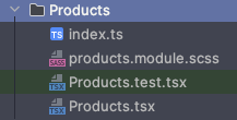
Product List Component Folder
One interesting aspect of this component is that it handles sending a request to a REST API in order to fetch the product data. This is accomplished through the fetchData method, which is invoked within a useEffect hook.
By specifying an empty dependency array, the code inside the useEffect hook is executed only once when the component is initially loaded. This ensures that redundant requests are avoided, optimizing the performance of our application and reducing bandwidth usage.
 useEffect(() => {
    fetchData(API_URL)
  }, [])


  async function fetchData(url: string) {
    try {
      const response = await fetch(url)
      if (response.ok) {
        const data = await response.json()
        setProducts(data.products)
        setIsLoading(false)
      } else {
        setError(true)
        setIsLoading(false)
      }
    } catch (error) {
      setError(true)
      setIsLoading(false)
    }
  }
The rendering aspect of the component is relatively straightforward. Once we have successfully fetched the product data, we can iterate through it using a regular map() function. For each product, we can render its thumbnail image, title, price, and a button for adding it to the cart.
To ensure that each row displays three items when viewed on large viewports, we utilize CSS (SCSS) styles. We'll do this by harnessing the capabilities of Flexbox, as demonstrated in the following snippet:
.productPage {
  padding: 1rem;
  margin-top: 8rem;

  .container {
    display: flex;
    flex-wrap: wrap;
    justify-content: space-between;

    .product {
      flex-basis: 33.33%;
      margin-bottom: 5rem;
      text-align: center;

      h3 {
        color: #007185;
        font-weight: 700;
        line-height: 20px;
        margin: 0;
      }

      img {
        height: 6rem;
      }

      button {
        background-color: #fbd815;
        width: 13rem;
        padding: .5rem;
        font-size: 1.1em;
        border-radius: 25px;
        border-color: #D5D9D9;
        border-style: solid;
        border-width: 1px;

        &:hover:not([disabled]) {
          background-color: #eecf1d;
          cursor: pointer;
        }

        &:disabled {
          opacity: .5;
          background-color: lightgray;
        }
      }
    }

    @media (max-width: 767px) {
      .product {
        flex-basis: 50%;
      }
    }

    @media (max-width: 400px) {
      .product {
        flex-basis: 100%;
      }
    }
  }
}

.error {
  color: red;
  text-align: center;
}
In addition to these features, the component code also includes functionality for handling the "Add to Cart" button click event, specifically adding the selected item to the local storage. We also implement basic error handling logic to display an error message in case the request to the third-party API fails.
Here is the completed component:
import { FunctionComponent, useEffect, useState } from 'react'
import useLocalStorageState from 'use-local-storage-state'

import { CurrencyFormatter } from '../CurrencyFormatter'
import classes from './products.module.scss'
import { Loader } from '../Loader'

const API_URL = 'https://dummyjson.com/products'

export type Product = {
  id: number
  title: string
  price: number
  thumbnail: string
  image: string
  quantity: number
}

export interface CartProps {
  [productId: string]: Product
}

export const Products: FunctionComponent = () => {
  const [isLoading, setIsLoading] = useState(true)
  const [products, setProducts] = useState<Product[]>([])
  const [error, setError] = useState(false)
  const [cart, setCart] = useLocalStorageState<CartProps>('cart', {})


  useEffect(() => {
    fetchData(API_URL)
  }, [])


  async function fetchData(url: string) {
    try {
      const response = await fetch(url)
      if (response.ok) {
        const data = await response.json()
        setProducts(data.products)
        setIsLoading(false)
      } else {
        setError(true)
        setIsLoading(false)
      }
    } catch (error) {
      setError(true)
      setIsLoading(false)
    }
  }

  const addToCart = (product: Product):void => {
    product.quantity = 1

    setCart((prevCart) => ({
      ...prevCart,
      [product.id]: product,
    }))
  }

  const isInCart = (productId: number):boolean => Object.keys(cart || {}).includes(productId.toString())

  if (error) {
    return <h3 className={classes.error}>An error occurred when fetching data. Please check the API and try again.</h3>
  }

  if (isLoading) {
    return <Loader />
  }


  return (
    <section className={classes.productPage}>
      <h1>Products</h1>

      <div className={classes.container}>
        {products.map(product => (
          <div className={classes.product} key={product.id}>
            <img src={product.thumbnail} alt={product.title} />
            <h3>{product.title}</h3>
            <p>Price: <CurrencyFormatter amount={product.price} /></p>
            <button disabled={isInCart(product.id)} onClick={() => addToCart(product)}>Add to Cart</button>
          </div>
        ))}
      </div>
    </section>
  )
}
🧩 How to Build the Cart
Cart Component
This component bears some resemblance to the Product List component in that it also lists products, but in a different manner with only one item per row.
It also introduces additional functionality by incorporating another component for updating the quantity of selected products. And it calculates the total price of all products in the cart.
 <section className={classes.cart}>
      <h1>Cart</h1>

      <div className={classes.container}>
        {getProducts().map(product => (
          <div className={classes.product} key={product.id}>
            <img src={product.thumbnail} alt={product.title} />
            <h3>{product.title}</h3>
            <Quantifier
              removeProductCallback={() => handleRemoveProduct(product.id)}
              productId={product.id}
              handleUpdateQuantity={handleUpdateQuantity} />
          </div>
        ))}
      </div>
      <TotalPrice amount={totalPrice} />
    </section>
The main distinction here is that instead of fetching the product data from an API, we retrieve it from the local storage. This is where we store the data for each selected product from the product list component.
const [cart, setCart] = useLocalStorageState<CartProps>('cart', {}) // reading the local storage value via the hook here

....
....

  const getProducts = () => Object.values(cart || {}) // method for getting all products data as an array data structure, that will allow us easier iteration later

....
....
In this case, we use the useEffect hook once again, but this time to reset the scroll position of the window whenever the user visits the page. This ensures that all relevant data is consistently visible to the user, regardless of how far they have scrolled on the product list page.
  useEffect(() => {
    window.scrollTo(0, 0)
  }, [location])
Indeed, you can see that the methods for decreasing or increasing the quantity of a product are passed to the component as callbacks through its props. This approach is useful as it helps maintain a relatively clean component by elevating the responsibility of state management to a higher level.
By lifting the logic for managing the state outside of the component, it allows for better separation of concerns and promotes reusability.
const handleRemoveProduct = (productId: number): void => {
    setCart((prevCart) => {
      const updatedCart = { ...prevCart }
      delete updatedCart[productId]
      return updatedCart
    })
  }

  const handleUpdateQuantity = (productId: number, operation: Operation) => {
    setCart((prevCart) => {
      const updatedCart = { ...prevCart }
      if (updatedCart[productId]) {
        if (operation === 'increase') {
          updatedCart[productId] = { ...updatedCart[productId], quantity: updatedCart[productId].quantity + 1 }
        } else {
          updatedCart[productId] = { ...updatedCart[productId], quantity: updatedCart[productId].quantity - 1 }
        }
      }
      return updatedCart
    })
  }
We can style the component using Flexbox to get our desired layout:
.cart {
  padding: 1rem;
  margin-top: 8rem;

  .container {
    display: flex;
    flex-direction: column;

    .product {
      display: flex;
      border-top: 1px dotted;
      border-left: 1px dotted;
      border-right: 1px dotted;
      padding: .3rem .5rem;
      align-items: center;

      h3 {
        color: #007185;
        font-weight: 700;
        font-size: 1em;
        line-height: 20px;
        margin: .3rem;
        flex: 1;
      }

      img {
        max-width: 3rem;
        height: auto;
        margin: .875rem;
      }
    }
  }
}
Here is the final version of the component's code:
import { FunctionComponent, useEffect } from 'react'
import useLocalStorageState from 'use-local-storage-state'

import { Quantifier } from '../Quantifier'
import { CartProps } from '../Products/Products.tsx'
import { TotalPrice } from '../TotalPrice'
import { Operation } from '../Quantifier/Quantifier.tsx'
import classes from './cart.module.scss'
import { useLocation } from 'react-router-dom'


export const Cart: FunctionComponent = () => {
  const [cart, setCart] = useLocalStorageState<CartProps>('cart', {})
  const location = useLocation()

  useEffect(() => {
    window.scrollTo(0, 0)
  }, [location])

  const handleRemoveProduct = (productId: number): void => {
    setCart((prevCart) => {
      const updatedCart = { ...prevCart }
      delete updatedCart[productId]
      return updatedCart
    })
  }

  const handleUpdateQuantity = (productId: number, operation: Operation) => {
    setCart((prevCart) => {
      const updatedCart = { ...prevCart }
      if (updatedCart[productId]) {
        if (operation === 'increase') {
          updatedCart[productId] = { ...updatedCart[productId], quantity: updatedCart[productId].quantity + 1 }
        } else {
          updatedCart[productId] = { ...updatedCart[productId], quantity: updatedCart[productId].quantity - 1 }
        }
      }
      return updatedCart
    })
  }


  const getProducts = () => Object.values(cart || {})

  const totalPrice = getProducts().reduce((accumulator, product) => accumulator + (product.price * product.quantity), 0)

  return (
    <section className={classes.cart}>
      <h1>Cart</h1>

      <div className={classes.container}>
        {getProducts().map(product => (
          <div className={classes.product} key={product.id}>
            <img src={product.thumbnail} alt={product.title} />
            <h3>{product.title}</h3>
            <Quantifier
              removeProductCallback={() => handleRemoveProduct(product.id)}
              productId={product.id}
              handleUpdateQuantity={handleUpdateQuantity} />
          </div>
        ))}
      </div>
      <TotalPrice amount={totalPrice} />
    </section>
  )
}
🧩 How to Build the Footer
To enhance the overall appearance of the application, I have included a footer component. Here is an example of how it looks:

The implementation of the footer component is relatively straightforward. It consists of two links to social platforms and a copyright text.
import { FunctionComponent } from 'react'
import classes from "./footer.module.scss"
import packageJson from '../../../package.json'
export const Footer: FunctionComponent = () => {
const currentYear = new Date().getFullYear()
return (
<footer className={classes.footer} data-cy="footer">
<ul>
<li className={classes.footerLinks}>
<a
href="https://twitter.com/mihailgaberov"
target="_blank"
rel="noopener noreferrer"
data-cy="twitterLink"
>
twitter
</a>{" "}
•{" "}
<a
href="https://github.com/mihailgaberov"
target="_blank"
rel="noopener noreferrer"
data-cy="githubLink"
>
github
</a>
</li>
<li className={classes.footerCopyrights}>
© {packageJson.author} {currentYear}. All rights reserved.
</li>
<li>
<div className={classes.version}>v.{packageJson.version}</div>
</li>
</ul>
</footer>
)
}
Again, in the component folder you will find the other files that are necessary for applying the styles and the tests for that component.
🧪 Testing the App
I am sure you've already noticed that in all components folders, except the Loader one, we have .test.tsx files. These are the files containing the component tests that we run on the front end.
In order to do a test run, open your CLI and run the following command from the root directory of your project:
yarn test
This should run all tests and give you the following output:
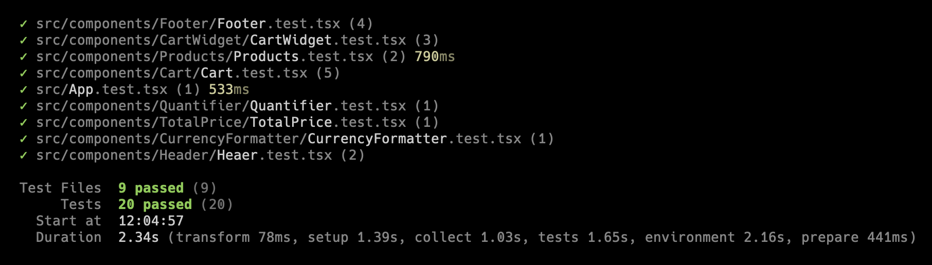
Application Tests
Now that we've built all the necessary components, let's delve into a more detailed discussion about local storage and how we can leverage it to manage the application state more effectively.
🧠 What is LocalStorage?
Before we dive into the details, let's begin with a brief explanation of what local storage is. This will ensure that everyone, including those who are unfamiliar with it, can easily understand how we use this in the app.
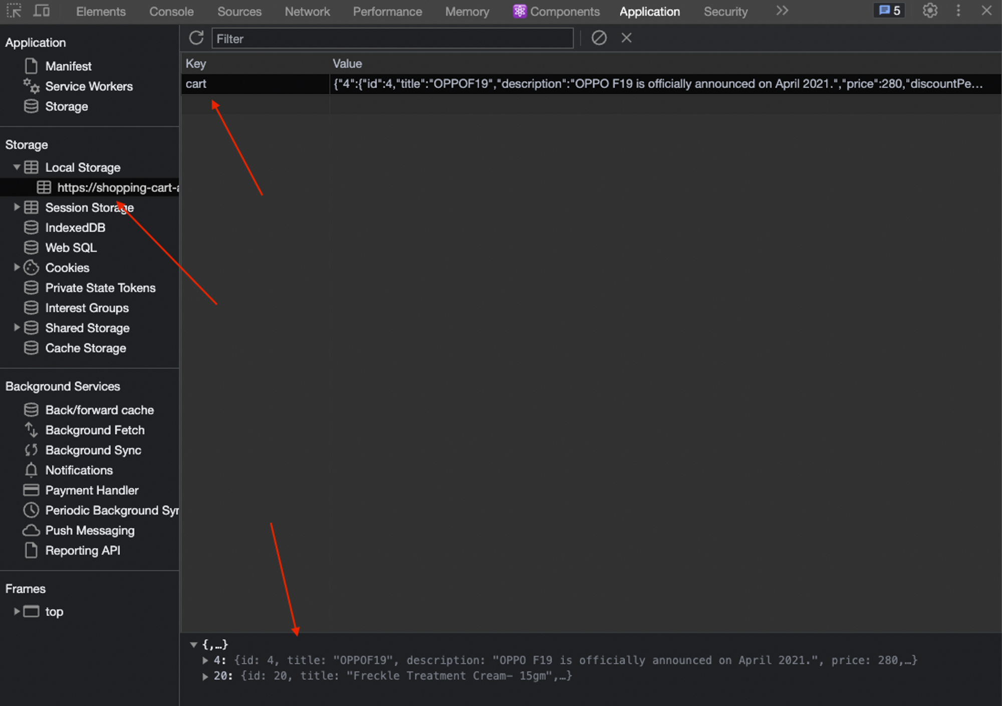
App LocalStorage
LocalStorage is a feature provided by web browsers that allows web applications to store data locally on the user's device. It provides a simple key-value storage mechanism, similar to a dictionary or associative array.
Unlike session storage, which is temporary and gets cleared when the browser session ends, local storage persists even after the browser is closed and reopened. The data stored in local storage remains available until explicitly removed by the application or cleared by the user.
Local storage is primarily used for client-side data storage, enabling web applications to save user preferences, session data, or any other relevant information. This makes it a useful tool for creating personalized experiences and maintaining state across multiple visits to a website.
With that being said, you may have already guessed that local storage can be utilized to store the data of items added to the cart by the user. By doing so, when we navigate to the cart page, our application will be aware of which items should be displayed there.
To accomplish this, I utilized a React hook called use-local-storage-state.
In the Product List component, we added products to the LocalStorage whenever the user clicked on the Add to Cart button for each item. This ensured that the selected products were stored persistently.
Then, when the user navigates to the cart page, we retrieve the stored data from the LocalStorage and render the products accordingly. By doing so, the user can easily view and interact with the products they previously added to their cart.
Here is a snippet from the code itself.
We add the items to the LocalStorage like this:
const [cart, setCart] = useLocalStorageState<CartProps>('cart', {})
...
...
...

const addToCart = (product: Product):void => {
    product.quantity = 1

    setCart((prevCart) => ({
      ...prevCart,
      [product.id]: product,
    }))
  }
And then read the data like this:
const [cart, setCart] = useLocalStorageState<CartProps>('cart', {})
...
...
...

const getProducts = () => Object.values(cart || {})
And then render them like this:
<div className={classes.container}>
        {getProducts().map(product => (
          <div className={classes.product} key={product.id}>
            <img src={product.thumbnail} alt={product.title} />
            <h3>{product.title}</h3>
            <Quantifier
              removeProductCallback={() => handleRemoveProduct(product.id)}
              productId={product.id}
              handleUpdateQuantity={handleUpdateQuantity} />
          </div>
        ))}
      </div>
How to Automate Unit Testing with GitHub Actions
GitHub Actions is a powerful automation tool provided by GitHub. It allows you to define and execute workflows directly within your GitHub repository.
With GitHub Actions, you can automate various tasks and processes, such as building, testing, and deploying your code, as well as performing code analysis, generating documentation, and more.
GitHub Actions workflows are defined using YAML syntax. A workflow consists of one or more jobs, and each job consists of a series of steps to be executed. Steps can include actions (reusable units of code), shell commands, or scripts.
name: Shopping Cart CI

on:
  push:
    branches: [ "main" ]
  pull_request:
    branches: [ "main" ]

jobs:
  build:

    runs-on: ubuntu-latest

    strategy:
      matrix:
        node-version: [19.x]
        # See supported Node.js release schedule at https://nodejs.org/en/about/releases/

    steps:
      - uses: actions/checkout@v3
      - uses: actions/setup-node@v3
        with:
          node-version: '19'
          cache: 'yarn'
      - run: yarn install
      - run: yarn test
In our case, I utilized GitHub Actions to create a workflow that automatically runs the unit test suite whenever a new change is committed to the main branch. This ensures that no production build is triggered in the event of a test failure.
Implementing this workflow is straightforward and highly beneficial. It provides the reassurance that any issues inadvertently introduced into the main branch will be caught before reaching production. This level of reliability and peace of mind is easily achieved by leveraging the capabilities of GitHub Actions.

Shopping Cart app - GitHub Actions
Conclusion
The topic covered in this tutorial may not be novel or unfamiliar, but its scope of application is remarkably extensive.
Nearly every online application that involves trading or purchasing goods incorporates a shopping cart or basket functionality in some form. Because of this, if you're a software engineer working in this domain, you'll need to possess a solid understanding of how to implement this functionality and its underlying principles.
By acquiring a high-level knowledge of these concepts and understanding how things operate in general, we can effectively contribute to the development of robust and efficient e-commerce systems.
📘 You now understand the purpose and functionality of a shopping cart in an online application.
📘 You have learned how to implement a product list page by fetching data from a third-party REST API.
📘 You have learned how to create a cart component that retrieves and renders data from the browser's local storage.
📘 You have discovered the benefits of GitHub Actions and how they can provide confidence when promoting your code to production.
📘 And most importantly, you have embraced the mindset of continuous learning, understanding that there is always more to explore and discover in the vast world of software engineering.
By combining these newfound skills with a commitment to ongoing learning, you are well-equipped to create efficient and robust e-commerce systems while continuously improving your abilities in this dynamic field. Remember, the journey of knowledge acquisition never ends! 🎓
I hope you found this tutorial enjoyable and engaging. Most importantly, I hope you were able to actively follow along and even experiment with the code. Feel free to make your own modifications and observe the resulting changes in the end product. Hands-on exploration and experimentation are fantastic ways to solidify your understanding and expand your skills.
Remember, the best way to enhance your skills and understanding is through practice and experimentation. So feel free to dive into the code, make it your own, and observe the exciting results you can achieve. Happy coding and exploring!
Thanks for reading! 🙏