
By Paul Akinyemi
Animations are a crucial part of any great website. Why? When done well, animations vastly improve the user experience of any site, as they help make sites fun and intuitive to use.
This article will show you how to build an animated landing page with the help of a JavaScript library called GSAP.
GSAP is a magnificent toolkit for building animations. It's been used in roughly 11,000,000 websites so far, has excellent performance, and takes care of browser inconsistencies for you, among other great features.
The landing page you'll be building was inspired by this Twitter post. This is what it'll look like when you're done:
You can check out a live demo here.
Intended Audience
This article assumes that you're a web developer who has a basic grasp of HTML, CSS, and JavaScript, as well as some familiarity with TailwindCSS, NPM, and using the terminal.
The article also assumes you'll be using a Linux terminal. If you're using Windows instead, check out this article to see the Windows cmd equivalent of the terminal commands the article uses.
Knowing GSAP is not a prerequisite, as this article provides an introduction to the features of the library used in the tutorial. Just keep in mind that this isn't intended to be a complete guide to the library.
Article Overview
This article consists of the following sections:
- How to set up the project
- Writing the markup
- A brief introduction to GSAP
- Adding animation to the page
- Conclusion
How to Set Up the Project
Before you start building the landing page, there are a few things you need to put in place.
In this section, you're going to:
- Set up the directory your project will live in.
- Set up GSAP and TailwindCSS.
- Import a font.
- Set up a simple development server.
How to set up the project directory
Start by running the following commands in your terminal:
mkdir gsap-landing
cd gsap-landing
mkdir build src
mkdir build/assets build/static
That code should create a tree of folders that looks like this:
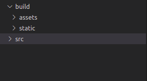 directory structure for the project
How to set up GSAP
To install GSAP, create a file in build called index.html, then put the following code into it:
<!DOCTYPE html>
<html lang="en">
<head>
    <meta charset="UTF-8">
    <meta http-equiv="X-UA-Compatible" content="IE=edge">
    <meta name="viewport" content="width=device-width, initial-scale=1.0">
    <script src="https://cdnjs.cloudflare.com/ajax/libs/gsap/3.10.2/gsap.min.js"></script>
    <title>Orfice</title>
</head>
<body>

</body>
</html>
This creates a basic HTML document, and imports GSAP through the script tag in the head.
How to set up TailwindCSS
To install TailwindCSS, make sure you're in the root directory for your project, then run the following commands in your terminal:
npm install tailwindcss
npx tailwind init
This should create three new files in your project root: package.json, package-lock.json, and tailwind.config.js.
Next, create a file in the src folder called input.css, and put the following code into it:
@tailwind base;
@tailwind components;
@tailwind utilities;
Go back to the project root, and replace the contents of tailwind.config.js with the following:
module.exports = {
  content: [
  "./build/**/*.{html,js}"
  ],
  theme: {
    extend: {},
  },
  plugins: [],
}
After that, open your package.json file and replace its contents with the following:
{
  "scripts": {
    "build-css": "npx tailwindcss -i ./src/input.css -o ./build/static/output.css --watch"
  },
  "dependencies": {
    "tailwindcss": "^3.0.23"
  }
}
Now, open up your terminal and run this command:
npm run build-css
This command is responsible for creating and updating the file: build/static/output.css, which is where the styling for your landing page will live, so you should keep it running in its own terminal window until you're done with the tutorial.
Next, link the CSS to your landing page by adding the following code to build/index.html, just above the script tag that imports GSAP:
<link rel="stylesheet" href="static/output.css">
That concludes the setup for TailwindCSS.
How to import the font
Replace the head of build/index.html with the following:
<head>
    <meta charset="UTF-8">
    <meta http-equiv="X-UA-Compatible" content="IE=edge">
    <meta name="viewport" content="width=device-width, initial-scale=1.0">
    <link rel="preconnect" href="https://fonts.googleapis.com">
    <link rel="preconnect" href="https://fonts.gstatic.com" crossorigin>
    <link href="https://fonts.googleapis.com/css2?family=Be+Vietnam+Pro:wght@400;500;600;700&display=swap" rel="stylesheet">
    <link rel="stylesheet" href="static/output.css">
    <script src="https://cdnjs.cloudflare.com/ajax/libs/gsap/3.10.2/gsap.min.js"></script>
    <title>Orfice</title>
</head>
Now, apply the font to your CSS.
Open src/input.css, and add the following code to the end of it:
@layer base {
    body {
        @apply overflow-hidden h-screen;
        font-family: 'Be Vietnam Pro', sans-serif;
    }
}
How to set up the server
To setup your development server, open a new terminal window, navigate to your project root, then run the following code:
npm install --save-dev live-server
That's all you need to do! To start your server, run the following command in your terminal:
live-server build
As long as the live-server command is running, it will serve build/index.html at localhost:8080, and automatically refresh the page when you make changes to the project.
How to Write the Markup
Take a look at what your page should look like at the end of the animation:
 structural outline of landing page
Let's call the blue section the navbar, the yellow section the header, and the image the preloader.
Your next step is to build each of these sections in the order they appear on the page.
How to build the Navbar
You're going to need an image in your navbar, so go to this link and download it. Save it in build/assets, with the name logo.jpg.
Your navbar will be split into three sections:
- the logo on the left
- a
divin the middle - a button on the right
Open build/index.html, and add the following code to the top of the body tag:
<nav>
    <img src="assets/logo.jpg" alt="logo">
    <div class="nav-links">
        <a href="#">Home</a>
        <a href="#">Shop</a>
        <a href="#">Contact</a>
        <a href="#">Testimonials</a>
    </div>
    <button class="cta">Let's work together</button>
</nav>
Next, you'll add spacing and alignment to your navbar with some CSS.
Open src/input.css, and add the following at the end of the @layer base section:
nav {
        @apply flex p-4 md:py-8 md:px-4 lg:p-12;
        @apply justify-center items-center gap-4;
    }
Then add this to the end of the file, outside @layer base:
@layer components {
    nav > img {
        width: 120px;
    }

    nav a {
        @apply underline;
    }

    .cta {
        @apply rounded bg-black text-white py-2 px-4;
    }

    nav .cta {
        @apply hidden md:inline-block;
    }

    .nav-links {
        @apply hidden md:flex gap-4 lg:gap-8 lg:mx-16 xl:mx-20;
    }
}
After you've done that, your page should look like this:
 navbar screenshot
Now that you've built the navbar, hide it for now so you can animate it into visibility later.
Go back to index.html, and add a class of opacity-0 to the nav:
<body>
    <nav class="opacity-0">
        <!-- leave the rest of the code as it is -->
    </nav>
</body>
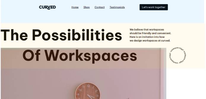
How to build the header
You're going to implement the header by building three rows.
The first row is made up of some bold, enlarged text, and a paragraph of normal text that you're going to hide when the screen is smaller than 768px (on mobile devices).
The second row is similar to the first one: some bold, enlarged text, shifted to the right, and a rotating SVG in place of the paragraph. The SVG will also be hidden on mobile devices.
The third row will only be visible on mobile devices, and contains a paragraph of text and a button.
Put the following code in build/index.html, after the nav tag:
<header>
        <div class="row first-row">
            <p class="bold-text">
                The Possibilities
            </p>

            <p class="copy">
                <span>
                    We believe that workspaces
                </span>
                <span>
                    should be friendly and convenient.
                </span>
                <span>
                    Here is an invitation into our how
                </span>
                <span>
                    we design workspaces at curved.
                </span>
            </p>
        </div>

        <div class="row second-row">
            <p class="bold-text">
                Of Workspaces
            </p>

            <p class="round-text" >
                <svg xmlns="http://www.w3.org/2000/svg" width="106" height="106" viewBox="0 0 106 106" fill="none">
                    <path d="M0,53a53,53 0 1,0 106,0a53,53 0 1,0 -106,0" id="curve"></path>
                    <text width="314.1593">
                            <textPath alignment-baseline="top" xlink:href="#curve">
                                    office workspace . office workspace . office workspace .
                            </textPath>
                    </text>
                    <defs>
                    </defs>
                </svg>
            </p>
        </div>

        <div class="row mobile-row">
            <p class="copy">
                <span>
                    We believe that workspaces
                </span>
                <span>
                    should be friendly and convenient.
                </span>
                <span>
                    Here is an invitation into our how
                </span>
                <span>
                    we design workspaces at curved.
                </span>
            </p>

            <button class="cta">Let's work together</button>
        </div>
    </header>
Now that the structure is in place, time for the visual effects.
You're going to define a custom utility class called animate-spin-slow, which applies a slow rotating animation to the element it's used on.
Replace the contents of tailwind.config.js with the following:
module.exports = {
  content: [
    "./build/**/*.{html,js}"
  ],
  theme: {
    extend: {
      animation: {
        'spin-slow': 'spin 10s linear infinite',
      }
    },
  },
  plugins: [],
}
Next, you're going to write the styling for the header itself.
Put the following code in src/input.css, inside @layer components:
    .row {
        @apply flex p-4 justify-center md:justify-start;
        @apply items-center gap-4 md:gap-8;
        @apply lg:gap-12 text-center md:text-left;
    }

    .first-row {
        @apply md:pt-8 lg:pt-16;
    }

    .bold-text {
        @apply font-bold text-5xl lg:text-6xl xl:text-8xl;
    }

    .copy {
        @apply font-medium;
    }

    .second-row .bold-text {
        @apply lg:pl-16 xl:pl-36
    }

    .first-row .copy {
        @apply hidden md:flex md:flex-col;
    }

    .round-text {
        @apply hidden md:block pl-20 lg:pl-40;
    }

    .round-text svg{
        @apply animate-spin-slow;
    }

    .round-text textPath {
        @apply text-xs fill-black;
    }

    .mobile-row {
        @apply flex md:hidden flex-col py-4;
    }
At this point, your page should look like this:
 header screenshot
Your navbar should be present on the page, but invisible, which is the cause of the white space at the top.
Now, hide all the blocks in each row, by giving them a class of opacity-0. Edit index.html to look like this:
<header>
        <div class="row first-row">
                <p class="bold-text opacity-0">
                    <!-- leave as is -->
                </p>

                <p class="copy opacity-0">
                    <!-- leave as is -->
                </p>
        </div>

        <div class="row second-row">
            <p class="bold-text opacity-0">
                <!-- leave as is -->
            </p>

            <p class="round-text opacity-0" >
                <!-- leave as is -->
            </p>
        </div>

        <div class="row mobile-row">
            <p class="copy opacity-0">
                <!-- leave as is -->
            </p>

            <button class="cta opacity-0"><!-- leave as is --></button>
        </div>
    </header>
And you're done with the header!
How to build the Preloader
First, download the image from this link. Save it in build/assets as office.jpg.
Now that you have the image, you're going to write the actual markup.
The preloader is going to consist of a div with the image inside, and an inner div to serve as an overlay.
Put the following code in index.html, outside the header tag:
<div class="pre-loader">
    <img src="assets/office.jpg" alt="an office">
    <div class="overlay"></div>
</div>
Now, you're going to position the preloader in the middle of the page, and add styling to the overlay.
Put the following code in src/input.css, inside @layer components:
.pre-loader {
        @apply absolute z-10;
        width: 40vw;
        top: calc(50% - (0.668 * 20vw));
        left: calc(50% - 20vw);
    }

    .pre-loader > .overlay {
        @apply absolute inset-x-0 bottom-0;
        @apply top-full bg-black bg-opacity-10 -z-0;
    }
After that, your webpage should look like this:
 preloader screenshot
A Brief Introduction to GSAP
In this section, we're going to quickly go over a few of GSAP's features. Feel free to skip this if you already have some experience with GSAP.
According to the GSAP docs:
GSAP is a property manipulator
Animation ultimately boils down to changing property values many times per second, making something appear to move, fade, spin, etc. GSAP snags a starting value, an ending value and then interpolates between them 60 times per second.
For example, changing the
xcoordinate of an object from 0 to 1000 over the course of 1 second makes it move quickly to the right. Gradually changingopacityfrom 1 to 0 makes an element fade out. Your job as an animator is to decide which properties to change, how quickly, and the motion's style. (Source: What is GSAP?)
To paraphrase: at its core, GSAP is a library that allows you to smoothly change any property of an object between two set points over some time.
GSAP has a lot of features, but we'll focus on the ones you'll need to build your landing page. You'll be using:
gsap.to()gsap.set()gsap.fromTo()- Timelines
gsap.to() method
This method tells GSAP to animate a target from its current state to a specified end state.
The method takes two arguments:
- The animation target. It can either be a raw object, an array of objects, or a string that contains a CSS query selector (to target a DOM element).
- An object which lists out: which properties you're animating, their final values, and special properties that affect the animation itself (like setting the duration or a delay).
Here's an example:
gsap.to('#object', {top: '75%', duration: 2})
That code tells GSAP to change the top property of the DOM element with an id of object to a value of 75%, and to make the change last two seconds.
gsap.set() method
This method works almost exactly the same as gsap.to(). It also animates the target to a given end state.
The difference is that gsap.set() creates an animation with a duration of zero seconds, instantly setting the properties of the target to their given values.
Here's an example:
gsap.set('#object', {top: '75%'})
Once this code runs, the top property of #object becomes 75%.
gsap.fromTo() method
The fromTo() method tells GSAP to animate the target object from a starting state we provide to an ending state we also provide. When the method executes, the target will be instantly set to the starting state, and then animated to the ending state.
The fromTo() method accepts three arguments:
- The target argument.
- An object which contains the properties you want the target to have at the beginning of the animation.
- An object which contains the properties you want the target to have at the end of the animation.
All special properties that control the animation itself can only go in the last argument, the object that contains the end state.
Here's an example:
gsap.fromTo('#object', {top: '75%'}, {top: '33%', delay: 3})
Timelines
A GSAP timeline is a special object that acts as a container for multiple animations. Its job is to make sequencing related animations much easier.
This is how timelines work: you create a timeline with gsap.timeline(), and then add animations to it with the same methods we've discussed so far.
Timelines also allow you to specify default special properties for each animation in the timeline, by passing them to gsap.timeline() as properties of an object.
Example:
let timeLine = gsap.timeline({defaults: {duration: 1}})

timeLine.set('#object', {top: '75%'})
timeLine.to('#object', {top: '50%', delay: 0.5})
timeLine.fromTo('#object', {top: '60%'}, {top: '25%', delay: 0.5})
That's everything you need to know about GSAP to understand the rest of this tutorial.
How to Add Animation
Now that all the markup is in place, it's finally time to add the animation.
Start by creating a new file in build/static called script.js.
This is what will contain all your animation JavaScript. Next, link script.js to your HTML by adding a script tag to index.html just above the closing body tag, like this:
<body>
    <!-- leave as is -->
    <script src="static/script.js"></script>
</body>
The first thing you're going to animate is your preloader. You're going to write code to slowly increase the height of the overlay, and then to increase its width while moving it down and to the left.
Add the following to static/script.js:
const timeLine = gsap.timeline({defaults: {duration: 1}})

timeLine.to('.pre-loader > .overlay', {top: '75%'})
timeLine.to('.pre-loader > .overlay', {top: '50%', delay: 0.5})
timeLine.to('.pre-loader > .overlay', {top: '25%', delay: 0.5})
timeLine.to('.pre-loader > .overlay', {top: '0', delay: 0.5})
timeLine.to('.pre-loader', {width: '80vw', left:0, top: '50%'})
timeLine.set('.pre-loader', {'z-index': -20})
Let's take a second to break this code down. It does a few things:
- It creates a timeline for our animations, setting a default duration of 1 second.
- It uses
gsap.to()to increase the height of the overlay by adjusting thetopproperty. - It uses
gsap.to()to increase the width of the preloader, align it with the left edge of the screen, and increase the width. - It uses
gsap.set()to immediately set thez-indexto -20, so it won't cover any of our text.
Next up is the navbar. You want to create an effect where it looks like the navbar is sliding in from above the screen, and gradually becoming visible at the same time.
Do that by adding the following code to the end of script.js:
timeLine.fromTo('nav', {y:-100}, {y:0, opacity:1})
That code uses gsap.fromTo() to set a transalateY(-100px)on the element, and then animate it to its normal position and full opacity.
You're going to animate the header now, piece by piece.
The first thing to do is to animate the bold text in the first row. You're going to implement the exact same kind of animation on it, but it's going to slide in from the bottom, not the top.
Add this to the end of script.js:
timeLine.fromTo('.first-row .bold-text', {y:100}, {y:0, opacity:1}, "<")
The last argument, <, tells GSAP to start this animation at the same time as the previous animation in the timeline. Since both animations have the same duration, this has the effect of executing them simultaneously.
Next, animate the bold text in the second row in the same way, but leave out the < argument, like this:
timeLine.fromTo('.second-row .bold-text', {y:100}, {y:0, opacity:1, delay:0.5})
The remaining parts of the header are interesting, because which elements you want to animate next depend on whether the site is viewed on a mobile device or not.
If the site is on mobile, what you want to animate are the elements of the third row. But if it isn't, you animate the remaining bits of the first and second rows.
You're going to solve this by using the window.matchMedia() method.
It takes a media query as its argument, and allows you to check whether the browser matches that media query or not.
Add this code at the end of script.js:
const isMobile = !(window.matchMedia('(min-width: 768px)').matches)

if (isMobile) {
    timeLine.fromTo('.mobile-row .copy', {y:100}, {y:0, opacity:1, delay:0.5})
    timeLine.fromTo('.mobile-row .cta', {y:100}, {y:0, opacity:1, delay:0.5})
} else {
    timeLine.fromTo('.first-row .copy', {y:100}, {y:0, opacity:1, delay:0.5})
    timeLine.set('.round-text', {opacity:1, delay:0.5})
}
Let's walk through that. The code you just added:
- Determines whether the width of the viewport is less than 768px.
- If it is, the code makes the paragraph in the mobile row slide up, followed by the button.
- If it isn't, it makes the paragraph in the first row slide up, and then makes the SVG visible.
And that completes your landing page!
Conclusion
In this article, you learned how to use the basics of GSAP to build a couple of cool animations. If you would like to learn more about GSAP and the awesome things you can do with it, visit this link.
You can find a the complete codebase here.
If you enjoyed this article, follow me on Twitter to know when I write something new!