By Vince MingPu Shao
Building a design system to support one product is not easy - it has to be robust and flexible at the same time for scalability. Though challenging, lots of great resources have shared useful principles and approaches that help teams build a good system both visually and programmatically. Standing on their shoulders, this article tries to contribute to an untouched ground by focusing on building a good system in SwiftUI.
Why do I write this article
During my first summer in ITP at New York, I'm lucky to have the opportunity to work as an iOS developer intern at Line Break Studio. One task I've been assigned to is building a design system in two steps: first visually in Sketch, and then programmatically in SwiftUI. The experience of experimenting with the new framework and building a design system with it has been amazing, but also buggy along the way. That's why we'd like to share our experience with the community, hopefully making your development process easier.
What is SwiftUI
Apple released this groundbreaking new framework in WWDC 2019, which is one of the bests in years. From the point of view as a web developer, the project development experience in SwiftUI is closer to which in conventional front-end stack and frameworks.
This is definitely an awesome move because programming interface and managing states are drastically easier than before. And the best part of this improvement is that one can integrate UIKit and SwiftUI smoothly. To learn the basics of SwiftUI, the official tutorials provided by Apple are very helpful.
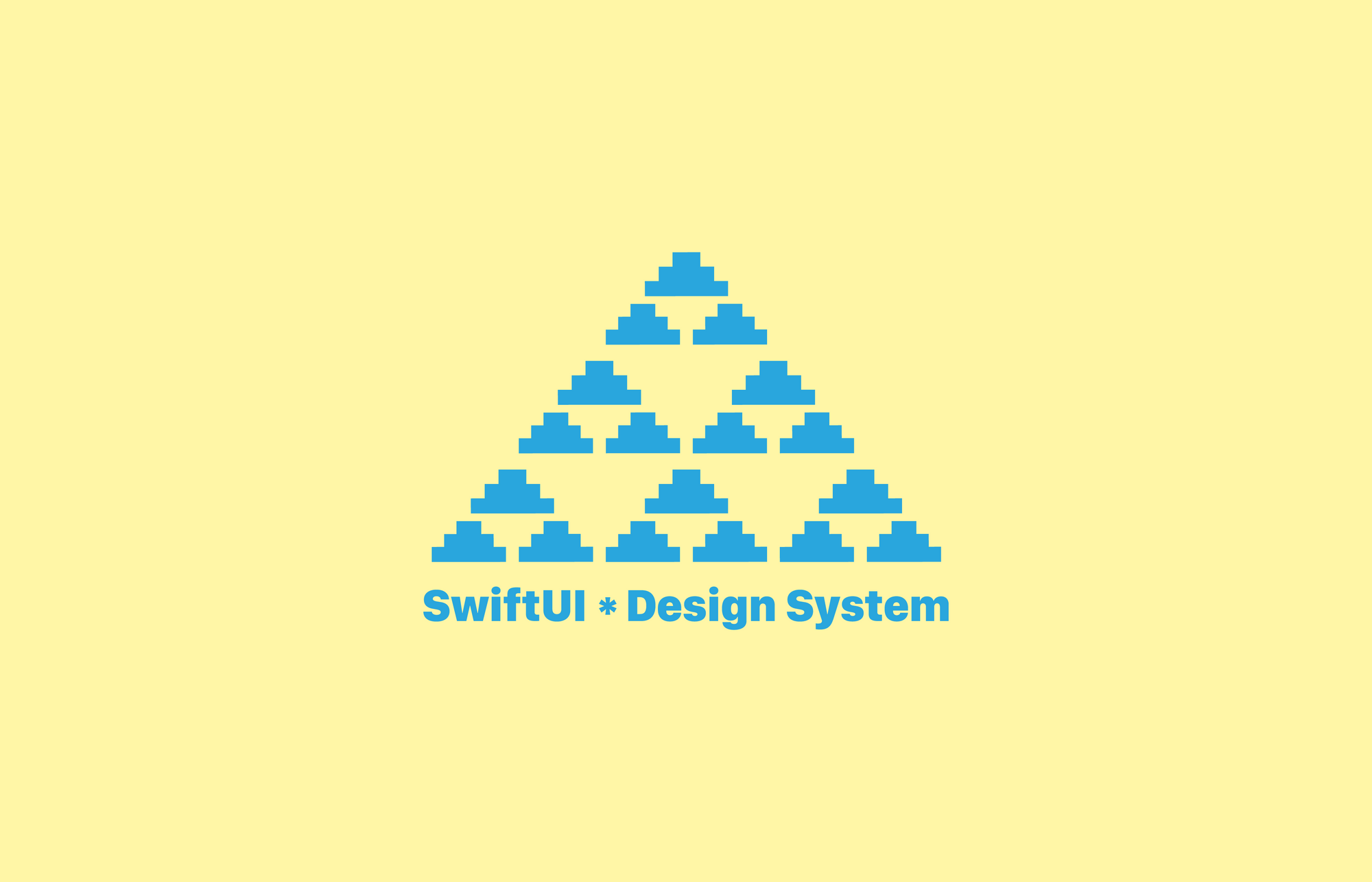
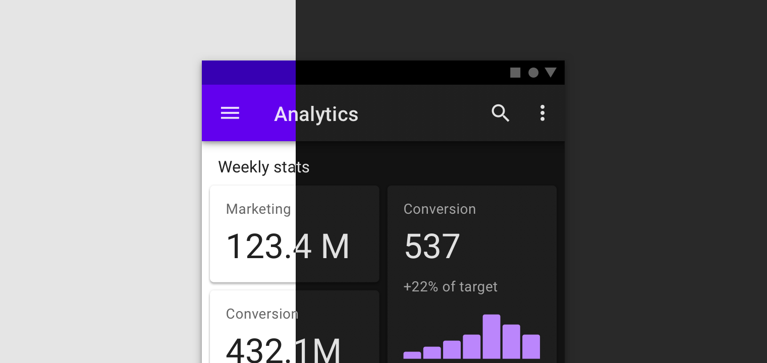
The demo project
For demonstration purpose, I put up a simplified version of design system we built in Line Break Studio. It a set of button components in different forms, which are built on top of two lower level parts: typography and colorPalette.
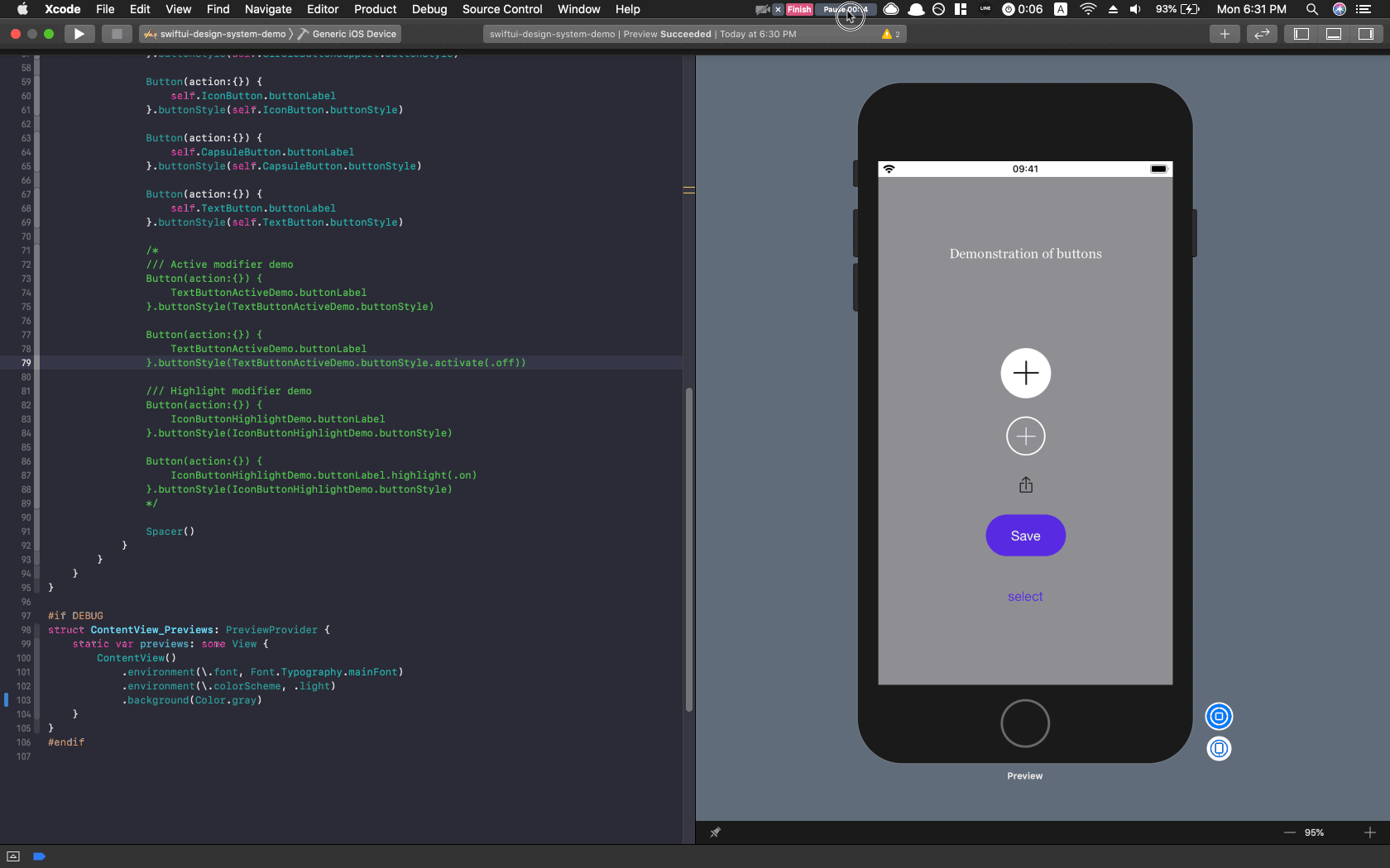 Dynamic rendering view of the demo project
The project is public on GitHub, and I'm using Xcode 11 Beta 5 for development. An Airtable base as design system management hub (read more about workflow management) is also public for reference.
Principles of building design system
Design system in code is a middleware between designers and developers. Developer of the system takes inputs from design system in visual form, and produces API that's identical with which for further development. Following two principles should be recognized to complete this system in code:
1. Communicate with tokens
Fundamentally, the purpose of having a design system in program is not about better code management or development efficiency, but to make sure the view is consistent with design files. To achieve that goal, using tokens to signify certain color, font, size or any visual elements is crucial to maintain quality of communication between developers, designers and managers in a team.
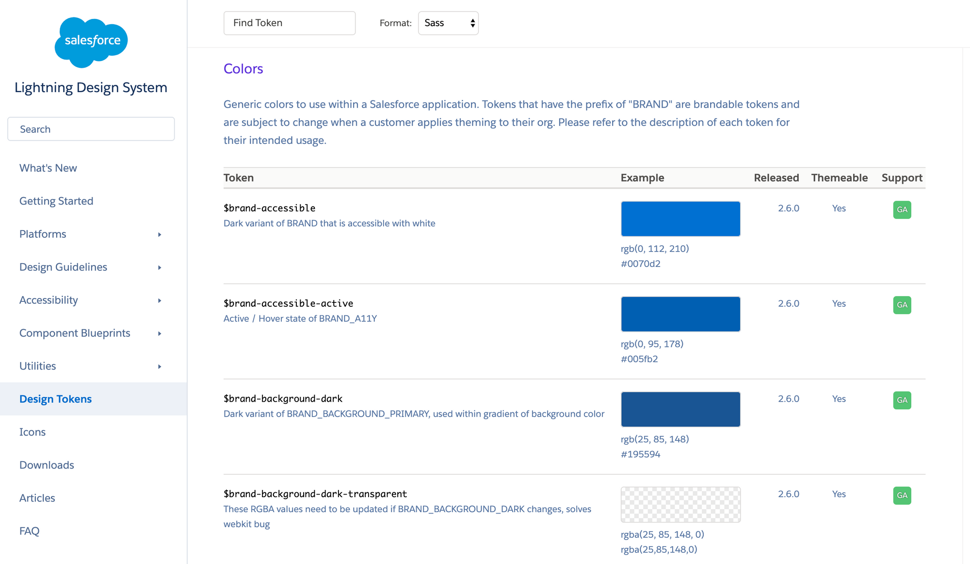 Lightning Design System's tokens built by Salesforce
2. Levels of hierarchy
In EightShapes' article, it points out that we should "Show options first, then decisions next", because "You can't make decisions without options."
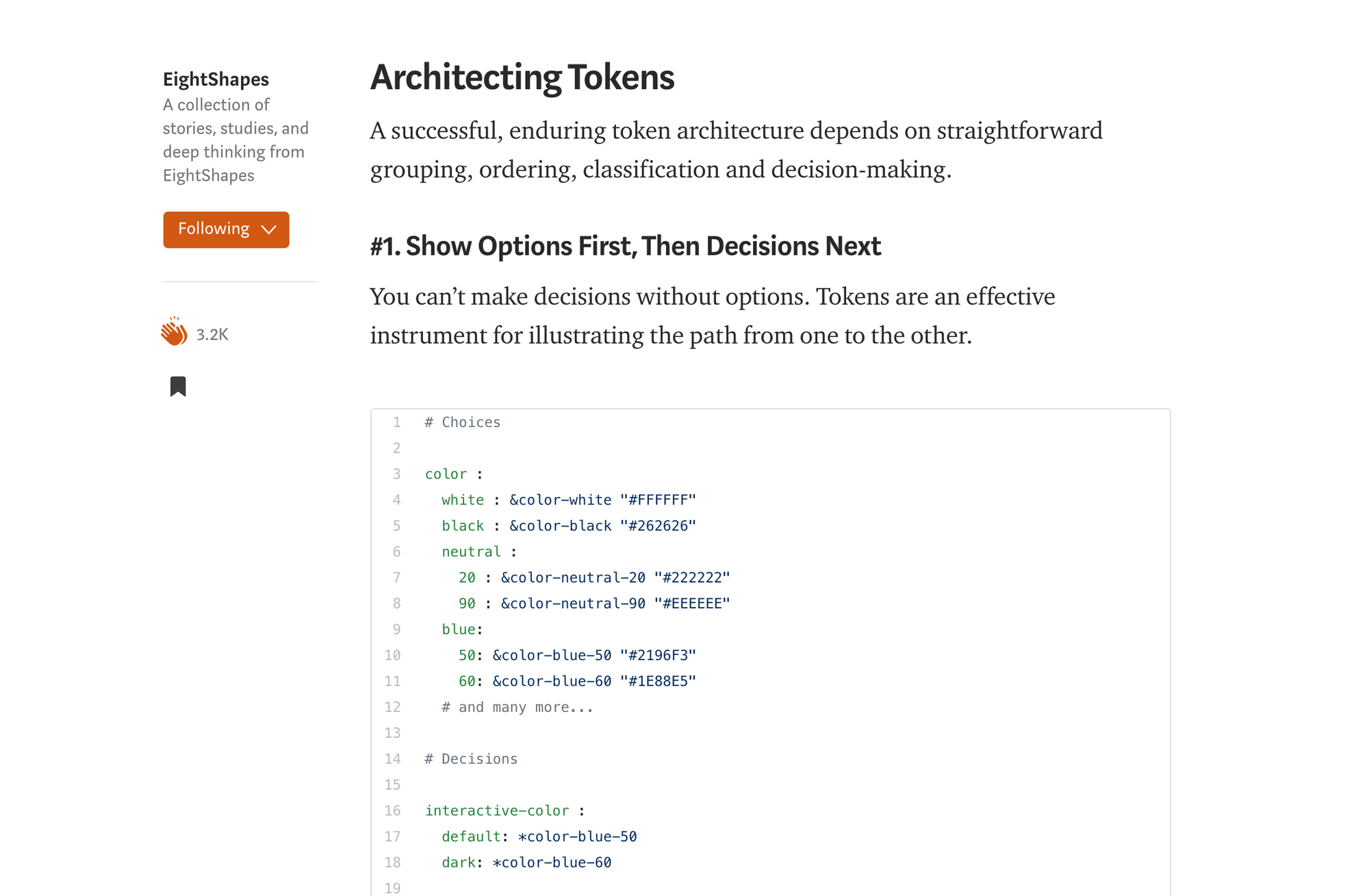 EightShapes' article about design tokens
This kind of ordering architecture loosens the degree of coupling between different levels, hence providing more flexibility and dynamic for possible revisions. The way I structure the levels is in this order from bottom to top: material → base → token. But it could be anyway the team's comfortable with.
Diving into code
Following section is a list of highlights we'd like to point out based on our experience. Please visit the GitHub repo for complete code. Any feedbacks or critics are welcome for improvements.
1. Architecting levels of hierarchy
There're two ways of stacking materials at lower level to construct tokens at highest level:
- Use
enumfor type safety and code literacy
Advantages of using enum in code as grouping wrapper or parameter in function have already been well recognized. One point worths mentioning here is the implementation of levels of hierarchy.
We always store the raw values, including font size (CGFloat) and font name (String), at the lowest level, because we don't want to mess around with it. But because raw value must be a literal in enum, we can't just assign a case to be a value from the other enum.
To work around this problem, we implement a function getValue, which returns the raw value in switch case when necessary.
- Use
structfor easier structure
Though enum is great, we don't need its unique feature in some cases. For example, because Xcode takes care of the heavy job of processing dynamic colors, and no parameter options are required in API endpoint, we can set up color palettes by simple two levels of struct.
2. Clear and straightforward naming of API endpoint
Naming convention is another broad topic for discussion and debate. In addition to basic Swift conventions, the only two rules we abide are, 1) no acronym and 2) making it simple. For example, to use typography and color system, instead of creating new endpoints, we make extension from Font and Color structs. This approach decreases the effort to memorize unfamiliar API names for developers.
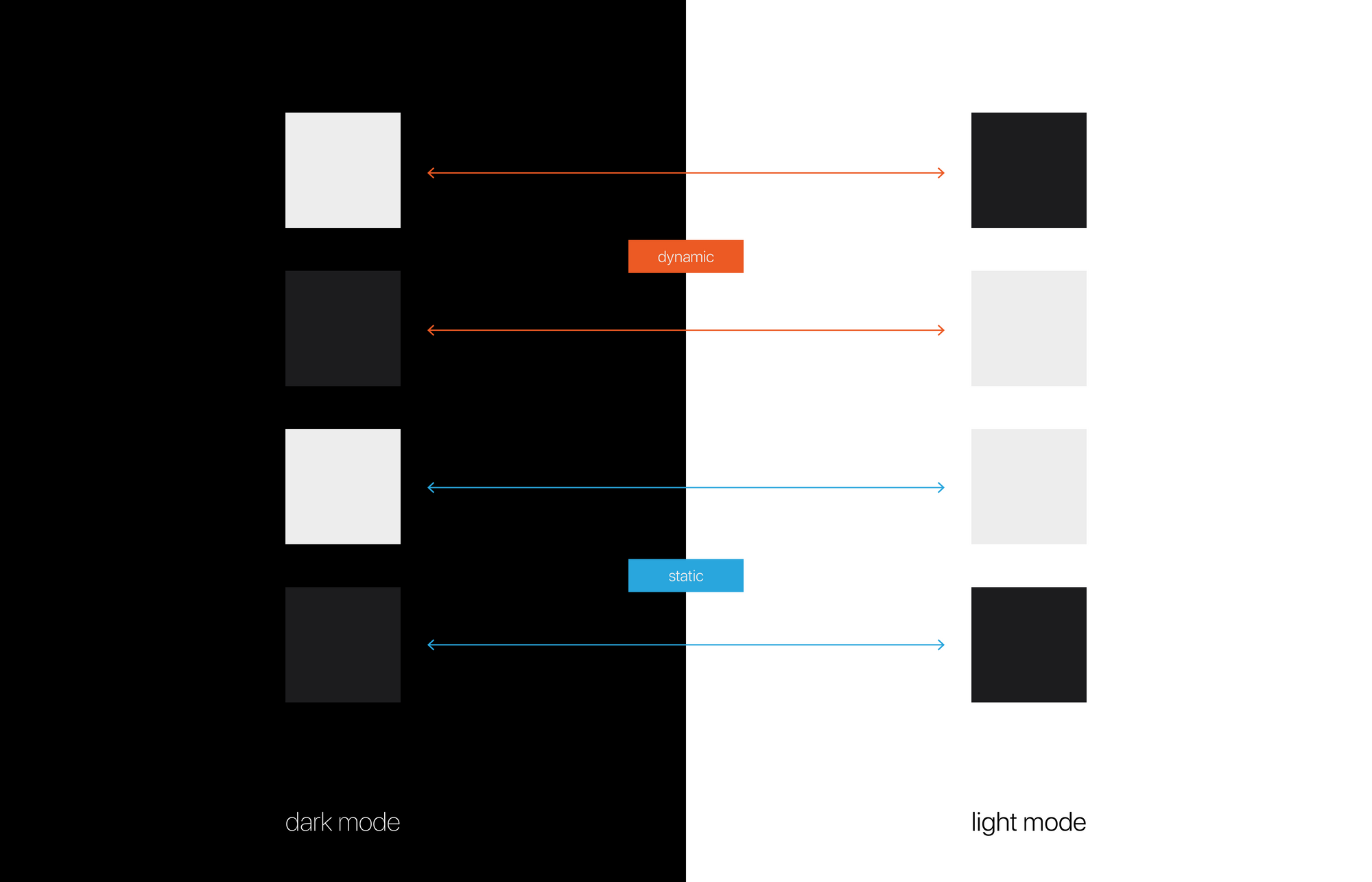
3. Manage color sets dynamically in two modes
So dark mode has become a standard in industry, and both iOS and Android team have implemented this feature. It's a good trend for users, but could bring designers and developers some challenges, including managing and naming the color sets, especially gray scale ones.
 Material Design's dark theme guide
To think and communicate about gray scale colors dynamically, using terms like white, light, black or dark doesn't work. Because if we referred to a dynamic color #000000 (black in HEX) black or dark in light color scheme, how do you talk about this particular color, which should turn into #FFFFFF (white in HEX), in dark color scheme? defaultDark or lightDark?
 Confusing transition of color sets
It is very confusing to name gray scale dynamic color sets in conventional approach. To avoid this confusion, we use theme and contrast to manage one set of color in light and dark schemes instead.
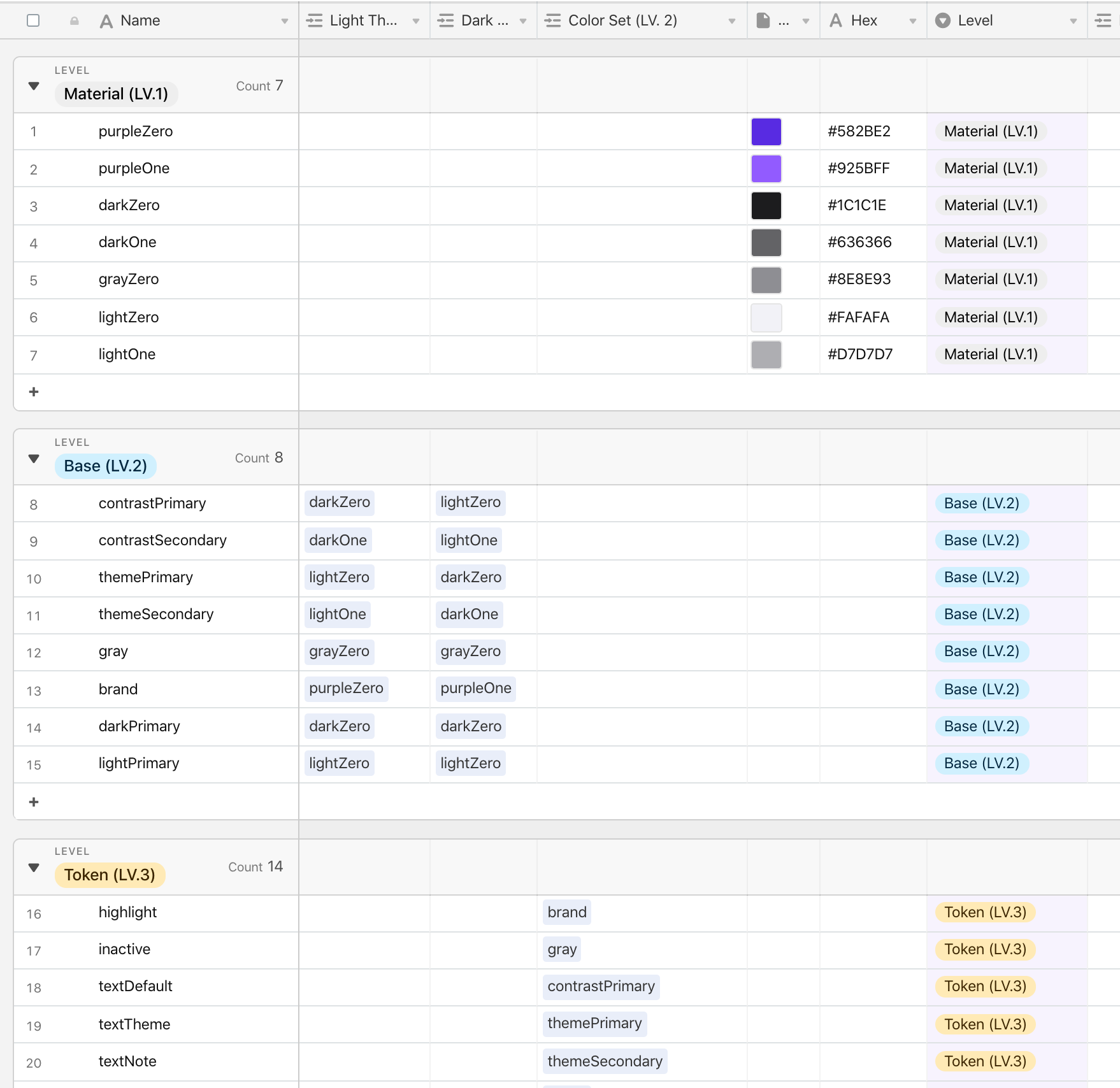 Example color naming in demo Airtable base
Note that a gray scale color doesn't always need to be reversed in opposite color mode. In these situations that light color remains light and dark remains dark, we simply name name it light or dark instead.
Once we wrap our head around this naming method, managing this architecture of color palette is easy in Xcode. To create a color set, simply create a new Asset Catalog file → add a new Color Set → and change Appearances to Any, Light, Dark will do.
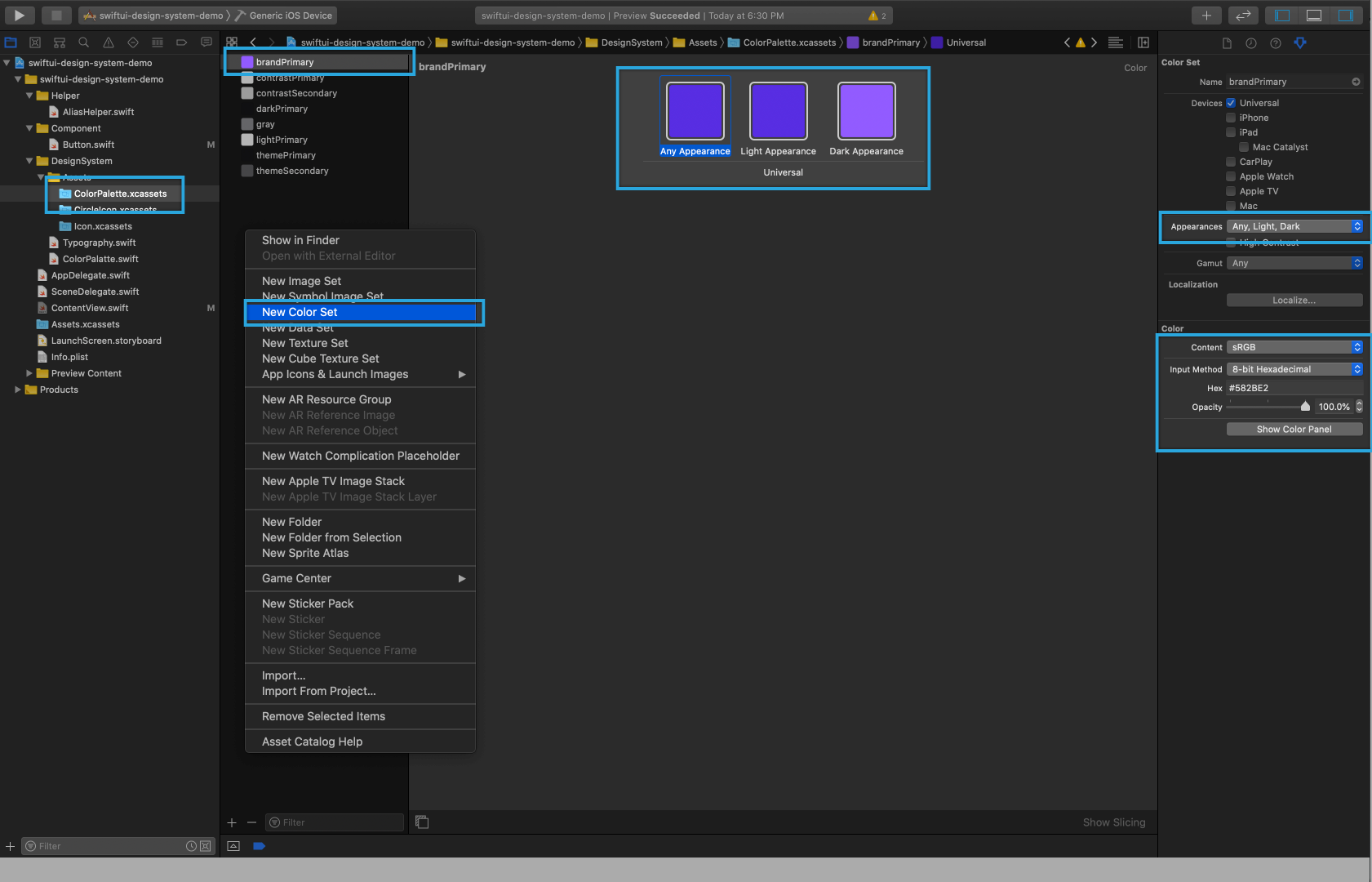 How to add color asset in Xcode
4. environment settings
One awesome feature in SwiftUI framework is the environment modifier, which provides ability to control environment values on target view. In terms of building design system, this ability provides convenient approach to change app's font at root level. And the other advantage of using environmentValue is to change and test light and dark color schemes in development.
5. buttonStyle and button label
Comparing to the old days in UIKit, constructing reusable buttons in SwiftUI is drastically easier. The Button view consists of two parts, which are action closure (event to be fired as button is pressed) and label (body of the button). The view can then be chained with a modifier buttonStyle. To learn details about building reusable buttons,I recommend reading Alejandro's tutorial, which is comprehensive and useful.
In our customized button components, first step is to create two structs, including TokenButtonLabel and TokenButtonStyle. These two structs are programmed according to the types of buttons we have in design files. For example, there're only two types of labels: icon and text. Each type has an according init function designed with different parameters for new instances.
On the other hand, there're four major types of button styles: circle icon, icon, capsule and text. To follow ButtonStyle protocol, a makeBody func has to be implemented. This function brings us a configuration property, providing a native isPressed value to monitor if the button is pressed or not.
Finally, stacking on top of TokenButtonLabel and TokenButtonStyle, the endpoint of the button component API will be TokenButton - a grouping that wraps content and style of button together, conforming to the button types in visual design system.
6. AnyView as wrapper
As we're dealing with the makeBody function brought by ButtonStyle protocol, we found a useful tip to work with View. To store a view in a variable, the type annotation could be indicated as AnyView, which works as a general container of views in SwiftUI.
In our case, because we want to add the opacity modifier to configuration.label to all types of buttons, instead of doing so repeatedly in each switch case, it makes more sense to chain the modifier at the end altogether. We can achieve this pattern by using the advantage of AnyView in this way:
7. Build view modifier with mutating function
To update styles of the buttons dynamically, we can build our own modifier. First instantiate customized mutable state properties in view, and then create a mutating function which returns a Self type after updating the target state property.
8. Tricky border style
One drawback of SwiftUI is styling a circle shape with circular border is not straightforward at all. I struggled for a while, and finally found a solution here on StackOverflow. A clipShape and an overlay modifier are required to make it work.
Conclusion
SwiftUI is an incredible improvement Apple makes. Though flaws still exist, building a robust and flexible design system with it, and furthermore complicated UI in iOS is way efficient than ever. I hope this article is helpful for any iOS team trying to build UI, and always welcome to any feedbacks!
? Read more of my works at vinceshao.com / Follow me on Twitter or LinkedIn