
By Wen Tjun Chan
A step by step approach towards visualizing financial datasets
It is a challenge to communicate data and display these visualizations on multiple devices and platforms.
“Data is just like crude. It’s valuable, but if unrefined it cannot really be used.” - Michael Palmer
D3 (Data-Driven Documents) solves this age-old dilemma. It provides developers and analysts the ability to build customized visualizations for the Web with complete freedom. D3.js allows us to bind data to the DOM (Document Object Model). Then apply data-driven transformations to create refined visualizations of data.
In this tutorial, we will understand how we can make the D3.js library work for us.
Getting started
We will be building a chart that illustrates the movement of a financial instrument over a period of time. This visualization resembles the price charts provided by Yahoo Finance. We will break down the various components required to render an interactive price chart that tracks a particular stock.
Required components:
- Loading and parsing of data
- SVG element
- X and Y axes
- Close price line chart
- Simple moving average curve chart with some calculations
- Volume series bar chart
- Mouseover crosshair and legend
Loading and Parsing of Data
const loadData = d3.json('sample-data.json').then(data => {
  const chartResultsData = data['chart']['result'][0];
  const quoteData = chartResultsData['indicators']['quote'][0];
  return chartResultsData['timestamp'].map((time, index) => ({
    date: new Date(time * 1000),
    high: quoteData['high'][index],
    low: quoteData['low'][index],
    open: quoteData['open'][index],
    close: quoteData['close'][index],
    volume: quoteData['volume'][index]
  }));
});
First, we will use the fetch module to load our sample data. D3-fetch also supports other formats such as TSV and CSV files. The data will then be further processed to return an array of objects. Each object contains the trade timestamp, high price, low price, open price, close price, and trade volume.
body {
  background: #00151c;
}
#chart {
  background: #0e3040;
  color: #67809f;
}
Add the above base CSS properties to personalize the style of your chart for maximum visual appeal.
Appending the SVG Element
const initialiseChart = data => {
  const margin = { top: 50, right: 50, bottom: 50, left: 50 };
  const width = window.innerWidth - margin.left - margin.right;
  const height = window.innerHeight - margin.top - margin.bottom;
  // add SVG to the page
  const svg = d3
    .select('#chart')
    .append('svg')
    .attr('width', width + margin['left'] + margin['right'])
    .attr('height', height + margin['top'] + margin['bottom'])
    .call(responsivefy)
    .append('g')
    .attr('transform', `translate(${margin['left']},  ${margin['top']})`);
Subsequently, we can use the append() method to append the SVG element to the <div> element with the id, chart. Next, we use the attr() method to assign the width and height of the SVG element. We then call the responsivefy() method (originally written by Brendan Sudol). This allows the SVG element to have responsive capabilities by listening to window resize events.
Remember to append the SVG group element to the above SVG element before translating it using the values from the margin constant.
Rendering the X and Y Axes
Before rendering the axes component, we will need to define our domain and range, which will then be used to create our scales for the axes
// find data range
const xMin = d3.min(data, d => {
  return d['date'];
});
const xMax = d3.max(data, d => {
  return d['date'];
});
const yMin = d3.min(data, d => {
  return d['close'];
});
const yMax = d3.max(data, d => {
  return d['close'];
});
// scales for the charts
const xScale = d3
  .scaleTime()
  .domain([xMin, xMax])
  .range([0, width]);
const yScale = d3
  .scaleLinear()
  .domain([yMin - 5, yMax])
  .range([height, 0]);
The x and y axes for the close price line chart consist of the trade date and close price respectively. Therefore, we have to define the minimum and maximum x and y values, using d3.max() and d3.min(). We can then make use of D3-scale’s scaleTime() and scaleLinear() to create the time scale on the x-axis and the linear scale on the y-axis respectively. The range of the scales is defined by the width and height of our SVG element.
// create the axes component
svg
  .append('g')
  .attr('id', 'xAxis')
  .attr('transform', `translate(0, ${height})`)
  .call(d3.axisBottom(xScale));
svg
  .append('g')
  .attr('id', 'yAxis')
  .attr('transform', `translate(${width}, 0)`)
  .call(d3.axisRight(yScale));
After this step, we need to append the first g element to the SVG element, which calls the d3.axisBottom() method, taking in xScale as the parameter to generate the x-axis. The x-axis is then translated to the bottom of the chart area. Similarly, the y-axis is generated by appending the g element, calling d3.axisRight() with yScale as the parameter, before translating the y-axis to the right of the chart area.
Rendering the Close Price Line Chart
// generates close price line chart when called
const line = d3
  .line()
  .x(d => {
    return xScale(d['date']);
  })
  .y(d => {
    return yScale(d['close']);
  });
// Append the path and bind data
svg
 .append('path')
 .data([data])
 .style('fill', 'none')
 .attr('id', 'priceChart')
 .attr('stroke', 'steelblue')
 .attr('stroke-width', '1.5')
 .attr('d', line);
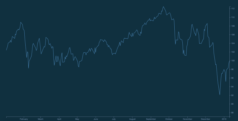
Now, we can append the [path](https://developer.mozilla.org/en-US/docs/Web/SVG/Tutorial/Paths) element inside our main SVG element, followed by passing our parsed dataset,data. We set the attribute d with our helper function, line. which calls the d3.line() method. The x and y attributes of the line accept the anonymous functions and return the date and close price respectively.
By now, this is how your chart should look like:
Rendering the Simple Moving Average Curve
Instead of relying purely on the close price as our only form of technical indicator, we use the Simple Moving Average. This average identifies uptrends and downtrends for the particular security.
const movingAverage = (data, numberOfPricePoints) => {
  return data.map((row, index, total) => {
    const start = Math.max(0, index - numberOfPricePoints);
    const end = index;
    const subset = total.slice(start, end + 1);
    const sum = subset.reduce((a, b) => {
      return a + b['close'];
    }, 0);
    return {
      date: row['date'],
      average: sum / subset.length
    };
  });
};
We define our helper function, movingAverage to calculate the simple moving average. This function accepts two parameters, namely the dataset, and the number of price points, or periods. It then returns an array of objects, with each object containing the date and average for each data point.
// calculates simple moving average over 50 days
const movingAverageData = movingAverage(data, 49);
// generates moving average curve when called
const movingAverageLine = d3
 .line()
 .x(d => {
  return xScale(d['date']);
 })
 .y(d => {
  return yScale(d['average']);
 })
  .curve(d3.curveBasis);
svg
  .append('path')
  .data([movingAverageData])
  .style('fill', 'none')
  .attr('id', 'movingAverageLine')
  .attr('stroke', '#FF8900')
  .attr('d', movingAverageLine);
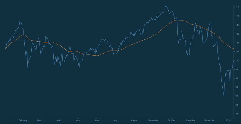
For our current context, movingAverage() calculates the simple moving average over a period of 50 days. Similar to the close price line chart, we append the path element within our main SVG element, followed by passing our moving average dataset, and setting the attribute d with our helper function, movingAverageLine. The only difference from the above is that we passed d3.curveBasis to d3.line().curve() in order to achieve a curve.
This results in the simple moving average curve overlaid on top of our current chart:
Rendering the Volume Series Bar Chart
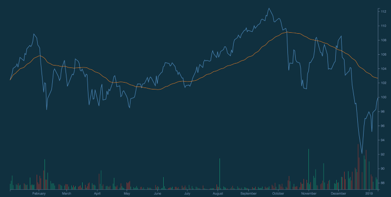
For this component, we will be rendering the trade volume in the form of a color-coded bar chart occupying the same SVG element. The bars are green when the stock closes higher than the previous day’s close price. They are red when the stock closes lower than the previous day’s close price. This illustrates the volume traded for each trade date. This can then be used alongside the above chart to analyze price movements.
/* Volume series bars */
const volData = data.filter(d => d['volume'] !== null && d['volume']   !== 0);
const yMinVolume = d3.min(volData, d => {
  return Math.min(d['volume']);
});
const yMaxVolume = d3.max(volData, d => {
  return Math.max(d['volume']);
});
const yVolumeScale = d3
  .scaleLinear()
  .domain([yMinVolume, yMaxVolume])
  .range([height, 0]);
The x and y axes for the volume series bar chart consist of the trade date and volume respectively. Thus, we will need to redefine the minimum and maximum y values and make use of scaleLinear()on the y-axis. The range of these scales are defined by the width and height of our SVG element. We will be reusing xScale since the x-axis of the bar chart corresponds similarly to the trade date.
svg
  .selectAll()
  .data(volData)
  .enter()
  .append('rect')
  .attr('x', d => {
    return xScale(d['date']);
  })
  .attr('y', d => {
    return yVolumeScale(d['volume']);
  })
  .attr('fill', (d, i) => {
    if (i === 0) {
      return '#03a678';
    } else {
      return volData[i - 1].close > d.close ? '#c0392b' : '#03a678';
    }
  })
  .attr('width', 1)
  .attr('height', d => {
    return height - yVolumeScale(d['volume']);
  });
This section relies on your understanding of how theselectAll() method works with the enter() and append() methods. You may wish to read this (written by Mike Bostock himself) if you are unfamiliar with those methods. This may be important as those methods are used as part of the enter-update-exit pattern, which I may cover in a subsequent tutorial.
To render the bars, we will first use .selectAll() to return an empty selection, or an empty array. Next, we pass volData to define the height of each bar. The enter() method compares the volData dataset with the selection from selectAll(), which is currently empty. Currently, the DOM does not contain any <rect> element. Thus, the append() method accepts an argument ‘rect’, which creates a new element in the DOM for every single object in volData.
Here is a breakdown of the attributes of the bars. We will be using the following attributes: x, y, fill, width, and height.
.attr('x', d => {
  return xScale(d['date']);
})
.attr('y', d => {
  return yVolumeScale(d['volume']);
})
The first attr() method defines the x-coordinate. It accepts an anonymous function which returns the date. Similarly, the second attr() method defines the y-coordinate. It accepts an anonymous function which returns the volume. These will define the position of each bar.
.attr('width', 1)
.attr('height', d => {
  return height - yVolumeScale(d['volume']);
});
We assign a width of 1 pixel to each bar. To make the bar stretch from the top (defined by y)to the x-axis, simply deduct the height with the y value.
.attr('fill', (d, i) => {
  if (i === 0) {
    return '#03a678';
  } else {
    return volData[i - 1].close > d.close ? '#c0392b' : '#03a678';
  }
})
Remember the way that the bars will be color coded? We will be using the fill attribute to define the colors of each bar. For stocks that closed higher than the previous day’s close price, the bar will be green in color. Otherwise, the bar will be red.
This is how your current chart should look like:
Rendering Crosshair and Legend for interactivity
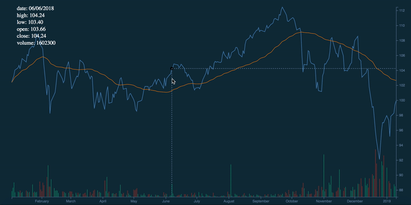
We have reached the final step of this tutorial, whereby we will generate a mouseover crosshair that displays drop lines. Mousing over the various points in the chart will cause the legends to be updated. This provides us the full information (open price, close price, high price, low price, and volume) for each trade date.
The following section is referenced from Micah Stubb’s excellent example.
// renders x and y crosshair
const focus = svg
  .append('g')
  .attr('class', 'focus')
  .style('display', 'none');
focus.append('circle').attr('r', 4.5);
focus.append('line').classed('x', true);
focus.append('line').classed('y', true);
svg
  .append('rect')
  .attr('class', 'overlay')
  .attr('width', width)
  .attr('height', height)
  .on('mouseover', () => focus.style('display', null))
  .on('mouseout', () => focus.style('display', 'none'))
  .on('mousemove', generateCrosshair);
d3.select('.overlay').style('fill', 'none');
d3.select('.overlay').style('pointer-events', 'all');
d3.selectAll('.focus line').style('fill', 'none');
d3.selectAll('.focus line').style('stroke', '#67809f');
d3.selectAll('.focus line').style('stroke-width', '1.5px');
d3.selectAll('.focus line').style('stroke-dasharray', '3 3');
The crosshair consists of a translucent circle with drop lines consisting of dashes. The above code block provides the styling of the individual elements. Upon mouseover, it will generate the crosshair based on the function below.
const bisectDate = d3.bisector(d => d.date).left;
function generateCrosshair() {
  //returns corresponding value from the domain
  const correspondingDate = xScale.invert(d3.mouse(this)[0]);
  //gets insertion point
  const i = bisectDate(data, correspondingDate, 1);
  const d0 = data[i - 1];
  const d1 = data[i];
  const currentPoint = correspondingDate - d0['date'] > d1['date'] - correspondingDate ? d1 : d0;

  focus.attr('transform',`translate(${xScale(currentPoint['date'])},     ${yScale(currentPoint['close'])})`);
focus
  .select('line.x')
  .attr('x1', 0)
  .attr('x2', width - xScale(currentPoint['date']))
  .attr('y1', 0)
  .attr('y2', 0);
focus
  .select('line.y')
  .attr('x1', 0)
  .attr('x2', 0)
  .attr('y1', 0)
  .attr('y2', height - yScale(currentPoint['close']));
 updateLegends(currentPoint);
}
We can then make use of the d3.bisector() method to locate the insertion point, which will highlight the closest data point on the close price line graph. After determining the currentPoint, the drop lines will be updated. The updateLegends() method uses the currentPoint as the parameter.
const updateLegends = currentData => { d3.selectAll('.lineLegend').remove();
const updateLegends = currentData => {
  d3.selectAll('.lineLegend').remove();
  const legendKeys = Object.keys(data[0]);
  const lineLegend = svg
    .selectAll('.lineLegend')
    .data(legendKeys)
    .enter()
    .append('g')
    .attr('class', 'lineLegend')
    .attr('transform', (d, i) => {
      return `translate(0, ${i * 20})`;
    });
  lineLegend
    .append('text')
    .text(d => {
      if (d === 'date') {
        return `${d}: ${currentData[d].toLocaleDateString()}`;
      } else if ( d === 'high' || d === 'low' || d === 'open' || d === 'close') {
        return `${d}: ${currentData[d].toFixed(2)}`;
      } else {
        return `${d}: ${currentData[d]}`;
      }
    })
    .style('fill', 'white')
    .attr('transform', 'translate(15,9)');
  };
The updateLegends() method updates the legend by displaying the date, open price, close price, high price, low price, and volume of the selected mouseover point on the close line graph. Similar to the Volume bar charts, we will make use of the selectAll() method with the enter() and append() methods.
To render the legends, we will use.selectAll('.lineLegend') to select the legends, followed by calling the remove() method to remove them. Next, we pass the keys of the legends, legendKeys, which will be used to define the height of each bar. The enter() method is called, which compares the volData dataset and at the selection from selectAll(), which is currently empty. Currently, the DOM does not contain any <rect> element. Thus, the append() method accepts an argument ‘rect’, which creates a new element in the DOM for every single object in volData.
Next, append the legends with their respective properties. We further process the values by converting the prices to 2 decimal places. We also set the date object to the default locale for readability.
This will be the end result:
Closing Thoughts
Congratulations! You have reached the end of this tutorial. As demonstrated above, D3.js is simple yet dynamic. It allows you to create custom visualizations for all your data sets. In the coming weeks, I will release the second part of this series which will deep dive into D3.js’s enter-update-exit pattern. Meanwhile, you may wish to check out the API documentation, more tutorials, and other interesting visualizations built with D3.js.
Feel free to check out the source code as well as the full demonstration of this tutorial. Thank you, and I hope you have learned something new today!
Special thanks to Debbie Leong for reviewing this article.