
By David Uzondu
CSS is a powerful language for styling web pages. But when you're designing a website, things like box shadows can be particularly difficult to get right.
In this guide, you will learn how to create your own box shadow generator with React and Vite. Here is a preview of what you will be building today. Let's get started.
Setting Up the Project
To set things up, you will need the following:
- Node.js installed on your computer. (If you don't have Node.js installed, you can get it from the official Node.js website). Node.js comes with a package manager called NPM.
- Knowledge of HTML, CSS, JavaScript and React (you do not have to be an expert).
If you have all of the items mentioned above installed on your computer, then feel free to proceed with the setup:
- On your terminal, run
npm create vite@latestoryarn add vite. This command will help you scaffold a new Vite project. - When the command runs, you will be prompted to name your project. Type the name for your project and hit enter. When you're prompted to select a framework, select "React" and set the variant as "JavaScript".
- Now run
cd <your_project_name>, making sure you replace<your_project_name>with the actual name of your project. Then runnpm ioryarn. This will install all the necessary dependencies that your project needs. - After your dependencies have been installed, run
npm i react-colorful. react-colorful is the NPM package that we will use in this project to render a color picker. - After the installing react-colorful, you can start the development server by typing
yarn devornpm run dev.
Project Structure
Our project will be structure this way: one CSS file is used to style the entire app, and the app layout will consist of a grid with three columns.
The first column will house, our 'controls'. This is where all the components required to generate the box shadow will live. The next column will be used to preview the box shadow currently being generated. The last column will contain our output.
Folder Structure
One last thing you need to do is to structure your folder. Follow the steps outlined below to see how you can do it.
- Open up the project in VSCode (or your favourite text editor) and clear the contents on the
Index.cssfile and theApp.css. - Head over this project's Github repository, then copy and paste the contents of the
App.cssfile into your ownApp.cssfile. - Modify the
App.jsxfile so that in the end it looks something like this:
import './App.css'

function App() {
  return (
    <div className="App">
      <Header />
      <div className='mainApp'>
        <Container />
      </div>
    </div>
  )
}
export default App
- In the
srcfolder, create acomponentsfolder. In thecomponentsfolder, create four files:Header.jsx,Control.jsx,CodeOutput.jsxandContainer.jsx.
Now that your folder is organised, you can proceed to the next part.
How to Build the Header
Let's start with the 'simplest' part of this project: the header. To build the header, navigate to the Header.jsx file and create a component that returns a div with the class name of "Header". Your file should look something like this in the end:
import React from 'react'

function Header() {
    return (
        <div className='Header'>
            <div>SHADOWGEN</div>
        </div>
    )
}
export default Header
How to Create the Controls
Controls are components that we can use to tweak the parameters of the box shadow. In this tutorial, we will have six controls:
- one control to control the color
- four controls that control the
offsetX,offsetY,spreadandblurvalues inpx - and the last control will be a checkbox that allows you to change the box-shadow style to
insetif checked.
In CSS, the common syntax for the box-shadow property is:
box-shadow: offsetXpx offsetYpx blur* spread* inset* #330303f5*;
⚠️ Note that optional parameters are marked with an asterisk.
In the Control.jsx file, import HexAlphaColorPicker from the react-colorful package.
import React from 'react'
import { HexAlphaColorPicker } from 'react-colorful'
Then create a functional component named Control and export it as default. Your functional component should return a parent div. The component should accept five props, namely: label, type, onChangeHandler, value and children.
import React from 'react'
import { HexAlphaColorPicker } from 'react-colorful'
function Control({ label, type, onChangeHandler, value, children }) {
    return (
        <div className={`paneChild ${type}`}>
        </div>
    )
}
export default Control
How to Create the Label for Each Control
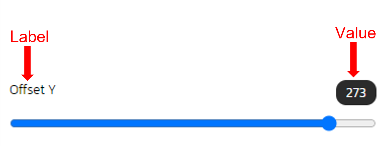 The Structure of a sample control.
Inside the parent div, create another div with the class, "label".
<div className="label">

</div>
In that div, create a label element and set the "for" attribute to the label prop. The label element should contain the label prop:
<div className="label">
    <label htmlFor={label}>{label}</label>
</div>
Next, let's conditionally render a value, right next to the label. To do that we need to check if the label is not 'Inset'. If this condition is met, we simply render a span element that contains the value prop.
In the end the code should look something like this:
<div className="label">
    <label htmlFor="{label}">{label}</label>
    {label !== "Inset" &&
    <span className="value">{value}</span>}
</div>
Now, to conditionally render a color picker or a input element, add the following lines of code:
{
type === 'color' ? <HexAlphaColorPicker color={value} onChange={onChangeHandler} /> :
<input type={type} name={label} value={value} min={(label === 'Spread' || label === "Blur") ? 0 : -350} max={(label === 'Spread' || label === "Blur") ? 100 : 350} onChange={onChangeHandler} />
}
This code uses a conditional statement to render different JSX components based on the value of the type prop. If type is 'color', a HexAlphaColorPicker is rendered with the color and onChange props passed in.
If type is not 'color', an input element is rendered with type, name, value, min, max, and onChange props passed in. The values of min and max depend on the value of the label prop. In both cases, the onChangeHandler function is passed in as a prop to handle changes in the input or color picker value.
Now the finished code should look something like this:
import React from 'react'
import { HexAlphaColorPicker, HexColorInput } from 'react-colorful'
function Control({ label, type, onChangeHandler, value }) {
    return (
        <div className={`paneChild ${type}`}>
            <div className='label'>
                <label htmlFor={label}>{label}</label>
                {label !== "Inset"
                    &&
                    <span className='value'>{value}</span>}
            </div>
            {
                type === 'color' ? <HexAlphaColorPicker color={value} onChange={onChangeHandler} />
                    :
                    <input type={type} name={label} value={value} min={(label === 'Spread' || label === "Blur") ? 0 : -350} max={(label === 'Spread' || label === "Blur") ? 100 : 350} onChange={onChangeHandler} />
            }
        </div>
    )
}
export default Control
How to Create the Output Component
Now, that you have created the Control component, head over to the CodeOutput.jsx file and add the following lines of code:
import React from 'react'
function CodeOutput({ shadow }) {
    return (
        <div className='paneChild'>
            <div className='label'>
                <span>CSS Output</span>
            </div>
            <div className='codeOutput'>
                box-shadow: {
                    shadow.map((element) => {
                        if (typeof element === 'number') {
                            return element + "px";
                        }
                        return `${element}`;
                    }).join(" ")
                };
            </div>
        </div>
    )
}
export default CodeOutput
The CodeOutput component takes a single prop called shadow, which is an array that represents the values for the CSS box-shadow property. The component returns JSX that displays the CSS output based on the shadow prop passed in.
The JSX contains two divs: one with the class name paneChild, and the other with the class name codeOutput. Inside the codeOutput div, the component maps over each element in the shadow prop and generates the corresponding CSS code.
If the element is a number, it adds "px" to the value, otherwise it adds the element as a string. The resulting array of CSS values is joined together into a single string with a space between each value.
Bringing it all together
We're almost done. Let's tie everything together in the Container.jsx file. Import the useState hook, the Control, and the CodeOutPut components respectively like so:
import React, { useState } from 'react'
import Control from './Control'
import CodeOutput from './CodeOutput'
Create a functional component called Container. In that component, use the useState hook to create a boxShadow variable and set its initial value to an array with six elements: [23, 23, 0, 10, " ", "#00000045"].
function Container(){
const [boxShadow, setBoxShadow] = useState([23, 23, 0, 10, " ", "#00000045"])
}

export default Container
⚠️ Note that the first four elements of the array ([23, 23, 0, 10]) represent the horizontal offset, vertical offset, blur radius, and spread radius of the shadow, respectively. The fifth element (" ") is a placeholder for the shadow's inset property, which is not being used in this case. Finally, the sixth element ("#00000045") represents the color of the shadow in HEX format.
Your component should return three divs wrapped in a React fragment. The first div should have a class names "controlPane" and "controls". The last div should have the class name, "controlPane".
function Container(){
const [boxShadow, setBoxShadow] = useState([23, 23, 0, 10, " ", "#00000045"])
return(
<>
    <div className="controlPane controls"></div>
    <div></div>
    <div className="controlPane"></div>
</>
)
}
Let's work on the first div
In the first div, add six Control components:
            <div className='controlPane controls'>
                <Control label="Color" type="color" value={boxShadow[5]} onChangeHandler={e => onChangeHandler(e, 5)} />
                <Control label="Offset X" type="range" value={boxShadow[0]} onChangeHandler={e => onChangeHandler(e, 0)} />
                <Control label="Offset Y" type="range" value={boxShadow[1]} onChangeHandler={e => onChangeHandler(e, 1)} />
                <Control label="Blur" type="range" value={boxShadow[2]} onChangeHandler={e => onChangeHandler(e, 2)} />
                <Control label="Spread" type="range" value={boxShadow[3]} onChangeHandler={e => onChangeHandler(e,3)} />
                <Control label="Inset" type="checkbox" value={boxShadow[4]} onChangeHandler={e => onChangeHandler(e, 4)} />
            </div>
Each Control component represents an element in the boxShadow array. Each one has a label prop, a type prop, a value prop set to the value of the element's index in the boxShadow array, and an onChangeHandler prop that calls a function onChangeHandler with the event and the index of the value to change.
How to declare the onChangeHandler Function
Right above the return statement, create a function that takes in two parameters, e and index.
function onChangeHandler(e, index) {
    switch (index) {
        case 5:
            setBoxShadow(boxShadow.map((c, i) => i === index ? e : c));
            break;
        case 4:
            setBoxShadow(boxShadow.map((c, i) => i === index ? e.target.checked ? 'inset' : '' : c));
            break;
        default:
            setBoxShadow(boxShadow.map((c, i) => i === index ? +e.target.value : c));
            break;
    }
}
The onChangeHandler function takes two arguments: e which is an event object, and index which is a numeric index value.
The function uses a switch statement to determine which logic to execute based on the value of index. If index is 5, the function updates the boxShadow state by mapping over the existing array and replacing the value at index 5 with e.
If index is 4, the function updates the boxShadow state by mapping over the existing array and replacing the value at index 4 with either the string 'inset' or an empty string ('') depending on whether e.target.checked is truthy or falsy, respectively.
Otherwise, if index is any other value, the function updates the boxShadow state by mapping over the existing array and replacing the value at the specified index with the numeric value of e.target.value.
 The first div should look something like this.
Let's work on the second div
In the second div, add another div with the class name "square". Recall that the second div is where a preview of the box shadow will be placed.
 <div>
     <div className='square'></div>
</div>
Set the style attribute of the div with class name "square" to the following:
{
boxShadow: boxShadow.map(shadowArrayToString).join(" "),
 backgroundColor: "#ffffff",
 border: "solid 0.2px"
}
The boxShadow property is set to the result of the map method called on the boxShadow array. The map method returns a new array where each item in the original array is converted to a string using the shadowArrayToString function, and then the resulting strings are joined together with a space character.
Now the the complete code for the second div should look like this:
<div>
    <div className='square' style={{
    boxShadow: boxShadow.map(shadowArrayToString).join(" "),
    backgroundColor: "#ffffff",
    border: "solid 0.2px"
    }}></div>
</div>
Just below the useChangeHandler function, add the following code:
const shadowArrayToString = (element) => {
     if (typeof element === "number") {
         return element + "px";
    }
return element;
}
The function shadowArrayToString takes one argument called element. The purpose of this function is to convert elements of the boxShadow array (which can contain numerical values representing pixel sizes) into a string format with a "px" suffix. If the element argument is not a number, the function returns the element value unchanged.
 The second div.
Let's work on the last div
The last div should have the class name "controlPane" and CodeOutput as a child component. The ChildOutput should have a shadow prop set to the boxShadow state.
<div className='controlPane'>
    <CodeOutput shadow={boxShadow} />
</div>
The Container.jsx file should look something like this:
import React, { useState } from 'react'
import Control from './Control'
import CodeOutput from './CodeOutput'
function Container() {
    const [boxShadow, setBoxShadow] = useState([23, 23, 0, 10, " ", "#00000045"])
    function onChangeHandler(e, index) {
        switch (index) {
            case 5:
                setBoxShadow(boxShadow.map((c, i) => i === index ? e : c));
                break;
            case 4:
                setBoxShadow(boxShadow.map((c, i) => i === index ? e.target.checked ? 'inset' : '' : c));
                break;
            default:
                setBoxShadow(boxShadow.map((c, i) => i === index ? +e.target.value : c));
                break;
        }
    }
    const shadowArrayToString =
        (element) => {
            if (typeof element === "number") {
                return element + "px";
            }
            return element;
    }
    return (
        <>
            <div className='controlPane controls'>
                <Control label="Color" type="color" value={boxShadow[5]} onChangeHandler={e => onChangeHandler(e, 5)} />
                <Control label="Offset X" type="range" value={boxShadow[0]} onChangeHandler={e => onChangeHandler(e, 0)} />
                <Control label="Offset Y" type="range" value={boxShadow[1]} onChangeHandler={e => onChangeHandler(e, 1)} />
                <Control label="Blur" type="range" value={boxShadow[2]} onChangeHandler={e => onChangeHandler(e, 2)} />
                <Control label="Spread" type="range" value={boxShadow[3]} onChangeHandler={e => onChangeHandler(e,3)} />
                <Control label="Inset" type="checkbox" value={boxShadow[4]} onChangeHandler={e => onChangeHandler(e, 4)} />
            </div>
            <div>
                <div className='square'
                    style={{
                        boxShadow: boxShadow.map(shadowArrayToString).join(" "),
                        backgroundColor: "#ffffff",
                        border: "solid 0.2px"
                    }}></div>
            </div>
            <div className='controlPane'>
                <CodeOutput shadow={boxShadow} />
            </div>
        </>
    )
}
export default Container
In the App.jsx file, import the Header and Container components and modify the functional component such that the final code looks like this:
import './App.css'
import Header from './components/Header'
import Container from './components/Container'
function App() {
  return (
    <div className="App">
      <Header />
      <div className='mainApp'>
        <Container />
      </div>
    </div>
  )
}
export default App
The finished project should look something like this:
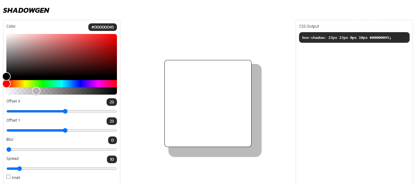
Conclusion
That's it! You successfully created a box shadow generator. Let's recap on some of the concepts we covered here:
- Vite: We learnt how to scaffold a basic React project with Vite. Vite is a great alternative to create-react-app and you can learn more about it here. You can build this project with
yarn buildornpm run build. - React-colourful: React-Colourful is a library for rendering color picker components with React. In this tutorial, we used the
HexAlphaColorPicker, but React-Colorful offers different kinds of color pickers. The NPM package is super popular, receiving up to 1.9 million downloads per week. - How to update the state of an array: We explored how to use the JavaScript
mapmethod to update the state of our box shadow generator, making it more dynamic and interactive. You can learn more about states from the official React Documentation.
Don't forget to check this project out on GitHub and follow me on Twitter. I hope you found this tutorial useful. Thank you for reading.