

Style guides are important to help you deliver a consistent brand experience.
As a UI/UX designer, creating style guides is indispensable if you hope to create great user experiences and interfaces.
In this article, you will learn what a style guide is, the importance of a style guide, and how to create one step by step.
What is a Style Guide?
A User Interface (UI) style guide is a standard that contains all the necessary details about the UI elements and interactions that occur within a product. It helps establish brand consistency.
A typical style guide contains information about typography, colours, layouts, components, and everything else that gives the UI its feel and look.
Creating a great and concise style guide for your product makes sure that the look and feel of the brand remains consistent.
Why Create a Style Guide?
Having a style guide is important for various reasons, which include:
- It helps all your user interface elements remain consistent
- It's a learning resource for newcomers and helps them onboard more quickly.
- It improves communication between designers and developers.
- And it can help boost your productivity.
What Should a Style Guide Include?
Some of the components of a typical style guide include:
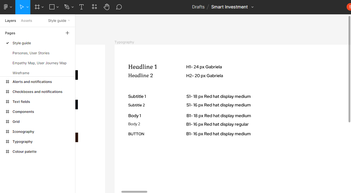
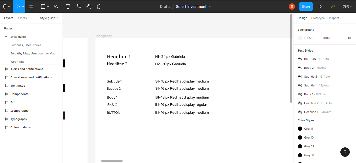
Typography: this plays a huge role in every design. Each font you choose for your designs conveys a message to your user. Typography in your designs should be legible, easy to read and understand, and visually appealing.
Your style guide should include typefaces, font sizes and font weights. Limit your design to 2-3 type faces in order for your design to look neat and professional. Remember to choose typefaces that complement each other.
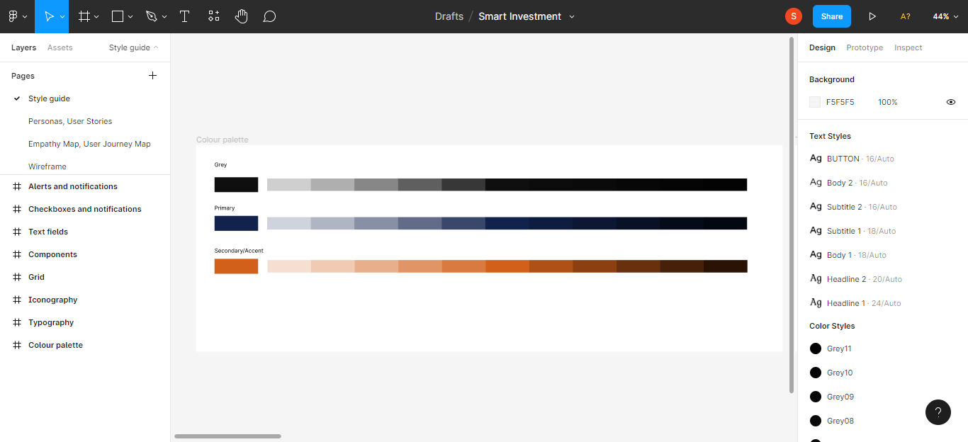
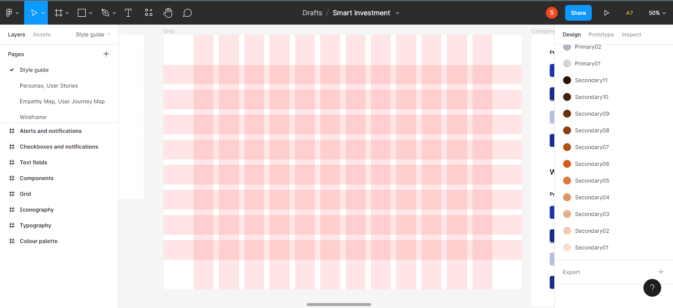
Colour palette: the right choice of colours for your designs can help determine the reaction of your audience, make them feel comfortable, and increase user satisfaction. You should have three categories of colours in your style guide: primary, secondary and neutral colours.
Primary colours are colours that are displayed frequently across all screens and elements in your design.
Secondary colours complement the primary colour(s). You can use them for micro interactions like arrows, progress bars, and even headings.
Iconography: this is the use of mostly symbols, figures, and images to convey more meaning to a user. Icons make communication easy and they are typically universal. You can choose a collection of icons that you'll use in your designs to keep them consistent.
Layout grids: a grid is a system that aligns a page based on rows and columns. Grids are indispensable in establishing consistency across all screens in a design. You cannot afford not to include a grid system in your style guide.
UI Elements: UI elements in a style guide typically includes buttons, input fields, checkboxes and alerts and notifications. Elements are essential, as a user cannot function effectively without them in your design. You should include these elements with their specific states – default, active, disabled and hover.
How to Create a Style Guide in Figma
Now we'll create a style guide from scratch in Figma, including the elements listed above.
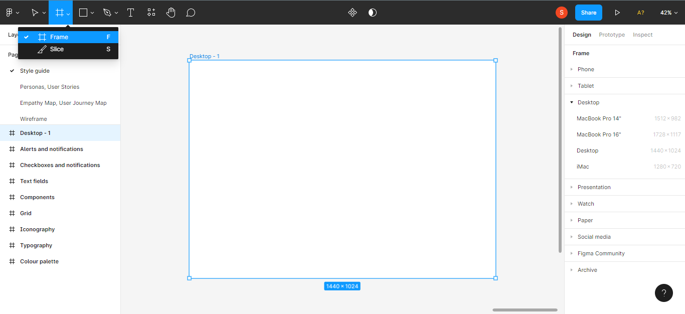
Open your Figma file and select a frame.
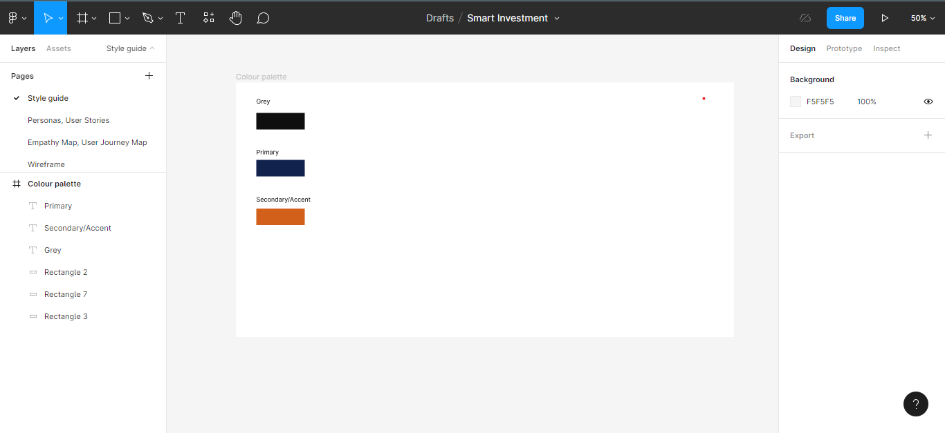
Choose a Colour Palette
Getting the right colours is very important for creating great designs. You must be able to pick colours that complement each other for your style guide.
If you don't have a specific colour palette in mind, you can try sites like colors.muz.li or coolors.co to get colour inspiration.
If you're working with a client, they may already have a colour palette in mind.
Step 1: Choose your color categories
Choose three categories of colours: a primary colour, a secondary colour, and greys (neutral).
Step 2: Generate Shades for the Colours
Now you'll need to generate shades for your colours. Generating shades for your colour palette helps cater to varied use cases. It makes it convenient for when you have to tweak the colour opacity or brightness.
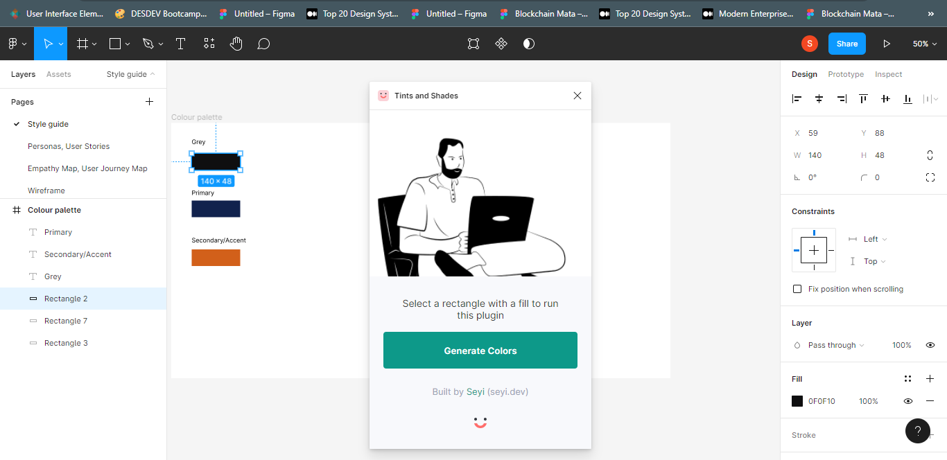
The Figma plugin Tints and Shades helps you generate colour shades.
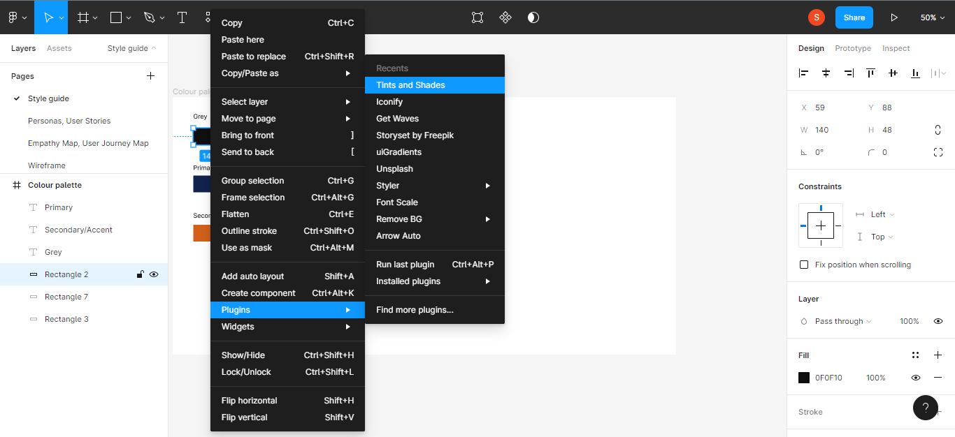
Select a colour and click on Tints and shades to generate the shades.
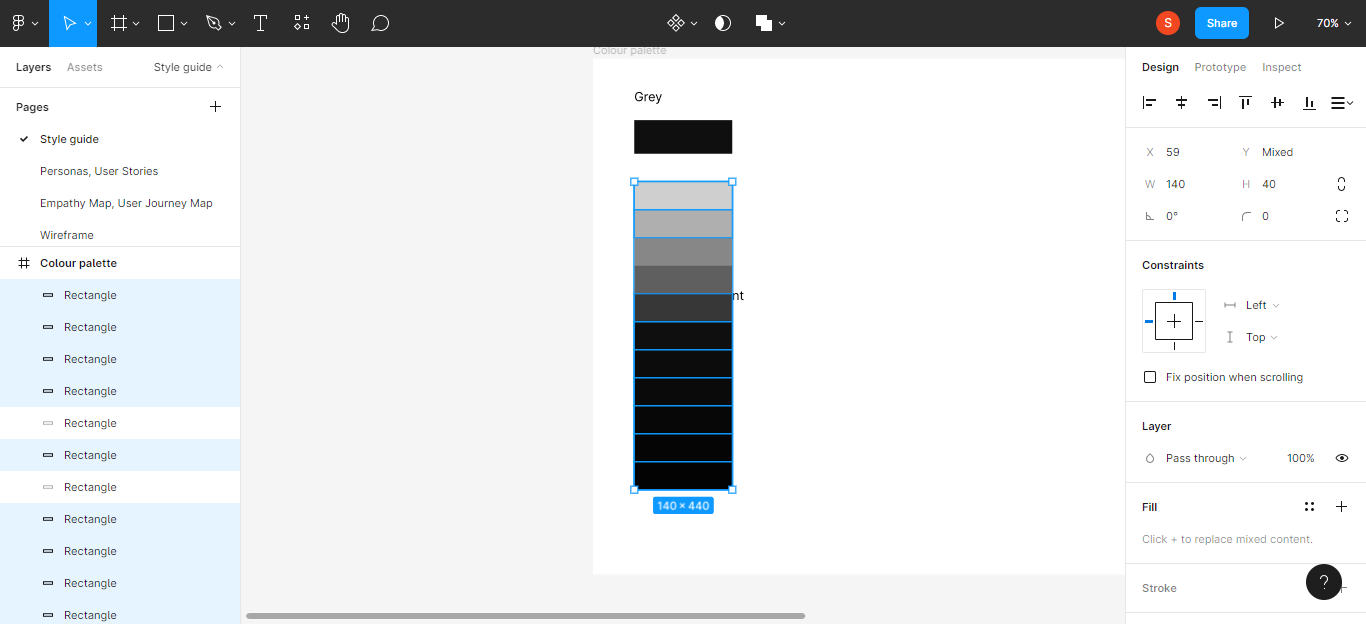
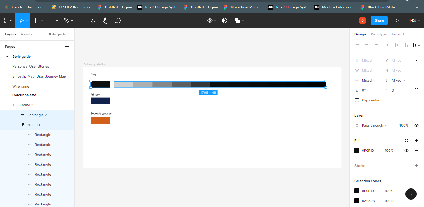
Auto layout (Shift + A) the generated shades to give them one frame, and arrange them vertically/horizontally.

Step 3: Make the colour shades into colour styles.
To make the generated colours styles, first select the frame and hit the Enter key in order to select the boxes in the frame individually.
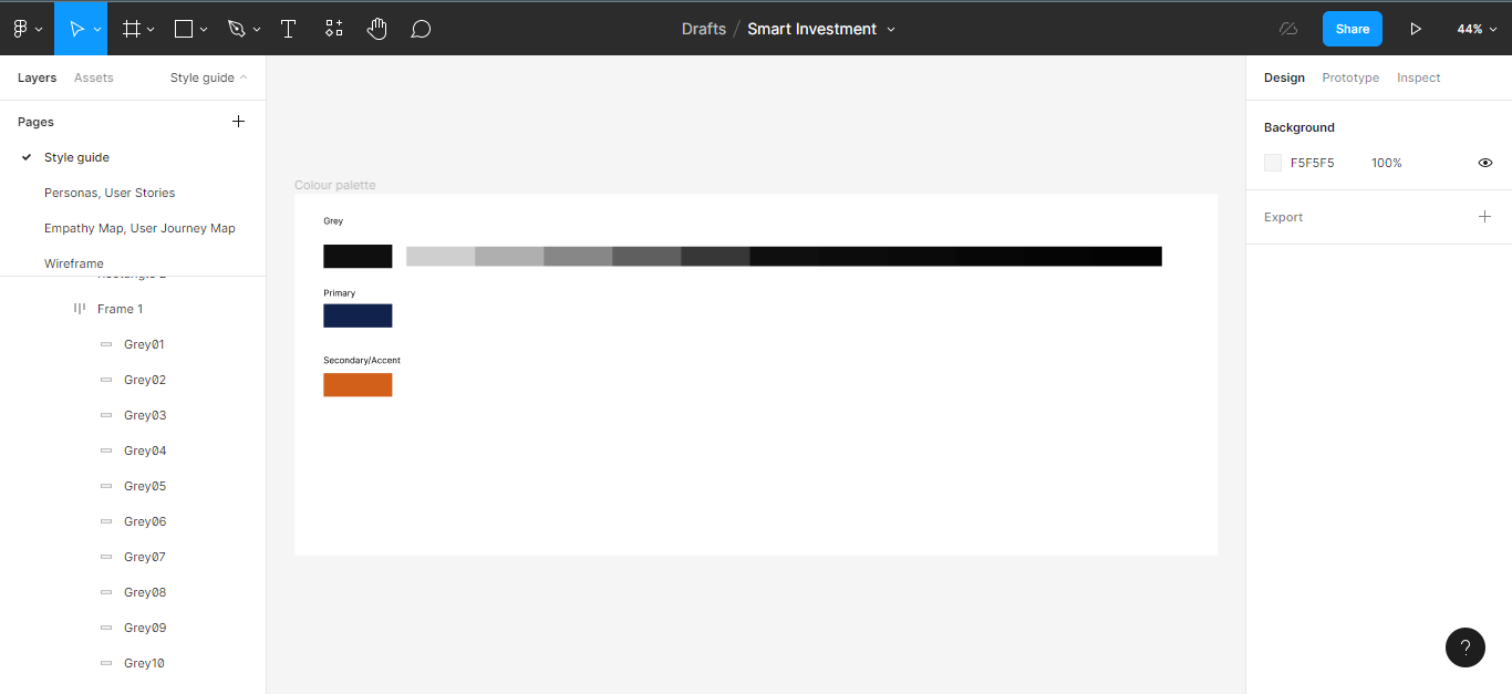
Rename the individual boxes, using the name of the colour category differentiating with numbers – for example grey 01, and so on.
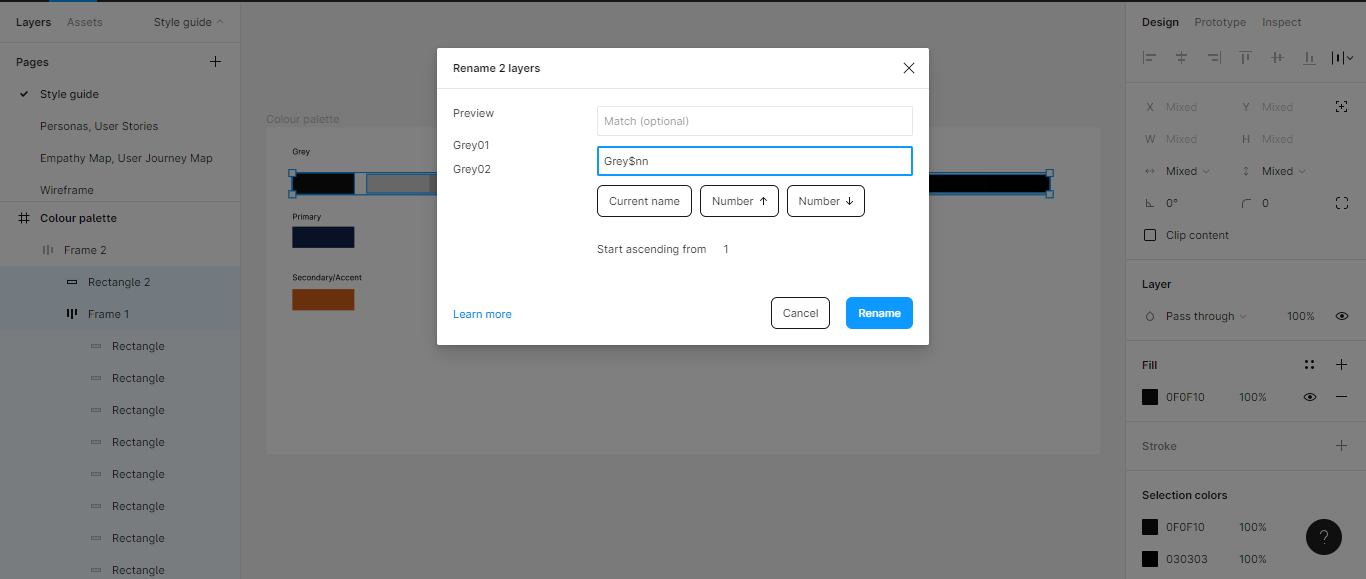
If you renamed your boxes successfully, the names will appear on the left hand side of your canvas.
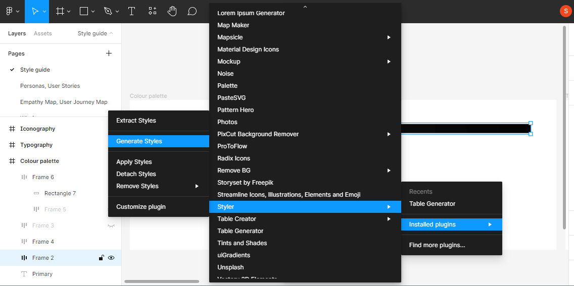
After you do this, you will need to make your colours into styles. You might use the Figma plugin Styler to style your colours. Click on the frame, selecting individual boxes using the Enter key.
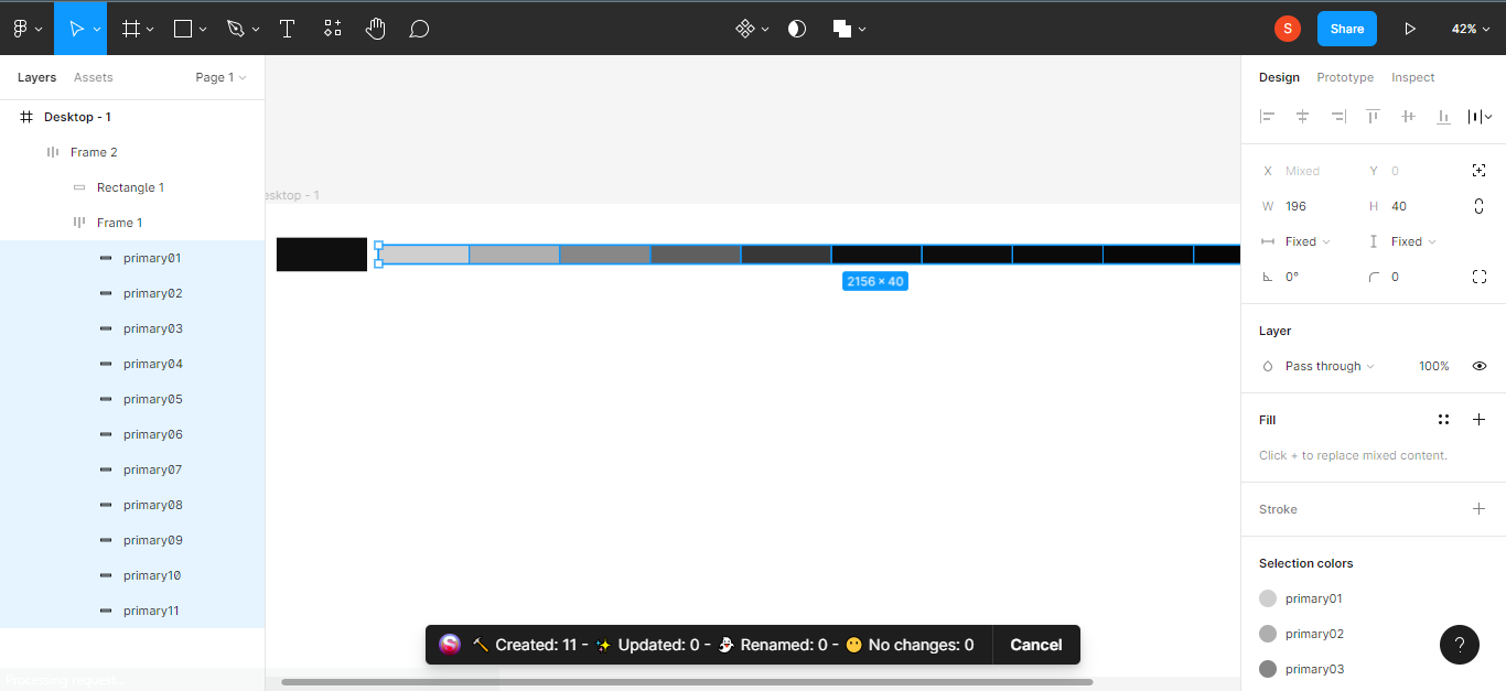
If you do this correctly, you will get a notification as you can see in the image above.
Repeat these steps for all colour categories – grey, primary, and secondary.
Choose Your Typography
Choosing the right font family, font sizes, and font weights is very important for a good style guide. If you get confused on how to generate or choose a font family, weight, and size, you can use the Material Design type scale material.io to generate type scales.
Step 1: Open a frame after choosing a font of your choice.

Step 2: Establish the page hierarchy
Decide on how many headlines, subtitles, body and captions your design might have. Remember that you can communicate hierarchy through differences in font weight (light, medium, regular), size, letter spacing, and case.
Step 3: Make your fonts styles
After choosing your font weights, size, and letter spacing, it's time to make them styles. Just like you did for your colour palette, select the fonts and use the plugin Styler to create them as styles.
NB: Choose smaller font sizes when designing for mobile (16px, 18px, and so on) and larger font sizes for web.
As you can see in the image above, your text styles will appear on the right hand side of your screen.
Choose Your Iconography
Next up, we have iconography. Icons are an essential part of our designs, as they visually express actions and objects in our interfaces. They help the designer further communicate the meaning of an action or screen, like the home icon, search icon, and more.
You can get icons from plugins like Iconify, Font Awesome, and libraries like feathericons and Google icons.
Step 1: Select a frame.
Go to the frame tool and select a frame for your iconography.
Step 2: Get all your icons
Now you'll need to get the icons you need for your design. Make sure you include different states of each icon, like filled, outline, and so on.
NB: make sure the sizes of your icons are consistent.
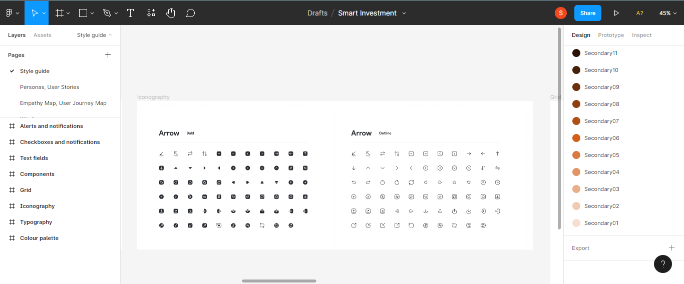
Violà! You now have your iconography. To know more about iconography, check out design system icons.
Setup Your Layout Grids
Grids are a fundamental part of any style guide as they help achieve better alignment, hierarchy, and consistency in your designs.
Setting a standard for your grid depends on whether you are designing for web or mobile – each has different standards. For example, you should use a 960 grid (12 or 16 columns) when designing for web.
First, go ahead and select a frame.
Step 1: Add a layout grid
Then get your layout grid from the left hand panel of your canvas.
Input your desired number of columns for the frame and values for the margin and gutter (that is the vertical part of the frame).
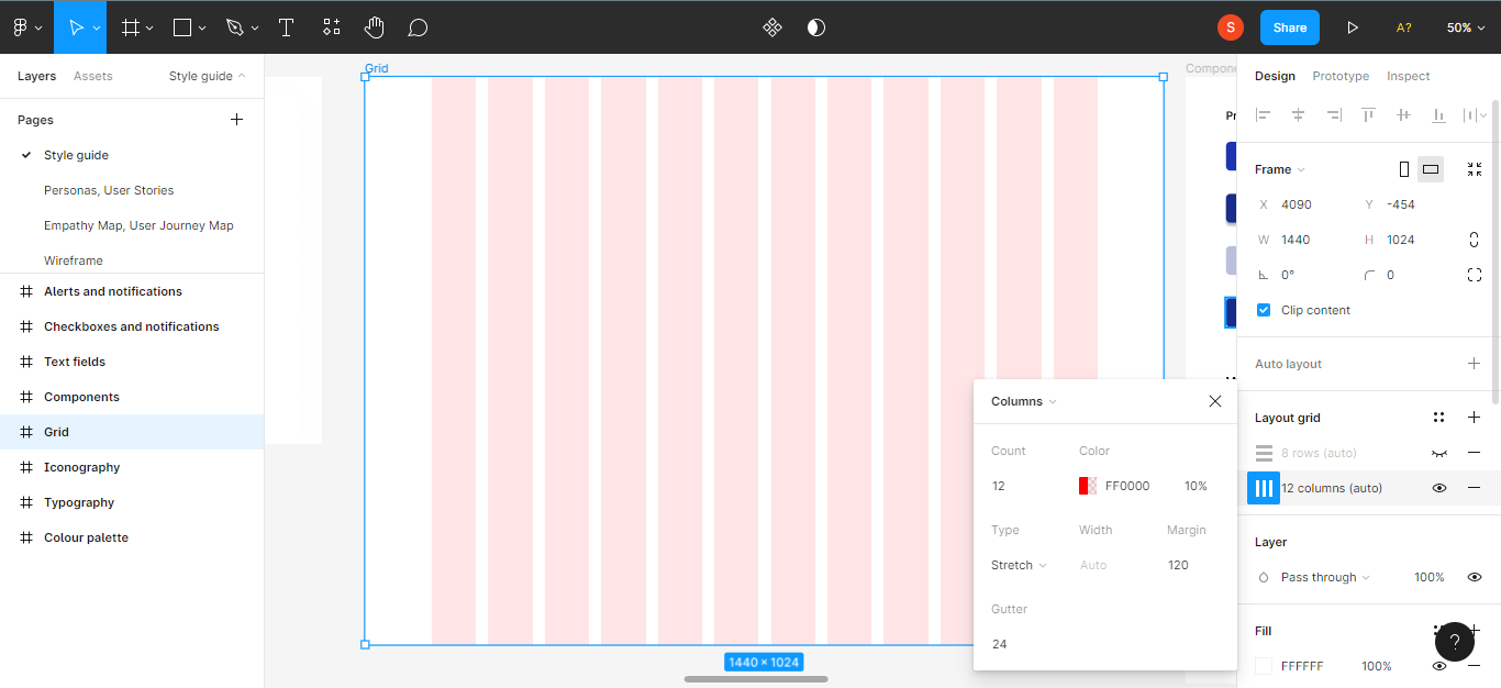
Next up, you will need to include grids for the horizontal part of the frame, or the rows. Input your desired value for rows, margins, and gutter.
Choose your components
The components you choose play an important part in your user interface. Components typically include text fields, button states, checkboxes, alerts and notifications.
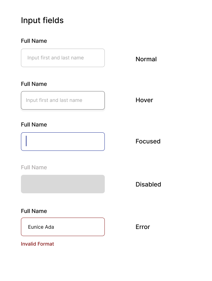
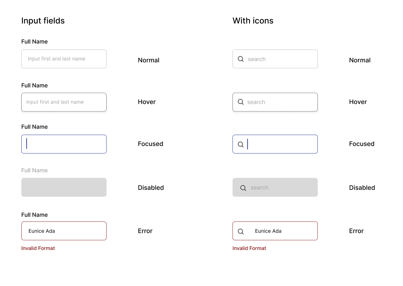
Define Your Input fields
Input fields, as the name implies, allow users to input text in a UI. And they need to be styled like everything else.
First, as always, select a frame.
Step 1: Design input fields in various states
You'll want to design each input field according to its state, like default, disabled, active, and error.
Step 2: Add icons to your input fields.
Design Your Buttons
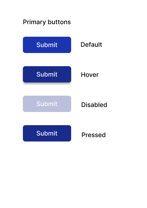
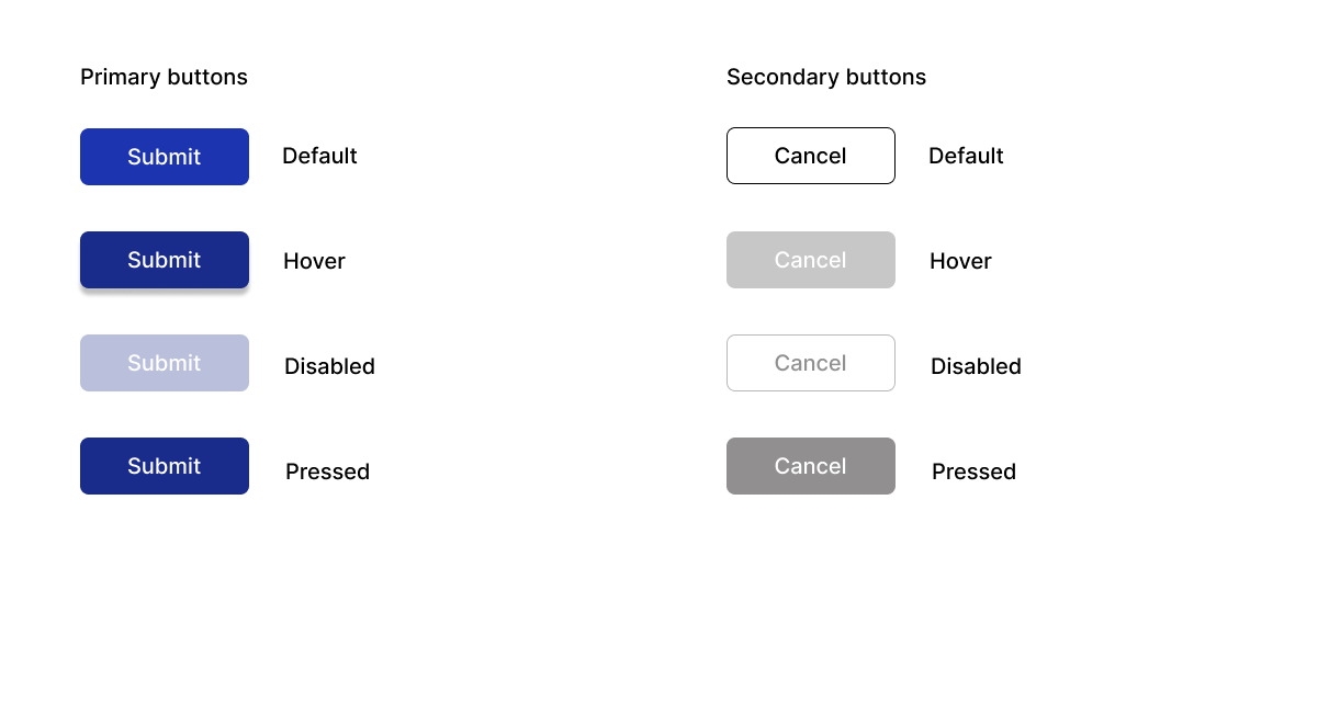
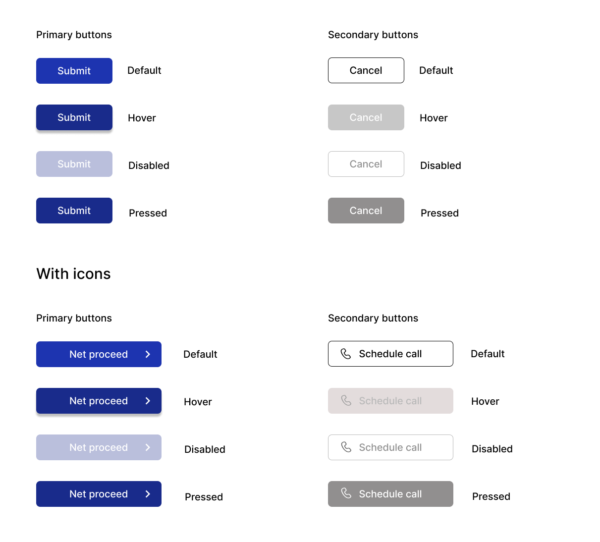
Your buttons should include primary buttons and secondary buttons in their different states, like disabled, default, hover and pressed.
Primary buttons are usually strong visual indicators to help users complete their journeys – for example 'next', 'submit', and so on. Secondary buttons are usually the alternatives to the primary actions, like 'cancel', 'back', and so on.
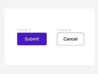
The image above shows two buttons. The button on the left is a primary button while the button on the right is a secondary button.
First, select a frame.
Step 1: Design the primary button
First you'll want to design a primary button in its various states: default, hover, pressed and disabled.
Step 2: Design the secondary button
Then you'll design a secondary button in its various states: default, hover, pressed and disabled.
Step 3: Check buttons with icons
You might want to check how the various buttons would look like with icons. Add icons to your primary and secondary buttons in all their states.
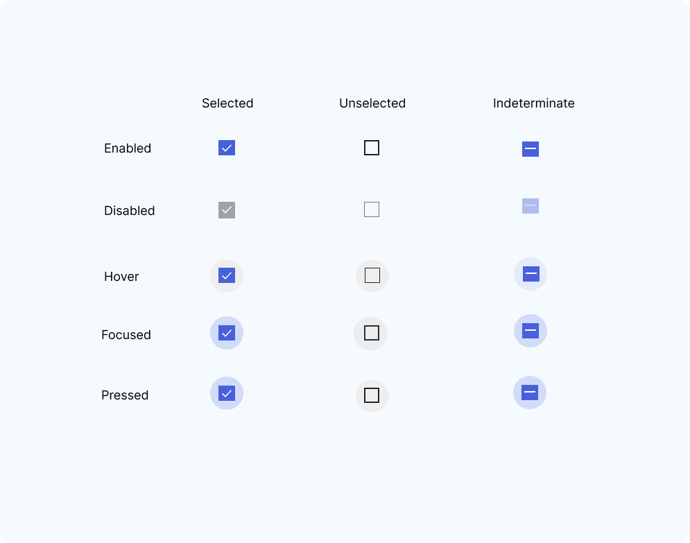
Checkboxes
You'll use checkboxes mostly when users might need to select more than one option from a list – that is, each checkbox is independent of the others in the list/form.
First, select a frame.
Step 2: Design your checkboxes
You'll want to include various states like enabled, disabled, hover, focused and pressed states.
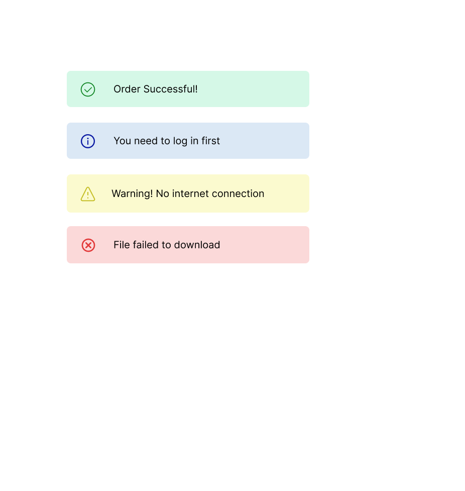
Alerts and notifications
With real time alerts, users can get notifications of reminders, errors, successes and so on. This reduces the risk of hacking, incorrect input, and loss of important information.
First, select a frame.
Step 1: Design notification and alerts
When you design your alerts, make sure to use the correct icons for warning, error, success and success states.
Live Style Guide Examples
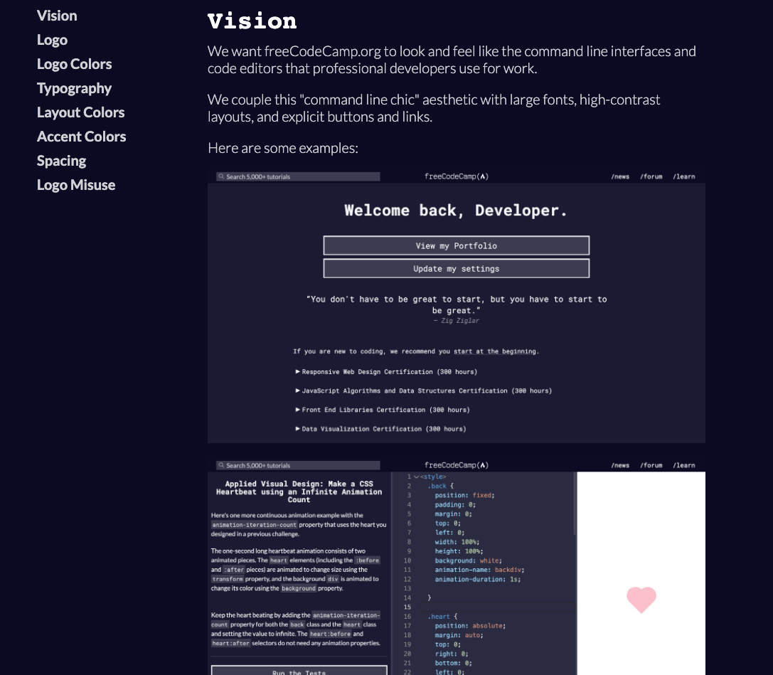
Here is Mozilla's style guide:
Here is freeCodeCamp's live style guide:
 freeCodeCamp's Design Style Guide
Conclusion
Creating a style guide is a fundamental step in product development for any organisation. And as a UI/UX designer, this is something you cannot avoid.
Remember that your style guide isn't fixed and that you can make updates at any point in time. Practice till you get it just the way you want it.