By Veronika Rovnik
Hi folks!
Python, data visualization, and programming are the topics I'm profoundly devoted to. That’s why I’d like to share with you my ideas as well as my enthusiasm for discovering new ways to present data in a meaningful way.
The case I'm going to cover is quite common: you have data on the back end of your app and want to give it shape on the front end. If such a situation sounds familiar to you, then this tutorial may come in handy.
After you complete it, you’ll have a Django-powered app with interactive pivot tables & charts.
Prerequisites
To confidently walk through the steps, you need a basic knowledge of the Django framework and a bit of creativity. ✨
To follow along, you can download the GitHub sample.
Here's a brief list of tools we’re going to use:
- Python 3.7.4
- Django
- Virtualenv
- Flexmonster Pivot Table & Charts (JavaScript library)
- SQLite
If you have already set up a Django project and feel confident about the basic flow of creating apps, you can jump straight to the Connecting data to Flexmonster section that explains how to add data visualization components to it.
Let's start!
Getting started with Django
First things first, let’s make sure you’ve installed Django on your machine. The rule of thumb is to install it in your previously set up virtual environment - a powerful tool to isolate your projects from one another.
Also, make sure you’ve activated in a newly-created directory. Open your console and bootstrap a Django project with this command:
django-admin startproject analytics_project
Now there’s a new directory called analytics_project. Let’s check if we did everything right. Go to analytics_project and start the server with a console command:
python manage.py runserver
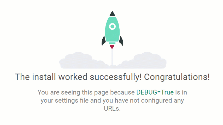
Open http://127.0.0.1:8000/ in your browser. If you see this awesome rocket, then everything is fine:
Next, create a new app in your project. Let’s name it dashboard:
python manage.py startapp dashboard
Here's a tip: if you're not sure about the difference between the concepts of apps and projects in Django, take some time to learn about it to have a clear picture of how Django projects are organized.
Here we go. Now we see a new directory within the project. It contains the following files:
__init__.py to make Python treat it as a package
admin.py - settings for the Django admin pages
apps.py - settings for app’s configs
models.py - classes that will be converted to database tables by the Django’s ORM
tests.py - test classes
views.py - functions & classes that define how the data is displayed in the templates
Afterward, it’s necessary to register the app in the project.
Go to analytics_project/settings.py and append the app's name to the INSTALLED_APPS list:
INSTALLED_APPS = [
    'django.contrib.admin',
    'django.contrib.auth',
    'django.contrib.contenttypes',
    'django.contrib.sessions',
    'django.contrib.messages',
    'django.contrib.staticfiles',
    'dashboard',
]
Now our project is aware of the app’s existence.
Views
In the dashboard/views.py, we’ll create a function that directs a user to the specific templates defined in the dashboard/templates folder. Views can contain classes as well.
Here’s how we define it:
from django.http import JsonResponse
from django.shortcuts import render
from dashboard.models import Order
from django.core import serializers

def dashboard_with_pivot(request):
    return render(request, 'dashboard_with_pivot.html', {})
Once called, this function will render dashboard_with_pivot.html - a template we'll define soon. It will contain the pivot table and pivot charts components.
A few more words about this function. Its request argument, an instance of HttpRequestObject, contains information about the request, e.g., the used HTTP method (GET or POST). The method render searches for HTML templates in a templates directory located inside the app’s directory.
We also need to create an auxiliary method that sends the response with data to the pivot table on the app's front-end. Let's call it pivot_data:
def pivot_data(request):
    dataset = Order.objects.all()
    data = serializers.serialize('json', dataset)
    return JsonResponse(data, safe=False)
Likely, your IDE is telling you that it can’t find a reference Order in models.py. No problem - we’ll deal with it later.
Templates
For now, we’ll take advantage of the Django template system.
Let's create a new directory templates inside dashboard and create the first HTML template called dashboard_with_pivot.html. It will be displayed to the user upon request. Here we also add the scripts and containers for data visualization components:
<head>
  <meta charset="UTF-8">
  <title>Dashboard with Flexmonster</title>
  <script src="https://cdn.flexmonster.com/flexmonster.js"></script>
  <script src="https://code.jquery.com/jquery-3.3.1.min.js"></script>
  <link rel="stylesheet" href="https://cdn.flexmonster.com/demo.css">
</head>
<body>
<div id="pivot-table-container" data-url="{% url 'pivot_data' %}"></div>
<div id="pivot-chart-container"></div>
</body>
Mapping views functions to URLs
To call the views and display rendered HTML templates to the user, we need to map the views to the corresponding URLs.
Here's a tip: one of Django's URL design principles says about loose coupling, we shouldn't make URLs with the same names as Python functions.
Go to analytics_app/urls.py and add relevant configurations for the dashboard app at the project's level.
from django.contrib import admin
from django.urls import path, include

urlpatterns = [
    path('admin/', admin.site.urls),
    path('dashboard/', include('dashboard.urls')),
]
Now the URLs from the dashboard app can be accessed but only if they are prefixed by dashboard.
After, go to dashboard/urls.py (create this file if it doesn’t exist) and add a list of URL patterns that are mapped to the view functions:
from django.urls import path
from . import views

urlpatterns = [
    path('', views.dashboard_with_pivot, name='dashboard_with_pivot'),
    path('data', views.pivot_data, name='pivot_data'),
]
Model
And, at last, we've gotten to data modeling. This is my favorite part.
As you might know, a data model is a conceptual representation of the data stored in a database.
Since the purpose of this tutorial is to show how to build interactive data visualization inside the app, we won’t be worrying much about the database choice. We’ll be using SQLite - a lightweight database that ships with the Django web development server.
But keep in mind that this database is not the appropriate choice for production development. With the Django ORM, you can use other databases that use the SQL language, such as PostgreSQL or MySQL.
For the sake of simplicity, our model will consist of one class. You can create more classes and define relationships between them, complex or simple ones.
Imagine we're designing a dashboard for the sales department. So, let's create an Order class and define its attributes in dashboard/models.py:
from django.db import models


class Order(models.Model):
    product_category = models.CharField(max_length=20)
    payment_method = models.CharField(max_length=50)
    shipping_cost = models.CharField(max_length=50)
    unit_price = models.DecimalField(max_digits=5, decimal_places=2)
Working with a database
Now we need to create a database and populate it with records.
But how can we translate our model class into a database table?
This is where the concept of migration comes in handy. Migration is simply a file that describes which changes must be applied to the database. Every time we need to create a database based on the model described by Python classes, we use migration.
The data may come as Python objects, dictionaries, or lists. This time we'll represent the entities from the database using Python classes that are located in the models directory.
Create migration for the app with one command:
python manage.py makemigrations dashboard
Here we specified that the app should tell Django to apply migrations for the dashboard app's models.
After creating a migration file, apply migrations described in it and create a database:
python manage.py migrate dashboard
If you see a new file db.sqlite3 in the project's directory, we are ready to work with the database.
Let's create instances of our Order class. For this, we'll use the Django shell - it's similar to the Python shell but allows accessing the database and creating new entries.
So, start the Django shell:
python manage.py shell
And write the following code in the interactive console:
from dashboard.models import Order

>>> o1 = Order(
... product_category='Books',
... payment_method='Credit Card',
... shipping_cost=39,
... unit_price=59
... )
>>> o1.save()
Similarly, you can create and save as many objects as you need.
Connecting data to Flexmonster
And here's what I promised to explain.
Let's figure out how to pass the data from your model to the data visualization tool on the front end.
To make the back end and Flexmonster communicate, we can follow two different approaches:
- Using the request-response cycle. We can use Python and the Django template engine to write JavaScript code directly in the template.
- Using an async request (AJAX) that returns the data in JSON.
In my mind, the second one is the most convenient because of a number of reasons. First of all, Flexmonster understands JSON. To be precise, it can accept an array of JSON objects as input data. Another benefit of using async requests is the better page loading speed and more maintainable code.
Let's see how it works.
Go to the templates/dashboard_pivot.html.
Here we've created two div containers where the pivot grid and pivot charts will be rendered.
Within the ajax call, we make a request based on the URL contained in the data-URL property. Then we tell the ajax request that we expect a JSON object to be returned (defined by dataType).
Once the request is completed, the JSON response returned by our server is set to the data parameter, and the pivot table, filled with this data, is rendered.
The query result (the instance of JSONResponse) returns a string that contains an array object with extra meta information, so we should add a tiny function for data processing on the front end. It will extract only those nested objects we need and put them into a single array. This is because Flexmonster accepts an array of JSON objects without nested levels.
function processData(dataset) {
    var result = []
    dataset = JSON.parse(dataset);
    dataset.forEach(item => result.push(item.fields));
    return result;
}
After processing the data, the component receives it in the right format and performs all the hard work of data visualization. A huge plus is that there’s no need to group or aggregate the values of objects manually.
Here's how the entire script in the template looks:
function processData(dataset) {
    var result = []
    dataset = JSON.parse(dataset);
    dataset.forEach(item => result.push(item.fields));
    return result;
}
$.ajax({
    url: $("#pivot-table-container").attr("data-url"),
    dataType: 'json',
    success: function(data) {
        new Flexmonster({
            container: "#pivot-table-container",
            componentFolder: "https://cdn.flexmonster.com/",
            width: "100%",
            height: 430,
            toolbar: true,
            report: {
                dataSource: {
                    type: "json",
                    data: processData(data)
                },
                slice: {}
            }
        });
        new Flexmonster({
            container: "#pivot-chart-container",
            componentFolder: "https://cdn.flexmonster.com/",
            width: "100%",
            height: 430,
            //toolbar: true,
            report: {
                dataSource: {
                    type: "json",
                    data: processData(data)
                },
                slice: {},
                "options": {
                    "viewType": "charts",
                    "chart": {
                        "type": "pie"
                    }
                }
            }
        });
    }
});
Don't forget to enclose this JavaScript code in <script> tags.
Phew! We’re nearly there with this app.
Fields customization
Flexmonster provides a special property of the data source that allows setting field data types, custom captions, and defining multi-level hierarchies.
This is a nice feature to have - we can elegantly separate data and its presentation right in the report's configuration.
Add it to the dataSource property of the report:
mapping: {
    "product_category": {
        "caption": "Product Category",
        "type": "string"
    },
    "payment_method": {
        "caption": "Payment Method",
        "type": "string"
    },
    "shipping_cost": {
        "caption": "Shipping Cost",
        "type": "number"
    },
    "unit_price": {
        "caption": "Unit Price",
        "type": "number"
    }
}
Dashboard's design
To make the dashboard, we’ve rendered two instances of Flexmonster (you can create as many as you want, depending on the data visualization goals you want to reach). One is for the pivot table with summarized data, and the other is for the pivot charts.
Both instances share the same data source from our model. I encourage you to try making them work in sync: with the [reportchange](https://www.flexmonster.com/api/reportchange/?r=fr5) event, you can make one instance react to the changes in another one.
You can also redefine the ‘Export’ button’s functionality on the Toolbar to make it save your reports to the server.
Results
Let’s start the Django development server and open http://127.0.0.1:8000/dashboard/ to see the resulting dashboard:
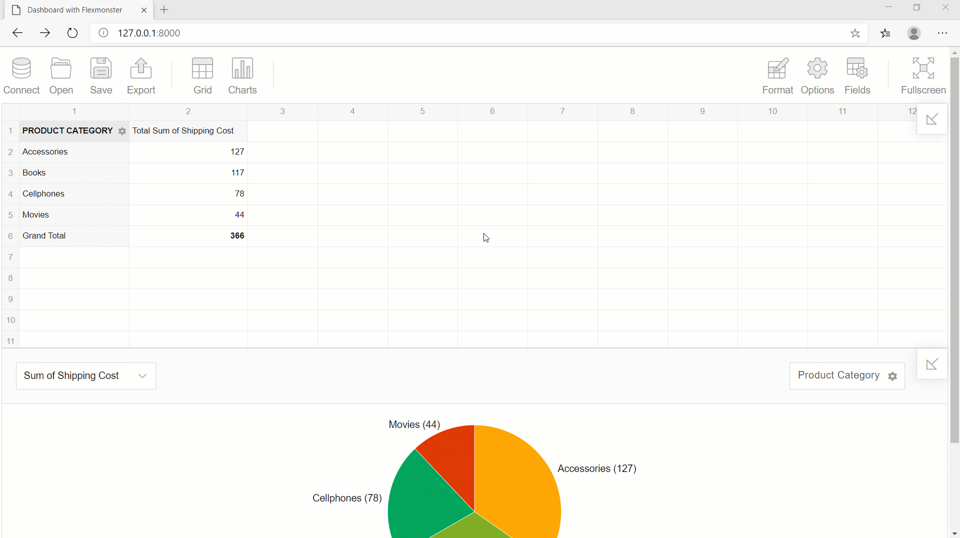
Looks nice, doesn't it?
Feedback
This time we learned how to create a simple Django app and display the data on the client side in the form of an analytics dashboard.
I do hope you enjoyed the tutorial!
Please leave your comments below - any feedback on the code’s improvement is highly appreciated.
References
The source code for the tutorial can be found on GitHub.
And here’s the project with Flexmonster & Django integration that inspired me for this tutorial.
Further, I recommend walking through important concepts in the documentation to master Django: