

Designers are always searching for tools that help ease their workflow and create innovative solutions for their users. This ranges from components, style guides, and design systems, to plugins and extensions.
In this article, we're going to look at components as features which can help boost your efficiency as a designer. I'll show you how to create an interactive button component using Figma.
Table of Contents
- Prerequisites
- What are Components?
– Button components - How to Create an Interactive Button Component in Figma
– Build the button component
– How to create variants
– How to create hover and active states
– How to create other button states
– How to group buttons by states
– How to make the button components interactive - Conclusion
Prerequisites:
To get the most out of this article, it'll be helpful to have basic knowledge of how to use Figma and its features. But note that this is not necessary, as I wrote this article for everyone – irrespective of their individual level of knowledge.
This article is for everyone who is interested in learning more about components, reusable elements, Figma, and design in general.
What are Components?
Components are reusable design elements that you can use multiple times within a project or across different projects.
Components are interactive building blocks for creating a user interface. They can be organized into categories based on their purpose: Action, containment, communication, navigation, selection, and text input. – Material Design 3
Components can range from simple elements like buttons or icons to more complex structures like navigation bars or entire UI modules. They help maintain consistency and uniformity in a design, they are scalable, and they're very helpful for collaboration.
Button Components
Buttons, sometimes called CTAs, are elements which allow a user to carry out a specific action like signing up, buying a product, subscribing to a newsletter, and so on. They come in different formats and sizes, and are very important elements in design.
Button components typically consist of visual attributes such as shape, size, color, and typography to convey their functionality and encourage user interaction. They can vary in style and appearance based on the design system, brand guidelines, or the context of their usage within an application or website.
How to Create an Interactive Button Component in Figma
Next, we're going to create an interactive button component in Figma. This button component will contain text only buttons, buttons with icons on either the left or right side of the text, and buttons with icons only.
The button component will contain different button states (default, hover, and active), and will be interactive.
This is very helpful for when you're designing interfaces with different use cases. For instance, you could want a button in your design to carry text and an accompanying icon, for a particular screen. In another screen, you might want to use an icon only button. If you have already created these different components, you'll save a lot of time.
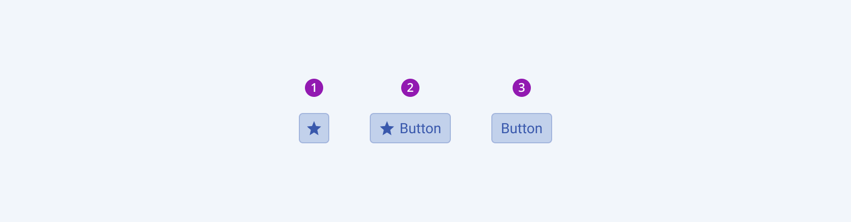 _Different button types (Icon only, Icon & text, text only). Image from Telerik_
Let's get started!
Build the Button Component
Open a new Figma file. If you don't have a Figma account, go ahead and create one at figma.com.
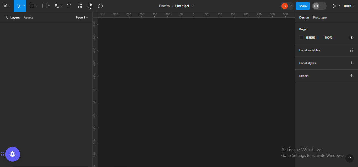 Opening a new Figma file
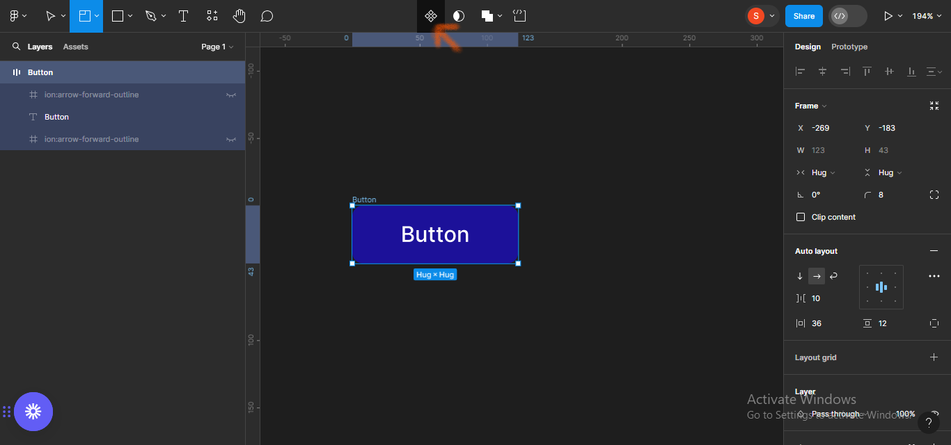
Next, click on the Text icon on the left hand panel, and type Button.
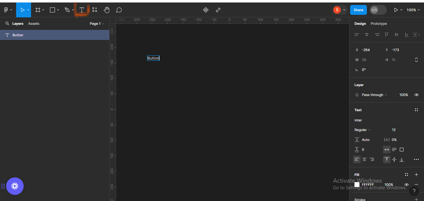 Typing "button" in the search bar.
Next, add auto-layout (Shift + A).
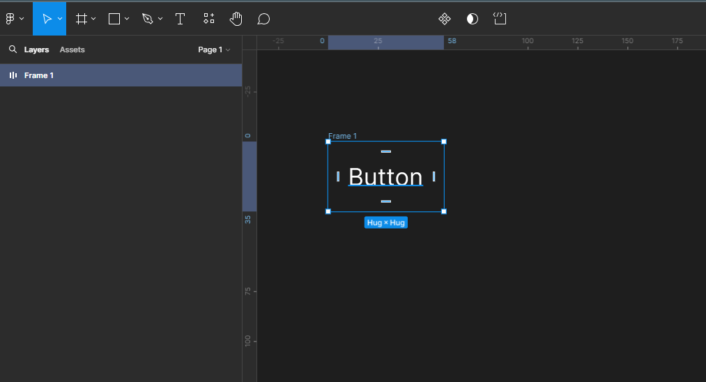 Adding auto-layout
Make the horizontal button padding to be 36px and the vertical padding 12px.
 Adding horizontal and vertical padding
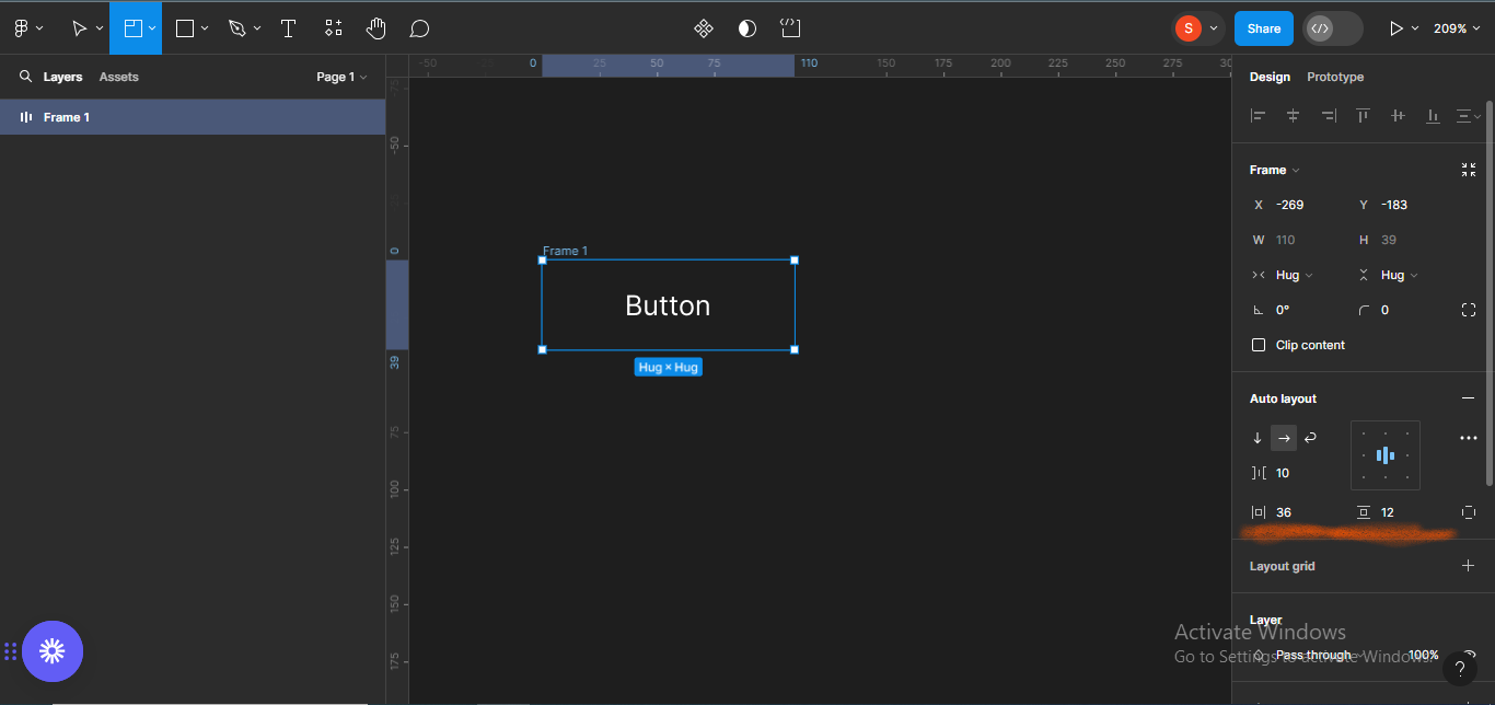
Also, give the button a border radius of 8px.
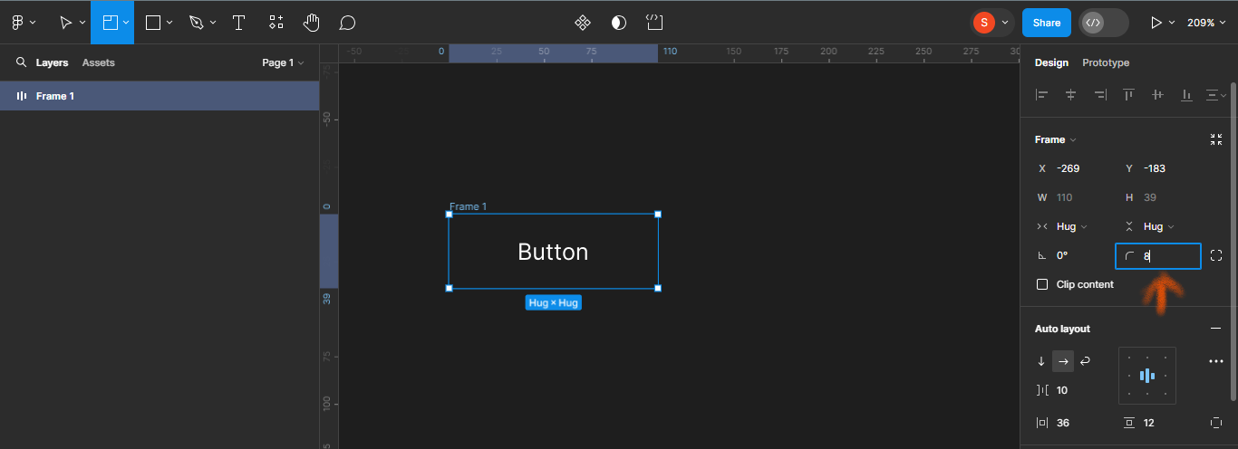 Adding a border radius.
Add a fill to the button.
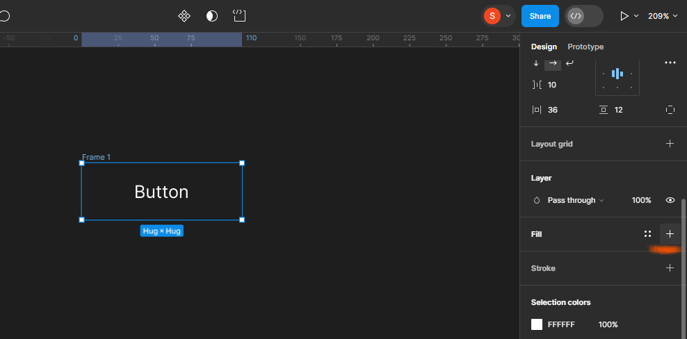 Moving to the "fill" section.
I'll choose the color code #1C199, which is a shade of blue.
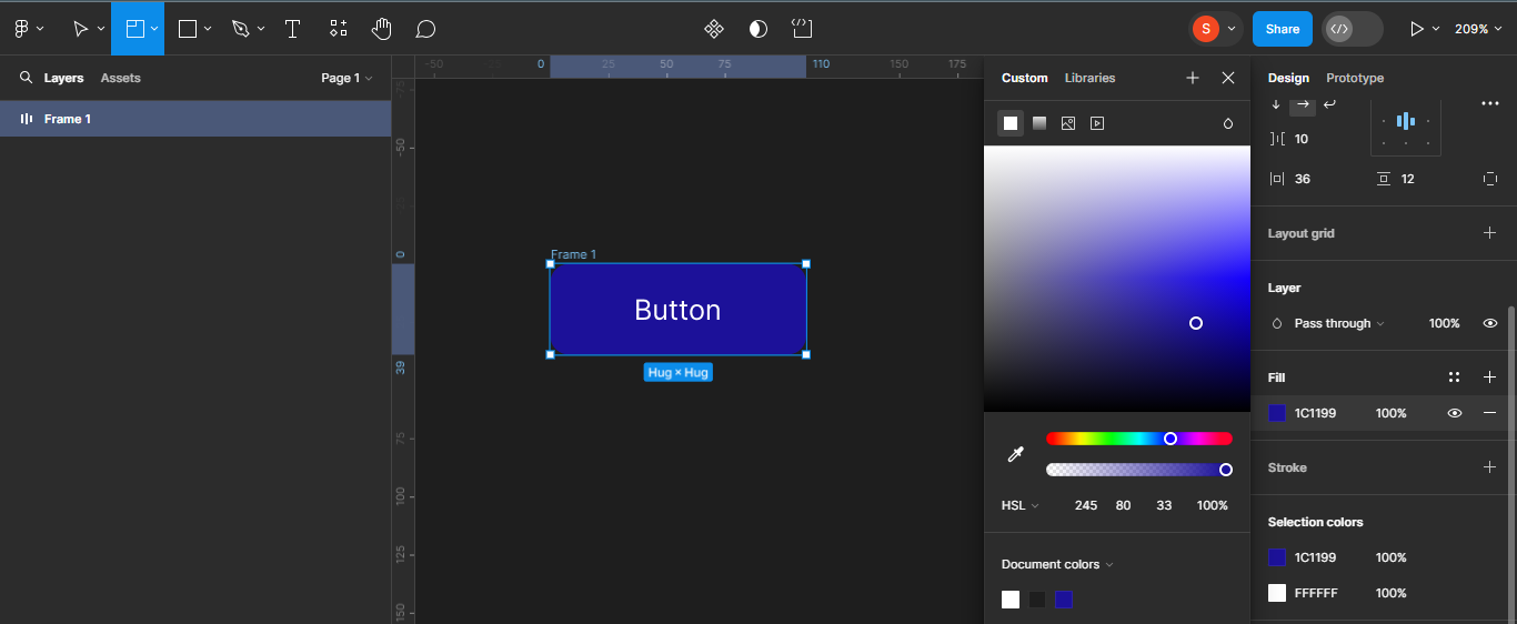 Choosing a color code.
Next, I'll make the text a little bit bolder. To do that, click on the text, and move to the font section on your right panel.
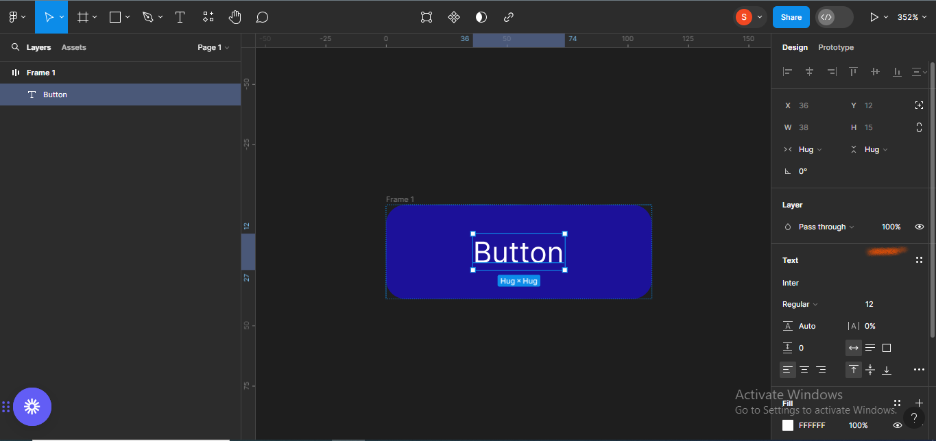 Moving to the font section.
I'll give the button a font size of 16px, and make the weight "medium".
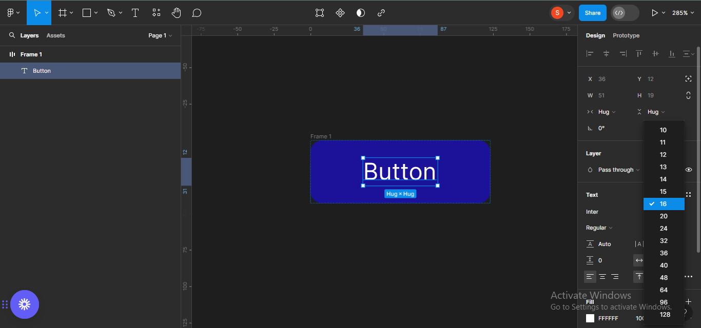 Changing the font size to 16 px
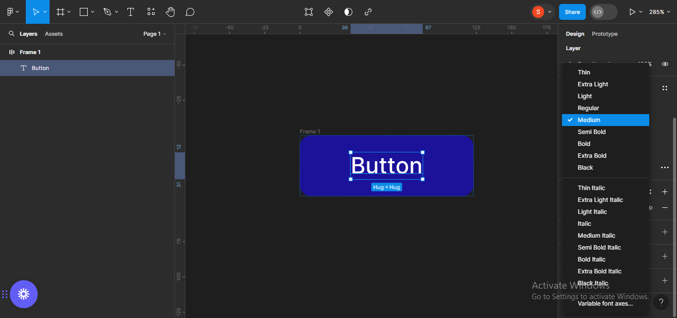 Changing the font weight to medium.
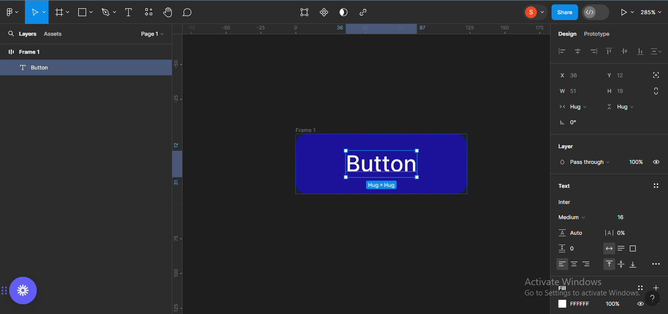 Showing the edited text
Next, I'll add any icon of my choice to the button frame. This will enable me easily create a button component with icons, and not just text when the time comes.
To add an icon, I'll use a Figma plugin called Iconify, which is one of the largest icon collections in Figma. To do this, right-click on your canva and a menu will pop-up. Go to the Plugins tab.
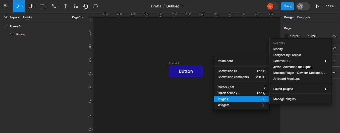 Opening Plugins
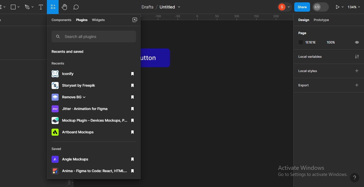
A list of the recent plugins you have used will pop-up. You'll also see all the Saved plugins you have. The first plugin on my list is Iconify (that's because I use it a lot, lol). Now, I'll just click on Iconify and search for the particular icon I want to use.
If you have never used a plugin before, and so there are no plugins on your list, you can use the resources section to search for your plugin of choice and save it to your list.
 Going to the resources section
 Searching for plugins
I want to use the forward arrow icon, so I'll just search for that using the search field on the plugin.
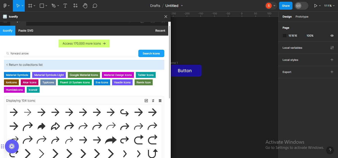 Searching for the forward arrow icon.
A lot of forward arrow icons from different collections will pop-up so, I'll just choose any particular one that works best for me, in this case, a forward arrow icon from IonIcons.
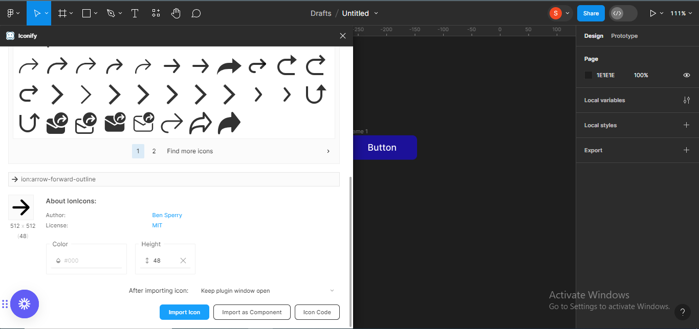 Selecting a particular forward arrow icon
I'll select the icon and click on the Import icon button so it can appear on my Figma file.
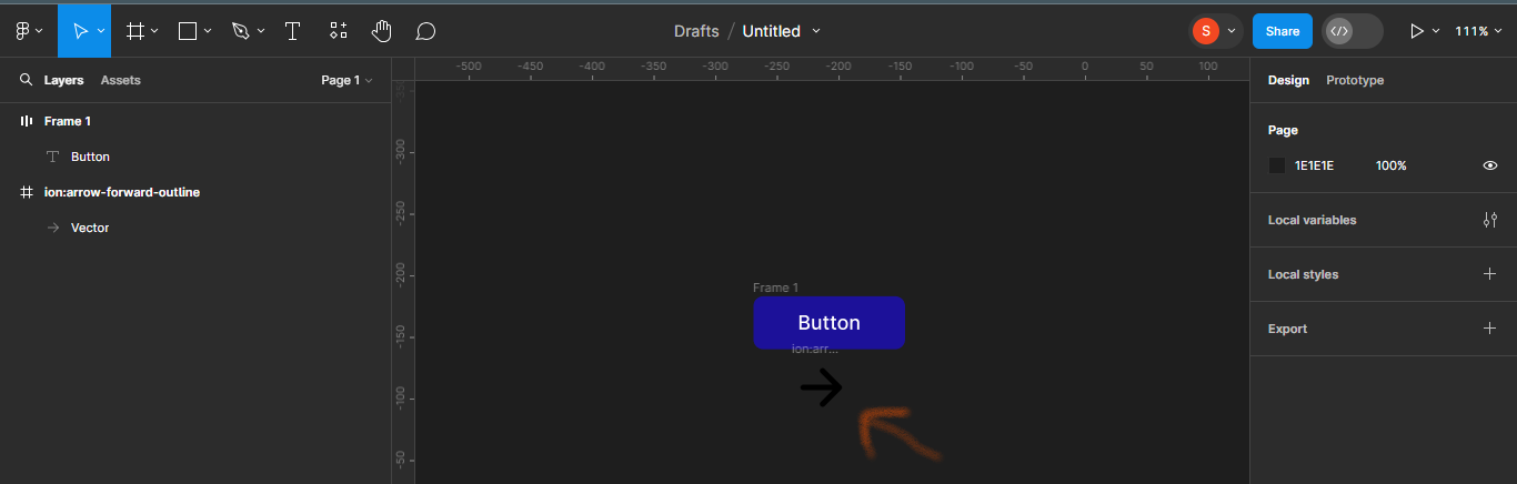 Importing the icon to your file
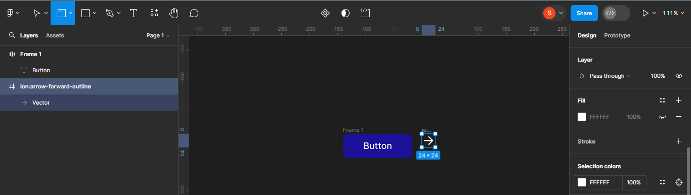
Next, we'll reduce the size of the icon to whatever height and width we want it to be. It's currently on 48 x 48 and I want it to be 24 x 24.
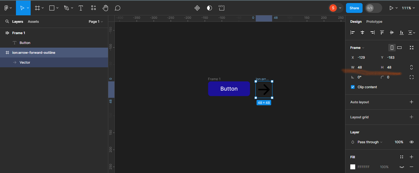 Icon size currently 48x48
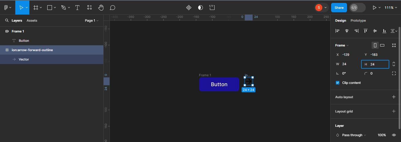 Changing icon size to 24x24
We'll also change the colour of the icon to match the text colour (white). To do this, make sure the icon is selected and then scroll down to Selection colours to input the color code, which in this case is #FFFFFF.
 Changing icon colour to white (#FFFFFF)
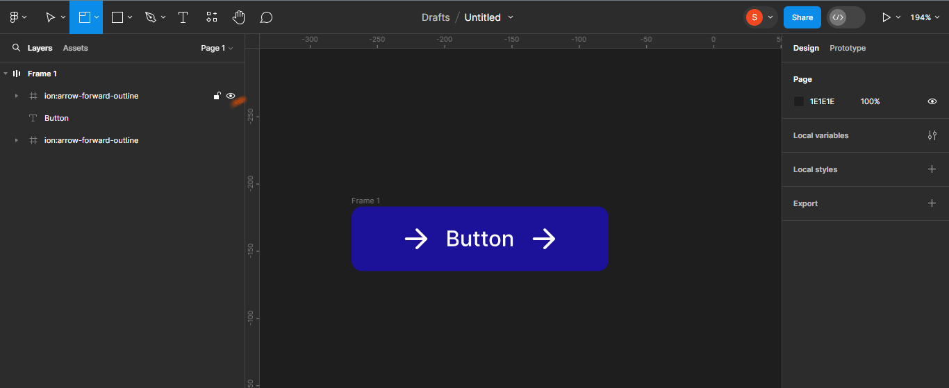
Next, we'll add the icon inside the button frame. To do this, just drag your icon inside the frame.
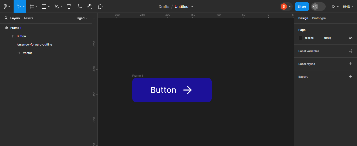 Dragging arrow icon into the button frame
You'll notice that the frame size increases to accommodate the icon added.
Next, duplicate the icon and move it to the other side of the text. Duplicating the icon will help us easily create button components with icons on either sides of the text later.
To do this, simply use Ctrl + D, and move the duplicated icon to the other side.
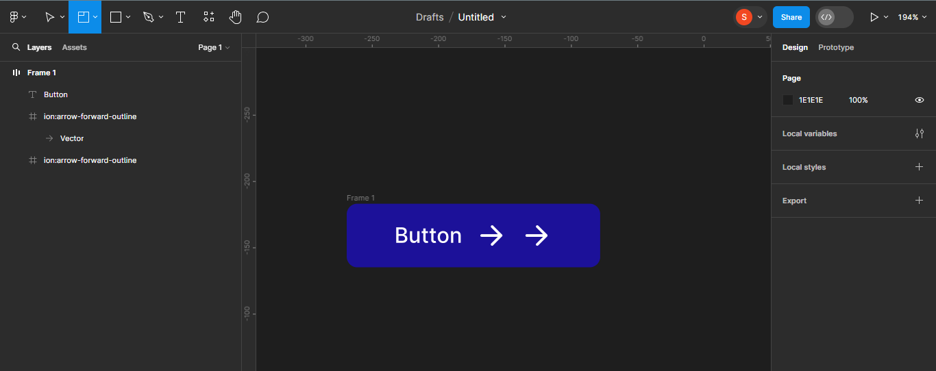 Using Ctrl + D to duplicate an icon
 Moving the duplicated icon to the other side of the frame.
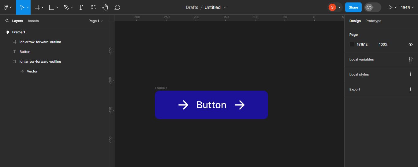
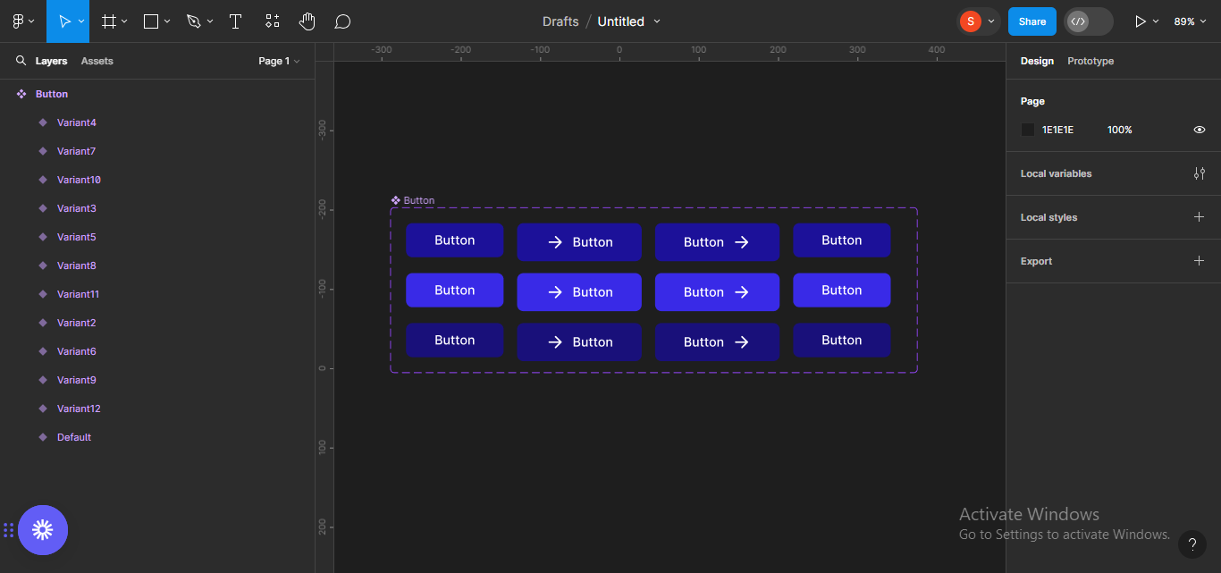
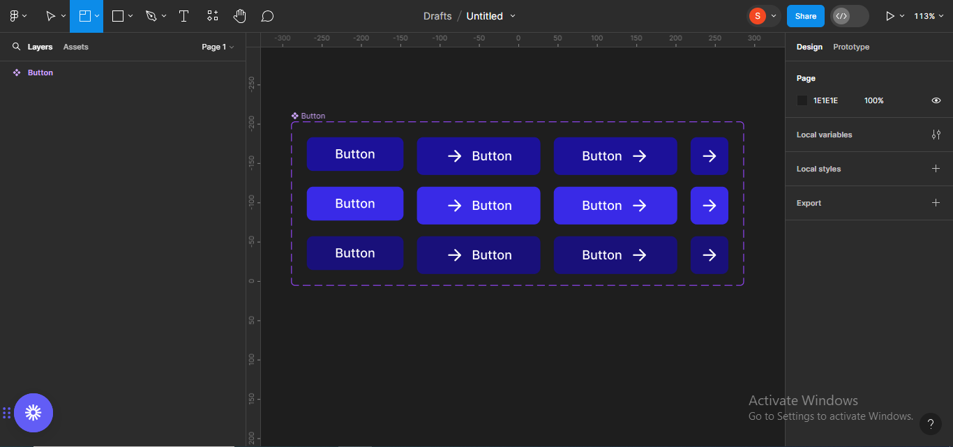
Next, I'll hide both icons because I want to create my first button component (text only button). I'll rename the frame to Button.
To hide both icons, move to the layers panel on your left, and click on the eye icon by the side of the assets you want to hide.
 Moving to the layers panel to hide the icons
You'll notice that the frame resizes automatically once both icons are hidden.
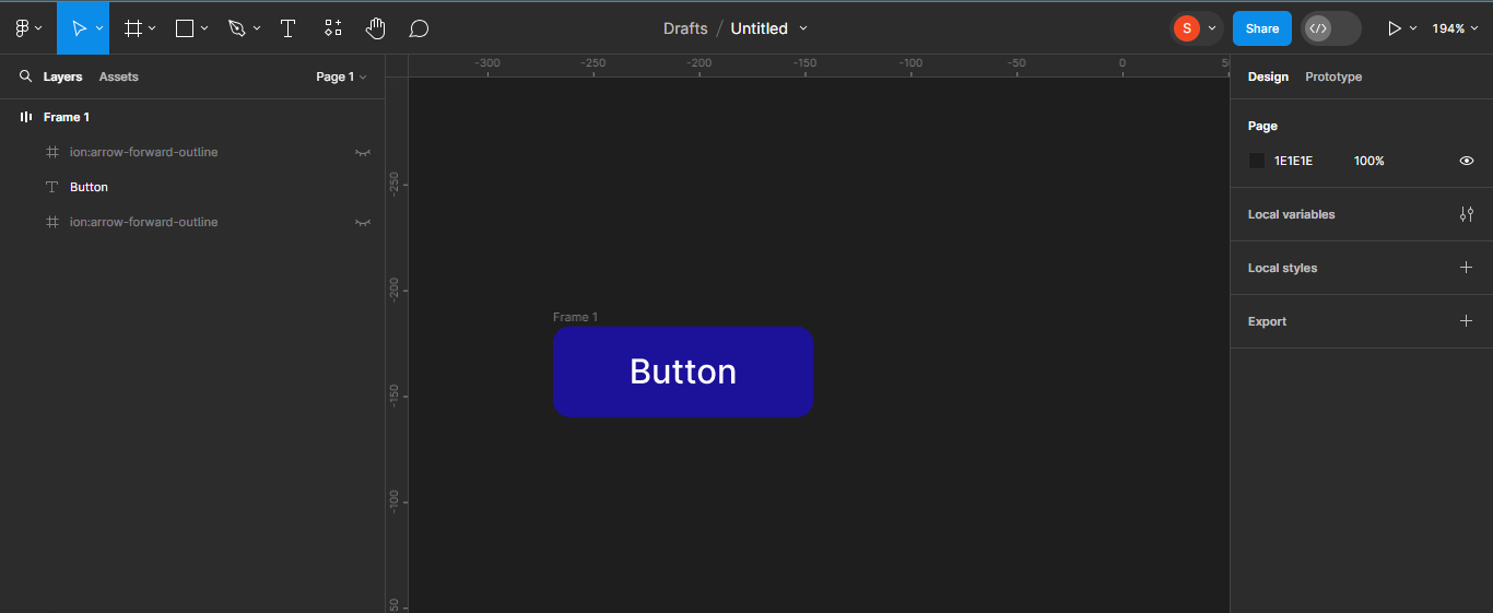 Button frame with hidden icons
I'll then rename the frame to Button. To do that, double click on the heading of the frame, and rename.
 Double-clicking the frame
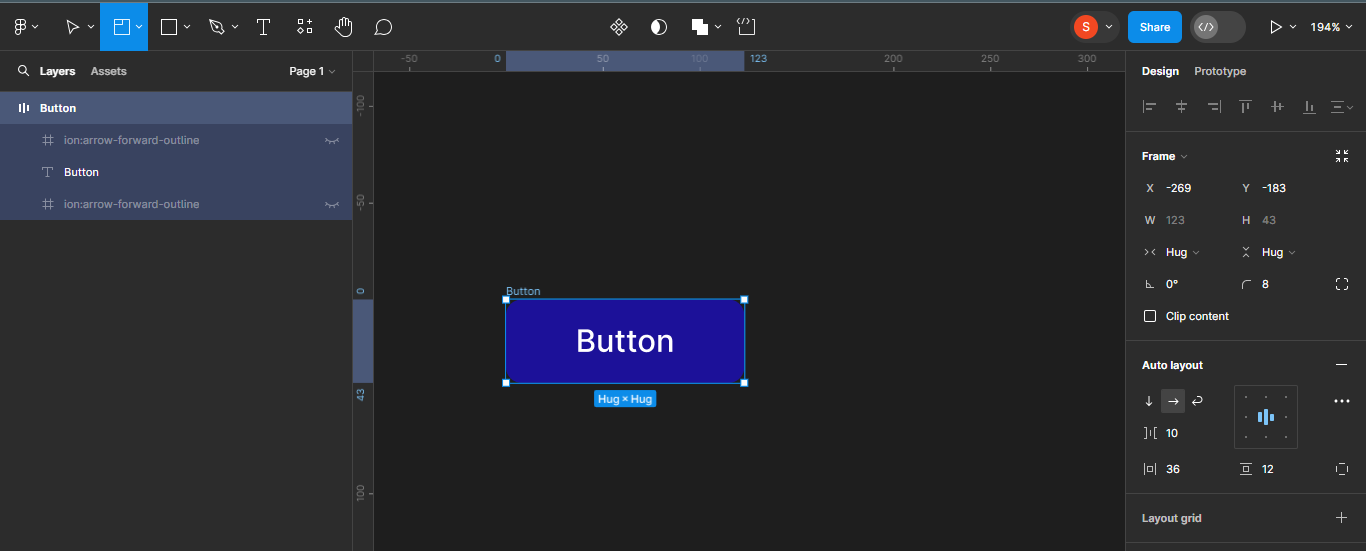 Renamed button frame
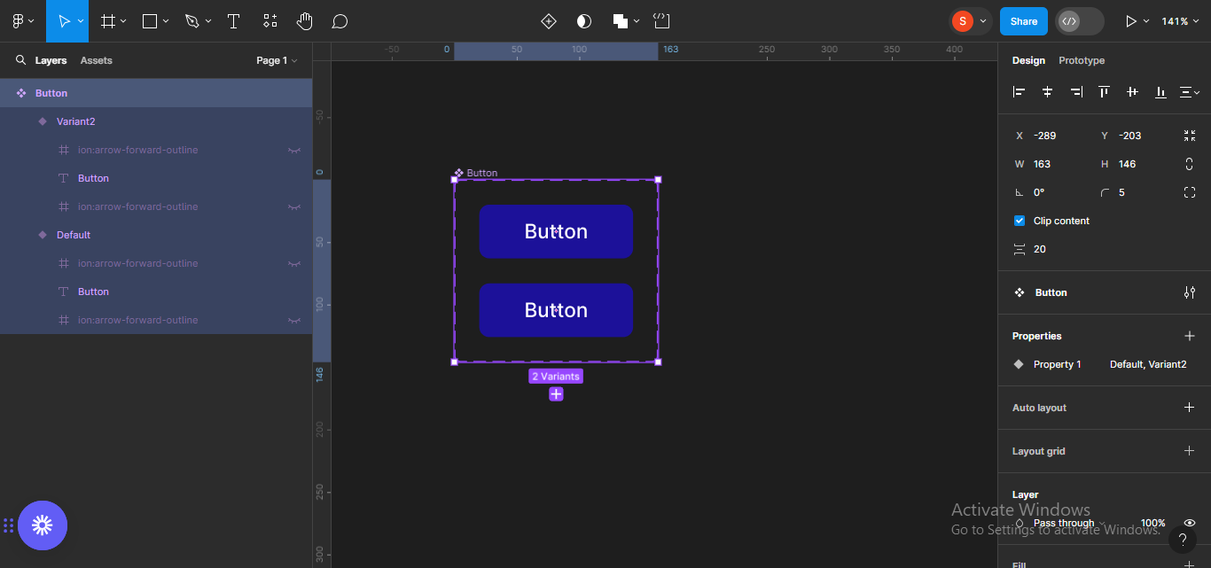
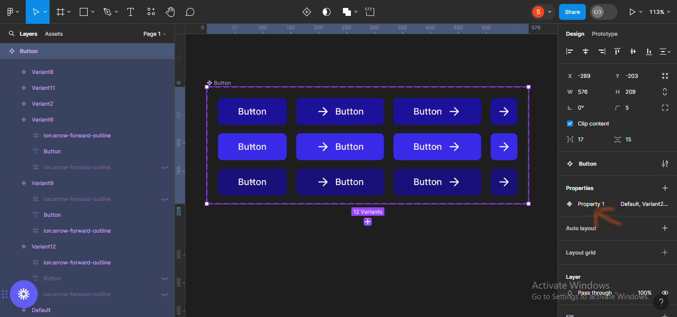
How to Create Variants
Next, we'll make the button frame a variant.
Variants help you create multiple versions or states of a component. They're very useful when designing interfaces that have different states or variations, such as buttons with different sizes or designs, like we're creating here.
To make the button frame a variant, double-click on the component icon at the top of your screen.
 Moving to the component icon at the top of the screen and double-clicking
 Variant of the button component
Next, I'll add another variant because I want to have three states for the button (Default, Hover, and Active). To add another variant, click on the plus icon on any of the already existing variants.
 Clicking on the olus icon on a variant to add nother variant
Automatically, a new variant will be added.
 Added third variant
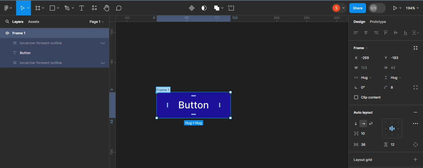
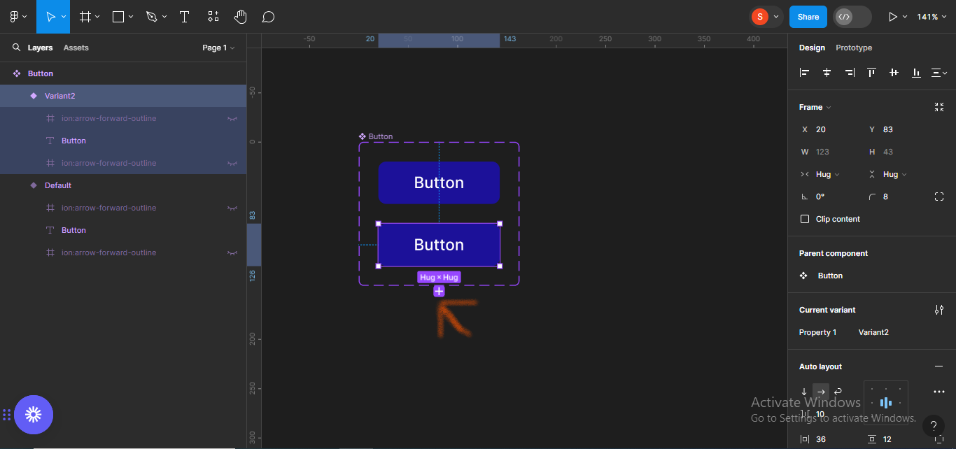
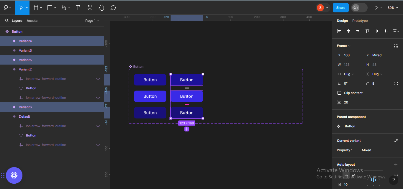
Next, I'll increase the size of the component frame so it can accommodate other variants that will be added. To do this, simply select the whole component, and drag to your satisfied size.
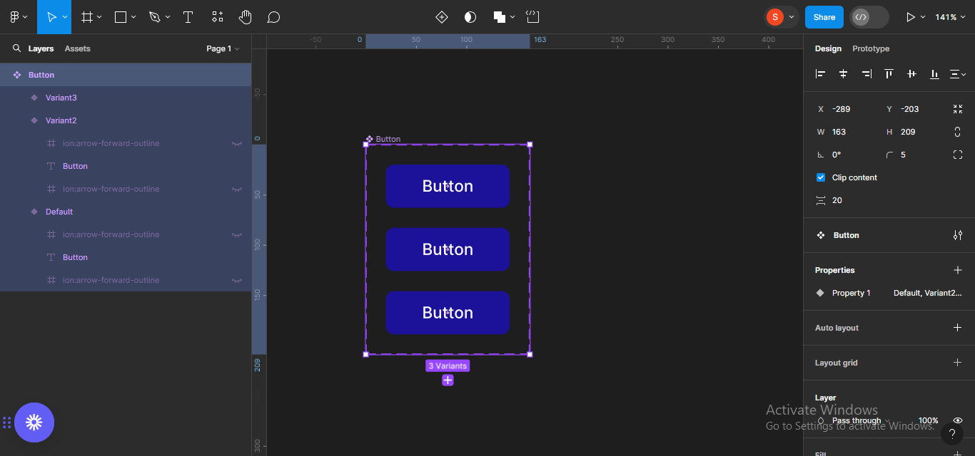 Selecting the component frame
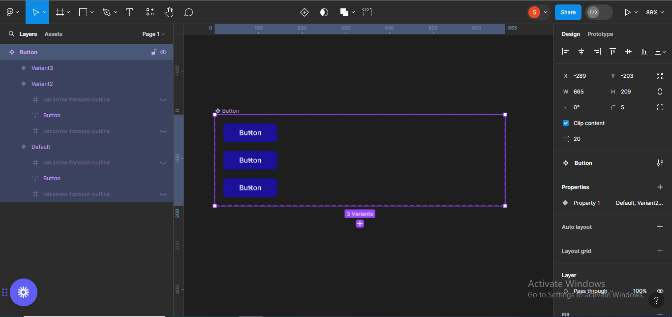 Increasing the width of the component frame.
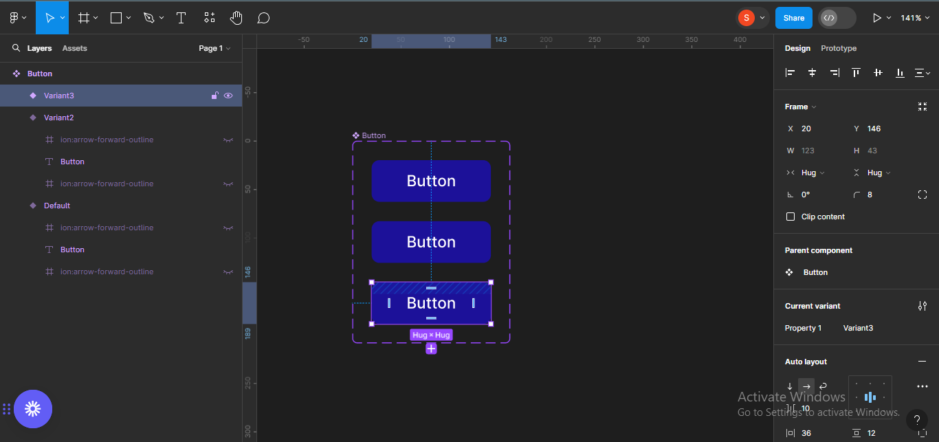
How to Create Hover and Active States
Next, I'll tweak the last two buttons (hover and active states), so the difference between the three button states will be obvious. To do this, I'll make the hover state lighter, and the active state darker.
For the hover state, I'll change the color code to #392AE7, which is a lighter shade of blue. Make sure the particular button is selected so the changes take effect:
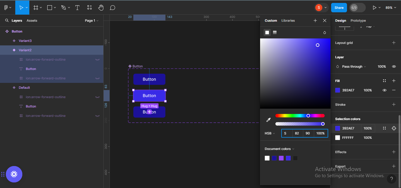 Changing color code for the hover state
For the active state, I'll change the color code to #19107A which is a slightly darker shade of blue.
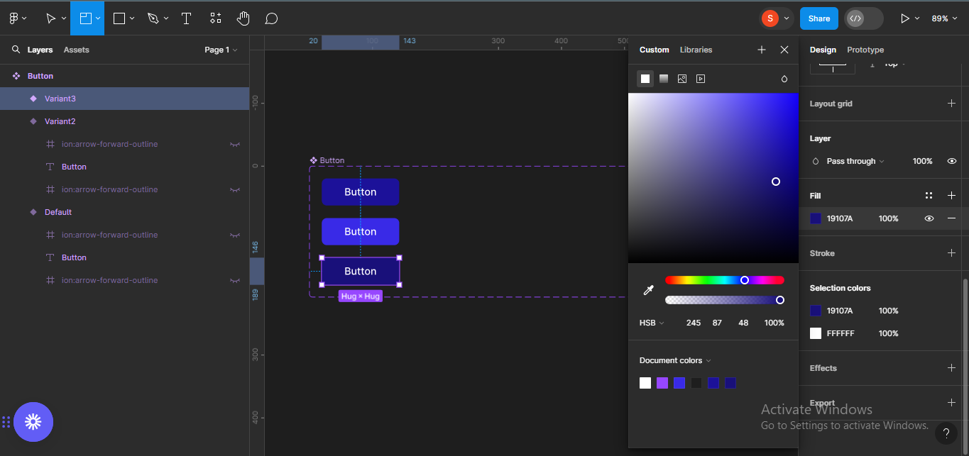 Changing the color code of the active state
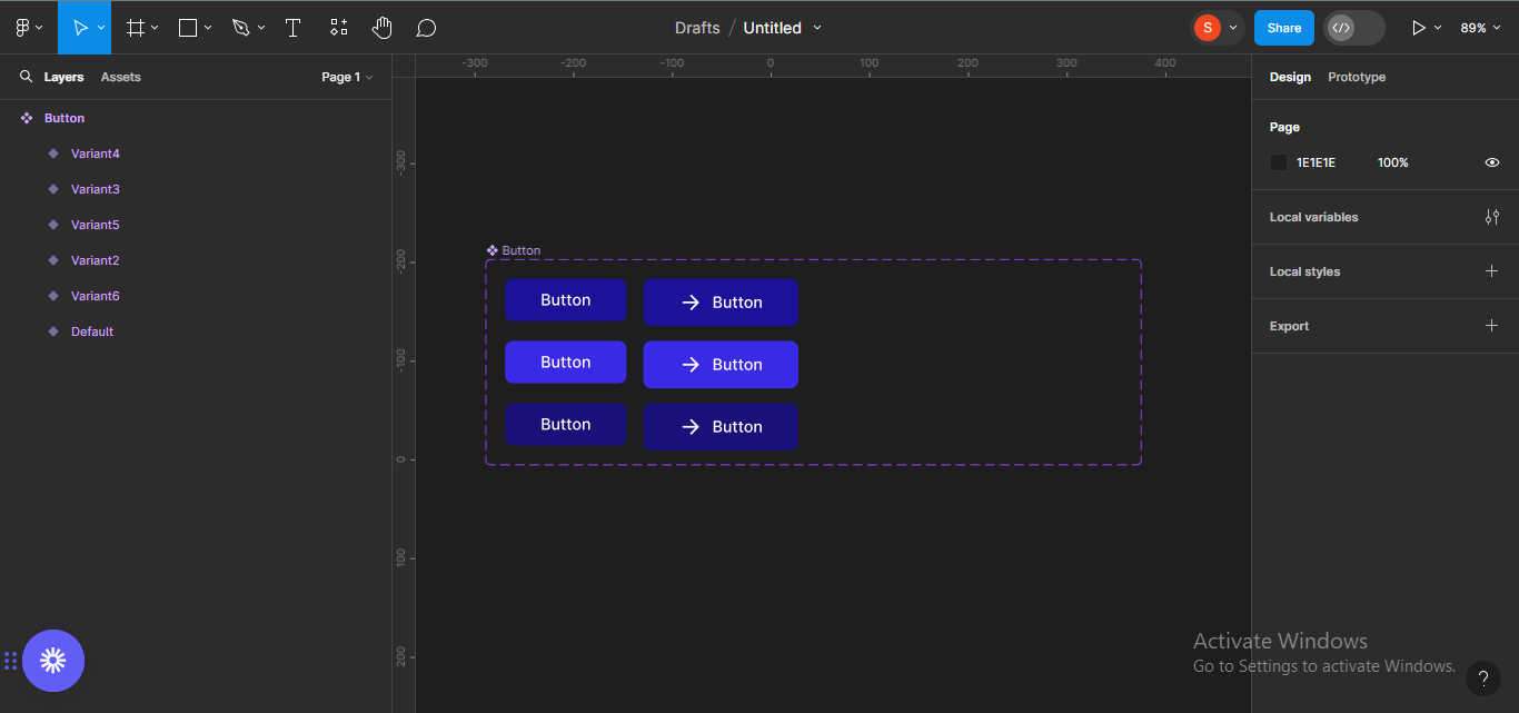
How to Create Other Button States
Next, we want to create other button states (buttons with icons on either side of the text, and with icons only).
To start with, I'll duplicate the three buttons. To do this, select the three buttons and duplicate using Ctrl + D.
 Duplicating the three buttons
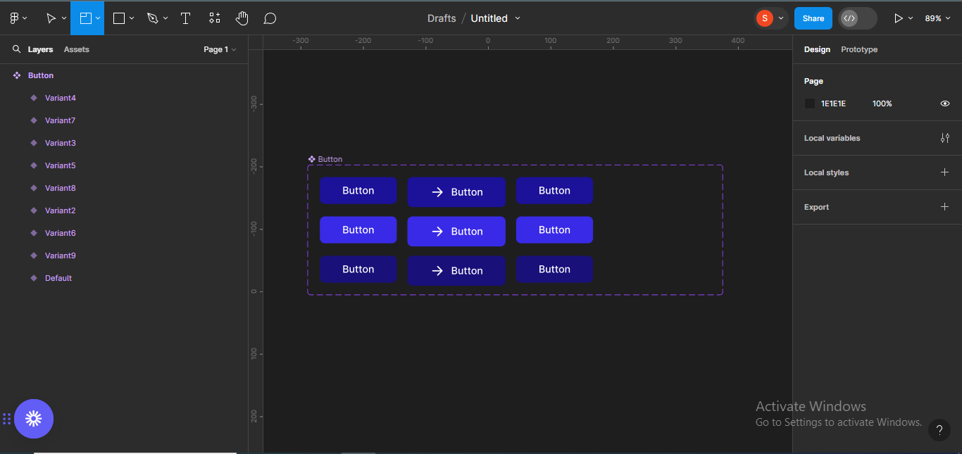
Next, we want to create button components with text and a left icon. To do this, click on the eye on the left icons on each of the icons to reveal them.
 Revealing the icons on the left side of the buttons
Next, we want to create button components with text and a right icon.
To do this, duplicate the buttons again, and do the same for the right icons.
 Duplicating the buttons a second time
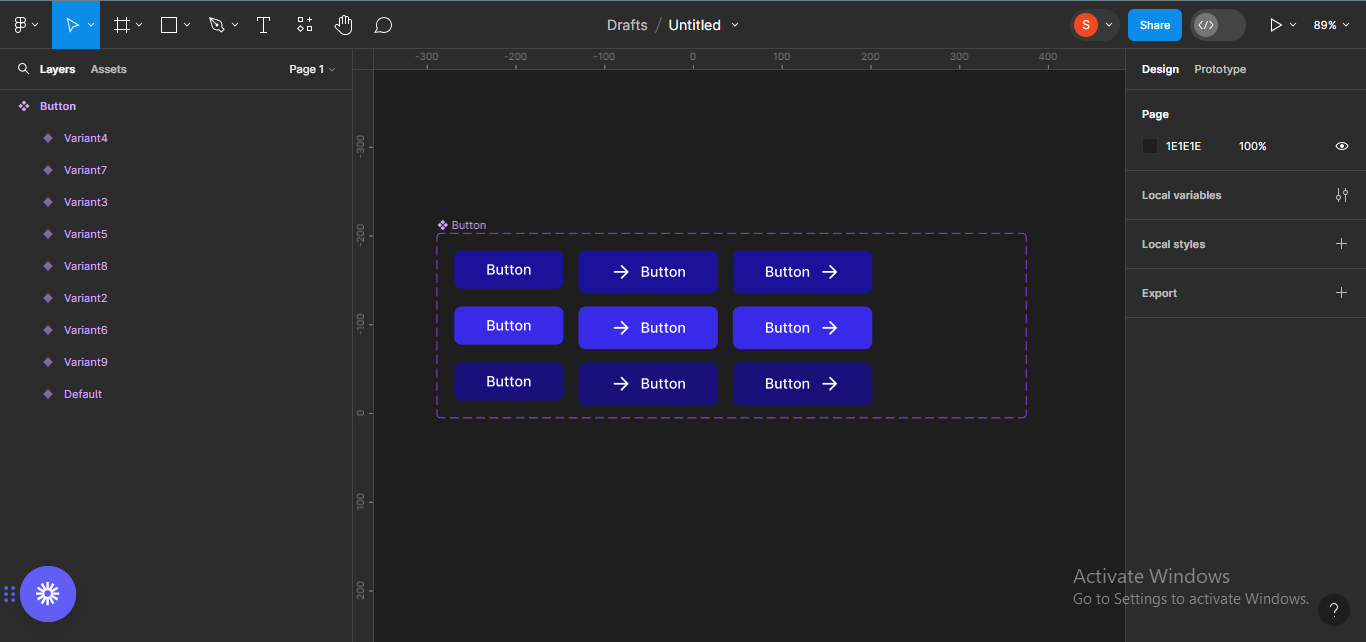 Revealing the icons on the right side
Lastly, we want to create button components with icons only.
To do that, we'll duplicate the buttons one last time to hide the text.
 Duplicating the buttons a third time
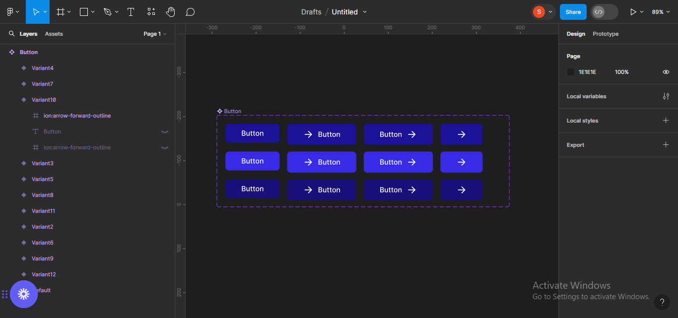 Hiding the text
I'll make the icon only frames a square shape. To do that, select the three frames and drag to resize.
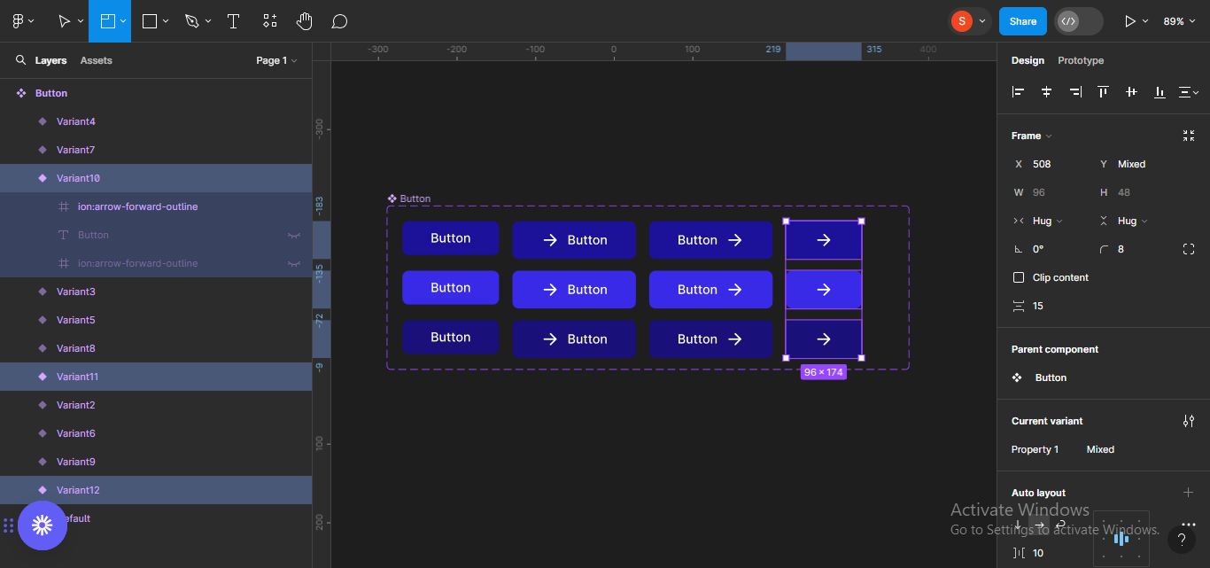 Selecting the 'icons only' frames
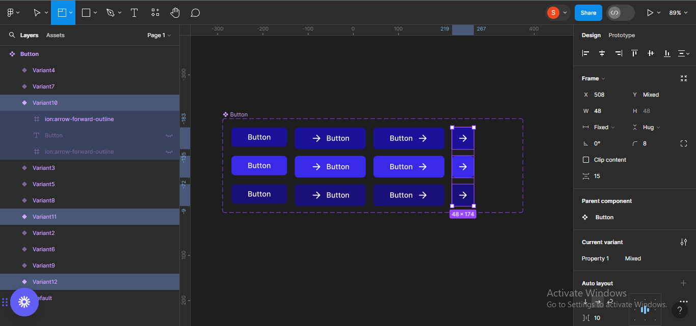 Resizing the frames
I'll now resize the component frame to fit its content.
 Resizing the component frame.
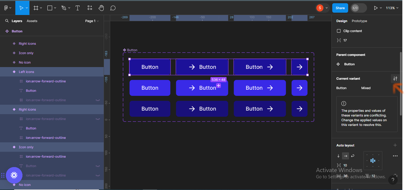
Next, we'll rename the different button states so it'll be easy to identify them. First, select the whole component frame. Then move to the section labelled Properties, and change Property 1 to Button to show that this is a button component.
 Moving to properties section
 Renaming the component frame
Next, we'll rename the button frames by icons. Select the first three frames horizontally, and go over to the Current variant section. Rename them No icons.
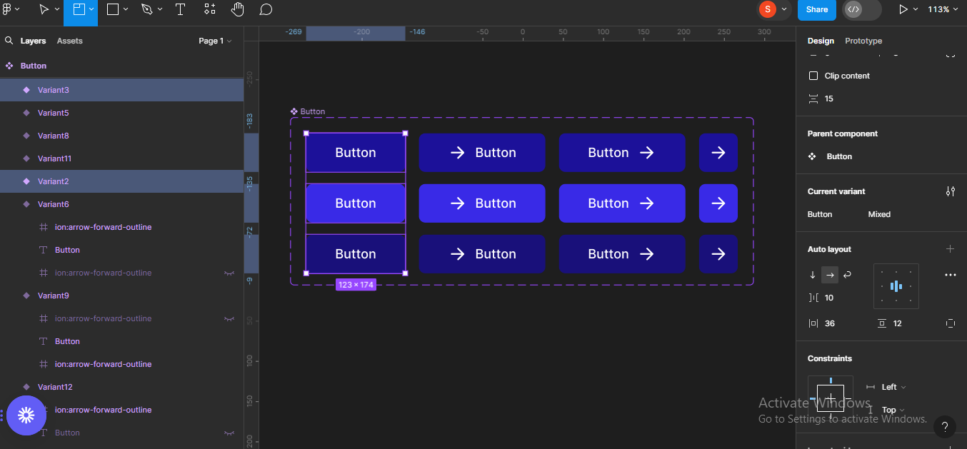 Selecting first three buttons and renaming them
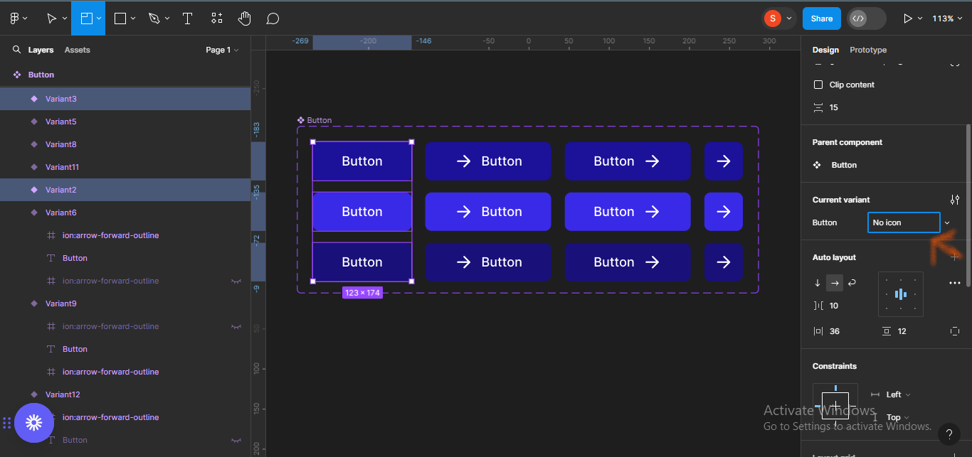 Renamed no icons buttons
We'll do same for the next three buttons, and name them Left Icons.
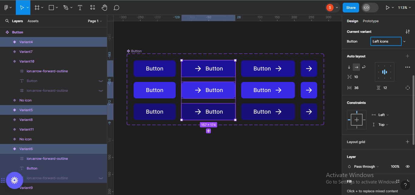 Renamed left icons' buttons
We'll do the same thing for the next set, renaming them Right Icons.
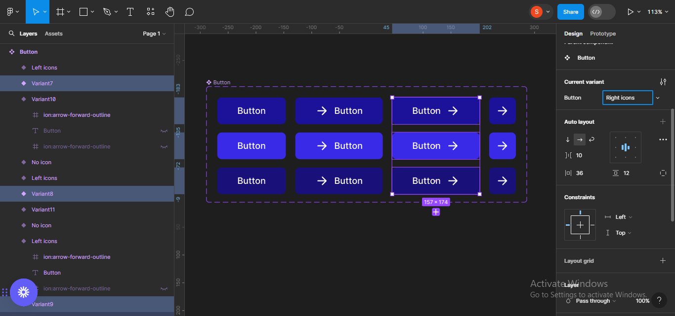 Renamed right icons' buttons
Finally, for the last set, we'll rename the buttons Icons only.
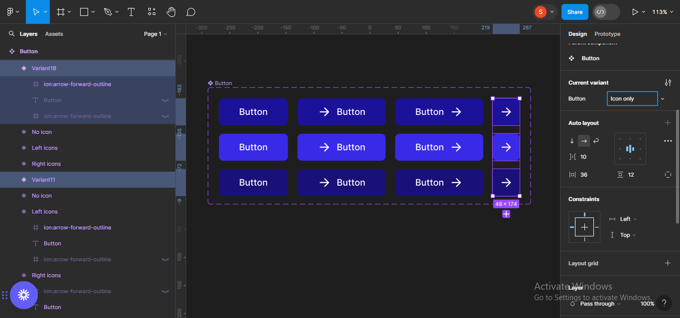 Renamed icons only buttons
How to Group Buttons by States
Next, we'll group the buttons by states and name them. We'll start with the first state: Default. Select all the button frames under default and move to the Current variant section on the right hand panel. Click on the configure icon to edit the component configuration.
 Clicking on configure icon
Click on the description box to add a description. In this case, I'll simply type Default state.
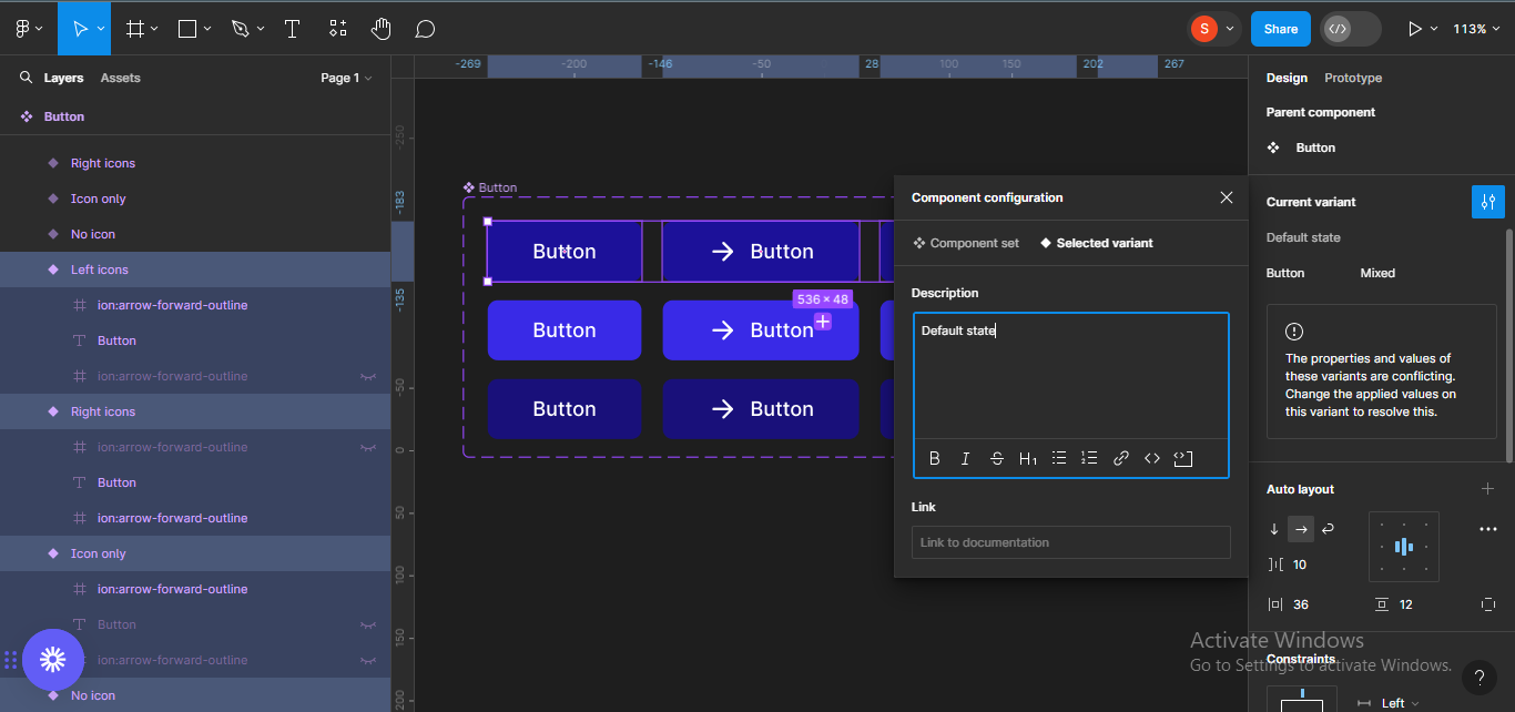 Adding a description
Do the same for the other two states – hover and active.
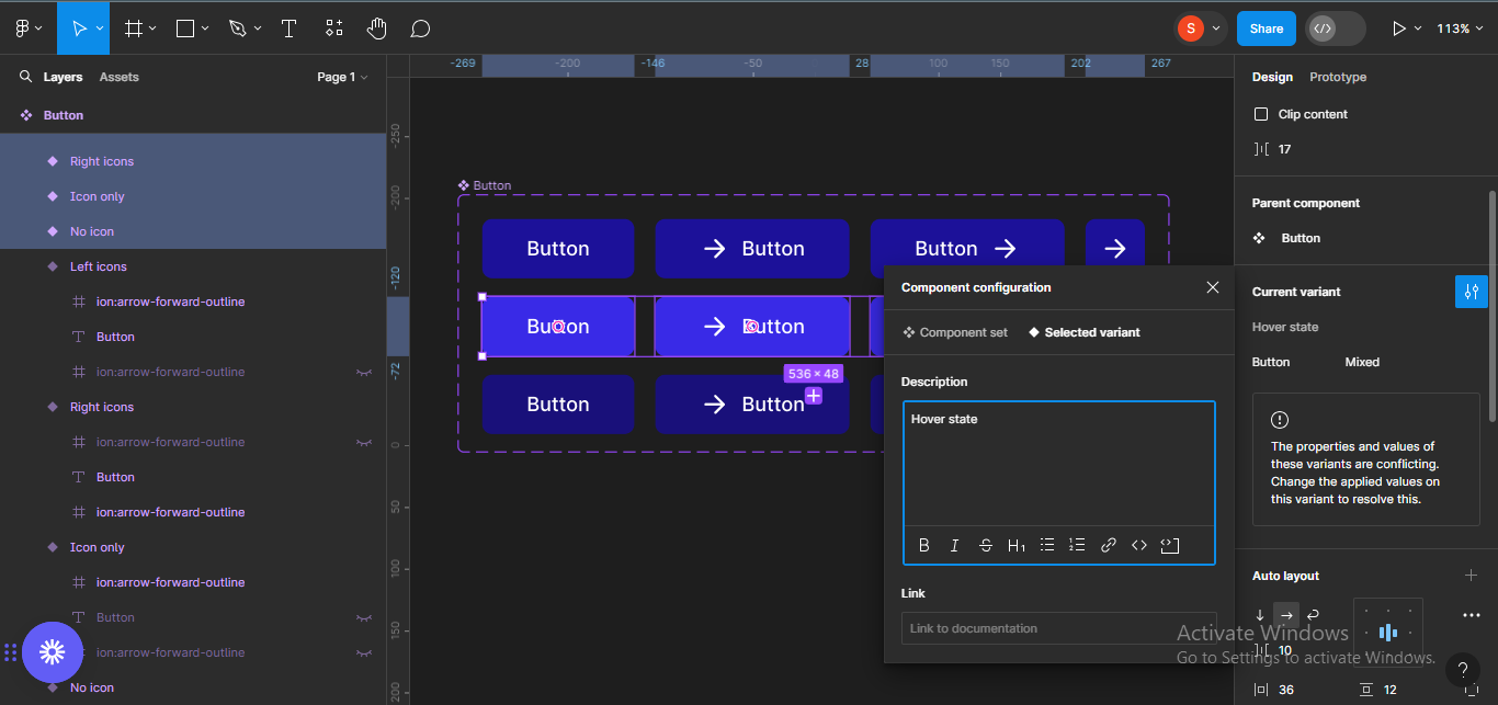 Adding a description for the hover state
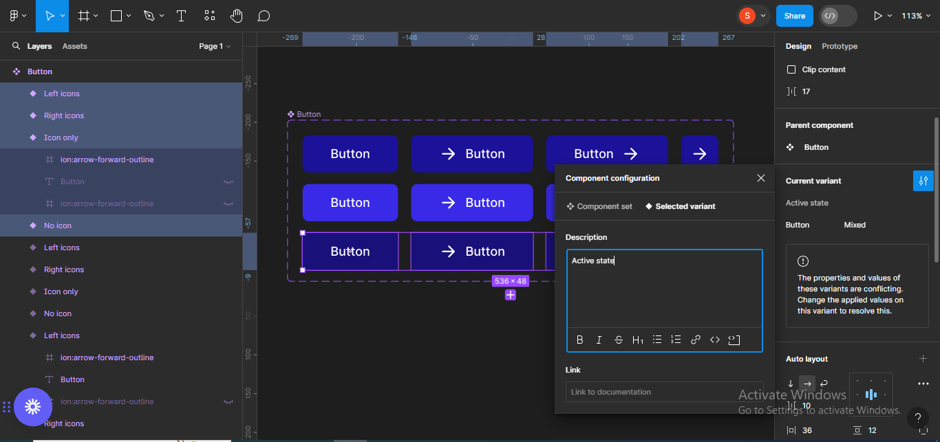 Adding a description for the active state
How to Make the Button Components Interactive
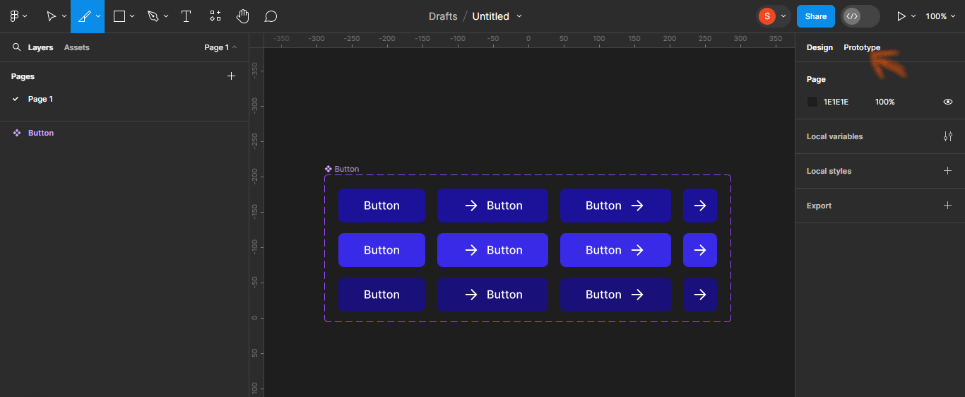
To start, switch to the Prototype tab, located at the top of your screen, right-hand panel.
 Switching to prototype mode
Next, add an interaction from the first to the second no icon button frame. To do this, click on the first button frame and drag the plus icon to the second frame.
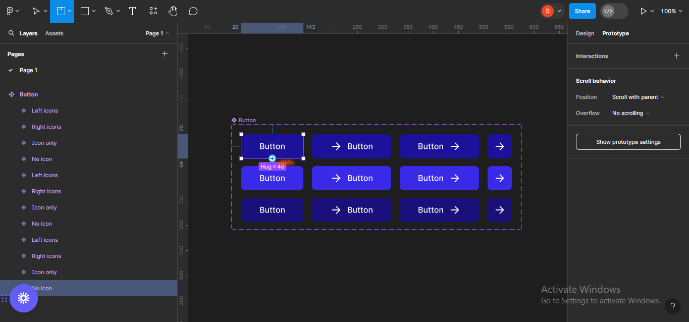 Adding an interaction
This will bring up a list of interaction options and settings for the animation.
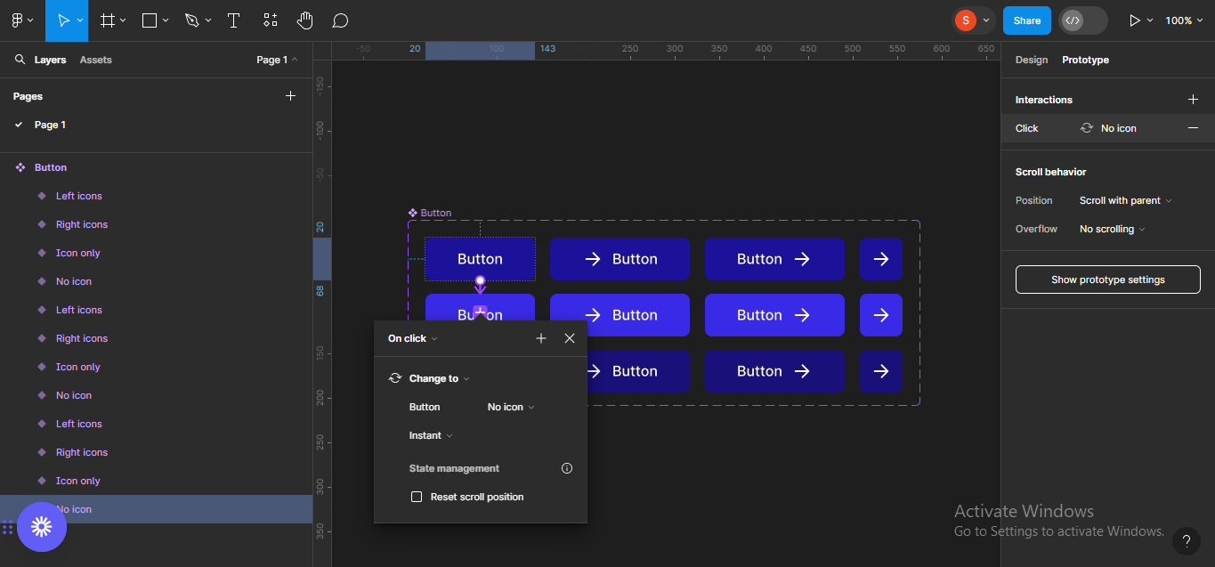 Bringing up interaction setting
Change On click to While hovering.
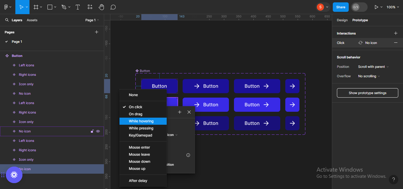 Changing interaction type to "while hovering"
Do the same for the next button frame but, instead of While hovering, change to While pressing.
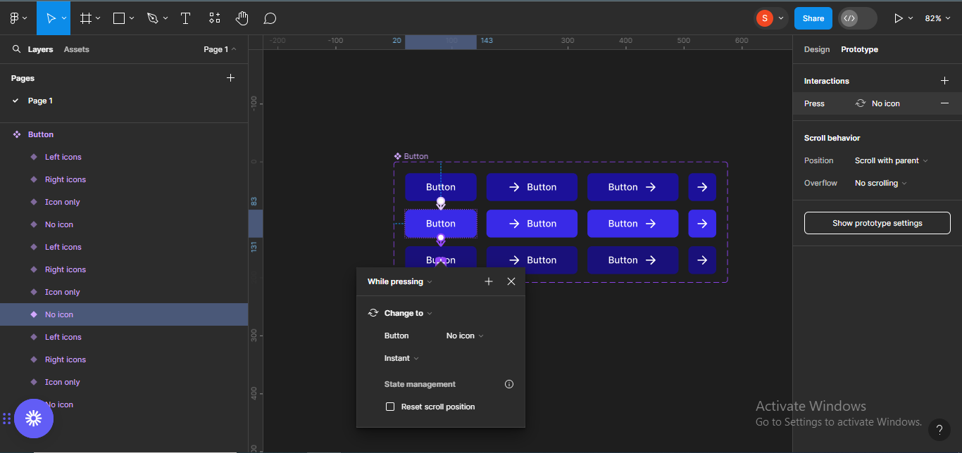 Animating the third button frame
Now, repeat the same steps for the other sets.
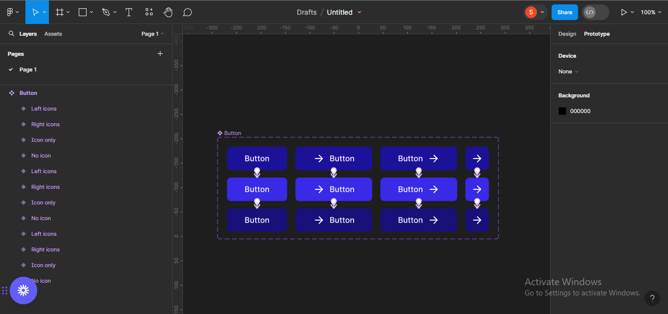 Repeating the animation steps for the other button sets.
Voilà, you just created an interactive button component.
Conclusion
Components help enhance your designs and make them more efficient. They also help you save time and they improve consistency across your designs. But they can only help when they're created the right way.
Practicing often will help improve your ability to create helpful reusable components. Remember, make every decision with your users in mind.