By Manu Arora
Whenever you're designing a card in HTML, box shadows play a vital role in making the cards stand out.
Whether its a pricing page card or even an e-commerce product listing card, box shadows can make or break the look and the entire message that that cards need to convey.
Today, let's understand how to make beautiful box shadows and how to make them stand out.
Understanding Box Shadow Syntax
Here's the basic syntax for a box shadow:
box-shadow: 1px 2px 3px 4px rgba(20,20,20,0.4);
There are 5 important parts in the above code snippet. Let's understand what they mean:
- Horizontal Offset:
1pxin the above example. This indicates how far the shadow will be from the card horizontally. Positive means to the right, negative means to the left. - Vertical Offset:
2pxin the above example. This indicates how far the shadow will be from the card vertically. Positive means to the bottom, negative means to the top. - Blur:
3pxin the above example. This indicates how blurry the shadow will look. Higher radius means more blur. - Spread:
4pxin the above example. This indicates how far the shadow will spread in all directions. - Color:
rgba(20,20,20,0.4)in the above example. This determines the color of the shadow. If not supplied, the default text color will be used. Color values can be Hex, RGB, or HSL.
Let's see the above code in action:
How Box Shadows Affect Cards
Consider the two examples here:
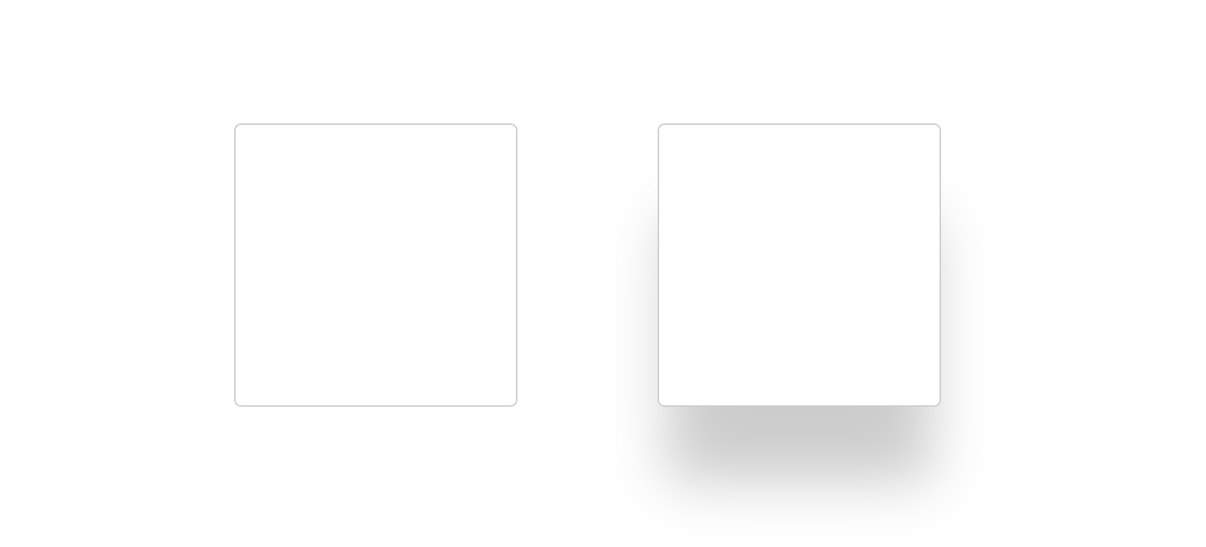
The first example has no box shadow, while the second example has a box shadow. The second one appears to be popping out of the screen (that makes it stand out a little as compared to the first one.)
So, if you need your cards to stand out, box shadows can help you make them really pop.
Let's say you're building an e-commerce application and you want your product cards to stand out. Box shadows can help you achieve this and get your customers to notice your products.
Even if your web application requires your cards to be subtle, you can always go with subtle box shadows to give a more pleasing aesthetic feel to the cards.
How to Use Multiple Layers Of Box Shadows
You can use more than one layer of box shadows in your cards – and you'll likely do this a lot.
The syntax to create multiple layers of box shadows look like this:
box-shadow: rgba(240, 46, 170, 0.4) -5px 5px, rgba(240, 46, 170, 0.3) -10px 10px, rgba(240, 46, 170, 0.2) -15px 15px, rgba(240, 46, 170, 0.1) -20px 20px, rgba(240, 46, 170, 0.05) -25px 25px;
Each individual box shadow is separated by a comma (,). You can add as many as you want but I recommend to limit yourself to at most 5.
The above example looks something like this:
Notice the 5 layers beneath the cards that are in descending order of opacity. When done correctly, it can give a different look altogether to your cards.
Now this specific card might not look perfect because it is designed to explain a certain concept. But let's make it more interesting by adding colors to the shadows.
Remember we talked about adding colors by using the rgba() syntax? Let's put it to use here.
Here, Instead of using the values rgba(0,0,0,0,2) which indicates the color (Black in this snippet), I replaced it with rgba(240, 46, 170, 0.2) with varying opacity in decreasing order. This is one way of adding colors – the limit is your imagination.
How to Use Colored Box Shadows
Even though colors can help you by making your cards stand out visually, they're not always the best option. Sometimes, a plain gray shadow works wonders on a white background. But this totally depends on the theme of your website.
Consider a simple blog application with lots of whitespace and general text content. If you have a card that displays blogs on the website, the best way will be to add a simple yet subtle box shadow to the cards to give them a good pop.
For example: consider the below cards taken directly from my website, where I have listed out all the blogs that I've written for freeCodeCamp so far.
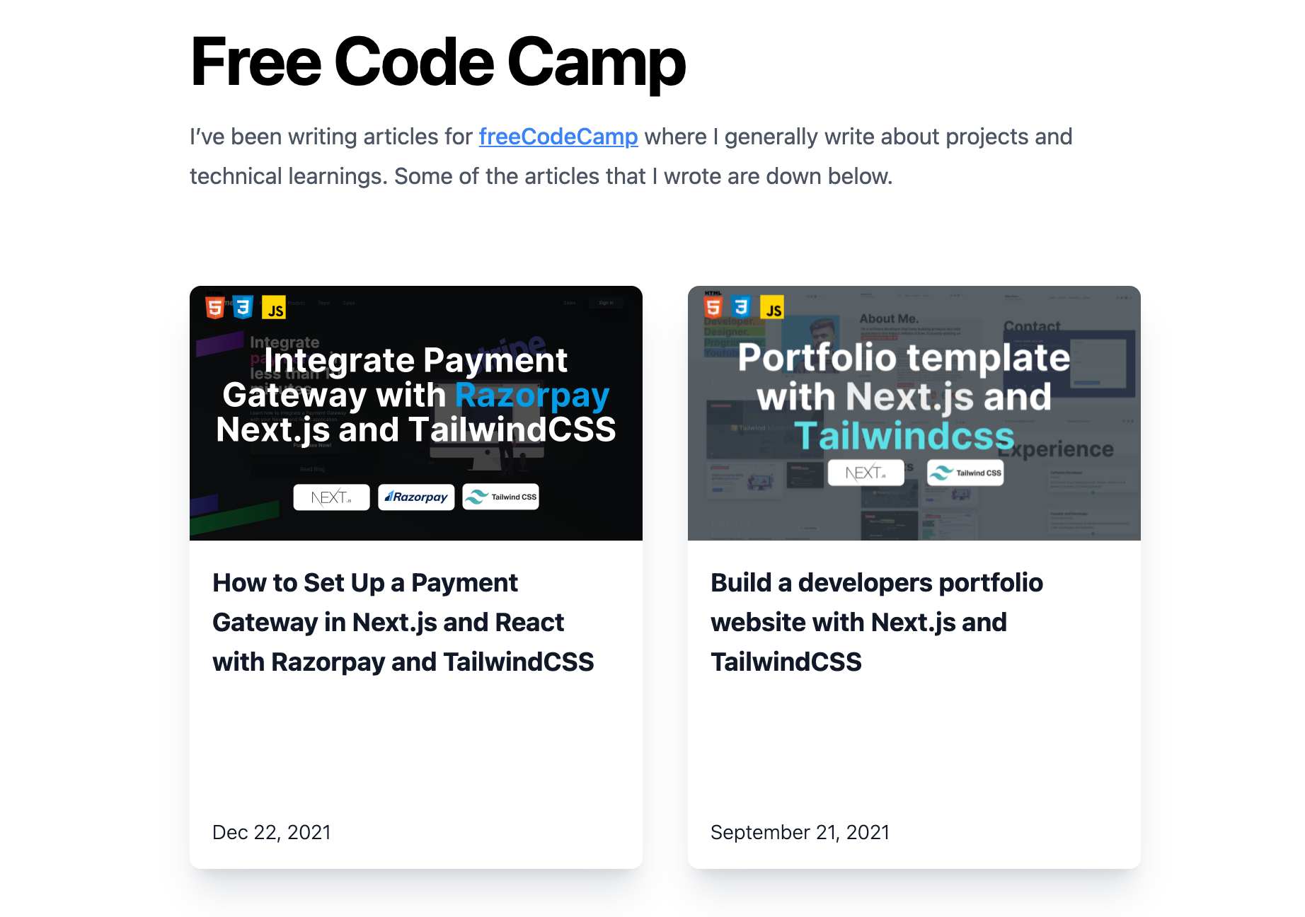
My website is simple and does one job – it showcases my personality and what I do. If I go on to add a red box shadow to the above boxes, it might not look that good. But if I use gray shadow with some amount of blur, it just helps it stand out without being too in-your-face.
So how do you use them correctly? Let's look at an example.
In the above example:
- Background color:
rgb(251 113 133); - Box Shadow:
box-shadow: rgba(254, 205, 211, 0.1) 0px 4px 16px, rgba(254,205,211,0.1) 0px 8px 24px, rgba(254,205,211, 0.1) 0px 16px 56px;
The box shadow is a lighter shade of the background color that we used in the above example. And there are three layers of shadows.
When we have a background color, it's generally a good idea to have colored shadows of a lighter shade of the background color that is being used. This looks better than having a plain white or black shadow.
How to Use Inner Shadows
All the above examples covered shadows that were 'outside' of the card that we were trying to style. But what if we wanted to have shadows on the inside?
You can use inset box shadows if you want to have box shadows within the holding container.
Consider the below example:
The code for the shadow is:
box-shadow: rgb(204, 219, 232) 3px 3px 6px 0px inset, rgba(255, 255, 255, 0.5) -3px -3px 6px 1px inset;
The keyword inset is used to specify that we want to use the shadow inwards and not the default behaviour that is outwards.
You can cleverly use inward box shadows in your web applications that have some important information to display. Like wells, or some alert that you're trying to show. In that case, the item appears to be embedded inside the webpage.
Box Shadow Examples
Creating box shadows is hard, not because it is difficult but because it requires some design knowledge to get the best out of it.
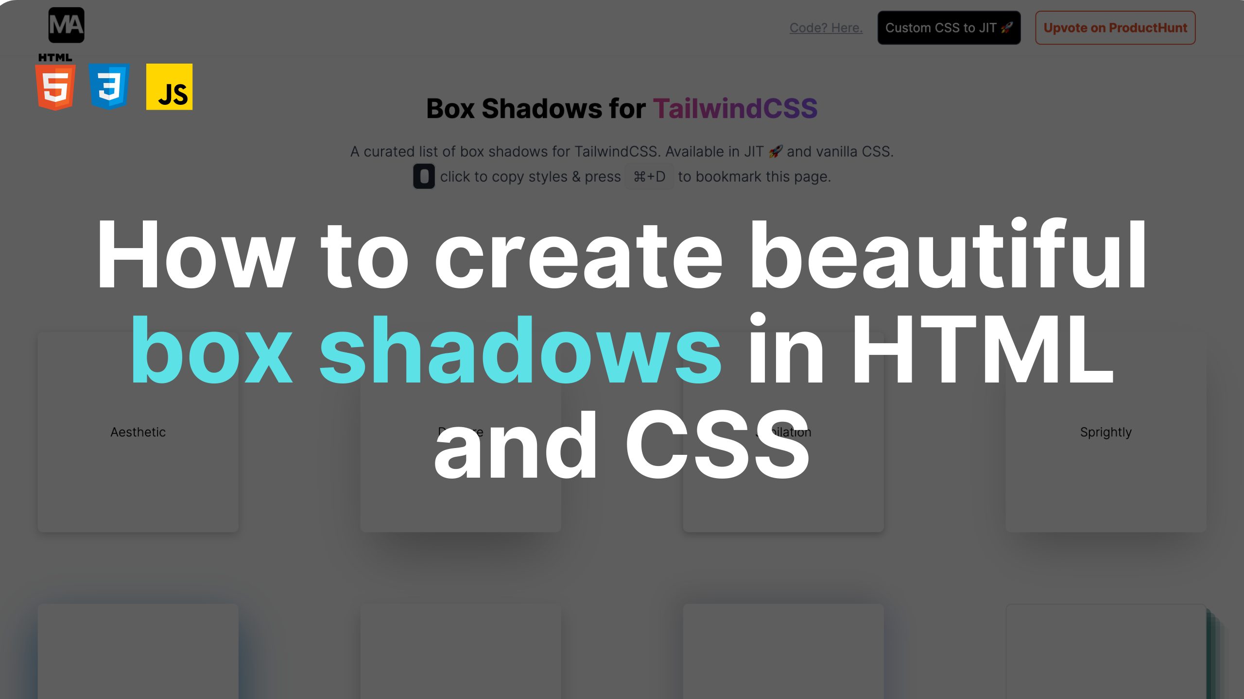
I recently created an application that is a curated list of beautiful box shadows that can help your cards stand out. Currently the project is rated #2 on ProductHunt and is helping a lot of developers make their cards beautiful and effective.
You can find the project here: Tailwind Box Shadows.
Currently, You can find box shadows in Vanilla CSS and Tailwind JIT code. Click to copy and paste and you're done. There is also a helper utility to convert CSS box shadows to Tailwind box shadows.
Conclusion
I've been using box shadows in almost all of my projects. It is the most underrated thing that I've ever come across. A good box shadow layout can really improve the visual aspects of your application.
If you liked the article, try implementing these shadows in your application and let me know what changes it brought to your app.
If you have any feedback, you can reach out to me on my Twitter and/or my Personal Website.