By Dillion Megida
We use icons when building frontend applications all the time – for indications, pointers, and so on. Here's how to create a reusable React component for icons.
When it comes to icons, you can use PNG or SVG images. PNGs come with a fixed color but allow dimension changes (like a regular image). In some cases this alters the image's quality.
SVGs, on the other hand, have better quality regardless of size and the colors are customizable even after downloading.
But you may agree with me that SVGs can be a pain when it comes to customizability.
In this article, I will show you how I currently go about creating customizable SVG icons as React components.
How to Download the Icons
I usually download the icons I use from Remixicon. I haven't tried out other icon libraries yet, so the steps in this article may or may not apply if you use a different library.
That being said, I have worked with a client in the past who created custom icons on Figma. I applied the solution shared in this step, and it also worked for most icons. So follow along even if you don't use Remixicon :)
On Remixicon, I select an icon of my choice, select size 18px, and select Copy SVG.
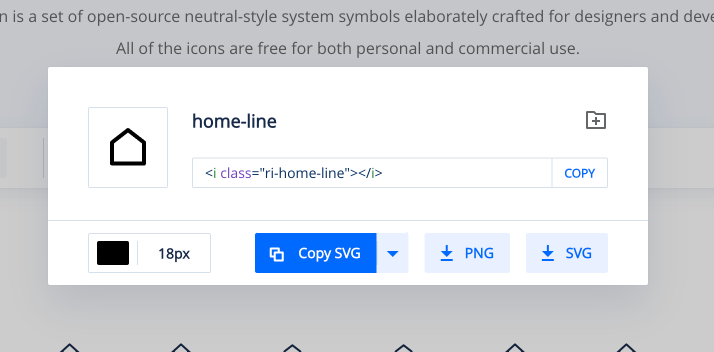
I leave the color as black. If you choose a different color, it may conflict with the specified colors you provide later. So better to leave it black, which is the default color of SVGs.
How to Create the React Component
Then I paste the SVG into a file, say, home-line.js with the following code:
import React from 'react'

export default function HomeLine() {
  return (
    <svg xmlns="http://www.w3.org/2000/svg" viewBox="0 0 24 24" width="18" height="18">
      <path fill="none" d="M0 0h24v24H0z"/>
      <path d="M21 20a1 1 0 0 1-1 1H4a1 1 0 0 1-1-1V9.49a1 1 0 0 1 .386-.79l8-6.222a1 1 0 0 1 1.228 0l8 6.222a1 1 0 0 1 .386.79V20zm-2-1V9.978l-7-5.444-7 5.444V19h14z"/>
    </svg>
  )
}
As it is, it uses the default color and size that comes from Remixicon. I'll add two props to modify this component: size and color.
The svg element has four properties: xmlns, viewBox, width and height. I'll use the size prop to modify the value of width and height. Then I'll add an extra property, fill, which I will use for the color prop.
Here is the updated component:
import React from 'react'

export default function HomeLine({
  size = 18, // or any default size of your choice
  color = "black" // or any color of your choice
}) {
  return (
    <svg
      xmlns="http://www.w3.org/2000/svg"
      viewBox="0 0 24 24"
      width={size} // added size here
      height={size} // added size here
      fill={color} // added color here
    >
      <path fill="none" d="M0 0h24v24H0z"/>
      <path d="M21 20a1 1 0 0 1-1 1H4a1 1 0 0 1-1-1V9.49a1 1 0 0 1 .386-.79l8-6.222a1 1 0 0 1 1.228 0l8 6.222a1 1 0 0 1 .386.79V20zm-2-1V9.978l-7-5.444-7 5.444V19h14z"/>
    </svg>
  )
}
I leave the viewBox as it is. And now I can use the component like this:
<HomeLine size={100} color="purple" />
<HomeLine size={50} color="red" />
<HomeLine size={30} color="green" />
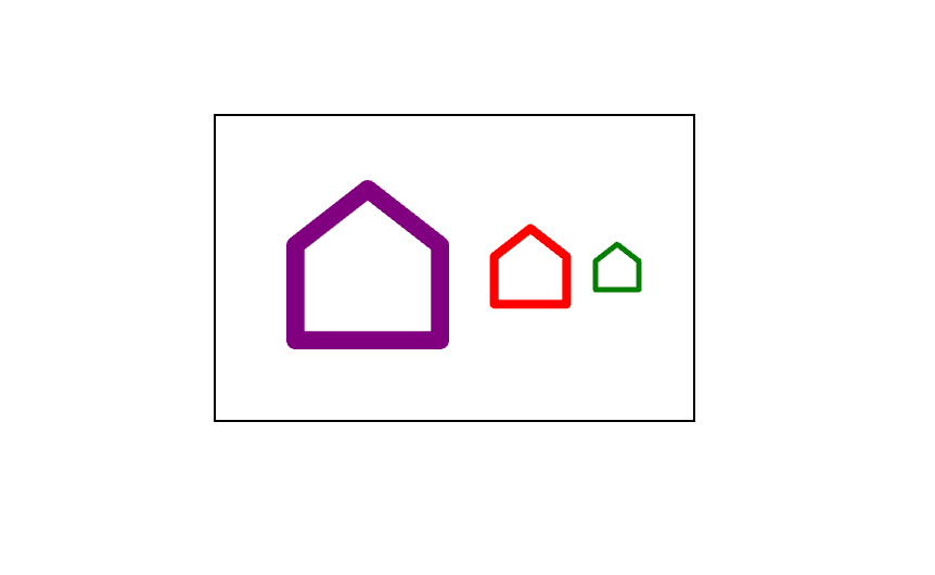
If you use a non-square-shaped icon, you will have to specifically provide the width and height prop to change both attributes accordingly.
Wrap Up
I know that Remixicon does not have every icon you may need, and when you are working with a design system, you may be provided with some custom icons.
But the idea shared here is something you can try with any library you're working with. And if you do, I would love to hear your experience trying this out.
If you liked this article and found it helpful, kindly share :)