
By Michelle Jones
Warning: contains graph violence
Graphs are used to present information in a visual, summary format. They can be used instead of tables. Used successfully, graphs reduce the amount and complexity of data used in sentences. Hopefully this article gives you extra tools for deciding what graphs (not) to use.
The person who has worked hardest and longest in the area of graph design is Edward Tufte. I have included a link to his website under Resources.
Anyone who knows me well also knows two key pieces of information. I hate pie charts and I hate poorly made bar charts. I have taken charts from publicly available reports to illustrate my points. I’ve also pulled the examples from different disciplines, to show that poor chart design is everywhere.
Finally, I have purposely chosen reports where the chart designer is not identified, or there are multiple authors. The purpose of this article is not to name and shame individuals, and the designer does not normally have much of a say in the publication approval process. Managers and/or peer reviewers have decided that these graphics were fine to use.
Pie charts
Simple pie charts
The purpose of pie charts is to show how mutually exclusive, related categories each contribute to the information about that category.
Let’s start with a simple example. Below is a pie chart containing just two categories: male and female. Pie charts are often used to show the ratio of sex, for example when reporting the results from surveys.
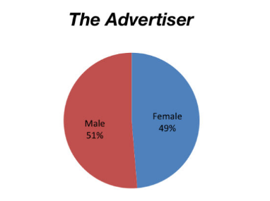
But why use a pie chart for a binary classification? To reiterate, the categories are mutually exclusive. We could just say 49% of the books reviewed had female authors. That 51% were by male authors is easy to assume, and calculate.
The point of the website is to highlight the lack of reviews for books with female authors. If you go to the link, you’ll see a series of 14 pie charts, one for each newspaper assessed by the Stella Count, for 2013. Even with a large screen, you’ll be scrolling to see all of them. And the pie chart for The Monthly has the colour of the categories reversed — it’s hard to keep track of consistent formatting for so many charts!
I think the information would be better presented in a bar chart. I’ve used R for this. The packages I’ve called are ggplot2 and ggridges. ggridges has been used to cycle the two colours through the bars. I think the colour cycling improves the readability of the graph compared to only having one colour for every bar. There was a hiccup I can’t fix, with the colour cycling towards the bottom, so I have forced a reverse order for two bars using FillValues.
FemaleAuthors <- data.frame(Publication=c("The Advertiser", "The Age", "Australian Book Review", "The Australian Financial Review", "Books+Publishing", "The Courier-Mail","The Daily Telegraph", "Good Reading", "The Monthly","Sunday Age","Sunday Tasmanian", "The Sydney Morning Herald","The Weekend Australian", "The West Australian"), PropOfFemales=c(49,42,47,15,61,41,46,49,41,49,49,43,35,58))FemaleAuthors <- FemaleAuthors[order(-FemaleAuthors$PropOfFemales, -FemaleAuthors$Publication),]FemaleAuthors$FillValues <- c(rep(c("A","B"),5),"B","A","A","B")
library("ggplot2")library("ggridges")ggplot(data=FemaleAuthors,aes(x=reorder(Publication, PropOfFemales), y=PropOfFemales, fill=FillValues)) + geom_bar(stat="identity", colour="black", width=1) + scale_y_continuous(breaks=seq(0, 70, by=5), limits=c(0,70), expand=c(0,0)) + scale_fill_cyclical(values=c("plum3","orchid2"))+ labs(x="Publication", y="Proportion of books reviewed \nwith female authors")+ coord_flip() + theme(panel.grid.minor.y=element_blank(), panel.grid.major.x=element_line(color="gray"), panel.background=element_blank(), axis.line = element_line(color="gray", size = 1), axis.text=element_text(size=10), axis.title=element_text(size=15), plot.margin=margin(5,5,5,5), legend.position = "none")
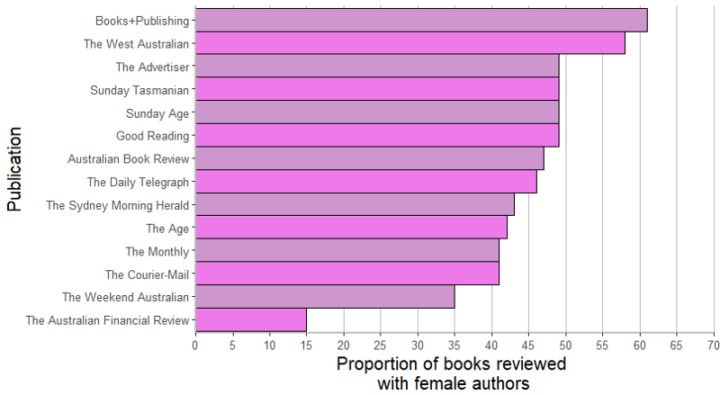
The important information from those 14 pie charts — the representation of female authors in newspaper book reviews — is now obvious at a glance.
For ease of interpretation, I have colour coded the bars with pinkish shades. (Yes, this is a stereotype, but the pink drives home the point that these are the results for females). The alternating colours make it easier for the eye to trace along each bar. I’ve graphed the data by descending female representation, reinforcing the point of the Stella Count.
While the exact proportions cannot be read from the graph, the grid line at each 5% provides a sense of the number. Important numbers can be mentioned in the text.
More complex pie charts
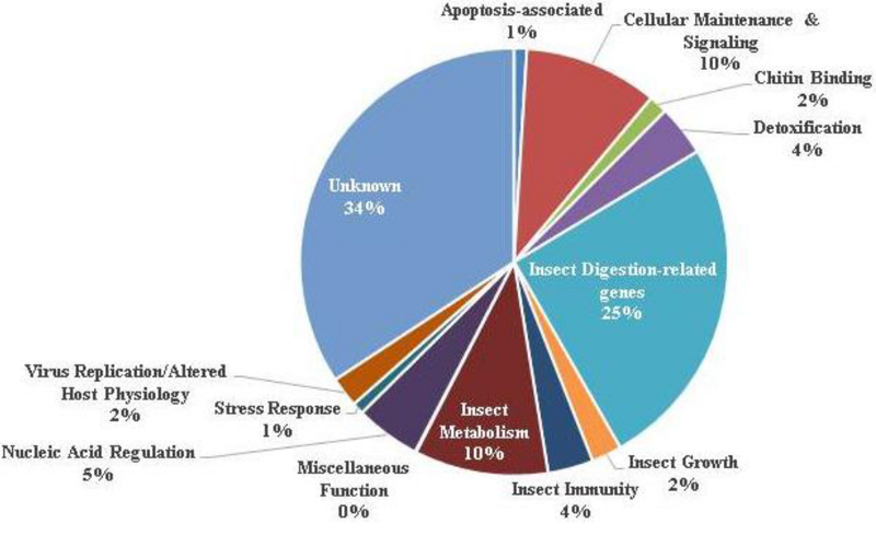
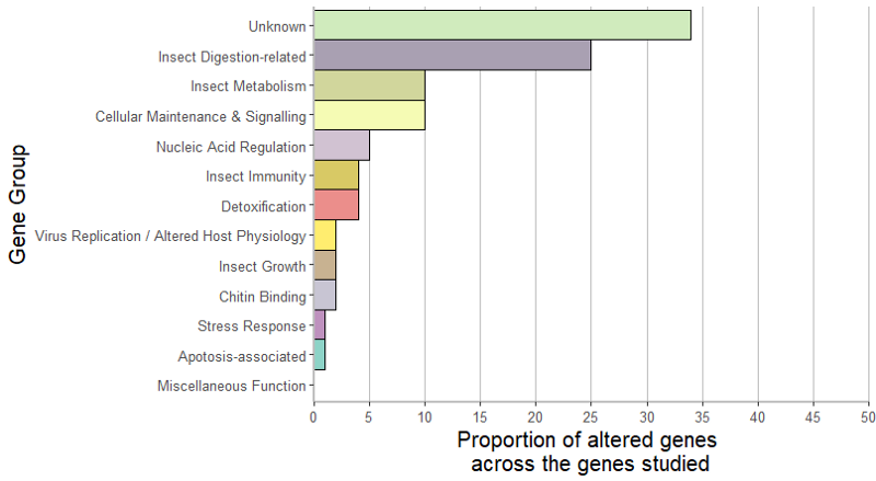
The pie chart below has a lot of slices, and relates to gene expression. Only three of the slices are large enough to contain text. Each category is tagged with its respective proportion.
One category, “Miscellaneous Function”, contained no altered genes, and is shown adjacent to the pie chart. It’s hovering in space. However, because that function is sitting next to the purple slice, a quick glance suggests that it relates to that slice. The line to “Nucleic Acid Regulation” shows the actual category, but not all the slices have lines linking the category.
Again, I can construct a bar chart because all the data is included in the original graphic. Using R, and the RColorBrewer package to get more colors than are contained in Set3:
GeneExpressionProfile <- data.frame(AlteredGenes=factor(c("Apotosis-associated","Cellular Maintenance & Signalling", "Chitin Binding","Detoxification","Insect Digestion-related", "Insect Growth","Insect Immunity", "Insect Metabolism", "Miscellaneous Function","Nucleic Acid Regulation", "Stress Response","Virus Replication / Altered Host Physiology", "Unknown")), PercentAltered=c(1,10,2,4,25,2,4,10,0,5,1,2,34))GeneExpressionProfile <- GeneExpressionProfile[order(-GeneExpressionProfile$PercentAltered),]library("ggplot2")library("ggridges")library("RColorBrewer")ggplot(data=GeneExpressionProfile,aes(x=reorder(AlteredGenes, PercentAltered), y=PercentAltered, fill=AlteredGenes)) + geom_bar(stat="identity", colour="black", width=1) + scale_y_continuous(breaks=seq(0, 50, by=5), limits=c(0,50), expand=c(0,0)) + scale_fill_manual(values=colorRampPalette(brewer.pal(12,"Set3"))(13)) + labs(x="Gene Group", y="Proportion of altered genes \nacross the genes studied")+ coord_flip() + theme(panel.grid.minor.y=element_blank(), panel.grid.major.x=element_line(color="gray"), panel.background=element_blank(), axis.line = element_line(color="gray", size = 1), axis.text=element_text(size=10), axis.title=element_text(size=15), plot.margin=margin(5,5,5,5), legend.position = "none")
Produces the following bar chart
Bar charts
As you can see, I really like bar charts. However, there are a number of ways to make bar charts less interpretable. These are stacked bar charts.
Stacked bar charts
One type of stacked bar chart uses proportions, so each the components inside each bar sum to 100%. These can be visually complex, and the messages from the chart are not always clear to a reader.
Additionally, because all the bars are forced to be the same length, differences in the numbers that underlie the proportions are masked. It could then be misleading to compare the relative proportions across the bars.
A factor that accounts for 30% of a bar may not be interesting if the result relates to three out of ten people. Our interpretation of the importance would change if the same percentage was based on 200 people.
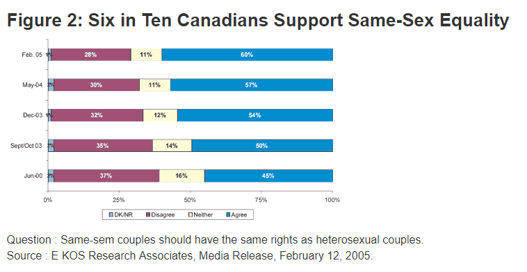
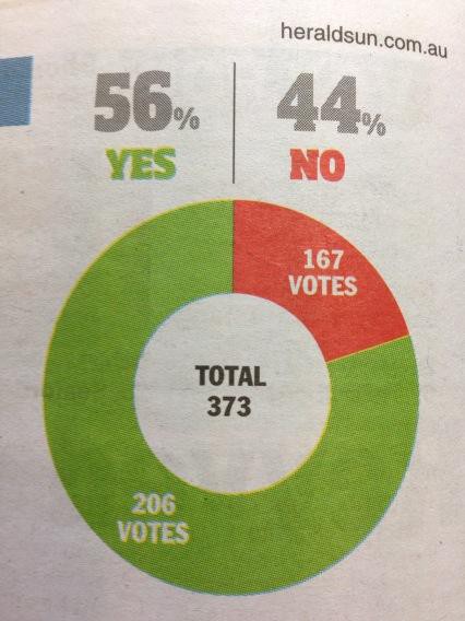
Another, less complicated example is below. There are two main problems with this graphic. First, the bars include the percents. This is an admission that people can’t interpret the values from the length of the bar sections. If you click on the link (in the caption), you will find that all the percents are listed, for all years, on the same page underneath the chart.
Why is this bad? All the information in the chart is duplicated in the text. Why include the bar chart?
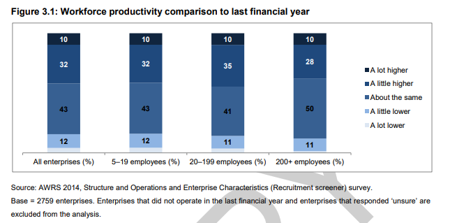
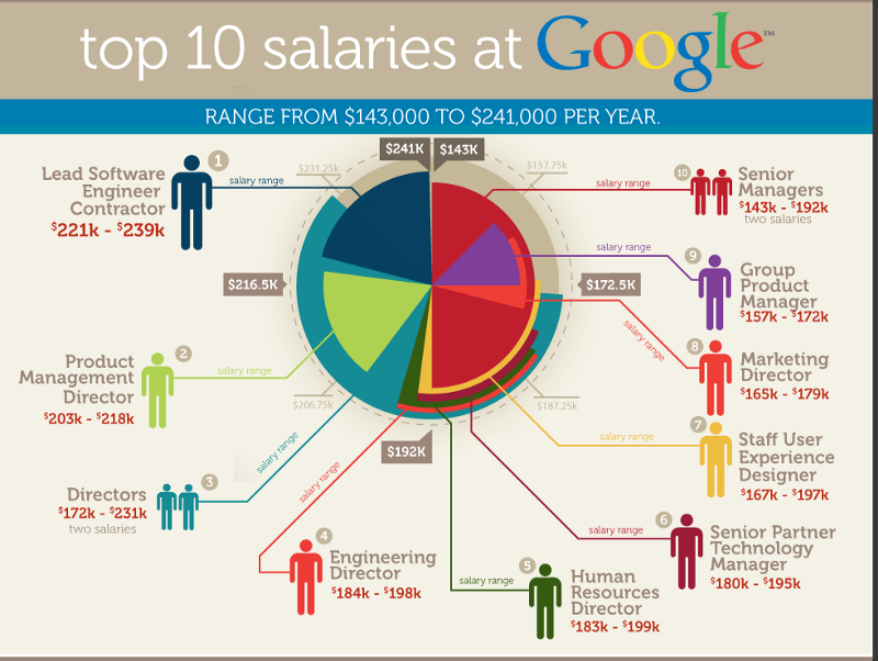
The use of numbers inside the bar sections seems to be relatively common. Another example is below. Here, they have used a light-to-dark color scheme for each section. I think gradient color schemes make charts harder to read. Gradient color schemes are also hard to interpret when the bars aren’t stacked.
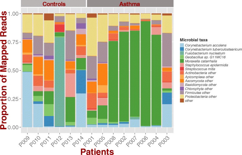
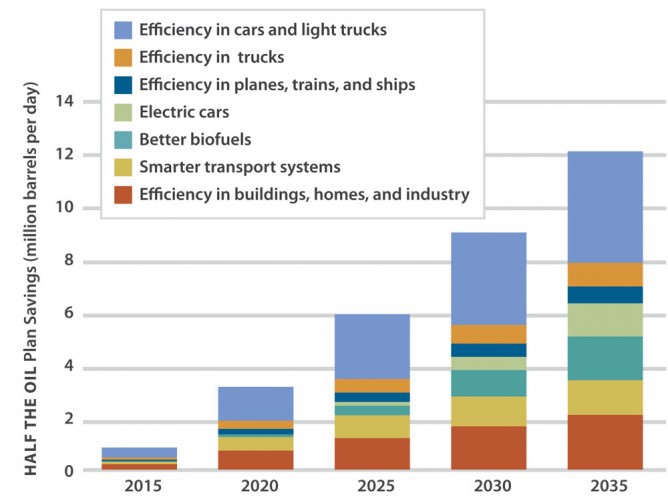
The other type of stacked bar chart is one where the bar sections take on their true values. This results in bars of different heights. The advantage is that we can see the actual numbers. However, the chart still contains a lot of information, and only the largest changes in categories are obvious.
Special mention: 3-D graphs
I have put these into a separate section to show that 3-D is not a good decision for charts.
3-D pie charts
The only thing worse than a 2-D pie chart is a 3-D pie chart.
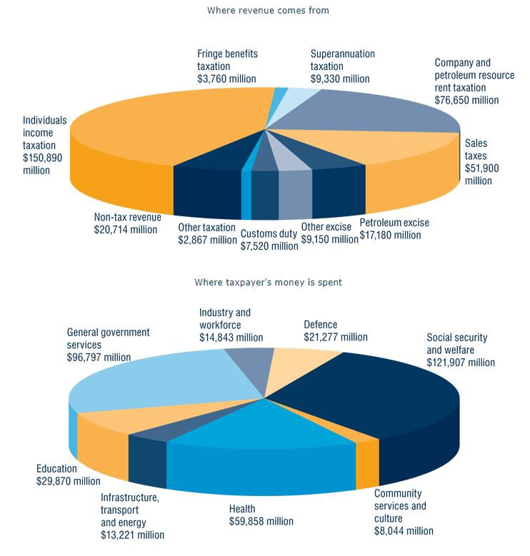
The relative size of the pieces is even more difficult to interpret. Because the chart is in 2-D space, slices become inaccurate. Let’s use the bottom chart as our example. I’m rounding to the nearest million in each example.
Compare “Social security and welfare” ($122 million) with “Health” ($60 million). Does the Health slice look about half the size of the Social security and welfare slice?
Compare “General government services” ($97 million) with the Social security and welfare slice. General government services is about 4/5 the expenditure of Social security and welfare, but the pie chart makes them look about the same amount.
The ordering of the categories isn’t clear, either. They’re not in size order. They’re not in alphabetical order.
What is the solution? Again, the same as for 2-D pie charts. If there are few categories, a bar chart is a better presentation of the data.
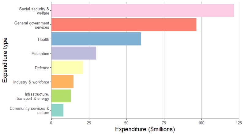
Let’s see how the bottom pie chart looks in bar chart form, using R. I’m using the ggplot2 package to do the plotting, and the stringr package to handle the text wrapping on the axis labels.
I like the colour sequence and combination of Set3 in the ColorBrewer palette. I’ve also removed clutter from the chart by removing the background colour and extraneous grid lines. I have ordered the expenditure categories by descending amount. I have wrapped the y-axis text to provide a better ratio of y-axis width versus internal plot width. The legend has been suppressed. I’ve expanded the right hand outer margin of the graph so the final x-axis value is not cut-off.
TaxExpenditure <- data.frame(Expenditure.Type=c(factor("Industry & workforce", "Defence", "Social security & welfare", "Community services & culture", "Health", "Infrastructure, transport & energy", "Education", "General government services")), Expenditure.Amount=c(14.843, 21.277, 121.907, 8.044, 59.858, 13.221, 29.870, 96.797))
library("ggplot2")library("stringr")ggplot(data=TaxExpenditure,aes(x=reorder(Expenditure.Type, Expenditure.Amount), y=Expenditure.Amount, fill=Expenditure.Type)) + geom_bar(stat="identity") + scale_y_continuous(breaks=seq(0, 125, by=25), limits=c(0,125), expand=c(0,0)) + scale_x_discrete(labels=function(x) str_wrap(x, width=20))+ labs(x="Expenditure type", y="Expenditure ($millions)")+ scale_fill_brewer(palette="Set3") + coord_flip() + theme(panel.grid.minor.y=element_blank(), panel.grid.major.x=element_line(color="gray"), panel.background=element_blank(), axis.line = element_line(color="gray", size = 1), axis.text=element_text(size=10), axis.title=element_text(size=15), plot.margin=margin(5,15,5,5), legend.position = "none")
The resulting graph is shown below. The relative differences in expenditure are much easier to see compared to the pie chart.
3-D exploded pie charts
Friends don’t let friends create 3-D exploded pie charts.
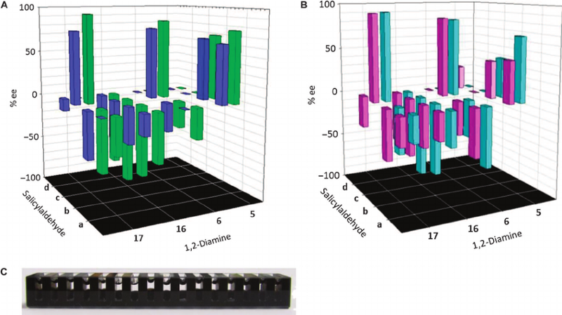
3-D bar charts
3-D bar charts are notoriously difficult to interpret correctly, as they try to compress three dimensions into 2-D space. The examples below are particularly complicated, due to the positioning of the zero plane.
More suggestions for better graphs
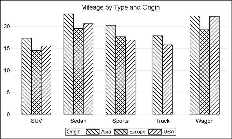
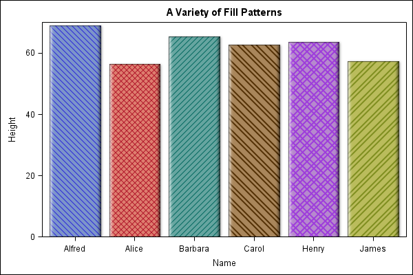
Don’t use patterns
The use of colour/grey-scale in graphs is better than using a pattern. Patterns, such as cross-hatching, make graphs harder to read.
Example 1:
Example 2:
Use a suitable colour scheme
Different color schemes are available for graphs. Not all of them are good.
Use suitable axis scales
Your numeric axis should start at zero. If your numbers are very large, express them in a suitable order of magnitude, for example using millions of dollars, or thousands of hours as your base.
If your graph then shows little variation between the category values, consider why a graph is necessary.
Did you want to show a change from year to year? If so, you could graph the percentage change from one year to the next, instead of graphing the raw numbers.
Did you want to highlight the impact of a particular factor across time? One option is to graph that factor and nothing else.
Category ordering is important
No one rule fits all for deciding the order of the categories. One option, which I have used in my examples, is by height. How will you decide your ordering:
- highest to lowest?
- alphabetical by category?
- some other order?
The order you use depends on the main information that the client needs from the chart.
Double check the accuracy of your graphic
Consider using error bars
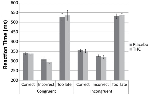
The graph below comes from a study that examined the effect of THC on subject reaction times and accuracy of response, using a computerised stimulus.
They have included error bars on each measure, so we can see at a glance whether any of the results differed between the subject groups (placebo versus THC). Only a greyscale color scheme has been used, and it is very effective.
Resources for creating better graphs
The guru for creating better graphs, and graphics, is Edward Tufte. All his books are works of art, but for the presentation of numbers I recommend The Visual Display of Quantitative Information.
A blog I find particularly useful is FlowingData. Even if you don’t become a (paid) member of the site, Nathan is a prolific publisher and you can get ideas from his posts. Some of these posts are graphics he has made, and others are examples of well-designed graphics he has sourced from elsewhere.
Disclaimer: no actual graphs were harmed in the making of this article.