

Once you understand the taxonomy of data, you should learn to apply a few essential foundational concepts that help describe the data using a set of statistical methods.
Before we dive into data and its distribution, we should understand the difference between two very important keywords - sample and population.
A sample is a snapshot of data from a larger dataset. This larger dataset which is all of the data that could be possibly collected is called population.
In statistics, the population is a broad, defined, and often theoretical set of all possible observations that are generated from an experiment or from a domain.
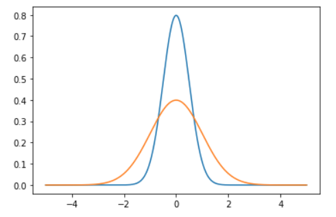
Observations in a sample dataset often fit a certain kind of distribution which is commonly called normal distribution, and formally called Gaussian distribution. This is the most studied distribution, and there is an entire sub-field of statistics dedicated to Gaussian data.
What we’ll cover
In this post, we’ll focus on understanding:
more about Guassian distribution and how it can be used to describe the data and observations from a machine learning model.
estimates of location — the central tendency of a distribution.
estimates of variability — the dispersion of data from the mean in the distribution.
the code snippets for generating normally distributed data and calculating estimates using various Python packages like numpy, scipy, matplotlib, and so on.
And with that, let's get started.
What is normal or Guassian distributon?
When we plot a dataset such as a histogram, the shape of that charted plot is what we call its distribution. The most commonly observed shape of continuous values is the bell curve, which is also called the Gaussian or normal distribution.
It is named after the German mathematician, Carl Friedrich Gauss. Some common example datasets that follow Gaussian distribution are:
Body temperature
People’s Heights
Car mileage
IQ scores
Let’s try to generate the ideal normal distribution and plot it using Python.
How to plot Gaussian distribution in Python
We have libraries like Numpy, scipy, and matplotlib to help us plot an ideal normal curve.
import numpy as np
import scipy as sp
from scipy import stats
import matplotlib.pyplot as plt

## generate the data and plot it for an ideal normal curve

## x-axis for the plot
x_data = np.arange(-5, 5, 0.001)

## y-axis as the gaussian
y_data = stats.norm.pdf(x_axis, 0, 1)

## plot data
plt.plot(x_data, y_data)plt.show()
Output:
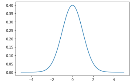
The points on the x-axis are the observations and the y-axis is the likelihood of each observation.
We generated regularly spaced observations in the range (-5, 5) using np.arange(). Then we ran it through the norm.pdf() function with a mean of 0.0 and a standard deviation of 1 which returned the likelihood of that observation.
Observations around 0 are the most common and the ones around -5.0 and 5.0 are rare. The technical term for the pdf() function is the probability density function.
How to test for Gaussian Distribution
It is important to note that not all data fits the Gaussian distribution, and we have to discover the distribution either by reviewing histogram plots of the data or by implementing some statistical tests.
Some examples of observations that do not fit a Gaussian distribution and instead may fit an exponential (hockey-stick shape) include:
People’s incomes
Population of countries
Sales of cars.
Until now, we have just talked about the ideal bell-shaped curve of the distribution but if we had to work with random data and figure out its distribution.
This is how we'll proceed:
Create some random data for this example using numpy’s
randn()function.Plot the data using a histogram and analyze the returned graph for the expected shape.
In reality, the data is rarely perfectly Gaussian, but it will have a Gaussian-like distribution. If the sample size is large enough, we treat it as Gaussian.
Note that you may have to change the plotting configuration (scale, number of bins, and so on) to look for the desired pattern.
Let's take a look at some code:
## setting the seed for the random generation
np.random.seed(1)

## generating univariate data
data = 10 * np.random.randn(1000) + 100

## plotting the data
plt.hist(data)plt.show()
Output:
Here’s the output of the code above with the histogram plot of the data:

The plot looks more like a simple set of blocks. But we change the scale, which in this case is the arbitrary number of bins in the histogram.
Let’s specify the number of bins and plot it again:
plt.hist(data, bins=100)
plt.show()
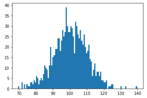
We can now see that the curve looks closer to a Gaussian bell-shaped curve.
Although, notice that we have a few observations that are going out of bounds and can be seen as noise.
This points to another important takeaway when working with sample dataset – you should always expect some noise or outliers.
Estimates of Location
A fundamental step in exploring a dataset is getting a summarized value for each feature or variable. This is commonly an estimate of where most of the data is located, or in other words, the central tendency.
At first, summarizing the data might sound like a piece of cake – just take the mean of the data. In reality, although the mean is very easy to compute and use, it may not always be the best measure for the central value.
To solve this problem, statisticians have developed alternative estimates to mean.
We are going to use the Boston dataset from the sklearn package.
Note that I’ve dropped a few columns, and this is what the dataframe looks like now:
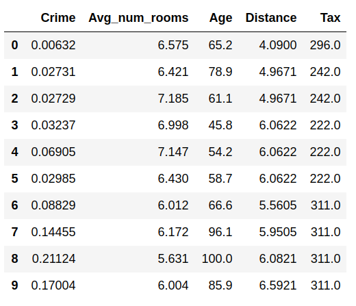
Let’s look over the commonly used estimates of location with the help of an actual sample dataset, rather than Greek symbols:
Mean
The sum of all values divided by the number of values, also known as the average
Here's how to calculate the mean of the Age variable:
df['Age'].mean()

## output: 68.57490118577076
Weighted mean
The sum of all values times a weight divided by the sum of the weights. This is also known as the weighted average.
Here are two main motivations for using a weighted mean:
Some observations are intrinsically more variable (high standard deviation) than others, and highly variable observations are given a lower weight.
The collected data does not equally represent the different groups that we are interested in measuring.
Median
The value that separates one half of the data from the other, thus dividing it into a higher and lower half. This is also called the 50th percentile.
Here's how to calculate the median of the Age variable:
df['Age'].median()

## output: 77.5
Percentile
The value such that P percent of the data lies below, also known as quantile.
The describe method makes it easy to find the percentile:
df.describe()

This gives summary statistics of all the numerical variables. Note that the metrics are different for categorical variables.
Weighted median
The value such that one half of the sum of the weights lies above and below the sorted data.
Trimmed mean
The average of all values after dropping a fixed number of extreme values.
A trimmed mean eliminates the influence of extreme values. For example, while judging an event, we can calculate the final score using the trimmed mean of all the scores so that no judge can manipulate the result.
This is also known as the truncated mean.
For this, we are going to use the stats module from the scipy library:
## trim = 0.1 drops 10% from each end

stats.trim_mean(df['Age'], 0.1)

## output: 71.19605911330049
Outlier
An outlier, or extreme value, is a data value that is very different from most of the data. The median is referred to as a robust estimate of location since it is not influenced by outliers, i.e. extreme cases whereas the mean is sensitive to outliers.
Estimates of Variability
Besides location, we have another method of summarizing a feature. Variability, also referred to as dispersion, tells us how spread-out or clustered the data is.
Calculating the variability measures for the same dataframe using libraries like pandas, numpy, and scipy.
Deviations
The difference between the observed values and the estimate of location. Deviations are sometimes called errors or residuals.
Variance
The sum of squared deviations from the mean divided by n — 1 where n is the number of data values. This is also called the mean-squared-error.
df['Age'].var()
Standard deviation
The square root of the variance.
df['Age'].std()

## output: 28.148861406903617
Mean absolute deviation
The mean of the absolute values of the deviations from the mean. This is also referred to as the l1-norm or Manhattan norm.
I’ve covered this in more detail along with a mathematical explanation here: Calculating Vector P-Norms — Linear Algebra for Data Science -IV
Median absolute deviation from the median
The median of the absolute values of the deviations from the median.
df['Age'].mad()

## output: 24.610885188020433
Range
The difference between the largest and the smallest value in a data set.
We can calculate the range of a variable using the min and max from the summary statistics of the dataframe:
df['Age'].iloc[df['Age'].idxmax] - df['Age'].iloc[df['Age'].idxmin()]

## output: 97.1
Order statistics
Order statistics, or ranks, are metrics based on the data values sorted from smallest to biggest.
Percentile
The value such that P percent of the values take on this value or less and (100–P) percent take on this value or more. This is sometimes called quantile.
Interquartile range
Interquartile range, or IQR, is the difference between the 75th percentile and the 25th percentile.
Q1 = df['Age'].quantile(0.25)
Q3 = df['Age'].quantile(0.75)
IQR = Q3 - Q1

## Output: 49.04999999999999
Now that you have a clear understanding of Gaussian distribution and common estimates of location and variability, you can summarize and interpret the data easily using these statistical methods.
Data Science with Harshit
With this channel, I am planning to roll out a couple of series covering the entire data science space. Here is why you should be subscribing to the channel:
This series would cover all the required/demanded quality tutorials on each of the topics and subtopics like Python fundamentals for Data Science.
Explained Mathematics and derivations of why we do what we do in ML and Deep Learning.
Podcasts with Data Scientists and Engineers at Google, Microsoft, Amazon, and CEOs of big data-driven companies.
Projects and instructions to implement the topics learned so far. Learn about new certifications, Bootcamps, and resources to crack those certifications like this TensorFlow Developer Certificate Exam by Google.
If this tutorial was helpful, you should check out my data science and machine learning courses on Wiplane Academy. They are comprehensive yet compact and helps you build a solid foundation of work to showcase.