By Arnav Varyani
“Color is a power that directly influences the soul.“— Wassily Kandinsky
Colors are the property possessed by an object of producing different sensations on the eye as a result of the way it reflects or emits light.
Colors are often attributed to our subconscious, our past, and our personal preferences. Selecting the right color can be one of the most crucial parts of designing literally anything ranging from a poster to an app. More importantly, color has the ability to evoke a certain kind of emotion in a person which may vary based on factors like culture and gender.
How can colors impact the way you make decisions?
We have all been socially conditioned by the world we live in. Everything we see has color which is used as a technique to stimulate a certain kind of emotion in people.
The primary colors are basically the parent colors of all the colors that exist; they are like the roots of every color.

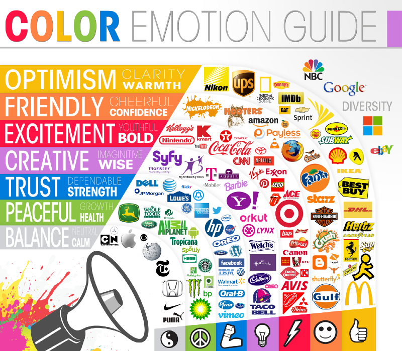
Red — Energy, Power, Love
Red creates a sense of urgency, thus you’ll notice it being used in posters such as that of clearance sales. Additionally red has the ability to increase your appetite, so it is used quite a lot in the food industry too. It is a very emotionally intense color, so using it as a background color may not be the best idea.

Yellow — Optimism, Intellect, Joy
Yellow is a color associated with the sun, and just like red it is really bright. It would be a better choice to use it in your app logo or your app screenshot design. This color may get too overwhelming so use it less than most.

Blue — Stability, Tranquility, Trust
Blue usually indicates coolness and calmness and creates a sense of trust, thus it is popularly used in logos of airlines and hospitals. You will notice a lot of app logos use this color, especially the ones that ask for a lot of your private details.
The secondary colors are the mixtures of two of the three primary colors. They are green, purple and orange.

Green — Growth, Health, Freshness
Green is the color of the environment and is strongly associated with money. It is usually used to advertise healthy foods and fresh products. You will notice that it is famously used in the health & fitness related apps.
Purple — Royalty, Nobility, Wealth
Purple has the energy of red and the stability of blue; traditionally it is considered to be a feminine color, so you’ll notice it being used in the makeup, fashion, and luxury industries a lot.

Orange — Enthusiasm, Encouragement, Happiness
Orange packs the energy of red and the optimism of yellow. It is a less commonly used color but is typically used in citrus-based products. It also has the ability to increase the flow of oxygen in the brain.

Grey, white, and black
These are commonly known as bland colors but still give a very classy look and you will notice them being used often in car brands. Grey is usually considered to be an emotionless color and it levitates on the neutral side. Black is usually associated with power, elegance, mystery while white is associated with safety, purity and faith.
Now that you know about the basic colors, you are not limited to just these six. Using the color wheel, you can also create many different types of color palettes as long as you maintain colorful harmony throughout your app.
How to create color palettes using the ‘Color Wheel’
A color wheel is an abstract illustrative organisation of color hues around a circle, which shows the relationships between primary colors, secondary colors, tertiary colors etc. (Source)
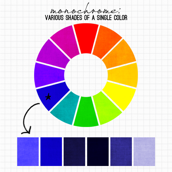
Monochromatic colors
Monochromatic colors are created by using the same color and combining them with various amounts of white or black to create different tones and shades that stand out from each other.
Pros:
- Trendy
- Useful for modern digital design
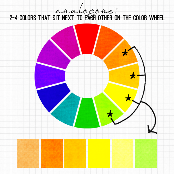
Analogous colors
Analogous colors are formed when you combine a color on the color wheel with the color immediately next to it.
Pros:
- Easy to look at
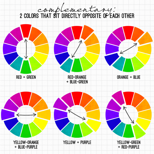
Complementary colors
Complementary colors are the exact opposite of analogous colors. Their main purpose is to grab the attention of the user, although it may not be ideal to use it for the main interface of the app.
Pros:
- Useful for creating app logos and app screenshot designs.
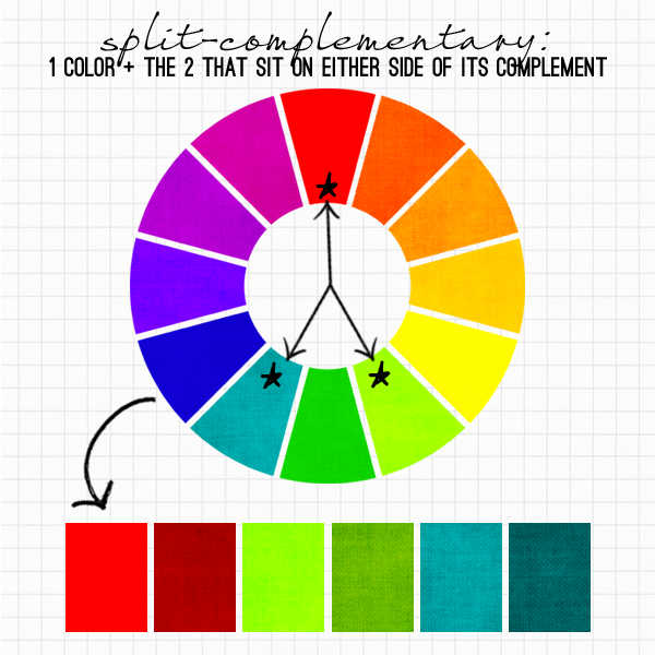
Split-Complementary colors
This is a combination of both analogous and complementary colors where you take one color and pick two colors that are right alongside the opposite color. They are one of my personal favourites.
Pros:
- Attention grabbing
- Easy to look at

Triadic colors
You can create a triadic color palette by taking one color on the color palette and drawing an equilateral triangle on the color wheel to form a triadic color.
Pros:
- Attention grabbing
- Well balanced
- Has a vintage feel to it
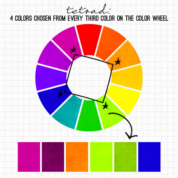
Tetrad colors (Square-based)
A square-based tetrad is used when all four colors are evenly spaced throughout the color wheel.
Pros:
- Works best when colors need to be balanced.
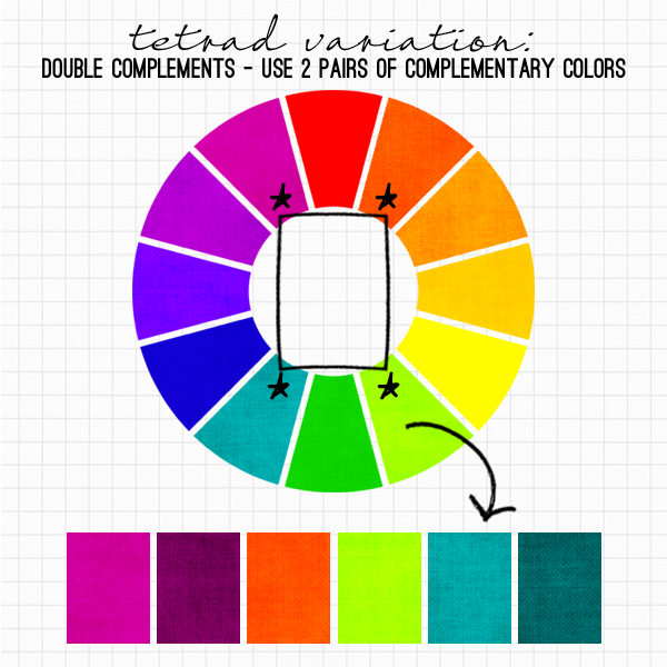
Tetrad colors (Rectangle-based)
A rectangle-based tetrad uses four colors that are pairs of two complementary colors on a color wheel.
Pros:
- Useful when only one dominant color is required.
Factors to consider before using a certain color
As I mentioned before, depending on your target audience, your use of colors should differ as they may not always imply the same thing.
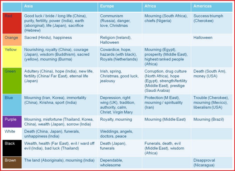
Culture
It is one of the vital factors to be considered before using any color; depending on the functionality of what your app does you should select an appropriate dominant color for your app.
For example, if you’re designing a dating app with your dominant color being red, it would get significantly more downloads in Asia than it would in Africa. Here’s a list that shows how different colors are perceived by different countries.
Gender
It has been scientifically demonstrated that men and women prefer certain colors over others. Women tend to prefer primary colors, and love blue, purple and green the most, but hate orange, brown and grey. If you want you can check almost any e-commerce app/website whose target audience is women and you’ll find these colors affirmed. Similarly, men love blue, green and black and hate brown, orange and purple.
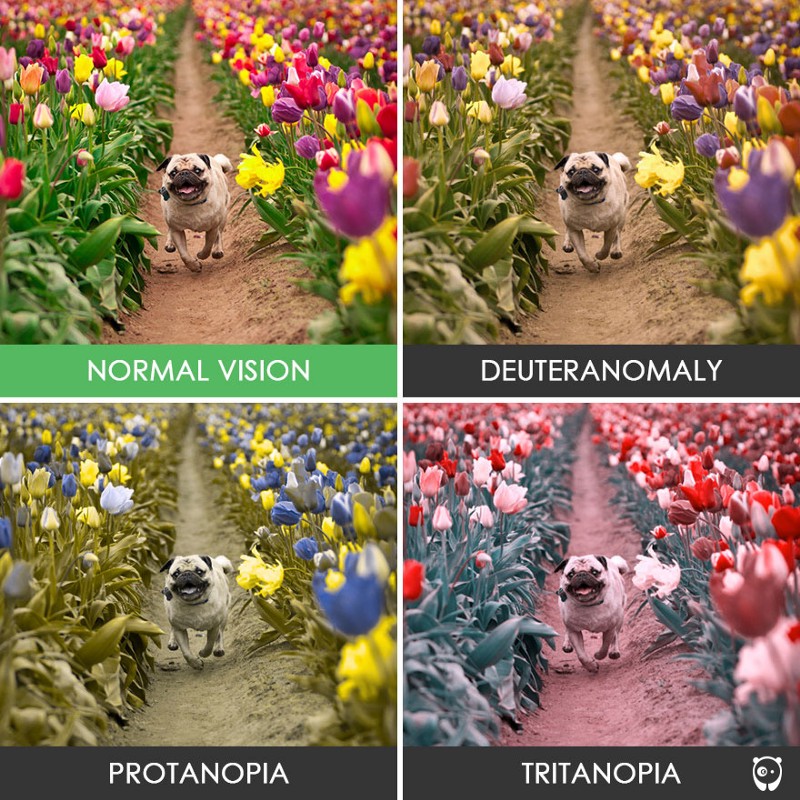
Color Blindness
Color blindness affects 1 in 12 men (8%) and 1 in 200 women around the world. This means that ~300 million people are color blind around the world and a mass you shouldn’t neglect. Majority of the population being men, so keeping the above mentioned statistics in mind you should decide your colours accordingly. At the end of the article, i’ve mentioned a tool you can use to see how a color blind person would see an image depending on the type of color blindness a person has.
Shades of the same color
This can also have quite an influence depending on the intensity of it. For example, bright red may signify love, but another shade of the color red, like crimson, probably wouldn’t signify the same thing.
A few great tools for designing
Now that we have covered the main aspects of color theory, here is a list that shows some of the websites that I use to create my own color palettes.
- Colorhunt—a free and open platform for color inspiration with thousands of trendy hand-picked color palettes
- A few other palettes include Coolors, Material Design Palette and Flat UI Colors 2
- ColorZilla — a chrome extension for finding the hex color code from any website.
- Toptal — a great tool for seeing how a color blind person would see a picture.
- If you would like to be inspired by a few websites that use their own unique color palette, you can see them here.
A few final things to keep in mind
- Test various color palettes — Try using different logos on your app to see which one gets you more downloads. Google Play Store offers you an option to show different logos to people so that you can increase your downloads.
- Avoid using too many colors — Colors can be a lot of fun, and we’ve seen that throughout this article. But don’t use them more than required, as it would just annoy your user and they could end up deleting your app from your phone.
- Use bright colors for CTA’s — Bright colors tend to be really attention-seeking so use them in buttons and logos, basically whenever you need the user to perform an action.
- Use colors that sell your brand the best — Although you don’t always have to stick to the rules, at the end of the day you are selling a product and your main purpose is to market it to make it successful. So use the colors that suit your product the best keeping all the factors in mind.
By using all the techniques and tools that we just spoke about in this article, I hope you land up with a good combination of colors for your own website/app. Good luck!
This is my first article, so I would appreciate if you would leave some feedback!