

Material UI's Data Grid is a powerful and flexible data table. It makes it easy for you to display data and perform out of the box functionalities such as editing, sorting, filtering, pagination and more.
In this article, we'll discuss why you should use the Data Grid in Material UI in your project. And then we'll also go through how to install and set up the Data Grid, consume and integrate a RESTful API, and enable pagination as well as sorting and filtering.
Table of Contents
Watch the video version of this article below, or on my YouTube channel:
Introduction to Data Grid
According to the Material UI documentation, Data Grid is a
"fast and extendable React data table and React data grid. It's a feature-rich component available in MIT or Commercial versions".
Basically, Data Grid in Material UI comes with some features like editing, sorting, filtering, updating, pagination, exports and so on by default.
The team also has future plans of implementing additional features like Excel export, Range selection, Group, Pivot, Aggregation.
For the purpose of this tutorial, we will be implementing some of the features of the Data Grid with a public REST API called JSONPlaceholder
Why use the Material UI Data Grid
There are some important reasons you might want to use the Material UI Data Grid:
Accessibility
User Interaction
Data Presentation
Accessibility
The Data Grid offers accessibility features such as cell highlighting. That is, every cell is accessible using the keyboard.
It also provides additional features such as keyboard navigation by using certain keys on the keyboard to change the focus of the table cells, along with density properties to determine the row and column height on the table.
User Interaction
In terms of interaction, the Data Grid provides an inbuilt feature such as row selection by default. This allows the user to select certain rows on mouse click or using certain keyboard shortcuts.
The Data Grid in Material UI supports single and multiple row selection, ability to disable selection certain rows or all rows, checkbox selection and much more.
Data Presentation
The Data Grid provides an inbuilt feature that allows data to be exported to CSV format.
Also, data can be manipulated by clicking a column header. This will trigger the sorting and filtering functionalities.
Another basic feature that comes by default is scrolling, which does not occur in a normal table by default.
How to Install and Setup React and Material UI Data Grid
To create a new project in React, you need to have Node.js installed. This will give us access to npm in our terminal. We can then install and use Create React App using npm to create our project, by running the command below:
npm i create-react-app
The next step is to create a new React project from the terminal by running the command below:
npx create-react-app data-grid
cd data-grid
npm start
Above we created a new project called data-grid. Then we navigated into the newly created project directory and started the project with npm.
By default, our project will be running on localhost:3000 in the browser.
Finally, we need to install two packages which are Material UI and the Data Grid using the command below:
npm install @mui/x-data-grid @mui/material
API Integration and Consumption
To integrate our API, we need to create a new file and folder in our src directory that's created for us when we generated our project with Create-React-App. We will call this new folder Table and the file will be called DataGrid.js.
In the end, our folder structure should look something like this:
> src
    > Table
        > DataGrid.js
.gitignore
package-lock.json
package.json
README
In the DataGrid.js file, we will use a functional component. In this functional component, we will implement some of the following default features in React:
useState hook
useEffect hook
The Fetch API
The useState Hook
The useState hook in React is an inbuilt function that helps us track state in a functional component.
The useEffect Hook
The useEffect hook allows us to handle side effects in our functional component. Some of these side effects could include things like updating the DOM, fetching data from a RESTful API, timer events, and so on.
The Fetch API
The Fetch API in JavaScript allows web browsers to make HTTP requests to web servers. The request can be of any APIs that send and receive data in JSON or XML format.
Now that we've explored the concept of hooks and the Fetch API, let's generate a boilerplate functional component in our DataGrid.js file:
import React from 'react'

const DataGrid= () => {
  return (
    <div>

    </div>
  )
}

export default DataGrid
The next step is to consume the REST API from JSON placeholder.
To do that, the first thing we need to do is to import the useState and useEffect hooks:
import React, { useState, useEffect } from 'react'
Then we create a variable using the useState hook:
const [tableData, setTableData] = useState([])
The tableData above serves as a getter, while the setTableData serves as a setter.
Finally, to access our data we will use the useEffect hook and the Fetch API:
useEffect(() => {
  fetch("https://jsonplaceholder.typicode.com/posts")
    .then((data) => data.json())
    .then((data) => setTableData(data))
}, [])
 console.log(tableData)
Above, we can see that inside the useEffect hook, we did three things:
First, inside the useEffect hook, we used Fetch to consume the JSON placeholder REST API
Then we converted the response we got into JSON format
Lastly, we passed the data from our response to the setter we created earlier called setTableData
To be sure we got the right response, we logged the data we got into the console. To see the results in the console, we need to import our DataGrid.js inside our App.js file:
import './App.css';
import DataGrid from './Table/DataGrid';

function App() {
  return (
    <div className="App">
      <DataGrid />
    </div>
  );
}

export default App;
Then we get the result below, which consists of a list of 100 objects in an array:
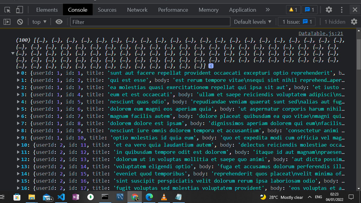
JSON Data in the Console
How to Display the API Results in the Material UI Data Grid
To display our API results in the Material UI Data Grid, we need to import the Data Grid package into our DataGrid.js file:
import { DataGrid } from '@mui/x-data-grid'
We then set up the configuration for the header section of our Data Grid table:
const columns = [
  { field: 'id', headerName: 'ID' },
  { field: 'title', headerName: 'Title', width: 300 },
  { field: 'body', headerName: 'Body', width: 600 }
]
As you can see above, it is in an array of objects and it contains an id, title and a body, which is in accordance with the results we got from our REST API.
Finally, we bring in the DataGrid component into our return statement:
<div style={{ height: 700, width: '100%' }}>
     <DataGrid
       rows={tableData}
       columns={columns}
       pageSize={12}
     />
   </div>
Above, we have three properties inside the DataGrid component:
The first one is the rows property. What we did with the row property was to pass in the results we got from our REST API, which is contained in the getter called tableData
The second property is called columns. This is the array of objects that contains the header of our DataGrid that include the id, title and body.
The last property is the pageSize. This helps us to set a limit to the amount of data that can be displayed at once. As you can see, we set this to 12 – the rest of the result is then paginated by default.
In the end, our DataGrid.js file should look something like this:
import React, { useState, useEffect } from 'react'
import { DataGrid } from '@mui/x-data-grid'

const columns = [
  { field: 'id', headerName: 'ID' },
  { field: 'title', headerName: 'Title', width: 300 },
  { field: 'body', headerName: 'Body', width: 600 }
]

const DataGrid = () => {

  const [tableData, setTableData] = useState([])

  useEffect(() => {
    fetch("https://jsonplaceholder.typicode.com/posts")
      .then((data) => data.json())
      .then((data) => setTableData(data))

  }, [])

  console.log(tableData)

  return (
    <div style={{ height: 700, width: '100%' }}>
      <DataGrid
        rows={tableData}
        columns={columns}
        pageSize={12}
      />
    </div>
  )
}

export default DataGrid
The results in the browser should also look like the image we have below:
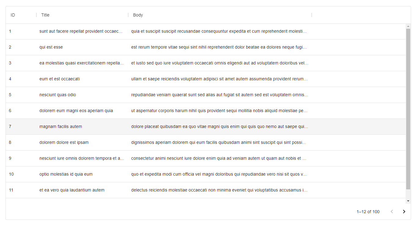
Data Grid Table Result
One awesome thing to note in the result of our image above is that, we have an out-of-the-box sorting and filtering functionality when we click on the header section(id, title, body) of our data table.
Conclusion
In this article, we learned about DataGrid in Material UI, React Hooks, REST API consumption and much more.
Also, the link to the code of this article can be found on GitHub.
If you enjoyed this article, show your support by subscribing to my YouTube channel where I create awesome tutorials on web development technologies like JavaScript, React, Angular, Node.js, and more.
If you have any feedback or question on this post or other programming related questions, you can find me on Twitter @thecodeangle.