
By Jessica Chan
If you’re trying to build freelance websites for clients, or even just trying to build up your portfolio, you may have come across this conundrum:
How do you build a website if you don’t have any web design skills?
Here are some options:
- You could hire a web designer to create the design for you — but (good) designers aren’t cheap.
- You could find a cheap designer on Fiverr or Upwork — but you know it can be risky.
- Or you could download a free or premium theme or template — but sometimes they don’t do everything you want them to.
One other option for you is to learn some basic skills to layout and design websites, and to build your own front end out.
Now, you’re not going to become an amazing designer in the time it takes you to read this article. And for complex websites, you may end up needing to work with a professional designer.
But I believe that you can learn how to plan and design simple websites that would work for most small businesses.
This method involves:
- Learning the basics of how websites are put together visually
- Researching existing web designs to get inspiration and ideas for yourself.
Once you know the basics of how to layout and design for the web, you’ll be able to build custom websites that you can use for your portfolio and freelance clients.
And, of course, each website you build will give you experience. Over time, you will be able to create more and more complex designs as you continue practicing your craft.
Here are the main steps of this process:
- Decide the basics of your website
- Plan the layout of your website
- Put the design together
- Build out the final product
Each step will be fueled by research — looking at other websites to see what they do, and pulling out the parts that you want to reuse for your website.
One important note: I’m not at all advocating that you steal CSS or images that aren’t yours. (For one thing, you won’t learn anything with a copy and paste job.)
The idea here is to get creative ideas and concepts, and use them to create something similar.
Decide the basics of your website
Before you start picking colors or fonts, let’s answer some general questions about this website:
1. What kind of business will the website promote?
A pizza place, photographer’s studio, or bookstore? Any kind of business could benefit from a website, so you can choose anything.
For our purposes here, we’ll choose a fictional coffee shop called Central Coffee. Because everyone likes coffee, right?
2. What pages will the website have?
Some common pages would be the homepage, about page, contact page, and pages specific to the industry that the business is in.
The best way to figure out the pages and other general structural aspects of the website is to do some quick online research.
Research existing websites
Check out other existing websites for similar types of businesses. Look at 3–4 of these websites and see what pages they have.
Try to notice how the website is designed and take notes on:
- What pages the website has,
- What the overall style is,
- How easy it is to navigate and find things,
- And anything else that piques your interest.
One good place to find example websites is Theme Forest. It has a ton of free and premium website templates and WordPress themes. And if you stick with the most popular themes, you know that generally they will be examples of good designs.
Here is one coffee shop example from a theme I found.
The7
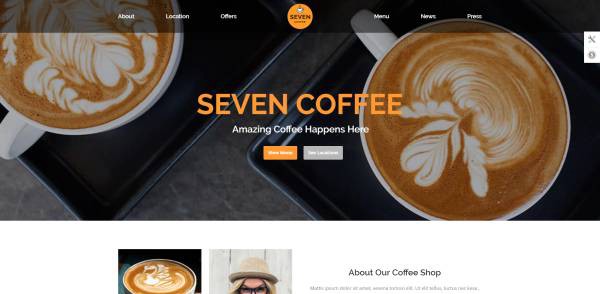
Pages:
One page website with the sections: Home, About, Location, Offers, Menu, News, Press, Blog Posts
Style:
Modern and clean, with good photos
Navigation:
Easy to navigate
And here are some websites that I found from a “coffee shop in Chicago” search:
The Wormhole Coffee
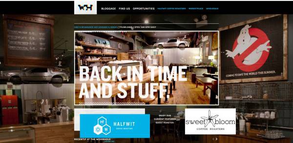
Pages:
Homepage, Blog, Location/Contact, Job Opportunities
Style:
Sort of modern; photos of the shop are more nostalgic
Navigation:
Not immediately obvious that this is a coffee shop. It’s a bit difficult to navigate the site.
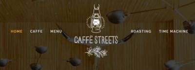
Caffe Streets
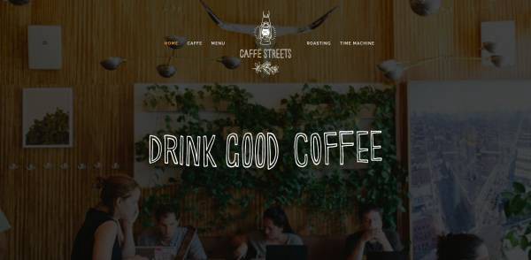
Pages:
One page website, the sections are: Home, Caffe (About), Menu, Roasting, Time Machine (juices), Contact Form
Style:
Simple and modern (Squarespace)
Navigation:
Pretty easy to navigate. I like the sticky menu bar up top that scrolls you down to each section.
Build Coffee
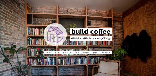
Pages:
One page website, the sections are: Homepage, About, Hours, Location, Shop, Catering, Events, Contact
Style:
Simple, design is a combination of full-width photos between sections of white background with text.
Navigation:
Pretty easy to navigate
Sawada Coffee
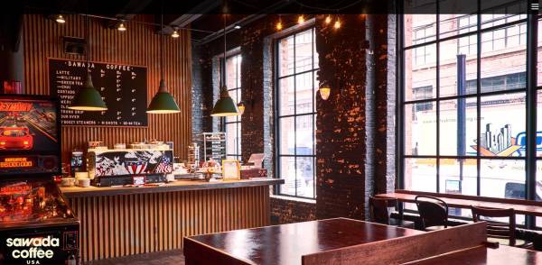
Pages:
Homepage, About, Food & Drink, Press, Contact & Hours, Our Restaurants, Jobs
Style:
Design is mostly about the photography, and the text seems almost an afterthought
Navigation:
It’s a bit difficult to navigate — I almost didn’t see the hamburger menu in the right corner.
Write down notes for your own website
Now, after looking at multiple coffee shop websites, we have a much better idea of what features are common. And we have some ideas of what we think works and doesn’t work.
Based on your research, you can now start writing down notes for your own site.
For Central Coffee, I think we’re going to stick with a simple one page website, with the following sections:
- Header
- Home
- About
- Menu
- Location/Contact
- Footer
Plan the layout of your website
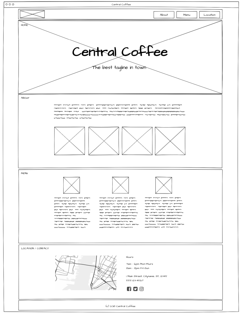
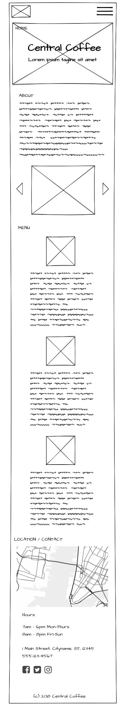
Now that we’ve figured out the skeleton of the site, we’ll flesh out each page or section with the elements that we want to put in each one. The layout that we’ll end up making is also called a wireframe.
In the wireframe, we’re not exactly designing anything, meaning no fonts, colors, or photos yet. We’re just figuring out the kind of content that we want, and roughly where it will be on the page. It’s more like a blueprint or a diagram at this point.
Header
I like the top navigation bar that’s on the Seven Coffee demo page, and the Caffe Streets website.
However, on both those pages it’s centered, and I’d rather have it aligned to the left, with the logo first and the sections after.
That’s for the desktop version. For tablet and mobile, we’ll just have the logo and hamburger menu in the header by default.
Clicking the hamburger will open up an off canvas menu that will slide in from the right to display the section navigation.
Home
Since it’s a one page site, the “homepage” will be what you initially see on the screen when you load the website. And I like how Seven Coffee has a little tagline under the name.

I think here I’ll have an image in the background (like Build Coffee) with the text on top of it. It’ll be the same on both desktop and mobile.
About
All the websites have a short About section, some with photos. I’ll put in a paragraph about the cafe and also include a few photos of the interior of the shop to entice users to want to come visit.
Menu
Each of the websites handles menus differently:
- Seven Coffee has a grid of menu items with prices,
- Caffe Streets just has a list of items,
- and Build and Sawada link out to PDFs of the menu.
Personally I hate when I’m browsing a website on my phone and I have to download a PDF. So I’m going to stick to a simplified menu with drink and food items, and include a few photos.
Location/Contact
I want to put the location, hours, and contact information at the bottom of the website. My guess is that users will start at the top of the site and scroll their way to the bottom.
Putting the call to action at the bottom will answer the question, “what now?” It will help visitors to take action, specifically by getting directions to the cafe and hopefully visiting!
Footer
The footer will be pretty minimal. It will just be a small bar with copyright information.
The complete wireframe
Here are complete wireframes of the desktop and the mobile version of the website. I created these using a free online tool called Mockflow. They let you create one project for free, and they have paid plans if you want more than one project.
It’s pretty easy to use, and I like the sketchy style option because it’s fun ?
Decide the basic design specifications
Again, we’re not going to make super detailed and fancy styles. We do need to figure out some of the basics though. Things like:
Color scheme
The color scheme is simply the different colors you’re using on the website. Think of it like painting and decorating your house. Usually you would want to stick with neutral tones like grays and white, for most of the spaces. And one or two bright accent colors for the important elements that you want to pop out, like links and buttons.
If you need some color inspiration, Canva has some sample color palettes that you can try out.
For the Central Coffee website, I’m going to use the Fall Collection from that Canva link– it’s a warm color palette based around browns.
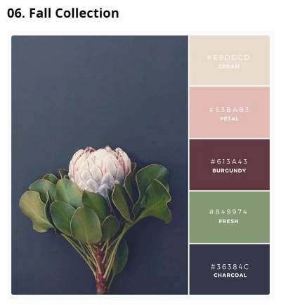
I’m trying to evoke that nostalgic, cozy feel associated with coffee shops.
Fonts
Going back through the websites, pretty much all of them use a sans-serif font (letters that don’t have the “serif,” or the end bars on like typewriter text).
I would pick a simple font for the majority of your text, and then you can go slightly more fancy with a heavier weight font for the titles and headlines.
Google Fonts is a great place to look for fonts that you can load on your website for free. Just don’t get too many, because every font family, weight, and style will add additional load to the site.
Images/Photography
Pick a general style or mood that fits the type of business the website is. For a coffee shop, you generally would want to go with inviting pictures with soft light, cozy or nostalgic feel for interior shots, people chatting and relaxing in the coffee shop, and images of food and drink.
For illustrations and logos, there are some free online graphic design tools that come with images you can use on your website. Some examples are:
Build out the website
Now we have wireframes to tell us generally how everything is laid out. And we have our design references, to help guide the front end styles.
Since we don’t have a designer to create detailed PSDs, we will just go ahead and start building the website from the wireframes we just drew up.
Here is how I usually approach building the front end of a website:
- Set up the website files
- Create and structure the folders and files.
- Get the task runner up and running. (I’m using Gulp for this project.)
- Create a separate HTML file for each template.
Then go through these steps for each HTML template:
- Create the skeleton structure with the basic HTML elements.
- Build out the page elements one by one.
- For each element, add in the CSS styles, first making sure each section is laid out correctly.
- Check how the page looks in the browser as you work, continuing to make corrections.
Make sure your website is responsive
While you’re building a site, it’s generally a good idea to check that your styles are looking seamless on desktop, tablet, and mobile.
You can easily check desktop styles on your own computer, with different browsers. For mobile, you can use Chrome’s developer tools, which emulates websites on various mobile devices.
Keep in mind that any emulation tool will not be 100% exactly like what the actual phone or tablet will see. So when testing your styles, you’ll eventually want to check it on a real phone when the website is on the internet.
Here are some device emulators that you can use to test website display:
- Responsinator.com (free)
- Screenfly by Quirktools (free)
- Browserstack (paid) — Browserstack allows you to test virtual machines on actual devices.
The finished product!
Here’s a screenshot of the finished Central Coffee website:
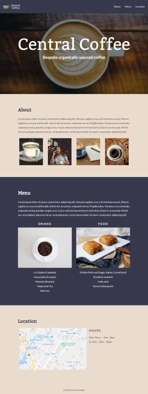
You can check out the real site for yourself on my Github.io page.
And that’s how I designed and built a website, without having to hire a designer.
I hope you found this post helpful! Let me know any thoughts you have in the comments below.
Want more?
◾️ Read more helpful posts like this on my blog: Coder-Coder.com.
◾️ Follow me on Instagram and Twitter!
◾️ Check out coding tutorials on my YouTube channel.