Having a good landing page for your website is important. It can help drive customers to your site where they'll find your products and services and hopefully take action.
In this text-based tutorial, I’m going to take you through how to make a landing page for a boxing TV channel with plain HTML, CSS, and JavaScript.
The name of our fictional TV channel is JabTV, and the purpose of making the landing page is to collect emails.
By the end of this tutorial, you will be able to make:
- a responsive hamburger menu
- a dark and light theme switcher
- a lightbox image gallery
- a scroll-to-top button
- and most importantly, a responsive web page
It doesn’t end with those benefits. I believe that as a beginner, you will be able to level up your CSS too after completing this tutorial.
To follow along with me, grab the starter files from this GitHub repo Check out the live demo too so you can get familiar with what we are building.
Table of Contents
- The Project Folder Structure
- The Basic HTML Boilerplate
- How to Make the Navbar
- How to Style the Navbar
- How to Make the Hero Section
- How to Style the Hero Section
- How to Make the About Section
- How to Make the Lightbox Image Gallery
- How to Style the Lightbox Image Gallery
- How to Make the Stakeholders Section
- How to Style the Stakeholders Section
- How to Make the Email Subscription Section
- How to Style the Email Subscription Section
- How to Make the Footer
- How to Make the Scroll-to-top Button
- How to Make the Dark and Light Theme Switcher
- How to Style the Dark and Light Theme Switcher
- How to Make the Landing Page Responsive
- How to Make a Hamburger Menu for the Landing Page
- Conclusion
The Project Folder Structure
The folder structure follows the convention that many front end developers use.
The HTML and readme files and a screenshot for the readme are in the root. The CSS files, JavaScript files, icons, and images go in their respective subfolders inside the assets folder.
The Basic HTML Boilerplate
The basic HTML boilerplate looks like this:
<!DOCTYPE html>
<html lang="en">
  <head>
    <meta charset="UTF-8" />
    <meta http-equiv="X-UA-Compatible" content="IE=edge" />
    <meta name="viewport" content="width=device-width, initial-scale=1.0" />

    <!-- Web page CSS -->
    <link rel="stylesheet" href="assets/css/styles.css" />

    <!-- Simple lightbox CSS -->
    <link rel="stylesheet" href="assets/css/simple-lightbox.min.css" />

    <!-- Favicons -->
    <link
      rel="apple-touch-icon"
      sizes="180x180"
      href="assets/icons/apple-touch-icon.png"
    />
    <link
      rel="icon"
      type="image/png"
      sizes="32x32"
      href="assets/icons/favicon-32x32.png"
    />
    <link
      rel="icon"
      type="image/png"
      sizes="16x16"
      href="assets/icons/favicon-16x16.png"
    />

    <title>JabTV Landing Page</title>
  </head>
  <body>
    <!-- Navbar -->

    <!-- Dark/light theme switcher -->

    <!-- Bars -->

    <!-- Hero section -->

    <!-- About section -->

    <!-- Lightbox image gallery -->

    <!-- Jab TV Stakeholders -->

    <!-- Email subscription -->

    <!-- Social icons -->

    <!-- Scroll to top button -->

    <!-- Web page script -->
    <script src="assets/js/app.js"></script>

    <!-- Ion icons CDN -->
    <script
      type="module"
      src="https://unpkg.com/ionicons@5.5.2/dist/ionicons/ionicons.esm.js"
    ></script>

    <!-- Simple lightbox -->
    <script src="assets/js/simple-lightbox.min.js"></script>
    <script>
      // Simple lightbox initializer
    </script>
  </body>
</html>
We will be coding the landing page section by section so it doesn’t get too complicated to understand.
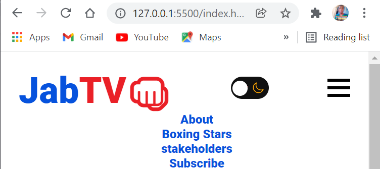
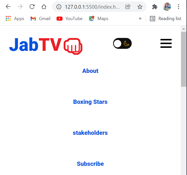
How to Make the Navbar
The navbar will have a logo to the left and nav menu items to the right. Later, we'll place the dark and light theme switcher between the logo and nav items, but let’s focus on the logo and menu items first.
For the logo, I won’t be using an image but a combination of text and emoji placed inside a span tag so I can style them differently.
The HTML for the logo looks like this:
<nav>
<a href="#" class="logo">
<h1>
<span class="jab">Jab</span><span class="tv">TV</span
><span class="fist">👊</span>
</h1>
</a>
</nav>
It’s a combination of the words “Jab” and “TV”, with a punch emoji.
The nav menu items are generic links placed in an unordered list tag, as shown in the snippet below:
<ul>
        <li class="nav-item">
          <a href="#about" class="nav-link" id="nav-link">About</a>
        </li>
        <li class="nav-item">
          <a href="#stars" class="nav-link" id="nav-link">Boxing Stars</a>
        </li>
        <li class="nav-item">
          <a href="#stakeholders" class="nav-link" id="nav-link"
            >stakeholders</a
          >
        </li>
        <li class="nav-item">
          <a href="#sub" class="nav-link" id="nav-link">Subscribe</a>
        </li>
</ul>
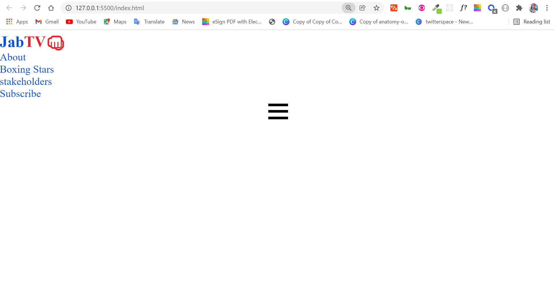
In addition, we need some bars for the mobile menu. The bars will be hidden on the desktop version and visible on mobile phones.
For this, I will be using bars made with raw HTML and CSS, not icons. The bars will be span tags placed in a container div with a class of hamburger.
<div class="hamburger" id="hamburger">
    <span class="bar"></span>
    <span class="bar"></span>
    <span class="bar"></span>
</div>
The nav menu now looks like this in the browser:
How to Style the Navbar
The navbar looks pretty ugly at this point, so we need to style it. We need to style the logo to make it look like one, and we'll use Flexbox to place the logo and menu items side by side.
For the whole web page, I will be using the Roboto font. I also have some CSS variables declared and some less complicated resets.
@import url("https://fonts.googleapis.com/css2?family=Roboto:ital,wght@0,400;0,900;1,700&display=swap");

/* CSS Variables */
:root {
  --normal-font: 400;
  --bold-font: 600;
  --bolder-font: 900;
  --primary-color: #0652dd;
  --secondary-color: #ea2027;
  --line-height: 1.7rem;
  --transition: 0.4s ease-in;
}

/* Smooth scroll effect */
html {
  scroll-behavior: smooth;
}

/* Resets */
* {
  margin: 0;
  padding: 0;
  box-sizing: border-box;
  transition: var(--transition);
}

 body {
  font-family: "Roboto", sans-serf;
}

ul li {
  list-style-type: none;
}

a {
  text-decoration: none;
  color: var(--primary-color);
}

a:hover {
  color: var(--secondary-color);
}
In the CSS code snippet above, I’m removing the default margin and padding assigned to all elements by browsers and setting the box-sizing to border-box. This way the padding and margin set will be more intentional.
I also set a transition (declared in the variables) so you will be able to see every transition on the website.
All links will be blue in appearance and red on hover – correlating to the primary and secondary colors.
To style the logo, I will make the first <span> red, the second <span> blue, and the .fist red. Both red and blue colors have been set as the secondary color and primary color respectively in the CSS variables.
The red and blue colors are commonly used in amateur boxing and other combat sports, which is why I chose them for the website.
.fist {
  color: var(--secondary-color);
}

.jab {
  color: var(--primary-color);
}

.tv {
  color: var(--secondary-color);
}
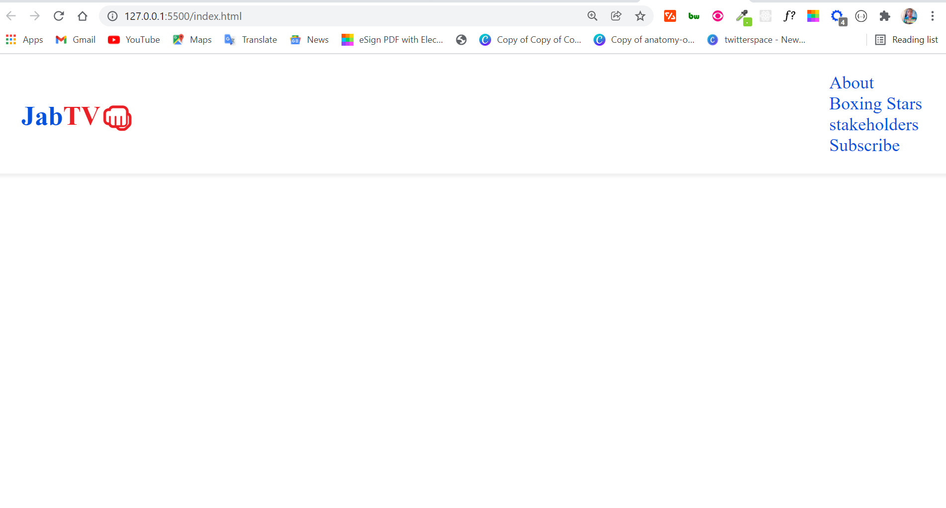
So far, the navbar looks like this:
To place the logo and menu items side by side, I will be using Flexbox. I will also hide the bars because we only need them on mobile devices.
nav {
  background: #fff;
  display: flex;
  justify-content: space-between;
  align-items: center;
  padding: 1rem 1.5rem;
  box-shadow: 2px 3px 2px #f1f1f1;
}
I applied a box shadow to make sure the user knows where the navbar terminates.
I’m also going to make the navbar sticky, so it always stays at the top whenever the user scrolls down. This helps create a good user experience.
I will do it with 4 lines of CSS:
 position: sticky;
  top: 0;
  left: 0;
  z-index: 1;
To hide the bars, I’m going to target the .hambuger class and give it a display of none:
.hamburger {
  display: none;
}
The navbar looks a lot better:
But the logo should be bigger. We also need to make sure the menu items are side by side and not on top of one another, so Flexbox will be instrumental here again.
.logo {
  font-size: 2rem;
  font-weight: 500;
}

ul {
  display: flex;
  justify-content: space-between;
  align-items: center;
}

.nav-item {
  margin-left: 2rem;
}

.nav-link {
  font-weight: var(--bold-font);
}
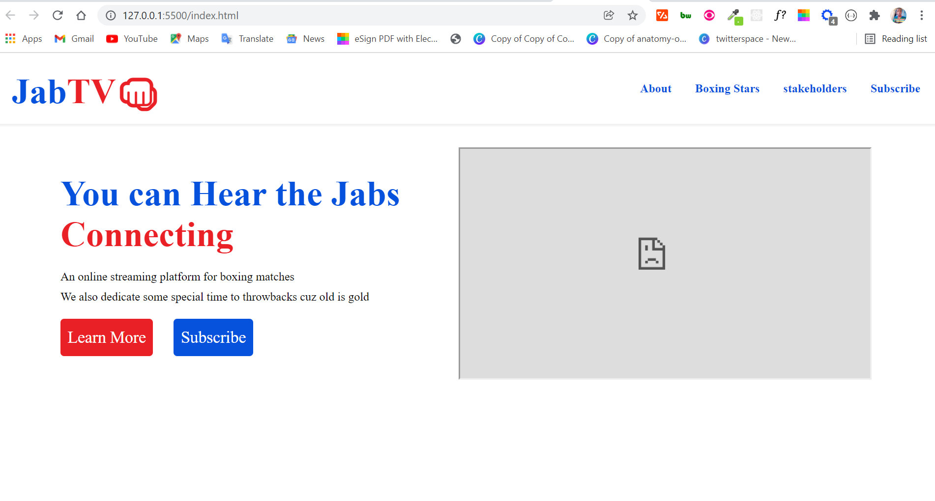
Take a look at the navbar now:
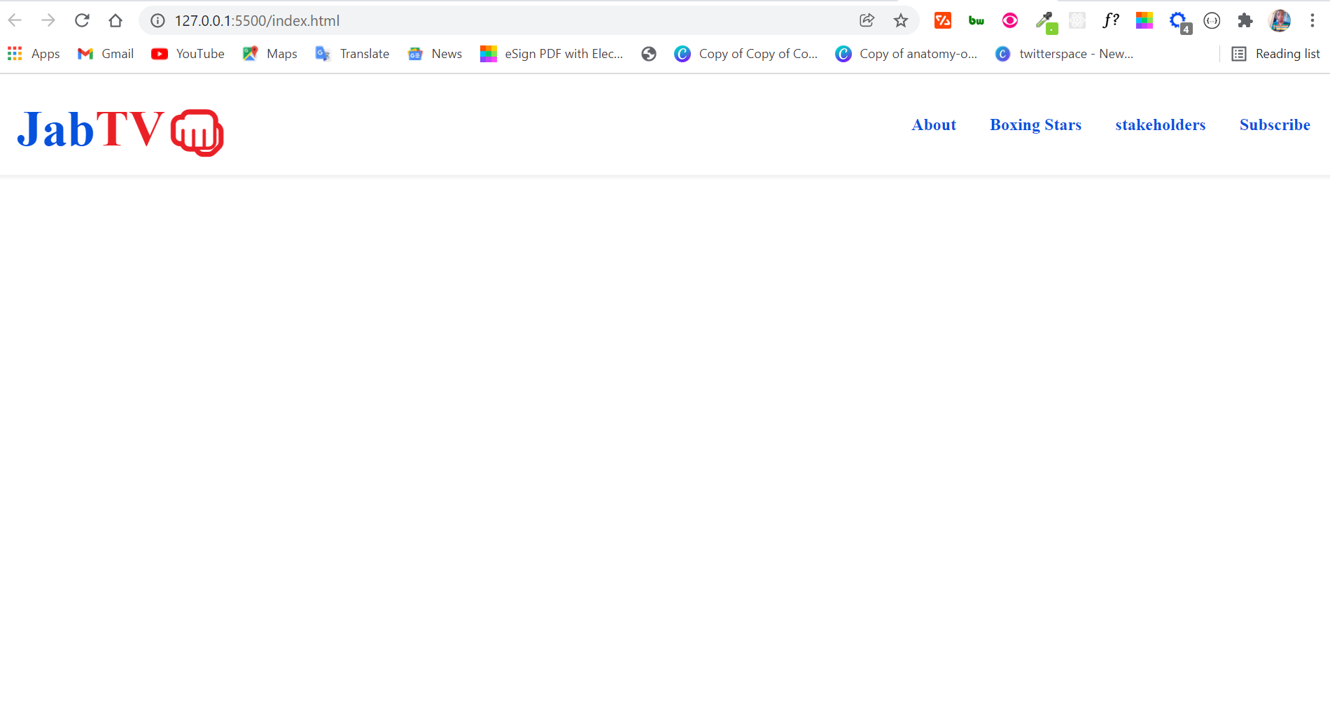
It doesn’t get better than that!
And take note that the logo is not an image. This means you can always update it with CSS.
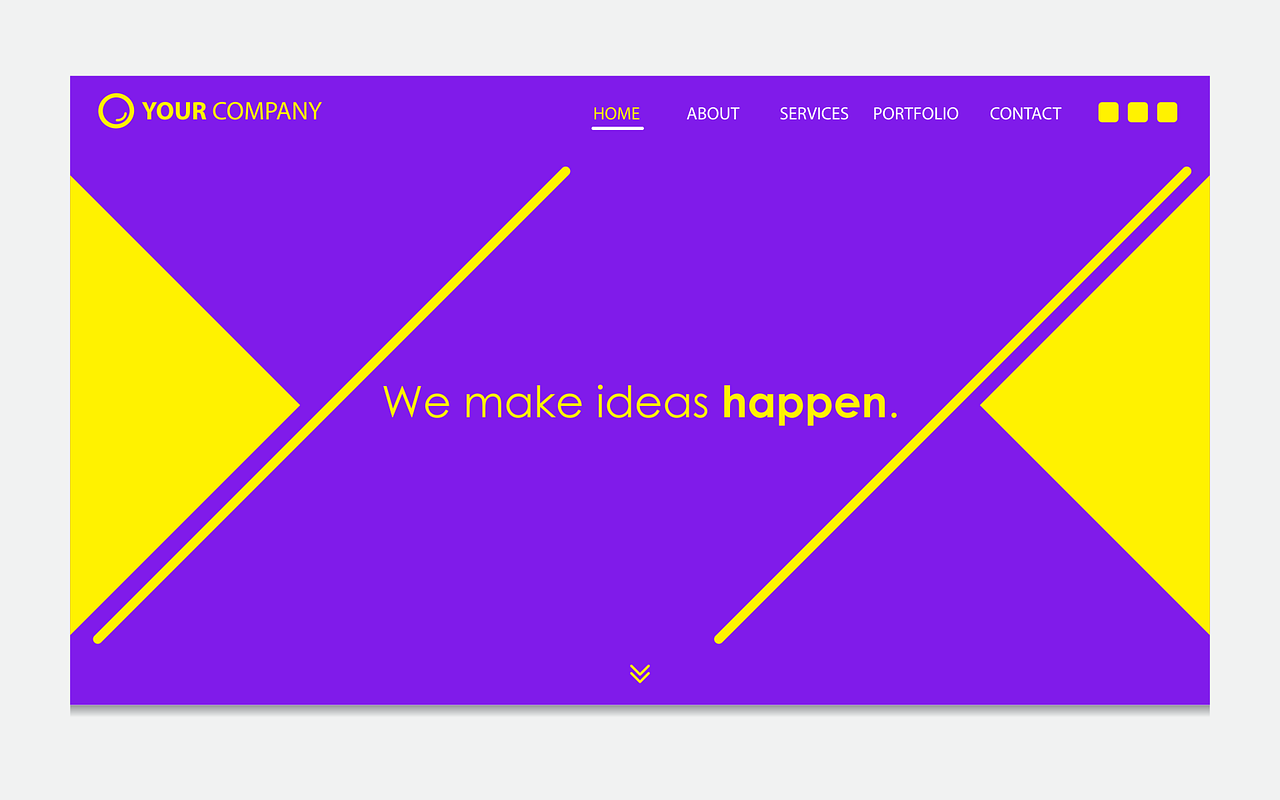
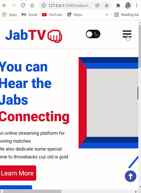
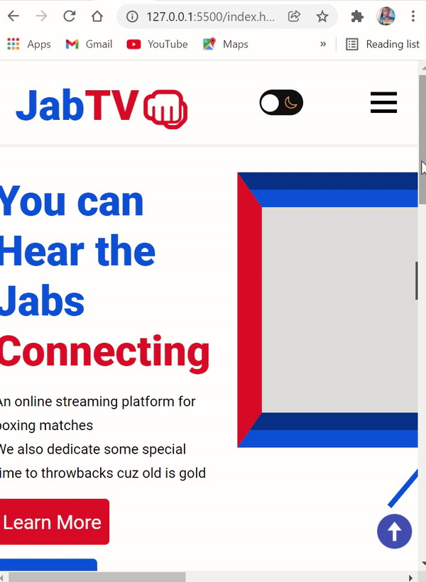
How to Make the Hero Section
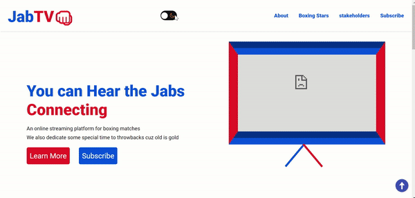
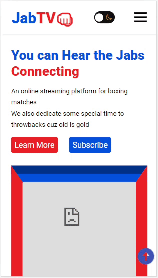
The hero section is going to contain a short description of JabTV, call to action (CTA) buttons, and an old-school TV made with CSS art. We'll make the TV with the iframe tag so a video can be displayed inside it.
The video we'll place in the iframe is of boxing great Mohammed Ali.
In short, this is what we are working towards:

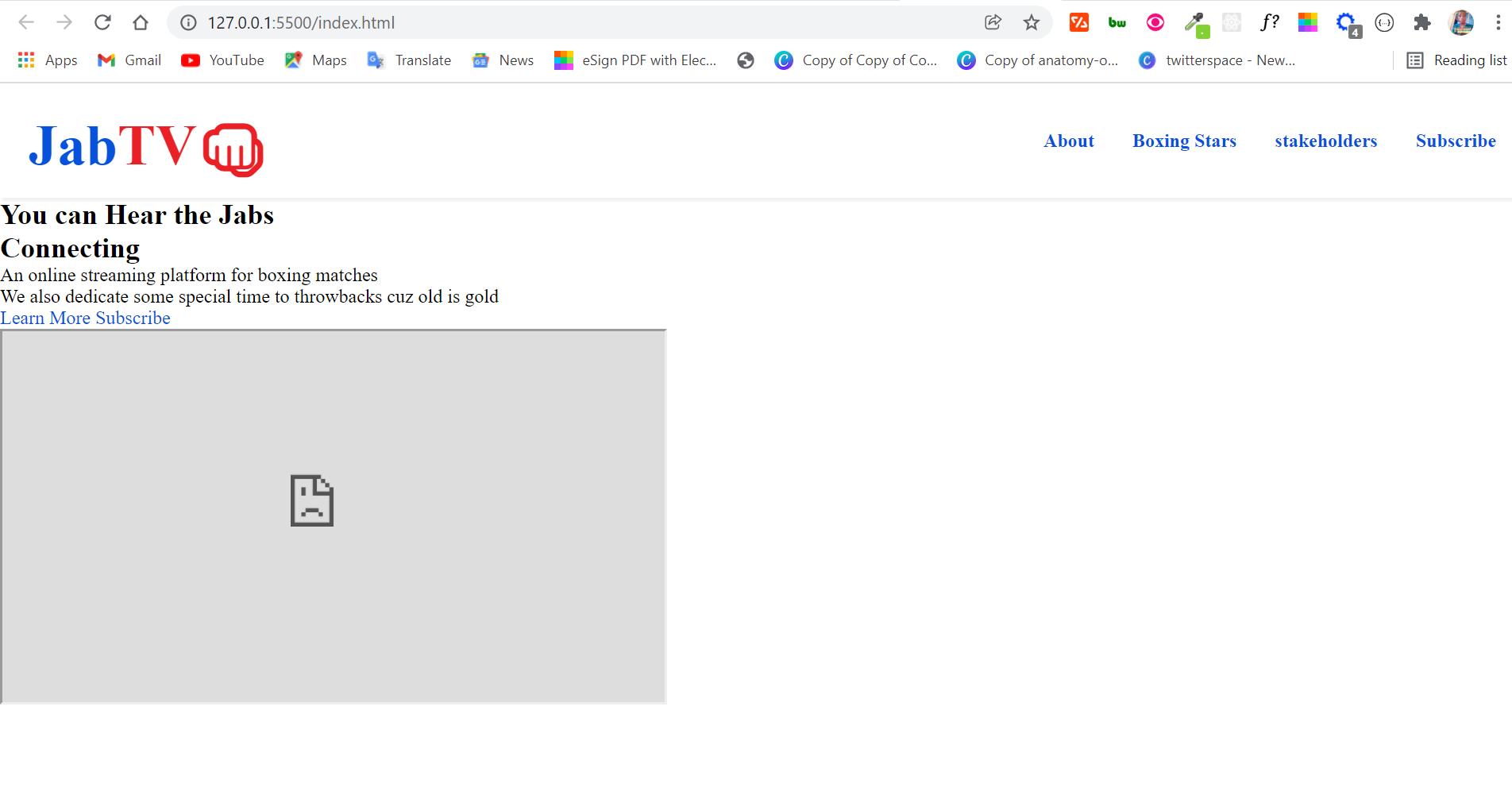
The HTML for the hero section is in the code snippet below:
    <section class="hero">
      <div class="intro-text">
        <h1>
          <span class="hear"> You can Hear the Jabs </span> <br />
          <span class="connecting"> Connecting</span>
        </h1>
        <p>
          An online streaming platform for boxing matches <br />
          We also dedicate some special time to throwbacks cuz old is gold
        </p>
        <a class="btn red" href="#">Learn More</a>
        <a class="btn blue" href="#">Subscribe</a>
      </div>
      <div class="i-frame">
        <iframe
          width="560"
          height="315"
          src="https://www.youtube.com/embed/sUmM_PFpsvQ"
          title="YouTube video player"
          frameborder="10"
          allow="accelerometer; autoplay; clipboard-write; encrypted-media; gyroscope; picture-in-picture"
        ></iframe>
        <div class="stand-1"></div>
        <div class="stand-2"></div>
      </div>
    </section>
With the HTML above, this is what we have in the browser:
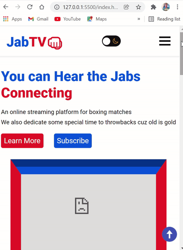
How to Style the Hero Section
To align the text and TV side by side, we need Flexbox.
display: flex;
  align-items: center;
  justify-content: space-between;
  gap: 1.9rem;
  max-width: 1100px;
  margin: 2rem auto -6rem;
}
Apart from aligning things with Flexbox, I also gave the section a maximum width of 1100px so the user won't have to look all the way to the extreme end to see the content of the section – this is good for user experience.
I applied a margin of 2rem on top, auto on the left and right, and -6rem on the bottom to center everything in the section.
So far, we have this in the browser:
To style the h1 texts of the hero section, I put them in their respective span tags, so I can style them differently.
Therefore, I will target the texts with the class attributes of the span tags:
.intro-text h1 {
  font-size: 3rem;
  margin-bottom: 1rem;
}

.intro-text h3 {
  margin-bottom: 0.5rem;
}

.hero p {
  line-height: var(--line-height);
}

.hear {
  color: var(--primary-color);
}

.connecting {
  color: var(--secondary-color);
}
Remember there are 2 buttons in the section, so I have a basic style defined for them:
.btn {
  margin-top: 1rem;
  display: inline-block;
  padding: 0.8rem 0.6rem;
  border: none;
  font-size: 1.4rem;
  border-radius: 5px;
  color: #fff;
}

.red {
  background-color: var(--secondary-color);
  margin-right: 1.5rem;
}

.red:hover {
  background-color: #f1262d;
  color: #fff;
}

.blue {
  background-color: var(--primary-color);
}

.blue:hover {
  background-color: #095cf7;
  color: #fff;
}
The section is taking shape:
Next, we need to make the iframe look like a TV. The border property will help us get that done.
From the HTML, remember I have 2 div tags with the classes of stand-1 and stand-2. I’m going to make the stands for the old school TV with the 2 div tags by using the transform property – which is instrumental in rotating or skewing an element.
iframe {
  max-width: 30rem;
  border-top: 40px groove var(--primary-color);
  border-bottom: 40px groove var(--primary-color);
  border-right: 28px solid var(--secondary-color);
  border-left: 28px solid var(--secondary-color);
}

.stand-1 {
  height: 90px;
  width: 6px;
  background-color: var(--primary-color);
  transform: rotate(40deg);
  position: relative;
  top: -16px;
  left: 200px;
}
.stand-2 {
  height: 90px;
  width: 6px;
  background-color: var(--secondary-color);
  transform: rotate(-40deg);
  position: relative;
  top: -105px;
  left: 255px;
}
To be able to move the stands around, I used the position property and set it to relative, which subsequently helped me assign left and top properties to the stands.
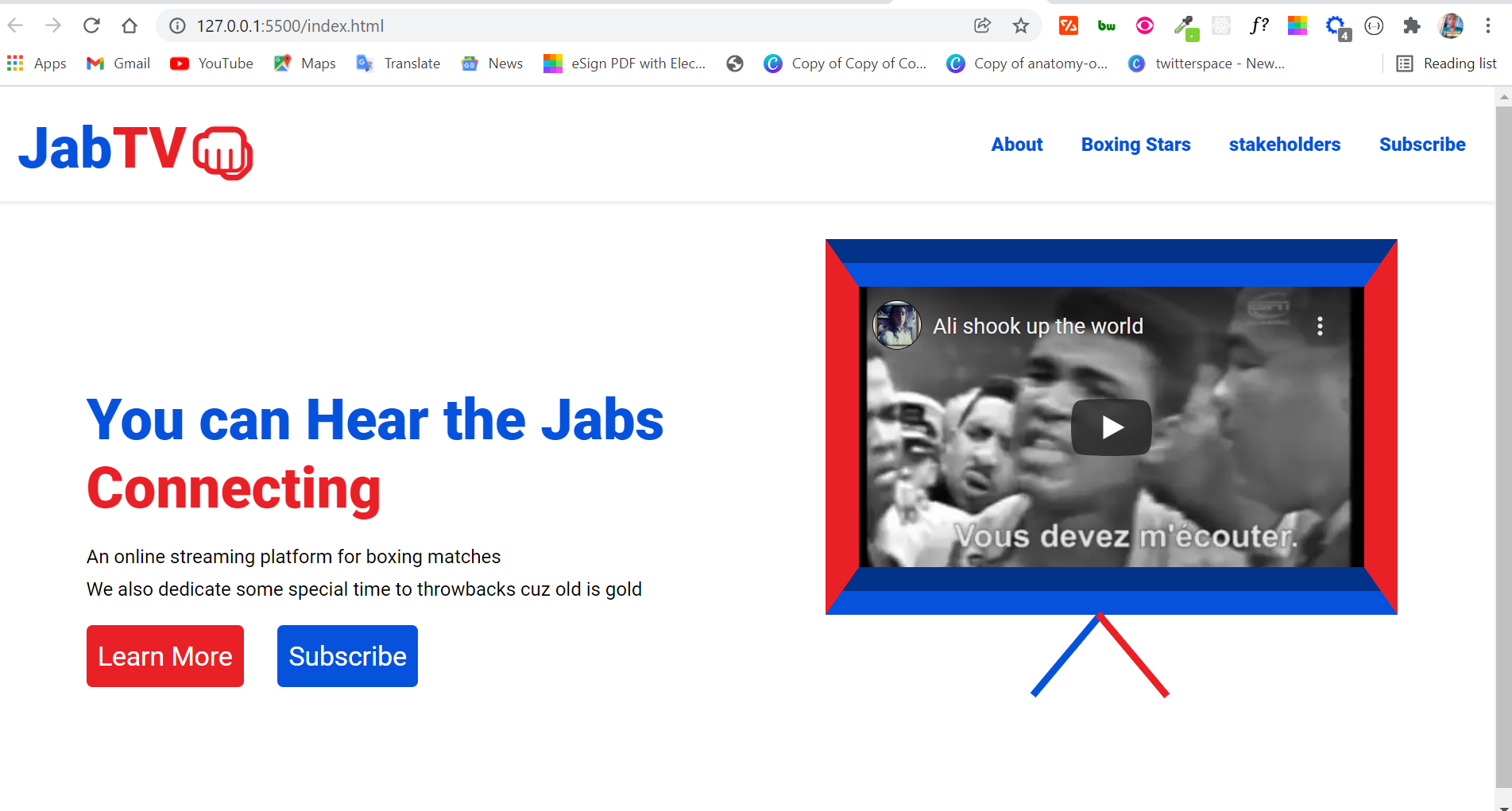
The hero section has now taken full shape:
How to Make the About Section
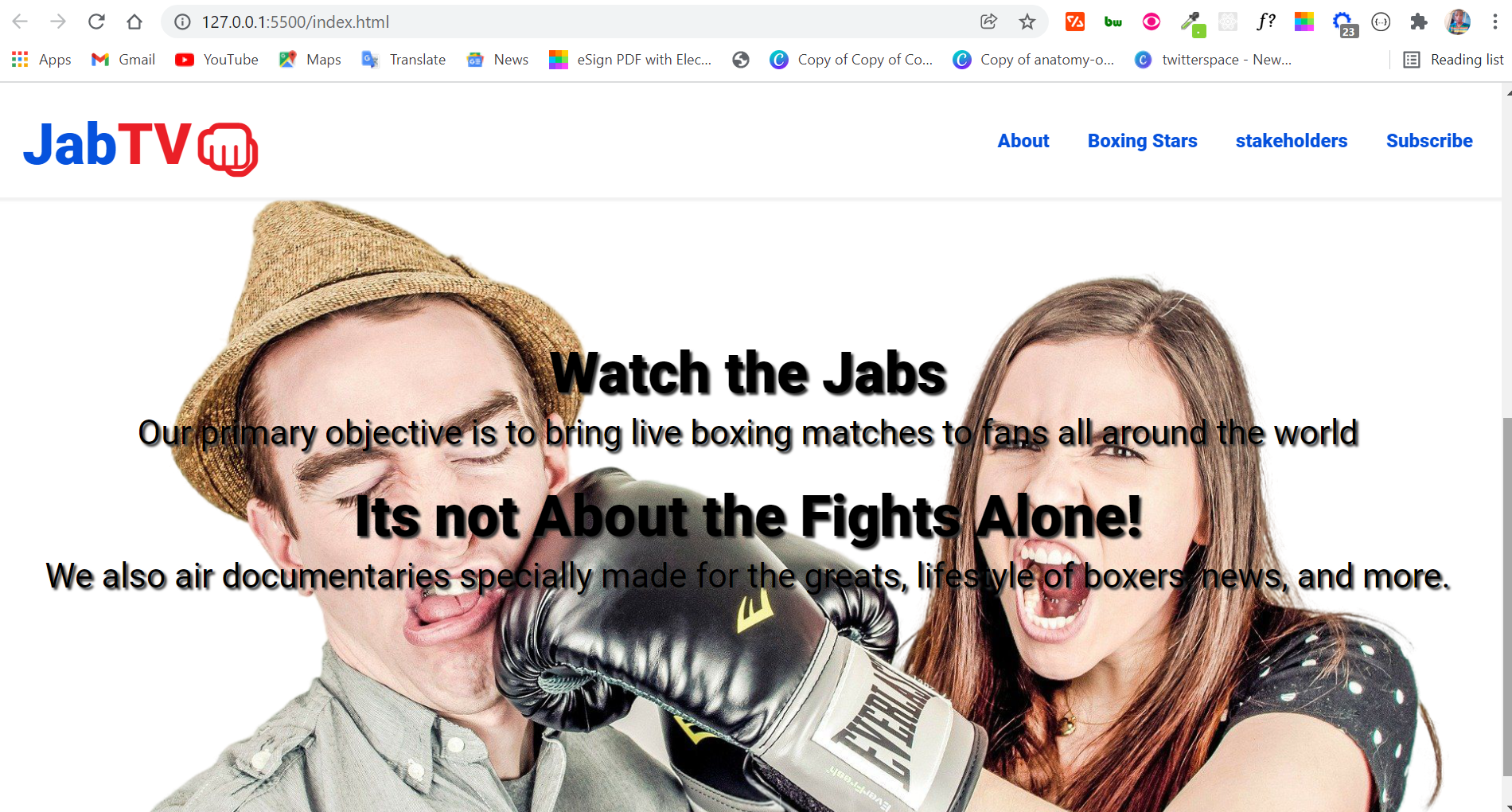
The about section will do what the name implies – it will detail what JabTV is about as briefly as possible. The section will contain text and a background image.
The HTML for this section is not complicated:
 <section class="about" id="about">
      <h3>Watch the Jabs</h3>
      <p>
        Our primary objective is to bring live boxing matches to fans all around
        the world
      </p>

      <h3>Its not About the Fights Alone!</h3>
      <p>
        We also air documentaries specially made for the greats, lifestyle of
        boxers, news, and more.
      </p>
</section>
If you’re wondering why there’s no img tag, it’s because I planned to bring in the background image with the CSS background property.
The background property is a shorthand for:
background-colorbackground-imagebackground-positionbackground-coverbackground-repeatbackground-originbackground-clip- and
background-attachment
Only what you specify will be applied, so you can always skip any of the properties.
Apart from the background property, I will also use Flexbox to align the text from the HTML so they can look nice on the background image.
This is how I used the position property in combination with Flexbox:
.about {
  position: relative;
  background: url("../images/jab-transformed.png") no-repeat top center/cover;
  height: 600px;
  display: flex;
  align-items: center;
  justify-content: center;
  flex-direction: column;
  gap: 1.5rem;
  margin: 2rem 0;
}
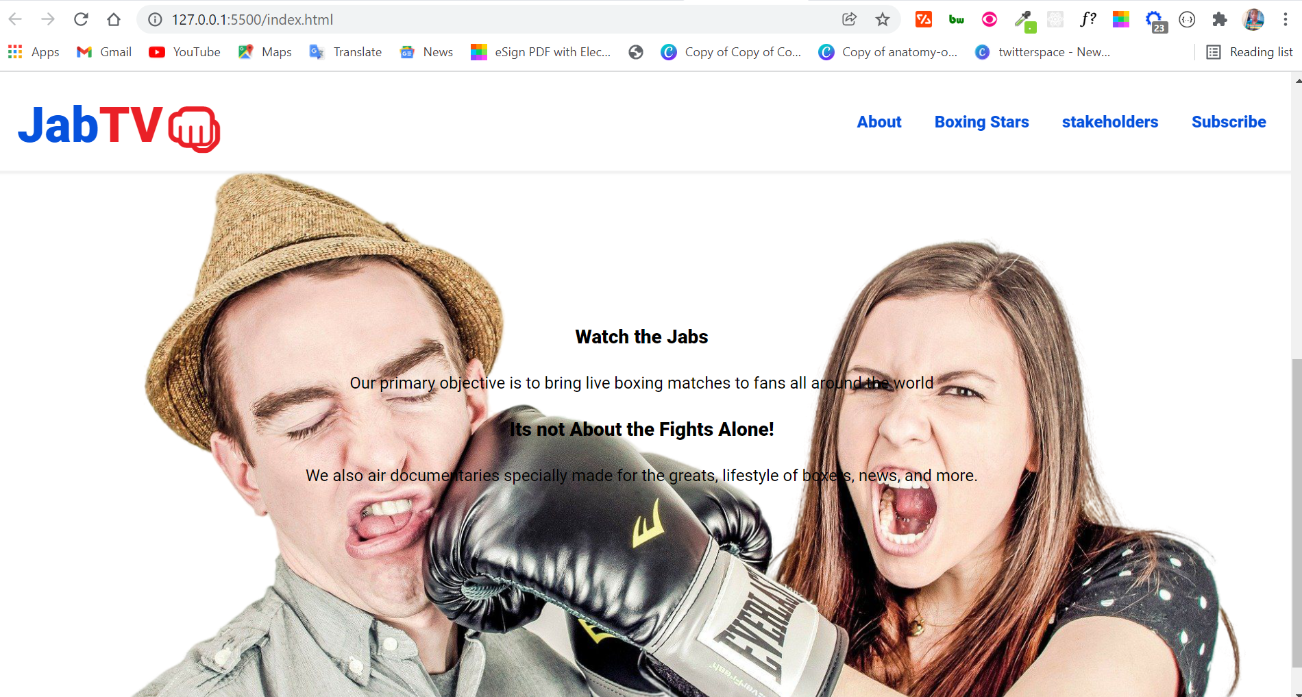
And this is how the section looks in the browser so far:
To make the texts look readable and nicer, I employed some more CSS:
.about h3 {
  font-size: 3em;
  margin-bottom: -20px;
}

.about p {
  font-size: 1.5em;
}

.about h3 {
  text-shadow: 2px 2px 2px #333;
}

.about p {
  text-shadow: 2px 2px 2px #333;
  font-size: 1.8rem;
}
Take note that I applied text shadow to the texts since they are displayed on an image. You should do this in every project for better accessibility.
The About section looks a lot nicer now:
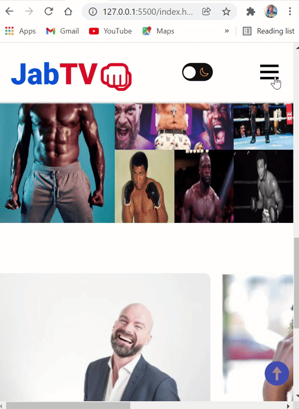
How to Make the Lightbox Image Gallery
For the lightbox image gallery, I will not be doing it from scratch – otherwise, this tutorial would become unbearably long. I will be using a plugin called simple lightbox, and CSS grid for the alignment of the images.
To use the simple lightbox plugin, you have to download it from their website. All we need is the minified CSS and JavaScript file.
When you extract the downloaded zip file, copy and paste the minified CSS and JavaScript file to the js and css subfolders inside assets, and link them appropriately, as I have done in the starter HTML.
To make the lightbox work, you have to wrap an anchor tag (<a>) around the image in an <img> tag.
The href of the anchor tag must also correlate with the image source, and they all must go inside a containing div tag which you'll need to assign a class attribute to.
This class attribute will be used to initialize the gallery with JavaScript. Don’t worry, the JavaScript will not be complicated. The gallery will feature boxing stars who I think are among the greatest.
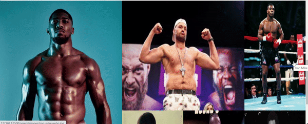
The HTML for the simple lightbox image gallery is in the code snippet below:
<section class="stars" id="stars">
      <div class="stars-gallery">
        <a href="assets/images/boda--femi.jpg" class="big">
          <img
            src="assets/images/boda--femi.jpg"
            alt="Anthony Joshua"
            title="AJ"
          />
        </a>

        <a href="assets/images/tyson-fury.jpg" class="big">
          <img
            src="assets/images/tyson-fury.jpg"
            alt="Tyson Fury"
            title="Gypsy King"
          />
        </a>

        <a href="assets/images/iron-mike.webp.jpg" class="big">
          <img
            src="assets/images/iron-mike.webp.jpg"
            alt="Iron Mike"
            title="Iron Mike"
          />
        </a>

        <a href="assets/images/ali.jpg" class="big">
          <img
            src="assets/images/ali.jpg"
            alt="Mohammed Ali"
            title="The Greatest"
          />
        </a>

        <a href="assets/images/wilder.jpg" class="big"
          ><img
            src="assets/images/wilder.jpg"
            alt="Deontay Wilder"
            title="Bronze Bomber"
          />
        </a>

        <a href="assets/images/big-george.jpg" class="big">
          <img
            src="assets/images/big-george.jpg"
            alt="George Foreman"
            title="Big George Foreman"
          />
        </a>
      </div>
</section>
To make the gallery work and scroll smoothly while viewing the images, you have to initialize it with one line of JavaScript:
<script>
     var lightbox = new SimpleLightbox(".stars-gallery a");
</script>
Our lightbox image gallery is now working:
How to Style the Lightbox Image Gallery
The images are badly aligned, so we need to arrange them with CSS Grid:
.stars-gallery {
  display: grid;
  grid-template-columns: repeat(5, 1fr);
}
In the CSS code snippet above, I targeted the div with a class of stars-gallery and gave it a display of grid, so we can use other properties of CSS on the elements inside the div.
I defined the column I need with grid-template-columns: repeat(5, 1fr);, which would confine the images into 5 columns.
So far, this is what the gallery looks like:
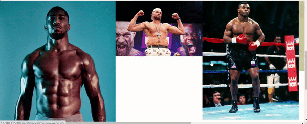
More still need to be done, because there is a white space and one of the images is not visible anymore.
I will give all the images a height and width of 100%, so they can all be visible:
.stars-gallery img,
.stars-gallery a {
  width: 100%;
  height: 100%;
}
Next, I will target the first image and define a grid row and column for it:
.stars-gallery a:first-child {
  grid-row: 1/3;
  grid-column: 1/3;
}
With the defined grid row and column, the first image will occupy the first 2 rows horizontally, and the first 2 columns vertically.
I will also target the second image and define a grid column for it:
.stars-gallery a:nth-child(2) {
  grid-column: 3/5;
}
Our image gallery is now nicely arranged and working fine:
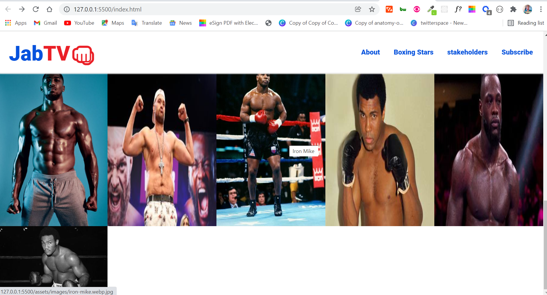
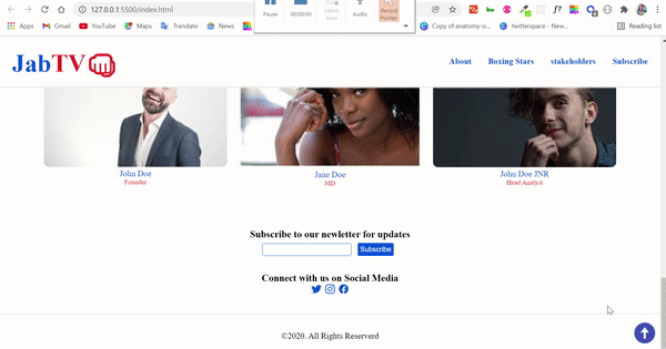
How to Make the Stakeholders Section
The stakeholders section contains those responsible for running JabTV.
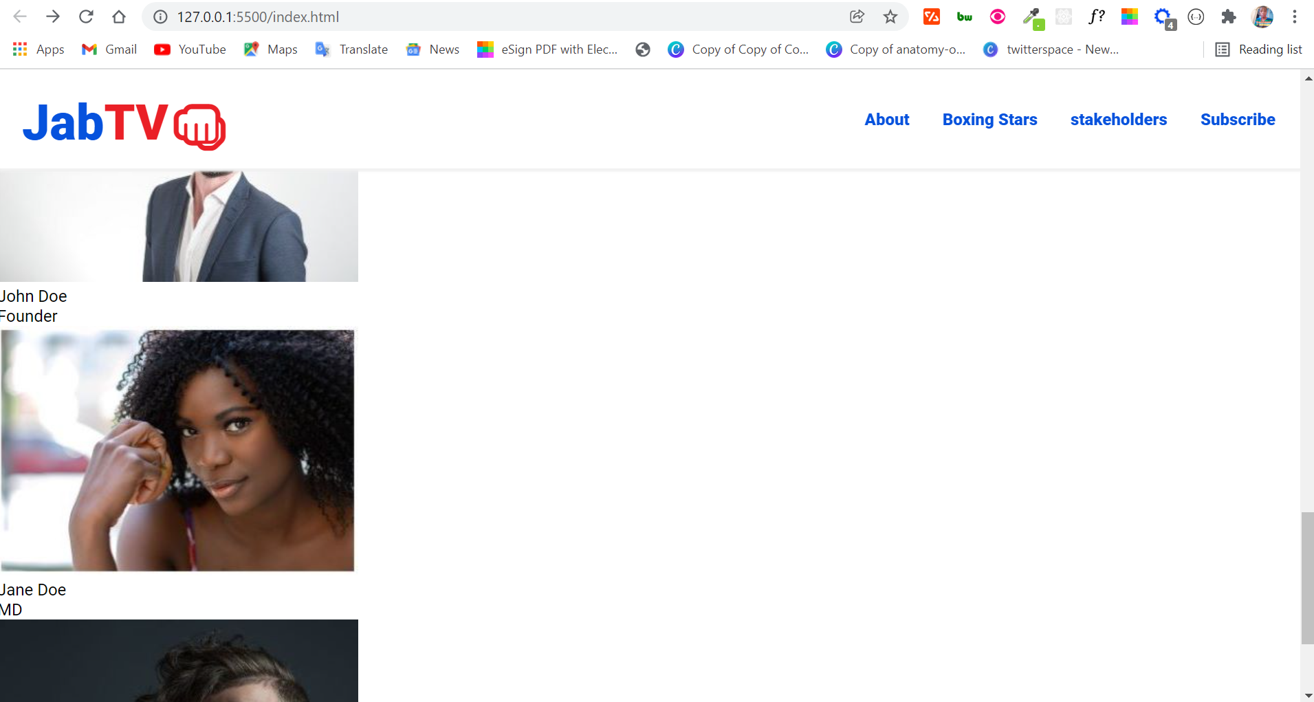
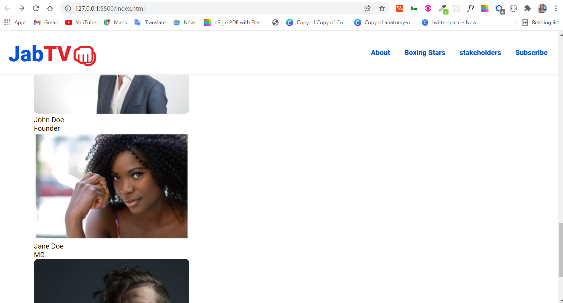
The HTML for this section is in the snippet below:
<section class="people" id="stakeholders">
      <div class="stakeholders">
        <div class="persons">
          <div class="person-1">
            <img src="assets/images/john.jpg" alt="John Doe" />
            <p class="name">John Doe</p>
            <p class="role">Founder</p>
          </div>
          <div class="person-2">
            <img src="assets/images/jane.jpg" alt="Jane Doe" />
            <p class="name">Jane Doe</p>
            <p class="role">MD</p>
          </div>
          <div class="person-3">
            <img src="assets/images/jnr.jpg" alt="John Doe Jnr" />
            <p class="name">John Doe JNR</p>
            <p class="role">Head Analyst</p>
          </div>
        </div>
      </div>
</section>
This is what the section looks like:
But that’s not how we want it, so we have some styling to do.
How to Style the Stakeholders Section
I will be using CSS grid to layout the images, names, and roles of the stakeholders. You can use Flexbox for this if you want. But before that, I’m going to do a little tweak for the section:
 .people {
  margin-top: 2rem;
  padding: 1rem 0;
}

.stakeholders {
  margin: 2rem auto;
  max-width: 1100px;
}

.stakeholders img {
  border-radius: 0.6rem;
}
In the code snippet above, I pushed the section down a little with a margin-top of 2rem. I targeted the .people class to do this.
The next thing I did was target the .stakeholders class, and I assigned it a margin of 2rem on the top and bottom. I also centered it on the left and right with auto.
Targeting the .stakeholders class again, I also gave the section a maximum width of 1100px, so spaces are created on the left and right. This makes sure that the user doesn’t look to the extreme left and right before seeing things.
This makes things look a little better:
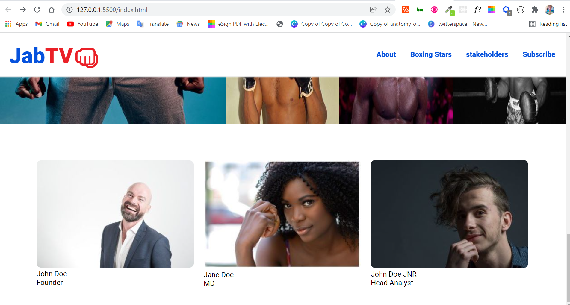
To finally layout the images and text with CSS grid, this is what I did:
.persons {
  display: grid;
  grid-template-columns: repeat(3, 1fr);
  place-items: center;
  gap: 1rem;
}
Since there are 3 images in a div:
- I defined 3 columns for the section
- aligned everything to the center horizontally and vertically with
place-items - added space of
1remwithin thedivtags with thegapproperty
Everything now looks good apart from the text:
To make the text look better, I’m going to target it with the .name and .role classes and align it to the center, and then assign it a color and font where necessary:
.name {
  color: var(--primary-color);
  text-align: center;
}

.role {
  color: var(--secondary-color);
  text-align: center;
  font-size: 0.8rem;
}
The section now looks good enough:

How to Make the Email Subscription Section
The email subscription section is going to be as short as possible. I will not be doing any integration for collecting emails here.
For this purpose, if you want to simply collect emails, you can use formspree. It’s better to use a service like Mailchimp or Convertkit, though, so you can do something with the emails you've collected.
The HTML for this section is just 12 lines:
<section class="sub" id="sub">
      <h3>Subscribe to our newsletter for updates</h3>
      <form action="#">
        <input
          type="email"
          name="email"
          id="email-sub"
          class="email-sub"
          required
        />
        <input
          type="submit"
          value="Subscribe"
          id="submit-btn"
          class="submit-btn"
        />
      </form>
</section>
As you can see, I have an input for email and a submit button inside a form.
The section doesn’t look too bad in the browser:
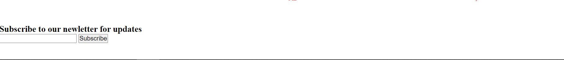
How to Style the Email Subscription Section
We need to align the h3 and form to the center, and make the subscribe button look good.
This is how I aligned the h3 and form to the center:
.sub {
  margin-top: 2rem;
}

.sub h3 {
  text-align: center;
}

form {
  text-align: center;
  margin: 0.4rem 2rem;
}
Notice I also pushed the section to the bottom a little with a margin of 2rem.
To push the form away from the h3, I gave it a margin of 0.4rem at the top and bottom, and 2rem at the left and right.
The form now looks a lot better:

The next thing we should do is make the input area and subscribe button look better. I attached a class of .email-sub to the input area, so I’m going to target it with the class and apply some styling:
.email-sub {
  padding: 0.2rem;
  border: 1px solid var(--primary-color);
  border-radius: 4px;
}

.email-sub:focus {
  border: 1px solid var(--secondary-color);
  outline: none;
}
Here's what's happening to the input area with the CSS above:
- I gave the input a padding of 0.2rem for better spacing
- I gave it (the input) a blue solid border of 1px
- I made the corners of the input rounded with a border-radius of 4px
- when focused, that is when you’re trying to type in the input, I changed the border color to the website’s secondary color
- lastly, I set the outline to none to remove the ugly outline that shows while typing in the input areas.
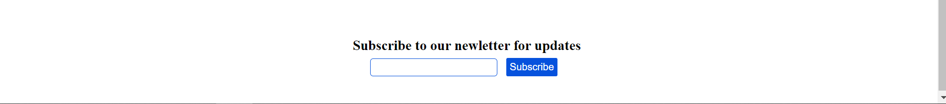
I made the subscribe button look better with the CSS below:
.submit-btn {
  background-color: var(--primary-color);
  color: #fff;
  padding: 0.3rem;
  margin: 0 0.5rem;
  border: none;
  border-radius: 2px;
  cursor: pointer;
}

.submit-btn:hover {
  background-color: #095cf7;
}
The subscription section now looks really cool:
I’m also going to include some social icons in the section. For the icons, I will be using ionic icons.
The icons will be wrapped in an anchor tag, so they can inherit the styles set for links in the CSS resets.
<section class="social">
      <h3>Connect with us on Social Media</h3>
      <div class="socicons">
        <a href="#"> <ion-icon name="logo-twitter"></ion-icon> </a>
        <a href="#"> <ion-icon name="logo-instagram"></ion-icon> </a>
        <a href="#"> <ion-icon name="logo-facebook"></ion-icon> </a>
      </div>
</section>
The CSS for the social icons is not complicated:
.social {
  text-align: center;
  margin: 2rem;
}

.socicons {
  font-size: 1.3rem;
}
This is how the email subscription section finally looks:

To learn more about Ionic icons, check the readme attached to the project on GitHub.
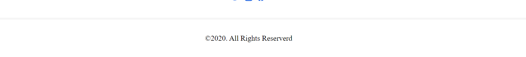
How to Make the Footer
The HTML for the footer is a one-liner:
<footer>©2020. All Rights Reserved</footer>
If you are wondering what © is, that’s the character entity for the © you always see in website footers.
The CSS is all done in 6 lines:
footer {
  border-top: 1px solid #f1f1f1;
  box-shadow: 0px -2px 3px #f1f1f1;
  text-align: center;
  padding: 2rem;
}
I applied a border-top and box-shadow to the footer so the upper part of it can correlate with the navbar.
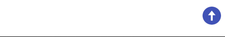
How to Make the Scroll-to-top Button
For a better user experience, let’s implement a scroll-to-top button. When clicked, this button will take the user to the top of the page from wherever they are.
The HTML for the scroll-to-top button is in the code snippet below:
<i class="scroll-up" id="scroll-up"
      ><img
        src="assets/icons/icons8-upward-arrow.png"
        class="socicon up-arrow"
        alt="up-arrow"
/></i>
We'll use the class attributes to style the button, and the ids to select it in our JavaScript file. That’s how we will do things in the CSS and JavaScript.
To make the button visible everywhere and look good, I’m going to give it a fixed position and increase the width and height. I will also give it a cursor of pointer, so the user knows what is happening when they hover their cursor on it.
.scroll-up {
  position: fixed;
  right: 0.5%;
  bottom: 3%;
  cursor: pointer;
}

.up-arrow {
  width: 3rem;
  height: 3rem;
}
To finally implement the scroll-to-top functionality, we will write 7 lines of JavaScript:
const scrollUp = document.querySelector("#scroll-up");

scrollUp.addEventListener("click", () => {
  window.scrollTo({
    top: 0,
    left: 0,
    behavior: "smooth",
  });
});
What is the script doing?
In the first line, I selected the button by assigning it to a variable called scrollUp.
I used the querySelector() method for this because it is reportedly faster. You can use getElementById too.
To get the user’s click action on the button, I used an important feature of the DOM (Document Object Model) called eventListener.
In the eventListener() function, I brought in a window object method called scrollTo, which helps move to anywhere on the web page.
To tell the scrollTo method where to scroll to, you have to assign it a property of either top and left, or top and bottom as the case may be. So I assigned it a top and left of 0.
The last thing I did was set the behavior property to a string of “smooth”, so things animate smoothly when the button is clicked.
Our scroll-to-top button is now working perfectly:
We now have a complete website! But let’s take things a little further by adding a dark and light theme switcher, since a lot of people now enjoy using websites in dark mode.
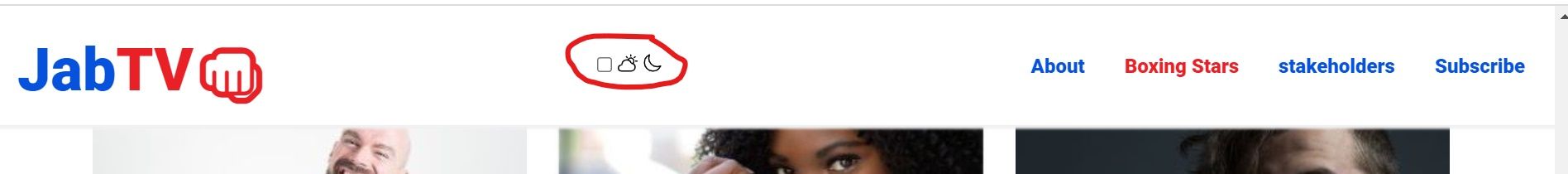
How to Make the Dark and Light Theme Switcher
To make the dark theme switcher accessible anywhere on the landing page, I’m going to put it in our sticky navbar.
I will be using:
- a div with the class of theme-switch to house everything
- an input type of checkbox to switch between dark and light mode
- a label to put in the 2 icons for moon (dark mode) and sun (light mode)
- a div with a class of switcher inside the label to create a ball-like shape. This shape would cover one icon when the user switches to either light or dark mode
This is how I converted the above points to HTML code:
<div class="theme-switch">
    <input type="checkbox" class="checkbox" id="checkbox" />
    <label for="checkbox" class="label">
       <ion-icon name="partly-sunny-outline" class="sun"></ion-icon>
       <ion-icon name="moon-outline" class="moon"></ion-icon>
       <div class="switcher"></div>
    </label>
</div>
And this is how it looks in the browser:
How to Style the Dark and Light Theme Switcher
The first thing I’m going to do is make the checkbox invisible and position it absolute.
We need to do this because what we need is the functionality of a checkbox to switch between light and dark mode – but we don’t need to make it visible to the user.
.checkbox {
  opacity: 0;
  position: absolute;
}
Next, I’m going to position the label relative, center everything in it with Flexbox, and give it a dark background. With this and some other minor stylings, the dark theme switcher will be more visible.
.label {
  width: 50px;
  height: 29px;
  background-color: #111;
  display: flex;
  align-items: center;
  justify-content: space-between;
  border-radius: 30px;
  padding: 6px;
  position: relative;
}
All you see now is a dark background. Don’t worry. Everything will become visible again.
Remember the div with a class of switcher? Let’s make it white and round to truly look like a ball. We will also position it absolute because its inside the label which has been positioned relative.
.switcher {
  background-color: #fff;
  position: absolute;
  top: 5px;
  left: 2px;
  height: 20px;
  width: 20px;
  border-radius: 50%;
}
Defining width, height, and a border-radius of 50% is how you make anything round in CSS.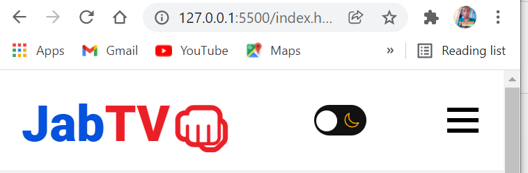
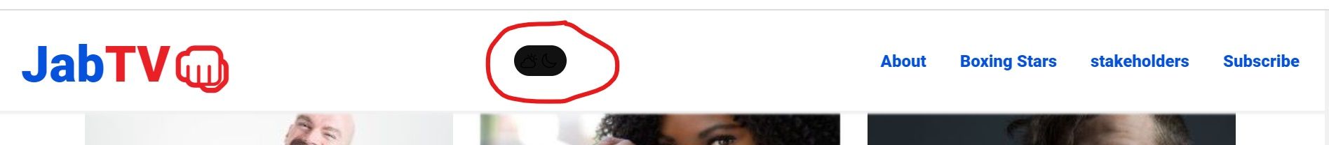
Our dark theme switcher is taking shape, but let’s make the icons visible by giving them the appropriate colors of reddish for sun and yellowish for moon.
.moon {
  color: #ffa502;
}

.sun {
  color: #ff4757;
}
Finally, to be able to move the ball left and right, we need to use the :checked pseudo-class on our checkbox, and target the ball with a class of switcher, then use the transform property to move it by setting a figure in pixels:
.checkbox:checked + .label .switcher {
  transform: translateX(24px);
}
Our ball is now moving and the icons are correctly showing:

What we need to do now is use JavaScript to toggle between the light and dark mode and set the colors for dark mode.
You can find the color set for our dark theme in the snippet below:
body.dark {
  background-color: #1e272e;
}

body.dark .bar {
  background-color: #fff;
}

body.dark p {
  color: #fff;
}

body.dark h3 {
  color: #fff;
}

body.dark nav {
  background-color: #1e272e;
  box-shadow: 2px 3px 2px #111010;
}

body.dark ul {
  background-color: #1e272e;
}

body.dark .name {
  color: var(--primary-color);
}

body.dark .role {
  color: var(--secondary-color);
}

body.dark footer {
  color: #fff;
  border-top: 1px solid #111010;
  box-shadow: 0px -2px 3px #111010;
}
And here’s how I used JavaScript to toggle the body.dark class by using change event on the checkbox and the toggle() method of DOM:
const checkbox = document.querySelector("#checkbox");

checkbox.addEventListener("change", () => {
  // Toggle website theme
  document.body.classList.toggle("dark");
});
Notice that I selected the checkbox with an id of #checkbox and assigned it to a checkbox variable. Try to always use ids for JavaScript and classes for CSS, so you don’t get confused.
Users can nohw toggle light and dark modes on our landing page:
How to Make the Landing Page Responsive
The landing page is not responsive yet, so we should fix that.
To make the landing page responsive, we need to make a hamburger menu for smaller devices, inside a media query. We will also use Flexbox and Grid once again to make the sections stack on top of one another.
How to Make a Hamburger Menu for the Landing Page
For the hamburger menu, the first thing I’m going to do is make the bars visible on a device with a screen width less than 768 pixels.
I will also set a cursor of pointer for the bars, so the user knows they can click when they hover their mouse on it.
@media screen and (max-width: 768px) {
  .hamburger {
    display: block;
    cursor: pointer;
  }
Next, I will change the flex direction of the nav menu items to column by targeting the unordered list they are contained in, so they go on top of one another.
I will also give the list a white background, align every item in it to the center, and make the list items fixed with the left property set to 100%, so it will be taken out of the viewport (invisible).
ul {
    background-color: #fff;
    flex-direction: column;
    position: fixed;
    left: 100%;
    top: 5rem;
    width: 100%;
    text-align: center;
  }
So far, this is what we have in the browser:

To make the nav items visible, I’m going to attach a class attribute of active to the unordered list containing them and set left to 0. This class will be toggled with JavaScript when the user clicks the bars.
ul.active {
    left: 0;
}
The nav items have become poorly spaced:
To make sure the nav menu items are well-spaced, I’m going to target them with the .nav-item class and give them some margins:
.nav-item {
    margin: 2rem 0;
  }
The CSS snippet above gives each nav menu item a margin of 2rem on the top and bottom, and 0 on the left and right, so they look like this:
There’s one more thing to do with the bars – we need to make sure they change to an X shape when they are clicked, and back to the bars when clicked again.
To do this, we will attach a class of active to the hamburger menu, and then rotate the bars. Remember that this active class will be toggled by JavaScript.
.hamburger.active .bar:nth-child(2) {
    opacity: 0;
  }

  .hamburger.active .bar:nth-child(1) {
    transform: translateY(10px) rotate(45deg);
  }

  .hamburger.active .bar:nth-child(3) {
    transform: translateY(-10px) rotate(-45deg);
  }
To do the toggling, we need some JavaScript:
const hamburger = document.querySelector("#hamburger");
const navMenu = document.querySelector("ul");

function openMenu() {
  hamburger.classList.toggle("active");
  navMenu.classList.toggle("active");
}
Here's what I did in the JavaScript:
- I selected the bars with the id of hamburger, and the unordered list with the element (
ul) - I wrote a function named
openMenuto get the classlists of the hamburger menu and unordered list, then used thetoggle()method to bring in the active class.
Our nav menu items are now being toggled back and forth with the bars changing shape as needed:
But there’s a problem. The menu items are not hidden any time one of them is clicked. We need to make this happen for a better user experience.
To do this, we need some JavaScript again. We will:
- select all the nav items with querySelectorAll() by targeting their ids
- listen for a click event on each of the nav menu items with the forEach() array method
- write a function to remove the
.activeclass – which will eventually return the nav menu to its original state.
const navLink = document.querySelectorAll("#nav-link");

navLink.forEach((n) => n.addEventListener("click", closeMenu));
function closeMenu() {
  hamburger.classList.remove("active");
  navMenu.classList.remove("active");
}
Everything now works fine with our mobile menu:
If you noticed, other parts of the website are not looking good on mobile devices. There’s even an annoying horizontal scrollbar. This is not 1998 but 2022!
Adding the following styles to the media query will fix it:
 .logo {
    font-size: 1.5rem;
  }

 .hero {
    flex-direction: column;
    max-width: 500px;
  }

  .intro-text h1 {
    font-size: 2.3rem;
  }

  .btn {
    padding: 0.5rem;
    font-size: 1.2rem;
  }

  iframe {
    max-width: 26rem;
  }

  .stand-1 {
    left: 170px;
  }
  .stand-2 {
    left: 225px;
  }

  .about {
    text-align: center;
  }

  .persons {
    grid-template-columns: repeat(1, 1fr);
  }
}
With the CSS above, I reduced sizes, changed the direction to column where necessary so the sections stack on top of one another, and made the TV stands aligned properly.
Looking at the landing page on smaller phones, we really can do better:
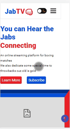
To make the landing page responsive on smaller phones, I will integrate few changes on mobile devices of screen width 420px and below:
@media screen and (max-width: 420px) {
  .hero {
    max-width: 330px;
  }

  .intro-text h1 {
    font-size: 2rem;
  }

  iframe {
    max-width: 330px;
  }

  .stand-1 {
    left: 140px;
  }
  .stand-2 {
    left: 195px;
  }
}
We now have a fully responsive landing page:
 .
.
Grab the finished copy of the landing page code from this Github repo.
Conclusion
In this detailed tutorial, you have learned how to make a:
- fully responsive website
- dark theme switcher
- hamburger menu
- lightbox image gallery
- scroll-to-top button.
These are functionalities you can always integrate into a new or existing project, so feel free to always come back to this article any time you need it.
If you find this text-based tutorial helpful, share it by tweeting a thanks or pasting the link on your social media platforms.
Thank you for reading!