
By Rodrigo Botafogo
By Rodrigo Botafogo & Daniel Mossé
According to Wikipedia “Ruby is a dynamic, interpreted, reflective, object-oriented, general-purpose programming language. It was designed and developed in the mid-1990s by Yukihiro “Matz” Matsumoto in Japan.” It reached high popularity with the development of Ruby on Rails (RoR) by David Heinemeier Hansson.
RoR is a web application framework first released around 2005. It makes extensive use of Ruby’s meta-programming features. With RoR, Ruby became very popular. According to Ruby’s Tiobe index it peaked in popularity around 2008, then declined until 2015 when it started picking up again.
At the time of this writing (November 2018), the Tiobe index puts Ruby in 16th position as most popular language.
Python, a language similar to Ruby, ranks 4th in the index. Java, C and C++ take the first three positions. Ruby is often criticized for its focus on web applications. But Ruby can do much more than just web applications. Yet, for scientific computing, Ruby lags way behind Python and R. Python has the Django framework for web, NumPy for numerical arrays, and Pandas for data analysis. R is a free software environment for statistical computing and graphics with thousands of libraries for data analysis.
Until recently, there was no real way for Ruby to bridge this gap. Implementing a complete scientific computing infrastructure would take too long. Enters Oracle’s GraalVM:
GraalVM is a universal virtual machine for running applications written in JavaScript, Python 3, Ruby, R, JVM-based languages like Java, Scala, Kotlin, and LLVM-based languages such as C and C++.
GraalVM removes the isolation between programming languages and enables interoperability in a shared run-time. It can run either standalone or in the context of OpenJDK, Node.js, Oracle Database, or MySQL.
GraalVM allows you to write polyglot applications with a seamless way to pass values from one language to another. With GraalVM there is no copying or marshaling necessary as it is with other polyglot systems. This lets you achieve high performance when language boundaries are crossed. Most of the time there is no additional cost for crossing a language boundary at all.
Often developers have to make uncomfortable compromises that require them to rewrite their software in other languages. For example:
“That library is not available in my language. I need to rewrite it.”
“That language would be the perfect fit for my problem, but we cannot run it in our environment.”
“That problem is already solved in my language, but the language is too slow.”
With GraalVM we aim to allow developers to freely choose the right language for the task at hand without making compromises.
As stated above, GraalVM is a universal virtual machine that allows Ruby and R (and other languages) to run on the same environment. GraalVM allows polyglot applications to seamlessly interact with one another and pass values from one language to the other.
GraalVM is a very powerful environment. Yet, it still requires application writers to know several languages. To eliminate that requirement, we built Galaaz, a gem for Ruby, to tightly couple Ruby and R and allow those languages to interact in a way that the user will be unaware of such interaction. In other words, a Ruby programmer will be able to use all the capabilities of R without knowing the R syntax.
Library wrapping is a usual way of bringing features from one language into another. To improve performance, Python often wraps more efficient C libraries. For the Python developer, the existence of such C libraries is hidden. The problem with library wrapping is that for any new library, there is the need to handcraft a new wrapper requiring a high level of expertise and time.
Galaaz, instead of wrapping a single C or R library, wraps the whole R language in Ruby. Doing so, all thousands of R libraries are available immediately to Ruby developers without any new wrapping effort.
To show the power of Galaaz, we show in this article how Ruby can use R’s ggplot2 library transparently bringing to Ruby the power of high quality scientific plotting. We also show that migrating from R to Ruby with Galaaz is a matter of small syntactic changes. By using Ruby, the R developer can use all of Ruby’s powerful object-oriented features. Also, with Ruby, it becomes much easier to move code from the analysis phase to the production phase.
In this article we will explore the R ToothGrowth dataset. To illustrate, we will create some boxplots. A primer on boxplot is available in this article.
We will also create a Corporate Template ensuring that plots will have a consistent visualization. This template is built using a Ruby module. There is a way of building ggplot themes that will work the same as the Ruby module. Yet, writing a new theme requires specific knowledge on theme writing. Ruby modules are standard to the language and don’t need special knowledge.
Here we show a scatter plot in Ruby also with Galaaz.
gKnit
Knitr is an application that converts text written in rmarkdown to many different output formats. For instance, a writer can convert an rmarkdown document to HTML, LaTex, docx and many other formats.
Rmarkdown documents can contain text and code chunks. Knitr formats code chunks in a grayed box in the output document. It also executes the code chunks and formats the output in a white box. Every line of output from the execution code is preceded by ‘##’.
Knitr allows code chunks to be in R, Python, Ruby and dozens of other languages. Yet, while R and Python chunks can share data, in other languages, chunks are independent. This means that a variable defined in one chunk cannot be used in another chunk.
With gKnit Ruby code chunks can share data. In gKnit each Ruby chunk executes in its own scope and thus, local variable defined in a chunk are not accessible by other chunks. Yet, All chunks execute in the scope of a ‘chunk’ class and instance variables (‘@’), are available in all chunks.
Exploring the Dataset
Let’s start by exploring our selected dataset. A dataset is like a simple excel spreadsheet, in which each column has only one type of data. For instance one column can have float, the other integer, and a third strings.
ToothGrowth R dataset analyzes the length of odontoblasts (cells responsible for tooth growth) in 60 guinea pigs, where each animal received one of three dose levels of Vitamin C (0.5, 1, and 2 mg/day) by one of two delivery methods, orange juice (OJ) or ascorbic acid (a form of vitamin C and coded as VC).
The ToothGrowth dataset contains three columns: ‘len’, ‘supp’ and ‘dose’. Let’s take a look at a few rows of this dataset.
In Galaaz, R variables are accessed by using the corresponding Ruby symbol preceded by the tilde (‘~’) function. Note in the following chunk that ‘ToothGrowth’ is the R variable and Ruby’s ‘@tooth_growth’ is assigned the value of ‘~:ToothGrowth’.
# Read the R ToothGrowth variable and assign it to the# Ruby instance variable @tooth_growth that will be # available to all Ruby chunks in this document.@tooth_growth = ~:ToothGrowth
# print the first few elements of the datasetputs @tooth_growth.head
## len supp dose## 1 4.2 VC 0.5## 2 11.5 VC 0.5## 3 7.3 VC 0.5## 4 5.8 VC 0.5## 5 6.4 VC 0.5## 6 10.0 VC 0.5
Great! We’ve managed to read the ToothGrowth dataset and take a look at its elements. We see here the first 6 rows of the dataset. To access a column, follow the dataset name with a dot (‘.’) and the name of the column. Also use dot notation to chain methods in usual Ruby style.
# Access the tooth_growth 'len' column and print the first few# elements of this column with the 'head' method.puts @tooth_growth.len.head
## [1] 4.2 11.5 7.3 5.8 6.4 10.0
The ‘dose’ column contains a numeric value with either, 0.5, 1 or 2, although the first 6 rows as seen above only contain the 0.5 values. Even though those are number, they are better interpreted as a factor or category. So, let’s convert our ‘dose’ column from numeric to ‘factor’.
In R, the function ‘as.factor’ is used to convert data in a vector to factors. To use this function from Galaaz the dot (‘.’) in the function name is substituted by ’‘(double underline). The function ’as.factor’ becomes ’R.asfactor’ or just ’as__factor’ when chaining.
# convert the dose to a factor@tooth_growth.dose = @tooth_growth.dose.as__factor
Let’s explore some more details of this dataset. In particular, let’s look at its dimensions, structure and summary statistics.
puts @tooth_growth.dim
## [1] 60 3
This dataset has 60 rows, one for each subject and 3 columns, as we have already seen.
Note that we do not need to call ‘puts’ when using the ‘str’ function. This functions does not return anything and prints the structure of the dataset as a side effect.
@tooth_growth.str
## 'data.frame': 60 obs. of 3 variables:## $ len : num 4.2 11.5 7.3 5.8 6.4 10 11.2 11.2 5.2 7 ...## $ supp: Factor w/ 2 levels "OJ","VC": 2 2 2 2 2 2 2 2 2 2 ...## $ dose: Factor w/ 3 levels "0.5","1","2": 1 1 1 1 1 1 1 1 1 1 ...
Observe that both variables ‘supp’ and ‘dose’ are factors. The system made variable ‘supp’ a factor automatically, since it contains two strings OJ and VC.
Finally, using the summary method, we get the statistical summary for the dataset
puts @tooth_growth.summary
## len supp dose ## Min. : 4.20 OJ:30 0.5:20 ## 1st Qu.:13.07 VC:30 1 :20 ## Median :19.25 2 :20 ## Mean :18.81 ## 3rd Qu.:25.27 ## Max. :33.90
Doing the Data Analysis
Quick plot for seeing the data
Let’s now create our first plot with the given data by accessing ggplot2 from Ruby. For Rubyists that have never seen or used ggplot2, here is the description of ggplot found in its home page:
“ggplot2 is a system for declaratively creating graphics, based on The Grammar of Graphics. You provide the data, tell ggplot2 how to map variables to aesthetics, what graphical primitives to use, and it takes care of the details.”
This description might be a bit cryptic and it is best to see it at work to understand it. Basically, in the grammar of graphics developers add layers of components such as grid, axes, data, title, subtitle and also graphical primitives such as bar plot, box plot, to form the final graphics.
Interested readers can look up the following articles on the grammar of graphics on medium: A Comprehensive Guide to the Grammar of Graphics for Effective Visualization of Multi-dimensional Data and What are the Ingredients of a Terrible Data Story?
In order to make a plot, we use the ‘ggplot’ function to the dataset. In R, this would be written as ggplot(<dataset>, ...). Galaaz gives you the flexibility to use either R.ggplot(<dataset>, ...) or <dataset>.ggplot(...). In the graph specification bellow, we use the second notation that looks more like Ruby. Ggplot uses the ‘aes’ method to specify x and y axes; in this case, _th_e ‘dose’ on the x axis and the ‘length’ on the y axis: ‘E.aes(x: :dose, y: :len)’. To specify the type of plot add a geom to the plot. For a boxplot, the geom is R.geom_boxplot.
Note also that we have a call to ‘R.png’ before plotting and ’R.devoff’ after the print statement. ‘R.png’ opens a ‘png device’ for outputting the plot. If we do no pass a name to the ‘png’ function, the image gets a default name of ‘Rplot’ where is the number of the plot. ’R.devoff’ closes the device and creates the ‘png’ file. We can then include the generated ‘png’ file in the document by adding an rmarkdown directive.
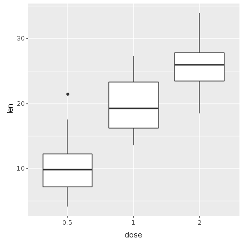
Great! We’ve just managed to create and save our first plot in Ruby with only four lines of code. We can now easily see with this plot a clear trend: as the dose of the supplement increases, so are the length of teeth.
Faceting the plot
This first plot shows a trend, but our data has information about two different forms of delivery method, either by Orange Juice (OJ) or by Vitamin C (VC). Let’s then try to create a plot that helps us discern the effect of each delivery method.
This next plot is a facetted plot where each delivery method gets is own plot. On the left side, the plot shows the OJ delivery method. On the right side, we see the VC delivery method. To obtain this plot, we use the ‘R.facet_grid’ function that automatically creates the facets based on the delivery method factors. The parameter to the ‘facet_grid’ method is a formula.
In Galaaz we give programmers the flexibility to use two different ways to write formulas. In the first way, the following changes from writing formulas (for example ‘x ~ y’) in R are necessary:
- R symbols are represented by the same Ruby symbol prefixed with the ‘+’ method. The symbol
xin R becomes+:xin Ruby; - The ‘~’ operator in R becomes ‘=~’ in Ruby. The formula
x ~ yin R is written as+:x =~ +:yin Ruby; - The ‘.’ symbol in R becomes ‘+:all’
Another way of writing a formula is to use the ‘formula’ function with the actual formula as a string. The formula x ~ y in R can be written as R.formula("x ~ y"). For more complex formulas, the use of the ‘formula’ function is preferred.
The formula +:all =~ +:supp indicates to the ‘facet_grid’ function that it needs to facet the plot based on the supp variable and split the plot vertically. Changing the formula to +:supp =~ +:all would split the plot horizontally.
R.png("figures/facet_by_delivery.png")@base_tooth = @tooth_growth.ggplot(E.aes(x: :dose, y: :len, group: :dose))@bp = @base_tooth + R.geom_boxplot + # Split in vertical direction R.facet_grid(+:all =~ +:supp) puts @bpR.dev__off
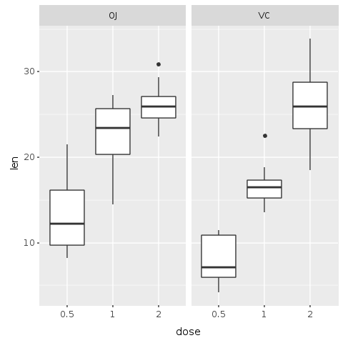
It now becomes clear that although both methods of delivery have a direct impact on tooth growth, method OJ is non-linear having a higher impact with smaller doses of ascorbic acid and reducing it’s impact as the dose increases. With the VC approach, the impact seems to be more linear.
Adding Color
If we were writing about data analysis, we would make a better analysis of the trends and improve the statistical analysis. But here we are interested in working with ggplot in Ruby. So, let’s add some colors to this plot to make the trend and comparison more visible.
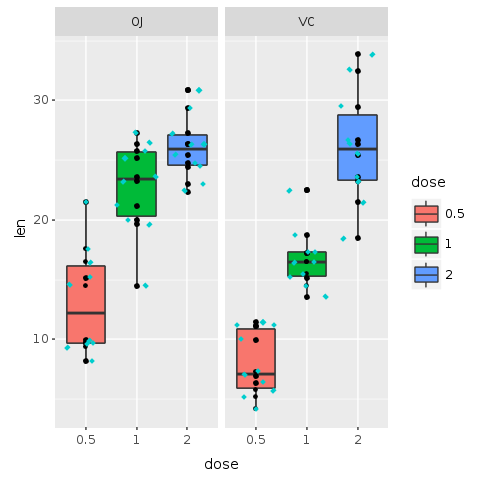
In the following plot, the boxes are color coded by dose. To add color, it is enough to add fill: :dose to the aesthetic of boxplot. With this command each ‘dose’ factor gets its own color.
R.png("figures/facets_by_delivery_color.png")
@bp = @bp + R.geom_boxplot(E.aes(fill: :dose))puts @bp
R.dev__off
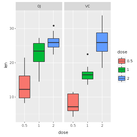
Faceting helps us compare the general trends for each delivery method. Adding color allow us to compare specifically how each dosage impacts the tooth growth. It is possible to observe that with smaller doses, up to 1mg, OJ performs better than VC (red color). For 2mg, both OJ and VC have the same median, but OJ is less disperse (blue color). For 1mg (green color), OJ is significantly better than VC. By this very quick visual analysis, it seems that OJ is a better delivery method than VC.
Clarifying the data
Boxplots give us a nice idea of the distribution of data, but looking at those plots with large colored boxes leaves us wondering what else is going on. According to Edward Tufte in Envisioning Information:
Thin data rightly prompts suspicions: “What are they leaving out? Is that really everything they know? What are they hiding? Is that all they did?” Now and then it is claimed that vacant space is “friendly” (anthropomorphizing an inherently murky idea) but it is not how much empty space there is, but rather how it is used. It is not how much information there is, but rather how effectively it is arranged.
And he states:
A most unconventional design strategy is revealed: to clarify, add detail.
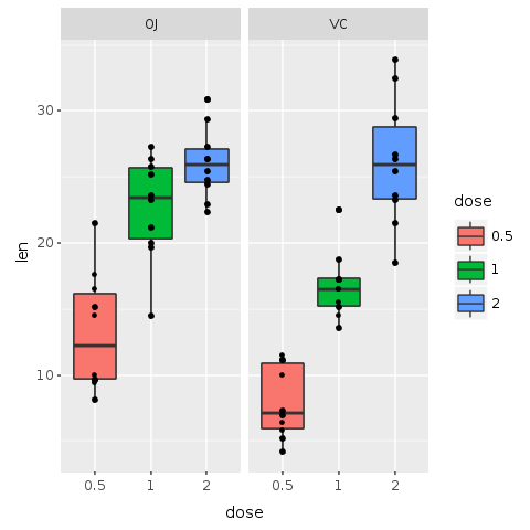
Let’s use this wisdom and add yet another layer of data to our plot, so that we clarify it with detail and do not leave large empty boxes. In this next plot, we add data points for each of the 60 pigs in the experiment. For that, add the function ‘R.geom_point’ to the plot.
R.png("figures/facets_with_points.png")
# Add point for each subject@bp = @bp + R.geom_point
puts @bp
R.dev__off
top of others)
Now we can see the actual distribution of all the 60 subjects. Actually, this is not totally true. We have a hard time seeing all 60 subjects. It seems that some points might be placed one over the other hiding useful information.
But no sweat! Another layer might solve the problem. In the following plot a new layer called ‘geom_jitter’ is added to the plot. Jitter adds a small amount of random variation to the location of each point, and is a useful way of handling overplotting caused by discreteness in smaller datasets. This makes it easier to see all of the points and prevents data hiding. We also add color and change the shape of the points, making them even easier to see.
R.png("figures/facets_with_jitter.png")
# Use small diamonds in a light blue color (cyan3) # to plot the subjects of the experimentputs @bp + R.geom_jitter(shape: 23, color: "cyan3", size: 1)
R.dev__off
Preparing the Plot for Presentation
We have come a long way since our first plot. As we’ve already said, this is not an article about data analysis and the focus is on the integration of Ruby and ggplot. So, let’s assume that the analysis is now done. Yet, ending the analysis does not mean that the work is done. On the contrary, the hardest part is yet to come!
After the analysis it is necessary to communicate it by making a final plot for presentation. The last plot has all the information we want to share, but it is not very pleasing to the eye.
Improving Colors
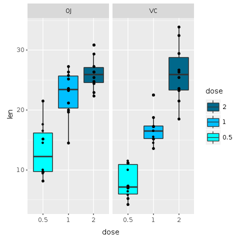
Let’s start by trying to improve colors. For now, we will not use the jitter layer. The previous plot uses three bright colors. Is there any obvious, or non-obvious for that matter, interpretation for the colors? Clearly, they are just random colors selected automatically by our software. Although those colors helped us understand the data, for a final presentation random colors can distract the viewer.
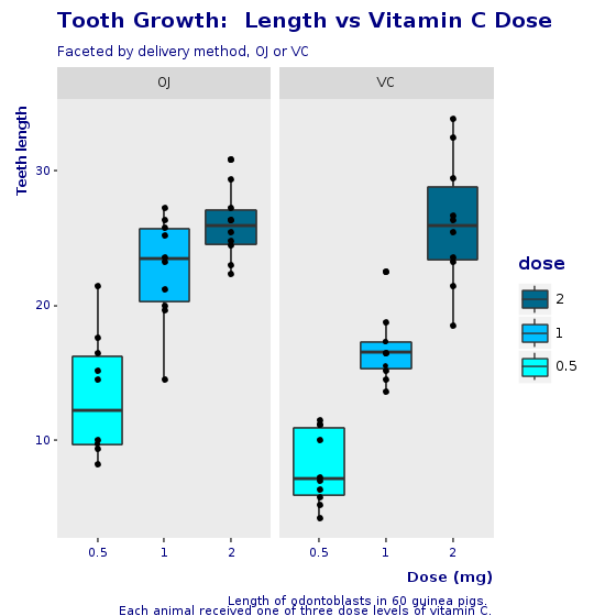
In the following plot we use ‘scale_fill_manual’ function to change the colors of the boxes and order of labels. For colors, we use shades of blue for each dosage, with light blue (‘cyan’) representing the lower dose and deep blue (‘deepskyblue4’) the higher dose.
Also, the legend could be improved: we use the ‘breaks’ parameter to put the smaller value (0.5) at the bottom of the labels and the largest (2) at the top. This ordering seems more natural and matches with the actual order of the colors in the plot.
R.png("figures/facets_by_delivery_color2.png")
@bp = @bp + R.scale_fill_manual(values: R.c("cyan", "deepskyblue", "deepskyblue4"), breaks: R.c("2","1","0.5"))
puts @bp
R.dev__off
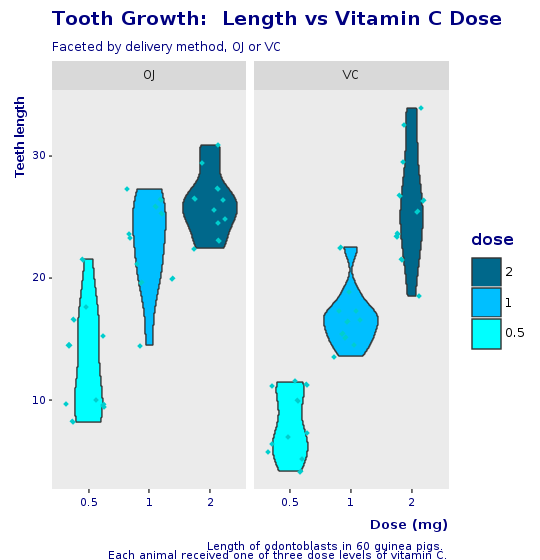
Violin Plot and Jitter
The boxplot with jitter did look a bit overwhelming. The next plot uses a variation of a boxplot known as a violin plot with jittered data.
A violin plot is a method of plotting numeric data. It is similar to a box plot with a rotated kernel density plot on each side.
A violin plot has four layers. The outer shape represents all possible results, with thickness indicating how common. (Thus the thickest section represents the mode average.) The next layer inside represents the values that occur 95% of the time. The next layer (if it exists) inside represents the values that occur 50% of the time. The central dot represents the median average value.
R.png("figures/violin_with_jitter.png")@violin = @base_tooth + R.geom_violin(E.aes(fill: :dose)) + R.facet_grid(+:all =~ +:supp) + R.geom_jitter(shape: 23, color: "cyan3", size: 1) + R.scale_fill_manual(values: R.c("cyan", "deepskyblue", "deepskyblue4"), breaks: R.c("2","1","0.5"))puts @violinR.dev__off
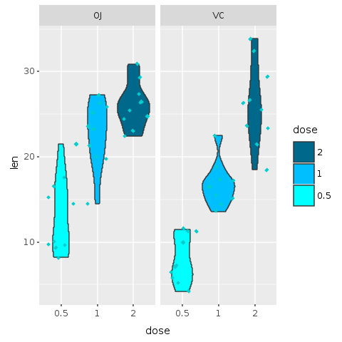
This plot is an alternative to the original boxplot. For the final presentation, it is important to think which graphics will be best understood by our audience. A violin plot is a less known plot and could add mental overhead, yet, in my opinion, it does look a bit better than the boxplot and provides even more information than the boxplot with jitter.
Adding Decoration
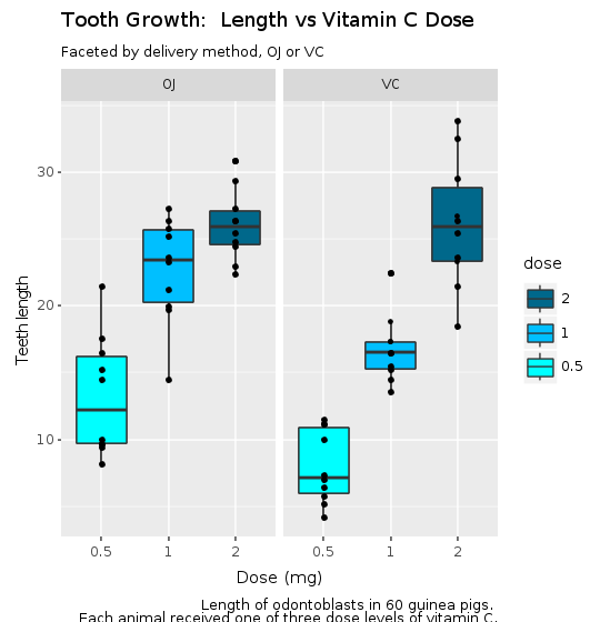
Our final plot is starting to take shape, but a presentation plot should have at least a title, labels on the axes and maybe some other decorations. Let’s start adding those. Since decoration requires more graph area, this new plot has a ‘width’ and ‘height’ specification. When there is no specification, the default values from R for width and height are 480 pixels.
The ‘labs’ function adds the required decoration. In this example we use ‘title’, ‘subtitle’, ‘x’ for the x axis label and ‘y’, for the y axis label, and ‘caption’ for information about the plot (for clarity, we defined a caption variable using Ruby’s Here Doc style).
R.png("figures/facets_with_decorations.png", width: 540, height: 560)
caption = <<-EOTLength of odontoblasts in 60 guinea pigs. Each animal received one of three dose levels of vitamin C.EOT
@decorations = R.labs(title: "Tooth Growth: Length vs Vitamin C Dose", subtitle: "Faceted by delivery method, OJ or VC", x: "Dose (mg)", y: "Teeth length", caption: caption)
puts @bp + @decorations
R.dev__off
The Corp Theme
We are almost done. But the default plot configuration does not yet look nice to the eye. We are still distracted by many aspects of the graph. First, the black font color does not look good. Then plot background, borders, grids all add clutter to the plot.
We will now define our corporate theme. in a module that can be used/loaded for all plots, similar to CSS or any other style definition.
In this theme, we remove borders and grids. The background is left for faceted plots but removed for non-faceted plots. Font colors are a shade o blue (color: ‘#00080’). Axes labels are moved near the end of the axis and written in ‘bold’.
module CorpTheme
R.install_and_loads 'RColorBrewer' #----------------------------------------------------------------# face can be (1=plain, 2=bold, 3=italic, 4=bold-italic)#---------------------------------------------------------------- def self.text_element(size, face: "plain", hjust: nil) E.element_text(color: "#000080", face: face, size: size, hjust: hjust) end #----------------------------------------------------------------# Defines the plot theme (visualization). In this theme we # remove major and minor grids, borders and background. We # also turn-off scientific notation.#---------------------------------------------------------------- def self.global_theme(faceted = false) # turn-off scientific notation like 1e+48 R.options(scipen: 999) # remove major grids gb = R.theme(panel__grid__major: E.element_blank()) # remove minor grids gb = gb + R.theme(panel__grid__minor: E.element_blank) # remove border gb = gb + R.theme(panel__border: E.element_blank) # remove background. When working with faceted graphs, # the background makes it easier to see each facet, so # leave it gb = gb + R.theme(panel__background: E.element_blank) if !faceted # Change axis font gb = gb + R.theme(axis__text: text_element(8)) # change axis title font gb = gb + R.theme(axis__title: text_element(10, face: "bold", hjust: 1)) # change font of title gb = gb + R.theme(title: text_element(12, face: "bold")) # change font of subtitle gb = gb + R.theme(plot__subtitle: text_element(9)) # change font of captions gb = gb + R.theme(plot__caption: text_element(8))
end end
Final Box Plot
We can now easily make our final boxplot and violin plot. All the layers for the plot were added in order to expose our understanding of the data and the need to present the result to our audience.
The final specification is just the addition of all layers build up to this point (@bp), plus the decorations (@decorations), plus the corporate theme.
Here is our final boxplot, without jitter.
R.png("figures/final_box_plot.png", width: 540, height: 560)
puts @bp + @decorations + CorpTheme.global_theme(faceted: true)
R.dev__off
And here is the final violin plot, with jitter and the same look and feel of the corporate boxplot.
R.png("figures/final_violin_plot.png", width: 540, height: 560)
puts @violin + @decorations + CorpTheme.global_theme(faceted: true)
R.dev__off
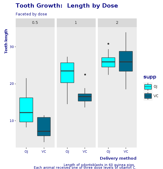
Another View
We now make another plot, with the same look and feel as before but facetted by dose and not by supplement. This shows how easy it is to create new plots by just changing small statement on the grammar of graphics.
R.png("figures/facet_by_dose.png", width: 540, height: 560)
caption = <<-EOTLength of odontoblasts in 60 guinea pigs. Each animal received one of three dose levels of vitamin C.EOT
@bp = @tooth_growth.ggplot(E.aes(x: :supp, y: :len, group: :supp)) + R.geom_boxplot(E.aes(fill: :supp)) + R.facet_grid(+:all =~ +:dose) + R.scale_fill_manual(values: R.c("cyan", "deepskyblue4")) + R.labs(title: "Tooth Growth: Length by Dose", subtitle: "Faceted by dose", x: "Delivery method", y: "Teeth length", caption: caption) + CorpTheme.global_theme(faceted: true)
puts @bp
R.dev__off
Conclusion
In this article, we introduce Galaaz and show how to tightly couple Ruby and R in a way that Ruby developers do not need to be aware of the executing R engine. For the Ruby developer the existence of R is of no consequence, she is just coding in Ruby. On the other hand, for the R developer, migration to Ruby is a matter of small syntactic changes with a very gentle learning curve. As the R developer becomes more proficient in Ruby, he can start using ‘classes’, ‘modules’, ‘procs’, ‘lambdas’.
Trying to bring to Ruby the power of R starting from scratch is an enormous endeavor and would probably never be accomplished. Today’s data scientists would certainly stick with either Python or R. Now, both the Ruby and R communities can benefit from this marriage, provided by Galaaz on top of GraalVM and Truffle’s polyglot environment.
We developed the coupling of Ruby and R, but the process we used can also be done to couple Ruby and JavaScript or Ruby and Python. In a polyglot world we believe that a uniglot library might be extremely relevant.
From the perspective of performance, GraalVM and Truffle promises improvements that could reach over 10 times, both for FastR and for TruffleRuby.
This article has shown how to improve a plot step-by-step. Starting from a very simple boxplot with all default configurations, we moved slowly to our final plot. The important point here is not if the final plot is actually beautiful (as beauty is in the eye of the beholder), but that there is a process of small steps improvements that can be followed to getting a final plot ready for presentation.
Finally, this whole article was written in rmarkdown and compiled to HTML by gknit, an application that wraps knitr and allows documenting Ruby code. This application can be of great help for any Rubyist trying to write articles, blogs or documentation for Ruby.
Installing Galaaz
Prerequisites
- GraalVM (>= rc8): https://github.com/oracle/graal/releases
- TruffleRuby
- FastR
The following R packages will be automatically installed when necessary, but could be installed prior to using gKnit if desired:
- ggplot2
- gridExtra
- knitr
Installation of R packages requires a development environment and can be time consuming. In Linux, the gnu compiler and tools should be enough. I am not sure what is needed on the Mac.
In order to run the ‘specs’ the following Ruby package is necessary:
- gem install rspec
Preparation
- gem install galaaz
Usage
- gknit
- In a scrip add: require ‘galaaz’
Running the demos
After installation, many galaaz demos are available doing:
> galaaz -T
will show a list with all available demos. To run any of the demos in the list, substitute the call to ‘rake’ to ‘galaaz’. For instance, one of the examples in the list is ‘rake sthda:bar’. In order to run this example just do ‘galaaz sthda:bar’. Doing ‘galaaz sthda:all’ will run all demos in the sthda category, in this case a slide show with over 80 ggplot graphics written in Ruby.
Some of the examples require ‘rspec’ to be available. To install ‘rspec’ just do ‘gem install rspec’.