
By Shachee Swadia
Data visualization is a vast field with so many different types of charts to learn and create.
But there are several basic, evergreen graphs that every data designer and web developer dealing with analytics should know how to build.
One of them is a Line Chart (or Line Graph). It's primarily designed to represent data over time.
You can follow along with this tutorial to learn how to quickly create beautiful interactive line (and step-line) charts using JavaScript. We'll look at some cool examples and build them step by step, which will make the process both clear and entertaining.
For your convenience, you can find all of them on CodePen so you could play with the line charting code further without limits.
Our Dataset
The last two decades have been nothing short of spectacular in the world of tennis. The Big Three — Roger Federer, Rafael Nadal, and Novak Djokovic — have won an astonishing combined 63 (of the past 78) Grand Slam tournaments. These are the most prestigious championships.
I decided to plot their outstanding rivalry. So, the JS line graphs in this tutorial will visualize the Big Three’s Grand Slam title race. And the first serve is already coming!
How to Build Line Charts in 4 Steps
Generally speaking, the whole process of creating any chart in JavaScript is broken down into four steps, and a line chart is no exception:
- Make an HTML page with a container.
- Include JavaScript files.
- Add your data.
- Code a visualization.
Let's go through each of these steps now.
1. Make an HTML page with a container
To start with, you need a place where you want your chart to appear.
If you don’t have one yet, create a basic web page. Then create a container for the line chart — add an HTML block-level element and give it a unique ID for further reference.
Here’s what such a page might look like:
<html>
  <head>
    <title>Line Chart JS</title>
    <style type="text/css">
      html, body, #container {
        width: 100%; height: 100%; margin: 0; padding: 0;
      }
    </style>
  </head>
  <body>
    <div id="container"></div>
  </body>
</html>
The width and height parameters of the element are set as 100%. As a result, the line chart will render all over the web page. Of course you can set the style settings to your own liking and needs.
2. Include JavaScript files
Next, include all JavaScript files, which we'll use to create the line chart, in the <head> section.
There are a whole lot of different JavaScript charting libraries which let you visualize data in a fast and simple way. Many of them support line charts, and you can choose one or another depending on your project requirements.
For illustration purposes, in this tutorial, I am using AnyChart JS Charts. It’s flexible, comes with extensive charting docs and API references, and you can use it for free (unless you are building something for a business.)
For the line chart, I add the “Base” module from the CDN. (Of course, you can download it, put it in a folder on your website, and use your own link in that case.)
<html>
  <head>
    <title>Line Chart JS</title>
    <script src="https://cdn.anychart.com/releases/8.11.0/js/anychart-base.min.js"></script>
    <style type="text/css">
      html, body, #container {
        width: 100%; height: 100%; margin: 0; padding: 0;
      }
    </style>
  </head>
  <body>
    <div id="container"></div>
    <script>
      // JavaScript code for the line chart.
    </script>
  </body>
</html>
The JavaScript code for the line graph will be inserted between <script> and </script> tags located in the <body> section (you may put those in the <head> section if you want).
3. Add your data
Then, add the data you want to visualize in your line chart.
I counted all Grand Slam singles titles won by Federer, Nadal, and Djokovic, by year. I will add it just like that as an array of arrays.
If you prefer other formats in your particular case, such as JSON, XML, CSV, or something else, check the ways to work with data.
var data = [
  ["2003", 1, 0, 0],
  ["2004", 4, 0, 0],
  ["2005", 6, 0, 0],
  ["2006", 9, 1, 0],
  ["2007", 12, 2, 0],
  ["2008", 13, 5, 1],
  ["2009", 15, 6, 1],
  ["2010", 16, 9, 1],
  ["2011", 16, 10, 4],
  ["2012", 17, 11, 5],
  ["2013", 17, 13, 6],
  ["2014", 17, 14, 7],
  ["2015", 17, 14, 10],
  ["2016", 17, 14, 12],
  ["2017", 19, 16, 12],
  ["2018", 20, 17, 14],
  ["2019", 20, 19, 16],
  ["2020", 20, 20, 17],
  ["2021", 20, 20, 20],
  ["2022", 20, 22, 20]
];
In each array, the year is the first parameter (column #0). Then comes the number of titles won by the three players subsequently (cumulative for each).
4. Code a visualization
Now, the warm-up session is done, and the court is all set. So let’s get the match started and do some quick JavaScript coding!
First, add anychart.onDocumentReady() as shown below:
<script>
  anychart.onDocumentReady(function() {
    // The main JS line charting code will be here.
  });
</script>
Everything else goes inside of that function.
So, second, include the data (from the previous step).
Third, create a data set and map it for each series (one for each player):
// create a data set
var dataSet = anychart.data.set(data);

// map the data for all series
var firstSeriesData = dataSet.mapAs({x: 0, value: 1});
var secondSeriesData = dataSet.mapAs({x: 0, value: 2});
var thirdSeriesData = dataSet.mapAs({x: 0, value: 3});
Fourth, create a line chart instance and three series with the mapped data:
// create a line chart
var chart = anychart.line();

// create the series and name them
var firstSeries = chart.line(firstSeriesData);
firstSeries.name("Roger Federer");
var secondSeries = chart.line(secondSeriesData);
secondSeries.name("Rafael Nadal");
var thirdSeries = chart.line(thirdSeriesData);
thirdSeries.name("Novak Djokovic");
Fifth, to make it clear at a glance what is shown in the line chart, a good idea is to add a legend and a title:
// add a legend
chart.legend().enabled(true);

// add a title
chart.title("Big Three's Grand Slam Title Race");
Finally, reference the container element ID and draw the resulting line chart:
// specify where to display the chart
chart.container("container");

// draw the resulting chart
chart.draw();
That’s it! A fully functional line graph built with JS is ready. Feels like a straight-sets victory, doesn’t it?
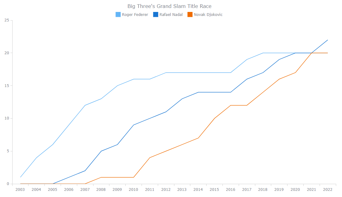 Line chart showing the Big 3't title race - created with AnyChart
Check out this basic version of the line chart with the full HTML/CSS/JS code on CodePen. Just in case, here’s the code too:
<html>
  <head>
    <title>Line Chart JS</title>
    <script src="https://cdn.anychart.com/releases/8.11.0/js/anychart-base.min.js"></script>
    <style type="text/css">
      html, body, #container {
        width: 100%; height: 100%; margin: 0; padding: 0;
      }
    </style>
  </head>
  <body>
    <div id="container"></div>
    <script>
      anychart.onDocumentReady(function () {

        // add data
        var data = [
          ["2003", 1, 0, 0],
          ["2004", 4, 0, 0],
          ["2005", 6, 0, 0],
          ["2006", 9, 1, 0],
          ["2007", 12, 2, 0],
          ["2008", 13, 5, 1],
          ["2009", 15, 6, 1],
          ["2010", 16, 9, 1],
          ["2011", 16, 10, 4],
          ["2012", 17, 11, 5],
          ["2013", 17, 13, 6],
          ["2014", 17, 14, 7],
          ["2015", 17, 14, 10],
          ["2016", 17, 14, 12],
          ["2017", 19, 16, 12],
          ["2018", 20, 17, 14],
          ["2019", 20, 19, 16],
          ["2020", 20, 20, 17],
          ["2021", 20, 20, 20],
          ["2022", 20, 22, 20]
        ];

        // create a data set
        var dataSet = anychart.data.set(data);

        // map the data for all series
        var firstSeriesData = dataSet.mapAs({x: 0, value: 1});
        var secondSeriesData = dataSet.mapAs({x: 0, value: 2});
        var thirdSeriesData = dataSet.mapAs({x: 0, value: 3});

        // create a line chart
        var chart = anychart.line();

        // create the series and name them
        var firstSeries = chart.line(firstSeriesData);
        firstSeries.name("Roger Federer");
        var secondSeries = chart.line(secondSeriesData);
        secondSeries.name("Rafael Nadal");
        var thirdSeries = chart.line(thirdSeriesData);
        thirdSeries.name("Novak Djokovic");

        // add a legend
        chart.legend().enabled(true);

        // add a title
        chart.title("Big Three's Grand Slam Title Race");

        // specify where to display the chart
        chart.container("container");

        // draw the resulting chart
        chart.draw();

      });
    </script>
  </body>
</html>
How to Customize Your Line Charts
The basic line chart we created by following the four steps above already looks good. But what if you want to customize it?
Let me show you how to make some changes in the same quick and easy manner.
1. Name the axes
It is always a good idea to explain what each axis of the line chart represents, even if it seems quite obvious. To add titles to both the X and Y axes, use the following:
chart.yAxis().title("Titles won");
chart.xAxis().title("Year");
2. Customize the markers
By default, when you move the mouse pointer over the plot, markers show up on each line series, and their shapes are different. Why not give the markers the same shape? Plus, it would be great to make them smaller.
Look how you can customize the appearance of the line series markers:
firstSeries.hovered().markers().type("circle").size(4);
secondSeries.hovered().markers().type("circle").size(4);
thirdSeries.hovered().markers().type("circle").size(4);
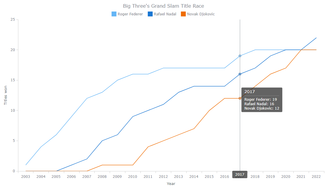
3. Enable crosshairs
Crosshairs are a pair of perpendicular lines following the mouse pointer to help you better understand the X and Y values at any currently hovered point.
In this case, it could be enough to get only one such line, vertical, to highlight the year. Here’s how it’s done:
chart.crosshair().enabled(true).yStroke(null).yLabel(false);
4. Change the tooltip position
Currently, the tooltip is following the mouse pointer. But in this situation, it could be better to make it stick to the data points.
To achieve that kind of behavior, just define the line chart tooltip position mode as “point” and fine-tune other position settings to your liking. For example:
chart.tooltip().positionMode("point");
chart.tooltip().position("right").anchor("left-center").offsetX(5).offsetY(5);
Check out how the JavaScript line chart looks now after all these customizations. (See it live with the full code on CodePen.)
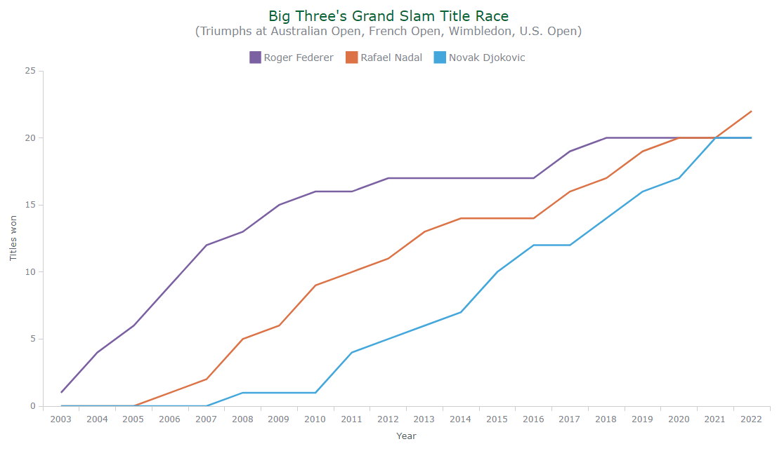
5. Change the colors
One of the simplest, yet most effective ways to personalize a data visualization is by playing with the colors.
The code below changes the color of each player’s line to the main color of the Grand Slam tournament he has won the most times: Wimbledon’s purple for Federer, French Open’s brown for Nadal, and Australian Open’s blue for Djokovic. Additionally, the thickness of the lines is adjusted.
firstSeries.normal().stroke("#7b60a2", 2.5);
secondSeries.normal().stroke("#db7346", 2.5);
thirdSeries.normal().stroke("#43a7dc", 2.5);
6. Improve the title and legend text
The last changes I want to demonstrate in this tutorial — and make the interactive line chart complete — are title and legend customizations.
You can add a subtitle to provide more context, and you can make the text styling more attractive in a few quick tweaks with the help of HTML:
chart
.title()
.enabled(true)
.useHtml(true)
.text(
'<span style="color: #006331; font-size:20px;">Big Three's Grand Slam Title Race</span>' +
'<br/><span style="font-size: 16px;">(Triumphs at Australian Open, French Open, Wimbledon, U.S. Open)</span>'
);
For the chart legend, it’s easy to modify the font size and the padding:
chart.legend().enabled(true).fontSize(14).padding([10, 0, 10, 0]);
See what we’ve got! (Check out this JS line chart on CodePen.)
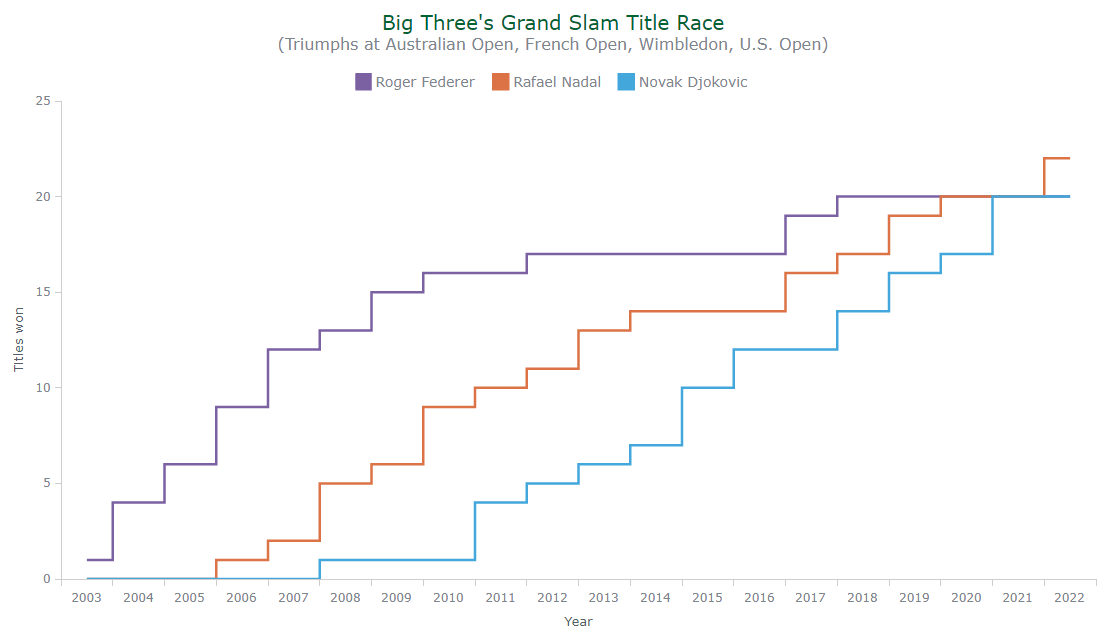
How to Create a Step Line Chart
Just like it’s always more exciting when a tennis match is a five-setter one, here is something extra to make this tutorial and this line graph visualization even more awesome.
From the point of view of data visualization, a stepped line chart will actually work better in this case. And we can make one with just one small modification.
Just change the line() function to stepLine() and your line chart will become your stepped line chart:
// create a stepped line chart
var chart = anychart.stepLine();

// create the series and name them
var firstSeries = chart.stepLine(firstSeriesData);
firstSeries.name("Roger Federer");
var secondSeries = chart.stepLine(secondSeriesData);
secondSeries.name("Rafael Nadal");
var thirdSeries = chart.stepLine(thirdSeriesData);
thirdSeries.name("Novak Djokovic");
Enjoy the elegant JavaScript-powered stepped line chart visualizing the Grand Slam title race between the Big Three in tennis. (Feel free to explore and continue playing with its full source code on CodePen.)
And here's the full code:
<html>
<head>
<title>Line Chart JS</title>
<script src="https://cdn.anychart.com/releases/8.11.0/js/anychart-base.min.js"></script>
<style type="text/css">
html, body, #container {
width: 100%; height: 100%; margin: 0; padding: 0;
}
</style>
</head>
<body>
<div id="container"></div>
<script>
anychart.onDocumentReady(function () {
// add data
var data = [
["2003", 1, 0, 0],
["2004", 4, 0, 0],
["2005", 6, 0, 0],
["2006", 9, 1, 0],
["2007", 12, 2, 0],
["2008", 13, 5, 1],
["2009", 15, 6, 1],
["2010", 16, 9, 1],
["2011", 16, 10, 4],
["2012", 17, 11, 5],
["2013", 17, 13, 6],
["2014", 17, 14, 7],
["2015", 17, 14, 10],
["2016", 17, 14, 12],
["2017", 19, 16, 12],
["2018", 20, 17, 14],
["2019", 20, 19, 16],
["2020", 20, 20, 17],
["2021", 20, 20, 20],
["2022", 20, 22, 20]
];
// create a data set
var dataSet = anychart.data.set(data);
// map the data for all series
var firstSeriesData = dataSet.mapAs({x: 0, value: 1});
var secondSeriesData = dataSet.mapAs({x: 0, value: 2});
var thirdSeriesData = dataSet.mapAs({x: 0, value: 3});
// create a stepped line chart
var chart = anychart.stepLine();
// create the series and name them
var firstSeries = chart.stepLine(firstSeriesData);
firstSeries.name("Roger Federer");
var secondSeries = chart.stepLine(secondSeriesData);
secondSeries.name("Rafael Nadal");
var thirdSeries = chart.stepLine(thirdSeriesData);
thirdSeries.name("Novak Djokovic");
// add a legend and customize it
chart.legend().enabled(true).fontSize(14).padding([10, 0, 10, 0]);
// add a title and customize it
chart
.title()
.enabled(true)
.useHtml(true)
.text(
'<span style="color: #006331; font-size:20px;">Big Three's Grand Slam Title Race</span>' +
'<br/><span style="font-size: 16px;">(Triumphs at Australian Open, French Open, Wimbledon, U.S. Open)</span>'
);
// name the axes
chart.yAxis().title("Titles won");
chart.xAxis().title("Year");
// customize the series markers
firstSeries.hovered().markers().type("circle").size(4);
secondSeries.hovered().markers().type("circle").size(4);
thirdSeries.hovered().markers().type("circle").size(4);
// turn on crosshairs and remove the y hair
chart.crosshair().enabled(true).yStroke(null).yLabel(false);
// change the tooltip position
chart.tooltip().positionMode("point");
chart.tooltip().position("right").anchor("left-center").offsetX(5).offsetY(5);
// customize the series stroke in the normal state
firstSeries.normal().stroke("#7b60a2", 2.5);
secondSeries.normal().stroke("#db7346", 2.5);
thirdSeries.normal().stroke("#43a7dc", 2.5);
// specify where to display the chart
chart.container("container");
// draw the resulting chart
chart.draw();
});
</script>
</body>
</html>
Conclusion
As you can see in this tutorial, creating interactive line (and stepped line) charts with JavaScript can be pretty straightforward. Let me know if you have any questions or suggestions.
It is motivating to see how these greats have achieved so much in their professional life.
Let’s use this inspiration to get ahead in the field of data visualization development by building even more (and all the more awesome) charts and graphs!