

You may have heard of, studied, or used a design system at some point in your coding career. But what role do design systems actually play in our projects? Why should we even bother to create or use them?
In this guide, you'll be learning what design systems are, why they're important, typical elements of a design system, and a practical example of how to implement a design system as a designer. Let's dive in!
What is a Design System?
Design Systems are structured collections of reusable design components and elements. We use them to create a consistent and cohesive user experience across a range of products or services.
A design system is like a set of building blocks and rules for creating digital products like websites and apps. Design systems are made up of key elements like typography, color palette, icons, spacing and layout, and so on.
Importance and purpose of a Design System
Design systems are important for many reasons.
Efficiency
Design systems help you become more efficient. Because it's a collection of reusable components, it saves the time of producing new elements, and helps designers produce new features quickly in projects. It also serves as a productivity booster.
Collaboration
A team trying to build a product may consist of designers, developers, product managers, and others. The design system helps all members of the team make reference to the brand guidelines, no matter what they working on. It also helps to make sure everyone, including stakeholders, are involved in the design process, and facilitates collaboration.
Consistency
Design systems ensure consistency in the user interface and user experience across various products and platforms.
We wouldn't want a scenario where a button design is inconsistent on different screens, would we? That's where the design system comes in. It helps our design assets and elements stay consistent, and it can always serve as a reference point.
Scalability
Scalability here refers to the ability of the design system to grow and adapt to the changing needs of a project or an organization.
A crucial element of any design system is scalability. Design systems help in situations where the project might need to expand to accommodate different devices and platforms or when the team is expanding or when trying to accommodate new trends and practices.
How Design Systems work
To understand how a design system works, you just need to know the kinds of assets or components that make up the system and their roles.
A typical design system comprises of the following parts:
Colours
When you open a design system, one of the first things you'll see is a colour palette section. It's one of the most common elements in a design system.
Design systems define a set of of primary and secondary colours, as well as their various uses. This includes background colours, text colours, and so on.
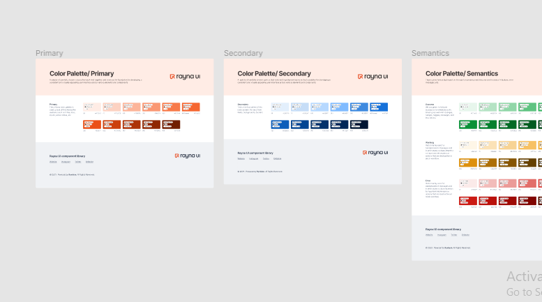 Colour palette section of Rayna UI design system
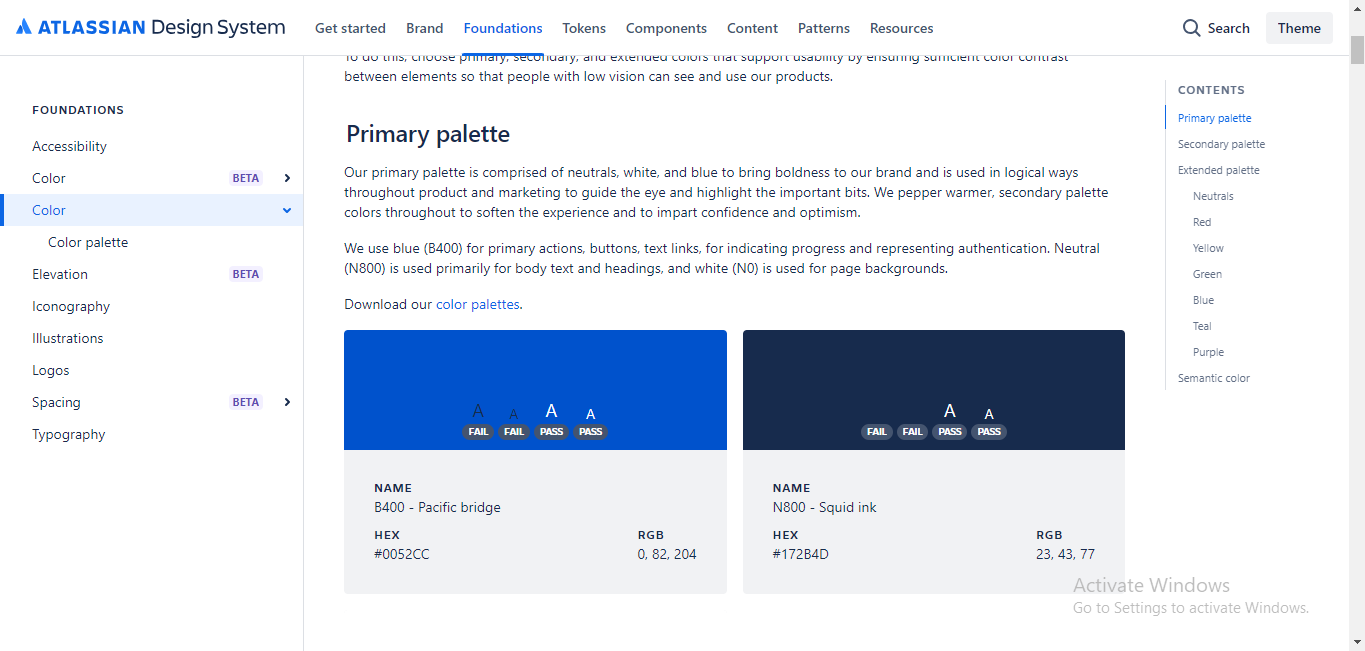 Colour palette section of Atlassian design system
Typography
Another typical element of a design system is typography. Every design system usually includes guidelines for typography, specifying fonts, font sizes, line height, and so on.
It may also define how typography is used for different content types like headings and body text, making sure they're accessible and legible for design use.
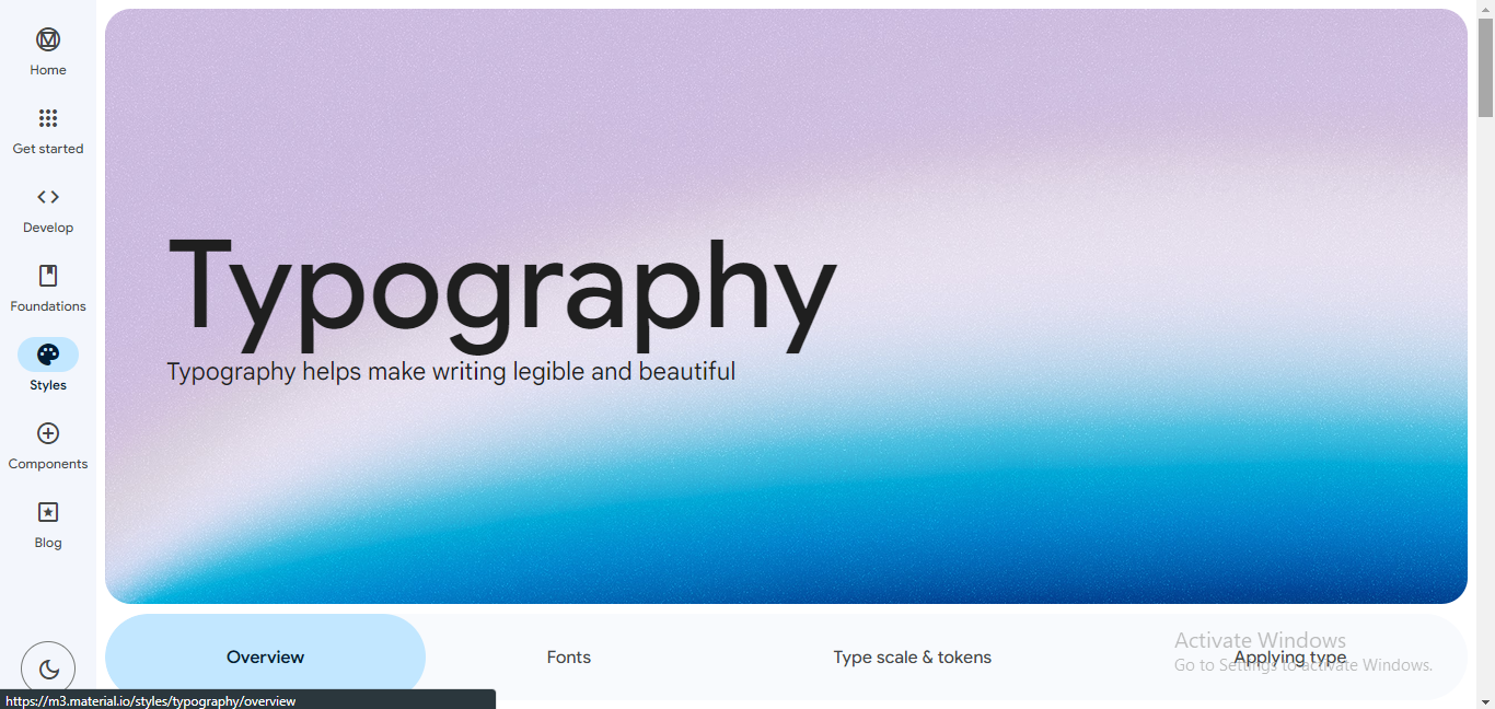 Typography section of Google's Material Design
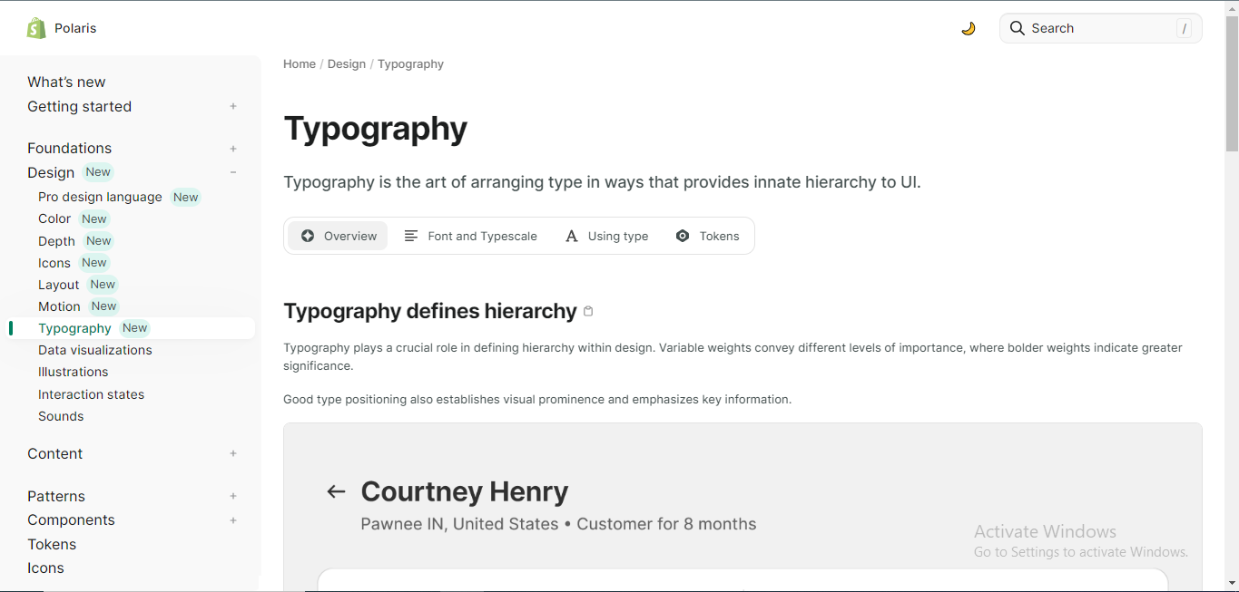 Typography section of Shopify's Polaris
Icons
Icons are very important when trying to give visual clues to your users. Design systems provide a set of standard icons and guidelines for their usage, ensuring they are recognizable and consistent.
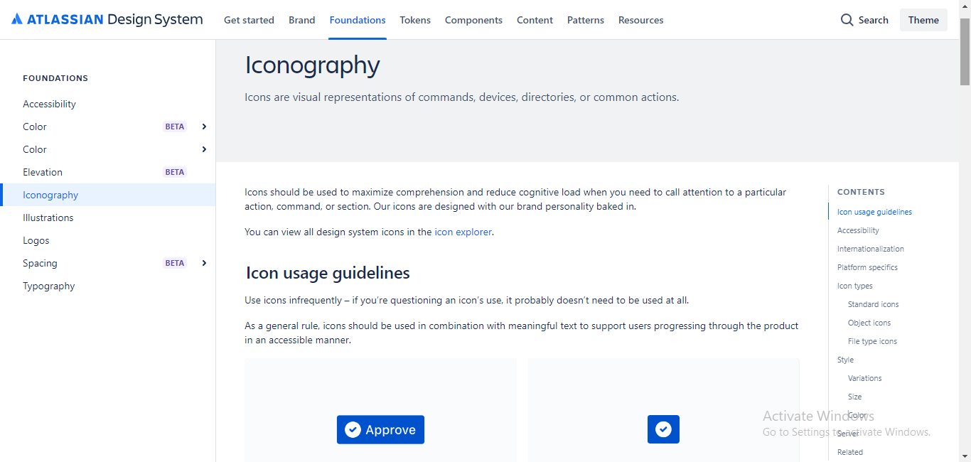 Iconography section of Atlassian design system
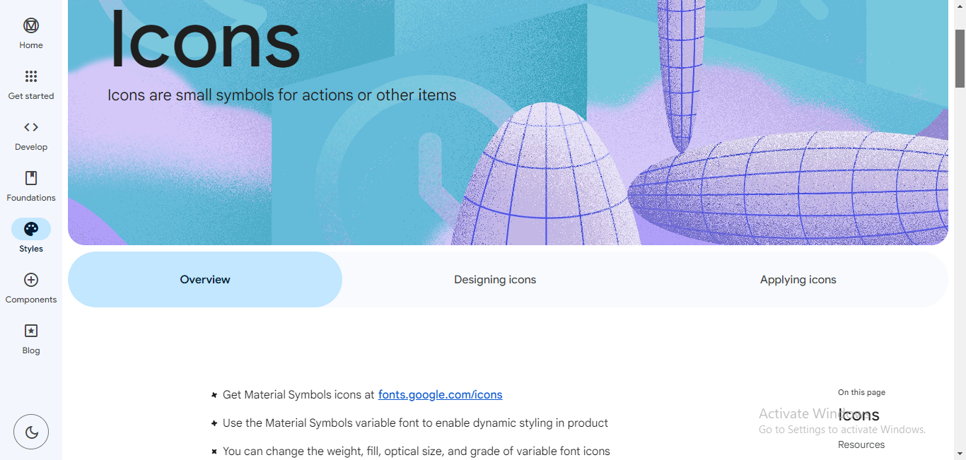 Iconography section of Google's Material Design
Grid and Spacing Styles
A grid system helps establish a consistent structure for different components or pages.
Design systems provide spacing guidelines specifying margins, padding, and other layout-related rules to maintain alignment to create a visually pleasing and organized design.
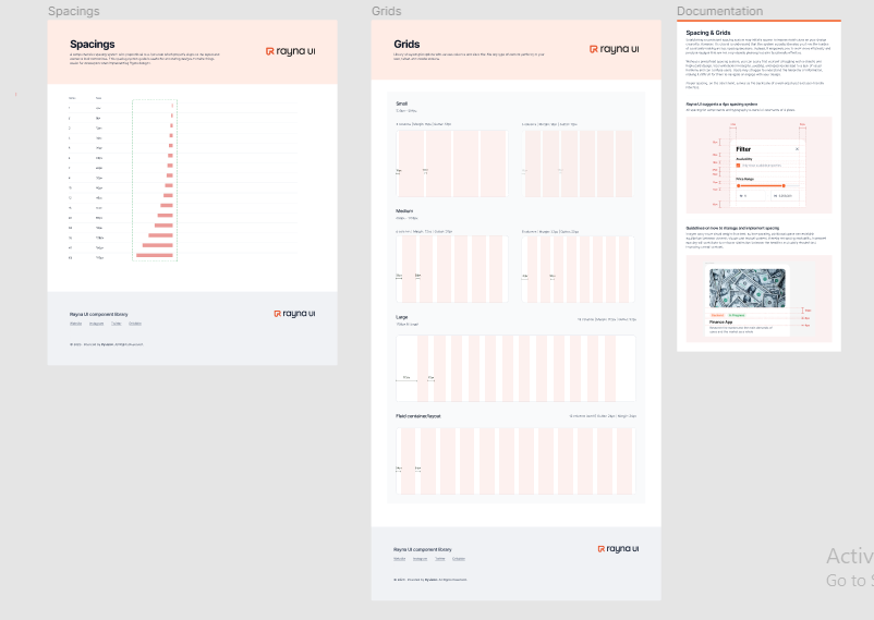 Grids and spacing styles section of Rayna UI design system
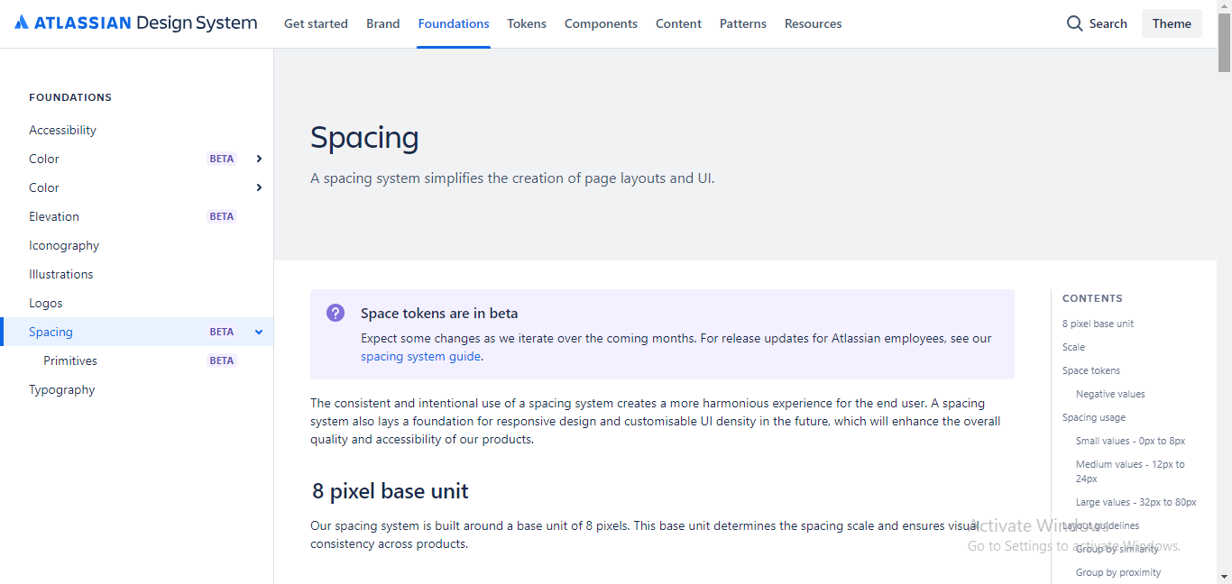 Spacing section of Atassian design system
Documentation
Every well-structured design system has some form of documentation that usually explains how to use the elements and guidelines effectively. The documentation also helps designers and developers understand how to use and implement the design system.
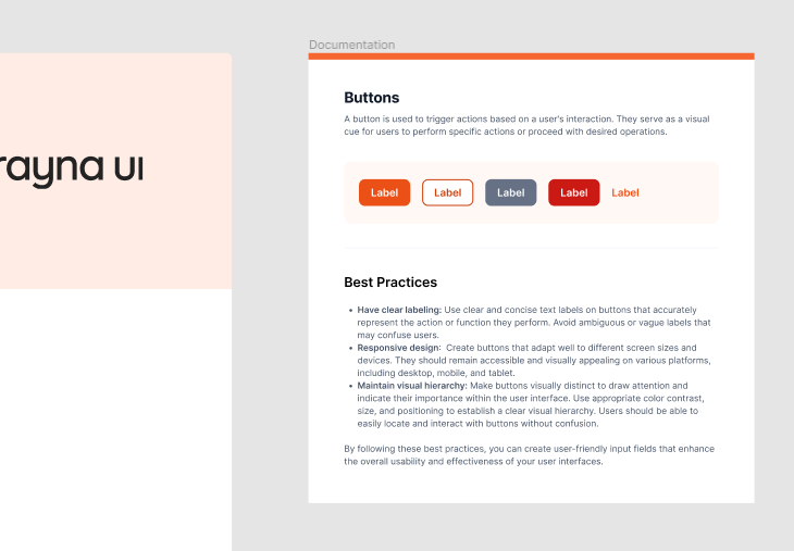 Documentation for button styles in the Rayna UI design system
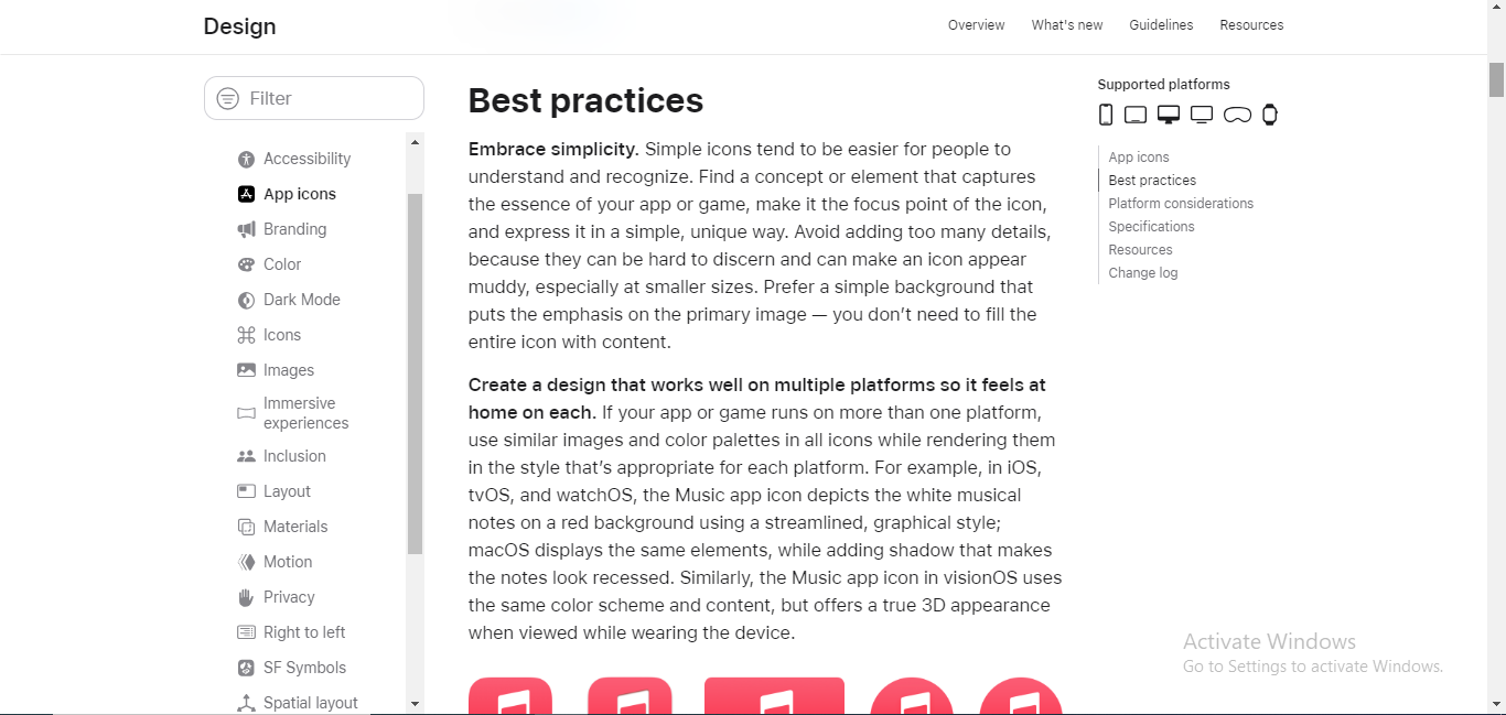 Documentation for App icons on Apple's Human Interface Guidelines
UI Patterns and Components
UI patterns and components are the building blocks of a user interface. Design systems define UI patterns and components such as buttons, forms, modals, accordions, navigation bars, and so on, along with guidelines on how and when to use them.
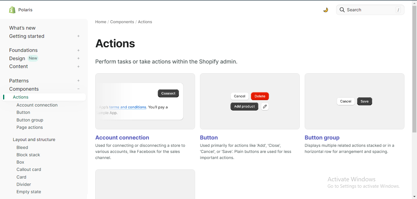 UI Components section of Shopify's Polaris
 UI Patterns section of Aplles's Human Interface Guidelines
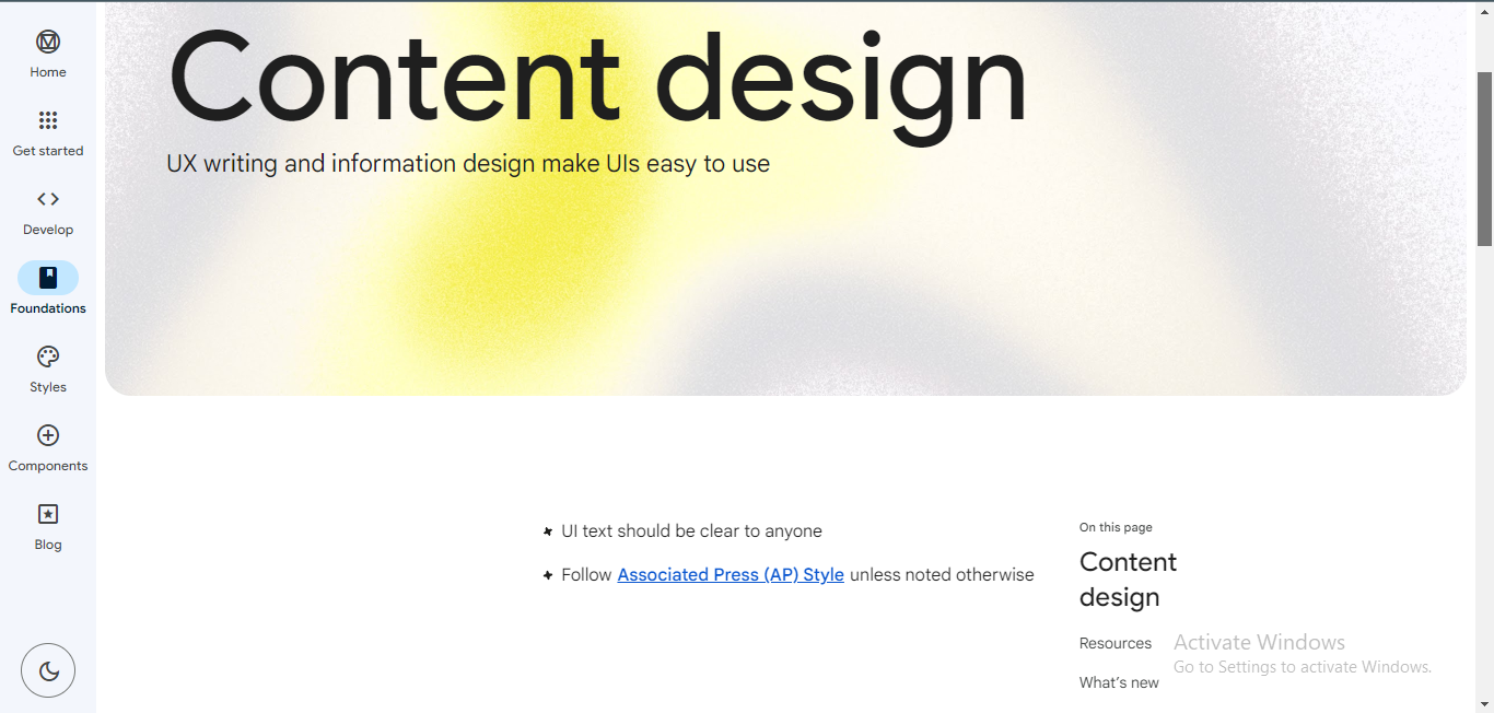
Content Guidelines
These cover how text and imagery is used in the user interface. They may specify tone, image use, and content hierarchy, ensuring that the content is consistent and aligns with the brand guidelines.
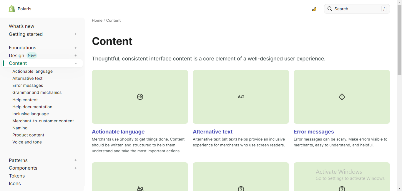 Content guidelines section of Shopify's Polaris
 Content guidelines section of Google's Material Design
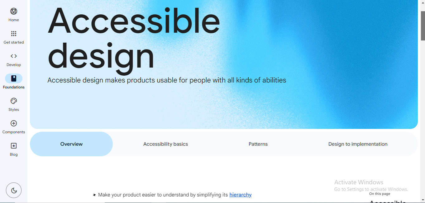
Accessibility Guidelines
Most design systems contain accessibility guidelines in order to increase the usability of products for people with all kinds of abilities. These guidelines ensure that the design is inclusive and complies with accessibility standards like WCAG (Web Content Accessibility Guidelines). This includes colour contrast, keyboard navigation and other accessibility features.
 Accessibility guidelines of Google's Material Design
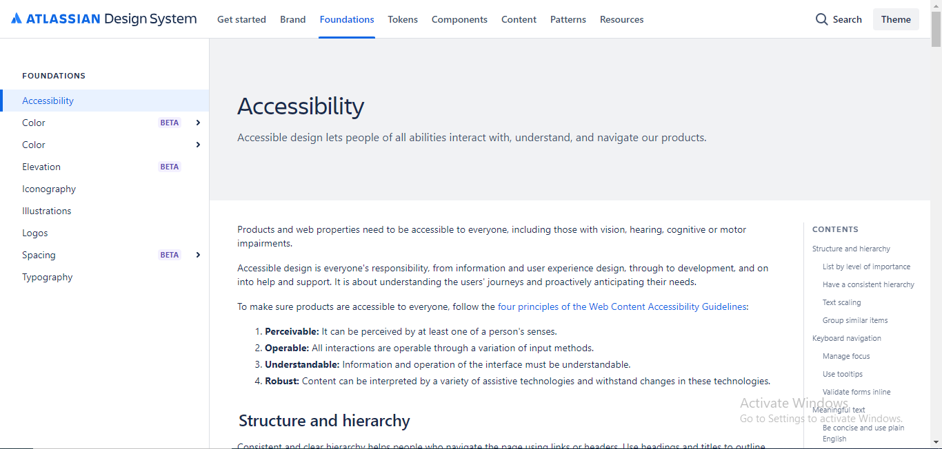 Accessibility guidelines of the Atlassian design system
Examples and Use Cases
Most design systems also contain examples and use cases of the design system in action to help designers and developers understand how to implement it effectively.
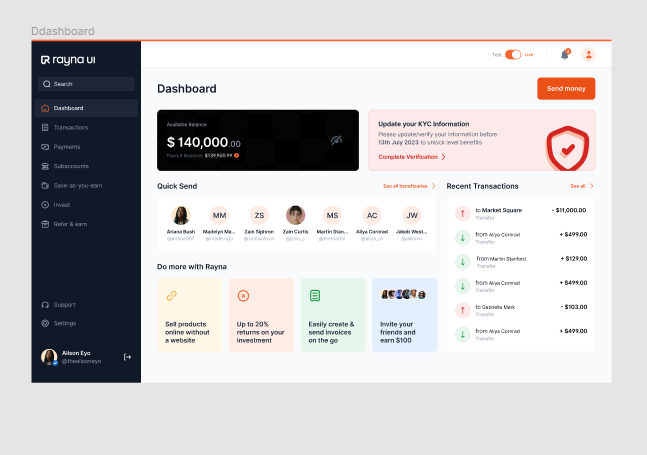 Fintech Dashboard use case from Rayna UI design system
 Applying type use case from Google's Material Design
Differences Between a Design System and a Style Guide
Style guides and design systems are very similar and can often be confused for the same thing – but they're different.
Some differences between design systems and style guides are:
Scope
Style guides are relatively limited in scope and may not include detailed UI components or interactions.
Design systems on the other hand, are more comprehensive and encompass a broader range of elements including interactive components, user interface guidelines, amongst others.
Consistency
Style guides typically focus on ensuring brand consistency, helping maintain a uniform look and feel across various materials and platforms.
Design systems aim to establish both brand and user interface consistency, by providing reusable components and interaction patterns.
Evolution and Scalability
Style guides tend to evolve more slowly, and might not be as scalable as design systems. Design systems are more adaptable and evolve with the product or service.
Collaboration
Style guides are mainly used by designers to ensure visual consistency across a brand. They have a limited role in facilitating collaboration amongst designers and developers.
Design systems, on the other hand, promote collaboration by providing a common language and shared resources between designers and developers.
Real-Life Examples of Design Systems
A lot of software corporations have created their own design systems to help ease the work of their designers and generally make it a smoother experience to build products.
Google, for instance, has a design system which they use for their products – you can see similar styles and elements in most of their products.
Most of these design systems are free and available to the public for use. Some examples of real life design systems are:
- Google Material Design by Google
- Apple Human Interface Guidelines by Apple
- Atlassian Design System by Atlassian
- Polaris by Shopify
- Carbon Design System by IBM
How to Use a Design System for Your Designs – Rayna UI Design System Example
For this article, we'll be using the Rayna UI Design System to illustrate how to use a design system for your designs.
It's a newer design system that I recently learned about, so I thought I'd share my experience by using it for a challenge.
Step 1 – Download the Design System
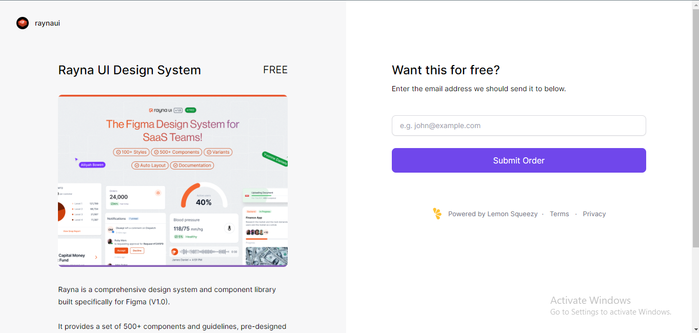
The first step will be to download the design system you're trying to use. In this case, we'll download the Rayna UI Design System. Go to their landing page @Rayna UI and grab it from there.
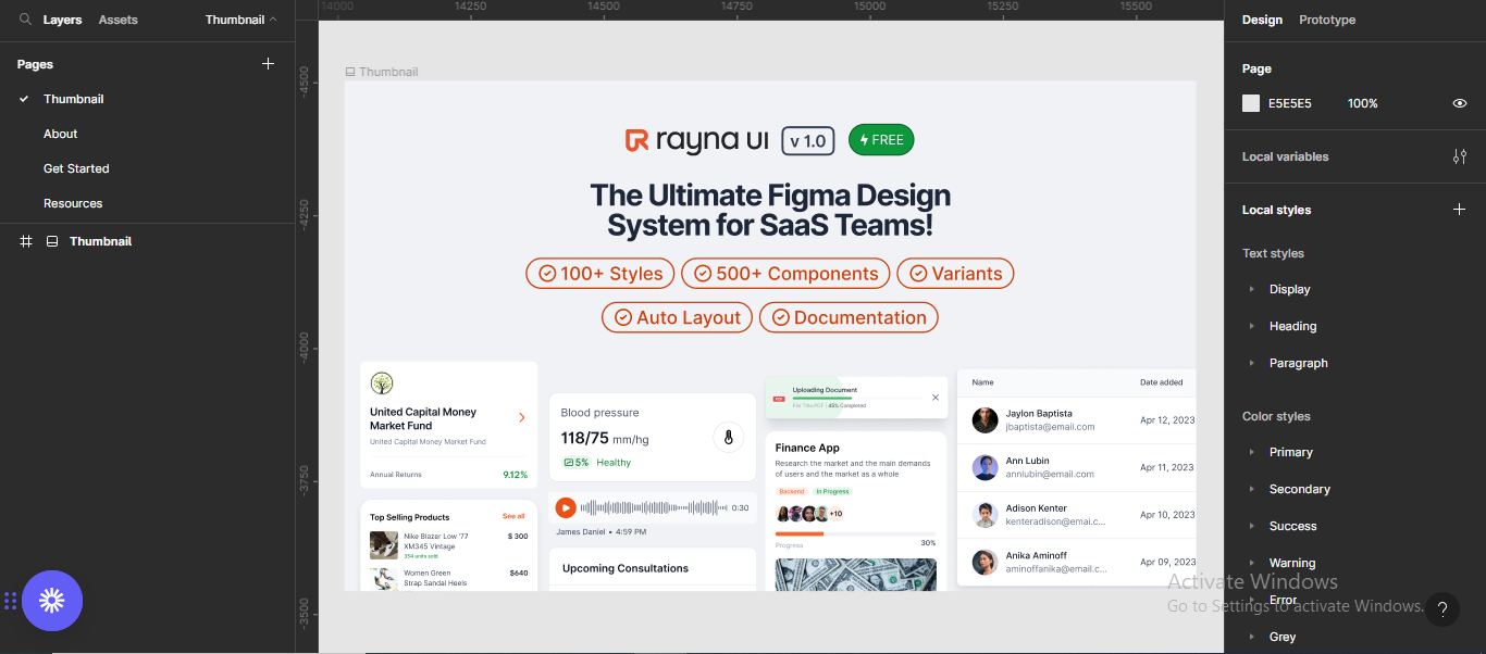
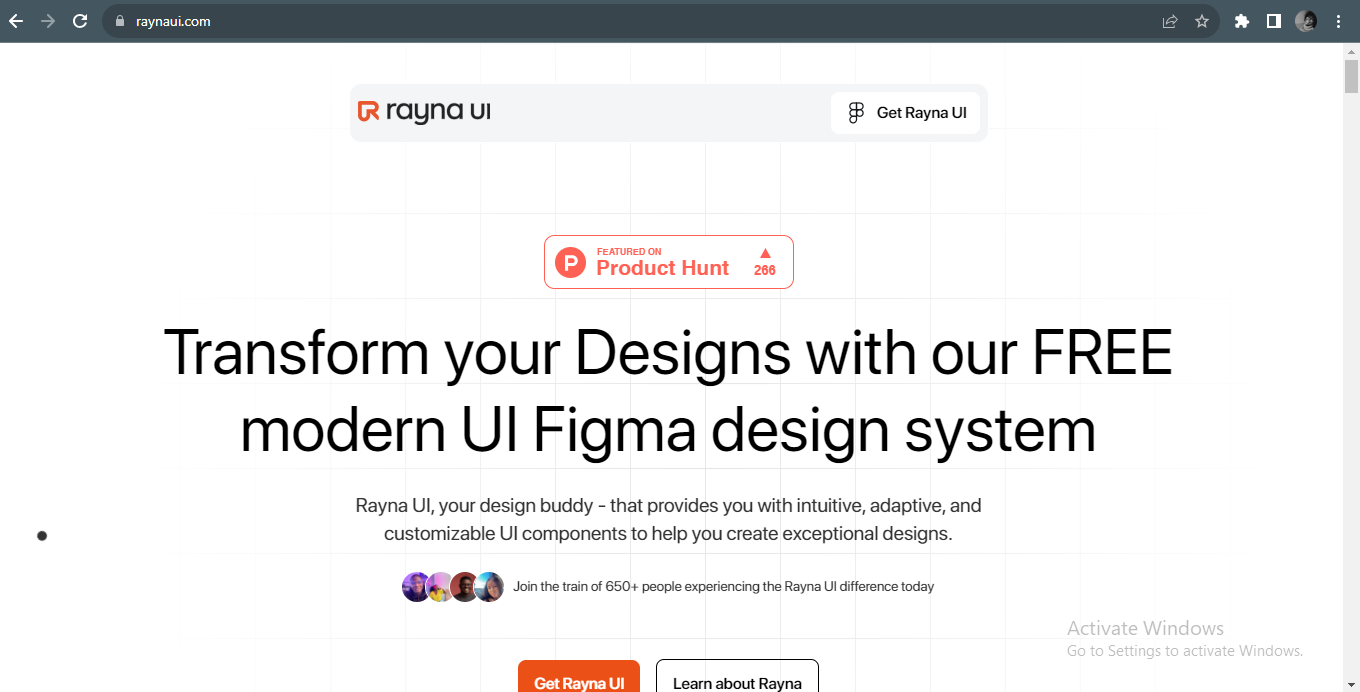 Rayna UI Landing page
Next, click on "Get Rayna UI" to download the design system.
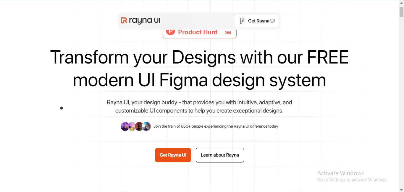 Rayna UI Landing page
Next, type your email in order to get the design system sent to your email address.
 Provinding your email address
The link to the Figma file will be shared to your email, and you can open it.
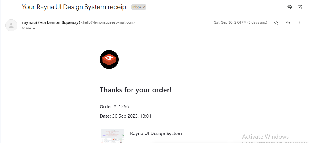 Checking your email
Scroll down in the email to find the link to view the Rayna UI Figma file.
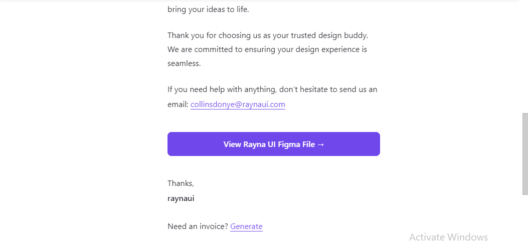 Checking your email
Click on the link sent to your email to open the design system. The link will open up the Rayna UI Design System on the Figma community.
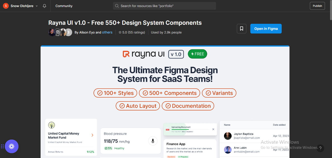 Opening the Rayna UI file in Figma Community
Next, click on the "Open in Figma" button by the right side of your screen. This will open up a Figma file containing all assets and components of the Rayna UI Design System.
 Opening the Rayna UI file in Figma
Step 2 – Publish the Rayna UI Design System to your libraries.
The next step is to publish the Rayna UI Design System to your libraries, so you can use it for any design.
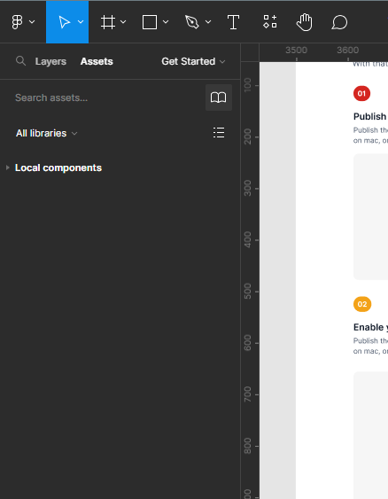
The third page on the Figma file (Get Started) contains a guide to getting started with the design system. Included in this guide are resources for beginners so you can gain a solid grasp of the basics, along with steps to take to publish and enable the library in other projects.
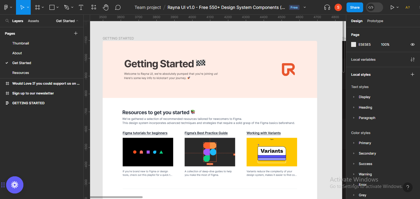 Getting Started with the Rayna UI design system
 Exploring the getting started section
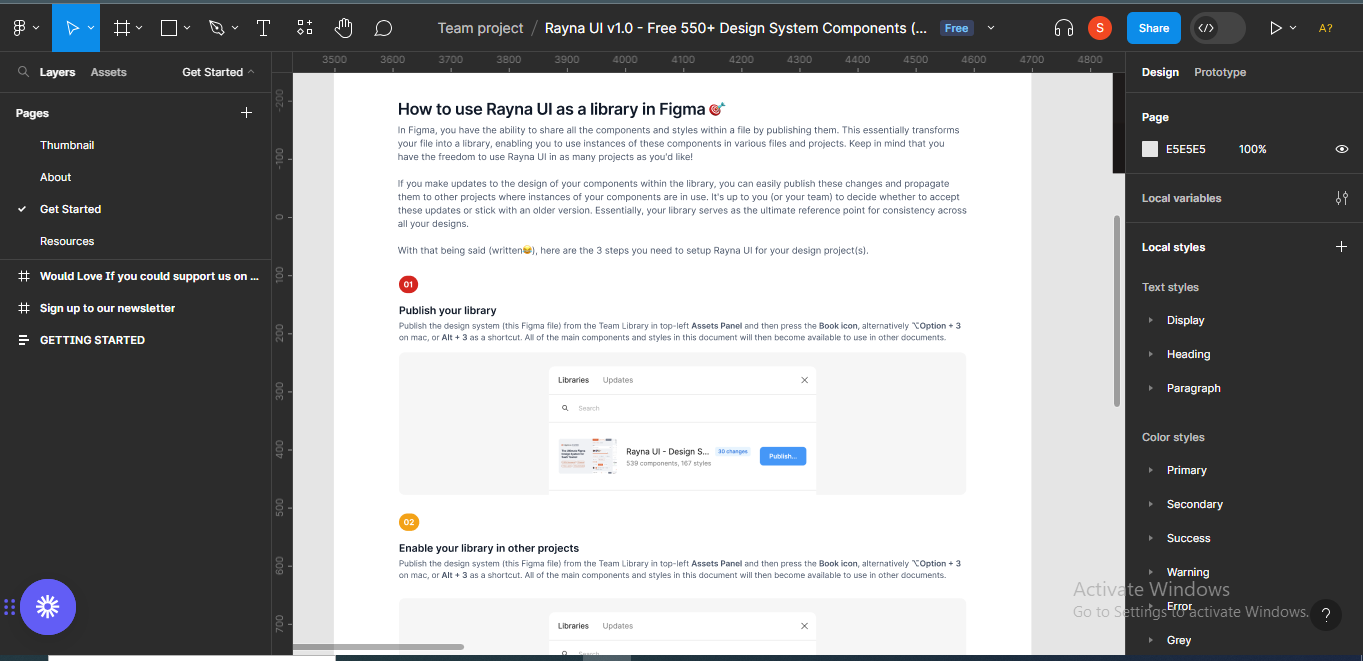
Follow the steps given in the guide to publish the library. First, go to the assets panel in the top-left area of your screen, and press the book icon.
 Clicking on the "Assets" panel
 Clickiing on the "book" icon
When you click on the book icon, it'll bring up a modal for you to publish the library.
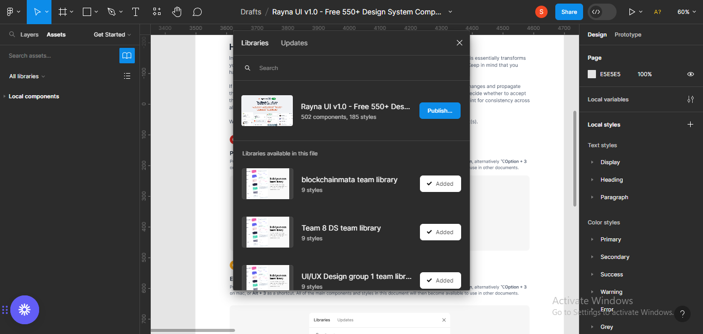 Publishing the library
Click on the publish button next to the file on the modal.
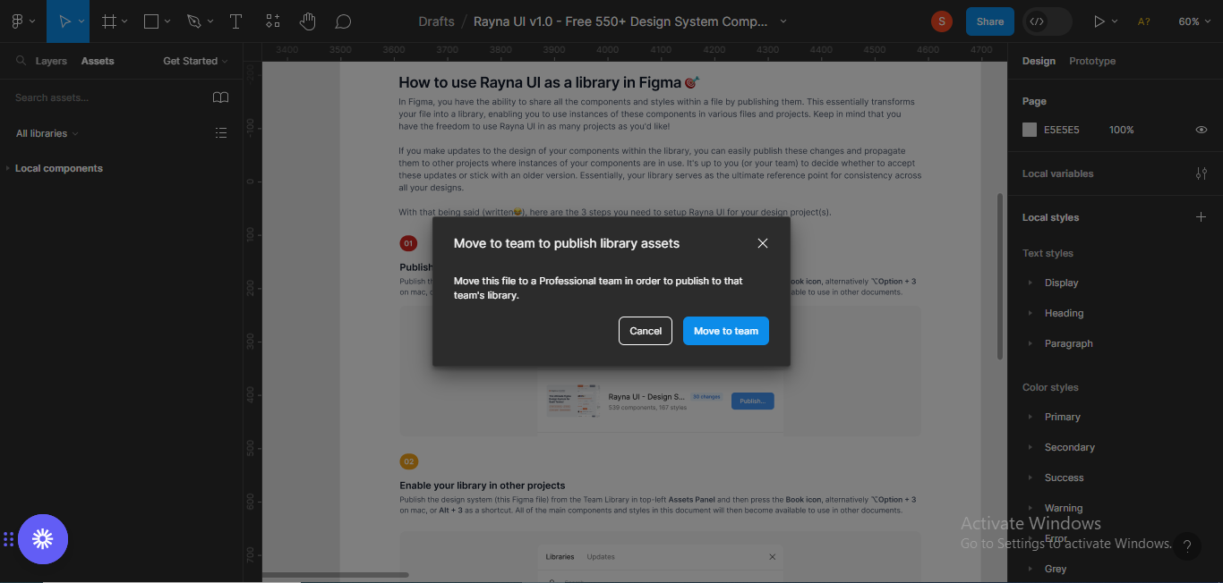 Moving the library to a professional team
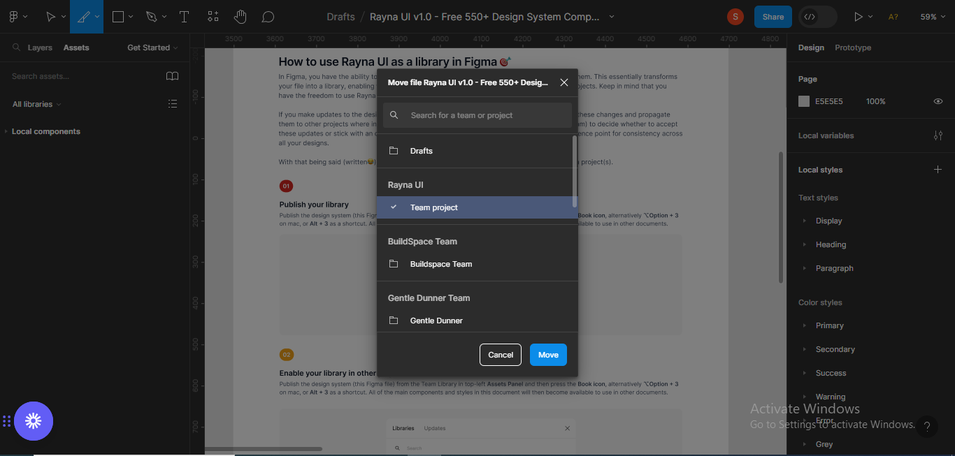
I was asked to move the library to a professional team, so I could publish there. Click on the "Move to team" button to move the file.
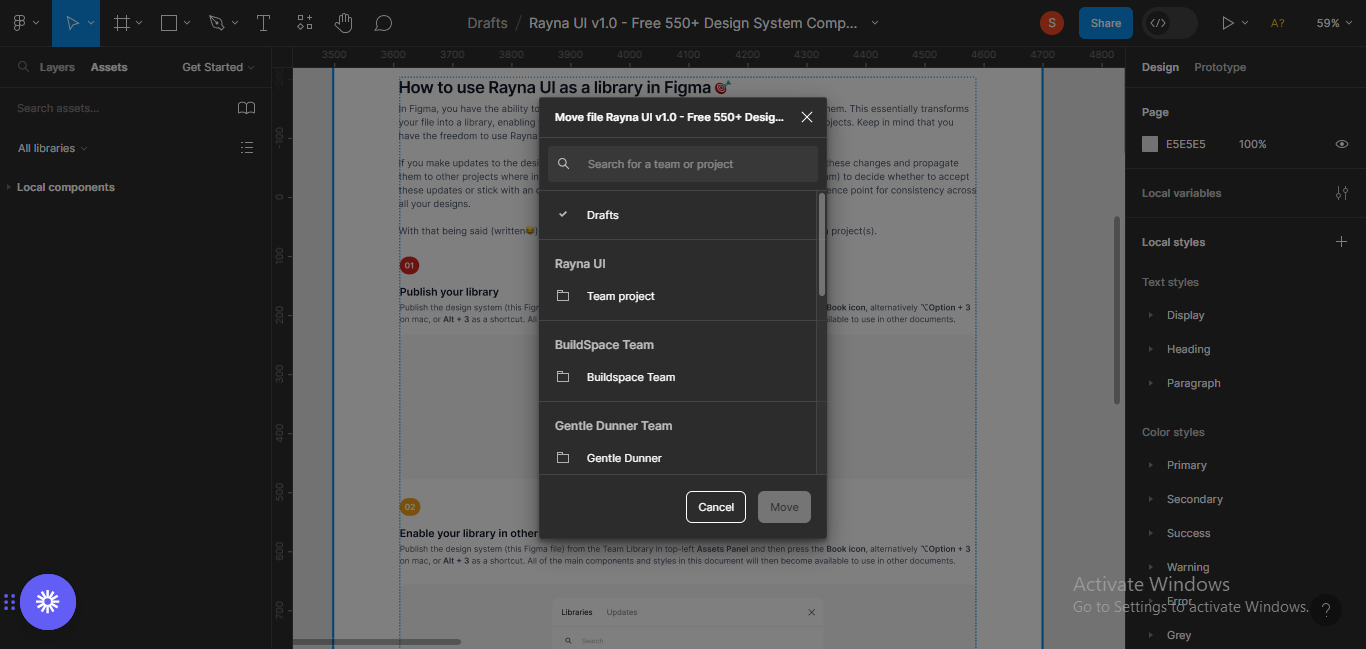 Selecting a team.
Next, select the team file you want to publish the library to.
 Selecting a team
After selecting a team, you'll have to publish the design system to the team files.
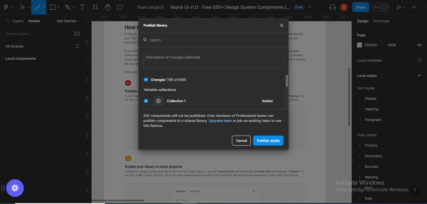 Publishing the design system
 Publishing the design system
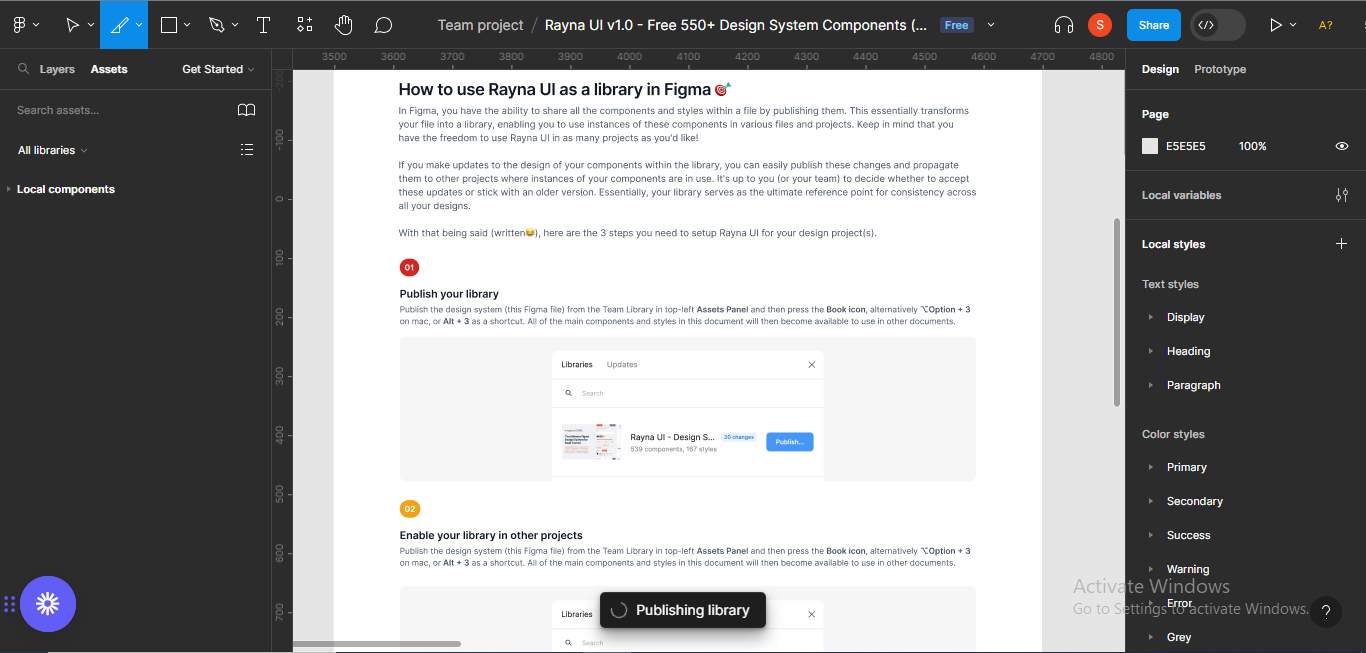
You'll receive a notification that your library has been published.
How to Use the Design System in Your Projects
Next, we'll be learning how to implement the design system in a design. I'll be designing a sign up screen for a fintech website to illustrate this.
Before starting your design, you can copy some icons you may need from the design system to your design file. I tend to copy the buttons and input field styles I may need, if I want to adhere strictly to the design system.
 Copied elements from the design system page.
For the sign up page I'm going to be designing, the details I need are the name of the website, input fields (full name, last name, email address, password, confirm password), and the buttons or CTAs (sign up and sign up with Google).
How to Design a Sign Up Web Screen
Step 1 – Select a Frame
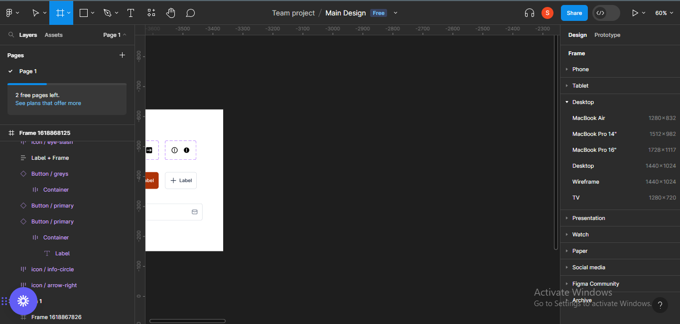
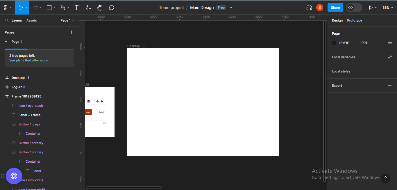
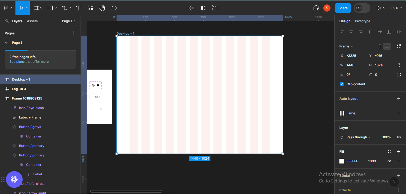
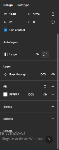
Firstly, I'll open the frame I'll be using. For this design, I'll be using the desktop frame (1440 x 1024).
To open a frame, go to the tools panel on the top left-hand corner of your screen. A panel with different kinds of frame types and sizes will come up.
 Tools panel-Frame
Open the Desktop section and choose "Desktop" (1440 x 1024). The frame will appear on your screen, and you can start designing.
 Choosing a frame
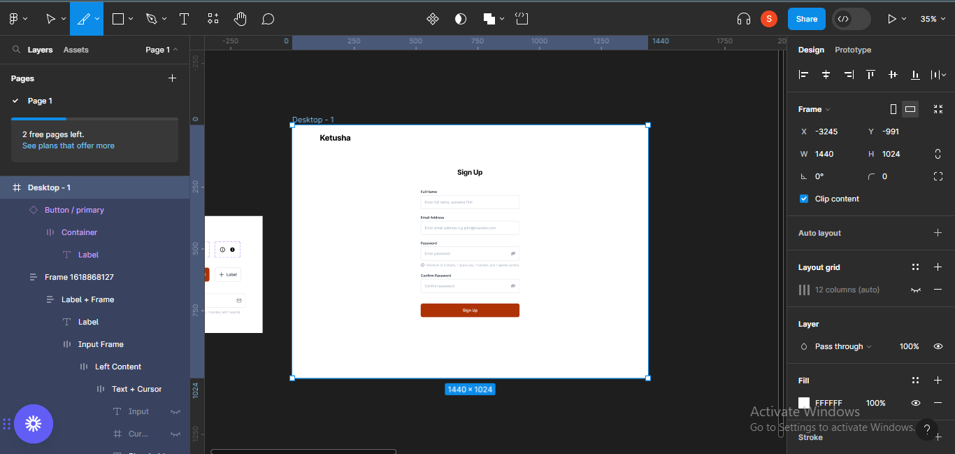
Step 2 – Add Grid Styles
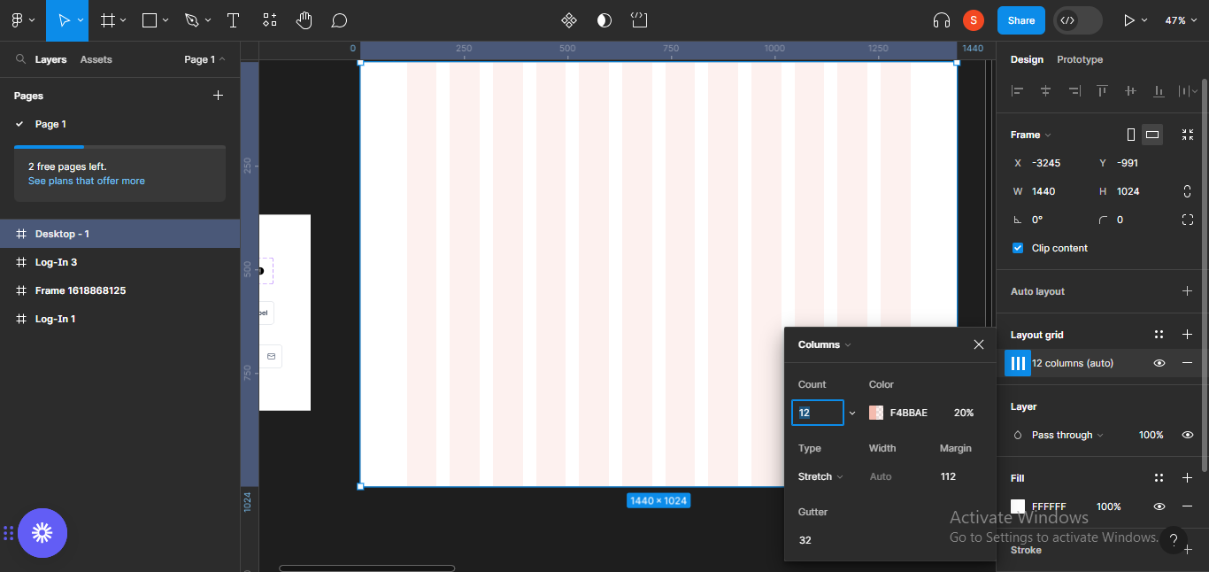
I like using grids for arrangement and consistency in my designs, so I'll add a grid layout to the frame.
In the Rayna UI Design System, there are already existing grid styles so I can just choose one. To add a grid style, go to the panel on your right, and click on the 4-block menu on the layout grid section.
 Grid style panel
A list of different grid styles on the design system will come up, and you can choose any which corresponds with the kind of screen you're designing for.
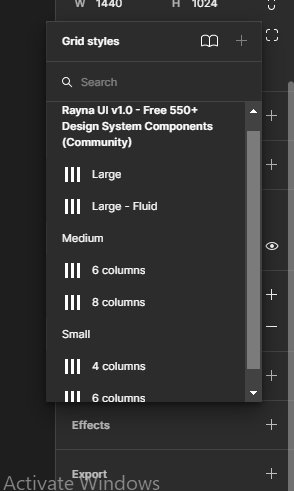 Choosing a grid style
Since I'm designing with a desktop frame, I'll choose Large.
 Choosing a grid style for a frame
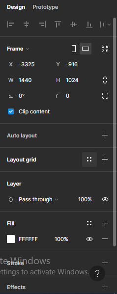
You can detach instance to see the specifications of the grid style you chose. To detach instance, click on the detach icon next to the eye icon on the layout grid section.
 Detaching style
You can now see the specifications for the grid style you chose. Since I chose Large, the grid specifications are:
- Count – 12, using columns
- Colour – F4BBAE, with opacity set to 20%
- Type – Stretch
- Width – Auto
- Margin – 112
- Gutter – 32
 Grid style specifications
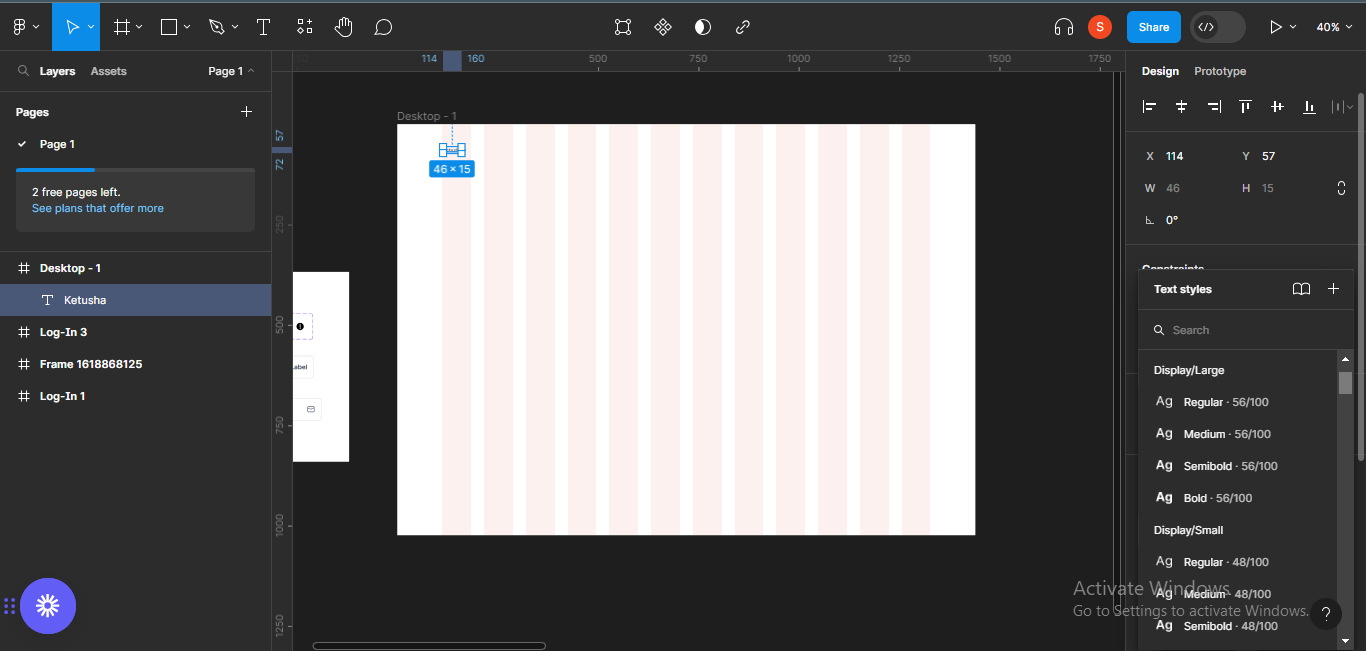
Step 3 – Add Content
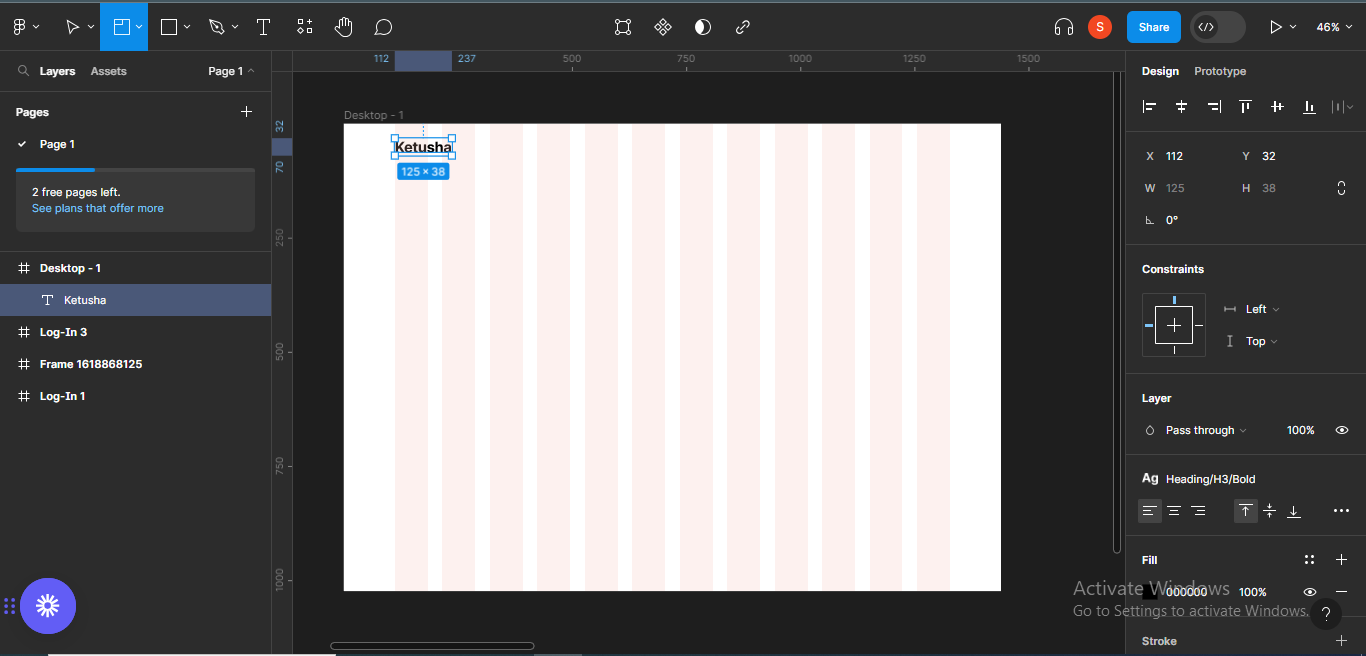
I'll go ahead to start adding content to the screen. I'll use a text to represent my logo – Ketusha.
You can also control text styles and sizes on the design system. To do that, go to the Text panel on the left hand side of your screen.
 Editing text size
 Confirming text size
Following the same format, I typed a heading for the form called "Sign Up".
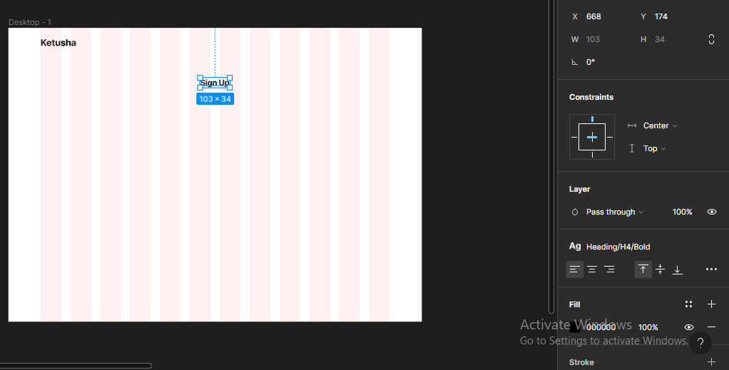 Sign Up form heading
Earlier, I suggested that you copy the icons, buttons, and input fields samples from the design system file, so you can use them easily while designing. Now, I'm going to paste the input field sample I copied in my frame.
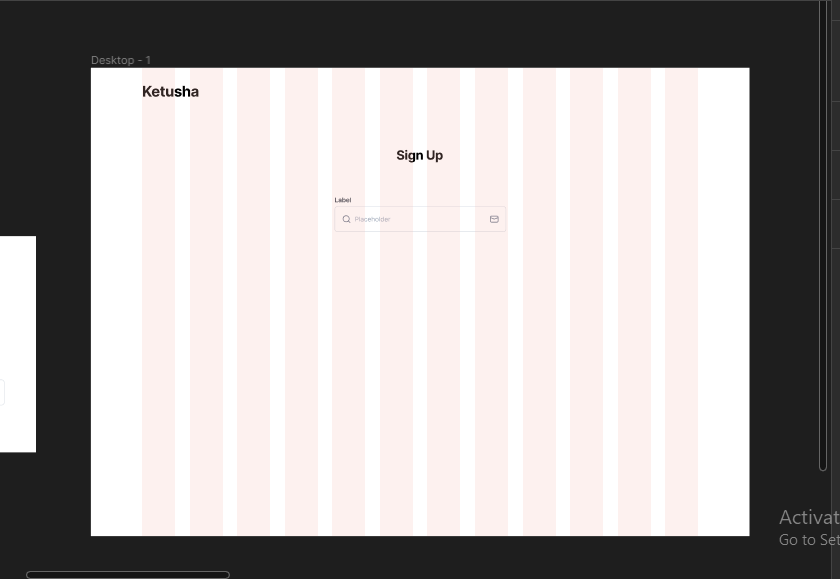 Pasting input field sample in frame
Since I want the input field to be longer, I'll elongate it slightly to 400 width. It was previously 375 width.
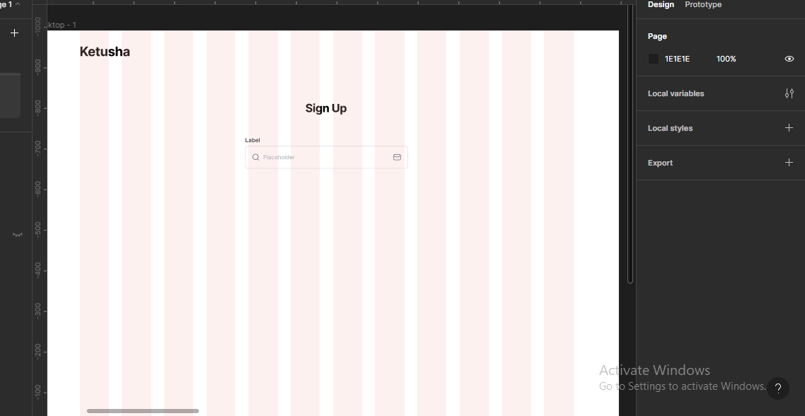 Elongating input field width
Next, I'll structure the input field to how I want it to look like – without icons.
 Input field without icons
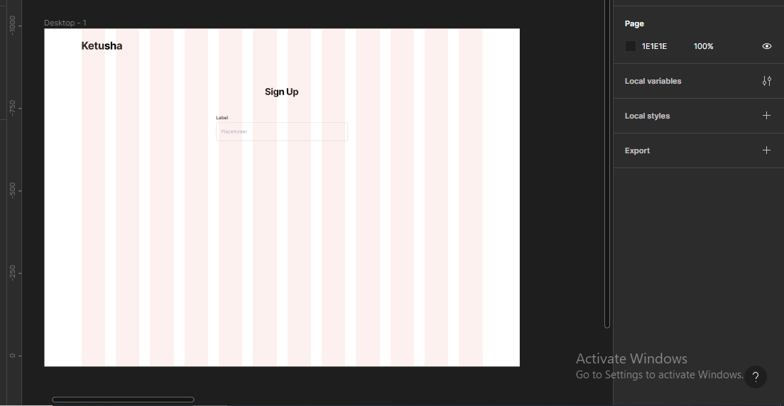
Next, I'll edit the label to the label I want for my design.
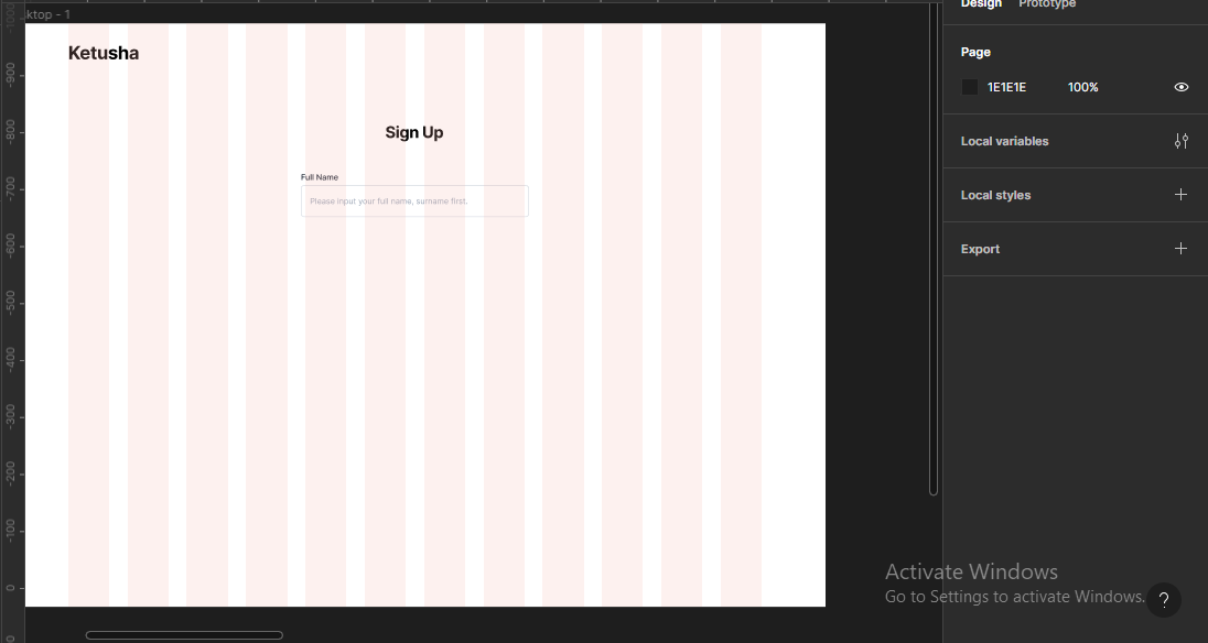 Editing label
Next, I'll just duplicate the input field until I'm satisfied, and also edit all the labels.
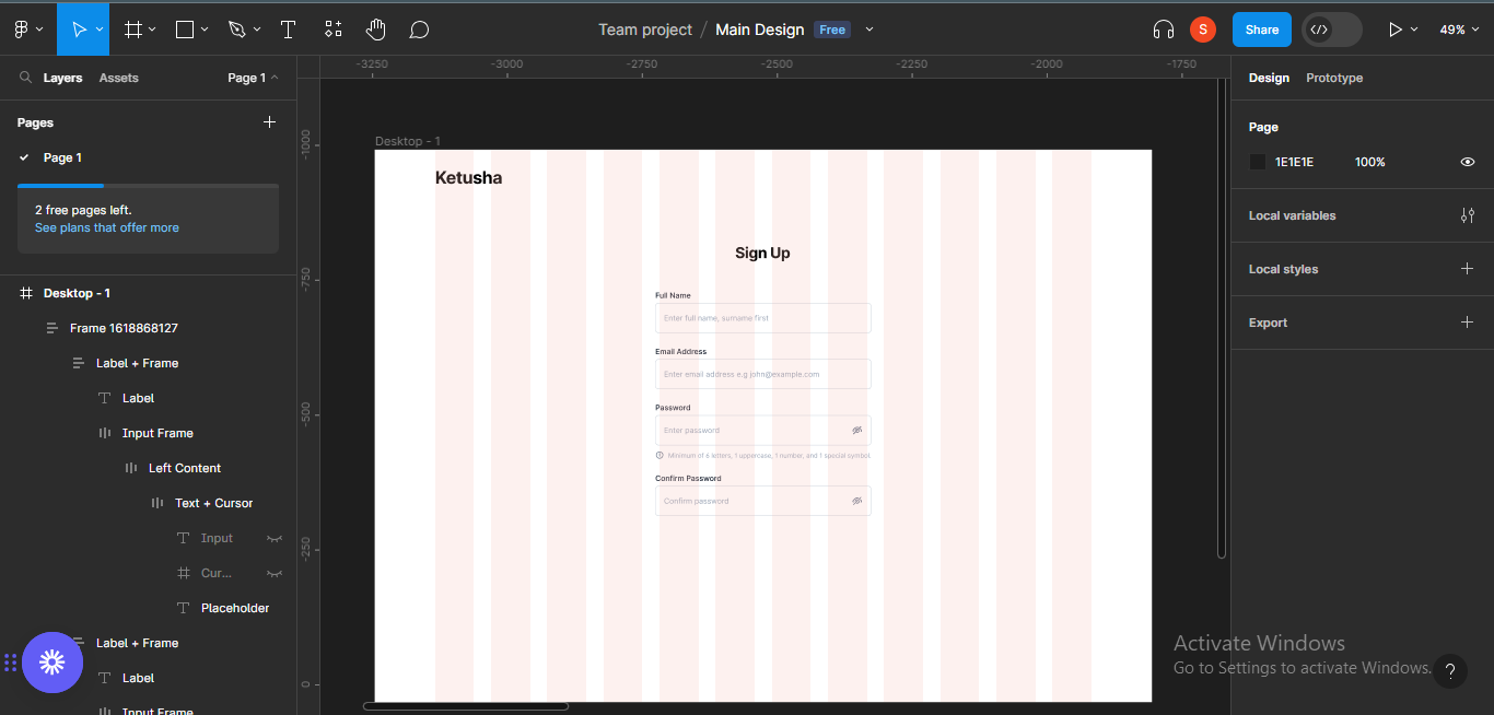 Adding other input fields
Next, I'll add the buttons to the screen.
 Adding CTAs
I'll add the "Sign up with Google" button, so the user can have different options for signing up on the platform.
 Adding other sign up options
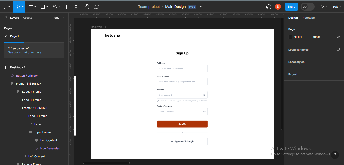
Next, I'll try to paste the google icon inside the "Sign up with Google" frame but that might not be possible.
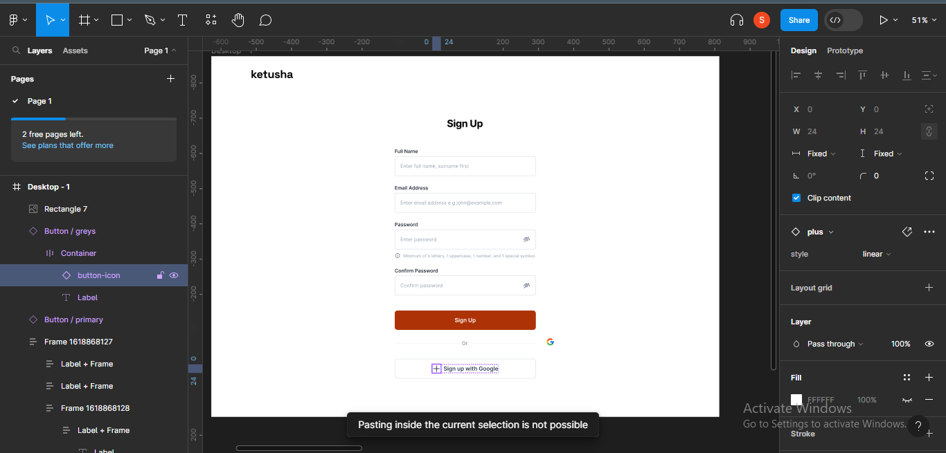 Pasting Google icon
To be able to paste and replace an item inside the selection, I'll have to detach the instance. To do this, right click on the item you're trying to replace. A list of options will come up. Click on "detach instance".
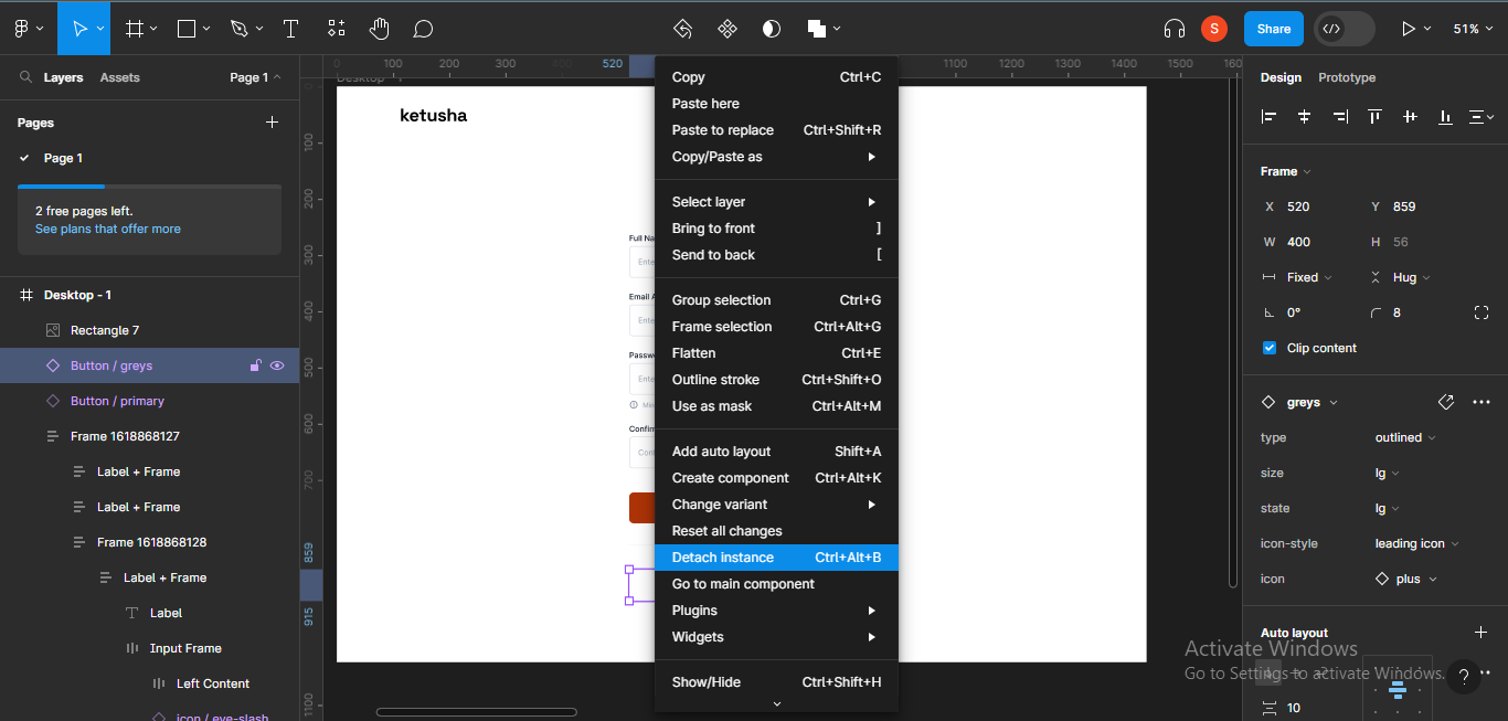 Detach instance
After that, right click on the icon again, and "paste to replace".
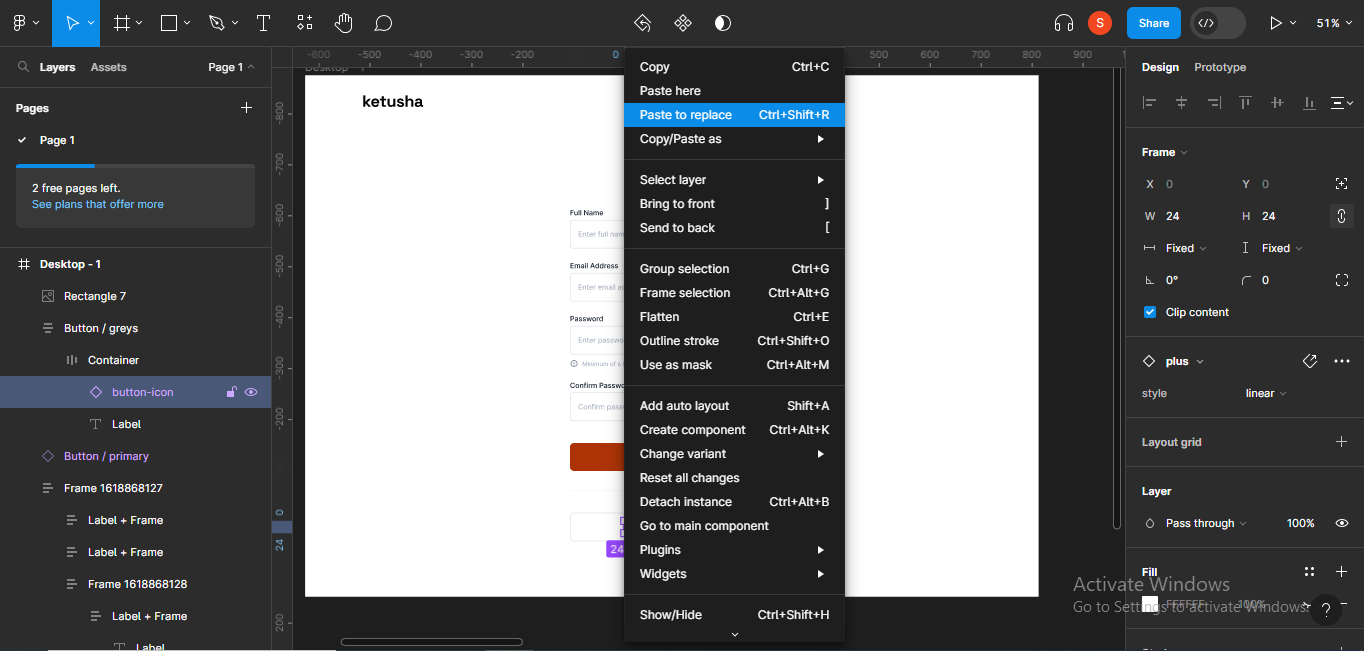 Paste to replace
The icon will be replaced instantly.
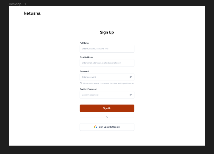 Web sign up form
We just created a sign up page using the Rayna UI Design System!
Keep in mind that using a design system doesn't mean you cannot be creative and add your own flair. You can add your own style and creativity as much as you'd like as you go.
Conclusion
Using design systems is a necessary skill every designer and developer should cultivate.
Design systems are a critical component of modern product design and development, fostering collaboration, efficiency, and innovation.
Thank you for reading!