
By Ankit Sharma
Introduction
Animation is defined as the transition from an initial state to a final state. It is an integral part of any modern web application. Animation not only helps us create a great UI but it also makes the application interesting and fun to use. A well-structured animation keeps the user engaged with the application and enhances the user experience.
Angular allows us to create animations which provides us similar native performance as CSS animations. In this article, we will learn how we can create animation using Angular 6.
We will use Visual Studio Code for our demo.
Prerequisites
Install VS code and Angular CLI.
If you are new to Angular, then refer to my previous article Getting Started With Angular 6.0 to set up the Angular 6 development environment on your machine.
Source Code
Download the source code from GitHub.
Understanding Angular Animation States
Animation involves transition from one state of an element to another state. Angular defines three different states for an element:
- Void state — represents the state of an element which is not part of the DOM. This state occurs when an element is created but not yet placed in the DOM or the element is removed from the DOM. This state is useful when we want to create animation while adding or removing an element from our DOM. To define this state in our code we use the keyword
void. - The wildcard state — This is also known as the default state of the element. The styles defined for this state are applicable to the element regardless of its current animation state. To define this state in our code we use the
*symbol. - Custom state — This is the custom state of the element and it needs to be defined explicitly in the code. To define this state in our code, we can use any custom name of our choice.
Animation Transition Timing
To show the animation transition from one state to another, we define animation transition timing in our application.
Angular provides the following three timing properties:
Duration
This property represents the time our animation takes to complete from start (initial state) to finish (final state). We can define the duration of animation in the following three ways:
- Using an integer value to represent the time in milliseconds. E.g.- 500
- Using a string value to represent the time in milliseconds. E.g. — ‘500ms’
- Using a string value to represent the time in seconds. E.g. — ‘0.5s’
Delay
This property represents the duration between the animation trigger and the beginning of the actual transition. This property also follows the same syntax as duration. To define the delay, we need to add the delay value after the duration value in a string format — ‘ Duration Delay’. Delay is an optional property.
For example:
- ‘0.3s 500ms’. This means the transition will wait for 500ms and then run for 0.3s.
Easing
This property represents how the animation accelerates or decelerates during its execution. We can define the easing by adding it as the third variable in the string after duration and delay. If the delay value is not present, then easing will be the second value. This is also an optional property.
For example:
- ‘0.3s 500ms ease-in’ — This means the transition will wait for 500ms and then run for 0.3s (300ms) with ease-in effect.
- ‘300ms ease-out’. — This means the transition will run for 300ms (0.3s) with ease-out effect.
Creating the Angular 6 application
Open command prompt in your machine and execute the following set of commands:
- mkdir ngAnimationDemo
- cd ngAnimationDemo
- ng new ngAnimation
These commands will create a directory with the name ngAnimationDemo and then create an Angular application with the name ngAnimation inside that directory.
Open the ngAnimation app using VS code. Now we will create our component.
Navigate to View >> Integrated Terminal. This will open a terminal window in VS Code.
Execute the following command to create the component.
ng g c animationdemo
This will create our component animationdemo inside the /src/app folder.
To use Angular animation we need to import BrowserAnimationsModule which is an animation-specific module in our application. Open the app.module.ts file and include the import definition as shown below:
import { BrowserAnimationsModule } from '@angular/platform-browser/animations';
// other import definitions

@NgModule({ imports: [BrowserAnimationsModule // other imports]})
Understanding the Angular Animation Syntax
We will write our animation code inside the component’s metadata. The syntax for the animation is shown below:
@Component({
// other component properties.
  animations: [
    trigger('triggerName'), [
      state('stateName', style())
      transition('stateChangeExpression', [Animation Steps])
    ]
  ]
})
Here we will use a property called animations. This property will take an array as input. The array contains one or more “trigger”. Each trigger has a unique name and an implementation. The state and transitions for our animation need to be defined in the trigger implementation.
Each state function has a “stateName” defined to uniquely identify the state and a style function to show the style of the element in that state.
Each transition function has a stateChangeExpression defined to show the change of the state of an element and the corresponding array of animation steps to show how the transition will take place. We can include multiple trigger functions inside the animation property as comma separated values.
These functions trigger, and state and transition are defined in the @angular/animations module. Hence, we need to import this module in our component.
To apply animation on an element, we need to include the trigger name in the element definition. Include the trigger name followed by @ symbol in the element tag. Refer to the sample code below:
<div @changeSize></div>
This will apply the trigger changeSize to the <div> element.
Let us create a few animations to get a better understanding of the Angular animation concepts.
Change Size Animation
We will create an animation to change the size of a <div> element on a button click.
Open the animationdemo.component.ts file and add the following import definition:
import { trigger, state, style, animate, transition } from '@angular/animations';
Add the following animation property definition in the component metadata:
animations: [
  trigger('changeDivSize', [
    state('initial', style({
      backgroundColor: 'green',
      width: '100px',
      height: '100px'
    })),
    state('final', style({
      backgroundColor: 'red',
      width: '200px',
      height: '200px'
    })),
    transition('initial=>final', animate('1500ms')),
    transition('final=>initial', animate('1000ms'))
  ]),
]
Here we have defined a trigger changeDivSize and two state functions inside the trigger. The element will be green in the “initial” state and will be red with an increased width and height in the “final” state.
We have defined transitions for the state change. Transition from “initial” state to “final” will take 1500ms and from “final” state to “initial” will take 1000ms.
To change the state of our element we will define a function in the class definition of our component. Include the following code in the AnimationdemoComponent class:
currentState = 'initial';

changeState() {
  this.currentState = this.currentState === 'initial' ? 'final' : 'initial';
}
Here we have defined a changeState method which will switch the state of the element.
Open animationdemo.component.html file and add the following code:
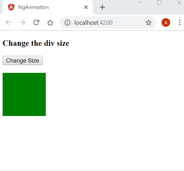
<h3>Change the div size</h3>
<button (click)="changeState()">Change Size</button>
<br />
<div [@changeDivSize]=currentState></div>
<br />
We have defined a button which will invoke the changeState function when clicked. We have defined a <div> element and applied the animation trigger changeDivSize to it. When we click on the button it will flip the state of the
Before executing the application, we need to include the reference to our Animationdemo component inside the app.component.html file.
Open app.component.html file. You can see we have some default HTML code in this file. Delete all the code and put the selector of our component as shown below:
<app-animationdemo></app-animationdemo>
To execute the code run the ng serve command in the VS code terminal window. After running this command, it will ask to open http://localhost:4200 in the browser. So, open any browser on your machine and navigate to this URL. You can see a webpage as shown below. Click on the button to see the animation.
Balloon effect animation
In the previous animation, the transition happened in two directions. In this section, we will learn how to change the size from all directions. It will be similar to inflating and deflating a balloon, hence the name balloon effect animation.
Add the following trigger definition in the animation property:
trigger('balloonEffect', [
   state('initial', style({
     backgroundColor: 'green',
     transform: 'scale(1)'
   })),
   state('final', style({
     backgroundColor: 'red',
     transform: 'scale(1.5)'
   })),
   transition('final=>initial', animate('1000ms')),
   transition('initial=>final', animate('1500ms'))
 ]),
Here, instead of defining the width and height property, we are using the transform property to change the size from all directions. The transition will occur when the state of the element is changed.
Add the following HTML code in the app.component.html file:
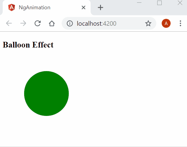
<h3>Balloon Effect</h3>
<div (click)="changeState()"
  style="width:100px;height:100px; border-radius: 100%; margin: 3rem; background-color: green"
  [@balloonEffect]=currentState>
</div>
Here we have defined a div and applied the CSS style to make it a circle. Clicking on the div will invoke the changeState method to switch the element’s state.
Open the browser to see the animation in action as shown below:
Fade In and Fade Out animation
Sometimes we want to show animation while adding or removing an element on the DOM. We will see how to animate the addition and removal of an item to a list with a fade-in and fade-out effect.
Add the following code inside the AnimationdemoComponent class definition for adding and removing the element in a list:
listItem = [];
list_order: number = 1;

addItem() {
  var listitem = "ListItem " + this.list_order;
  this.list_order++;
  this.listItem.push(listitem);
}
removeItem() {
  this.listItem.length -= 1;
}
Add the following trigger definition in the animation property:
trigger('fadeInOut', [
  state('void', style({
    opacity: 0
  })),
  transition('void <=> *', animate(1000)),
]),
Here we have defined the trigger fadeInOut. When the element is added to the DOM it is a transition from void to wildcard () state. This is denoted using void =>; . When the element is removed from the DOM, it is a transition from wildcard () to void state. This is denoted usi`ng =>`; void.
When we use the same animation timing for both directions of the animation, we use the shorthand syntax <;=>. As defined in this trigger, the animation from void => * and * => void will take 1000ms to complete.
Add the following HTML code in app.component.html file.
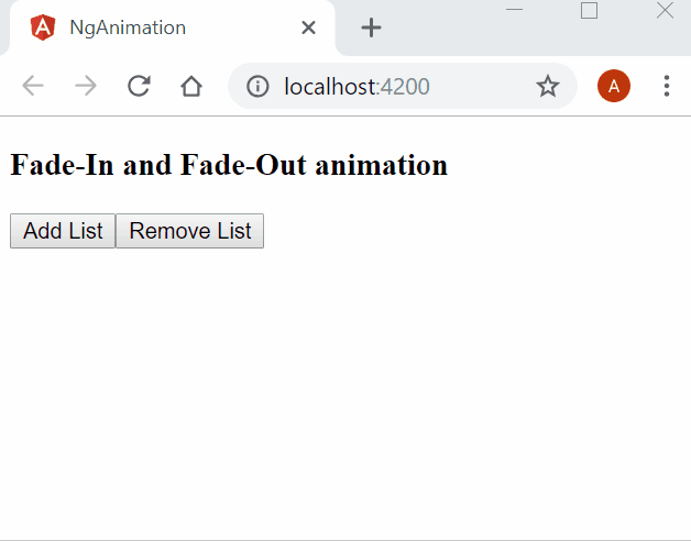
<h3>Fade-In and Fade-Out animation</h3>

<button (click)="addItem()">Add List</button>
<button (click)="removeItem()">Remove List</button>

<div style="width:200px; margin-left: 20px">
  <ul>
    <li *ngFor="let list of listItem" [@fadeInOut]>
      {{list}}
    </li>
  </ul>
</div>
Here we are defining two buttons to add items to and remove them from the list. We are binding the fadeInOut trigger to the <li> element, which will show a fade-in and fade-out effect while being added and removed from the DOM.
Open the browser to see the animation in action as shown below:
Enter and Leave animation
When adding to the DOM, the element will enter the screen from the left. When deleting, the element will leave the screen from the right.
The transition from void => * and * => void is very common. Therefore, Angular provides aliases for these animations:
- for void => * we can use ‘:enter’
- for * => void we can use ‘:leave’
The aliases make these transitions more readable and easier to understand.
Add the following trigger definition in the animation property:
trigger('EnterLeave', [
  state('flyIn', style({ transform: 'translateX(0)' })),
  transition(':enter', [
    style({ transform: 'translateX(-100%)' }),
    animate('0.5s 300ms ease-in')
  ]),
  transition(':leave', [
    animate('0.3s ease-out', style({ transform: 'translateX(100%)' }))
  ])
])
Here we have defined the trigger EnterLeave. The ‘:enter’ transition will wait for 300ms and then run for 0.5s with an ease-in effect. Whereas the ‘:leave transition will run for 0.3s with an ease-out effect.
Add the following HTML code in the app.component.html file:
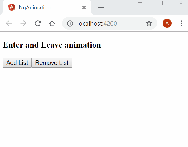
<h3>Enter and Leave animation</h3>

<button (click)="addItem()">Add List</button>
<button (click)="removeItem()">Remove List</button>

<div style="width:200px; margin-left: 20px">
  <ul>
    <li *ngFor="let list of listItem" [@EnterLeave]="'flyIn'">
      {{list}}
    </li>
  </ul>
</div>
Here we are defining two buttons to add items to and remove them from the list. We are binding the EnterLeave trigger to the <li> element that will show the enter and leave effect while being added and removed from the DOM.
Open the browser to see the animation in action as shown below:
Conclusion
In this article, we’ve learned about Angular 6 animations. We explored the concept of animation states and transitions. We also saw a few animations in action with the help of a sample application.
Please get the source code from GitHub and play around to get a better understanding.
If you’re preparing for interviews, read my article on C# Coding Questions For Technical Interviews.
See Also
- ASP.NET Core — Using Highcharts With Angular 5
- ASP.NET Core — CRUD Using Angular 5 And Entity Framework Core
- CRUD Operations With ASP.NET Core Using Angular 5 And ADO.NET
- ASP.NET Core — Getting Started With Blazor
- CRUD Using Blazor with MongoDB
- Creating An SPA Using Razor Pages With Blazor
Originally published at https://ankitsharmablogs.com/