

Building websites and applications is hard. There are a lot of things to consider to make sure our apps are usable and accessible including how our React components work.
How can we take advantage of the power of Chakra UI to build great web apps?
- What is Chakra UI?
- What makes Chakra UI so great?
- What are we going to build?
- Step 0: Creating a new React project with Next.js
- Step 1: Installing and configuring Chakra UI in Next.js
- Step 2: Adding Chakra UI components to a React app
- Step 3: Making responsive components with Chakra UI
- Step 4: Customizing the default Chakra UI theme
What is Chakra UI?
Chakra UI is a component library for React that makes it easy to build the UI of an app or website.
Their goal is to provide a simple, modular, and accessible set of components to get up and running quickly.
What makes Chakra UI so great?
To start, by default Chakra strives to make each component accessible. It’s a critical part of application development that’s often overlooked, and the Chakra maintainers have gone out of their way to ensure the components follow the WAI-ARIA guidelines.
Chakra also includes a simple API allowing developers to get productive. It allows people and teams to make inclusive apps without having to worry about building a bunch of components themselves.
For styling and customization, Chakra uses Emotion under the hood to provide developers the ability to style their components right inside of their JavaScript with style props. It comes with a default theme, but allows the ability to easily override it with custom settings.
What are we going to build?
To get a good idea of how Chakra works, we’re going to essentially rebuild the default Next.js template with Chakra UI components.
This will help us understand a few important concepts, such as how to use Chakra UI with Next.js, how to add custom styles with props, and how to customize the Chakra UI theme.
The concepts here can apply pretty much to any React app, though the examples will be slightly specific to Next.js.
Step 0: Creating a new React project with Next.js
To get started, we need a React app. We’re going to use Next.js as our framework which will give us the ability to easily spin up a new app.
Once inside the directory you want to create your project in, run:
yarn create next-app my-chakra-app
# or
npx create-next-app my-chakra-app
Note: feel free to change my-chakra-app to whatever you want to name the project directory.
And once that’s finished, you can navigate into that directory and start the project with:
yarn dev
# or
npm run dev
That should spin up your development server at http://localhost:3000 and we should be ready to go!
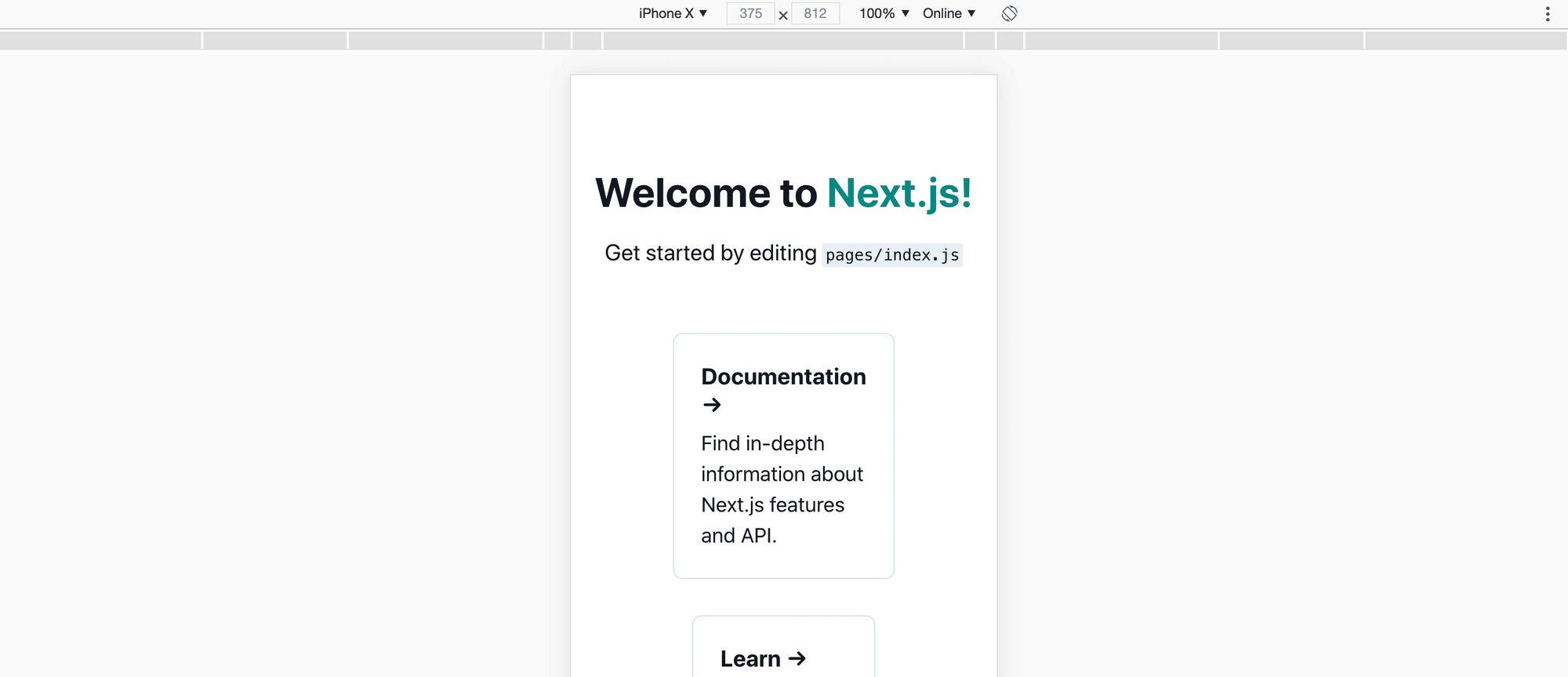
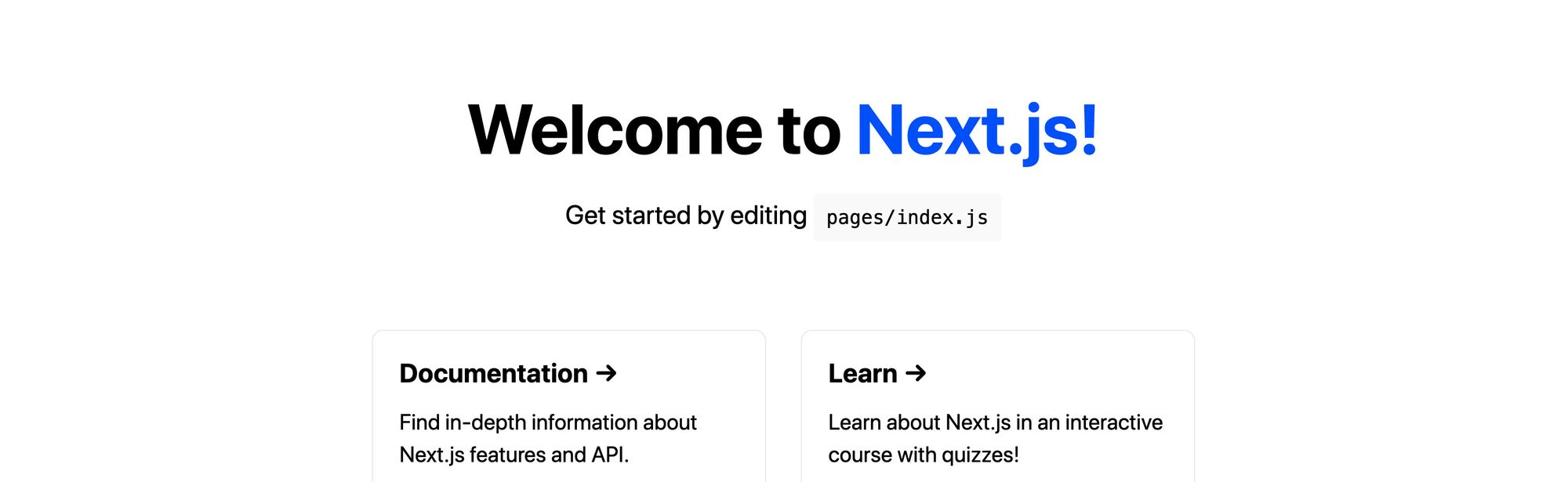 Default Next.js template
Step 1: Installing and configuring Chakra UI in Next.js
Next, let’s install Chakra UI.
Inside of your project directory, run:
yarn add @chakra-ui/core @emotion/core @emotion/styled emotion-theming
# or
npm install @chakra-ui/core @emotion/core @emotion/styled emotion-theming
This will install Chakra UI and its dependencies, which includes Emotion, as it relies on it for the styling.
To get Chakra working inside of our app, we need to configure a Provider at the root of our application. This will allow all of Chakra’s components to talk to each other and use the configuration to maintain consistent styles.
Inside pages/_app.js, first let’s import our Provider at the top:
import { ThemeProvider, theme } from '@chakra-ui/core';
Next, replace the return statement inside of the component with:
function MyApp({ Component, pageProps }) {
  return (
    <ThemeProvider theme={theme}>
      <Component {...pageProps} />
    </ThemeProvider>
  )
}
As you’ll notice, we’re also passing a theme variable to our provider. We’re importing the Chakra UI default theme straight from Chakra and passing it in to our ThemeProvider so all of our components can get the default styles and configurations.
Finally, we want to add a component called CSSReset right as a direct child of our ThemeProvider.
First, add CSSReset as an import:
import { ThemeProvider, theme, CSSReset } from '@chakra-ui/core';
Then add the component right inside ThemeProvider:
<ThemeProvider theme={theme}>
  <CSSReset />
  <Component {...pageProps} />
</ThemeProvider>
And now if we reload the page, we can see that things are looking a little bit different!
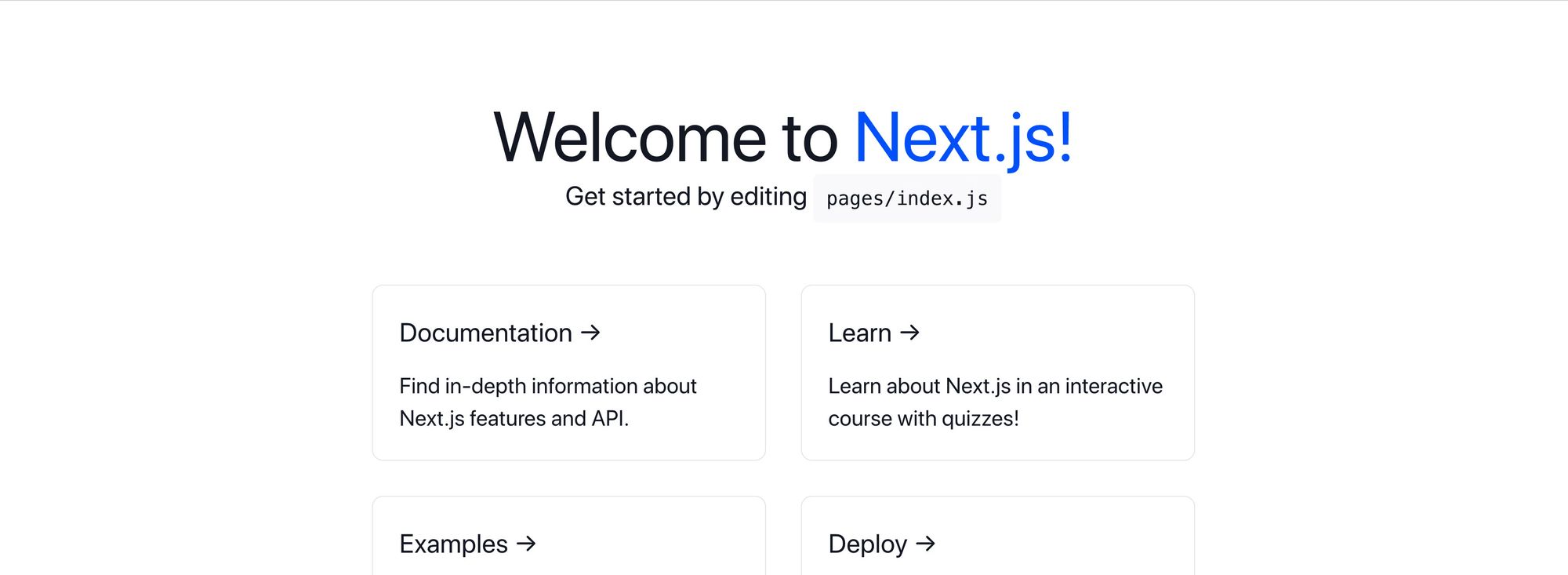 Next.js with Chakra UI CSS Reset
The browser comes with a lot of default styles and by default, Chakra UI doesn’t override them. This includes styles like borders on a button element.
While we don’t necessarily need the CSS Reset here, we could override those things manually. This provides us with a foundation where we’ll know that Chakra UI is working as it’s intended to and we can start adding our components.
Step 2: Adding Chakra UI components to a React app
Now for the fun part. We’re going to use Chakra UI components to try to rebuild the Next.js default template. It’s not going to look 100% exactly like it, but it will carry the spirit and we can customize it as we’d like.
Building the Title and Description
Starting from the top, let’s update our title and description.
At the top of the page, we need to import our Heading component:
import { Heading, Link } from "@chakra-ui/core";
Then let’s replace the <h1> with:
<Heading as="h1" size="2xl" mb="2">
  Welcome to Next.js!
</Heading>
Here, we’re using the Heading component which we then set “as” an h1. We can use any HTML heading element tag name, but since we’re replacing an h1, we want to use that.
We’re also setting a size attribute, which allows us to control how big out heading is, as well as mb, which stands for margin-bottom, allowing us to add some space below.
And we can already see our page is looking more like the default template.
 Chakra UI Heading component
We also want to add back our link.
Add Link to our import statement at the top and then inside of our <Heading> component, replace the Next.js text with:
<Link color="teal.500" href="https://nextjs.org">Next.js!</Link>
Chakra’s Link component creates a link as expected, but then allows us to use the style props to customize it. Here, we’re using the color variable teal.500 that Chakra provides to change our link to Chakra’s colors.
And we can see that we have our Next.js link!
 Chakra UI Heading with Link component
The last piece of the header is the description. For that, we want to use the Text component.
Add Text and Code to the import statement and replace the description with:
<Text fontSize="xl" mt="2">
  Get started by editing <Code>pages/index.js</Code>
</Text>
We’re using the Text component to recreate a <p> tag and the Code component to create our <code> tag. Similar to our Heading component, we’re adding a fontSize to make the font bigger and mt which stands for margin-top to add some space above it.
And now we have our header!
 Chakra UI Text component with Code
Replacing info cards with Chakra UI components
For each of our cards, we can use the same concepts as we did with the header to recreate each of our boxes.
To start, add an import for the Flex component and replace the tag <div className={styles.grid}> with:
<Flex flexWrap="wrap" alignItems="center" justifyContent="center" maxW="800px" mt="10">
  ...
</Flex>
Make sure to leave all of the cards inside of the Flex component. The Flex component will recreate our grid by adding Flexbox along with the same properties that were on the grid before.
At this point, it should exactly the same as it did before.
Next, add Box to the import statement and then replace the first card with:
<Box as="a" href="https://nextjs.org/docs" p="6" m="4" borderWidth="1px" rounded="lg" flexBasis="45%">
<Heading as="h3" size="lg" mb="2">Documentation →</Heading>
<Text fontSize="lg">Find in-depth information about Next.js features and API.</Text>
</Box>
Similar to our Heading component, we’re setting our Box component “as” an <a> tag allowing it to serve as a link. We then configure our style props to replicate our cards.
Inside of that, we use the Heading and Text component to recreate the actual content of the cards.
And after only changing the first card, we can now see the changes:
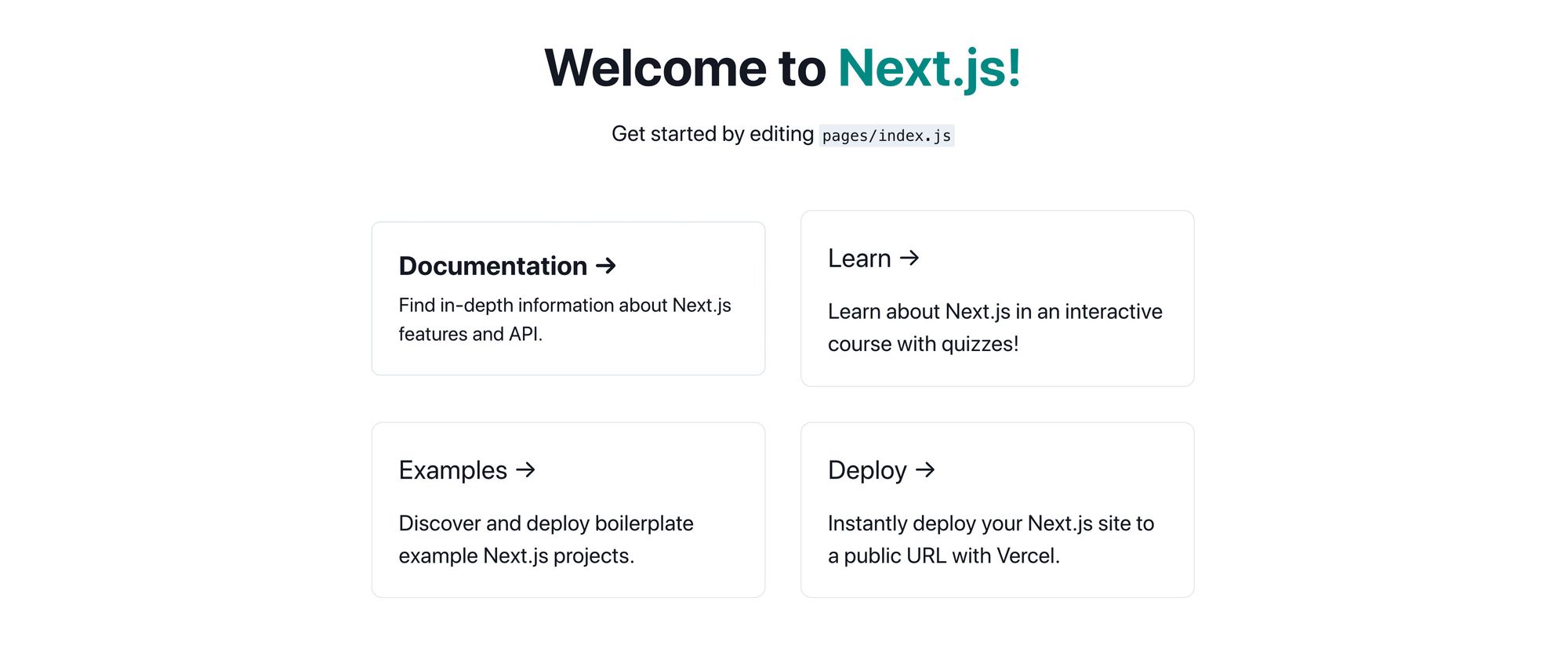 Chakra UI Box component
Now, we can go back and replace the other three cards with the same components to finish recreating our grid.
For fun, we can add a 5th card that links to Chakra UI:
<Box as="a" href="https://chakra-ui.com/" p="6" m="4" borderWidth="1px" rounded="lg" flexBasis="45%">
<Heading as="h3" size="lg" mb="2">Chakra UI →</Heading>
<Text fontSize="lg">Build accessible React apps & websites with speed.</Text>
</Box>
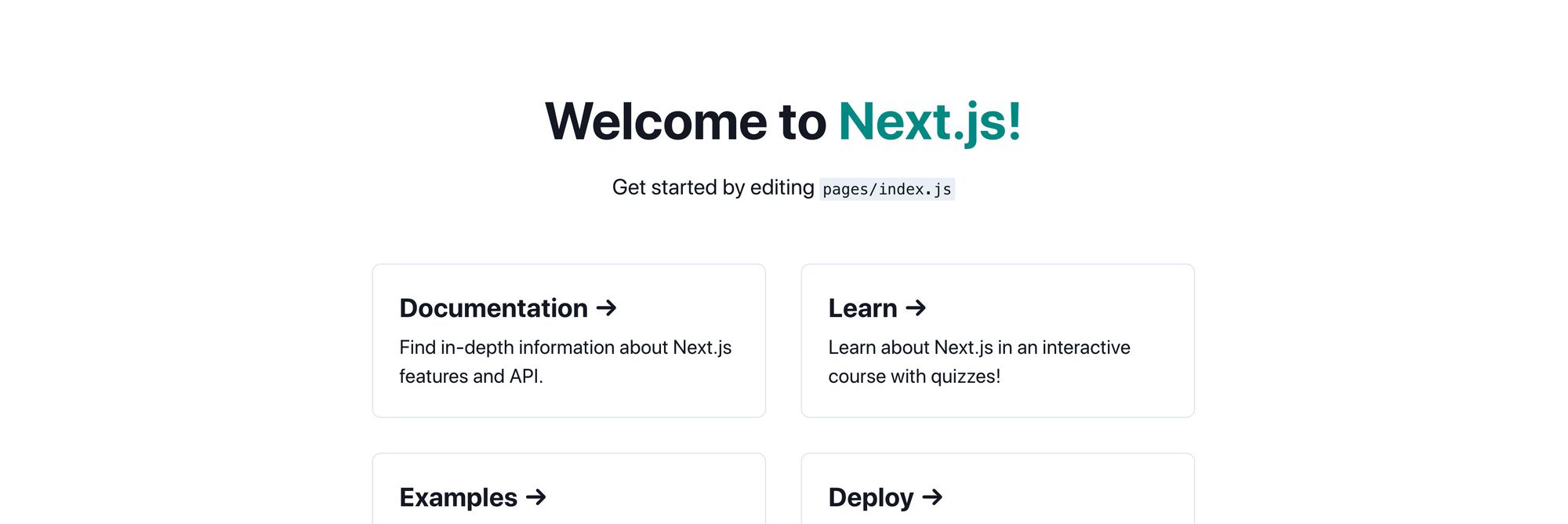
And with all of our changes, we can now see our recreated Next.js starting template!
 Chakra UI recreating Next.js grid
Step 3: Making responsive components with Chakra UI
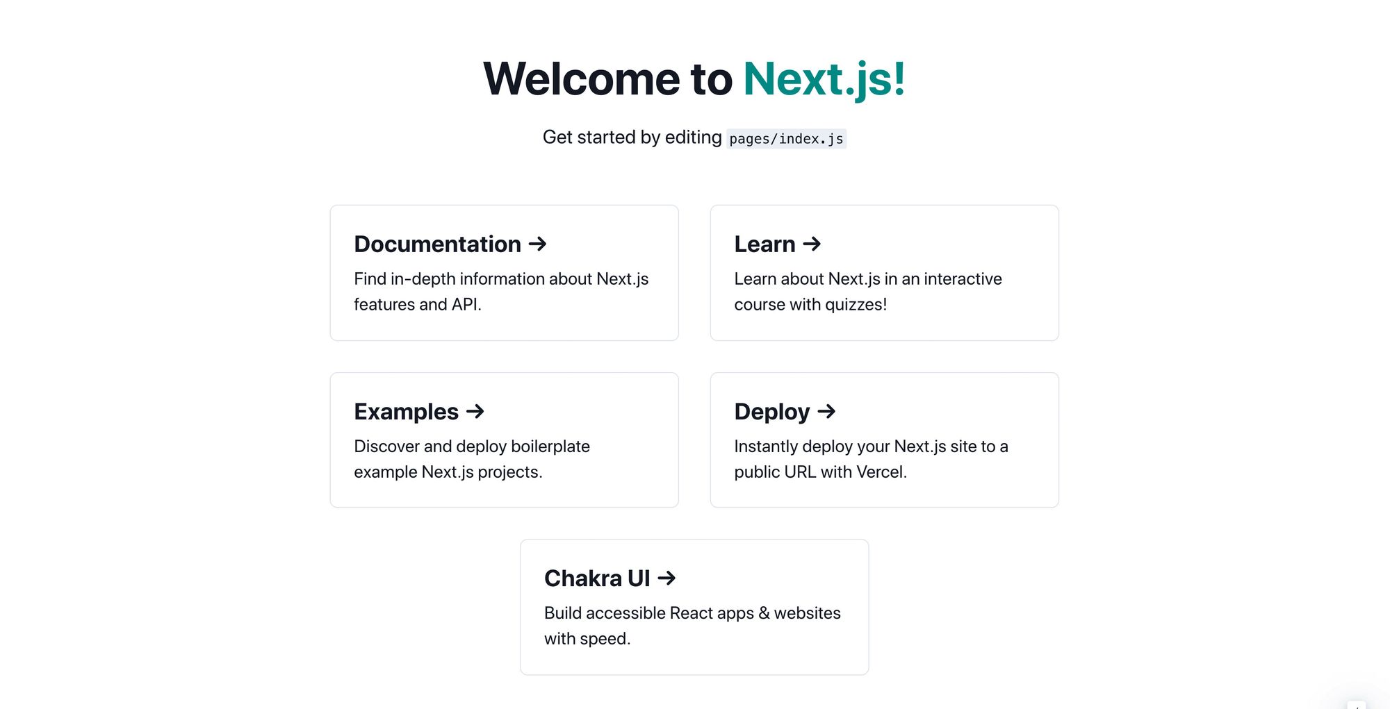
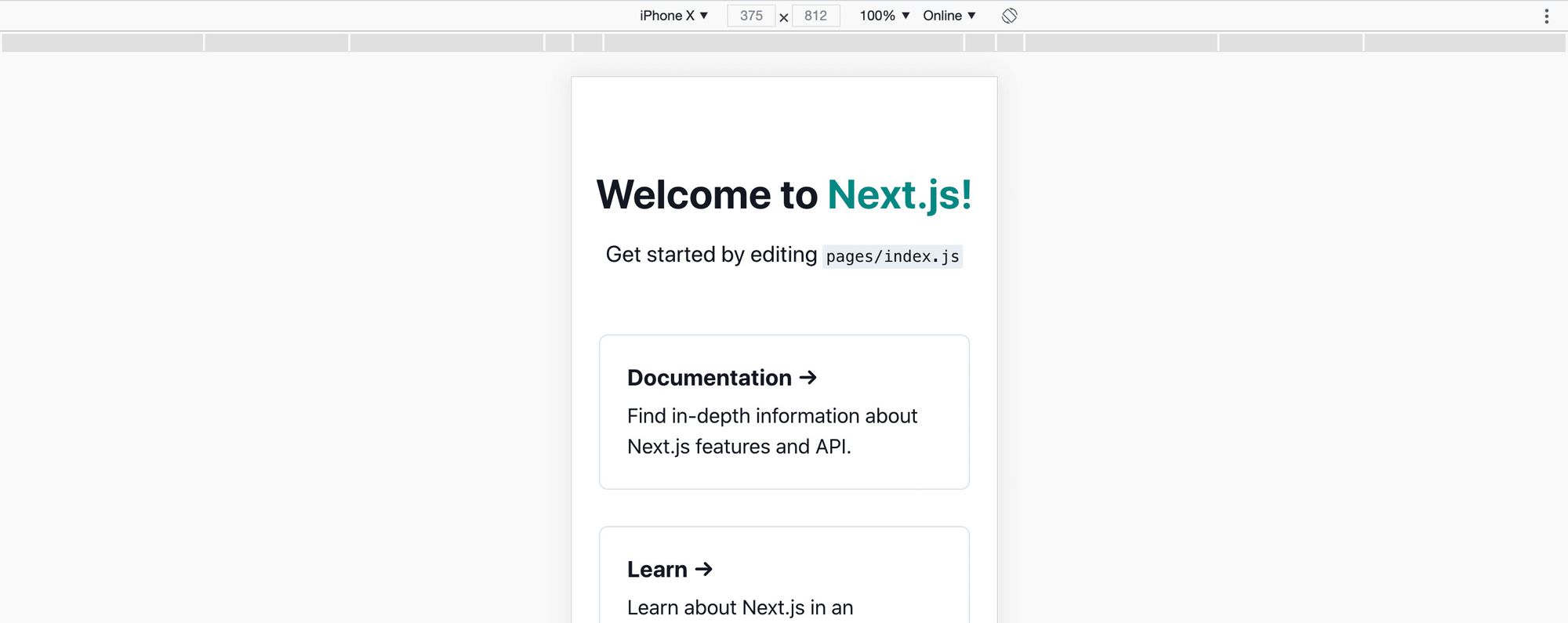
Part of what the default Next.js grid was able to provide was the ability for the cards to expand to full width once the size of the browser becomes small enough. This is particularly relevant at 600px, which typically means someone’s on a mobile device.
If we look at our page on a mobile device, we can see that our cards aren’t filling up the entire width.
 Chakra UI default without responsive
Chakra allows us to set responsive styles with its baked in sizing, allowing us to easily recreate our responsive grid cards.
To do this, instead of passing in a single value to our style props, we can pass in an array.
For instance, on each of our Box components, let’s update the flexBasis prop to:
flexBasis={['auto', '45%']}
Here, according to Chakra’s default responsive breakpoints , we’re saying that by default, we want our flexBasis to be set as auto. But for anything 480px and larger, again which is Chakra’s default first breakpoint, we set it to 45%.
Chakra considers its responsive styling to be mobile first, which is why you see the 480px act as a minimum size, not a maximum size.
And with that change, we can now see that on a large device, we still have our grid.
 Chakra UI components on large device
But now on mobile, our cards take up the entire width!
 Chakra UI components on small device
Using the array pattern works for all of the breakpoints, so if you wanted more control over your styles, Chakra lets you do that.
Step 4: Customizing the default Chakra UI theme
While Chakra provides a pretty great default theme, we also have the ability to customize it to our liking to match our brand or personal taste.
For instance, while the teal that we used for our Heading link is great and uses Chakra’s styles, what if I wanted to customize all links to use the purple that I use on my website?
To start, Chakra comes with a default purple, so we can update our link to use that purple:
Welcome to <Link color="purple.500" href="https://nextjs.org">Next.js!</Link>
And we see our change.
 Making Next.js header link purple with color style prop
That looks great, but let’s update it to the exact purple I use.
Inside of pages/_app.js, we’re going to create a new object at the top of the page, where we spread the default theme creating a new theme object. We’ll also replace the theme prop with our new object:
const customTheme = {
  ...theme
}

function MyApp({ Component, pageProps }) {
  return (
    <ThemeProvider theme={customTheme}>
If we save and reload the page, it will look exactly the same.
Next, we want to update the colors, so in our custom theme object, let’s add the colors property, where we can then set our custom purple:
const customTheme = {
  ...theme,
  colors: {
    ...theme.colors,
    purple: '#692ba8'
  }
}
Note: you’ll see here that we’re also spreading theme.colors. If we don’t, we’ll be replacing the colors object with only the purple value, meaning we won’t have any other colors.
But if we reload the page, our link isn’t purple anymore!
 Next.js link with no color
Chakra typically uses ranges of colors which allows us to use different shades of each of the colors. In our Link component, we’re specifying purple.500 which we didn’t set to exist.
So to fix that, we can use a tool like Smart Swatch to get all of our color values that we need and set those in our custom theme object:
const customTheme = {
  ...theme,
  colors: {
    ...theme.colors,
    purple: {
      50: '#f5e9ff',
      100: '#dac1f3',
      200: '#c098e7',
      300: '#a571dc',
      400: '#8c48d0',
      500: '#722fb7',
      600: '#59238f',
      700: '#3f1968',
      800: '#260f40',
      900: '#10031a',
    }
  }
}
Tip: Smart Swatch actually lets you copy those values as a JavaScript object, making it easier to paste into our theme!
And now if we reload the page, we can see our purple!
 Next.js with custom purple
While we used a range value here, we can also specify color variables without a range.
Say I wanted to leave the default Chakra purple “as is” but provide a way for me to reference my purple.
To do that, I could remove those purple values and add a new custom variable:
const customTheme = {
  ...theme,
  colors: {
    ...theme.colors,
    spacejelly: '#692ba8'
  }
}
Then update my Link to use that color:
Welcome to <Link color="spacejelly" href="https://nextjs.org">Next.js!</Link>
And we can see that we’re now using our purple without overriding the original:
 Next.js with custom color variable
We can apply this to most parts of the styles of Chakra, including Typography and setting custom Breakpoints. It’s another way to make our project custom to our own while still taking advantage of the power of Chakra!
What else can you do with Chakra UI?
While we went through some simpler examples, it really opens the door to more complex style changes and controls that Chakra provides with its component APIs.
There are also a whole lot of awesome components that you can use to transform your website or application and make development fast and easy!
They even provide recipes that have some examples of how you can combine the components resulting in powerful functionality. This includes a responsive header and even adding animations with Framer Motion.