
Have you ever had a problem positioning items on your web browser? Perhaps every time you try to think of a solution, you become tired and give up.
If so, stay tuned as I reveal a new method for resolving these kinds of problems with minimal or no stress.
Welcome everyone. In this tutorial, we'll go through how to use the CSS grid layout.
First we'll learn what CSS Grid is and what it's meant to do. Then we'll go through the features of CSS grid, reasons why we should study it, and the benefits it brings to our projects. Finally, we'll discuss when it's best to use it.
What is CSS Grid?
So what is CSS Grid?
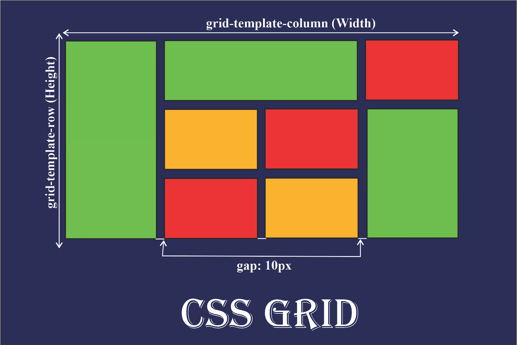
CSS Grid is a two-dimensional layout that you can use for creating responsive items on the web. The Grid items are arranged in columns, and you can easily position rows without having to mess around with the HTML code.
Here is a concise definition of the CSS Grid layout:
CSS Grid is a powerful tool that allows for two-dimensional layouts for columns and rows to be created on the web. (Source)
Features of CSS Grid Layout
Flexible Track Sizes
You can use the fr unit (Fraction Unit) to assign any specified pixel value to the grid. This will make your grid organized and responsive.
Item Placement
CSS grid has made it much easier to position items in the container in any area you want them to be without having to mess with the HTML markup.
Alignment Controls
The alignment of an element/item in a container is easier than ever before with CSS Grid. In the container, you can now arrange elements/items horizontally and vertically as you wish.
Benefits of CSS Grid
CSS Grid is very flexible and responsive. It makes it easy to create two-dimensional layouts. CSS Grid also easy to use and is supported by most web browsers.
The CSS grid makes your mark-up cleaner (in your HTML code) and gives you a lot more flexibility. This is partly because you don’t have to change the mark-up (HTML code) to change the position of an item using the CSS grid.
All in all, CSS Grid Layout helps us build a more complex layouts using both columns and rows.
When Should You Use CSS Grid
Although you can use CSS Grid in practically any aspect of web development, there are certain situations when it's ideal.
For example, when we have a complex design layout to implement, CSS Grid is better than the CSS float property. This is because Grid is a two-dimensional layout (with columns and rows), whereas the CSS float property is a one-dimensional layout (with columns or rows).
Grid is also a good choice when we need a space or gap between elements. By using the CSS grid gap property, the spacing of two elements is much easier than using the CSS margin and padding properties which might end up complicating things.
CSS Grid Properties
The CSS grid layout consists of many grid properties. Now we'll take a look at some of them so we can learn how to use them.
Grid container property
This is a CSS grid property that houses the grid items/elements. We implement the CSS grid container property by setting the container to a display property of grid or in-line grid.
For Example:
display: grid;
or
display: in-line grid;
Grid-template-column property
This is a property used to set each column’s width. It can also define how many columns you want to set to your project.
You can implement the CSS gird column property using grid-template-column.
For Example:
grid-template-column: 100px auto 100px;
The code above shows that we have three columns. The width of columns one (the first column) and three (the third column) are set to 100px. The width of column two (the middle column) is set to auto.
This means that as the size of your screen increases, columns one and three take 100px of the screen width, while column two takes the remaining width of the screen (which is auto).
Grid-template-row property
You use the CSS row property to set the height of each column. You can also use it to define how many rows you want to set in your project.
You can implement the CSS gird row property using grid-template-row, like this:
grid-template-row: 50px 50px;
The code above shows that we have a total of two rows and those two rows are 50px high.
Note that we can also assign the column and row property to our HTML code at once by simply using gird-template. Grid-template is another way of representing the grid-template column and grid-template-row.
For example:
grid-template: 50px 50px / 100px auto 100px;
The code above will give you the same result as grid-template-column and grid-template-row.
To use the grid-template property, you will have to assign the value to the row first before assigning the column's value, just like the code above. The 50px 50px is for the row while 100px auto 100px is for the column.
A way to remember this is by thinking of the letter L:

grid-template
Try this out and see it for yourself.
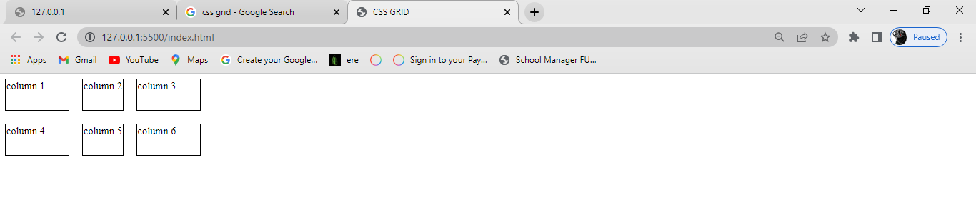
A gird with a column of 100px auto 100px and row of 50px 50px
Column-gap property
As the name states, it is a grid property that assigns a space between two or more columns in a container. You can do this by using the column-gap property and giving it a value. For example:
column-gap: 20px;
From the code above, you can see that a gap of 20px was assigned to the column.
20px column-gap
Row-gap property
Just like column-gap, row-gap is a CSS property that assigns a space between two or more rows in a container. For example:
row-gap: 50px;
row-gap: 50px;
Note that we can also assign a gap to both the columns and rows of a container by using the gap property. For this to work, we only assign one value to both the columns and the rows of the container, just like we did in the code above.
Here's an example:
gap: 20px;

gap: 20px
From the diagram above, we can see that a gap of 20px was set to both the columns and rows of the container making them equally spaced.
Justify-content property
This is a grid property that you use in positioning items (columns and rows) horizontally in a container. It displays how the web browser positions the spaces around the items (columns and rows).
The justify-content property has six possible values:
Startendcenterspace-aroundspace-betweenspace-evenly
Start
This positions the items at the left side of the browser and can be executed with the following code:
justify-content: start;
justify-content: start;
End
This positions the items at the right side of the browser and can be executed with the following code:
justify-content: end;

justify-content: end;
Center
This positions the items at the center of the browser and can be executed with the following code:
justify-content: center;

justify-content: center;
Space-around
This property distributes the items in the container evenly, where each item in the container has an equal amount of space from the next container.
This code can be executed like this:
justify-content: space-around;
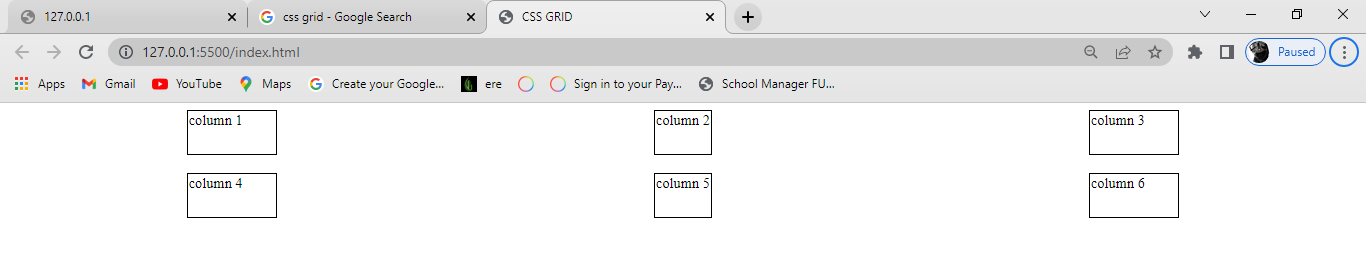
justify-content: space-around
Space-between
Just like the space-around property, space-between distributes the items in the container evenly, where each item in the container has an equal amount of space from the next one in the container. It takes up the entire width of the container.
This code can be executed like this:
justify-content: space-between;
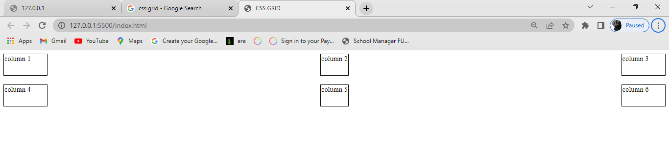
justify-content: space-between
Space-evenly
Just as the name states, this property distributes the items in the container evenly, where each item in the container has an equal amount of space from the next one in the container.
This code can be executed like this:
justify-content: space-evenly;
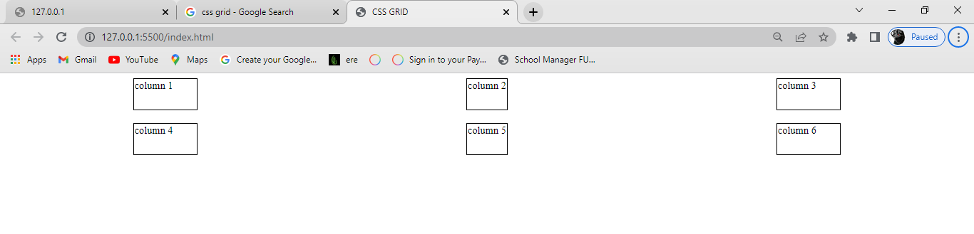
justify-content: space-evenly;
Note that all the justify-content properties position their items/elements horizontally. Try doing it yourself to understand it more.
Align-content property
Align-content is the opposite of justify-content. You use the align-content property in positioning items vertically in a container.
Just like justify-content, the align-content property has six possible values:
Startendcenterspace-aroundspace-betweenspace-evenly
Start
This positions the items at the top of the browser and can be executed with the following code:
align-content: start;
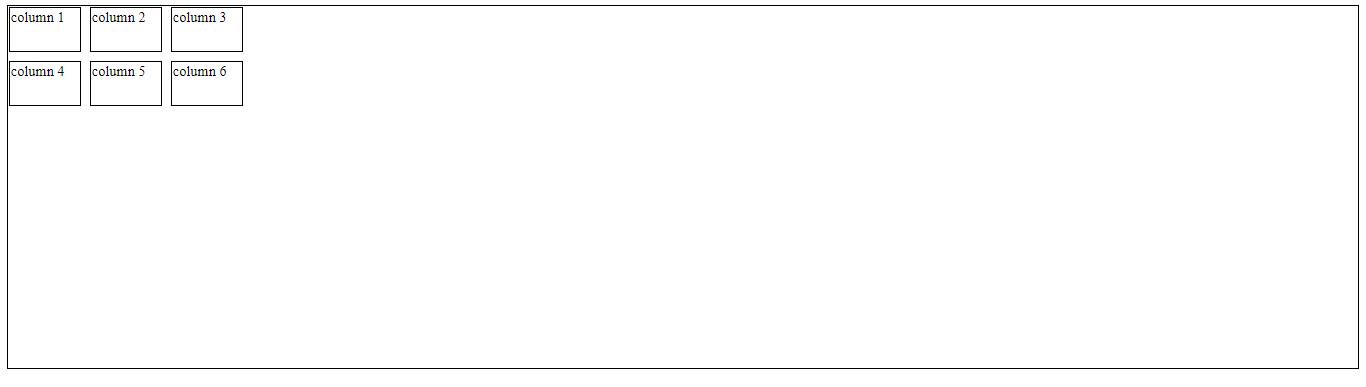
align-content: start;
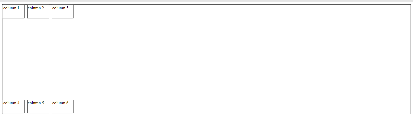
End
This positions the items at the bottom of the browser and can be executed with the following code:
align-content: end;
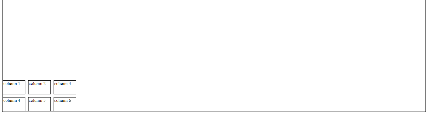
align-content: end
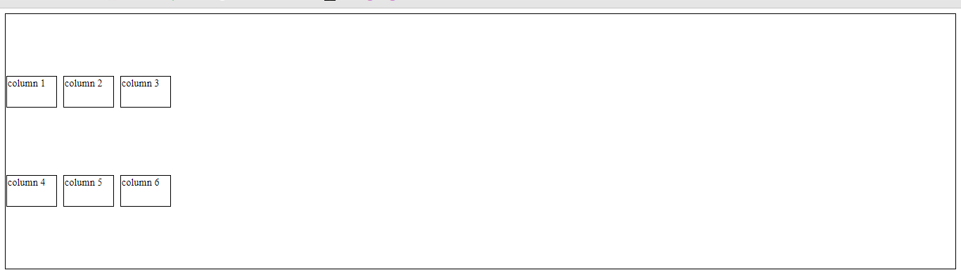
Center
This positions the items at the center of the browser and can be executed with the following code:
align-content: center;
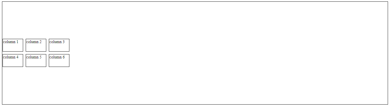
align-content: center;
Space-around
This property distributes the items along the side of the container evenly, where each item in the container has an equal amount of space from the next one vertically.
This code can be executed like this:
align-content: space-around;
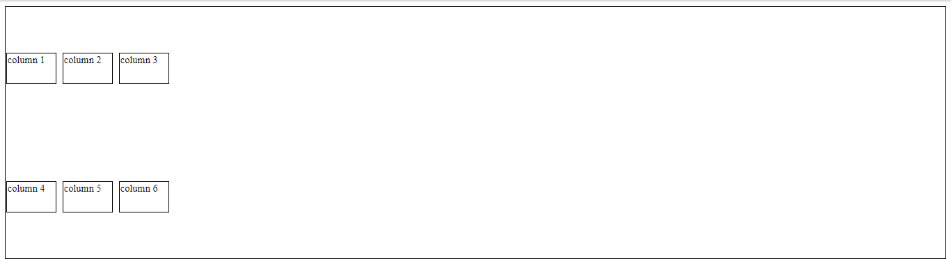
align-content: space-around
Space-between
Just like the space-around property, Space-between distributes the items in the container evenly, where each item in the container has an equal amount of space from the next one in the container, and takes up the entire width of the container in the vertical direction.
This code can be executed like this:
align-content: space-between;
align-content: space-between
Space-evenly
Just as the name states, this property distributes the items in the container evenly, where each item in the container has an equal amount of space from the next one vertically.
This code can be executed like this:
align-content: space-evenly;
align-content: space-evenly
Conclusion
In today's article, we studied what CSS Grid Layout is all about, why we should learn it, and the properties of CSS grid.
Thank you for reading.
Have fun coding!