
By Cem Eygi
Positioning elements with CSS in web development isn’t as easy as it seems. Things can get quickly complicated as your project gets bigger and without having a good understanding of how CSS deals with aligning HTML elements, you won't be able to fix your alignment issues.
There are different ways/methods for positioning elements with pure CSS. Using CSS float, display and position properties are the most common methods.
In this article, I will be explaining one of the most confusing ways for aligning elements with pure CSS: the position property. I also have another tutorial for CSS Display Property here.
If you prefer, you can watch the video version of CSS Positioning Tutorial:
Let's begin...
CSS Position & Helper Properties
So there are 5 main values of the Position Property:
position: static | relative | absolute | fixed | sticky
and additional properties for setting the coordinates of an element (I call them “helper properties”):
top | right | bottom | left AND the z-index
Important Note: Helper properties don’t work without a declared position, or with position: static.__
What is this z-index?
We have height and width (x, y) as 2 dimensions. Z is the 3rd dimension. An element in the webpage comes in front of other elements as its z-index value increases.
Z-index doesn’t work with
position: staticor without a declared position.
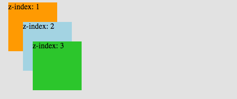 Elements are ordered from back to front, as their z-index** increase
You can watch the video on my channel to see how to use the z-index in more details:
Now let’s move on with the position property values...
1. Static
position: static is the default value. Whether we declare it or not, elements are positioned in a normal order on the webpage. Let’s give an example:
First, we define our HTML structure:
<body>
  <div class="box-orange"></div>
  <div class="box-blue"></div>
</body>
Then, we create 2 boxes and define their widths, heights & positions:
.box-orange {          // without any position declaration
  background: orange;
  height: 100px;
  width: 100px;
}

.box-blue {
  background: lightskyblue;
  height: 100px;
  width: 100px;
  position: static;   // Declared as static
}
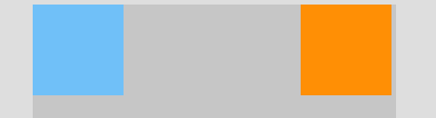
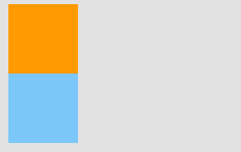 same result with & without position: static**
As we can see in the picture, defining position: static or not doesn't make any difference. The boxes are positioned according to the normal document flow.
2. Relative
position: relative: An element’s new position relative to its normal position.
Starting with position: relative and for all non-static position values, we are able to change an element’s default position by using the helper properties that I've mentioned above.
Let’s move the orange box next to the blue one.
.box-orange {
  position: relative;  // We are now ready to move the element
  background: orange;
  width: 100px;
  height: 100px;
  top: 100px;         // 100px from top relative to its old position
  left: 100px;        // 100px from left
}
 Orange box is moved 100px to bottom & right, relative to its normal position**
NOTE: Using position: relative for an element, doesn’t affect other elements’ positions.
3. Absolute
In position: relative, the element is positioned relative to itself. However, an absolutely positioned element is relative to its parent.
An element with position: absolute is removed from the normal document flow. It is positioned automatically to the starting point (top-left corner) of its parent element. If it doesn’t have any parent elements, then the initial document will be its parent.
Since position: absolute removes the element from the document flow, other elements are affected and behave as the element is removed completely from the webpage.
Let’s add a container as parent element:
<body>
  <div class="container">
    <div class="box-orange"></div>
    <div class="box-blue"></div>
  </div>
</body>
.box-orange {
  position: absolute;
  background: orange;
  width: 100px;
  height: 100px;
}
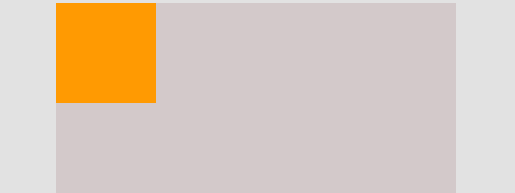 position: absolute takes the element to the beginning of its parent
Now it looks like the blue box has disappeared, but it hasn’t. The blue box behaves like the orange box is removed, so it shifts up to the orange box’s place.
Let’s move the orange box 5 pixels:
.box-orange {
  position: absolute;
  background: orange;
  width: 100px;
  height: 100px;
  left: 5px;
  top: 5px;
}
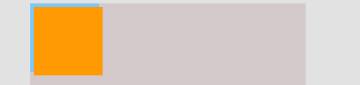 Now we can see the blue box**
The coordinates of an absolute positioned element are relative to its parent if the parent also has a non-static position. Otherwise, helper properties position the element relative to the initial .
.container {
  position: relative;
  background: lightgray;
}

.box-orange {
  position: absolute;
  background: orange;
  width: 100px;
  height: 100px;
  right: 5px;    // 5px relative to the most-right of parent
}
4. Fixed
Like position: absolute, fixed positioned elements are also removed from the normal document flow. The differences are:
- They are only relative to the document, not any other parents.
- They are not affected by scrolling.
.container {
  position: relative;
  background: lightgray;
}

.box-orange {
  position: fixed;
  background: orange;
  width: 100px;
  height: 100px;
  right: 5px;    // 5px relative to the most-right of parent
}
Here in the example, I change the orange box’s position to fixed, and this time it is relative 5px to the right of the , not its parent (container):
As we can see, scrolling the page doesn’t affect the fixed positioned box. It is not relative to its parent (container) anymore.
5. Sticky
position: sticky can be explained as a mix of position: relative and position: fixed.
It behaves until a declared point like position: relative, after that it changes its behavior to position: fixed . The best way to explain position: sticky is by an example:
IMPORTANT: Position Sticky is not supported in Internet Explorer and earlier versions of other browsers. You can check the browser support at caniuse.com.
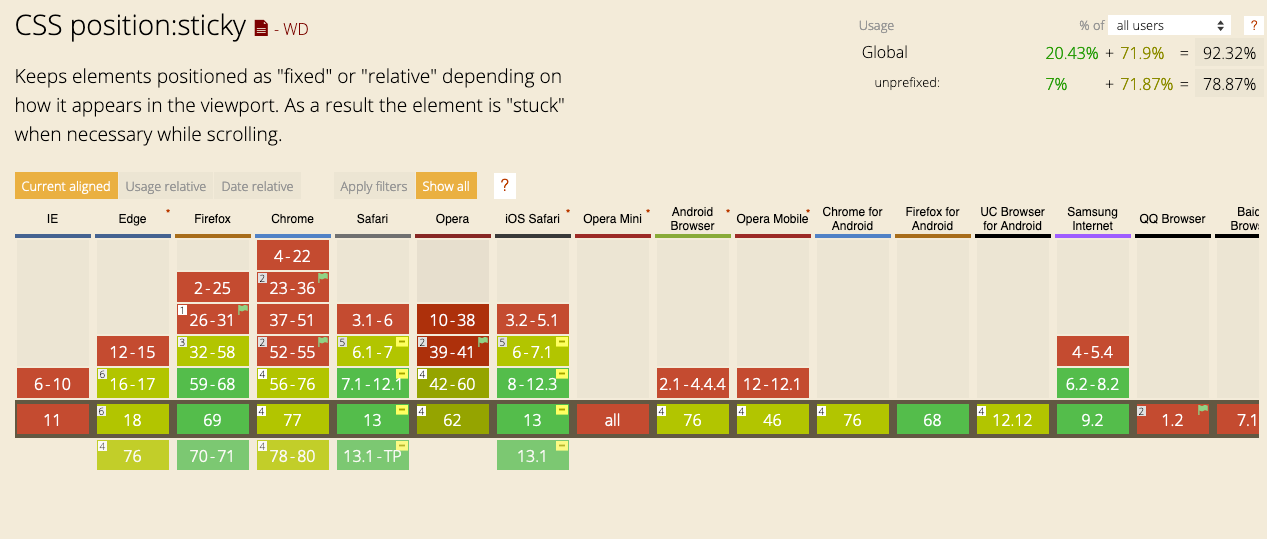 Browser Support for Position:sticky
The best way to understand the CSS Position Property is by practice. Keep coding until you have a better understanding. If something is not clear, I will answer your questions below in the comments section.
If you want to learn more about web development, feel free to follow me on Youtube!
Thank you for reading!