
By Yazdun Fadali
If you've ever worked with form validation in React, you know that it can quickly become messy and overwhelming. This is especially the case if you're just starting out with React.
In this tutorial, I will show you how to create reusable React components that allow you to build maintainable and clean forms. They'll easily be able to scale as your application grows.
You will also learn how to implement the popular react-hook-form library in your React application, which will simplify the process of adding form validations. And you'll learn how to implement reusable input validations across your entire React application, eliminating the need for repetitive code.
Get ready to level up your form handling skills in React with this ultimate guide. Let's dive in and master form validation in React.
Here's what we'll cover:
- What Are We Going to Build?
- Getting Started
- How to Build a Reusable Input Component
- How to Implement Input Validation in React
- How to Display Appropriate Error Messages
- Dynamic Input Validation
- How to Implement a Multiline Input Feature in the Input Component
- How to Handle Successful Form Submission
- Conclusion
Alright, let's dive in!
What Are We Going To Build?
In this tutorial, we will be building a minimalistic form that will allow users to input data. Here is a quick demo (live demo):
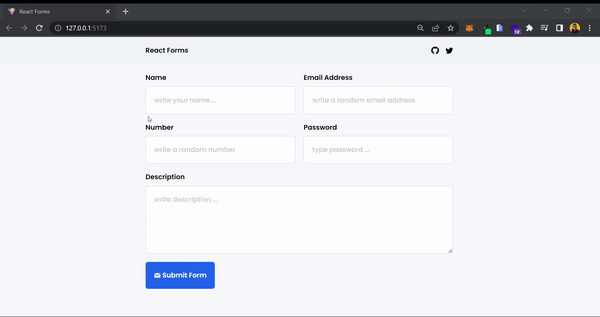 Preview of the final project
We will leverage the power of react-hook-form, a popular form validation library in the React ecosystem, to handle form validation efficiently. We will be using Tailwind CSS for styling.
Don't worry if you're not familiar with Tailwind CSS or react-hook-form, as this tutorial is designed to be beginner-friendly. But having a basic understanding of React fundamentals will help you get the most out of this tutorial.
So let's get started and create a sleek and functional form in React!
Getting Started
To get started with this tutorial, I highly recommend using the starter boilerplate that I've prepared for you. It comes with all the necessary dependencies and folder structure, so you won't need to spend time setting up your project from scratch.
You can simply clone the starter boilerplate from the provided GitHub repository and follow along with the tutorial without any delays. This will allow you to focus on learning and implementing the concepts of form validation in React without getting bogged down by setup details.
- Starter Boilerplate: View on GitHub
- Final Version: View on GitHub
After setting up the starter boilerplate and running it on your local machine, you should be able to see the following page. This page will serve as the starting point for our form validation project in React.
 Starting page for our project
From here, we will gradually build upon the existing code and implement form validation using react-hook-form.
During this tutorial, we will be focusing on two key files: src/components/Input.jsx and src/Form.jsx.
In src/components/Input.jsx, we will create a reusable input React component. This component will serve as the foundation for our form, allowing users to input data in a clean and user-friendly manner.
We will implement input validation using react-hook-form, which will ensure that the data entered by users is valid before it is submitted.
Next, we will move on to src/Form.jsx, where we will handle form validation and submission. This file will serve as the main container for our form, and we will utilize react-hook-form to handle form validation efficiently.
By completing these two files, you will be able to create a beautiful and functional form with reusable input components and efficient form validation. So let's dive into the code and build our form validation project step by step.
How to Build a Reusable Input Component
To start our form validation project, we will first create a reusable input component. Currently, our src/components/Input.jsx looks like this:
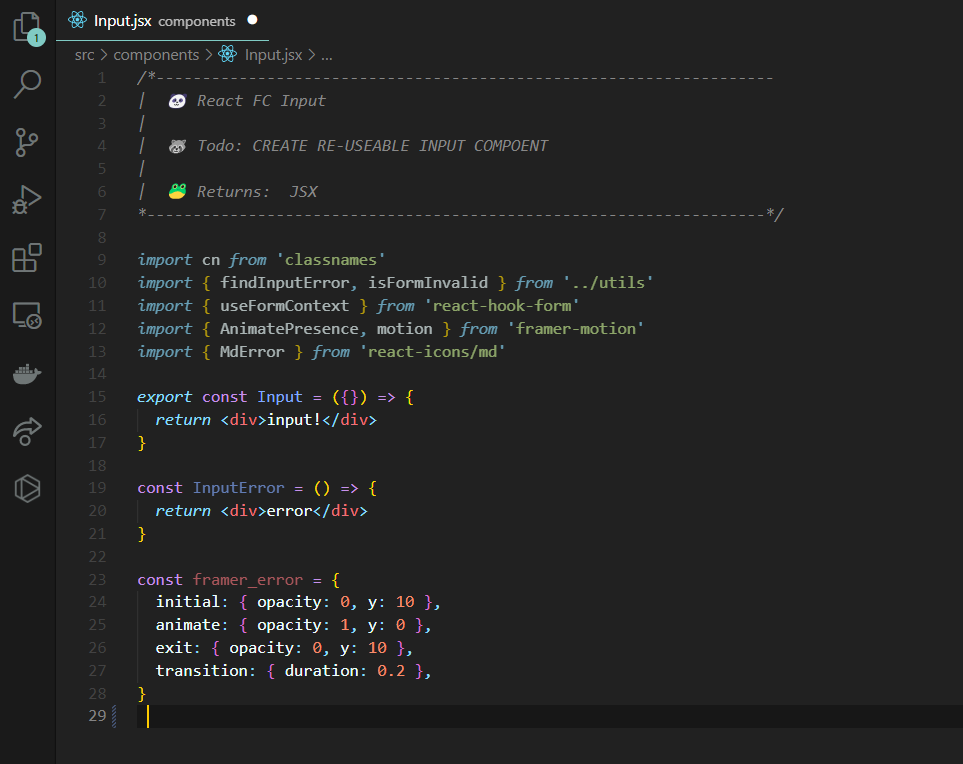 Screenshot of
 src/components/Input.jsx
The provided boilerplate code imports necessary dependencies such as classnames, react-hook-form, framer-motion, and react-icons. It defines a Input component, which currently renders a simple "input!" text. It also defines an InputError component which currently renders a "error" text.
Additionally, it includes a framer motion animation object framer_error with initial, animate, exit, and transition properties for error handling. This code will be further enhanced and customized to create a reusable input component for our form validation project.
Now it's time to dive into some coding! Our Input component will receive props that will determine the type of input to render, placeholder, id, and so on. We will utilize Tailwind CSS to add styling to our input component.
Let's start enhancing our input component with props and Tailwind CSS. Add the following code to src/components/Input.jsx:
export const Input = ({ label, type, id, placeholder }) => {
  return (
    <div className="flex flex-col w-full gap-2">
      <div className="flex justify-between">
        <label htmlFor={id} className="font-semibold capitalize">
          {label}
        </label>
      </div>
      <input
        id={id}
        type={type}
        className="w-full p-5 font-medium border rounded-md border-slate-300 placeholder:opacity-60"
        placeholder={placeholder}
      />
    </div>
  )
}
The Input component receives ({ label, type, id, placeholder }) as props. These props are then used to dynamically render the Input component.
The label prop is used as the text content of the label element, and the type, id, and placeholder props are passed directly to the corresponding attributes of the input element using JSX syntax. This allows the Input component to be flexible and reusable, as different values can be passed in as props to customize its behavior based on the specific use case.
Now let's see our input component in action by adding the following code to src/Form.jsx:
export const Form = () => {
  return (
    <div className="container mt-5 text-center">
      <div className="grid gap-5 md:grid-cols-2">
        <Input
          label="name"
          type="text"
          id="name"
          placeholder="type your name..."
        />
        <Input
          label="password"
          type="password"
          id="password"
          placeholder="type your password..."
        />
      </div>
    </div>
  )
}
After adding the code to src/Form.jsx, open up your local server and you should be able to see the resulting page with the input component:
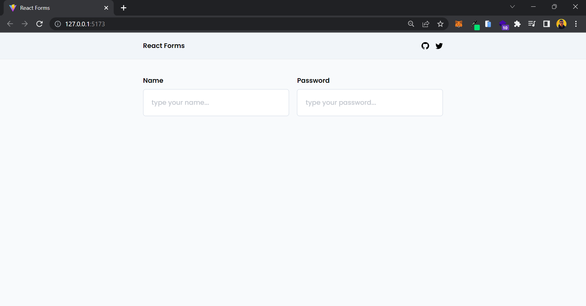 Preview of what we've built so far
Great job 🎉! You have successfully created a re-usable Input component for your app. Now, let's take it a step further and add some exciting validation features to enhance our app's functionality.
How to Implement Input Validation in React
Now it's time to implement react-hook-form and add input validation to our application.
First, we need to modify our src/Form.jsx file to utilize the useForm hook and FormProvider component provided by react-hook-form. These tools will allow us to easily handle form validation and submission in our React application.
Let's dive into the details of how to use them effectively. Add the following code to the src/Form.jsx:
export const Form = () => {
  const methods = useForm()

  const onSubmit = methods.handleSubmit(data => {
    console.log(data)
  })

  return (
    <FormProvider {...methods}>
      <form
        onSubmit={e => e.preventDefault()}
        noValidate
        className="container"
      >
        <div className="grid gap-5 md:grid-cols-2">
          <Input
            label="name"
            type="text"
            id="name"
            placeholder="type your name..."
          />
          <Input
            label="password"
            type="password"
            id="password"
            placeholder="type your password..."
          />
        </div>
        <div className="mt-5">
          <button
            onClick={onSubmit}
            className="flex items-center gap-1 p-5 font-semibold text-white bg-blue-600 rounded-md hover:bg-blue-800"
          >
            <GrMail />
            Submit Form
          </button>
        </div>
      </form>
    </FormProvider>
  )
}
There's a lot happening in this section, but no worries – I'll guide you through it. First, you use const methods = useForm() to set up the form methods from react-hook-form for form management.
Next, you create a custom onSubmit function that utilizes the methods to handle form submission, which we'll run when the form is successfully submitted.
Then you use the FormProvider component provided by react-hook-form to wrap your form, allowing you to access the form's context inside your Input component later on. Then you utilize the JavaScript spread operator to pass all the useForm methods to the FormProvider.
Inside the FormProvider, you create a form and pass noValidate to indicate that you want to rely entirely on react-hook-form for form validation. You also prevent the form's default behavior by passing onSubmit={e => e.preventDefault()}.
Instead of attaching the onSubmit function to the form, you create a custom button at the end of the file and pass the custom onSubmit function to it to handle form submission.
Next, you need to update the Input component to enable form validation. Add the following code to src/components/Input.jsx:
export const Input = ({ label, type, id, placeholder }) => {
  const { register } = useFormContext()

  return (
    <div className="flex flex-col w-full gap-2">
      <div className="flex justify-between">
        <label htmlFor={id} className="font-semibold capitalize">
          {label}
        </label>
      </div>
      <input
        id={id}
        type={type}
        className="w-full p-5 font-medium border rounded-md border-slate-300 placeholder:opacity-60"
        placeholder={placeholder}
        {...register(label, {
          required: {
            value: true,
            message: 'required',
          },
        })}
      />
    </div>
  )
}
You are retrieving the register function from the useFormContext hook provided by react-hook-form, which is used to register an input field with the library, allowing it to handle validation. This function will be passed to the input element.
The register function takes two arguments. The first argument is the name of the input, which will be used as a key within your form context to access the input's value or retrieve its error message.
The second argument is an object that contains the input's validations. React-hook-form supports a wide range of validations, and you can refer to their documentation for more information. For now, we are only using the required validation.
Now open up your local server, you can enter values into all the inputs. But the form cannot be submitted until all inputs are filled, as they have required validation. Upon successful submission, the custom onSubmit function will execute and log the form data into the browser console:
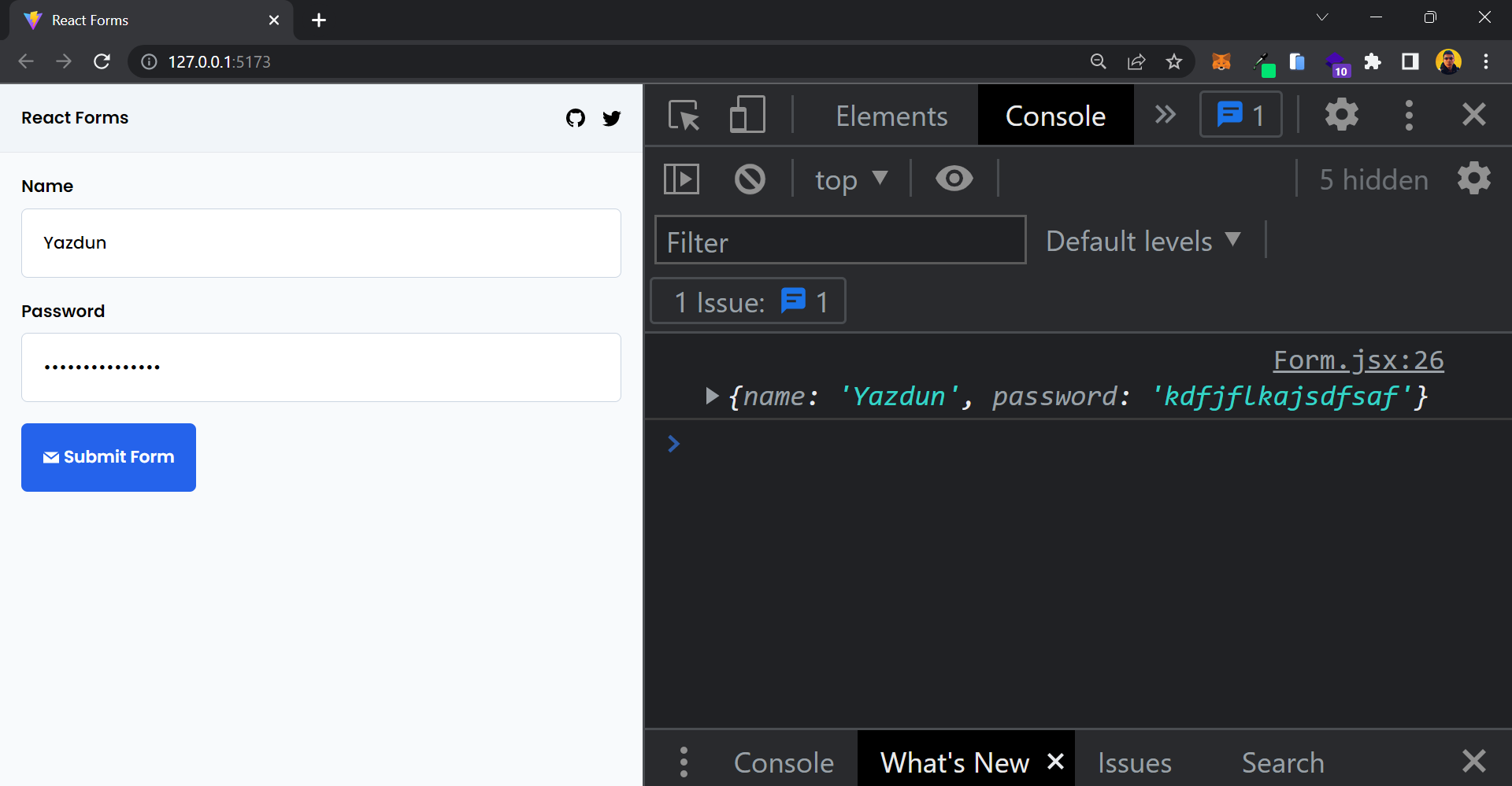 Successful form submission
Congratulations! 🎉 You've successfully completed this challenging section. Great job! Now, let's take it a step further and enhance our custom Input component by learning how to pass dynamic validations and display appropriate error messages.
How to Display Appropriate Error Messages
Before going any further, let's get error messages out of the way. Add this code to src/components/Input.jsx:
export const Input = ({ label, type, id, placeholder }) => {
  const { register } = useFormContext()

  return (
    <div className="flex flex-col w-full gap-2">
      <div className="flex justify-between">
        <label htmlFor={id} className="font-semibold capitalize">
          {label}
        </label>
      </div>
      <input
        id={id}
        type={type}
        className="w-full p-5 font-medium border rounded-md border-slate-300 placeholder:opacity-60"
        placeholder={placeholder}
        {...register(label, {
          required: {
            value: true,
            message: 'required',
          },
        })}
      />
    </div>
  )
}

const InputError = ({ message }) => {
  return (
    <motion.p
      className="flex items-center gap-1 px-2 font-semibold text-red-500 bg-red-100 rounded-md"
      {...framer_error}
    >
      <MdError />
      {message}
    </motion.p>
  )
}

const framer_error = {
  initial: { opacity: 0, y: 10 },
  animate: { opacity: 1, y: 0 },
  exit: { opacity: 0, y: 10 },
  transition: { duration: 0.2 },
}
Let me explain to you what's going on here. First of all, you've created a custom component called InputError which recieves a message as a prop and display it.
You are using framer motion to add smooth transitions to this component. Framer Motion is a library which allows us to add cool animations to our react components.
Now let's update your Input component so you can make use of InputError:
import { findInputError, isFormInvalid } from '../utils'

export const Input = ({ label, type, id, placeholder }) => {
  const {
    register,
    formState: { errors },
  } = useFormContext()

  const inputError = findInputError(errors, label)
  const isInvalid = isFormInvalid(inputError)

  return (
    <div className="flex flex-col w-full gap-2">
      <div className="flex justify-between">
        <label htmlFor={id} className="font-semibold capitalize">
          {label}
        </label>
        <AnimatePresence mode="wait" initial={false}>
          {isInvalid && (
            <InputError
              message={inputError.error.message}
              key={inputError.error.message}
            />
          )}
        </AnimatePresence>
      </div>
      <input
        id={id}
        type={type}
        className="w-full p-5 font-medium border rounded-md border-slate-300 placeholder:opacity-60"
        placeholder={placeholder}
        {...register(label, {
          required: {
            value: true,
            message: 'required',
          },
        })}
      />
    </div>
  )
}
You're using the useFormContext hook to retrieve the formState, which contains all the form error messages. But in order to display the errors properly, you need to extract the relevant errors for each input.
To simplify this process, I've already written a utility function called findInputError.js in the src/utils directory. This function takes an errors object and the input's name as arguments and returns the related errors. Then we pass the filtered error to the InputError component. You can check out this utility function for reference:
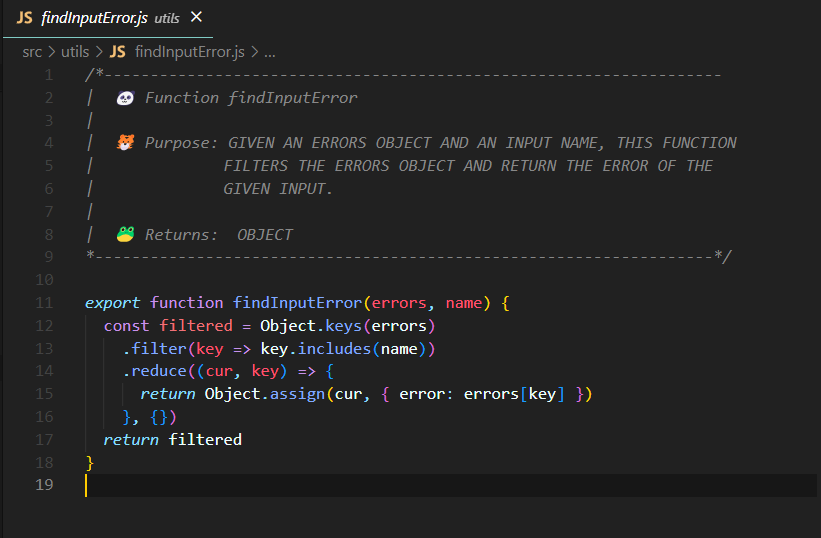 Screenshot of
 src/utils/findInputError.js
In order to display an error message, the form must be invalid. To determine if the form is invalid or not, I've also written a simple utility function for you that takes an error object as input and returns true if the form is not valid. You can check out this utility function for reference:
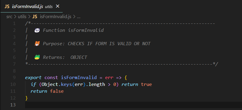 Screenshot of
 src/utils/isFormInvalid.js
Additionally, you may have noticed that we've used the AnimatePresence component from the Framer Motion library to wrap the InputError component. We did this to add animation to the unmounting of InputError, providing a smooth user experience. While this is optional, I thought it would be a nice touch to add to this project.
Here is what your project looks like so far:
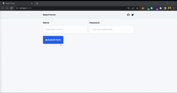 Preview of what we've built so far
Dynamic Input Validation
Part 1
You have made excellent progress so far! Currently, we have hard-coded validations into the Input component, but you may need different types of validations for each input in the future.
Let's update the Input component to receive a validation object as a prop and pass it to the react-hook-form register function. Let's modify src/components/Input.jsx like this:
export const Input = ({ label, type, id, placeholder, validation, name }) => {
  const {
    register,
    formState: { errors },
  } = useFormContext()

  const inputError = findInputError(errors, name)
  const isInvalid = isFormInvalid(inputError)

  return (
    <div className="flex flex-col w-full gap-2">
      <div className="flex justify-between">
        <label htmlFor={id} className="font-semibold capitalize">
          {label}
        </label>
        <AnimatePresence mode="wait" initial={false}>
          {isInvalid && (
            <InputError
              message={inputError.error.message}
              key={inputError.error.message}
            />
          )}
        </AnimatePresence>
      </div>
      <input
        id={id}
        type={type}
        className="w-full p-5 font-medium border rounded-md border-slate-300 placeholder:opacity-60"
        placeholder={placeholder}
        {...register(name, validation)}
      />
    </div>
  )
}
There haven't been many changes. You have added two new props to our custom Input component, a validation object and a name prop. We will use the name prop instead of the label to register our input, and also utilize it to find the related input errors.
You've also passed the validation prop to the register function instead of hard-coding it. This allows you to have dynamic validations for your inputs.
Now let's modify src/Form.jsx and pass dynamic validations to our custom Input component:
export const Form = () => {
  const methods = useForm()

  const onSubmit = methods.handleSubmit(data => {
    console.log(data)
  })

  return (
    <FormProvider {...methods}>
      <form
        onSubmit={e => e.preventDefault()}
        noValidate
        autoComplete="off"
        className="container"
      >
        <div className="grid gap-5 md:grid-cols-2">
          <Input
            label="name"
            name="name"
            type="text"
            id="name"
            placeholder="type your name..."
            validation={{
              required: {
                value: true,
                message: 'required',
              },
            }}
          />
          <Input
            label="password"
            name="password"
            type="password"
            id="password"
            placeholder="type your password..."
            validation={{
              required: {
                value: true,
                message: 'required',
              },
              minLength: {
                value: 6,
                message: 'min 6 characters',
              },
            }}
          />
        </div>
        <div className="mt-5">
          <button
            onClick={onSubmit}
            className="flex items-center gap-1 p-5 font-semibold text-white bg-blue-600 rounded-md hover:bg-blue-800"
          >
            <GrMail />
            Submit Form
          </button>
        </div>
      </form>
    </FormProvider>
  )
}
You are now passing different validations to each Input component. This allows each Input to dynamically validate its value based on the provided validation object.
Part 2
In the previous section, you learned how to pass dynamic validation to your custom Input component.
While this approach works, it may not be efficient if you need to use the password or name Input component in multiple places, such as the sign-up page, login page, and profile page.
Copy-pasting the same code in multiple locations can lead to maintenance issues, especially if you need to make changes to the validation logic later on.
But there is a solution to this problem. You can isolate the input validations into a separate object and then pass that object to the custom Input component using JavaScript spread operators. This approach allows you to centralize the validation logic, making it easier to manage and update across your application, even as it scales.
Let's update src/Form.jsx and see how this works in action:
export const Form = () => {
  const methods = useForm()

  const onSubmit = methods.handleSubmit(data => {
    console.log(data)
  })

  const name_validation = {
    name: 'name',
    label: 'name',
    type: 'text',
    id: 'name',
    placeholder: 'write your name ...',
    validation: {
      required: {
        value: true,
        message: 'required',
      },
      maxLength: {
        value: 30,
        message: '30 characters max',
      },
    },
  }

  const password_validation = {
    name: 'password',
    label: 'password',
    type: 'password',
    id: 'password',
    placeholder: 'type password ...',
    validation: {
      required: {
        value: true,
        message: 'required',
      },
      minLength: {
        value: 6,
        message: 'min 6 characters',
      },
    },
  }

  return (
    <FormProvider {...methods}>
      <form
        onSubmit={e => e.preventDefault()}
        noValidate
        autoComplete="off"
        className="container"
      >
        <div className="grid gap-5 md:grid-cols-2">
          <Input {...name_validation} />
          <Input {...password_validation} />
        </div>
        <div className="mt-5">
          <button
            onClick={onSubmit}
            className="flex items-center gap-1 p-5 font-semibold text-white bg-blue-600 rounded-md hover:bg-blue-800"
          >
            <GrMail />
            Submit Form
          </button>
        </div>
      </form>
    </FormProvider>
  )
}
Great! Using a separate object to store input props and validations, and then passing it to the custom Input component using spread operators can help you to centralize and manage the validation logic in your application.
This approach can make it easier to update or modify the validations in one place, instead of having to make changes in multiple locations. It can also improve code reusability and reduce duplication, especially when using the same input component in different parts of your application.
In order to keep the input validation logic separate from the main component, I have created an input validation file in the boilerplate code located at src/utils/inputValidations. This file contains various pre-defined input validators that you can utilize in your application.
You can easily import these validators wherever needed and pass them to the custom Input component using JavaScript spread operators. This approach allows for centralized management of input validations, making it easy to update and reuse them across different parts of your application.
By leveraging the input validation file, you can keep your code organized, maintainable, and scalable, and ensure consistency in input validation throughout your application.
Let's modify src/Form.jsx and use our custom validators:
export const Form = () => {
  const methods = useForm()

  const onSubmit = methods.handleSubmit(data => {
    console.log(data)
  })

  return (
    <FormProvider {...methods}>
      <form
        onSubmit={e => e.preventDefault()}
        noValidate
        autoComplete="off"
        className="container"
      >
        <div className="grid gap-5 md:grid-cols-2">
          <Input {...name_validation} />
          <Input {...email_validation} />
          <Input {...num_validation} />
          <Input {...password_validation} />
        </div>
        <div className="mt-5">
          <button
            onClick={onSubmit}
            className="flex items-center gap-1 p-5 font-semibold text-white bg-blue-600 rounded-md hover:bg-blue-800"
          >
            <GrMail />
            Submit Form
          </button>
        </div>
      </form>
    </FormProvider>
  )
}
Now your code becomes much cleaner and more maintainable. One of the major benefits is that you can now easily use the same input validator at multiple places in your application without duplicating code.
This means that if you need to update the validation logic, you only need to make changes in one place, and the changes will be applied everywhere the input validator is used. This makes managing input validations more efficient and minimizes the risk of inconsistencies across different parts of your application. It's an awesome approach that promotes code reusability and scalability.
How to Implement a Multiline Input Feature in the Input Component
Congratulations on your progress so far! With the challenging parts behind us, we can now focus on adding a straightforward feature to our custom Input component. This feature will allow us to easily handle multiline inputs in our application.
Add the following code to src/components/Input.jsx:
export const Input = ({
  name,
  label,
  type,
  id,
  placeholder,
  validation,
  multiline,
  className,
}) => {
  const {
    register,
    formState: { errors },
  } = useFormContext()

  const inputErrors = findInputError(errors, name)
  const isInvalid = isFormInvalid(inputErrors)

  const input_tailwind =
    'p-5 font-medium rounded-md w-full border border-slate-300 placeholder:opacity-60'

  return (
    <div className={cn('flex flex-col w-full gap-2', className)}>
      <div className="flex justify-between">
        <label htmlFor={id} className="font-semibold capitalize">
          {label}
        </label>
        <AnimatePresence mode="wait" initial={false}>
          {isInvalid && (
            <InputError
              message={inputErrors.error.message}
              key={inputErrors.error.message}
            />
          )}
        </AnimatePresence>
      </div>
      {multiline ? (
        <textarea
          id={id}
          type={type}
          className={cn(input_tailwind, 'min-h-[10rem] max-h-[20rem] resize-y')}
          placeholder={placeholder}
          {...register(`${name}`, validation)}
        ></textarea>
      ) : (
        <input
          id={id}
          type={type}
          className={cn(input_tailwind)}
          placeholder={placeholder}
          {...register(name, validation)}
        />
      )}
    </div>
  )
}
You have made some modifications to the Input component code. You have added two new props: multiline, which determines whether the component should render an input or a textarea, and className, which allows us to customize the Input component with custom Tailwind utility classes if needed.
To merge all the utility classes together, you are using a JavaScript library called classnames, which provides a clean syntax for combining multiple class names. Now let's add a multiline input to src/Form.jsx:
export const Form = () => {
  const methods = useForm()

  const onSubmit = methods.handleSubmit(data => {
    console.log(data)
  })

  return (
    <FormProvider {...methods}>
      <form
        onSubmit={e => e.preventDefault()}
        noValidate
        autoComplete="off"
        className="container"
      >
        <div className="grid gap-5 md:grid-cols-2">
          <Input {...name_validation} />
          <Input {...email_validation} />
          <Input {...num_validation} />
          <Input {...password_validation} />
          <Input {...desc_validation} className="md:col-span-2" />
        </div>
        <div className="mt-5">
          <button
            onClick={onSubmit}
            className="flex items-center gap-1 p-5 font-semibold text-white bg-blue-600 rounded-md hover:bg-blue-800"
          >
            <GrMail />
            Submit Form
          </button>
        </div>
      </form>
    </FormProvider>
  )
}
The {...desc_validation} object has multiline set to true, which allows it to render a textarea instead of an input. Also, you've passed a custom classname to this particular Input component, ensuring it always fills the full width. If you open your local server, you will see the output as follows:
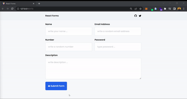 Preview of what we've built so far
With that, your Input component is officially completed! 🎉 You've successfully created a maintainable and reusable component that you can use in your own React applications.
Before we wrap up, there's one last topic to discuss which is successful form submission. Let's get into that.
How to Handle Successful Form Submission
In an ideal scenario, we would like to display a success message when a form submission is successful, process the submitted data, and reset the form. In this section, we will cover how to handle these actions.
First, let's update src/Form.jsx:
export const Form = () => {
  const methods = useForm()
  const [success, setSuccess] = useState(false)

  const onSubmit = methods.handleSubmit(data => {
    console.log(data)
    methods.reset()
    setSuccess(true)
  })

  return (
    <FormProvider {...methods}>
      <form
        onSubmit={e => e.preventDefault()}
        noValidate
        autoComplete="off"
        className="container"
      >
        <div className="grid gap-5 md:grid-cols-2">
          <Input {...name_validation} />
          <Input {...email_validation} />
          <Input {...num_validation} />
          <Input {...password_validation} />
          <Input {...desc_validation} className="md:col-span-2" />
        </div>
        <div className="mt-5">
          {success && (
            <p className="flex items-center gap-1 mb-5 font-semibold text-green-500">
              <BsFillCheckSquareFill /> Form has been submitted successfully
            </p>
          )}
          <button
            onClick={onSubmit}
            className="flex items-center gap-1 p-5 font-semibold text-white bg-blue-600 rounded-md hover:bg-blue-800"
          >
            <GrMail />
            Submit Form
          </button>
        </div>
      </form>
    </FormProvider>
  )
}
We have utilized the useState hook to create a state variable called success, which is initially set to false.
Upon successful form submission, we update the state value to true using the setSuccess function. When success is true, a paragraph with the message "Form has been submitted successfully" will be displayed. Also, we are utilizing the methods object from the react-hook-form library to reset the form using methods.reset() after a successful submission.
We have also included a console.log statement to display the submitted data in the console after form submission. You can utilize this data as needed, such as sending it to a backend server, storing it in local storage, and so on.
But for the purpose of simplicity in this tutorial, we are solely logging the submitted data in the console, which will be displayed in the following format:
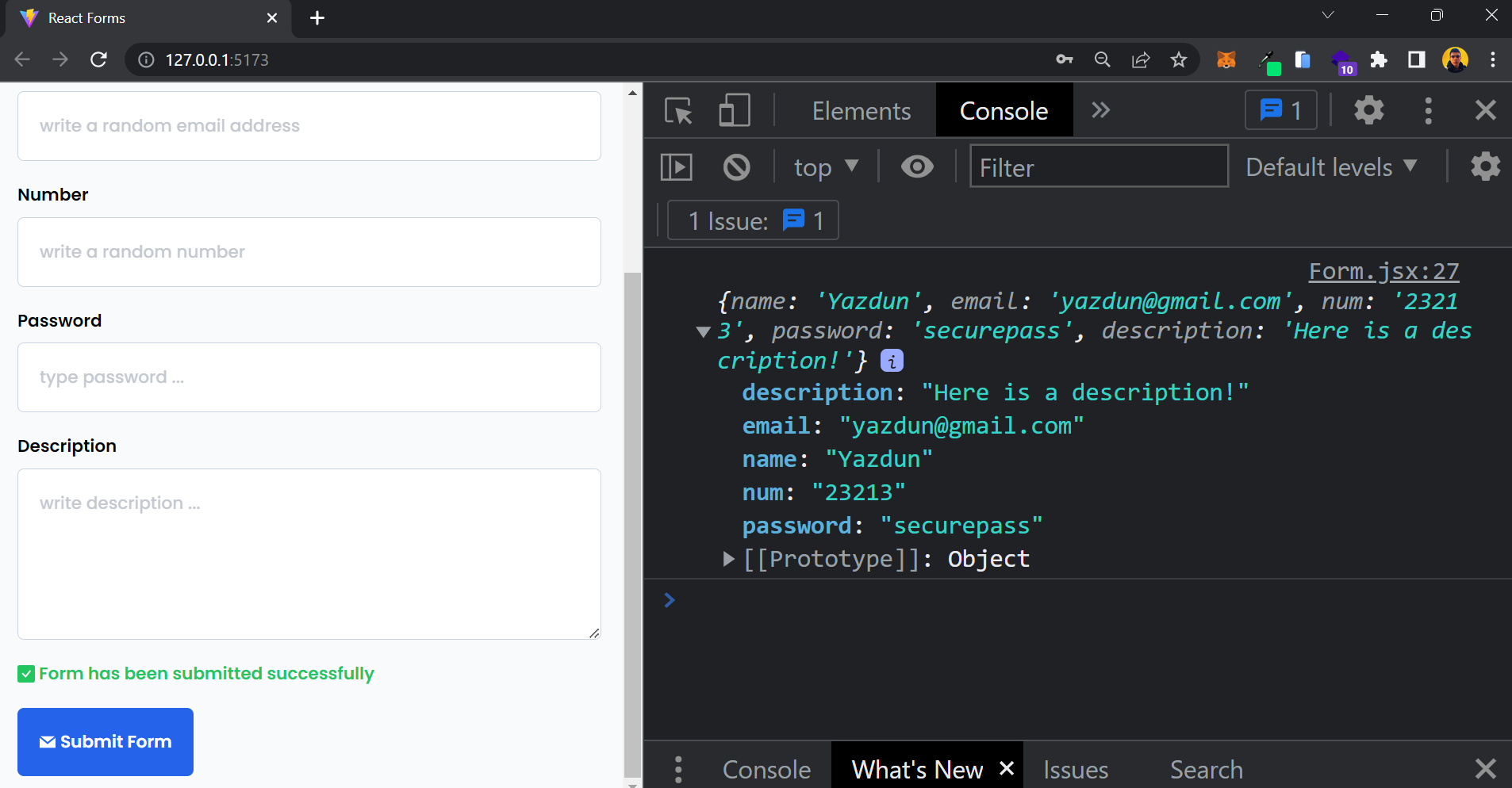 Screenshot of successful form submission
At this point, we have a fully functional form that includes a custom Input component and reusable Input validations. This form gracefully handles different form states, whether it's a failed submission or a successful one.
Conclusion
In this tutorial, we have successfully built a maintainable and reusable form in React using the react-hook-form library. We created a custom Input component that can handle various types of inputs with validation. We also implemented error handling for failed form submissions and displayed success messages for successful submissions.
Throughout the tutorial, you learned how to use react-hook-form to manage form state, handle form submissions, reset forms, and validate form inputs. You also utilized the power of Tailwind CSS for styling and customization, including passing custom classnames to our Input component.
By following best practices and leveraging the features of react-hook-form, you were able to create a clean and efficient form that can be easily integrated into any React application.
This form can serve as a foundation for more complex forms with additional functionality, such as backend API integration, form data persistence, and form validation with custom rules.
I hope this tutorial has been helpful in understanding how to build a form with react-hook-form and Tailwind CSS. Feel free to experiment and extend the functionalities of this form to suit your specific requirements.
You can follow me on Twitter where I share more useful tips on web development. Happy coding!