
Building projects is a great way to build your skills, especially when it comes to web development.
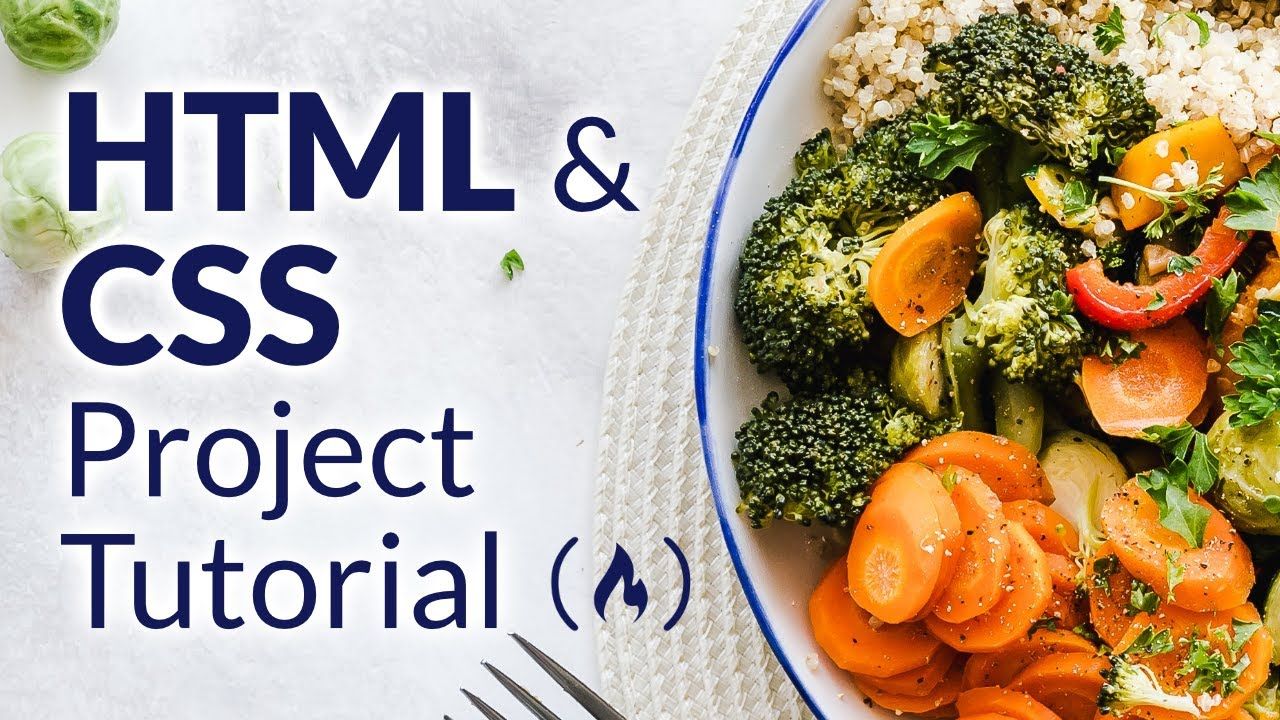
We just published an HTML & CSS course on the freeCodeCamp.org YouTube channel that will teach you how to build a recipe website.
John Smilga developed this course. He is one of the most prolific contributors to the freeCodeCamp YouTube channel and has created a bunch of popular courses.
The project you will build is a multi-page website created with only HTML and CSS with no frameworks. The pages include a home page, about page, recipe page, contact page, and more.
There are no prerequisites for this course but it would be helpful to have basic knowledge of HTML and CSS. The course includes starter files and assets to get you started quickly.
Watch the full course below or on the freeCodeCamp.org YouTube channel (2-hour watch).
Transcript
(autogenerated)
This course will help you improve your skills with HTML and CSS.
Popular instructor john smith will teach you how to create a multi page recipe website using just HTML and CSS.
Hey, what's up, he is john from coding addict, and welcome to another HTML and CSS project.
And this video, we'll build a multi page food recipe site.
If you want to see the entire project in action, just navigate to the URL HTML, CSS simply recipes dotnet for that app, again, the URL is HTML, CSS simply recipes dotnet will find that up.
And effectively, we've got a recipe site with a bunch of pages.
So we've got a home page, and about page, the tags page.
And then once we click on a tag, we'll navigate to a tag template page.
We also have got recipes page, as well as the contact page.
And also if we click on a similar recipe, we'll have a single recipe page.
Before we start setting up the project, or image just mentioned that since it's a HTML CSS project, there's going to be very minimal functionality.
So I'm copying and pasting, since in plenish, demo, there are no templates or components.
So for example, if you want to display navbar, and all pages, yes, you will have to copy and paste, since there's no way around it.
In order to follow along with the project, you'll need a star and probably the fastest way to get it is by navigating to john smith without calm again, the URL is john smith, calm, and then look for the project page and filter by YouTube.
So check for you to project.
And in here, if you click on this button, of course, you'll navigate to the project, the one that I just showed you, but you're looking for the stars.
So just click on the star or the source code, both of them lead to the same repo.
And once we get here, just look for download zip option.
And once you download the zip, of course, you want to crack it open here.
And then I'll just drag and drop and place it on desktop, I'll use my favorite text editor, Visual Studio code.
And I always prefer working side by side with a browser window.
So open up the browser.
I'll set them side by side.
And then we'll go over what you can find in the project.
And essentially, we've got two folders, we've got a final one, star one.
And of course in the final is where you'll find the entire source code, just in case you ever need a reference.
And the star is world we doing all of our work in the store, you'll find the general structure for the project.
So I already prepared some stuff for you.
Like we have assets.
So this is where you'll find all the images, some CSS files that I'm going to talk about a little bit later, some empty HTML pages.
So these are all the pages that eventually will create, as well as one lonely JavaScript file.
And if you take a look at the index HTML, you'll find here the general setup, where essentially we've got some link tags.
So one is going to be for favicon.
Then the next one will be for normalized CSS.
We also have one for Font Awesome icons, and one for main CSS.
And if you take a look at the main CSS, you'll find some global styles that are used in all of my project.
If you're confused about some of this stuff, for example, why are using normalize? And what is the benefit of global styles, please watch my default star video where I cover all of that in great detail.
And you can find the video link in the description.
Lastly, we're working on HTML CSS project, I prefer extension called preview on a web, which spins up the local web server.
And as a result, once I save the file, I can see the changes instantly.
So let me show you.
So these are my extensions.
The one that I prefer using is this one, we review on a web server.
And of course, you just need to install it.
And if you want to see in a browser, you can either right click it, and I'll show you that in a second.
Or you can use this shortcut.
So once you install the extension, just navigate to index HTML in the star.
So of course, this is all do the work.
Now if you want to check out the final, of course, navigate there.
And then like I said, we can right click over here, and then choose this option.
Or you can just go for the shortcut, and I believe it was Ctrl Shift L and once you split it up, you should see a bridge in the browser.
And like I said, the reason why I prefer using this extension is because every time you make some kind of changes, you'll right away See that in the browser.
So if I go here with Hello people.
And once I save the file, check it out.
Now, of course, I have the element displayed in the browser.
And then lastly, once in a while, I want to showcase more, we've got on a big screen as well.
So therefore, I'll navigate here.
And I'll just copy and paste this URL.
So essentially, I have two browsers, one is going to be the smart one, where it will see the result right away.
And once in a while, I'll hop back to the big browser, just to showcase how something looks on a big screen as well.
All right, and we're gonna kick things off with a navbar, which has two layouts, we have a small screen layout and a big screen layout.
And on the small screen, we can also toggle the length.
So let me make this smaller nurse is going to be a small screen layout where of course, we can toggle.
Now, I also probably forgot to tell you that when I'm recording, I actually zoom in.
So that's why everything looks so big.
Technically, if I go back to 100%.
Now, of course, you'll see that everything is smaller.
So don't be surprised if at some point, your application looks a little bit different than mine.
Let me make this big.
I'm gonna navigate back to the index HTML.
Again, I'm using my web server located in the star in the index HTML.
And of course, as always, we just need to start by adding the HTML, we're going to do that in the following way, we're shall remove all the code all the dummy code.
And I'll close the sidebar just so we have more real estate.
So now I have an app.
And of now, that's just my preference.
And let's go with nav element also right away, add a class of navbar.
And inside of the nav bar, I want to grow with knives on third live.
And then sort of this day, we're gonna have two more.
One is going to be for novel links, and one is going to be for neither.
So first, let's set up the header.
And again, I'm going to use some comments here.
So let's say header.
So one year, we'll place a logo with a toggle button, and then also one for now, of course, this is where all the links are going to be.
Now, as far as nav center, why I prefer sticking in a number, because now we're on a big screen, I can always make sure that the nav content is spanning only certain with and of course, I'll show you once we start styling the big screen, because notice navbar actually is going to be spanning all across, then as far as the content, the nerve center, one that I will always be certain with.
That's why I have that nav center inside of Napa.
Now when it comes to header, we want to place two things over here, we have a link back to the homepage.
So basically, I'm wrapping my image in the link.
So we can always Navigate back home.
Just to show Grace, how is not going to work.
Like if I go to about page.
That's the look.
But if I want to navigate back, either click on home, or I can simply click on a logo, and I'll be back home.
And then the second thing is the toggle button, which of course is going to have that Font Awesome icon.
So let's start with a link for the href.
We're going to go with index HTML.
And of course, this is going to make sense once we add this navbar to different pages.
Because of course, we are already located in the index HTML, when we'll add a class of nav logo.
And then inside of this link, let's go with IMG.
And then all the images are going to be in the assets.
And then more specifically, we have recipes one show these ones we'll use a little bit later than 40.
About for the main one, as well as logo, well, they're just going to be located right in the assets folder.
So let's set up the path.
We're going to go with forward slash report assets.
And as far as logo one, we're just looking for logo, SVG.
And then let's add a alternative text on our site here, simply recipes, server one, we should see the logo on screen.
And of course we do.
And after that, let's set up that button.
And this button is going to have two classes, it's gonna have a class of btn.
So this is coming from the global styles as well as the NAB btn because we'll do a little bit more styling.
And also, you know, let's add a type.
Let's say that is going to be equal to the button ran inside of the button.
Like I said, we're going to go with Font Awesome icon.
So we're looking for I element.
And of course, I can access these classes, because I have the link to the font.
Awesome.
Notice over here, so that's the CDN link for Font Awesome.
And then as far as the classes we're looking for FA s and then FA and align, justify.
So once I have my element, of course, I should see my icon.
Since I do good move on to the next thing.
So once we set up the header We're here, when we want to add a comment of lunch.
And as the name already suggests, in the nav links, we'll have a bunch of link elements.
But one of them the last one, contract one is going to be wrapped in a div, because it will have a little bit different styling, not just on a big screen, as different styling, and of course, also on a small screen.
Because of that, of course, we'll wrap it in a div.
So let's create four links, we need to make sure that the values for the href actually match our pages.
Otherwise, it's not gonna make sense.
And I'll start with index HTML.
And as far as the text, I'm going to go with home.
But we also want to add a class of nav link amount, I'm going to have one for about one for tags, and one for recipes.
And then make sure the editor value actually matches the pages that we have over here.
So let me toggle the sidebar.
Man, I'll copy and paste four times, and learn as far as the values and we're gonna go with about HTML, when I'm looking for tags, HTML.
And the last one will be recipes, HTML, recipes, HTML, all of them have a class of modeling, so that stays the same.
And now of course, we just want to change these routers around as far as the text ones.
So let me select them.
When I look for home, I'll remove all of them.
And we'll go with about when we're looking for tags.
And of course, the last one little beer recipes.
Like already previously mentioned, when it comes to contact us, it's going to be a link Yes, it's going to navigate to the contact page.
But we'll wrap it in a div with two classes with nav one class as well as the contact one class.
So let's say your nav link, another close contact link.
So contact hyphen link.
inside of this div, let's go with another href element.
And I'll say contact HTML.
And then we'll just add a class of button.
And of course, as far as the text will go with contact, and that should do it for the HTML.
As far as the logo I created in figma, which is arguably the most popular web design software out there.
It's very, very easy to get started.
And you can easily find bunch of great tutorials on how to get up and running with pigma on YouTube, as well as Udemy.
And once the bones are in place, of course, now we can just start styling the number mesh.
And once we have the HTML in place.
Now of course, let's start styling.
First, we'll worry about the small screen layout.
So first, I want to set this one up.
Don't worry about toggle effect.
And only then I'll set up the big screen where we're going to do that by navigating to main CSS, again, it is located in the CSS folder, and more specifically, main CSS.
And then we have the navbar comment.
So these are all the global styles and then right off the navbar common will start styling.
And let's just start with nav center.
And eventually there's also going to be some styles for number.
But for time being though probably not going to make sense.
So I'll just add selector for the entire navbar.
First we'll start with our center, and then you'll see what styles we want to add to nav bar as well.
So let's start over here and I just want to go with some kind of width.
Since I want to set up this width fluid, meaning I want to set it based on a screen size, I'm going to go with width, and 90 view width.
So those are units.
And essentially, that just means 90% on screen with regardless whether that's really small, or really big.
And then as far as the max width, we're going to go over here.
And then remember, I mentioned that I'm going to be using a CSS variable for that.
And in my global styles, I have max width set to 11 120 pixels.
So that's the width I'm going to use.
Let me go back here, I'm just gonna say half an hour friend, and then max width.
And what this means is that our content number is never going to be bigger than 1112.
That's why we have an App Center.
That's why we added Of course, max width.
Now you'll notice right now that of course the nerve center is all the way in the left hand side.
Why? Well because we have the width bar, we haven't set up the margin, or we haven't styled the parent container.
So we have two choices either you go here with margin zero and auto.
So that will also always place it in the center.
Or we're gonna work with a parent container.
And in this case, we'll just say display flex, and then justify content.
We'll set it in the center.
And lastly we'll go with a line items and I'll set it equal to center but I can tell you right away that we won't be able to see that.
Why well because now bar doesn't have any height.
So once we add the height and is going to be on a big screen, then we'll actually see this property in action.
If you're ever in doubt, I highly suggest just adding the background.
So in this case, let's say you're confused, what's happening with map center, simply go with background and then set it equal to run.
Again, this is just going to be temporary.
And then you can do the same thing with a navbar and trudge around and set it equal to blue.
And what you'll notice, once you go to the big screen, so this is going to be that nav center, it's never going to be bigger than that 1100 20 unless you use the remaining of the number.
Again, if you're ever in doubt, two options, either you can set up the board.
And that's also something that people use.
Or you can just add the background colors.
And that way you can clearly see Okay, so this is my nerve center.
And this is the remaining of the map.
Now, of course, since I have justified con on center, you can clearly see that Madison's are sitting in the center of the nav bar.
So now let me come and these ones out, because they're useful.
But they're also a little bit annoying, because of course, I don't want to look at the red color all the time.
And next, I want to go with the header.
Now of course we're styling, where we have the logo, as well as the button.
This is going to be the case where I'll set up the height.
And I'm going to go with six REM.
And what's really interesting is that once we get to the big screen, we'll change this height around, and effectively we'll add the height to the entire number.
But for now, since we're just styling the small screen, we'll go with height six arms for the header.
And then again, we want to go with display flex.
And we'll go with justify content, space between.
And essentially in here, we're just pushing these items as far as possible, away from each other.
So notice now buttons all the way and right inside the logo is all the way on the left hand side.
And then I also want to set them up in the center vertically.
And of course, in order to do that, we just go with align items center.
Of course, you can use the grid for that.
But it's just always my preference to stick with flex.
If you have these straight up horizontal and vertical layouts.
Of course, once it starts to get more complex, then grid is always a better choice.
And after that, they want to make my logo a little bit smaller.
So go with a nav header.
And then I'll target the image.
And essentially, I just want to go over 200 pixels.
Now you'll see that course our logo is a little bit smaller than we want to go with now button.
As you can see, we already have a bunch of styles applied because we're using that global button class.
But I just want to add a little bit different padding.
So in here, let's go with NAB btn.
And then I'm looking for padding, zero point 15.
And of course, I'm going to go with REM.
And then the same thing is going to be over here, where we'll go with zero point 75.
REM essentially in here, just make this padding a little bit smaller, this one a little bit bigger.
Of course, that is a choice.
If you don't want that, you don't have to apply the styles.
And then let's go for Font Awesome.
Now one is, of course, the IOM and so I'll go with navigation.
And then I'll set the font size equal to one point 25.
One point 25 RPMs.
And once we have the map button in place, when I just want to go all the links.
So of course now I'm talking about the entire list.
And as far as the nav links, I'll set it equal to a display flex again.
So display flex hour, we're going to go with flex direction, equal to a column.
So now of course, instead of being in one line, were stacked one on top of each other.
And then there's going to be more styles.
So out here to do, but we'll worry about them once we start actually toggling the links, and then we'll right away go for that one individual link.
My one has a class of link on here.
Let's go with display block.
So we'll change from being line one to display block one, and we want to go for text align.
And I'll set it equal to center.
And of course, Texas in the center, then let's also add text transform.
And we're just going to go with capitalize.
And after that let's add a different color.
And in this case, I'm going to grow water gray one, but I'm going to go for 900.
So now of course all the links have the same color as our text.
And then let's go for letter spacing, MT will be equal to our CSS variable when we want to add a padding for only add padding top bottom, padding, one REM and then left and right zero.
And also I want to add a border on top.
So let's go board top one pixels solid, and then we're shooting for our CSS variable.
So again, I'm going to go for gray and 500.
So that's going to be my border.
Then I also want to add transition because as we'll be hovering, I'll change the color of my link.
So I'm gonna go over here, we transition that is equal to my CSS variable, of course, in the global styles.
And then let's just go with nav link, and then hover.
So as we're hovering, we want to change the color, and we'll set it equal to the primary one.
And then lastly, as far as this Contact link, I just want to change the padding again, just like we did over here with an app button.
Not to do that, we just go here with contact, and then link, and I'm targeting the actual link element here.
So I have the class and then I'm targeting the link.
And in here, let's go with padding.
And again, I'm going to go with zero point 15.
REM, and then one REM left and right.
And once we're done styling, the Contact link, we're almost almost done.
But before I let you go, there's something that I want to point out.
And that is simply the fact that if you take a look at the logo, button, you probably noticed that even though I set up for the parent, for the header to be aligned items in the center, the logo, and button are not vertically in assembling.
Now first of all, let's take a look at why is that happening.
More remember, in the index HTML, we have course a link, and that link wraps the image.
So if we're going to go back, and again, I'm going to do that right after header, but doesn't really matter where you do that, I'm going to go with nav logo.
And let's do that trick.
We'll go with background.
And then let's add the red one.
And you'll notice that yes, these ones, so the link, not the logo, but the link is in one line with the button, but not the logo that is sitting inside of going.
In order to fix that, we simply need to set our logo to be in display flex.
And then in order to place the image in the center, we simply need to go with align items, and then center.
Again, please keep in mind, we're talking about the logo.
So we're talking about the link, a man we set it up as display flex and line items in the center.
So now the actual image is in the center.
Now, of course you can clearly see that are actually in one line.
So now we want to remove the background, we don't even know more.
And once we fixed this tiny bug, we're done styling the navbar for the small screen layout.
Alright, it looks like we're done with initial navbar CSS.
But before we worry about styling, the big screen layout, let's quickly knock out the toggle functionality.
And as a side note, if you're not comfortable with JavaScript, you can simply copy and paste the code from the final directory.
And the idea is following on a small screen, we want to hide all the strings by default.
And we'll do that by setting up the height zero in lunch and not show them we'll create a new class with the current height or the knowledge.
And lastly in JavaScript will toggle the nav links by adding and removing the show links class.
So the end result should look something like this.
What if I made my screen smaller? Notice the button.
And once we click, we show the links.
And once we click one more time was LAN we hide the links.
Like I already mentioned, the plan is following where we'll find the nav links, murders, we have our to do before we do anything before we set height zero, I actually want to check the height of the nav links.
So let's open up the dev tools.
We're looking for the elements.
And more specifically, we're looking forward into how links and I can see that the height for nav links is 309 point 79 pixels.
And once I know that info, I'll create a class, I'll say show lunch.
And then we'll set up the height to be exactly that, whatever we have right now for not once, and in my case, I'm going to go with 310 pixels.
And once I have this height.
Now of course I want to go to now which I'm like I said by default will hire them.
So say here, height is equal to zero, then we also need to set up the overflow hidden.
Otherwise, you can clearly see that we can still see the links.
So let's go over here or flow hidden.
We also want the transition because when we'll be toggling actually one that toggle effect to happen over time, not instantly.
So therefore we'll go here with transition.
We'll just be looking for the CSS variable, the transition one.
And once we have all of this in place, we can actually test it out by just adding and removing the class the show links one, E and F those and then of course we'll navigate to the JavaScript file out of functionality there as well.
So let's go to the big screen.
I always find it to be easier working there.
So let's inspect, of course, I'm looking for the nav links element or here, and then just click on the class.
And right next to the nav links, just go with show links.
And what you'll notice, the moment you press enter, now you can see the links.
If I remove the class, then you can probably already guess, we won't be able to see the links.
Effectively, the only thing we need to do right now is just navigate to the JavaScript file.
So let's go to the directory, the JavaScript one, we're looking for app j, s.
And in here, we'll start with simple Hello World.
And then back in the index HTML, we want to set up the script tags.
So let's say your script.
And as far as the source, again, we're pointing to the JavaScript folder, and the app js.
If you can see the hello world in a console, then of course, we're moving in the right direction.
As far as the address, you can select the nav links and nav button directly.
But I always like to set up a function that gets me not element and if the element doesn't exist.
So essentially, if I get back No, then I just throw there might seem like an overkill on a small project for still decided to share the functionality.
So in here, we want to go with const get element.
And we'll pass in the selector.
So this is going to be either the nav links or nav button, or whichever element you want to select.
On.
First, let's go with const element.
So now selected, and I'll say document, and then query selector.
And now we pass in the selector.
And you probably already know that in vanilla j s, if there is no element.
Sure, if I pass in some kind of selector, that doesn't point to an element, which I'll get back to know.
So I'll say here, if element exists, only if it exists, then I'll return the element.
Otherwise, I'll throw the air.
And I'll just say throw an error.
And of course, I'll pass in some kind of message.
In this case, I'm going to go with template string, I'll say please, double check your class names.
And we'll go there is no.
And of course, now I'm looking for that selector.
And let's add a class here.
And once I have the function, of course, we're going to test it out, where I'm going to go with cons lunch, snom, selecting the nav links, and all pass in the class of nav links.
If I don't see anything in the console, then of course, we are in good shape.
Now if I'll add some class name, that doesn't point to an element that of course will have please double check your class names.
There is no bla bla bla class.
Hopefully that is clear.
So now of course, we can set the proper class here, copy and paste, we're going to be looking for nav be 10.
In this case, of course, we also need to change the name here.
So nav, btn, and then DOM.
And then let's just add a event listener on the button, the click around and then every time I click the button will toggle the showings class.
So we'll add an remove class on the links element.
So let's say hello here now btn, van, add an event listener.
And then we'll be listening for click events.
And of course, we need to pass in a callback function.
As far as the logical simpler go with links, class list.
And toggle.
So class lists is the property on there we have toggle method.
And in here, we just need to say which class we want to toggle.
Keep in mind or in here, you do need to pass in the.we already know that we're talking about the class or you simply need to provide the class value.
And the moment I save, I can see that I have no bugs in the console, which is always a good time.
And then of course, notice, as we're clicking, we're toggling the links.
So if you want to test it out on a big screen, of course, you can do that.
And you'll clearly see that the moment I click, I show links over here, notice how we're again, adding this class.
Of course, in this case, we're not doing this manually.
And then once we click one more time, then we hide the links.
And before I let you go, let me just say that I'm fully aware that we are cheating a little bit, simply because if we change the amount of links, or functionality is not going to work as expected, because keep in mind that back in the main CSS, we're actually hard coding this height value.
So of course, as we're going to be adding more links, or removing the links, our functionality is not going to work as expected.
If you took my JavaScript course, you probably worked on a project where we cover the proper toggle functionality, but since it's not the main focus of the project, I decided to take this route instead.
Alright, and once we have toggle function Now we're going to place finger and close the app js.
And now of course, we'll focus on a big screen wild.
So essentially, that's the look that I'm shooting for.
Once we get to the big screen, I want all of them in one line, links are going to be on the left hand side, and then the contact one is going to be all the way on the right hand side, and not user, we just need to come up with some kind of value for the media query.
On In my case, I'm going to go for 992.
Just keep in mind that of course, I'm zoomed in.
So technically, it's not going to happen exactly at 992.
So let's go media screen.
And we'll be looking for min width, min width.
As far as the value, like I said, I'm going to go with 992.
The first thing that I want to do is hide the knob button.
So let's just start with the class knob btn.
And we're going to go with display.
Once we get to the big screen, I don't want to show the button.
Of course, once we get past nine to notice we don't have the button, that's the first thing we want to accomplish.
After that, we want to go with nav bar, and we want to set the height to be six milligrams.
If you remember, on a small screen, we now have had or what six outcomes correct.
Now in this case, that's not what I want.
Therefore, I'll go with number.
And then we'll set height to be six RPMs.
And again, if you want to check it out, of course, background right there, and you'll see how it's gonna look like then we want to go with a knife center.
And I want to set up display flex, why? Because I want all of them in one line, keep in mind that course for the links will still have to send them up as display flex as well.
Otherwise, it's not gonna work, there will still be flex direction column.
But as far as nerve center, yes, I want the header, I want the length in one line.
Therefore, we'll go here with now center.
And we're looking for display.
And of course, we'll set it equal to flex, then we want to align them vertically in the center.
So go with align items center.
After that, we have the now header.
And this is the case where of course we'll target that will say nav header, I don't want the height to be six items.
So we'll just say here, auto.
So essentially, this is going to be the height of the actual content.
And then let's go with margin.
Right.
So this is just going to create a little bit of distance in between the links.
Now, if I navigate to the big screen, this is what you should see.
Now of course, we can see the links.
And this is exactly what we're going to work on right now.
Where essentially, we need to understand that if I take a look at the links, I set it to be equal to zero.
So what happens if I hide the links on a small screen, of course, is exactly what I have right now, I'm not going to be able to see them on a big screen.
So notice, if I show the links on a small screen, I'll also see them on a big screen.
Now of course, the layout is still domestic, don't worry about that.
That's not what we focused on.
What I want to showcase is that if we hide them on a small screen, we're not going to be able to see them on a big screen.
Why? Well, because this height is set to zero.
And in order to fix that, we simply need to target the class first, some nav links, we want to go with height, auto.
And now you'll notice that even though the links are hidden on a small screen, once we get to the big screen, we set the height, we can see the links.
Now of course, what's more common is layout and because it is a mess, I simply want to change my flex direction.
And I want to set it equal to row.
And of course they will be in one line, then I want to align them in the center vertically because I have the button and I have the ones just in case there are some differences there.
And also, notice over here, the nav center is taking up all of the space.
And when it comes to header, it just has its own width correct.
And the same goes for knowledge.
But I want to change that centrally.
Since now center is taking all of this space, I want my links to take up the remaining of the space.
The way we set that one up, we just go with width, and we set it equal to 100%.
And yes, the moment nothing changed over here, don't worry.
We'll work on that a little bit later.
But now if we take a look at the links, notice actually spanning all across so I have my now center of our still display flex and now the nav links are spanning all across again.
You want us to route just go with background and red and you'll see that now.
The links are picking up the remaining space.
And if I remove that with 100.
And of course, it's not the case.
Now, of course, what I want is to style those nav links specifically, because if you remember, there are quite a few styles coming from the small screen, I actually want to override them.
So go with an avalanche of nontargeting at one specific link, and I'm going to go with padding zero, since we added some padding on a small screen, then we want to go with war top, sort of equal to none, when as far as the margin, so I want some distance in between, we're going to go with margin, right, and we'll set it equal to one REM.
And as far as the font size, I'm going to go with non REM.
And then lastly, when it comes to that Contact link things, I want to place it all the way on the right hand side and simply go with margin left, and we'll set it equal to zero.
And what you'll notice is that we have the header, we have the lunch.
And of course, the Contact link is all the way on the right hand side.
And probably the biggest gotcha is that height zero, we're essentially, again, on a small screen, we set it equal to height zero, of course, once we get to the big screen, if we're hiding those links on a small screen, we need to show them and therefore we set it equal to aura.
And with this in place, we're done installing the navbar.
Now of course, we can move on to our next task.
Alright.
And once we're done with the navbar, let's set up a structure for all our pages.
Now before we do that, the admin just quickly mentioned that if you're bothered with the small margin on a contact one, you can simply go back and add here margin.
And of course, we're looking for margin right in this case.
And we'll consider equal to zero because of course, all the links get this margin, right.
So if we remove it, of course, will not have that space all the way on the right hand side.
As far as the structure, we want to set up the page class.
And then we also want to set up the footer.
So this is going to be structure for all the pages.
And then in different pages, of course, we'll add different content, but all of them will have the navbar will have the footer, as well as the bridge.
And you'll see once we get there.
So first, let's go back to index HTML.
And then right after nav, we have an of nav, and let's just say here, main or page or whatever.
So some kind of comment, copy and paste, and we'll say end of main.
And now let's set up a main element.
And let's add a class of page.
And then after the main one, this is where we want to set up a for short Mingo here with Porter.
And I'm going to go with the poorer element.
As far as the class, since there might be a footer, also, in some kind of card or something like that.
I always prefer setting it up explicitly as page footer.
But of course, this is the preference.
Technically, you can just select the footer in the CSS, and you'll still be in good shape.
And as far as poorer.
I want to go with paragraph here, then we'll go with special HTML character.
So I'm going to go here with ampersand and then we'll say copy.
So of course, now we'll get that copyright sign.
And then I just want to set up the date.
Now for time being we'll hard code that.
And then later on video will actually set up the JavaScript code as well.
So let's go here with ID and date.
So that's what we'll use in JavaScript.
Like I said, For now, we'll just hardcode we'll say 2021.
And then right next in the span, we'll set up another one.
So still within the same paragraph, we'll go with second span.
And here, let's class and we'll say for logo for logo.
And let's just write whatever is the logo of the site.
So in my case, it is simply recipes.
But of course, you can add different logos as well.
And then right outside of the span, but still within the paragraph, we'll go with built by, I'm just gonna use a shameless plug.
And I'll set up a link back to John's milk about calm.
So go with href when I want to go to the big screen, and I'm going to be looking for John's melton.com, I'm going to grab the href copy and paste.
And of course, now I have a link, let's just step over here coding.
So that should do it for the HTML part for the structure for all the pages.
Now of course, we just want to swing back to the main CSS.
And I'll grab this comment one, and then copy and paste and we'll set up one for footer as well.
Let me copy this one copy and paste and then let's set up one for photo and you're not mature.
We're going to copy paste one more time, because that way I can set up the next Comment as well.
And for the sake of simplicity, I'm just gonna leave it blank.
Now we'll actually start with a footer.
And only then we'll worry about the page.
And you'll see in a second why, for the time being, what we can do on a page is just set up our famous background red, so that we will clearly see what we're styling.
And let's just start by targeting the page footer.
So let's say here, page footer, and I want to go with height equals to forums.
So add some kind of height, then we'll also go with text align center.
So now all the text is going to be in the center, then we want to add background.
And let's go with CSS variable.
So in this case, I'm looking for the value of black.
And then of course, we also want to add some kind of color.
In this case, we'll go with color.
And we're looking forward to white one.
So now of course, all the text is white, apart from the link, but I'm noticing here that of course, I am the height.
But I'm not placing the content in the center.
So actually, a better approach is removing this text align center, and we'll go display.
And I'll set it equal to flex.
And then let's align them in the center vertically, and also justify content, which of course, is going to do that horizontally.
So both justify content, as well as the Align items are set to center.
Now, we still have some default margins.
And therefore we will target the footer, and more specifically paragraph, and also margin bottom is equal to zero.
And once we have that, I just want to add colors to the link, as well as the logo.
And in order to accomplish that, we simply go with footer logo, then comma, and then we'll go with page footer.
And then, of course, I want to go with color.
And we'll be looking for the primary one.
So once we set it up first, now the logo, as well as the link this primary color.
If I take a look at the complete project, that's what I'm shooting for.
Now the next thing that I want to do is set up the page height.
Because if you notice a moment, of course, yes, we do have the nine bar we have the footer, but I actually want the page to take up the remaining space.
And how we can do that, well, we can use min height.
And we'll use the calc function, because both the navbar as well as the footer have some kind of height.
And first, let's start with some kind of width.
So in here, let's say background red, and we'll go with width.
And width always will be 90% of the screen size.
That's why we have view with units.
And of course, I also want to set up some kind of max width.
And this will be equal to my CSS variable.
So let's go over here with max width.
And eventually, what you'll notice is that the content of the page is going to be aligned exactly like the navbar.
So if you remember, we also use the max width in the map center.
And that's why both of them will be in one line.
Now, of course, we have no content.
So you cannot see that yet.
But trust me, eventually, it's going to be there, whenever we want to go with margin, zero and auto.
So now I always place it in the center.
And then I also want to add a little bit of padding on top.
So say here, padding top, and let's just go with two REM now of course, you can clearly see our red box, which essentially is going to be our page.
And lastly, what we want is set up that min height.
So for all the pages, there's always going to be this min height.
I want this to be 100%.
But I want to subtract the height of the navbar as well as the height of the footer.
So we can do that by setting up min height.
When we'll go with calc function.
Let's just go with honored view heights.
So this is going to be 100% on the screen minus.
And then of course, we want to add six hours plus the forearms, I don't want you'll notice that regardless on screen size, this is going to take at least 100% of the height.
Now of course, if we'll add more content, it's going to be bigger.
And you'll see that in later pages, but at least minimum is going to be 100% minus the navbar as well as the footer.
And then before we have that all the pages, I actually want to go to the app js, I want to target the date element.
And I just want to showcase how we can add this dynamically.
So for the time being, let's just remove this code, essentially, let's just remove the current year because we're not going to be hard coding that.
And I want to swing back to App j s.
And in here right after the button.
We'll go with const date.
So now we're selecting get element and of course I'm looking for that Id missed a date.
And in here, we'll just go with constant current year.
And if you want to current year in JavaScript, we just simply go with new date, we invoke it.
And we have functioned by the name of get full year.
So now of course, we just need to go with date.
So that's the element when text content matter is equal to the current year.
So this way, we'll always have the current year, we won't have to hard code this.
And then lastly, once we have this structure, I actually want to take it, copy and paste and set it up in all the pages.
And before you get mad about it, before you get mad about the fact that we still need to copy and paste and all the pages, let me just say one more time, since we're just using straight up HTML and CSS, we don't, we don't have any concept of templates or components that we have in Korea.
So yes, if we have multiple pages, there's really no other way.
And of course, once we set up a structure for all the pages, then we'll worry about index HTML.
And then one by one, we'll add code, meaning the HTML and CSS to the rest of the pages.
So once you have the structure, since we'll use it and all the pages, and since we have all the correct links, whether that is for CSS, or for JavaScript, I want to take all of us, and then one by one, I want to add it to all the pages.
Because in here, yes, we have some boilerplate code.
But essentially, what we want is just select everything, and then overwrite with our current code that is coming from the index HTML.
And of course, the only thing you need to do over here is just change the title.
And since this is 404 page, since this is an error page, we're going to go here with error.
And if you want add more text, of course, you can do that.
But in my case, I want and then just so I can understand what is happening, where I have the page, also add a new one.
And I'll say our page, again, we need to do that for all the pages, we want to do that for about contract recipes, single recipe, back template, and tags.
And of course, I'll stop the video because I don't think it's very useful for you to watch how I do 200 pages.
But I strongly suggest you do the same because that way, it's going to be easier later on when we set up the pages.
And once you copy and paste our page structure, your website should look something like this, where all the pages, use the navbar, you'll have the footer, you'll also have the page with a heading one with the name of the page.
And of course, a title that matches whatever is the file name or here.
And essentially from the navbar, you should be able to navigate to all the pages as well as the 404.
So the 404, of course, is the one where we need to go to the URL.
And let's just say for for HTML.
And effectively, this is an error page, if the user is looking for some kind of resource on a server that doesn't exist.
And just to showcase how is that going to look like in the actual dynamic application.
Let me just find here, Gatsby version three.
So this is the original project.
Notice, if I'm looking for some kind of page that doesn't exist, let's say Users page, also in this portal for, so that's the one that we'll set up here in the error page.
And with all this in place.
Now of course, we can keep working on a project.
Next, I actually want to work on homepage, where we have this banner.
Alright, and once we have all the structure in place.
Now of course, let's worry about our hero.
And essentially what I want is some kind of div with a background.
And for that background, we'll use the image.
And then we'll also place a text in the center.
And as far as the HTML, we want to go to index HTML.
So of course, there's going to be our homepage.
And then inside of the main, let's just add here a comment.
Let's say that we're going to be looking for the header element here.
And let's go with the actual header element with a class of hero.
And inside of it, we're going to go with hero container and hero tags.
And you'll see in a CSS, why we have this nested structure.
So let's go with hero container.
And then inside of that hero container, we're gonna go with hero text.
And in there we'll place the heading one with some kind of text again, in my case, it's going to be simply recipes.
And then right below it, we'll go with a subtitle.
Now one will be no fluff, no fluff, just the recipes.
And once we have the HTML in place now of course we want Navigate to main CSS, open up the main CSS here, we have already a comment.
So we'll just say your hero, I guess, before we do anything, maybe let's just copy and paste.
So we don't worry about the next one.
So copy and paste.
And then let's just say here, here, oh, and in here, I just want to set up some kind of height for my hero.
And I guess I'm gonna go with height of 40 view heights, essentially going to 40% of the screen.
So let's go with height.
And once we have that, let's add that in background.
So let's go over here with background URL.
And we'll be looking for the image.
And in this case, I'm looking in the assets.
And we'll go with main jpg.
But of course, we want to place it in the center, we want to make sure it covers everything.
And also there's no repetition, of course, we can do it long way.
Or there's also a shortcut, where we go and center cover, and then we set it equal to no repeat.
So once we do that, of course, we should see the image.
Now what I want is to add a border radius.
So I want around the edges.
And I also want to add a little bit of margin in the bottom.
So let's go here with margin bottom on assert equal to two RMS.
And also I want to add that border radius.
So let's just go with border radius, and set it equal to our border radius global property.
Now, in order to set up Look, where I have a text right in the center, and as you notice, here, the background is actually a little bit darker.
So there's some kind of overlay on image will actually set this one as position relative position relative, and then the hero center.
So this enclosing div, this is where all set up position absolute.
And then we'll use this player flex to place a text in the center.
So let's keep scrolling.
And we're gonna go with hero container.
And like I said, we're gonna go with position absolute.
And since the parent is position log, Now, of course, we're setting up everything based on a parent.
And then here, I just want to have a width 100%, height, all 100%.
And then let's just set up top and left to be equal to zero.
So top left, both are equal to zero.
And once we have all of this in place, Now, of course, let's add that overlay.
And we do that by going with background.
And then we're looking for RGBA.
And I'm just gonna go with 000 0.4.
So RGBA.
Now, this gives me 0.04.
That's not what I want.
So essentially, notice how the background right now is darker.
So we added the overlay on top of the image.
And of course, if we go really dark, then of course, there's going to be hard to see the image.
So therefore, I go here with RGB.
And as a result, I can nicely control this color.
So the darker you'll go here, of course, the darker the overlay is going to be.
And the reason why we want to set that up, is because if we don't do that, then of course with white text, it is going to be hard to see the text.
That's why we want to set up the image, we want to add the overlay, and we want to add some dark color to it.
And then we'll make the text white.
So right after the background, we can probably go with border radius, since at the moment, our image has the border radius, but not the container.
So let's go with border radius, and set it equal to the border radius property.
And then if I want to place the text in the center, we want to go with display flex align items center.
So now it's going to be for vertical, just for content is going to be for horizontal center.
And then we want to target the Hero Packs.
So that's going to be a div inside of that container.
So here are tags.
And let's just set up text align center, because you notice, even though the hero text is in the center, the actual text inside of it is not before we go text align, and we set it equal to centers.
Now, of course, everything is in the center.
And let's also add that white color.
So let's go with our CSS variable.
And of course, the name is white.
And then the very last thing that I want to add is the media query for 768 pixels.
And once we get to that screen size, I want to make the font size for heading one for RPMs and set the margin bottom to be equal to zero.
From here, let's go with media screen.
And of course, we're looking for some kind of value.
In this case, I'm going to grow with men with 768 pixels.
And once we get to the screen size, like I said, we're going to go with hero text and how Everyone, let's just go with font size for RPMs.
And then let's set up the margin bottom to be equal to zero.
And once we have everything in place, let's navigate here, this is going to be the look on a big screen.
And if we make this smaller, of course, this is going to be the look on my screen.
Now, as always, I'm massively zoomed in.
So technically, if you take a look at the small screen, it's going to look something like this.
And once we have our here on place, now of course, we can focus on our recipes, where we'll have two column layout.
On one side, we'll have tags.
And then on the other side, we'll have the cards beautiful.
With our hair out of the way.
Now let's tackle the big beast, the recipes layout, where we've got a two column layout with tags in one column, and cards in the other.
Now, since we'll reuse this layout in multiple pages, please take your time.
And don't rush with this one.
Better to take more time right now than chase some silly spelling errors later on from my part, I'll probably be even more annoying than usual, by repeating the same things over and over.
Since in here we have the nested layout.
So it can get tricky.
And therefore I think it's important that I basically keep repeating the same thing.
And we'll also split this one into multiple videos, just so we can build everything step by step.
The good news is, once we're done with the recipes, it's pretty much smooth sailing from here on out.
And effectively, we want to go back to the index HTML, of course, we're looking for the main and you want to place this one in the main.
So not outside of main not inside of the footer, you still want to place it in the main and therefore allowed bunch of comments here as well.
Again, we will reuse this one.
So it's much easier if you have clear comments where the next section starts, or element.
And hopefully you get the gist.
So we'll go here with end of error.
And we'll have another set of comments.
And let's just go with recipes container container.
I'll do it over here as well.
And let's just say endof love recipes container.
And we're going to go with section with a class of recipes, container section, recipes, container, inside of the container will have two major things.
We'll have a tags container.
So I'm talking about verse column over here.
So this is gonna be our tags.
And then we'll have recipes cards.
And of course, there's going to be more content.
But for now, let's just set up those main elements.
And again, we'll place a bunch of comments, let's say tag container.
And we'll copy and paste course, on here, we'll say tag container.
And as far as the tags, we'll just go with div with a class of tags container.
So if you want, maybe let's add an s here as well, just so it makes a little more sense.
And then we have a recipes list.
So these are going to be those cards.
And in this case, I think I can just copy and paste, we'll just change things around where I want to select all the tags here.
And let's say recipes.
And instead of container, this is going to be a list.
So let's say here.
So that's going to be the structure for this container, recipes container, run tags container, where we'll have the tags.
Here, of course, we'll have the cards, the recipe cards.
And now one by one, let's add more content.
As far as the recipes container, we're going to have 104 with a text of recipes.
And then also have a div with a class of tags list.
And essentially in here, I'm just gonna have lunch.
Now, since again, this is HTML and CSS project will simply navigate through the page to the tag template page will display these recipes when you're talking about the dynamic project one, but we set it up in Gatsby.
Of course, in here we navigate to the tag, of course, we display that one specific or multiple recipes that are associated with that tag.
Keep in mind that in this case, of course, it's not going to be dynamic, we'll just have one page and we'll navigate there, content will always be the same.
But when it comes to dynamic project, of course, you'll click on a tag and then you only display the recipes that are associated with that tag.
And hopefully you can already see when it comes to layout, it resembles a lot to what we have here in recipes list.
So this is what I'm talking about where we will reuse this layout.
Some parts of this layout quite heavily Around the project.
So let's make sure that we set up everything correctly.
So back in the index HTML tags contain an array of heading four.
And in here, I want to go with tags list.
And essentially, these are just going to be linked to the tag template page, then they're not going to be dynamic, all them will point to the same page.
And essentially in there, we'll just have static content.
And as far as the href, we want to go with that template HTML.
And here, let's just add some different values.
So I'm going to go with beef.
And I'll say one.
So what I'm trying to say here is that there's one recipe that has the tag of beef.
And of course, we'll just copy and paste and change these routers around.
So for breakfast, we'll go with two than four carrots, we'll go with three carrots, we'll go with three.
And here, of course, we'll have the generic one, the food one, which is for, and again, not to be redundant, but in a normal project, of course, versus coming from the database.
So this info is coming from database.
And it changes it is dynamic, the more items you add course, you'll display different info in here, just HTML and CSS project.
So of course, we're just hard coding.
When it comes to recipes list, we want to set up those guards.
So we're done with tags container should look something like this.
I'm back in the recipes list, we want to set another comment, we'll go with single recipe.
So this is going to be that card.
And we'll copy and paste.
So say and have single recipe.
And in here, I want to go with link.
Now this link is going to go to single recipe page.
Essentially, this page probably is going to be the last we set up because there's also quite a bit of work over there.
But the idea is that this goes to the tag page.
But then this one goes to that single recipe, whatever it is, again, in our case, it's going to be hard coded.
So if you take a look all the time display the same info here.
But in general, when you have dynamic product, of course, you display a different recipe.
Hopefully that is clear.
As far as the href will go with single recipe HTML, right away out of class here, have a recipe.
And inside of it, we want to go with image as far as the source while it's going to be in the assets.
And we'll start with recipe one, then two, I believe we'll have four.
So you can already guess that, of course being the assets, we have recipes folder.
And in there, I have recipe one, recipe two, three, and four.
So let's start with the first one.
So we're gonna we have here a image tag.
Now let me close the sidebar.
And we're going to be looking in the assets, and then more specifically the recipes.
And then in there we have recipe one, jpg.
Now as far as the alternative, not just say food.
And I also want to right away add classes.
So the generic IMG class, remember, was set in global styles, as well as recipe.
ru IMG master class, I want to learn right after my image.
Let me close this one.
And right after my image, let me go with the heading five.
And I'm going to go with some kind of text.
Let me just see.
So I'm going to go with this one.
And I'm also going to go with prep time and cook time.
So I'm going to set up a paragraph with the text of prep.
And again, in this case, we're hard coding, of course, we're going to go with 15 minutes of a vertical bar.
And of course, we'll go with cook.
This is going to be equal to five minutes.
Let me save it, let me take a look.
That should be the look on a big page.
Okay, looks about right.
And now we simply want to copy and paste this one and just change the heading five.
So I'll leave the paragraph exactly the same.
But since I'm going to be changing the pictures, I'll also change the text over here.
And if you want to see the final text, just navigate to complete project and of course, this is what we're shooting for.
So these are the titles of our recipes.
So let me just take here where I have the starting comment and select everything, including the admin comment and now of course we want to copy and paste three times so 123 and now the only thing left to do is scroll up.
Okay, that's our first recipe.
And we will look for the next one, we'll just change the image.
Now of course this is going to be recipe number two.
And as far as the text, these are going to be Greek ribs, ribs and let me just save it so I can see Yep, that looks about right, then we have vegetable soup.
And that is going to be recipe number three.
And of course, I'll change the text here as well.
And the last one will be banana pancakes.
And of course, we want to change the image as well.
So in this case, we're looking for recipe number four.
So if I take a look at the big screen should look something like this.
Of course, we have the recipes.
So these are going to be our tags.
And then we have those four recipe cards.
Wonderful.
We're actually done with HTML.
So now let's navigate to main CSS.
And of course, let's set up the styles.
Like always, we'll start with the small screen, of course, and then we'll worry about the big screen layout, I have my comment here.
Let me copy and paste.
And here, I'll just write recipes.
And then in order to help us, I'll add some borders, again, just so we have an understanding of what's happening.
So in here, let's go with a recipes container.
So that's gonna be that main container.
And here, we'll go with display grid.
And if you remember, by default, is going to be a one column layout.
So that's exactly what I want on a small screen.
But eventually, keep in mind that this is going to be a two column layout.
Correct.
So we might as well set up the gap right now for both for rows, as well as the columns.
Again, I'm talking about the parent container, where I have the recipes and the cards.
And therefore, I'll go with gap here.
And I'll say, to REM, and we'll set it up as one REM again, at the moment, we'll only use one, because we have one Commonwealth.
But then eventually, once we have two columns, essentially, once we set up the meter queer, of course, then we'll use both of the values are we're about as clear workers, in order to help us more just go with two pixels, solid, and red, just so we can see what's happening.
So that's gonna be my main container.
When we want to go with tags container gun, that is for tags, tags container.
And essentially, we want to set up right away board just so we can see what is happening.
So what we're styling.
And in this case, I'm going to go with below.
And once I save, I should see over here that that is my tags container.
And as far as the styles, I actually want to place it all the way at the bottom.
So I want to change the order.
Notice over here in the index HTML, what do I have first, of course, I have the tags.
Correct, I have my dark container.
And only then I have the recipes list.
And as I noted, may just change this one as well.
So it's not going to be recipes container will go with recipes lists, so and of recipes list, just so we have a little bit more clarity on what I'm trying to do on a small screen is to actually change the order.
So notice here, I have the hero first.
And then I have the cards.
And all the way in the bottom, I have the recipes.
I mean, it's not a big deal, you can technically keep it at the top, but it's actually my preference to change the order.
And if you remember, by default, all of them have order of zero.
So if you add order of one, you'll notice that the recipes are going to be all the way in the bottom.
So essentially, we have the recipes list still with order zero, and we just change the order over here.
Now of course, once we get to the big screen, we'll change it back again.
But that's a different scenario, than we want to go with display flex, and flex direction column.
Now again, keep in mind that I'm talking about the parent container for the heading for as well as the lunch.
So for both of them.
Now, when it comes to links, there's going to be another nested layout.
But we'll worry about that one a little bit later.
So let's just say here, display flex, then we want to go with flex direction, we're going to be looking for the column.
Eventually, we want to set up the button in the bottom as well.
And we'll set it equal to three REM, so should look something like this, then we want to go with a recipes list.
And then we'll swing back to the tags.
So let's go over here with a recipes list.
And again, by default, this is going to be a one column layout.
And we'll do that just by setting up display grid.
And then we'll right away set up the gap of qR yams and one REM and again, this is going to be the same as with the main container where since we have one column layout, of course, we're not at the moment using both values.
But how the recipe list eventually is going to look like.
Well, it's going to be a three column layout.
Correct.
So therefore i right away and that got property with both of the values.
And also I want to do the same thing where I'll add the padding bottom equal to three REM when we want to swing back The tags.
So I set up pretty much the major styles for the recipes list.
Now I want to worry about the tags.
First, me scroll down just so you can see what's happening.
We're going to go with tags container, when we're looking for heading for, of course, and we'll add a little bit of margin in the bottom.
So say here 0.5 RPMs.
And as far as the font word was changed around, and let's set it equal to 500.
After that, I want to go with entire list course, I'm talking about the actual tags list, and I'll make the screen size bigger just because I have zoomed in.
Otherwise, it's gonna look funky.
And we're gonna go tags list.
And in here, we want to go with display grid, and right away, set it up as a three column layout.
So let's say grid, template columns.
And we're looking for one fraction, one fraction, and one fraction.
Again, keep in mind that this is going to be a small screen layout.
Once we get to the big screen, of course, we'll set it back to one column while running, we want to style the actual link.
So let's say over here, tags list.
And of course, the moving forward link element.
As far as the text transformation, we'll capitalize it when we want to set them up as display block.
And after that, we want to set up the color.
And I'm going to go with my gray 500 here.
And also I'll add transition because there's going to be a hover effect.
So transition.
As far as hovering, let me just speed this up by copying.
Then I'll say hover.
And as we're hovering, I'm just going to change it to primary.
So again, covering both the color, and instead of gray.
Let's go with primary.
Once we save, we should see that as we're hovering, notice, of course, we're changing the color of the link, run, we want to go and style the recipe.
Now what is the recipe? Well, that is going to be our card.
So we're pretty much done with a tags, of course, apart from the big screen, and therefore I'll still leave those borders, I'll remove them at the very, very end.
And you're not actually with me look for the recipes list.
And let me add the border here as well.
Because I think it's gonna be very helpful later.
So let's say here, green, let's say that one on your course, we're going to see where we have our columns.
And like I said, we're gonna target the recipe.
So that's going to be the entire card recipe here.
And remember, it was a link.
So start with display block.
And then once we set this up, now, of course, I want to target the image.
So each card has the image.
So let's target it, let's say recipe.
And I believe the class 40 image was recipe IMG.
And I'll set up the height, and I'll go 15 REM work.
So Vern, all right away a border radius.
Look for our CSS variable for that course, border radius.
And as far as the margin, well, we're just set up margin bottom one, REM, we save that one.
And then we want to go with a recipe and heading five.
So of course, it's going to be the title, and also want to style the paragraph.
And then we're pretty much done with a small screen.
So let's go over here, let's say recipe.
And heading five, like I said, we're looking for margin bottom zero, then I want to make the line height smaller.
So go with one, if you remember in global styles, of course, by default, it was bigger.
And then as far as the color, let's go with color.
And we're gonna go with gray 700.
So it's not going to be as dark as the rest of our text, it's going to be a little bit lighter.
And then also we have one for the paragraph.
So let's say your recipe paragraph.
And basically what we're looking for is margin bottom to be zero because there is some margin as a default.
And the same thing, line height will be equal to one.
And that's usually the case when I'm dealing with some kind of cards because you don't want those massive line heights around what's also add right away margin top to be 0.5 RPMs.
Just so we get a little bit of space.
As far as the color, I'm going to go with gray, but I'm looking for 500.
So I'll just copy this one, just so we can save a little bit of time.
And then I also want to set up the letter spacing.
So the letter spacing, and we're looking forward to CSS variable.
There it is.
With this in place, we're actually done styling the small screen layout.
Now of course, we just need to focus on multiple media queries.
Wonderful.
Our small screen looks pretty good, apart from those borders, which of course will remove a little bit later.
So now let's focus on the multiple screen sizes.
And of course, we'll do that setting up the media queries.
So let me go here with media screen And I believe we'll have three of them.
So right away, set them up.
And then we'll just worry about the code inside of them.
So let's just go with 576 pixels.
And then we want to copy and paste this one two times.
And then as far as the values, one is going to be for 992.
Online, last one will be for 1200 pixels.
So we set this one up.
And inside of the first one, we want to go with recipes list.
So this is the actual list where we have the cards.
Keep that in mind, I'm not talking about the container, talking about the recipes list where we have the cards, and I want to set it up as two column layout.
So let's go over here with recipes list.
And we want to go with grid template columns.
And we'll set it up as one fraction, one fraction.
Now keep in mind that if we scroll up, if we take a look at the recipe list, it is already a display grid.
Correct.
So therefore, I can right away, set up that column.
Well, I also like to set up my images a little bit more, once they're side by side.
So on a small screen, I mean, 15 remc, is pretty good.
But once actually the screen size gets a little bit bigger meaning starting with 576.
Once I have to come Well, actually, it makes a little bit more sense to go with a recipe.
And then IMG, at least in my opinion, of course you don't have to but in my opinion, I always go with 10 RPMs.
Basically, I said them smaller, maybe sometimes bigger than than REM.
So hopefully you get the gist.
So now let me navigate here to the big screen just to showcase what's happening.
So I'll make this one on over here.
So this is going to be our one column layout.
And then once we get to the 576 course, this is going to be the look.
So now we have that two column layout.
Hopefully that is clear.
Now we can focus on 992.
Now at 992 will actually change the layout for the entire container, where we have the tags, as well as this recipe list.
And we will do that, of course, we will look for our media query.
that's step number one.
And we're looking for recipes and container.
Now again, it is already in display grid.
Correct, starting with a small screen.
So the only thing we really need to do is come up with values for the columns.
And in my case, I went with 200 pixels.
So that's for the tags.
That's the width of my first column, and then one fraction, basically to take up the remaining space for the recipe list.
And as far as the recipes list, well, I have already a grid template column set to one fraction, one fraction, so I don't need to worry about that.
The only thing that I want to set up here, and maybe I'll style the paragraph a little bit differently as well.
But as far as the tags container, I want to go with or zero.
Remember, on a small screen, what was the order? It was one.
And what was the result? Well, the result was that tags are all doing the bottom correct.
So they're after the recipes list.
Now of course, once we get to 992, I want this look, I want actually both of them side by side, like this.
So I need to place it back where it belongs.
And of course, I can do that with order of zero.
So let's go with tags.
And then list let's set up or I'm sorry, not tagged with my bad.
So tags container first, and we'll go with or, and of course it's going to be zero.
And then as far as the tags list, of course, we have three column layout on a small screen.
But it's got something we want over here, where's No, we want one column layout, because now of course, they will be side by side.
Now how we can achieve that all we can go to tags list and remember it is already display grid, it already has the column layouts, we simply need to change it, we need to go with grid template columns and set it up as one fraction.
And lastly, as far as the recipe, I actually want to go with Paragraph Font size to be zero point 85.
REM, so you can place it at the very end or after the recipe doesn't really matter.
We'll go with recipe paragraph.
And let's just go with font size.
And like I said, we're going to be looking for 0.5 REM.
Let's save it.
And let's take a look.
And we can clearly see that this is our main container with a red border.
And then of course we have blueboard order recipes, meaning for the tags I'm sorry, and the green one for recipes.
And as you can see, once we have a smaller screen, then of course we have this layout.
And once we're good over here beautiful Now we have two column layout.
And lastly, once we get to 1200 pixels, the only thing I really want to do here is make the recipes list, a three column layout.
So let me swing back.
And we'll keep on scrolling.
And of course, at 1200 pixels, will set up our recipes list to be a grid template columns.
And of course, I'm looking for three column layout.
So I'm gonna go with one fraction, one fraction and one fraction.
And yes, I'm fully aware.
And of course, we can write the repeat and all that.
But in this case, I just thought that it's going to be quicker if I go with one fraction.
And then as far as the font size for the heading five, I want to set it up to be one point 15.
REM.
So I'm looking for a recipe.
And since I already have for the paragraph, I might as well copy and paste.
And essentially, we want to go with heading five here, believe it was hitting five, and then we'll go with 1.1 point 15 RMS, let's save that one.
And I need to navigate back to the homepage here.
Now let's take a look at our big screen layout.
So essentially, once our screen gets bigger, bigger, bigger, bigger van, of course, we arrived at the three comwell.
Again, this is going to be the look on a small screen, where we have recipes list.
First of all, and we have the tags van once we get to the 576 we have two column layout for recipes list.
Then once we get to 992, we have two column layout for the entire container.
And we still have these two columns over here for the recipes list.
And then once we get to the big screen, Wallah course.
Now we have two column layout.
Here we have three column layout.
So now of course, the only thing really left is to remove those borders.
So we have recipes list, we have tags container, of course, we have the recipes container.
And with this in place, we have tackled the big beast, congratulations.
And of course, we can move on to our next step.
Not bad, not bad.
Essentially, we're done with our own page.
So now let's knock out the other pages as well.
We'll start with the easy ones first, like error and recipes, and eventually work on more complex ones as well.
And this video, I want to complete three pages, or a page or recipes page.
template page.
Let's start with an error.
I know I already said this before.
But essentially the 404 error page is if the server cannot find the resource in the Gatsby project is going to look something like this.
Or again, we go with a domain and then we say error.
And of course that's going to spit back the error page.
And actually, if you deploy this project, really simple recipes, one, it's going to work the same way.
So even the HTML and CSS one on natla phi, if you're looking for some kind of pressure, there's an existence, we have the 404 course we'll get back this result.
Now in our local development, that's not going to happen because the extension is not that smart.
So in order to see the page, of course, we'll have to do that manually.
The way we're going to do that in the project is following we were first on a big screen, let's just type 404.
html, Okay, looks about right.
And then we want to do the same thing.
So let me grab the URL, and just copy and paste and set it up on a small screen as well.
So let me select everything.
And then I'm looking for 404.
So this is how it's gonna look like.
Now when it comes to actual code course we want to navigate to 404.
html course this is going to be our basic structure for all the pages.
And for the error page, we simply want to add one more class here, since we'll add a little bit more styles.
And let's say here are on hyphen page.
And then as far as the content will go here with section and then serve section.
Let's go with heading one, let's say error.
And then lastly, let's go with heading three, and also a page not on font.
So resave it over here.
And now of course we just want to go back to main CSS.
Again, we're looking for our comment, we want to make sure that we have for the next one.
on here, I'll just say error as far as the code.
Essentially what we're looking for is that class of error page error page.
And we'll go with text align, text align, center, like so.
And of course, we also want to add a little bit of padding to the top amount will be equal to five arms.
And when it comes to a heading one, let's just go with error page on heading one and let's go with font size and RPMs.
And you know, I messed up a little bit more in the 404, we actually want to go with 404, the numbers marked the text of her.
And of course, we have our page.
And once that is done with me just navigate back.
And in this case, we're looking for recipes page, again, in the navbar.
recipes page.
And the same is going to be on a big screen where we want to go to the recipes page.
And what's really cool, we already have all the code for it.
And you know, get the code over here, take a look at the project.
So this is our homepage, correct.
We have the hero as well as the recipes layout.
Now, what do you think is going to be in recipes? Well, is going to be pretty much the same page without the hero.
And again, this is the case where of course, normally, this is some kind of template, or this is a component where you just pass in the data.
So you don't have to repeat yourself.
But like I have already said million times, since we're working with just HTML and CSS.
Yes, we will have to copy and paste.
Now, of course, let me go back to my project.
And I'm looking for the index HTML.
This is the reason why I added so many comments over here, because we definitely don't want to mess this up.
So we have main over here, correct with a class of page, then we have the hero so we can actually collapse this one.
And what we're looking for is this entire container.
Now there's going to be few more instances where we'll just be looking for recipes list.
This is not the case, in the recipes page, you want to take the whole thing.
So therefore I have these comments where recipes container, so copy everything with the comment of recipes container, and then and of recipes container.
That's what you're looking for, not the main.
Now that stays over here.
But the recipes container.
Yeah, take the whole thing, copy.
And now of course, I want to navigate to recipes, HTML, that's my page, we keep on scrolling.
And where we have the page, the main one, we simply want to dump our recipes layout.
So we just paste our code over here.
Let me save recipes, HTML, as well as the index one.
And now in our project, if we take a look, Wallah, we have a recipes page down.
So this is going to be our home page.
And this is going to be our recipes page.
And lastly, In this video, I want to work on tag template, which also is going to look very, very familiar.
Because if we take a look at complete project, either to Gatsby one, or just HTML and CSS, which you'll notice, but if we navigate to a tag bridge, what do we have over here, we have some kind of hard coded value, which of course, again, is not going to be the case in dynamic project.
So this value will change based on the tag.
Now in this case, of course, that's not the case will always have this beef.
And then what do you see over here? It looks like a list.
Correct? Now, where do you think his list is coming from over here.
So that's why we set up the CSS in such a way where it doesn't really matter where we're placing that list, gonna have one column where I'll put on a small screen, and two column layout on a bigger screen.
And then once we get to the big screen, it's gonna be a three column world.
And in order to set that up, we simply go and look for the tag template, because remember, index HTML, or in the recipes now as well, when we're talking about those tags links, where do they navigate back template correct.
So therefore, we'll look for tag template.
And then again, we have the main one, a class of page.
Now, of course, we just want to change it around a little bit, where we'll start by setting up a enclosing div.
And we're simply doing that because I want to place the heading for on top of rest of the content.
And we're going to go with beef.
So again, we're hard coding some kind of value, in this case, beef.
And now what you want is grab the recipes list from the index HTML.
And I'm not going to repeat this whole spiel about why we're copying pasting, because I think I already have mentioned this way too many times during the project.
So we're looking for recipes list, not the container.
We're looking for recipes list.
Take a look at the comment and look for the end one as well.
So we're looking for and have on here probably muster up, or no, sorry, I muster up right now because I was looking for different comment.
Again, we're looking for recipes was my bad.
I mixed it up with the recipes container and the recipes list.
That's the endpoint.
We copy this one and by In the tag template, copy and paste, and congratulations, we have three pages out of the way.
So now of course, we have the home page, we have the recipes, we have 404.
If we click on one of the tags, whether in the recipes page, or in the home page, where are we going to navigate, we're going to navigate to a tag template, where it will display the bag and list of recipes, which again normally would point to the recipes that are associated with that tag.
And of course, you will be setting this up dynamically normally.
But if we're just worried about HTML and CSS, we have three pages out of the way.
And of course, we can focus on next pages.
Nice.
And next, I want to work on the about page, where effectively we'll have two column layout for the info, as well as the picture.
And then here at the bottom.
Again, we're going to use a list.
So technically, these would be some featured recipes that you want to display.
Again, normally, this is going to be dynamic, you'll just pass in which recipes you want to showcase point and Rockers, we'll just use our recipes list, same one, we used in tag template, this one over here.
Now in this case, or we only want to pass in three.
So we're in the tag template, we set up four parameters goes, we'll just go with three.
And effectively, we will reuse that list few more times throughout the project.
The setup is going to be exactly the same where again, looking for about HTML, I have my page.
So I do have the structure.
And here let's set up those recipes first, and navigate here to the about page as well.
So we can see right away.
And once we set up those featured recipes, so the recipe list, then we'll worry about the rest of the content.
Inside of the page, we want to go with section.
And then let's add a bout page.
So this is where the info as well as the photo are going to be located.
And then we want to go with another section.
And then let's just call this featured, recipes, recipes.
And actually don't think that there are any styles with it, but more just on the section with this class.
And then inside of it, we want to go with heading five.
And we're looking for a featured title.
And I'm sorry, this is a class.
So it's a featured title.
The only reason why I'm adding here this class is because I want to place the text in the center.
And again, technically, we can use this feature recipes.
But if I remember correctly, the heading five was already in the car.
So that's why I just went here with this class.
Again, long story short, basically, we'll set this one in the center.
And then as far as the text logist, right look at this awesome source.
And right below it.
This is where we want to place those recipes.
So let's go back to index HTML.
Again, we're looking forward to recipes list.
Same deal, man.
This goes Of course, eventually we'll remove one of the cards placed in my setup.
But if you want, of course, you can keep all four.
So we copy and paste the list.
We're looking for what we were looking for about HTML correct.
Got a little bit last order.
And then right after the heading five.
So within featured recipes, we want to copy and paste and like I said, Margot's, I'll remove one of them.
So I'll remove the last recipe.
And once we save, of course, we right away have our nice layout, like I previously mentioned, effectively for this one for 205, I just want to place it in the center.
So let's quickly go to CSS.
And we're looking for feature title, I believe, featured.
And we're looking for title.
And we're simply want to go text align center.
Now of course, it's going to be in the center without the recipes less part.
Now of course, we just want to add that info, which is going to be here in the About page.
We also want to add a photo.
So let's set that one up.
And in here we want to go with article.
So this is where the info is going to be located.
And then right below it, we're going to go with image.
And in this case, we're looking in the assets.
More specifically, we're looking for the about one and nine as far as the alternative.
I'll just say pouring salt.
And we'll also add few more classes to image.
Those are following we'll go with our IMG, so the global one, as well as about IMG.
Now when it comes to info, we're looking for Heading Two.
We'll just type some kind of text and you're not in this case just so we can speed this one up.
Look for this project already.
Other one, basically just copy and paste the text, there's really no point to return that from the scratch.
And essentially, I got this text, I believe from the hipster ipsum, which is my favorite place to get lorem ipsum text, effectively the dummy text.
And we want to go here with the first paragraph.
So there will be two paragraphs.
And I'm just getting the text over here, if you want, you can simply type Lorem, and then whatever amount of characters, so you can go here with Lorem.
And then let's say 20, or 10, or whatever.
Now in my case, since I liked that text better, we're just going to copy and paste.
That's my first paragraph.
And then of course, we're looking for a second one.
And at the very, very, very bottom, also have the button.
So it's here button class will be btn.
And we want or you're not sure is going to be a link, my button shows me remove my apologies, we're going to go with link, this is going to be to contact HTML, when we want to add a class of btn.
And let's add a contact.
And since we have already global class for to beat him, that's why we have to look.
And now of course, we want to swing back to main CSS, and we just want to apply few styles to about page, I'm just gonna keep this one on the bottom.
Because I like to keep things organized that way, but of course, you're gonna leave it at the top as well.
We're gonna go with about page, we're looking forward to heading two.
So that's that main heading with dummy text.
So both page heading Q and hero, say text transform, set equal to none.
And there's no transformation because for all the headings, we have that base transformation, then as far as the font size, I'll go with bold, so I'll make it a little bit bolder.
And then in here, let's also set up about page.
Now, of course, I'm talking about that section.
And first, I want to go with display grid, display grid.
And again, by default is going to be that one column layout.
But that doesn't stop me from setting up the gap.
Correct.
So again, I have two arms, and forearms.
So this one, of course, is going to be for my row.
And then this one will be for my columns.
And again, the morning we have one column, so it doesn't really matter.
And then we also want to set up right away some kind of padding here.
Let's go with padding bottom, three REM, so that's going to be added to this entire thing.
So now of course we have distance between section, the about page, our featured recipes.
And then we also want to target right away the image.
As far as the about the image, we have the class correct.
So let's go with about half an IMG.
And we're looking for border radius.
And we use our CSS variable for that.
As far as the height, well, let's set it up as 300 pixels.
Now, of course, the height is a little bit smaller.
And then we also want to of course, go with some kind of media query because on a bigger screen, we'll have a two column world.
So let's set up a meteor screen.
As far as the size, let's go with men with macros.
Again, I went with 992.
That was just my preference.
And we'll target the about page, setup grid template columns, grid template columns as one fraction and one fraction.
So we have two column layout.
And then when it comes to rows, I'm going to go with 400 pixels.
Now keep something in mind where we will have only one row.
And essentially what I'm doing, I'm setting up the height for my row, and then I'll use the height for the image and I'll set it equal to 100%.
So effectively, as a result, my image is going to be the height of my arrow.
So let's try it out over here.
We'll say grid template rows, and we're looking for 400 pixels.
And then of course in here we'll go with a line items, and we'll placing it in the center.
And I'll comment this one out in a second just so we can see why we're adding that one.
And let's go with our about IMG and then here we'll go with height.
And like I said, we're gonna go with 100%.
So now what happens on a small screen while this look so once I make my screen size smaller is going to look something like this.
And once we get to 992 we have this two column layout, and then image is the height of my row.
And since text is smaller, now of course we're placing it in the center.
Now if I'll comment this one out, you'll notice that text is all the way at the top.
So let me put it back in there.
And of course we have the about page completed as well.
All right, as far as the next step, we want to go to contact page.
And of course, tile this sucker.
Practically here, where I'm saying feature of recipes are, we already know where to get them.
The moment we have them already in the about a man when it comes to form.
I mean, most of it is already in a global CSS.
So we should be done with this in no time.
Now, at the moment, of course, in the contact, this is all I have a text with contact page.
And of course, we'll start in the contact HTML.
That's what we're looking for.
And like I said, since I want to simplify this, first, we'll go to about HTML.
And we're looking for those featured recipes.
So take this section, the featured one, and just copy and paste and place it in the contact page.
So take all this code, navigate back to contact HTML.
And in here, we'll have two sections.
One is going to be for dot info, as well as the form.
Now let me close the sidebar.
So let's start with that section.
Let's set up a section with a class of contact, and then hyphen, container.
And right after it, we'll copy and paste our featured ones.
So this is what you should see on a screen, the featured recipes.
And of course, we just need to navigate up where we have the actual container, the contract one, as far as the HTML, I mean, there's not much, there's some headings, some paragraphs, like I keep saying form as well.
And we'll start with an article.
So the article is gonna have some kind of class.
And we're gonna go with contact info.
And this goes on, as far as text.
Again, I'm just gonna speed this up.
And I'm just going to copy and paste from the final one.
So we're looking for heading three, copy and paste.
And the same goes for these three paragraphs.
That's it, that's all we have to do, come up with paragraph and then copy and paste.
Same goes for the rest of the two.
So another paragraph here, another set of text.
If you don't like my text, course, you can always go with Lorem.
third paragraph, and learn again, we copy and paste the text.
And then right next to this article, we'll place another one.
And this is where we will place our form.
And effectively, we're looking for form class, as well as the contact form.
So this is where we'll add a little bit more styling.
And this is what you should see on the screen.
Now I will remove the action because of course, it's not going to be dynamic, not going to be a working form.
And then third, we're going to go with form row.
And then I want to add the label, as well as the input.
So we'll go here with label, as far as the poor attribute will go here with name, I want to add a class of form, hyphen label, again, this is coming from global CSS, and then we'll just add your name, Ron, we'll save it.
And after that, I'm going to go with input, a type will be text, we're just set up a name is equal to name.
And then we want to go with ID as well as the class of form input.
So let's set it up over here, not say ID, and I'll set that one equal to nine.
So just make sure that both attributes, the ID and four have the same value.
And we'll also look for the class.
And that will be form input.
And once I have my first row, essentially, what we want to do is just add a comment.
And we'll say, single form row, also added over here, the end of my div, and also end up single row.
And now of course, we just want to copy and paste, I believe two more times.
I mean, this is going to be text area, so maybe you only want.
So let's take this one, copy and paste.
And as far as the values, essentially everywhere where we have the name, we want to change it around to email showed me select all the names over here.
I'll go for email, and the only one that I need change back, of course, is this one.
So say name is also equal to an email.
So if I take a look, yep, there it is.
Now, of course, we still need to add some CSS, but at least the basic setup is working.
And like I said, we'll also add a text area.
So let me keep on scrolling here.
And after this row, we'll set up another one.
The class is exactly the same.
So go here with form row.
And then inside of it.
Again, another label.
In this case we're looking for a message class will still be a form our label.
As far as the text, let's just write message and this is where we want to go With that text area, so right after this label will go with text area.
And as far as the attribute values, let's set up both name and ID equal to a message.
And then I'll remove the columns and rows, because of course, we have already all the styling in a global CSS, so go with form, we're looking forward to class of text area.
And once we save, we only need to add a button.
So right after this Dev, we'll go with button.
Now in this case, it's going to be type Submit.
And now as far as the styling will go with btn, btn iphon block.
Now, of course, the button is going to be spanning all across our form.
And line as far as the text messages go with sub.
And once we have all of this in place, essentially, we just want to navigate to main CSS.
Sure, let me open up the file for CSS and working for main CSS, I have the about think I need to copy the comment as well copy and paste.
And of course, now I'm looking for the contact page.
First the value contact page.
And I'll close the sidebar here.
And what I want to do is set up that form to be 100%.
Remember, by default, we have some value already on the forum class.
And that's why we added that contact form class.
And in here, let's just say width to be our percent.
And as far as the margin, I'm going to go with zero.
Now the word of course, will use the container, the contract container to set them up side by side.
And in fact, we'll do that right now.
where we want to go back through the main CSS, we want to look for contact and learn hyphen container.
And here we'll go with display grid.
Now again, on the small screen, by default, it's going to be a one column layout.
But that doesn't stop us from setting up the properties for the gap.
So to REM reorients.
Over here for the column, a man I'll also add a padding to the bottom markers.
And we're gonna go with three RPMs.
So that's gonna be the distance in between these guys.
And once we have all of this in place, Now, of course, we just want to worry about the media.
And we'll go with Meteor screen.
As far as the min width, one, we'll just set it up as 992 min width 992 pixels.
Of course, I'm here, let's just go with contact container.
And I'm going to be looking for grid template columns.
And in this case, I'm going to go with one fraction.
So that's for the text, that's for the left column over here.
And as far as the form, I'm actually going to hard code, I'm going to say 450 pixels.
And then since I want text in the center, again, I'm going to go with that align items center.
So let's go back over here on line items.
And we'll set it equal to center.
And of course, once we have added the CSS, we're done with the contact form, now we can focus on our next task.
And once we have the contact form in place, Now, of course, let's set up the tags page, the moment has only a heading one.
And what we're shooting for is this look where we have the tags.
Of course, these are going to be dynamic in normal project.
But in our case, we'll just hard code.
And once you click on a tag, when you navigate that tag template page, and of course, this page we already have, that's why we have the recipes in place.
And as part of the setup Well, here, let me go back to the tags.
And I'll do the same here.
And of course, I'm already in the page, so I'm good.
We're looking for tags, HTML, close the sidebar For now, we want to remove that heading one will still keep the page.
What we're looking for is the section.
And I'm going to go with tags wrapper.
So that's the class in here.
Let's add a comment.
So single Montag, and I'm just because it's going to be under single tag and optional tag.
And then as far as the setup, it's going to be a link class will be a tag.
And again, we'll hard code these values.
And I'm not going to go over why we're hard coding values, because I believe I have said that already more than enough times during this project where you want this link to navigate well, to the tag template.
Remember, that represents some specific tag and recipes that have that tag.
And as far as the proper path.
Well, it is tagged template HTML.
Correct.
Like I said, we'll add a class over here, and I'll say tag, and as far as the values, we'll just go with heading five We'll set it equal to beef.
And as far as the mana recipes, well, it's going to be a paragraph with one recipe.
And now what we want to do is just take this one tag, copy and paste, let me take a look how many are created, think I went with five, suddenly see, the moment I have 1234 showed me copy that one more time.
And now we're just want to change these routers, we're gonna, this is gonna have two recipes.
And we have dinner, food, and all that.
So let me scroll up, let me make sure that I don't do anything with the first one.
Okay, that one stays the same.
For the second one, we're looking for breakfast, it's gonna have two recipes.
Then we have one for carrots.
And that is going to have, I believe three recipes.
Then we have dinner and food.
We have one recipe for dinner with foresters, online food with one wants, the HTML is in place.
Now, of course, let's just navigate to main CSS.
And we want to set up another new comment in here.
So go here with tags, of course, this one a little bit more serious as of the contact page, because, of course, we're the contact page, the biggest one was the form.
But we already had bunch of styles in a global CSS.
So let's go here with tags page.
And then I'm going to worry about my wrapper, again, is going to be a one column layout, starting with the small screen.
And as the screen size increases, then we'll also change the amount of columns.
But that doesn't stop us from tags wrapper.
So that's the entire wrapper.
When we go with display grid, I'm going to go with qR M.
So that's going to be for the columns and rows, and adding the same deal.
We'll go with padding bottom three are yums.
And once we have all our lists in place, now of course, we just want to worry about that one single tag.
And we will set up the CSS is going to be following where we'll target the tag, we're looking for background.
And in this case, I'm going to go with gray, and 500.
That's going to be the default value, then I also want to add right away a border radius.
And of course, we'll use our CSS variable for that.
After that we want to go text align center.
So make sure that the text is in the center color, white thing that should look good.
And as far as transition, while we're just use our CSS variable, because when we'll hover, I'll change this color.
And then we're pretty much done, I just want to set up the padding top bottom, zero point 75, REM, and left and right zero.
As I'm hovering over the tag, like I said, I want to change it to a primary color, religious grab the background one person over here, and instead of gray 500, we'll go with primary 571.
Notice as we're hovering Now, of course, we're changing the color, and we just want to add some margins, zero to the bottom of heading five, paragraph because if you remember, the default, we have them there.
So now of course we'll remove those margins.
And I want to do for both for tag paragraph as well as the heading.
So therefore we'll go with tag paragraph tag heading.
And then like I said, we're gonna go with margin bottom zero, so both of them have no margin.
They're also I want to increase the font weight for the heading.
So let's set up the hearing here.
We're going to go with font weight.
And let's just set it up as 600.
Let's save as you can see, now of course, the font weight is a little bit bolder.
And lastly, we'll have to Commonwealth starting with 576.
And a three column layout.
Once we get to nine or 92.
Since I want to save a little bit of time on a boilerplate, we'll just copy and paste, set it up over here 576 we're targeting a tags wrapper, of course.
So the classes, tags and wrapper.
Since we already have display grid, we're just going to go with grid template columns.
one fraction, one fraction.
Of course, the only thing that's left to do is to take this copy and paste 992 and then we'll have three Commonwealth shows because some people probably are annoyed and we're going to go repeat.
We're just say three, one production.
So of course that is the alternative syntax that we can use.
Now let me navigate to the big screen for tags.
route is going to be my layout Once I click on a tag, navigate to a tag template page, and with this in place, we're really need to worry about that single recipe page, this one over here.
And don't freak out about this error page.
Essentially, when I was setting up the structure for all the pages, I just forgot to change it to a single recipe.
If you take a look at the title, of course, it says single recipe.
And as far as the single recipe page, it's gonna look something like this, we're back in home.
And we just click on one of the recipes.
Again, we're hard coding these values, there's going to be four banana package.
Stop, we have some kind of info.
And then we have instructions, ingredients, and tools.
And in order to make it easier, again, we'll separate these two, were in the first video, or worry about all the info section.
And then we'll deal with instructions ingredients.
And we'll start by navigating to single recipe of course, in here, first, I want to remove that one, we're not gonna use that anymore, the layout is going to be following or again, we have the page.
So this is where we'll place all of our content.
And instead of the recipe page are going to be two sections.
One is going to be recipe hero section with a class of recipe and hyphen hero.
And then the second one will be the recipe content.
So that's where the instructions tools and all that is going to go in.
So we're going to go here with recipe content.
And this is the one that we'll work on in the next video.
And this video will focus on this one, I'll start by placing some kind of image like I said, we are hard coding this.
So we're simply needs to look for the assets.
And then more specifically image we want and Marcos, since I'm going with banana pancakes, I'm going to go with recipe number five, I do want to add some classes here.
So we'll start with our image class.
And there's also going to be a recipe hyphen, hero, and hyphen IMG.
As far as the alternative, let's just say bank x, once we save, we should see the image, which is always a good sign right next to the image, we'll have that second layout.
And this is going to be the article, sort of the articles start with heading two.
And we're just write the names of banana pancakes.
And after that, we want to set up some kind of dummy text.
And in this case, I'm going to go with paragraph and of course, like I did before, I'm just gonna grab my hipster text, copy and paste my text.
Awesome.
And we'll have a recipe icons.
So of course, we're talking about this column over here.
And the same goes for tags.
And I guess more properly, this is a row with a three column layout.
Well, of course, we have the icons.
And then here we have another row where we display the tags.
So let's keep scrolling.
As far as the recipe icons, well, we want to go with they've sort of they've set up some articles.
Again, we're not placing in the recipe content.
So let's just add here a comment recipe content.
So we're clear where we're setting this up.
So we want to look for recipe hero.
And then right off to the paragraph, we'll go with Dev, and we'll just say recipe, icons, we'll copy and paste.
And of course, the moment I'm just setting up the comment, but eventually the dev is going to be there.
And the second one will be recipe tags.
And this is very useful.
Once you start troubleshooting.
Trust me, adding these comments seems like a silly idea.
But once in a while, it really helps you out.
And then we'll look for them.
And like I said, we'll be looking for a recipe icons inside of it, we're going to go with one article.
And that is going to be a single recipe icon.
As far as the setup, well, we just need to look for the icon, and therefore I'll go for element.
The classes are following FA s and FA Clark, a man would just add some kind of dummy text that's going to be placed in the heading five or say prep time.
And also we'll have a paragraph with some kind of hard coded value.
In this case, that's going to be 30 minutes.
And now of course, I just want to take this article, copy and paste and change some values around where the second one will be f A are not FA s FA are not going to be a prep time.
Gonna be a cook time.
Here, I'm just gonna go with 15 minutes.
And then lastly, we have the user friends.
So that's the name of the icon.
We're looking for FA s fa.
And let's remove this piece and let's say user Friends, this is just going to be amount of servings, servings.
And we're looking for some kind of value again.
So in this case, I'm going to go with six servings.
And lastly, we want to set up those tags.
So again, make sure that you don't place this in the recipe icons, make sure that you place here in the recipe tags.
So there will the class of recipe tags.
And as far as the content here, we'll go with tags.
So that's text.
And this is going to be a link.
Now again, we're navigating to a tag template page, therefore in my href, doctype, tag, template, and HTML, and we just want to set up some dummy values.
So beef, save it, now you want to take the link.
So don't think tags tag just don't link, I think I'm going to copy and paste this, I don't know two more times.
So three total.
Let me close the sidebar, we just want to change these powers around.
second one will be breakfast.
Third one will be pancakes.
And the fourth one will be food.
Once we have the HTML for to hear on voice, Now, of course, let's just navigate to main CSS, we're looking for the last thing pretty much all the way in the bottom, we'll have our recipe template.
So let's take this comment, copy and paste.
And we'll just say, a recipe.
template or single recipe, you're not actually I'm gonna go with single recipe, single recipe page.
And we want to start with that recipe hero.
So recipe hero, by default is going to be a one column layout.
And we'll right away, set it up as display grid should be already familiar with that.
All right away also set up the gap to be through your items.
Once I have this in place, now I want to focus on that image.
And remember the class was a recipe hero, IMG, recipe Hero, Hero IMG.
Basically I want to go with height to be 300 pixels.
So now it's a little bit bigger.
As far as the border radius, well, we have the property for that we have border radius property, when it comes to the paragraph, this one over here, I'm just gonna make it a little bit lighter as far as gray color.
So therefore, I'll go with recipe info.
And then I'm looking for paragraph.
And of course, we want to go with color.
And I'm looking for gray.
And I'm going to go with 600.
So now it's a little bit later, then we can start focusing on those icons.
So that's the next row.
As far as the setup there, we'll go with a recipe.
I can't, man, I'm looking for display grid, sure, I want to set up as a grid layout.
And right from the get go, it's going to be a three column while so go over here with grid template columns.
And in this case, I'm going to go to repeat.
And as far as the value, I'll repeat three times, and one fraction.
So right from the get go, we have a three column layout.
And again, I've massively zoomed in.
So of course, normally it's going to look something like this.
And then once we have all of this in place.
Now let's add a little bit of gap.
And in my case, I'm going to go to one REM and we do want to add a margin top bottom, and therefore I'm going to go with two REM and zero, so nothing on left and right.
And when it comes to the text align, I want to place it in the center.
So let's set up here text align center.
When we want to focus on the icon, we can access that by recipe icons.
So recipe hyphen, icons, and I'm looking for Ireland.
And here I'm going to go with font size 1.5 RPMs.
And as far as the color, let's just go with primary color.
And we're going to be looking for our primary one.
And I believe I'm going to go with 500.
Why don't we want to target the heading five as well as the paragraph.
And in this case, I think it's going to be faster if I just copy and paste.
So we're looking forward to heading five.
And we're also looking for the paragraph, or we just want to set up the margin bottom to be equal to zero.
And then font size to be zero point 85.
REM, let's say well one.
And lastly, I want to target this recipe icons paragraph and just add a different color.
And in this case, I'm going to go for gray.
And again, I'm looking forward at 600 value.
So let's go here.
And let's say 600.
So that's going to be the color for that paragraph.
Man, we just really need to worry about those tags, as well as the two column layout once we get to the big screen.
And in order to style the tags.
We'll start With the actual container, and we'll set it up as display flex.
So right from the get go, we're going to be display flex, a man will align them in the center vertically.
So align items center around, we'll make sure that it wraps if the screen size is not big enough, so flex wrap equal to rub a man as far as the font size, I'm going to go with 0.7.
This is the interesting part, where I'm going to be looking for em values.
So basically, depending on my container, I also want to add the font weight.
And in this case, it's going to be equal to 600.
So the font weight, of course, is going to be a little bit bigger.
And then let's target those links.
So of course, I'm not talking about that text, talking about the link.
So recipe tags, and we're looking for a element and background will be equal to the primary 500.
So primary hyphen, hyphen, primary 500.
And as far as the border radius, or not border bottom, sorry, border radius, that's going to be equal to a border radius CSS variable, then we want to set up some kind of color, that's going to be equal to white.
And man as far as the padding top is actually going to be quite small.
So 0.05 REM, as far as left and right, we're going to go with 0.5 REM.
And then we also want to add a little bit of margin, we're not going to go with top bottom, so that's why it's going to be zero, but left and right is going to be zero point 25.
REM, then we want to go with text transform.
And we'll capitalize text transform on couplers.
Lastly, like I said, we want to worry about that to Commonwealth once we get to the big screen.
Since I'm lazy, typing the media queries, let me just select this code, copy and paste.
And we just need to change some of ours around where the men will still be 992.
So that's the same point in here, we want to go to a recipe hyphen hero.
Once we get the big screen, I just want to change it to two column layout.
As far as the image is going to be for fractions.
When it comes to the text, as well as the icons and all that it's going to be five fractions.
And again, since I want both of them to be in center, we're just going to go with align items in the center since the height for one of them probably is going to be bigger.
If we go to the next one.
Notice now in this case, the image is the one that it's smaller on a big screen, therefore, it's sitting right in the center.
So that's the look that we have for hero.
Beautiful Congrats, we have finally arrived at the last step.
And essentially in here, we want to set up the instructions, ingredients, tools.
But before we do that, there's actually a tiny typo here are noticed the recipe info, it's not a recipe info should be recipe hero.
Now, of course, my text is gray.
Essentially, I'm looking here for 600.
Now, everything is just like in the final project, I will start in a single recipe.
And you're not in this case, I'll collapse the hero.
Sure, sir, not in a way.
We're looking for recipe content.
That's the one we want to set up.
And here we have two Commonwealth wherefor inside of this section First, I want to set up that article.
And then there's going to be another article.
And since I was lazy, as far as the class names, I just set it up as second column.
That's it.
So I'm here in the second column.
This is where we'll place the ingredients and tools.
But first, we'll worry about the instructions.
Some instructions, of course, are going to go in our first column.
And I want to start with heading four.
And we'll just say instructions, when we'll set up a single instruction comment.
And after that, let's go with deal with the same class.
So single instruction.
Now inside of the div.
If you take a look at the complete project, you'll notice this step on the horizontal line.
So that's going to be in our header.
And then we'll have some kind of text.
So let me start by getting this text here, just because I want to speed this up.
So first, I'm going to set up the paragraph.
But above the paragraph, there's going to be a header.
And inside of it, we'll have another paragraph.
And I'm going to go with step one.
And then right next to it, we want to place a empty div.
And yes, there's there needs to be here.
Now there's a million different ways how we can set it up.
But in this case, I just went with extra HTML element.
Once I have this single instruction, I just want to copy and paste and let me take a look at this.
If I have three, so let me just copy and paste One, two, when we want to change the step, this is going to be two, this is going to be three, just to stay consistent.
Also take this text and add in step number two.
And same thing for step number three, of course, you can keep all of them the same, it doesn't really matter which service.
Okay, so I have step 123.
And then inside of the second column, this is where we want to set up the ingredients.
And we also want to go with those.
Now both of them are going to be in separate Dev.
So let's go with dev Saturday, we're going to go with heading for an ingredient.
Hopefully, I can spell it correctly, because that's usually an issue.
And we're just looking for paragraph, a class of single ingredient.
And then as far as the value again, yes, I know that it's probably annoying to some people.
But we'll just copy and paste.
Since I don't see the point of setting up everything from the scratch.
What you want to do is just take this paragraph, so not the heading for just a paragraph from the same class, you probably want to copy and paste at least in my case, I'm going to copy and paste this two times.
And we just want to change these vowels around.
So we want to select this one, we want to do the same thing for the third one as well.
And then the same goes for the tools.
But of course, the difference is the class name, as well as the text.
So we can copy and paste or we can set up everything from scratch.
In this case, I think I'm going to go with setting up everything from scratch.
So Dev, Van heading for tools.
And let's go with paragraph.
Let's add a class here.
So class, I'm more looking for a single tool.
And as far as the value again, Mark, just take these ones, copy and paste the first tool, I'm just going to copy and paste and essentially get those values once we have the HTML.
Now let's navigate to main CSS.
And let's continue over here.
First, we'll worry about the recipe content.
Now, of course, I'm talking about the container where both the instructions, ingredients and tools are sitting, because we'll have to Commonwealth.
So let's go here with recipe, recipe hyphen content.
And we're going to be looking for a padding, top bottom, three, REM and then left and right zero whenever we want to go with display grid.
So that's, of course, our small screen layout.
And we'll set it up as gap to our games for the rows and firearms for the columns.
But of course, we only have the rows on a small screen.
And then let's go with a media query.
And if you want, you can add it here as well just make sure that you move this media query below the recipe counted.
Otherwise, there's going to be a mess up, you know, in my case, just stay consistent.
I'm just going to copy it and paste.
And we're looking for recipe content, I want to go with grid template columns.
And as far as the values will go with two fractions, so that's for the first column.
That's for instructions, and then one fraction for the other value.
Now if we go to the big screen, check it out, we have the instructions, as well as ingredients and tools in a second column.
And then slowly but surely, let's start working on those instructions.
So we're looking for single instruction.
And first, I want to go with header.
And this is going to be a display grid.
So now of course I'm dealing with this step, the horizontal line that we cannot see, as far as the setup is going to be grid template columns.
We're looking for auto, one fraction, show the step will have its height, or I'm sorry, its width, and the horizontal line is going to take up the rest.
I also want to add a little bit of gap here.
I'm going to go 1.5 RPMs.
And what's that one that horizontal line in the center? We're going to go with a line items on center.
Sir, it the reason why we don't see anything is because we haven't styled that horizontal line.
So why don't we do that? First, let's go with single instruction when we're looking for the header, and then more specifically a div.
And here, let's go with height, two pixels.
And background will be a gray one.
And I think I'm going to go with that 300 we have our single recipe.
That's good.
And we also have that horizontal line.
Now there's still some things we need to add.
Don't worry about it.
As long as you can see this horizontal line.
That means that we are moving in the right direction.
And I'm going to hop back to the header and more specifically, the paragraph.
So we're living A single instruction van will import a header.
And instead of the day, we're looking for the paragraph.
And in this case, I want to go with text transform, and set it up as uppercase.
Now, of course, we're dealing with that step one, two, and three, then let's go with font weight.
And we'll set it up as 600.
Gray.
And let's add right away a margin bottom to be zero, margin bottom, zero, and I also want to change the color.
And I'll set it up as primary.
And once we save everything works, lastly, when it comes to the instruction, so this one over here, I want to set up a different, Great North target that since I don't want to select this paragraph over here, I'm just gonna say, single, single instruction, one error, and I'm just targeting the paragraph.
And you're not actually need to remove this error, my bad.
So basically, I'm looking for the entire paragraph, therefore algos single instruction.
And only the direct child of that instruction, which is the paragraph will have that color and gray.
So go here with color.
And for gray.
I think I'm going to go with seminar.
Now, of course, this one is a little bit lighter.
If you don't believe me, can actually send this up as 300.
And you will clearly see that I'm targeting the correct paragraph when we want to style the second column.
So let's keep moving, we'll say second column.
And in this case, there's not much to it, we'll say display grid, we're looking for grid in this case.
Now I do want to add a program, that's going to be equal to two RPMs.
So that's the distance in between.
and knowledge just started the single ingredient, as well as single tool.
Now when it comes to single ingredient may again make sure that I spell this correctly.
I'm looking for a border bottom border bottom.
Now it's going to be two pixels solid.
And we're looking for two gray one.
So let's set up here var and then we're looking for gray, and then 300.
That's going to be the border.
I also want to add a little bit of padding in the bottom, padding bottom zero point 75 RPMs and nine as far as the color, I'm going to go with that gray 700.
And, same goes for single tool, single tool in here.
We'll go with the same border, show copy and paste.
Same goes for padding.
So pretty much the same stuff.
Just the colors are going to be different, where I'm going to go the color for my primary 500 and then as far as text, I just want to capitalize, so text transform, set it up as capitalized.
And once all of this is in place, we're done with the project.
Congratulations.
And I hope to see you in the next one.