
Forms are one of the most important parts of the web. Without them, there wouldn't be an easy way to collect data, search for resources, or sign up to receive valuable information.
You can embed forms on websites with the HTML form element. Inside the form element, several inputs are nested. These inputs are also known as form controls.
In this tutorial, we will explore the HTML form element, the various input types it takes, and how to create a submit button with which data is submitted.
By the end, you will know how forms work and you'll be able to make them with confidence.
Basic HTML Form Syntax
<form action="mywebsite.com" method="POST">
    <!--Input of any type and textareas goes in here-->
</form>
HTML Form Input Types
You use the <input> tag to create various form controls in HTML. It is an inline element and takes attributes such as type, name, minlength, maxlength, placeholder, and so on. Each of these has specific values they take.
The placeholder attribute is important as it helps the user understand the purpose of the input field before they type anything in.
There are 20 different input types, and we will look at them one by one.
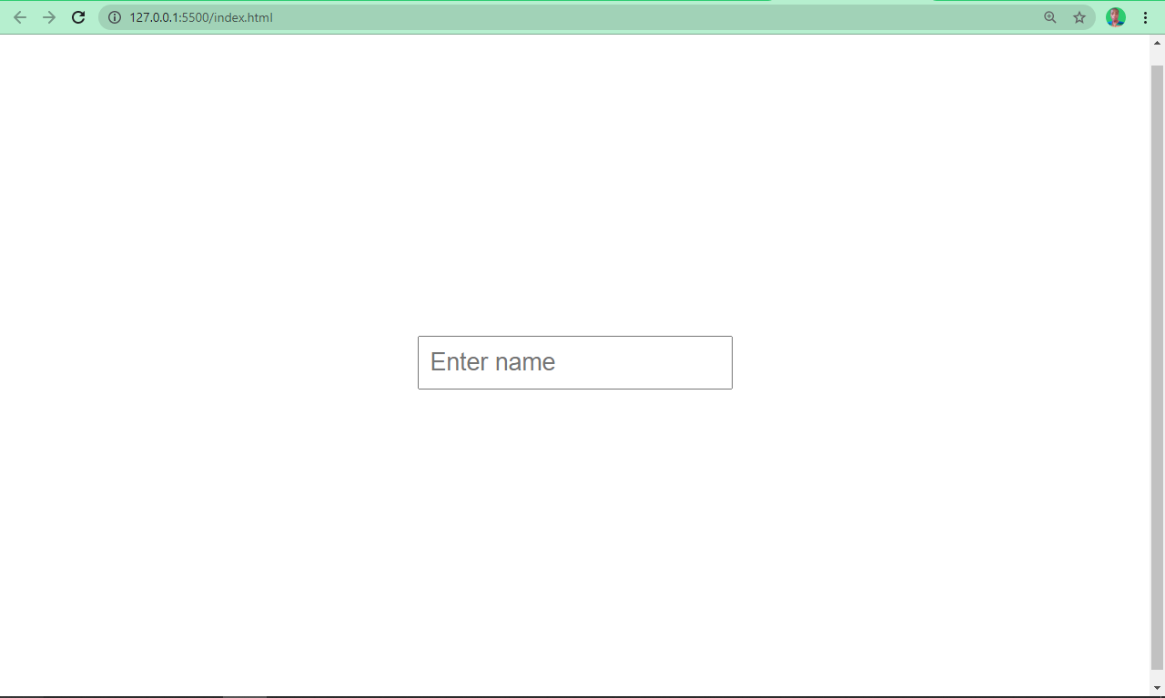
Type Text
This type of input takes a value of “text”, so it creates a single line of text input.
<input type="text" placeholder="Enter name" />
An input with the type of text looks like the screenshot below:
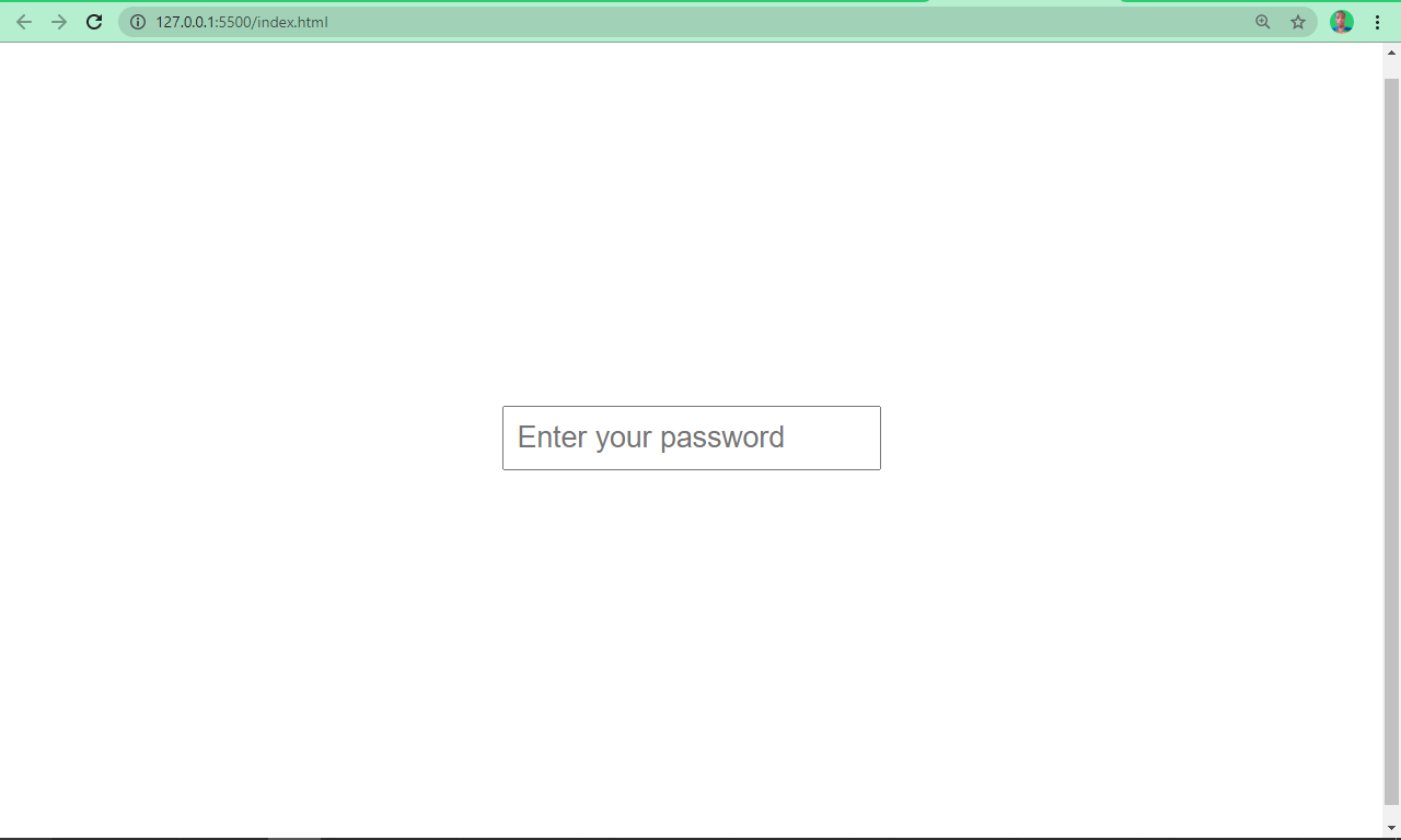
Type Password
As the name implies, an input with a type of password creates a password. It is automatically invisible to the user, unless it is manipulated by JavaScript.
<input type="password" placeholder="Enter your password" />
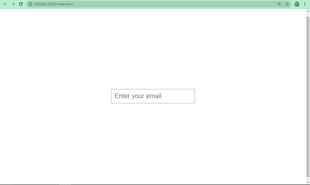
Type Email
Any input with the type of email defines a field for entering an email address.
<input type="email" placeholder="Enter your email" />
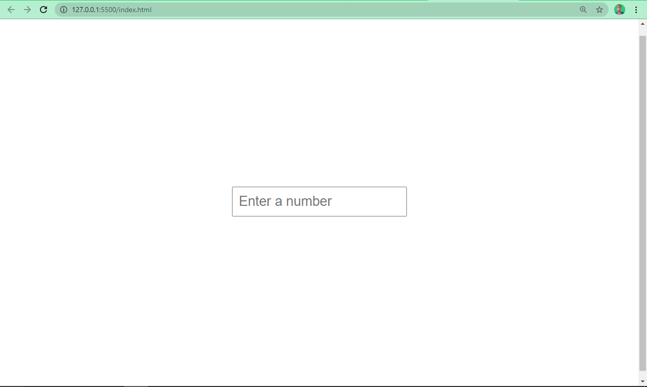
Type Number
This type of input lets the user insert numbers only.
<input type="number" placeholder="Enter a number" />
Type Radio
Sometimes, users will need to pick one out of numerous options. An input field with its type attributes set to “radio” lets you do this.
<input type="radio" />
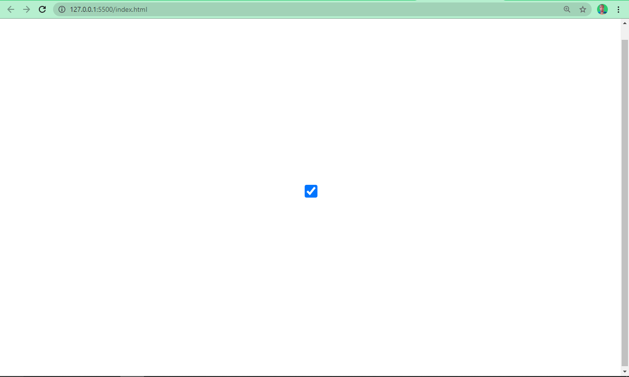
Type Checkbox
So, with an input type of radio, users will be allowed to pick one out of numerous options. What if you want them to pick as many options as possible? That’s what an input with a type attribute set to checkbox does.
<input type="checkbox" />
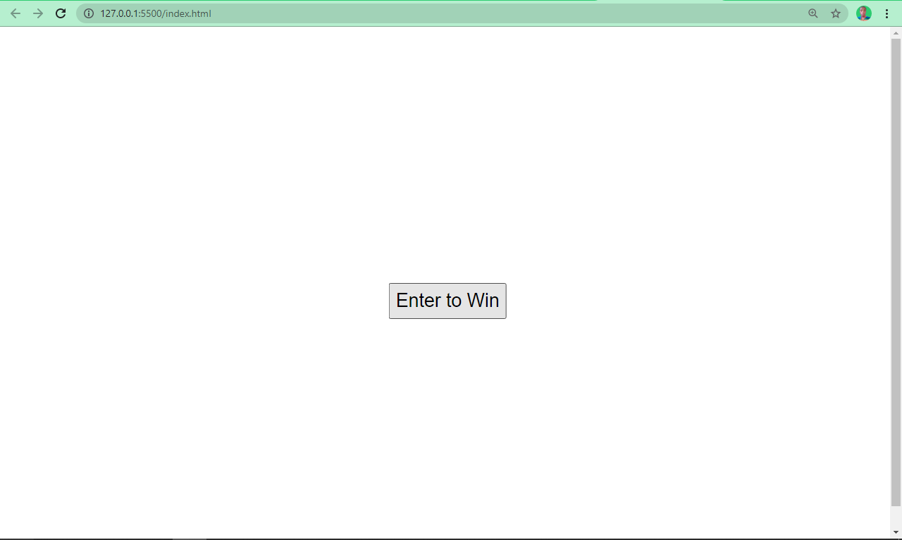
Type Submit
You use this type to add a submit button to forms. When a user clicks it, it automatically submits the form. It takes a value attribute, which defines the text that appears inside the button.
<input type="submit" value="Enter to Win" />
Type Button
An input with a type set to button creates a button, which can be manipulated by JavaScript's onClick event listener type. It creates a button just like an input type of submit, but with the exception that the value is empty by default, so it has to be specified.
<input type="button" value="Submit" />

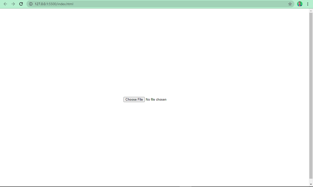
Type File
This defines a field for file submission. When a user clicks it, they are prompted to insert the desired file type, which might be an image, PDF, document file, and so on.
<input type="file" />
The result of an input type of file looks like this:
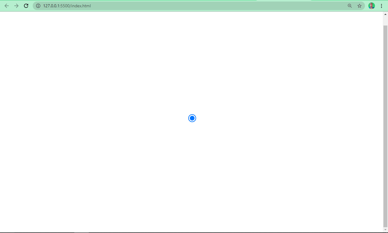
Type Color
This is a fancy input type introduced by HTML5. With it, the user can submit their favourite color for example. Black (#000000) is the default value, but can be overridden by setting the value to a desired color.
Many developers have used it as a trick to get to select different color shades available in RGB, HSL and alphanumeric formats.
<input type="color" />
This is the result of an input type of color:

Type Search
Input with the type of search defines a text field just like an input type of text. But this time it has the sole purpose of searching for info. It is different from type text in that, a cancel button appears once the user starts typing.
<input type="search" />
Type URL
When the type attribute of an input tag is set to URL, it displays a field where users can enter a URL.
<input type="url" />
Type Tel
An input type of tel lets you collect telephone numbers from users.
<input type="tel" />
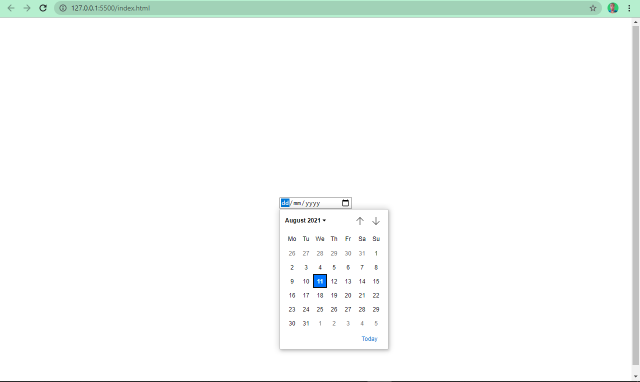
Type Date
You might have registered on a website where you requested the date of a certain event. The site probably used an input with the type value set to date to acheive this.
<input type="date" />
This is what an input with type date looks like:
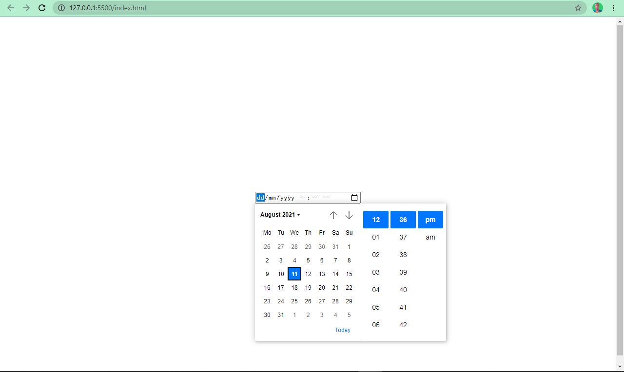
Type Datetime-local
This works like the input type date, but it also lets the user pick a date with a particular time.
<input type="datetime-local" />
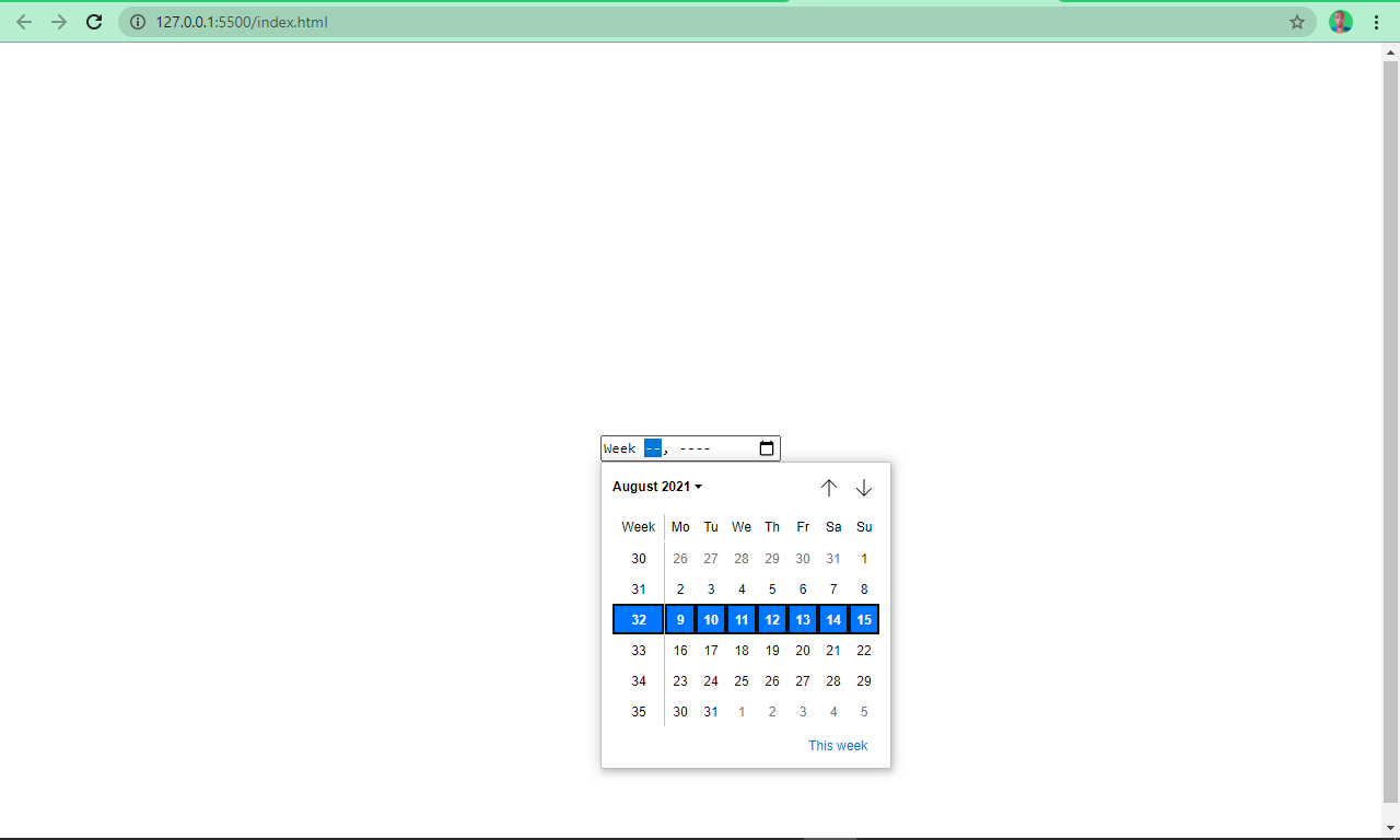
Type Week
The input type of week lets a user select a specific week.
<input type="week" />
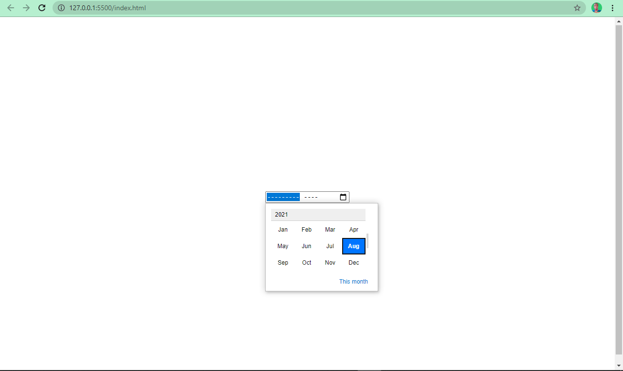
Type Month
The input with the type of month populates months for the user to pick from when clicked.
<input type="month" />
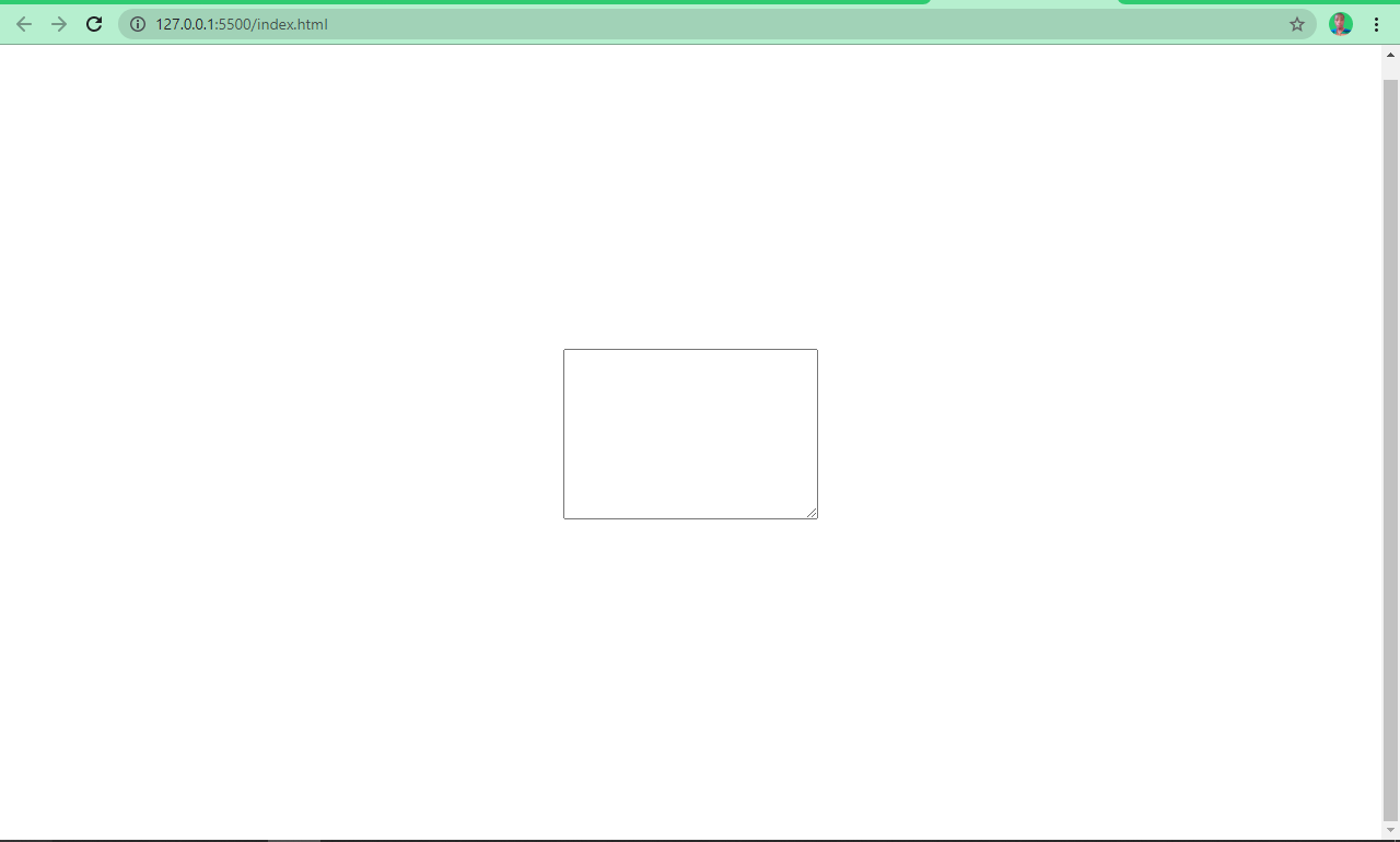
Textarea
There are times when a user will need to fill in multiple lines of text which wouldn't be suitable in an input type of text (as it specifies a one-line text field).
textarea lets the user do this as it defines multiple lines of text input. It takes its own attributes such as cols – for the number of columns, and rows for the number of rows.
<textarea cols="50" rows="20"></textarea>
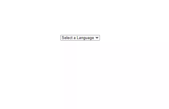
Multiple Select Box
This is like a radio button and checkbox in one package. It is embedded in the page with two elements – a select element and an option, which is always nested inside select.
By default, the user can only pick one of the options. But with multiple attributes, you can let the user select more than one of the options.
<select>
      <option value="HTML">Select a Language</option>
      <option value="HTML">HTML</option>
      <option value="CSS">CSS</option>
      <option value="JavaScript">JavaScript</option>
      <option value="React">React</option>
</select>
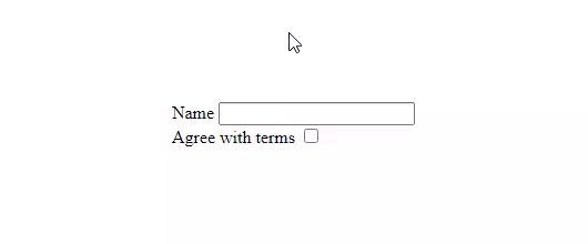
How to Label HTML Inputs
Assigning labels to form controls is important. When they're properly connected to the input field through their for attribute and the input’s id attribute, it's easier for the user to use as they can just click the label itself to access the input.
<label for="name">Name</label>
<input type="text" id="name" /> <br />
<label for="check">Agree with terms</label>
<input type="checkbox" id="check" />
How HTML Forms Work
When a user fills in a form and submits it with the submit button, the data in the form controls are sent to the server through GET or POST HTTP request methods.
So how is the server indicated? The form element takes an action attribute, which must have its value specified to the URL of the server. It also takes a method attribute, where the HTTP method it uses to convey the values to the server is specified.
This method could be GET or POST. With the GET method, the values entered by the user are visible in the URL when the data is submitted. But with POST, the values are sent in HTTP headers, so those values are not visible in the URL.
If a method attribute is not used in the form, it is automatically assumed that the user wants to use the GET method, because it’s the default.
So when should you use the GET or POST method? Use the GET method for submitting non-sensitive data or retrieving data from a server (for example, during searches). Use the POST request when submitting files or sensitive data.
Mini Project: Build a Basic Contact Form
Let’s take what we’ve learned about forms and use it to make a simple contact form. I will also introduce a few new concepts as we go to round it all out.
Here's the HTML:
<form action=example-server.com">
      <fieldset>
        <legend>Contact me</legend>
        <div class="form-control">
          <label for="name">Name</label>
          <input type="name" id="name" placeholder="Enter your name" required />
        </div>

        <div class="form-control">
          <label for="email">Email</label>
          <input
            type="email"
            id="email"
            placeholder="Enter your email"
            required
          />
        </div>

        <div class="form-control">
          <label for="message">Message</label>
          <textarea
            id="message"
            cols="30"
            rows="10"
            placeholder="Enter your message"
            required
          ></textarea>
        </div>
        <input type="submit" value="Send" class="submit-btn" />
      </fieldset>
</form>
What’s going on in this HTML code?
First, a form element is wrapping every other element. It has an action set to “example-server.com”, a dummy server where the form data will be received.
After the form element, every other element is also surrounded by a fieldset element with a legend tag right under it.
We use the fieldset element to group related inputs together, and the legend tag contains a caption conveying what the form is about.
The inputs name, email, and textarea are all in a div with a class of form-control. So they behave like a block element, in order to make styling easier with CSS.
They are also validated with the required attribute, so the form fails to submit when those fields are empty or when the user fails to type in the values in the appropriate format.
After all that, we'll have the result in the screenshot below:
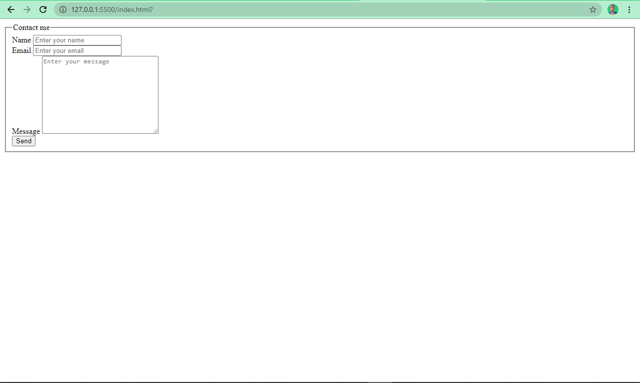
How ugly is that? We need to apply some styling!
Here's the CSS:
body {
    display: flex;
    align-items: center;
    justify-content: center;
    height: 100vh;
    font-family: cursive;
  }

 input,
    textarea {
    width: 100%;
    padding: 5px;
    outline: none;
  }

  label {
    line-height: 1.9rem;
  }

  input[type="submit"] {
   transform: translate(2.2%);
   padding: 3px;
   margin-top: 0.6rem;
   font-family: cursive;
   font-weight: bold;
  }

 fieldset {
   padding: 20px 40px;
 }
What’s the CSS code doing here?
We center everything in the body horizontally with Flexbox, and vertically with a 100% viewport height. We used a font-family of cursive.
We gave the inputs and textarea a width of 100% so they go all the way across. The labels got a minimal line-height of 1.9rem (30.4px), so they don’t stay too close to their respective inputs.
We specifically styled the button (input type button) with the transform property to push it to the center as it was off center a bit. We gave it a padding of 3px for more spacing around it. We then selected a cursive font-family for it with a weight of bold.
Because the button was too close to the textarea, we set a margin-top of 0.6rem to push it down a little bit.
We gave our fieldset element a padding of 20px at the top and bottom, with 40px at the left and right to push apart the border it creates around the form elements it is wrapped in.
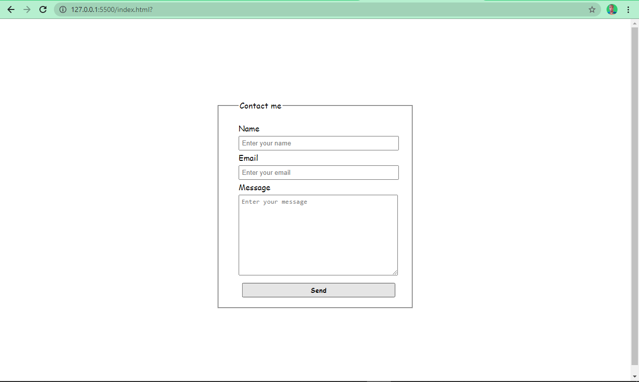
At the end of it all, we have the beautiful form below:
Conclusion
I hope this tutorial has helped you understand how forms work. Now you should have the knowledge you need to integrate forms into your websites so you can start collecting data.
Thank you for reading, and keep coding.