
You use the HTML select tag to create drop-down menus so that users can select the value they want. It is an instrumental feature in collecting data to be sent to a server.
The select tag normally goes within a form element, with the items to choose from coded within another tag, <option>. It can also be a standalone element, which would still be associated with a form with one of its special attributes, form.
In this tutorial, I will walk you through how to create a dropdown menu with the select tag so you can start using it to collect data in your coding projects. I will also touch on how to style the select tag because it is notoriously difficult to style.
Here's an Interactive Scrim about How to Make a Dropdown Menu or Combo List in HTML
Attributes of the Select Tag
Before I dive deep into whot to create a dropdown menu with the select tag, we need to discuss the attributes the select tag takes.
These are its attributes:
- name: You need to attach the name to every form control as it is used to reference the data after it's submitted to the server.
- multiple: This attribute lets the user select multiple options from the dropdown menu.
- required: This is typically used for validation. With it, the form won't submit unless a user selects at least one option from the dropdown.
- disabled: This attribute stops the user from interacting with the options.
- size: Expressed in numbers, the size attribute is used to specify how many options will be visible at a time.
- autofocus: This attribute is used on all form inputs, select inclusive, to specify that the input should be on focus when the page loads.
How to Create a Dropdown Menu with the Select Tag
To create a dropdown menu with the select tag, you firstly need a form element. This is because you will also have a submit button within it (the form element) in order to submit the data to the server.
<form action="#">
      <label for="lang">Language</label>
      <select name="languages" id="lang">
        <option value="javascript">JavaScript</option>
        <option value="php">PHP</option>
        <option value="java">Java</option>
        <option value="golang">Golang</option>
        <option value="python">Python</option>
        <option value="c#">C#</option>
        <option value="C++">C++</option>
        <option value="erlang">Erlang</option>
      </select>
      <input type="submit" value="Submit" />
</form>
I've added some simple CSS to center the dropdown and button, and give the body a light-grey background:
body {
     display: flex;
     align-items: center;
     justify-content: center;
     margin: 0 auto;
     height: 100vh;
     background-color: #f1f1f1;
   }

input {
     display: flex;
     align-items: center;
     justify-content: center;
     margin: 0 auto;
   }
To make it more elaborate and accessible, you can also attach the select box to a label element, so it gets focused when the label text is clicked. You can do that with this code:
<form action="#">
      <label for="lang">Language</label>
      <select name="languages" id="lang">
        <option value="javascript">JavaScript</option>
        <option value="php">PHP</option>
        <option value="java">Java</option>
        <option value="golang">Golang</option>
        <option value="python">Python</option>
        <option value="c#">C#</option>
        <option value="C++">C++</option>
        <option value="erlang">Erlang</option>
      </select>
      <input type="submit" value="Submit" />
</form>
I put a number symbol (#) as a the value of the action attribute so you don't get a 404 when you click on the submit button.
But now we have to make a little change in the CSS:
 body {
     display: flex;
     align-items: center;
     justify-content: center;
     margin: 0 auto;
     height: 100vh;
     background-color: #f1f1f1;
   }

input {
     display: flex;
     align-items: center;
     justify-content: center;
     margin: 0 auto;
   }

label {
     display: flex;
     align-items: center;
     justify-content: center;
     margin: 0 auto;
   }

select {
     margin-bottom: 10px;
     margin-top: 10px;
   }
In the end, this is the result:
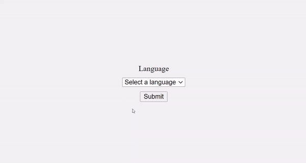
It doesn’t end there. One of the dropdown items appears by default and will be selected if the user clicks on the submit button immediately when they land on the page.
But this isn’t a good user experience. You can get rid of it by coding in “select a language” as the first item of the dropdown.
 <form action="#">
      <label for="lang">Language</label>
      <select name="languages" id="lang">
        <option value="select">Select a language</option>
        <option value="javascript">JavaScript</option>
        <option value="php">PHP</option>
        <option value="java">Java</option>
        <option value="golang">Golang</option>
        <option value="python">Python</option>
        <option value="c#">C#</option>
        <option value="C++">C++</option>
        <option value="erlang">Erlang</option>
      </select>
      <input type="submit" value="Submit" />
</form>
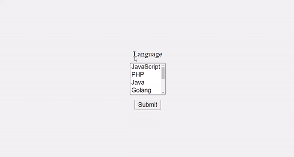
When the user clicks the select box to select an item, the dropdown is also covering the submit button – another thing that negatively affects good user experience.
You can change this with the size attribute, which will show a certain number of items by default and show a scroll for other items in the dropdown.
This also lets you get rid of the dummy first item, because some of the items will be visible to the user automatically.
 <form action="#">
      <label for="lang">Language</label>
      <select name="languages" id="lang" size="4">
        <option value="javascript">JavaScript</option>
        <option value="php">PHP</option>
        <option value="java">Java</option>
        <option value="golang">Golang</option>
        <option value="python">Python</option>
        <option value="c#">C#</option>
        <option value="C++">C++</option>
        <option value="erlang">Erlang</option>
      </select>
      <input type="submit" value="Submit" />
</form>

With the multiple attribute, you can allow the user to select multiple items from the dropdown.
 <form action="#">
      <label for="lang">Language</label>
      <select name="languages" id="lang" multiple>
        <option value="javascript">JavaScript</option>
        <option value="php">PHP</option>
        <option value="java">Java</option>
        <option value="golang">Golang</option>
        <option value="python">Python</option>
        <option value="c#">C#</option>
        <option value="C++">C++</option>
        <option value="erlang">Erlang</option>
      </select>
      <input type="submit" value="Submit" />
</form>
This makes 4 items visible by default. To select multiple items, the user has to hold down the shift or ctrl key, then select with the mouse.
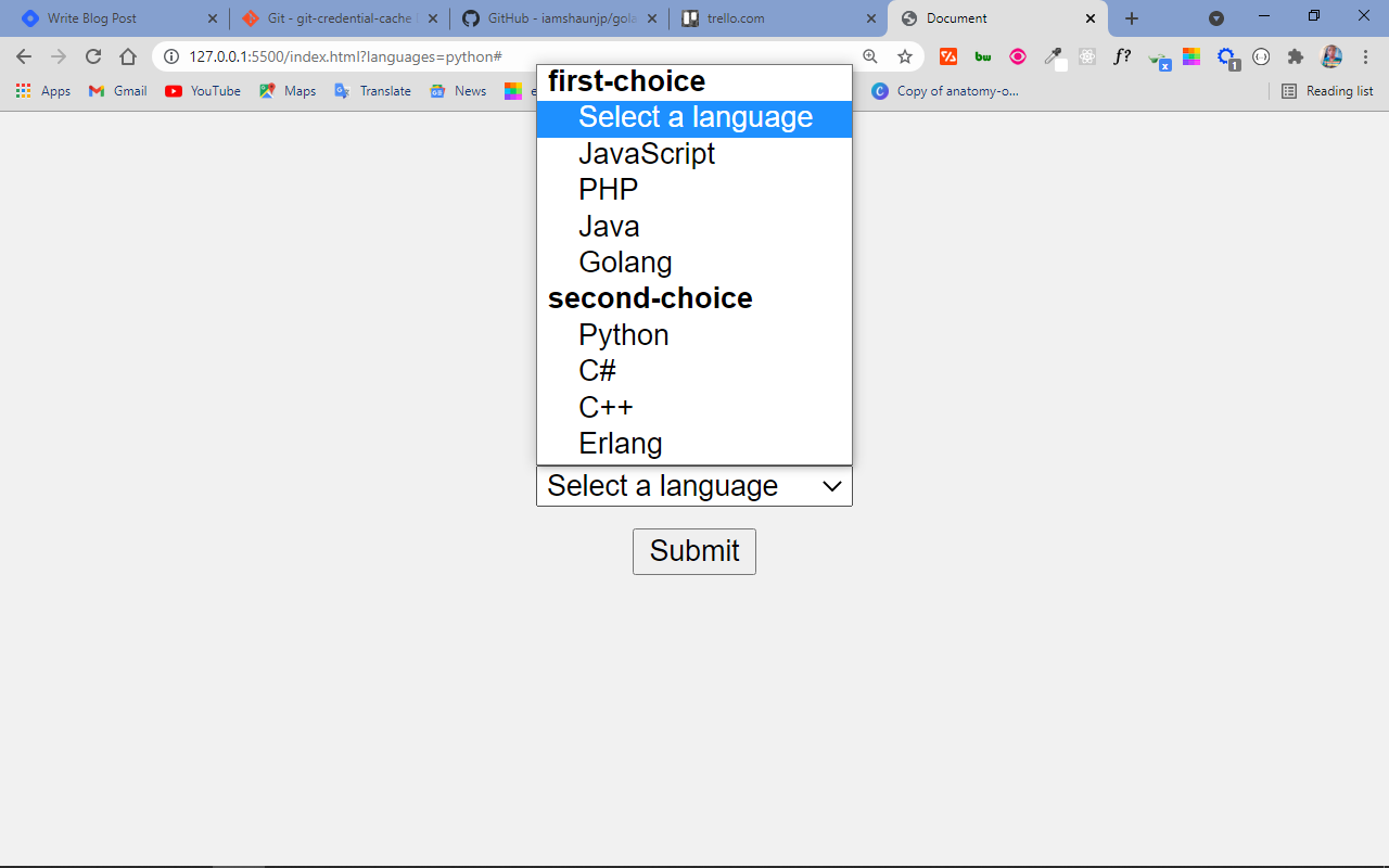
That’s not all you can do with the select and <option> tags. You can also make a multi-layer select box with the <optgroup> element inside a <select> tag.
You can convert the already made dropdown to a multi-layer select box like this:
<form action="#">
      <label for="lang">Language</label>
      <select name="languages" id="lang">
        <optgroup label="first-choice">
          <option value="select">Select a language</option>
          <option value="javascript">JavaScript</option>
          <option value="php">PHP</option>
          <option value="java">Java</option>
          <option value="golang">Golang</option>
        </optgroup>
        <optgroup label="second-choice">
          <option value="python">Python</option>
          <option value="c#">C#</option>
          <option value="C++">C++</option>
          <option value="erlang">Erlang</option>
        </optgroup>
      </select>
      <input type="submit" value="Submit" />
</form>
How to Style the Select Element
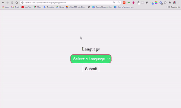
Styling the select element is often confusing and renders inconsistently within browsers. But you can always try the following:
 <form action="#">
      <label for="lang">Language</label>
      <select name="languages" id="lang">
        <option value="select">Select a Language</option>
        <option value="javascript">JavaScript</option>
        <option value="php">PHP</option>
        <option value="java">Java</option>
        <option value="golang">Golang</option>
        <option value="python">Python</option>
        <option value="c#">C#</option>
        <option value="C++">C++</option>
        <option value="erlang">Erlang</option>
      </select>
      <input type="submit" value="Submit" />
</form>
 select {
        margin-bottom: 10px;
        margin-top: 10px;
        font-family: cursive, sans-serif;
        outline: 0;
        background: #2ecc71;
        color: #fff;
        border: 1px solid crimson;
        padding: 4px;
        border-radius: 9px;
      }
In the CSS code snippet above, I gave the text in the select box the following appearance:
- a font family of cursive and a color of white,
- an outline of 0 to remove the ugly outline when it is on focus,
- a greenish background,
- a 1-pixel tick crimson-colored border,
- a border-radius of 4 pixels to get a slightly rounded border on all sides,
- and a padding of 4 pixels to space things out a little bit.
The select box now looks better:
Conclusion
The select tag is very useful when you're making dropdowns and combo lists in HTML. It is like a radio button and checkbox in one package.
Remember that with radio buttons, you only get to select one item from a list – but with a checkbox, you can select multiple items. Select is more flexible, as you can configure it to accept only a single item or multiple items.
One issue with the select tag is that it is very difficult to style. A reasonable solution is to use a CSS library that offers great utility classes to style a form along with the select element.
I hope this tutorial has made you more familiar with the select tag so you can start using it in your projects.
Thank you for reading and keep coding.