
By Adam Wattis
When developing an MVP (Minimum Viable Product), you intend to go from idea to prototype as fast as possible. The faster you can prototype your idea, the faster you are able to iterate upon it.
As you’re moving from abstract idea to working prototype, you usually don’t want to spend a lot of time creating a custom design when you should be focusing on the functionality of the application. To solve this issue, we use frameworks like Bootstrap to quickly achieve a structured layout with a UI that looks “pretty good” without too much effort.
What we really want to achieve, in terms of design, is to rapidly create a UI that is recognizable and coherent.
I’m about to show you a super fast way of going from abstract idea, to design, to working prototype with Material Design. Material Design is Google’s open source design system that they use for all their applications. This makes it recognizable because it is intuitive and easy to navigate, and most people are familiar with it already. If you haven’t already, you should definitely check out what Material design is all about.
By using the Material Design Plugin for Sketch, we’ll create our own customizable Material Design system. This will include a great set of components that will allow us to quickly create coherent designs for our prototype app. The app we’ll make is a simple reminders app.
We will use front-end framework Vue.js together with the Material Design component library Vuetify.js to realize our app designs. Lets get to it!
Creating the design system
Download this plugin for Sketch. Once installed, simply go to Plugins > Material > Open Theme Editor to see the Material Design Theme Editor. Click “Create New Theme”, and we choose to begin with the Baseline theme.
We are now presented with our Material Design system of Sketch components.
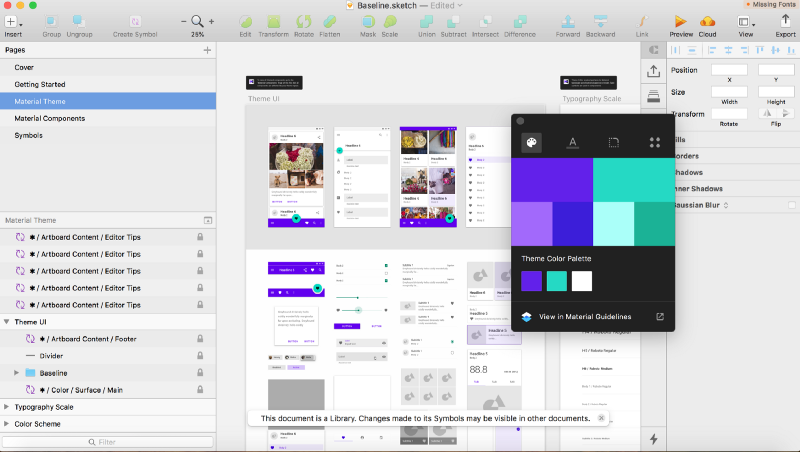
In the Theme Editor, you may change the primary and secondary color, change the font, change the shape of elements’ corners, and include custom icons. For this example, we will change none of these and just stick with the defaults.
We have now created our design system. As you can see, it says that the document is a library. This means that any changes you make to this Sketch file will affect your mock-ups and update all your designs with those changes. How great is that?
Before we continue, we will also install the Sketch Material plugin, which will add some modules that we’ll soon use.
Mock-ups
Let’s start by opening a new Sketch document then creating a new iPhone artboard and saving it as MaterialReminders.sketch. This is where we’ll create our designs for our application. But first, lets explore the rich component library that is at our disposal.
Under Insert > Symbols you should see the component library we just created.
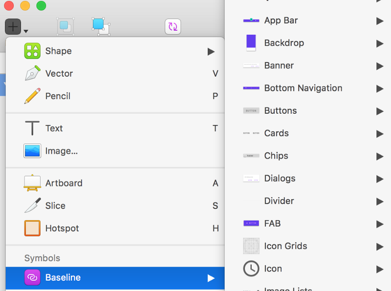
Just so many components! We can now begin to create our designs. But first we must break down what functionality we want this reminders app to have. We’re keeping it simple and only adding the ability to:
- Add a new reminder
- Delete a reminder
- Check off a reminder from your todo list
- Uncheck a reminder from your completed list
Fantastic, let’s speed things up and begin dropping some components into our first iPhone artboard.
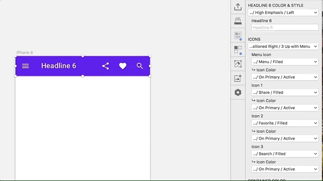
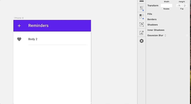
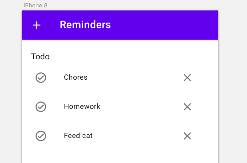
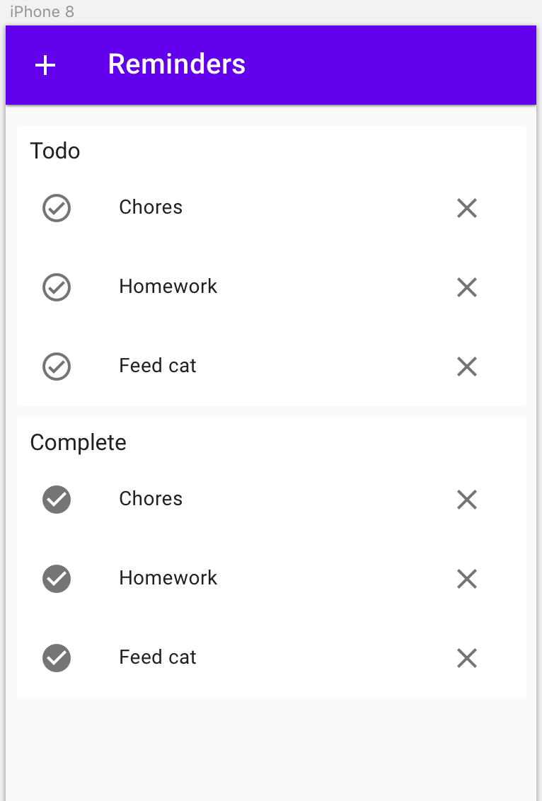
We start with a top navbar. Drop it in and place it then size it to fit the screen. We’ll have to change the first icon to an “Icon / Add / Filled” for the Menu Icon and change icon color to white. Then change all the other icons to none, since we wont be needing them. We also change the headline to Reminders.
We’ll now start dropping in some dummy reminders. We’ll create our reminders like a list, so let’s find a suitable component. We’ll use “List / Single Line / Indent / Body 2”.
Now we will center the list object, take away the bottom divider, set the text to “Chores”, and lastly change the icon to “Icon / Checked Circle / Outlined”.
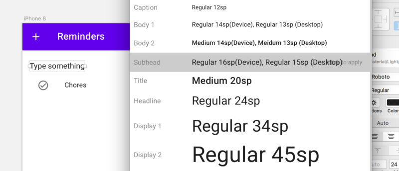
Add a title by inserting a text field, then using the Plugins > Sketch Material > Typography module to change the style to Subhead.
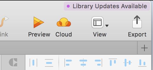
It’s beginning to look pretty good so far! But we are now faced with a problem. We want to also include list controls to the right in each list object, because we want to add a delete button there. But the devs over at Google did not include any override for that in the Sketch component. No worries though, we’ll fix this by going into our library file and adding our icon to the symbol, thus updating it throughout our project.
Go to the library and find the list component we used in the Material Components page. Then, double click it to go to its symbol. Click the icon to the left so that it is in focus, then copy paste and move it over to the right. Done deal.
When we switch back over to our project, we can now see that in the the top right corner it says “Library Updates Available”.
Now we should be able to change the right hand icon to “Icon / Close / Filled” which will be the button to remove a reminder completely from the list.
To create a list of reminders, we simply copy paste a bunch more list objects, change their text, then change the title that we added to Todo.
Then we copy paste that entire list to create the Completed list. On this new list, you must change the title to “Completed”, then change all the icons to the left to be filled instead of outlined.
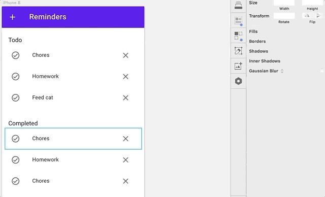
Were almost done with our mock-ups. To speed things along, I just changed our artboard color to #FAFAFA and added a “Shadow / 00dp” behind each of my lists.
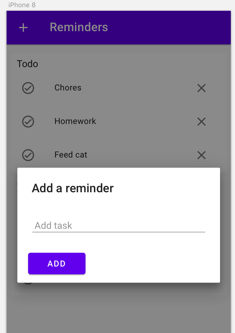
This mock-up view is now complete. The next one we need to create is the dialogue that appears when you press the add button.
We begin by copy pasting the artboard we’ve been working on to create an exact copy. Then, we use the Dialogue and Form modules under “Plugins / Sketch Material” to create a dialogue and a form separately. These are then combined and a opaque box is placed behind. I switched out the transparent action button in the dialogue to a primary colored button.
We are now done with Sketch. Of course, we could add more features and expand our mock-ups even more, but we will keep it simple for now. The next step is to write the code that will become our app!
Vue with Vuetify
Now to the fun part — coding. We will be using Vue.js which is a front-end UI library written in JavaScript. It’s really easy to learn, and checking out their website would be a first step. To implement Material Design, we’ll use the Vuetify.js component library which includes a bunch of Vue components along with a grid system to easily organize your layout.
We start by simply copy pasting the example markup that’s on the Vuetify starter page. Let’s look at what this does for us.
When looking at HTML, start from the outside and work you way inwards.
We have our <head> and <body></body> tags.Inside the <head></head> tag we have <link> tags that` will pull in the required vuetify.min.css file and Google Fonts.
In the <body></body>; we have a
components, for example <v-app></v-app> and , which are signified by the “v-” in their names.
Further down you have two <script><;/script> tags that import the Vue.js and Vuetify.js modules into our page.
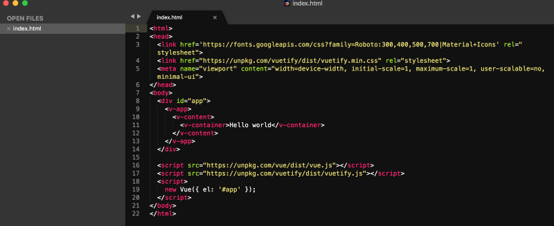
Lastly, after the import statements, there is a third <script><;/script> tag which creates a new Vue() instance. This is where we will write all our JavaScript code.
We can see that the instance is hooking into ‘#app’ which is the ID of the <div> tag in our HTML. This lets our Vue instance know where to inject our UI.
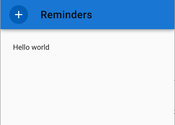
Inside of the <v-content></v-content> tag we will soon place all our Vuetify components. But first we will save what we have for now as index.html, and then open the file in our browser, where we should be presented with “Hello world”.
We continue by looking up what HTML we need for the top navbar component in the Vuetify documentation. The tag we’re looking for is <v-toolbar app></v-toolbar> . We’ll also have to add a <;v-btn> inside this navbar so that we can press it to display the dialogue to add new reminders.
In this button we’ll also add a @click= event which will set addModal to true which will bring up the dialogue modal. We add this in between the <v-content></v-content> tags:
<v-toolbar app color="primary"> <v-btn color="primary darken-1" icon @click="addModal = true"> <v-icon>add</v-icon> </v-btn> <v-toolbar-title> Reminders </v-toolbar-title></v-toolbar>
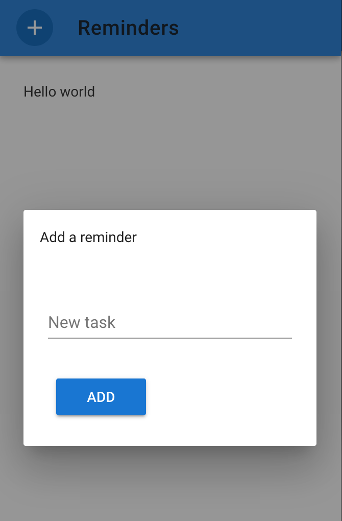
Next, we must add the HTML for the dialogue. This will live right after the <v-toolbar-title></v-toolbar-title> tag, but still inside the <v-toolbar> tag. Here is the dialogue:
<v-dialog v-model='addModal'> <v-card> <v-card-title>Add a reminder</v-card-title> <v-card-text> <v-container grid-list-md> <v-layout wrap> <v-flex md12> <v-text-field v-model="newTask" label="New task"></v-text-field> </v-flex> <v-flex md12> <v-btn color="primary" @click="add">Add</v-btn> </v-flex> </v-layout> </v-container> </v-card-text> </v-card></v-dialog>
Here we add a <v-card-title> with “Add a reminder” as a title. Then we use the Vuetify grid system to create a list that spans all 12 columns. We add a <v-text-field> that binds to 'newTask' and has a lable that says “New task”. There will also be a button that, through the @click= event, triggers the 'add' function that we’ll write in just a second.
After saving the changes to your document, you should end up with something like this when you refresh your index.html page in your browser:
Don’t worry that the dialogue does not yet work — we must first add the functionality for it inside our Vue() instance. We do this by adding the following to our instance right after the el: '#app' but separated by a comma:
el: '#app',data: { addModal: false, newTask: ''}
The data object is where we will store our application state. With this tweak, our dialogue should now work. Save and refresh the page.
Now whenever you click to open your dialogue modal, the internal state in data: {} is set to addModal: true, which then displays the modal. Similarly, whenever you write a message in the dialogue’s text input, it will be saved in newTask since the <v-text-field></v-text-field> is bound to it through v-model=.
We’ll now add the code for the add function that will save whatever is inside newTask to our soon-to-be list of reminders. This function must be located inside the methods object, which we’ll add after our data: {}, object in the Vue instance.
The function will look like this:
add() { if (this.newTask !== '') { this.tasks.unshift({text: this.newTask, completed: false}) this.addModal = false this.newTask = '' }}
After enclosing the function inside the method: {} object, the code should now look like this:
new Vue({ el: '#app', data: { addModal: false, newTask: '', }, methods: { add() { if (this.newTask !== '') { this.tasks.unshift({text: this.newTask, completed: false}) this.addModal = false this.newTask = '' } } }});
When the add() function fires, it will add our task from newTask to our not-yet created tasks list unless it’s empty. It will then close the dialogue by setting this.addModal = false and set the newTask to empty again.
Let’s create our task list so that we can begin entering some reminders. Inside the data object, place this code:
tasks: [ // Some dummy data { text: 'Chores', completed: false }, { text: 'More chores', completed: false }]
These will be our dummy reminders. As you can see, we have a completed key that is set to either true or false so that we can differentiate between the tasks that are completed and those which are not. This also means that we can’t simply display our tasks list as it is in our UI, because then we would be displaying completed and non-completed tasks together.
The way we’ll solve this is with computed properties. They work by constantly watching for changes in your application and returning a computed value based on the changes.
We need two computed properties: one for the todo list and one for the done list that will each separate incomplete and completed tasks. We add computed: {} after our methods: {}, and drop in todo: function() {} and done: function() {} computed properties. The todo function will return this.tasks.filter(function(task) {return !task.completed}) and the done function will return the opposite by removing the ! (which means “not”) in front of task.completed . The code should look like this:
computed: { done: function() { return this.tasks.filter(function(task) {return task.completed}) }, todo: function() { return this.tasks.filter(function(task) {return !task.completed}) }}
We’re now ready to render our two lists in our UI. This is going to be quite a bit of markup, but don’t worry, we’ll walk through it together. We’re going to replace <v-container>Hello world</v-container> by selecting it and then pasting in the following in its place:
<v-container grid-list-md> <v-layout row wrap> <v-flex xs12> <v-list> <v-subheader>Tasks to do</v-subheader> <v-list-tile v-for="task in todo"> <v-list-tile-action> <v-btn icon ripple @click="complete(task)"> <v-icon v-if="task.completed">check_circle</v-icon> <v-icon v-else>check_circle_outline</v-icon> </v-btn> </v-list-tile-action> <v-list-tile-title> {{task.text}} </v-list-tile-title> <v-list-tile-action> <v-btn icon ripple @click="remove(task)"> <v-icon color="grey lighten-1">cancel</v-icon> </v-btn> </v-list-tile-action> </v-list-tile> </v-list> </v-flex> <v-flex xs12> <;v-list> <v-subheader>Completed tasks</v-subheader> <v-list-tile v-for="task in done"> <v-list-tile-action> <v-btn icon ripple @click="complete(task)"> <v-icon v-if="task.completed">check_circle</v-icon> <v-icon v-else>check_circle_outline</v-icon> </v-btn> </v-list-tile-action> <v-list-tile-title> {{task.text}} </v-list-tile-title> <v-list-tile-action> <v-btn icon ripple @click="remove(task)"> <v-icon color="grey lighten-1">cancel</v-icon> </v-btn> </v-list-tile-action> </v-list-tile> </v-list> </v-flex> </v-layout></v-container>
To begin with, we add grid-list-md to our container. Then we add <v-layout row wrap></v-layout> and <v-flex xs12> and add our two <v-list> tag`s with a in each. This creates our basic layout in form of two lists.
Then, we will add <v-list-tile v-for="task in todo"></v-list-tile>; where the v-for= statement iterates through each task in our computed todo property. Same thing goes for the done property. As we iterate through each list we will render each list item. Each item will display the task.text and will have two buttons: one for triggering the complete() function and one to trigger the remove() function.
Let’s continue by writing these inside of our method object.
complete(task) { task.completed ? task.completed = false : task.completed = true},remove(task) { this.tasks = this.tasks.filter(function(x){return x !== task})},
The complete function body contains a ternary operator which will toggle the complete button on each reminder. Whenever task.completed is set to true on a reminder, the entire UI will update and move this reminder to the “Completed” list.
You should now have a real working prototype of our reminder application!
Final thoughts
In this article, I was not trying to show how to specifically build a useless reminders app with limited functionality (although that is exactly what I did). Rather, that you can use these tools that I have presented to you to very rapidly build a collection of mock-ups and then, with minimal setup, create a real, working prototype from these designs.
With this in place you can now tweak your component library, build out your designs, and then quickly implement them in code as you go along.
You can find the finished Sketch file and code here. I also strongly recommend diving deeper into the tools I’ve talked about to fully realize their potential.
Hope you enjoyed this article and that you find it useful. Comment if you have any questions or let me know what you thought of it.