

SEE is a beautiful Apple TV series that depicts a dystopia where humans have lost their sight. Hundreds of years later, it was considered a myth that people could ever see.
Jason Momoa is one of the leads and plays Baba Voss, an elite warrior. Jason's wife gives birth to sighted twins, and years after, during battle, Baba Voss sometimes needs the aid of the sighted children. They helped him understand the terrain better, even with his battlefield mastery. We could say his children helped him visualize things.
In ancient times, before digital devices, data visualization was also a myth. Earlier humans understood the need for visualization, so they had resources like maps, hieroglyphs, rock art, and so on. Eyewitnesses typically draw their paths and other relevant information on stones, wood, or scrolls.
Like Baba Voss's kids, these resources make it easier for humans to have a visual perspective on things or environments.
So what does visualization actually mean in this context? We can define visualization as "any technique for creating images, diagrams, or animations to communicate a message." (source)
In this article, we'll explore what data visualization is and how you can use the data visualization tool Matplotlib to explore and analyze data. You'll learn how to use it to create charts that help business owners and stakeholders get more insight about data and make informed decisions.
What is Data Visualization?
Data visualization refers to the integration of data and visual elements like images, charts, diagrams, and so on to communicate messages to different stakeholders.
These stakeholders can be users, team members, managers, or top executive members of an organization.
Data in this context refers to different input gathered from the organization database or gotten from external sources, like public databases or private organizations, that have given access through their APIs.
We'll work with an employee layoff dataset which contains details of employees that have been laid off in different industries from 2020 to 2022. The columns in the dataset include the names of companies, locations, industries, total laid off, percentage laid off, date, countries, and other relevant columns.
Below is a snapshot of the data frame:

What is Matplotlib?
Matplotlib is a popular Python library for displaying data and creating static, animated, and interactive plots. This program lets you draw appealing and informative graphics like line plots, scatter plots, histograms, and bar charts.
Matplotlib is highly customizable and flexible, which makes it a preferred choice for data analysts and scientists working in fields such as finance, science, engineering, and social sciences.
In this article, I'll show you how to create a bar chart, a pie chart, and a line plot to explain how you can do data visualization using Matplotlib.
The first thing you need is to import the Matplotlib and other relevant libraries like Pandas, Numpy and their sub modules.
#Imports packages
import pandas as pd
import matplotlib.pyplot as plt
import numpy as np
import matplotlib.dates as mdates
from matplotlib.ticker import MaxNLocator
In the code above, we import the Pandas package, which analyzes and manipulates our data. We imported Matplotlib and we'll use the Pyplot module for data visualization.
We'll use the Numpy package imported in the third line for numerical computations. We'll also work with the date module for date manipulations when plotting our chart. The last module is the ticker module, which sets ticks on plot axes. With these modules, you can analyze, manipulate, compute, and visualize your data.
How to Create a Bar Chart
Bar charts help you with categorical values. That is, if you want to compare different entities on quantity, a bar chart is an excellent way to visualize it. In the layoff dataset, we'll compare different companies that laid off employees according to the number of staff laid off.
plt.figure(figsize= (8, 6))
industry_val = df_layoffs.groupby('company')['total_laid_off'].sum().sort_values(ascending = False).head(10)
industry_val.plot(label="", kind='bar')
plt.show()
The code above is one way to create a bar chart. It shows the top 10 companies with the highest number of layoffs.
We first set the size of the graph to 8 inches by 6 inches. Then, we group our data in the dataframe by the sum total of employees laid off by each company. We then sort in descending order and select the top 10 with the highest layoffs. Finally, we create our bar chart using the selected data. The last line (plt.show()) displays the graph which is shown below.
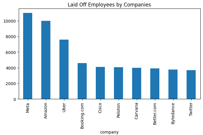
From the chart above, you will notice that Meta and Amazon had the highest number of laid off staff while Twitter had the fewest layoffs.
How to Create a Pie Chart
A pie chart represents a whole sector, with each portion allocated according to its size to a sub-sector. The industry column will be a perfect fit for using pie chart. We'll see which industry had most and fewest layoffs.
# Group the data by industry and sum the total laid off employees
industry_val = df_layoffs.groupby('industry')['total_laid_off'].sum().sort_values(ascending=False).head()

# create the pie chart and display the labels and values inside the pie
plt.figure(figsize=(8, 6))
plt.pie(industry_val, labels=industry_val.index, autopct='%1.1f%%')
plt.title('Laid Off Employees by Industry')
plt.show()
First, the code groups the data by industry and sums up the total number of laid-off employees for each industry. It then sorts the industries in descending order based on the total number of laid-off employees and selects the top values using the head() function.
Next, we create a pie chart to visualize the data. The size of each slice in the pie represents the proportion of laid-off employees in that industry. The pie chart labels show the names of the industries. The percentage values inside the slices show the proportion of laid-off employees in that industry. The chart is titled "Laid Off Employees by Industry."
Finally, the pie chart is displayed using the plt.show() function. Like we did in the bar chart, the plt.figure(figsize=(8, 6)) function sets the chart size to be 8 inches wide and 6 inches tall.

The chart above shows the proportion of layoffs across different industries. The transportation sector and consumer sector are the industry mostly affected followed by retail, finance and food industry.
How to Create a Line chart
Line charts show changes over time for an entity. With our dataset, a line chart could be used to show the trend of layoffs over the past year or two. This depends on what you are trying to communicate, but we'll work with a one year analysis.
# convert date column to datetime object
df_layoffs['date'] = pd.to_datetime(df_layoffs['date'])

# select data for one-year duration starting from January 1st, 2022
start_date = pd.Timestamp('2022-01-01')
end_date = start_date + pd.DateOffset(years=1)
df_one_year = df_layoffs.loc[(df_layoffs['date'] >= start_date) & (df_layoffs['date'] < end_date)]

# plot the selected data
df_date = df_one_year.groupby('date')['total_laid_off'].sum()
plt.figure(figsize=(10, 4))
plt.plot(df_date.index, df_date.values)
plt.xlabel('Date')
plt.ylabel('Total Laid Off')
plt.title('Laid Off Trend for 2022')
plt.xticks(rotation=45)
# set the format of the x-axis labels to show Month-Year
date_fmt = mdates.DateFormatter('%b-%Y')
plt.gca().xaxis.set_major_formatter(date_fmt)

# Use MaxNLocator to reduce the number of xticks
locator = MaxNLocator(nbins=10)
plt.gca().xaxis.set_major_locator(locator)

plt.show()
In comparison to the bar charts and pie charts, this code is much more challenging. But here is an explanation:
The first line of the code converts the 'date' column of the DataFrame (df_layoffs) into a DateTime object so that the dates can be handled easily.
# convert date column to datetime object
df_layoffs['date'] = pd.to_datetime(df_layoffs['date'])
Next, we select the data for a one-year duration starting on January 1st, 2022. The start date is defined as a Timestamp object, and the end date is set as one year from the start date using the pd.DateOffset function. The loc function is then used to filter the DataFrame rows, selecting only those that fall within this one-year duration. Remember we are working with a year's data.
# select data for one-year duration starting from January 1st, 2022
start_date = pd.Timestamp('2022-01-01')
end_date = start_date + pd.DateOffset(years=1)
df_one_year = df_layoffs.loc[(df_layoffs['date'] >= start_date) & (df_layoffs['date'] < end_date)]
After that, we group the selected data by date and calculate the total number of layoffs on each date using the groupby and sum functions. This is stored in a new DataFrame called df_date.
# plot the selected data
df_date = df_one_year.groupby('date')['total_laid_off'].sum()
Then, we create a plot of the laid off trend for 2022 using the matplotlib library. The plot size is set to (10, 4) using the figure function.
plt.figure(figsize=(10, 4))
The x-axis represents the date, and the y-axis represents the total number of layoffs. The xlabel function labels the x-axis as 'Date,' and the ylabel function labels the y-axis as 'Total Laid Off.'
plt.plot(df_date.index, df_date.values)
plt.xlabel('Date')
plt.ylabel('Total Laid Off')
The plot title is set to 'Laid Off Trend for 2022' using the title function.
plt.title('Laid Off Trend for 2022')
The x-axis labels are rotated by 45 degrees using the xticks function to avoid overcrowding.
plt.xticks(rotation=45)
The format of the x-axis labels is set to show the Month-Year format using the DateFormatter function.
# set the format of the x-axis labels to show Month-Year
date_fmt = mdates.DateFormatter('%b-%Y')
plt.gca().xaxis.set_major_formatter(date_fmt)
Finally, the number of xticks on the plot is reduced using the MaxNLocator function, which reduces the number of xticks to 10.
# Use MaxNLocator to reduce the number of xticks
locator = MaxNLocator(nbins=10)
plt.gca().xaxis.set_major_locator(locator)
The plot is then displayed using the show function.
plt.show()
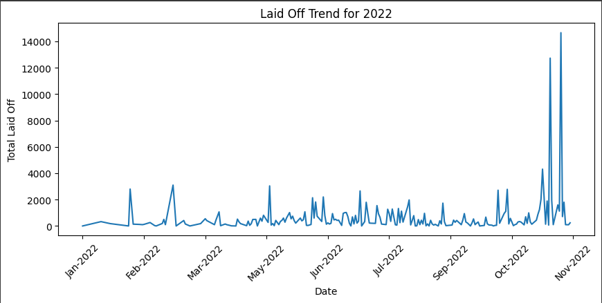
The chart above shows layoff trends and patterns for 2022.
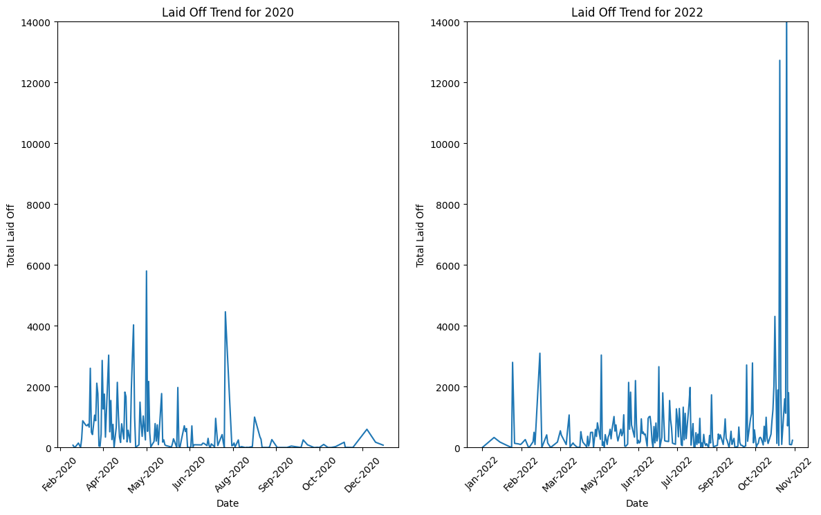
You can also analyze how well an entity performed over different periods of time. The second chart shows an analysis of employee layoffs in 2020 versus 2022.
import pandas as pd
import matplotlib.pyplot as plt
import matplotlib.dates as mdates
from matplotlib.ticker import MaxNLocator

# convert date column to datetime object
df_layoffs['date'] = pd.to_datetime(df_layoffs['date'])

# filter data to only include 2020 and 2022
df_filtered = df_layoffs[(df_layoffs['date'].dt.year == 2020) | (df_layoffs['date'].dt.year == 2022)]

# group data by year and calculate total layoffs
df_filtered['year'] = df_filtered['date'].dt.year
df_yearly = df_filtered.groupby(['year', 'date'])['total_laid_off'].sum().reset_index()

# create subplots and plot the data for each year in separate charts
fig, axs = plt.subplots(ncols=2, figsize=(14, 8))
for i, year in enumerate(df_yearly['year'].unique()):
    df_year = df_yearly.loc[df_yearly['year'] == year]
    axs[i].plot(df_year['date'], df_year['total_laid_off'])
    axs[i].set_xlabel('Date')
    axs[i].set_ylabel('Total Laid Off')
    axs[i].set_title(f'Laid Off Trend for {year}')
    axs[i].xaxis.set_major_formatter(mdates.DateFormatter('%b-%Y'))
    axs[i].tick_params(axis='x', rotation=45)
    locator = MaxNLocator(nbins=10)
    axs[i].xaxis.set_major_locator(locator)

# set y-axis limit to 0-14000 for each subplot
for ax in axs:
    ax.set_ylim([0, 14000])

plt.show()
Let's review the different components of the code above.
The 'date' column in the DataFrame is converted to a datetime object.
# convert date column to datetime object
df_layoffs['date'] = pd.to_datetime(df_layoffs['date'])
Next, the code filters the data to only include layoffs from the years 2020 and 2022. It then groups the filtered data by year and date and calculates the total number of layoffs for each date.
# filter data to only include 2020 and 2022
df_filtered = df_layoffs[(df_layoffs['date'].dt.year == 2020) | (df_layoffs['date'].dt.year == 2022)]

# group data by year and calculate total layoffs
df_filtered['year'] = df_filtered['date'].dt.year
df_yearly = df_filtered.groupby(['year', 'date'])['total_laid_off'].sum().reset_index()
We then create two subplots and plot the total number of layoffs for each year in separate charts. We set the x-axis labels to the date format of 'MMM-YYYY' (for example, Jan-2022) and rotate them by 45 degrees. We also set the y-axis label to 'Total Laid Off' and the chart title to 'Laid Off Trend for {year}' (for example, Laid Off Trend for 2020). Finally, we show the charts using the plt.show() command.
# create subplots and plot the data for each year in separate charts
fig, axs = plt.subplots(ncols=2, figsize=(14, 8))
for i, year in enumerate(df_yearly['year'].unique()):
    df_year = df_yearly.loc[df_yearly['year'] == year]
    axs[i].plot(df_year['date'], df_year['total_laid_off'])
    axs[i].set_xlabel('Date')
    axs[i].set_ylabel('Total Laid Off')
    axs[i].set_title(f'Laid Off Trend for {year}')
    axs[i].xaxis.set_major_formatter(mdates.DateFormatter('%b-%Y'))
    axs[i].tick_params(axis='x', rotation=45)
    locator = MaxNLocator(nbins=10)
    axs[i].xaxis.set_major_locator(locator)

plt.show()
Overall, the code is used to filter, group, and visualize data related to company layoffs specifically focusing on trends for 2020 and 2022. You can see the result in the chart below:
Conclusion
We started by discussing what visualization is and how data visualization is significant in transforming raw numbers into insight and business sense.
Then we used the popular Python library Matplotlib, which is a tool for data visualization, to create bar charts, pie charts, and line charts. There are also other use cases not covered in this article, like histograms, scatter plots, box plots, and so on.
By using these visualizations, we can make sense of our data and take actions that wouldn't be possible by looking at raw numbers. Data visualization can help us achieve better outcomes in other areas such as finance, science, engineering, etc. For further study, you can check the official matplotlib documentation here.
Thank you for reading! Please follow me on LinkedIn where I also post more data related content.