By Adam Naor
The KISS principle (or Keep It Simple, Stupid) states that most systems work best if they are kept simple rather than made overly complicated.
When building a product, designing a website, creating an app, or engineering a block of code, strive for simplicity.
Having built and launched products, I have witnessed firsthand when good ideas are made irrelevant because of product complexity and the ensuing product debt that follows.
I have also seen how complex standards have been refined so that the design is left simpler and stronger as a result.
There are few commercial, intellectual, or technical reasons to make things complicated when simplicity can help you design, launch, scale, and learn faster.
I want to use examples from my time as a builder and entrepreneur to share my perspectives with you.
By sharing these lessons, I hope that you can best leverage the KISS principle in your work.
In the summer of 2014, I started a bootcamp exercise class called “Fun Social Exercise”. How this class came about and my role in developing it into a small side business underscores my love of coaching and building.
It also shows that KISS can apply to many domains in our lives – not just building technical products.
KISS In Practice
First, the backstory.
While living in Australia I joined an exercise cross-training class to maintain my fitness. As time progressed, the founder of the fitness program asked me to assist him in instructing the workouts.
The class, though popular, had design problems.
For example, it was impractical to coach over 70 people at the same time. And I suggested that we expand our class offerings to additional weekday evenings.
When my idea was rejected, I was faced with a dilemma. Should I continue coaching in an inefficient and less effective manner, or take a chance, and start my own fitness course?
I decided to take the chance.
KISS and Customers: Working Backwards
A key tenet of KISS is that you must obsess over the customer and make decisions that benefit these stakeholders.
By working backwards from what customers need and want, one can simplify and remove policies, software layers, work-flows, or even iconography that are incongruent with earning customer trust.
The first several classes of my new venture were poorly attended, and my decision to start my own bootcamp looked like a failed gamble.
But I stuck with it and stripped away all “the noise”. Gone were superfluous drills, a laborious check-in system for attendees, and fancy equipment. Gone too were the revolving locations for classes (which often confused new members) and guest trainers.
I simplified my marketing Call To Action (Join a Class, Free Today) and started coaching the sessions myself.
I built a strategy to grow and retain clients:
- I leveraged Meetup.com, Facebook groups, and Reddit sub-communities to target young professionals.
- I integrated Google Maps into the website to help people locate the class and find it easily.
- I eventually hired certified trainers in order to brand my bootcamp as “professional.”
These modifications led to the growth of my budding class.
After each class I would speak with a few participants to better understand what they wanted from future classes and how I could improve.
Anything but the bare essentials was removed.
Coaching group exercise classes is an activity I enjoyed because it is mentally challenging, physically taxing, and inherently social. Every class needed an organized action plan that was communicated clearly.
At each class, I had to come prepared to motivate each attendee, maintain everyone’s attention over a grueling hour, and most of all, inspire others to keep challenging themselves.
Coaching turned out to be a terrific platform for understanding KISS firsthand. One might think people join a fitness class to lose weight or to meet people.
If you dig deeper, however, you'll find another reason: in reality, people join a social fitness class because it gives them a sense of purpose.
Through this realization, I was able to better tailor the class to ensure the right outcomes. By stripping away “nice but not necessary” attributes, I could better deliver what participants valued and mitigate abstractions.
KISS And Good Design
In the world of software and technology, KISS is integral to good design.
Part of the reason is that technology isn't always well-understood by the general public. And for any given product type, users might have dozens of similar options to choose from.
Consider this rundown on ways to save money on internet safety tools and products. The fact that it lists 55 separate ways to accomplish those aims is a testament to a crowded market with so many options that users can't make sense of them all without expert help.
And in a market like that, if you can deliver the goods in a straightforward way – you're going to find easier success.
So, before writing one line of code, know your technical North Star. The concept of building an MVP (Minimal Viable Product) is aligned with KISS because you want to do the least amount of work in order to confirm or disprove your hypothesis.
KISS is so important to principles of design that Amazon lists it as a core leadership principle. Specifically, Amazon states that “leaders expect and require innovation and invention from their teams and always find ways to simplify.”
Wireframe religiously. Deploy universally understood concepts. Avoid distractions.
Another benefit of KISS is deeply understanding why something is occurring. If you don’t embody a principle of simplicity in your design, you will likely suffer from product conflation.
When I founded Pennybox, for example, I wanted parents to use the software to teach their children how to earn and save money at home.
But too few parents were adding their kids to the app. Why was this happening?
As it turned out, it was too hard to add other users. It was also unclear that adding a child to the parental settings was the Call To Action the app desired.
Because there were seemingly multiple root causes, I didn’t know which one to solve first.
That was a bad situation to be in.
If I had deployed the beta product with a strong KISS focus, precious time and resources could have been saved.
Instead I created technical debt that needed to be managed, further adding to the burden of accelerating the app’s growth.
Closing Thoughts on the KISS Principle in Design
You can learn from my missteps.
When using the KISS principle in design, think about your users and work backwards.
Builders are never done learning and always seek to improve themselves and their designs and products.
Be curious about new possibilities and act to explore them by reducing noise so that you can focus on what really matters: confirmation from your users that your solution adds value.
Case study #1:
Here are a few examples of KISS that I find compelling.
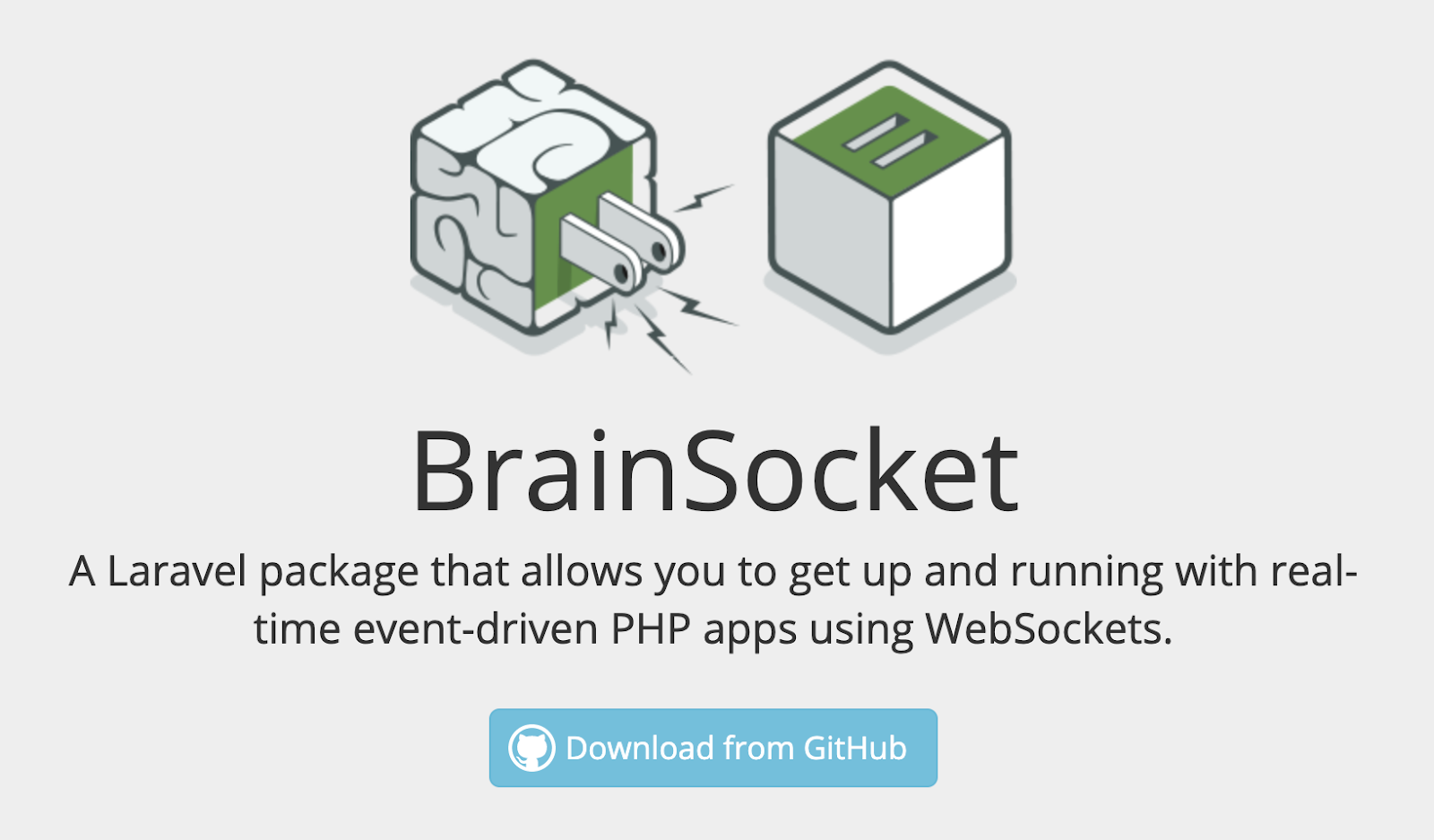
Brain Box Labs has an open source community that helps software developers. Their labs section is incredibly easy to use and universally understood. The Call To Action is a simple Download button.
Case Study #2:
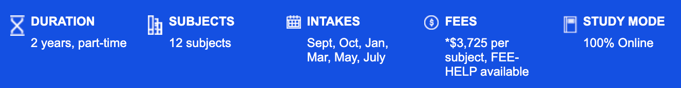
A second example of KISS can be found on the University of Technology (UTS) Sydney’s website. They offer a digital marketing course with incredibly easy to understand parameters.
Many educational sites lack clarity in their CTA and value-prop. Not so with UTS which lets its readers see exactly how the course works, its duration, and its fees. What could be a simpler design?
Case Study #3:
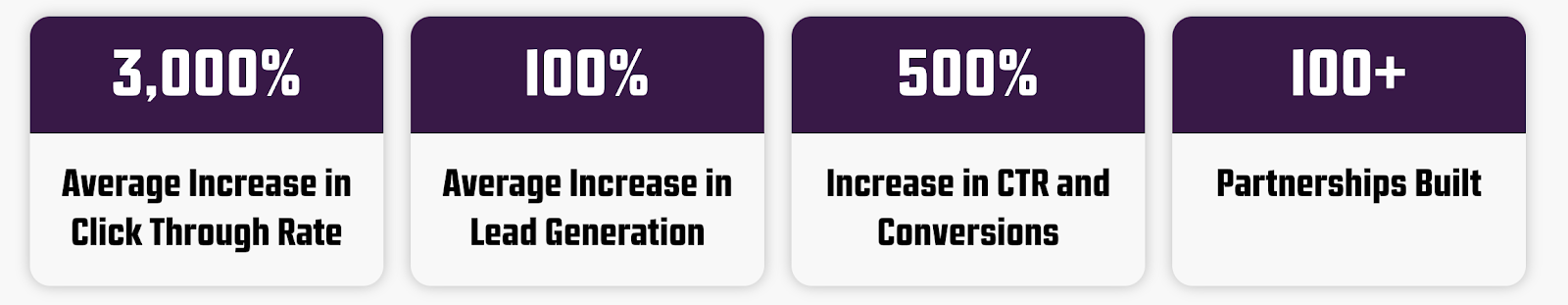
An example of KISS can be found in the digital marketing material at the Guerrilla Agency. They use a very simple design aesthetic to demonstrate their value prop to prospects.
If you sell services online, consider replicating your Call To Action with clear, bold, and universally understood metrics.
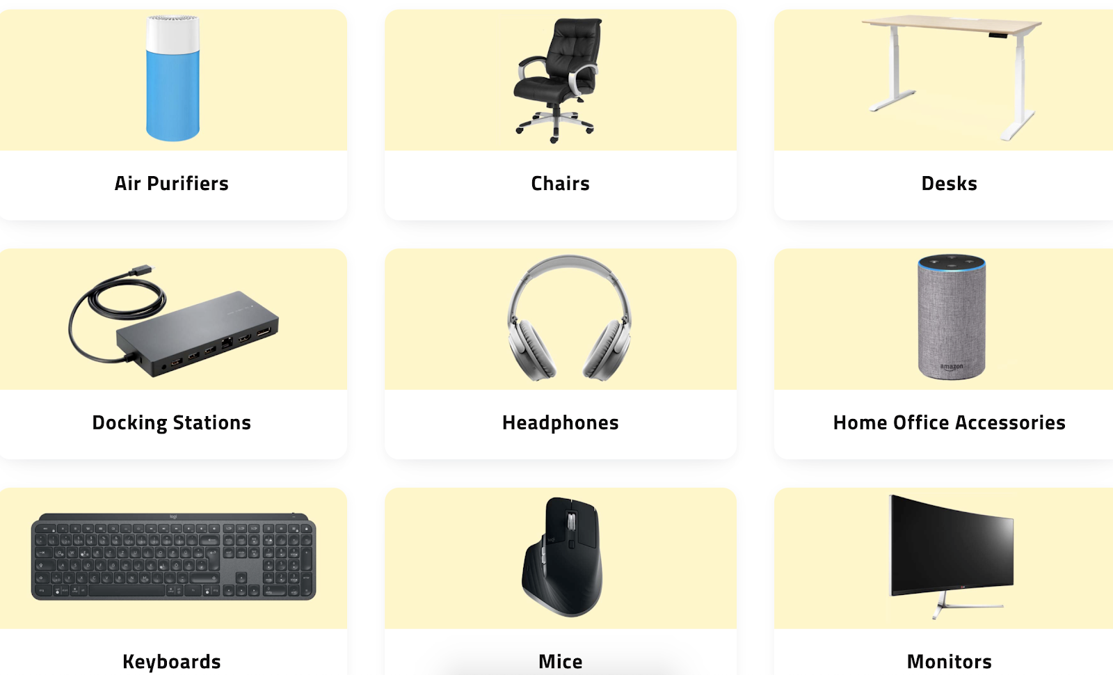
Case Study #4:
When I launched my website to help people work from home more effectively, I used KISS extensively in my design.
Below is how I visually educate users about products they can use when working from home – from docking stations to how to maintain health while working remotely for weeks or months at a time.