
By Per Harald Borgen
Alpine.js is a rugged, minimal framework for composing Javascript behavior in your markup. That's right, in your markup!
It allows you to write most of your JS inline in your HTML, making it easier to write declarative code (as opposed to procedural code). According to its creator Caleb Porzio, it aims to fill the void between vanilla JS (or jQuery) and large v-dom frameworks like Vue/React.
We at Scrimba definitely think it lives up to its promise, so we're happy to present you with a free one-hour course!
In it, you'll find a bunch of fun and interactive tutorials which embed your learning and give you the muscle memory you need to become a hotshot at Alpine.js.
Now let's have a look at how the course is structured!
Why learn Alpine.js?
In the first lesson, the teacher Andre Madarang starts off by explaining why you should learn the library. Shortly speaking, Alpine.js works well when you need a small amount of JS, e.g. a few drop-downs or tabs. This means you get a bunch of power at a crazy small size with no need to NPM install.
Andre also gives you an introduction to himself. He is a full-stack developer and Youtuber who teaches web development concepts such as Laravel, Vue and Tailwind CSS. We're thrilled to have him onboard as a Scrimba teacher!
Installation & A Basic Alpine Component
Installing Alpine.js is easy - you can use npm if you want, but Andre also shows us how to use a cdn and add it in a script tag - it's as simple as that!:
<head>
    <script
        src="https://cdn.jsdelivr.net/gh/alpinejs/alpine@v1.9.8/dist/alpine.js"
        defer
    ></script>
</head>
Now, it's time to create our first Alpine.js component! First, we define state using the x-data attribute. State is available within the scope of the <div> in which it is defined, so in the example below, both the <button> and the <h1> have access to state.
To use this state, we then use the x-show directive to show or hide the element and toggle the element on and off using @.
<div x-data="{ isOpen: true }">
    <button @click=" isOpen = !isOpen">Toggle</button>
    <h1 x-show="isOpen">index.html</h1>
</div>
Dropdown
Now, we use our new-found knowledge of state to implement a dropdown.
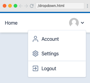
We then see how to set events to close the dropdown by clicking off the dropdown or by pressing the escape key, using @click.away on the <ul> or @keydown.escape on the <button>.
Modals and x-ref
In this cast, Andre takes us through another example of how to use state to open and close a modal. Next, he introduces references, which allow us to add methods to particular elements in the click handler.
In this case, we focus the close button once the modal is open by adding a reference to the close button with an x-ref directive and then adding a method to the click handler.
<button
    class="bg-blue-700 text-white px-4 py-3 mt-4 text-sm rounded"
    @click="isOpen = false"
    x-ref="modalCloseButton"
></button>
<button
    class="bg-blue-700 text-white px-4 py-3 mt-4 text-sm rounded"
    @click="isOpen = true
                    $nextTick(() => $refs.modalCloseButton.focus())
                    "
></button>
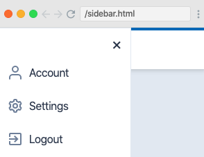
Sidebar
Now it's time for some revision to help our new knowledge sink in. In this short cast, we add the functionality to toggle the visibility of a sidebar. This is a great way of embedding our learning and shows us another application of what we have learned.
Tabs
Next up, we build a set of tabs. This is more involved than our previous examples because we have to hold state for all the tabs, not just a boolean.
As usual, state is defined using the x-data directive on an HTML element which encapsulates all the required elements. We then set the default to tab1 and set an event listener (which makes the tab active) for each one of the tabs.
<li class="-mb-px mr-1">
    <a
        class="inline-block rounded-t py-2 px-4 font-semibold hover:text-blue-800 bg-white text-blue-700 border-l border-t border-r"
        href="#"
        @click.prevent="tab = 'tab1'"
        >Tab 1</a
    >
</li>
To change the contents section to the contents of the tab which has been clicked, we add x-show directives to the <div>s containing the contents:
<div x-show="tab === 'tab1'"></div>
Finally, Andre shows us how to apply the active tab styles with conditional class rendering.
:class="{ 'bg-white text-blue-700 border-l border-t border-r' : tab === 'tab1'
}" ;
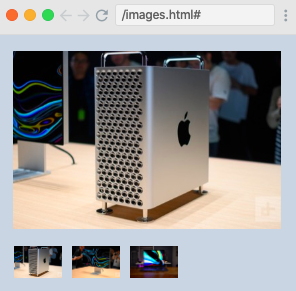
Image Selection
In this cast, Andre shows us how the skills we learned in the previous cast can be applied to a different UI experience - an image selector. Image selectors work in the same way as tabs, but with images instead of text.
Scroll Detection
Now, Andre shows us how to build a scroll detector which changes the background color as the user scrolls. To do this, we define some state which keeps track of whether the user has scrolled.
<div x-data="{ atTop: true }"></div>
Now, we add a scroll event listener on the window and some conditional class rendering on the <nav>.
<nav
    class="p-4 w-full fixed"
    :class="{ 'bg-white shadow-md' : !atTop }"
    @scroll.window="atTop = (window.pageYOffset > 40) ? false : true"
>
    Top Nav goes here
</nav>
Accordion Toggle and Loops
In this section, we build an accordion toggle using loops. In our example, there are several FAQs with answers, and we want to toggle the visibility of the answers.
A great way of doing this without repeating code is to use loops. To do this, we store all our questions and answers in an array, loop over them, and then set the event listener on each iteration of the loop.
Note: For this to work, our elements need to be wrapped in a template tag.
<template x-for="faq in faqs" :key="faq.question">
    <div>
        <button
            class="w-full font-bold border-b border-gray-400 py-3 flex justify-between items-center mt-4"
            @click="faq.isOpen = !faq.isOpen"
        >
            <div x-text="faq.question"></div>
        </button>
        <div
            class="text-gray-700 text-sm mt-2"
            x-text="faq.answer"
            x-show="faq.isOpen"
        ></div>
    </div>
</template>
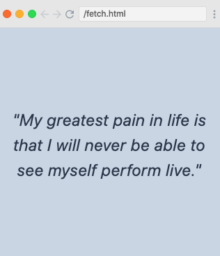
fetch and x-init
Now, we see how we can make requests to an external API. This sounds intimidating but is easily broken down into four steps.
- Add state to hold the quotes:
x - data = "{ quote:'' }";
- Give the app a quote to show upon initialization:
x - init = "quote = 'Awesome quote'";
- Set the text in the
<div>which displays the quote as the state:
Use fetch to grab the quote from an external API:
x-init=" fetch('https://api.kanye.rest') .then(response => response.json()) .then(data => quote = data.quote) "
Here's the full code block:
<div
    class="container mx-auto px-4"
    x-data="{ quote:'' }"
    x-init="
                fetch('https://api.kanye.rest')
                    .then(response => response.json())
                    .then(data => quote = data.quote)
            "
>
    <div
        class="flex items-center text-center justify-center h-screen text-2xl italic"
        x-text='`"${quote}"`'
    ></div>
</div>
The UI looks like this:
Todo App and x-model
In this cast, we learn how to build a mini to-do app. We need three pieces of state for this; one for keeping the to-dos in an array (todos), one to keep track of whether the user types in a new to-do (todoTitle) and one to keep track of the new to-do ID (todoId).
As we are using many pieces of state, we extract our function to a <script> tag to make things cleaner. The function returns an object which contains our state and our functions:
<script>
    function todos() {
        return {
            todos: [
                {
                    id: 1,
                    title: "Finish Alpine Screencast",
                    isComplete: false
                }
            ],
            todoTitle: "",
            todoId: 2
        };
    }
</script>
Now we loop over our to-dos to display the title we have stored in the array and conditionally add a line-through if the to-do is completed.
<template x-for="todo in todos" :key="todo.id">
<li class="flex items-center justify-between">
<div
class="flex items-center"
:class="{ 'line-through' : todo.isComplete }"
>
<input type="checkbox" />
<div class="ml-3" x-text="todo.title"></div>
</div>
<button class="text-xl ml-2">×</button>
</li>
</template>
We now work on adding a to-do. First, we add an x-model directive to our <input> which syncs the todoTitle with whatever is typed into the <input>:
<input
    type="text"
    class="shadow w-full px-2 py-2"
    x-model="todoTitle"
    @keydown.enter="addTodo()"
/>
The function we want to run when a user types a new to-do is then added to our <script> tag.
We also use an x-model on the checkbox to allow the user to mark a to-do as complete.
<input type="checkbox" x-model="todo.isComplete" />
Transitions: Dropdown
Next up, Andre shows us some funky transitions which give our dropdown a crisp and professional finish using Tailwind CSS utility classes. These transitions give you fine-grained control over how your dropdown switches from hidden to visible, with options including opacity, duration, origin and others.
<ul
    x-show="isOpen"
    @click.away="isOpen = false"
    class="absolute font-normal bg-white shadow overflow-hidden rounded w-48 border mt-2 py-1 right-0 z-20"
    x-transition:enter="transition transform origin-top-right ease-out duration-200"
    x-transition:enter-start="opacity-0 scale-75"
    x-transition:enter-end="opacity-100 scale-100"
    x-transition:leave="transition transform origin-top-right ease-out duration-200"
    x-transition:leave-start="opacity-100 scale-100"
    x-transition:leave-end="opacity-0 scale-75"
></ul>
Transitions: Modal
Now it's time to put our new knowledge of transitions to the test by adding them to our modal. In the spirit of Scrimba, Andre gives us a chance to test out our new skills before showing us how he does it, so no spoilers here!
Transitions: Sidebar
Finally, we add a nice, smooth transition for the sidebar we implemented earlier. Again, no spoilers, so you can go ahead and give it shot yourself when you watch the course.
Conclusion
We've now taken a look at some use cases for Alpine.js and built a few examples where it might be a better choice than React or Vue. Hopefully you've learned something new about Alpine.js and will be putting your new skills to good use very soon.
If you haven't already, don't forget to check out the course over at Scrimba.
In the meantime, happy Alpine coding! :)