
Today we're gonna learn about every single CSS background property with every possible value. We'll learn the short-hand, too. Let's go !🏅
Table of Contents
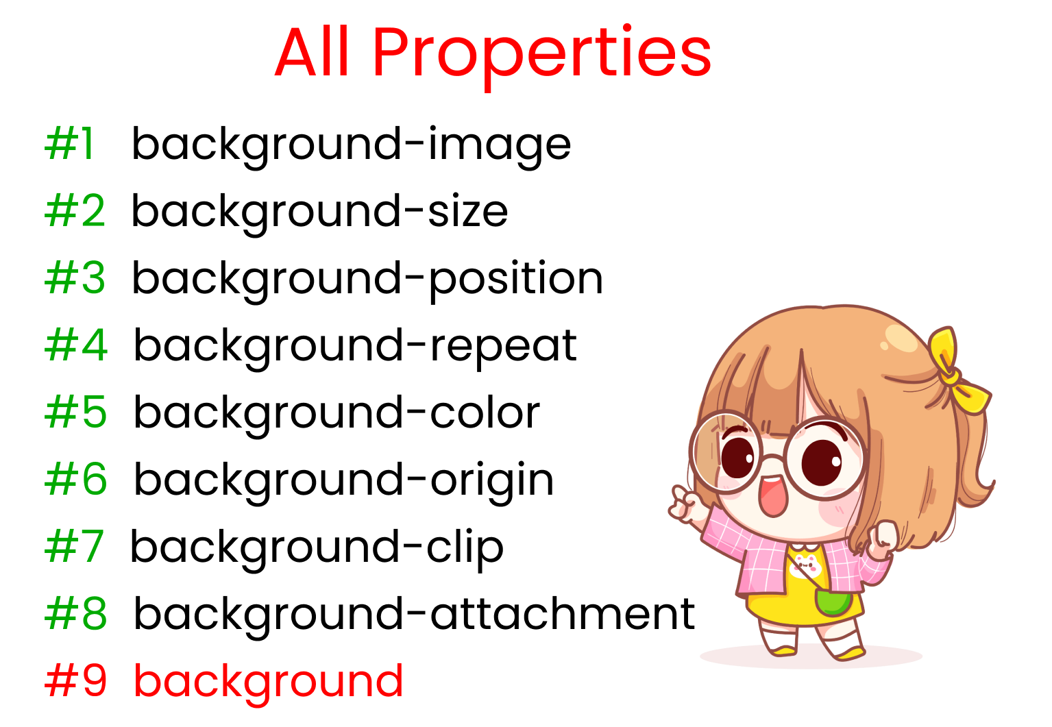
- All properties
- background-image
- background-size
- background-repeat
- background-position
- background-origin
- background-clip
- background-attachment
- background-color
- Short hand
- Conclusion
You can watch this tutorial on YouTube as well if you like:
All Properties
This is a list of All the properties we're gonna discuss today. The red text at the end is the shorthand.
What Are CSS Background Properties?

CSS background properties let us to control the size and properties of images so that we can make responsive images for both smaller and larger screens. This in turn helps us create responsive websites.
For example,
- The property background-size allows us to reset the width and height of our image according to screen size.
- background-position allows us to tell the browser where to put the image on the screen.
And many more!
How to Set Up the Project
Before coding, you need to know little bit of HTML, CSS, and how to use VS code.
To test out the properties and their values, follow these steps 👇
- Create a new folder named 'BACKGROUND-PROJECT'. Open it in VS code.
- Create
index.htmlandstyle.cssfiles. - Install 'live server' on VS code.
- Start live server.
HTML
Create one div with the class name 'container' inside the body tag in the HTML file.
<div class="container"></div>
CSS
In CSS, you MUST include a height for the container, otherwise we won't be able to see the image. In our case, we will set it to 100vh, like this:
.container{
  height : 100vh;
}
Download the images for the project.
The images are on my GitHub repository. Here's how to get them:
- Visit and copy the link above ☝️
- Go to downgit and paste the link you copied
- Follow the steps in this video 👇

And..... we're all set!

Let's start coding 😊
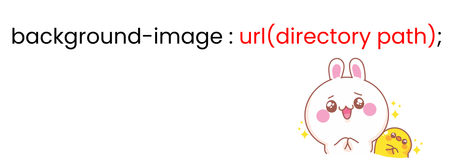
The CSS background-image property
Using this property, we can add images throughout our stylesheet.

We write the syntax after writing the selector name, like this:👇
.container{
// We'll put image path/URL 👇 inside quotes
   background-image  :  url(' ');
}
We can use background-image in 2 ways:
- By locating image path in the directory
- By specifying the image URL
How to Use background-image through the Directory Path
Here's the syntax for background-image when using the directory path 👇
.container{
//  Put  image  path  👇 inside quotes
  background-image: url(' ');
}
There are three cases when you'll want to specify an image path in our CSS:
- When
imageandstyle.cssare in the same folder - When
imageis in the next folder - When
imageis in the previous folder
When image and style.css are in the Same Folder, it looks something like the below. 👇
Notice that kitty.png and style.css are in the same parent folder named Background-project:

To locate the file path of the kitty.png, write the following code in style.css:
 .container{
   background-image : url("kitty.png");

   height: 100vh;
// set size & stop image repetition
   background-repeat : no-repeat;
   background-size : contain;
 }
When the image is in the Next Folder, style.css is in previous folder. Notice on the image below that kitty.png is in the Assets folder while style.css is in the previous folder.
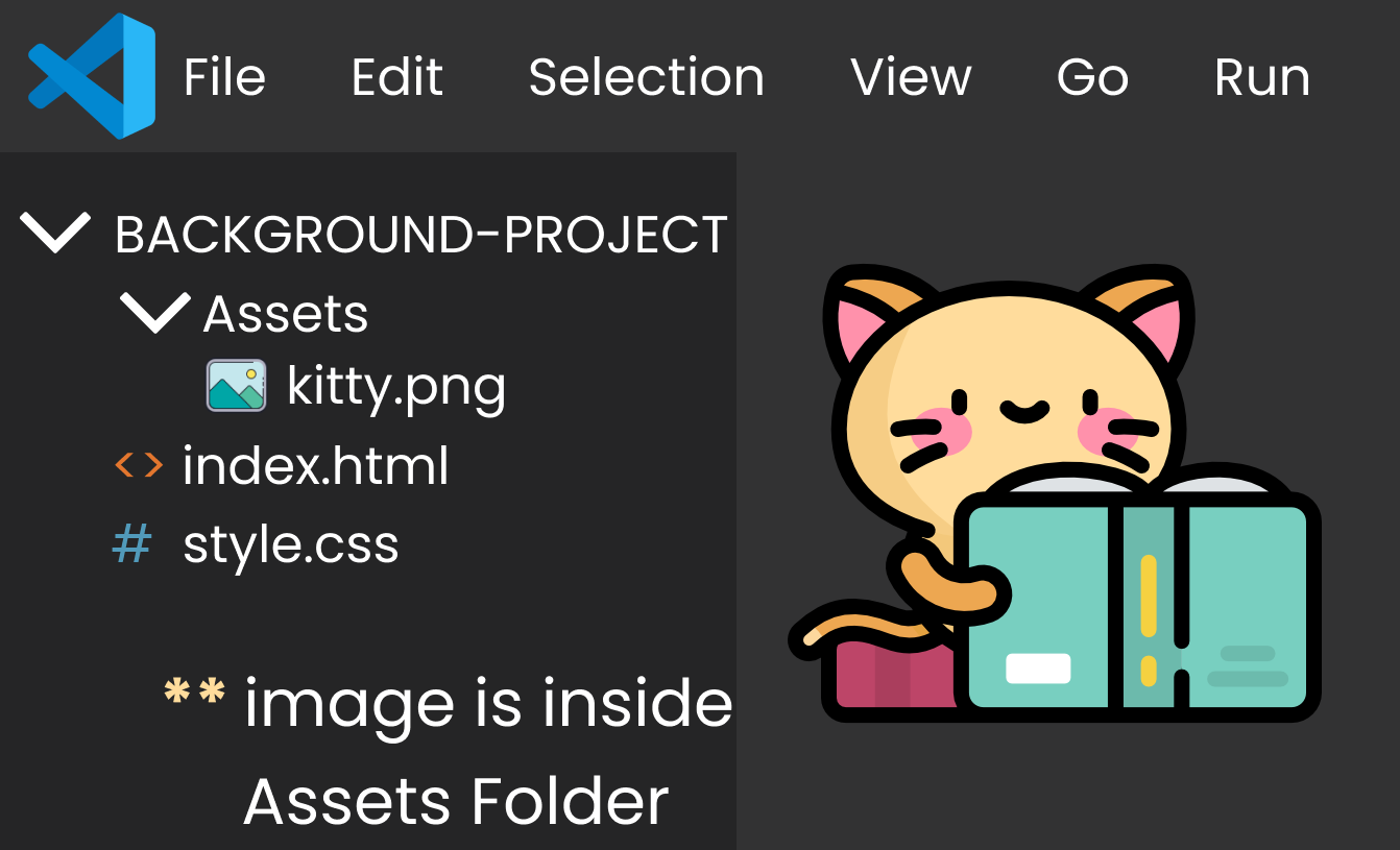
To go forward and locate the file path of kitty.png, we write one dot and slash like this (./) after the quote in style.css. Then we write the name of the folder then slash (/) and finally we write the name of image, like this:👇
 .container{
   background-image : url("./Assets/kitty.png");

   height: 100vh;
// set size & stop image repetition
   background-repeat : no-repeat;
   background-size : contain;
 }
If the image is in the Previous Folder, then we need to go back. Notice in the image below👇 that style.css is in the src folder and kitty.png is outside the src folder.
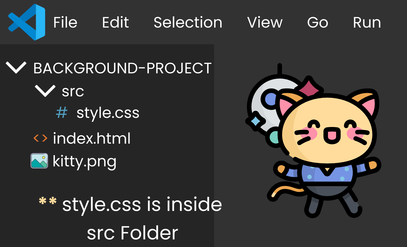
To go back and locate the file path of kitty.png, we write two dots and a slash (../) after the quote in style.cs. Then we write the name of the image, like this: 👇
 .container{
   background-image : url("../kitty.png");

   height: 100vh;
// set size & stop image repetition
   background-repeat : no-repeat;
   background-size : contain;
 }
How to Use background-image by Direct Link
This is pretty easy. Write the property and insert the link inside url().
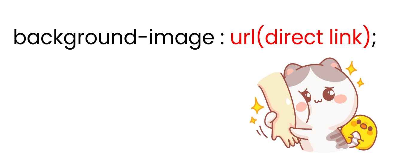
To work with an image which is a direct link, we need to write the following code:
//example ->
 .container{
    background-image : url("https://dev-to-uploads.s3.amazonaws.com/uploads/articles/szxp3jqyjyksrep1ep82.png");

  height: 100vh;
// set size & stop image repetition
   background-repeat : no-repeat;
   background-size : contain;
 }
Take a Break
The CSS background-size property
We can adjust the size of an image using the background-size property.

We write the syntax after writing the selector name, like this 👇
.container{
// We'll write values 👇 here
  background-size  : cover;
}
You can use background-size in 3 ways:
- use the Cover / Contain value
- set the image width and height
- use auto
Let's start by discussing the cover & contain values.
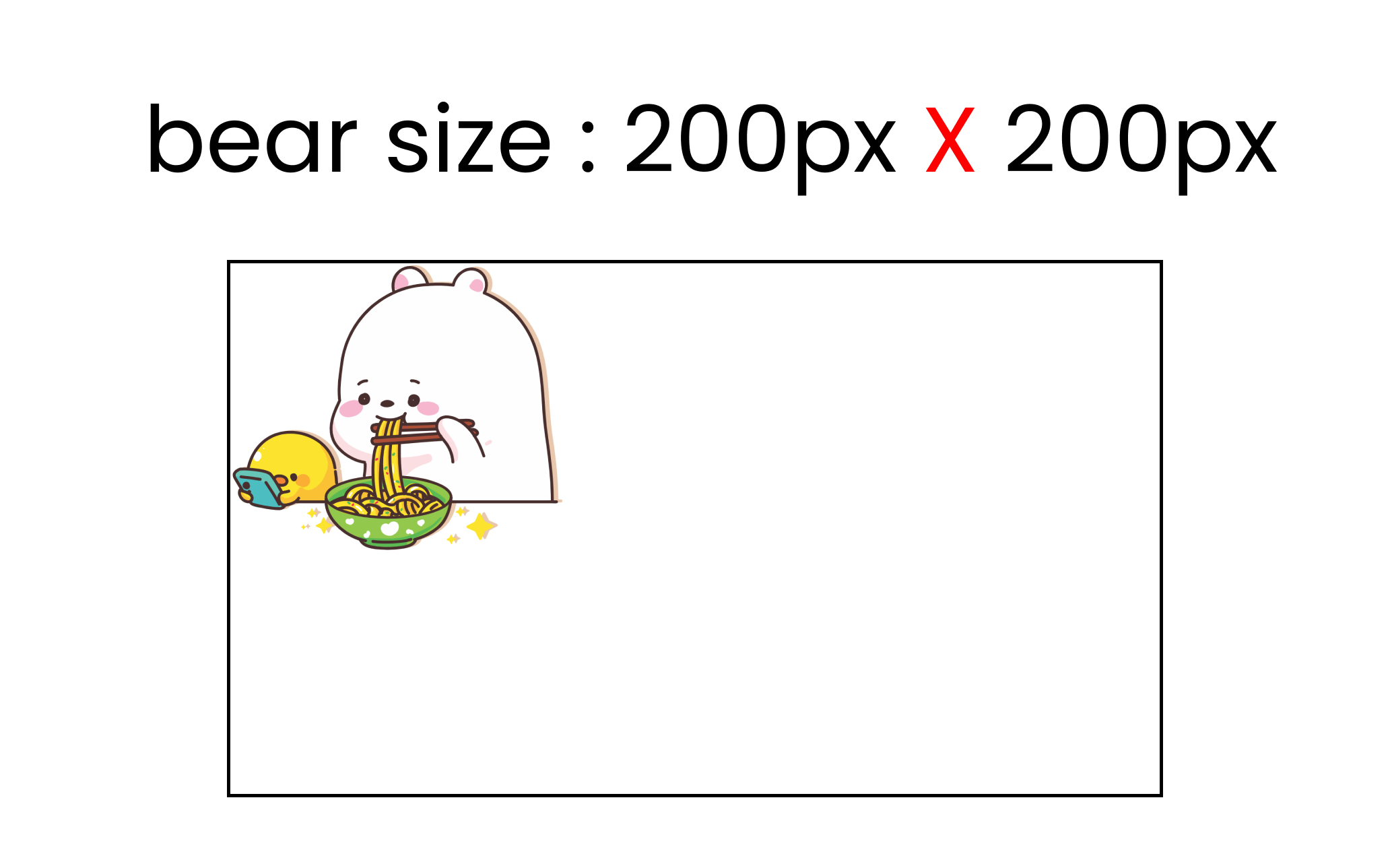
Bear size : [718px X 614px]
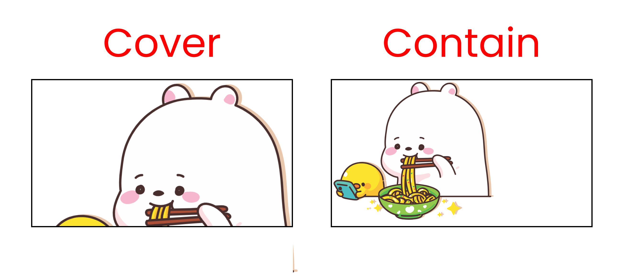
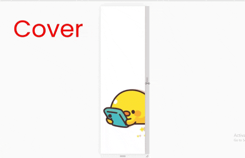
Cover value
For this to work, we must include an image, set the height, and stop image repetition. We do that like this in CSS: 👇
.container{
  background-image : url('cute-bear.png');
  background-repeat: no-repeat;
  background-size : cover;

// Must include the height
  height : 100vh;
}
When we use this property, it will stretch the image to the whole screen even when we resize the window. Watch the video below to see how it looks:👇
The contain value
Same steps here – we must include an image, set its height, and stop image repetition like this:👇
.container{
  background-image : url('cute-bear.png');
  background-repeat: no-repeat;
  background-size : contain;

// Must include the height
  height : 100vh;
}
This value will preserve the image size [Responsive Image] even when we resize the window. Check out this video below to see how it works: 👇
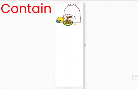
Image width and height
We can set the width and height of the image using the background-size property.
Here's the syntax in CSS: 👇
.container{
// here, we see  width👇  &  👇 height
  background-size : 200px   200px;
}
Also, don't forget to insert the image, set its height, and stop image repetition. The code snippet looks like this:
.container{
  background-image : url('cute-bear.png');
  background-repeat: no-repeat;

// here, we see  width👇 &  👇 height
  background-size : 200px  200px;

// Must include the height
  height : 100vh;
}
Auto sizing
When using this value, the image will stay at its original size. It won't change when we resize the window. It looks like this:
The CSS background-repeat property
This property allows us to repeat the same image multiple times.
We write the syntax after writing the selector name, like this 👇
.container{
// we'll change values 👇 here
  background-repeat : repeat;
}
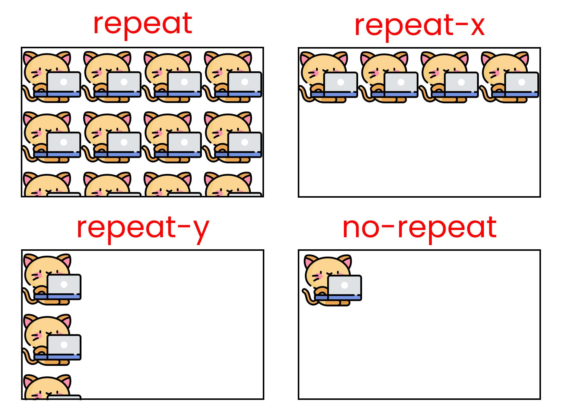
This property has six values:
- repeat
- repeat-x
- repeat-y
- no-repeat
- space
- round
Here are the results of each of these six values at a glance. Note that the kitty size in these examples is [200px X 200px].
Now, Let's investigate what's happening with each value. BUT, before that, note that we need to insert an image using the background-image property, like this:
.container{
   background-image : url('kitty.png');
   background-size : 200px 200px;
   background-repeat :  ; //we will play with values here

   height : 100vh;
}
The repeat value
By using this value, we can repeat the same image multiple times along both the X and Y axes as long as the screen space doesn't end. Here, the kitty size is 200px x 200px.
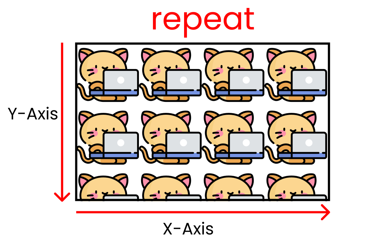
To duplicate this result, we write ->
.container{
   background-image : url('kitty.png');
   background-size : 200px 200px;
   background-repeat : repeat;

   height : 100vh;
}
The repeat-x value
This value allows us to repeat the same image multiple times along the X-Axis as long as the screen space doesn't end. Kitty size: 200px X 200px.
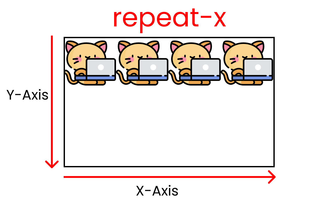
to make this happen, we write ->
.container{
   background-image : url('kitty.png');
   background-size : 200px 200px;
   background-repeat : repeat-x;

   height : 100vh;
}
The repeat-y value
This one works the same way as "repeat-x", but works along the Y-Axis as long as the screen space doesn't end. Kitty size: 200px X 200px.
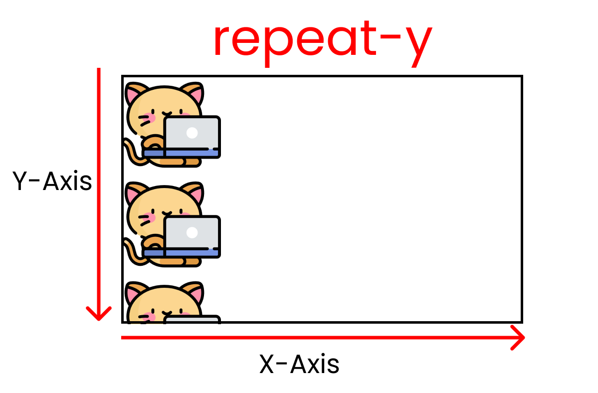
for this outcome, we write ->
.container{
   background-image : url('kitty.png');
   background-size : 200px 200px;
   background-repeat : repeat-y ;

   height : 100vh;
}
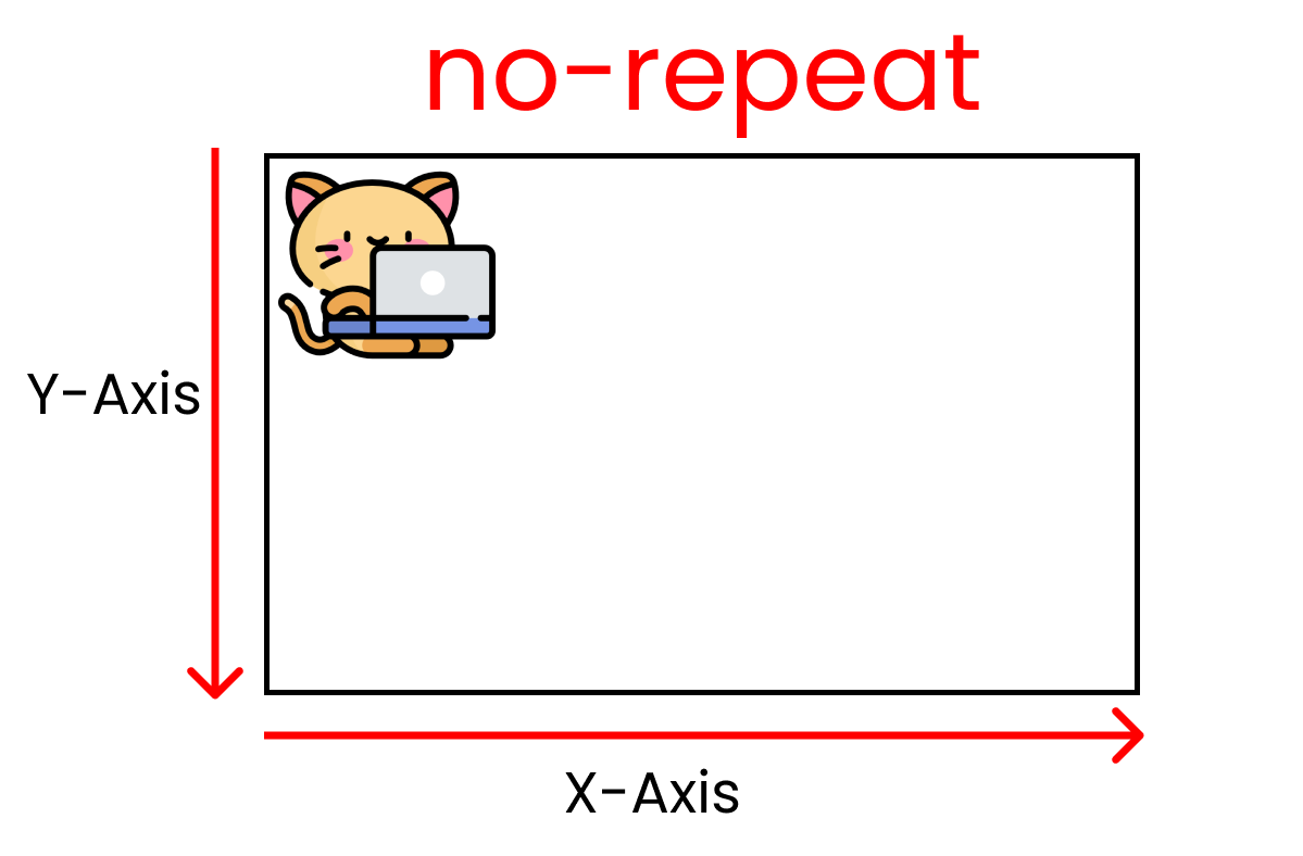
The no-repeat value
We can have our original image without repetition using this value. Kitty size: 200px X 200px.
For this result, we write ->
.container{
   background-image : url('kitty.png');
   background-size : 200px 200px;
   background-repeat : no-repeat ;

   height : 100vh;
}
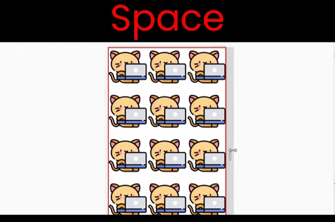
The space value
This works both along the X and Y axes. We can see the main difference between the values space and round when we resize the window. Notice that we have empty spaces when we resize the window:
to experiment with this value, write ->
.container{
   background-image : url('kitty.png');
   background-size : 200px 200px;
   background-repeat : space ;

   height : 100vh;
}
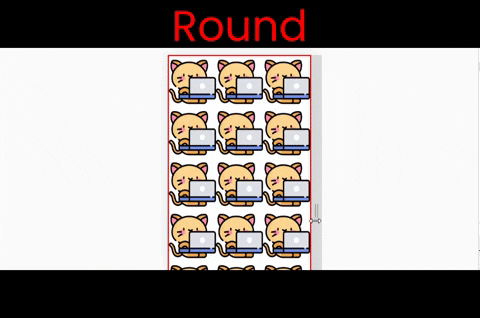
The round value
This works both along the X and Y axes. Notice that the image is stretching when we resize the window.
Follow along & write ->
.container{
   background-image : url('kitty.png');
   background-size : 200px 200px;
   background-repeat : round ;

   height : 100vh;
}
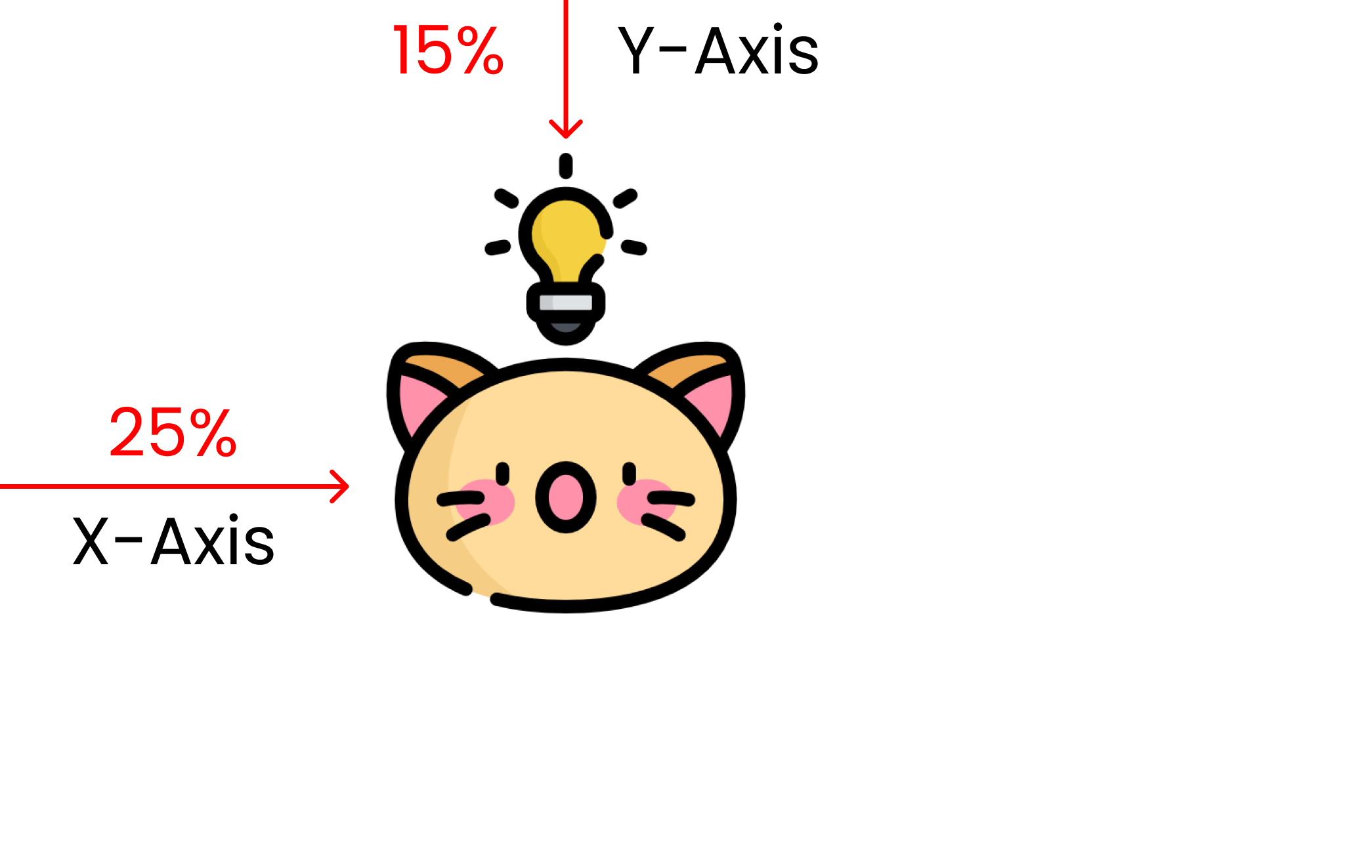
The CSS background-position property
This property is used to change the position of an image on the screen.
Here's the syntax: 👇
.container{
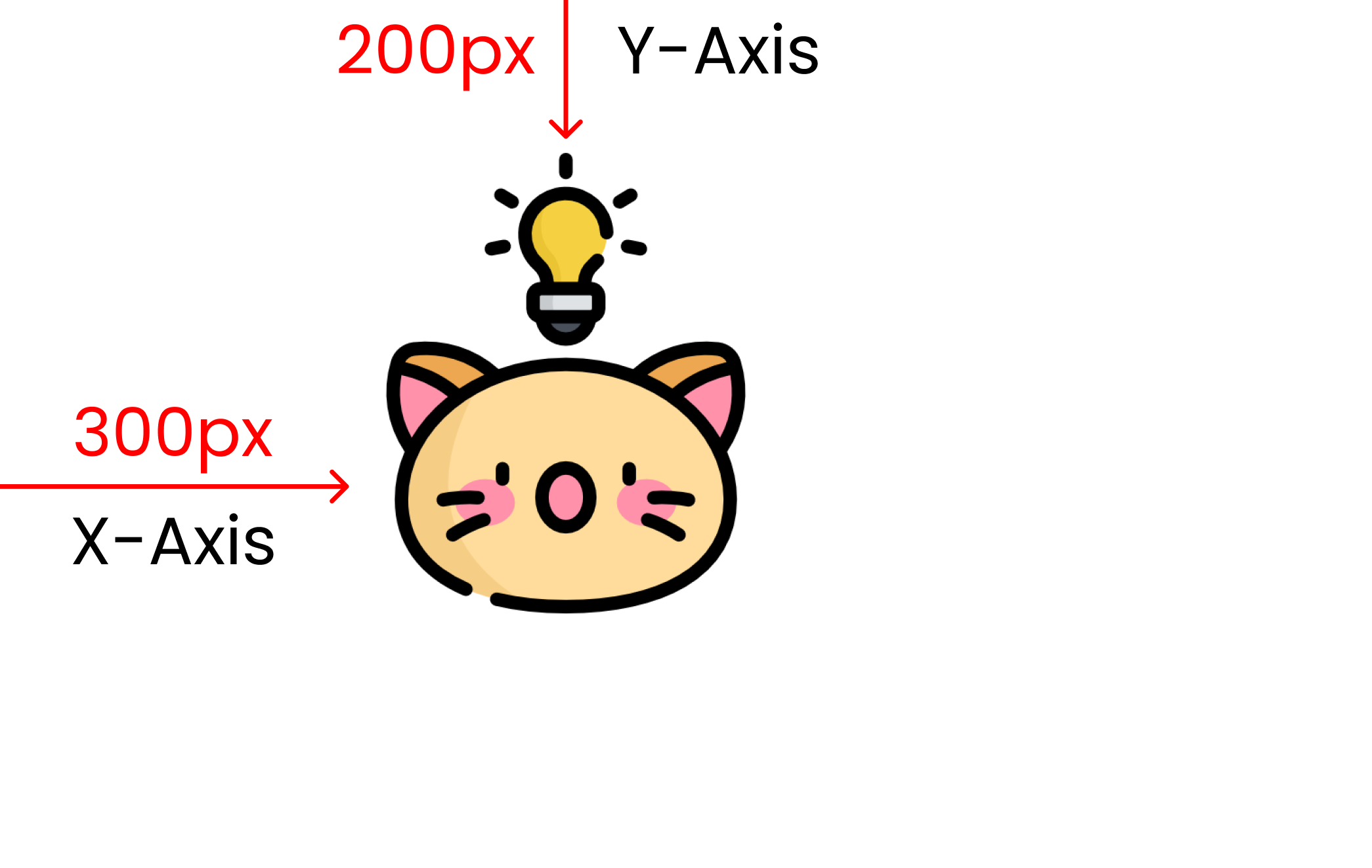
// This is X-Axis👇 & 👇 Y-Axis
background-position : 300px 200px;
}
Also, don't forget to insert the image, set its height, and stop image repetition. We've set the kitty size to 200px X 200px using the background-size property:
.container{
  background-image: url("kitty-idea.png");
  background-size: 200px 200px;
  background-repeat: no-repeat;

// This is         X-Axis👇  & 👇 Y-Axis
  background-position : 300px 200px;
  height: 100vh;
}
And here's the result:
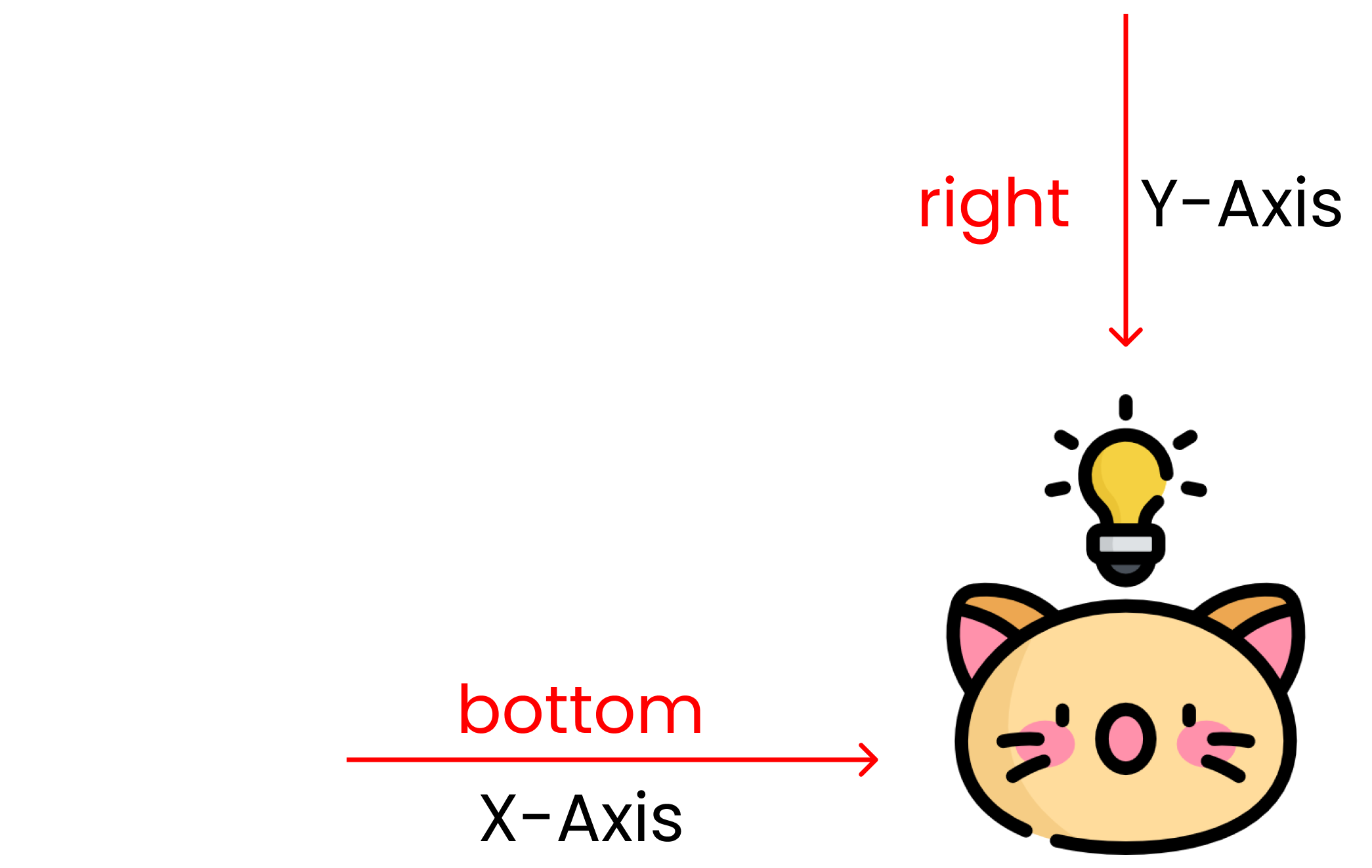
You can also use a combination of these values:
- top
- left
- right
- bottom
- percentage values
For an example, let's set our kitty at the very bottom right. Here's the code snippet for this:
.container{
  background-image: url("kitty-idea.png");
  background-size: 200px 200px;
  background-repeat: no-repeat;

// This is         X-Axis👇  & 👇 Y-Axis
  background-position : bottom right;
  height: 100vh;
}
And here's the result:
Calculating the available space of the screen, the % values determine the position of the image. Here's what it looks like in code:
.container{
  background-image: url("kitty-idea.png");
  background-size: 200px 200px;
  background-repeat: no-repeat;

// This is         X-Axis👇  & 👇 Y-Axis
  background-position : 25% 15%;
  height: 100vh;
}
And here's the result:
The CSS background-origin property
This property allows us to set the origin of our image across the CSS box model.
We write the syntax after writing the selector name, like this 👇
.container{
// We'll write values   👇 here
  background-origin: border-box;
}
Its four values are:
- border-box
- padding-box
- content-box
- inherit
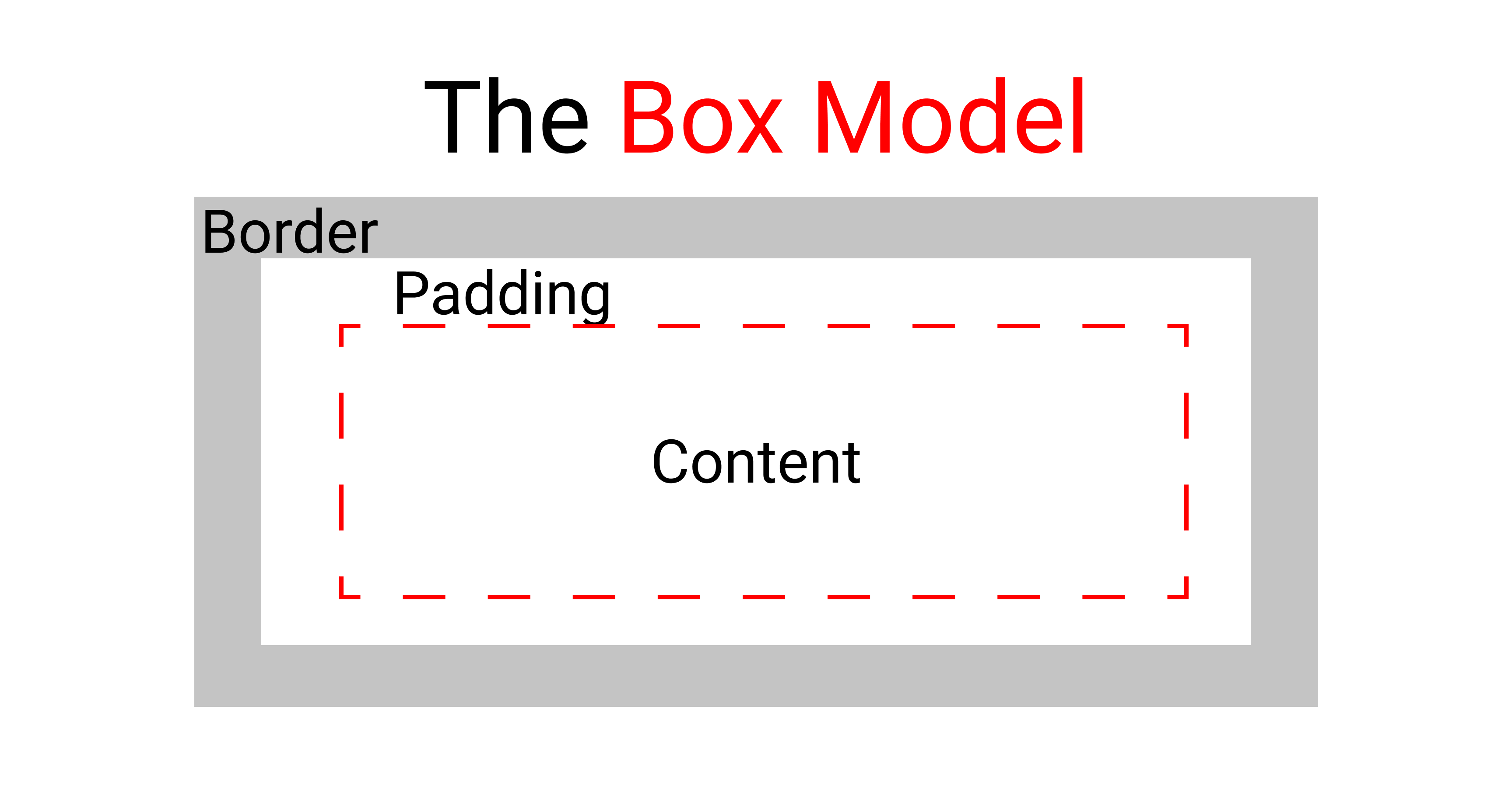
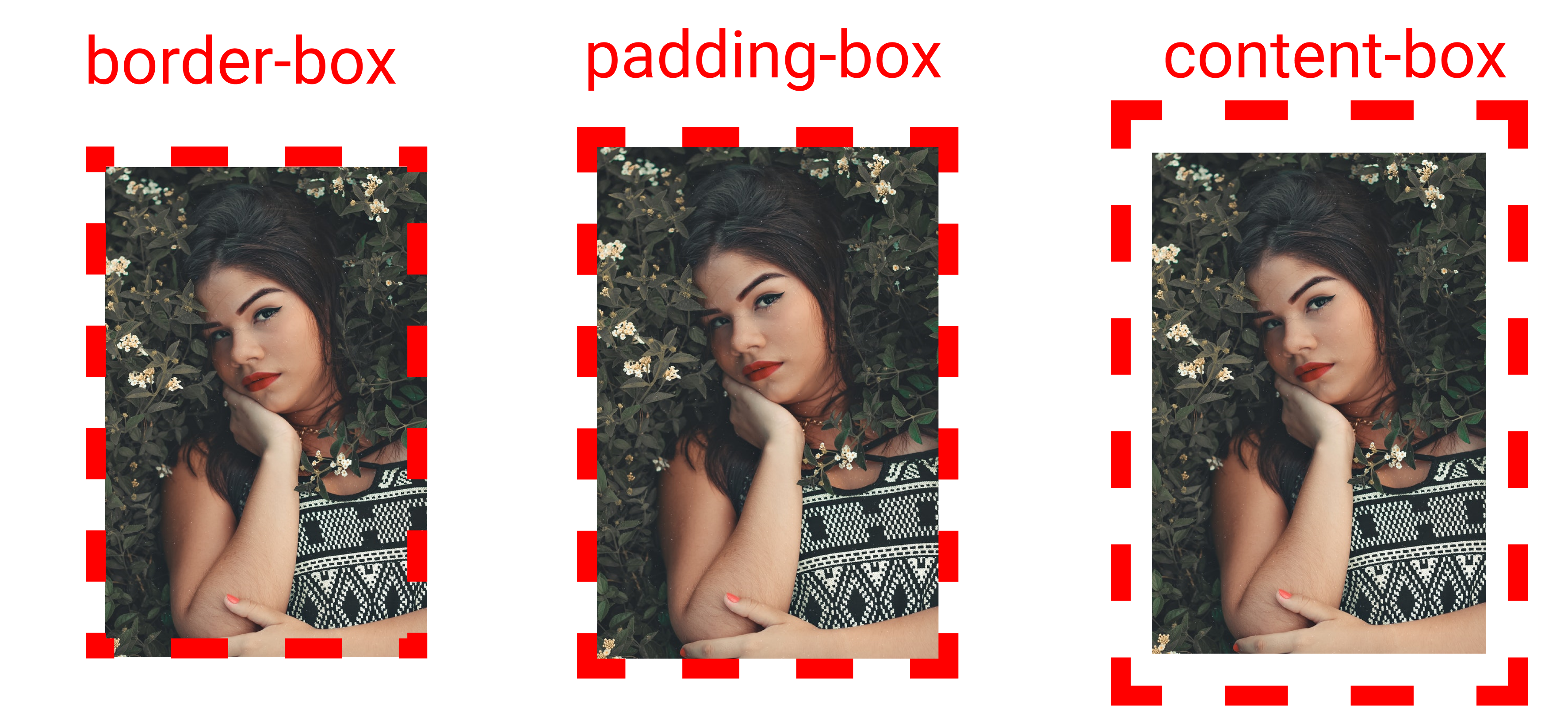
In the standard CSS box model, the outermost part is the border. Then comes the padding and finally we have the content itself at the center.
Here's the result of every property at a glance:
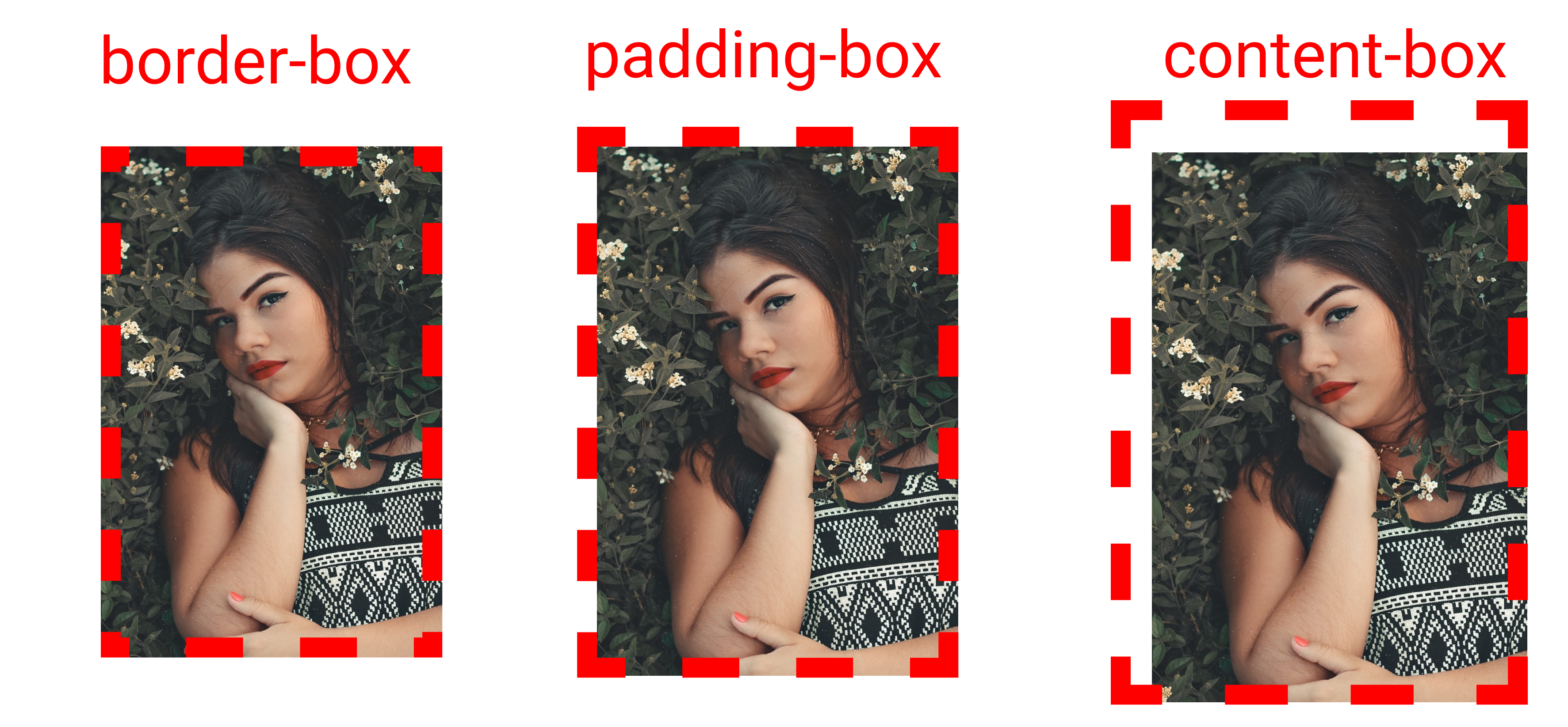
To recreate these results:
- First we need an image, we need to stop image repetition, and set the height and width of both the container and the image.
- Once done, we will insert 40px of padding, otherwise we can't see the difference between the padding box and the content box.
- Then, insert a 25px red border. Set the border-style to dashed to get a dashed border on the screen.
- set the background-size to 400px & 400px
Here's what that looks like in code:
.container{
  background-image: url('cute-girl.png');
  background-repeat: no-repeat;
  background-size: 400px 400px;

// Change  values here  👇  to see difference
  background-origin: border-box;
  padding: 40px;
  border: 25px solid red;
  border-style: dashed;

// Width & height for container 👇
  width : 400px;
  height : 400px;
}
Take A Break
The CSS background-clip property
This is the same as the background-origin property. The main difference is that background-clip CUTS the image to fit inside the box, while background-origin PUSHES the content inside the box to fit.

We write the syntax after writing the selector name, like this 👇
.container{
// We'll write values   👇 here
  background-clip  : border-box;
}
Its four values are:
- border-box
- padding-box
- content-box
- inherit
Here's the result of every property at a glance:
To recreate these results:
- First we need an image, we need to stop image repetition, and we need to set the height and width of both the container and the image.
- Once done, we will insert 40px padding, otherwise we won't be able to see the difference between the padding box and content box.
- Then, insert a 25px red border. Set the border-style to dashed to see the dashed border on screen.
- Set the background-size to 400px & 400px
The code looks like this:
.container{
  background-image: url('cute-girl.png');
  background-repeat: no-repeat;
  background-size: 400px 400px;

// Change  values here  👇  to see difference
  background-clip: border-box;
  padding: 40px;
  border: 25px solid red;
  border-style: dashed;

// Width & height for container 👇
  width : 400px;
  height : 400px;
}
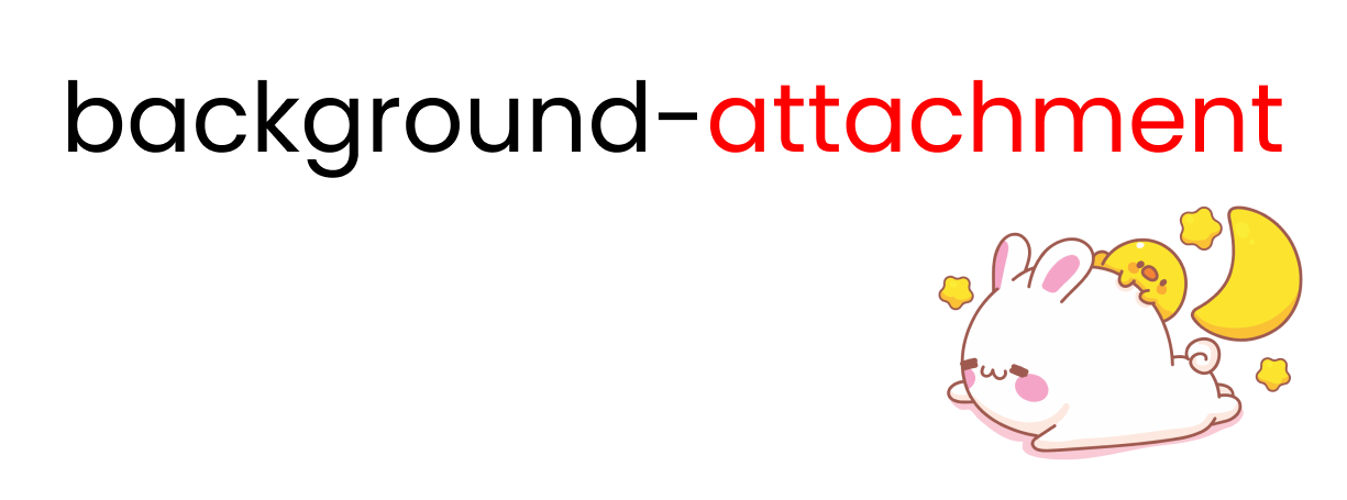
The CSS background-attachment property
This property allows us to control the behavior of our content and image when we scroll.
We write the syntax after writing the selector name, like this 👇
.container{
// We'll  change  values 👇  here
background-attachment: scroll;
}
Its three values are:
- scroll
- fixed
- local
When we use scroll, the image is fixed and we can freely scroll our content. The fixed value gives us a parallax effect on mouse scroll and local produces multiple images as long as our content doesn't end.
You can see the results live here 👇
The CSS background-color property
You can use this property to fill your background with color.
We write the syntax after writing the selector name, like this 👇
.container{
// we'll change values 👇  here
   background-color :  red;
}
Out of the many options, the most popular ones are:
- Solid color by name or hex value
- Using the
RGB()color function - Using the
linear-gradient()function
How to get a solid background color by name or hex value
You can use color names to set the background color, like this:
.container{
   background-color : red;

   height : 100vh;
}
Or, you can use a hex color code like this:
.container{
   background-color : #ff0000; //red color

   height : 100vh;
}
You can check out these resources for more colors:
How to use the RBG() color function to set background color
You can use RGB() color function to set the background color like this:
.container{
// color name is "American River"
   background-color : rgb(99, 110, 114);

   height : 100vh;
}
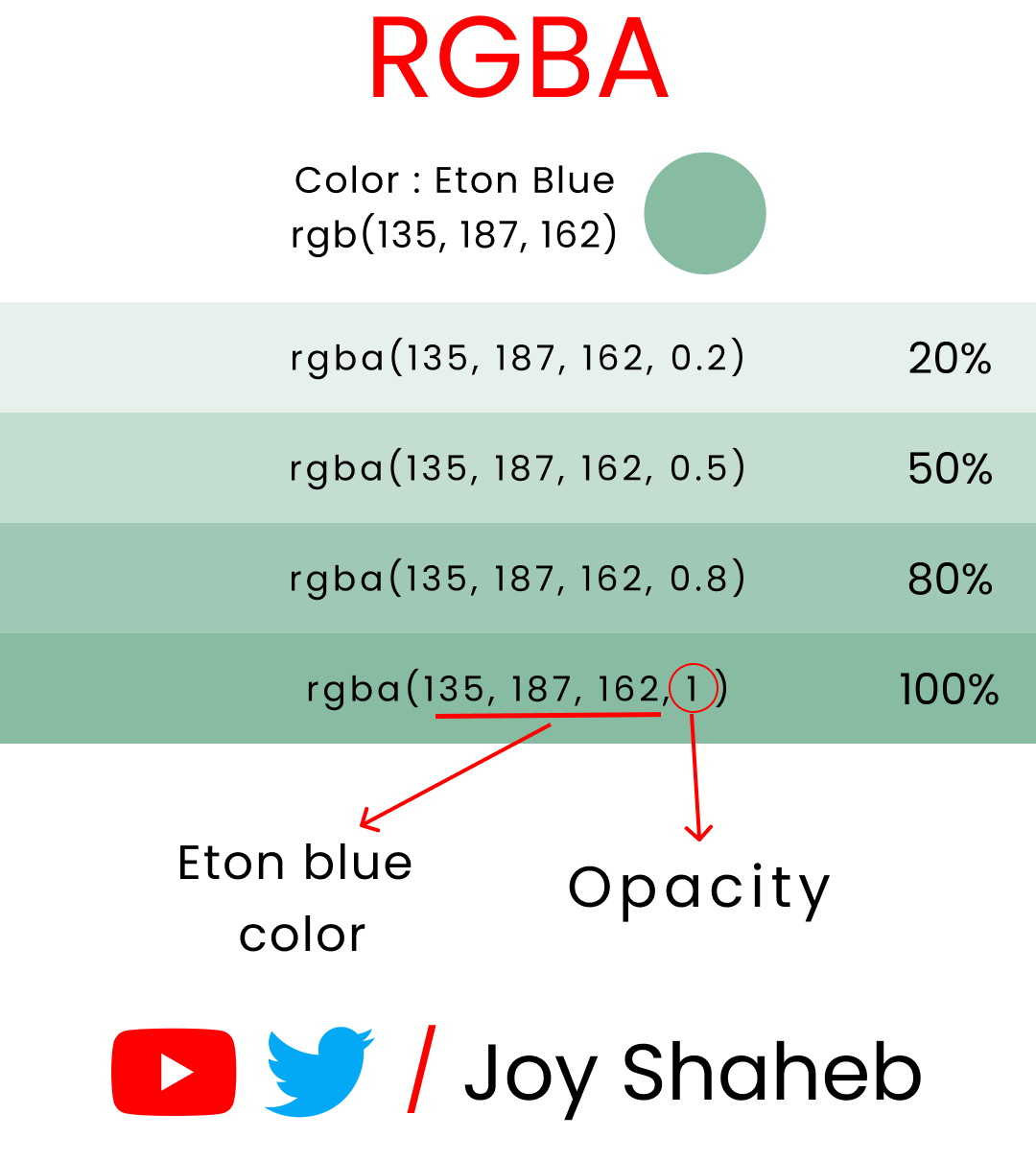
Or, you can use RGBA() to set both color and opacity like this:
.container{
// The 0.5 at last represents        50% 👇 opacity
   background-color :  rgba(99, 110, 114, 0.5);

   height : 100vh;
}
This is an experiment with the color named 'Eton blue' with various opacity levels: 👇
How to set the background color with the linear-gradient() function
You can use this function to create a gradient color of more than 1 color. Here are some examples of gradient colors:
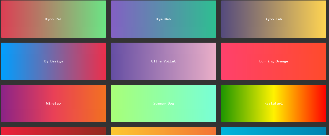
You can visit this website for more color resources with CSS code snippets.
Let's recreate this background color:
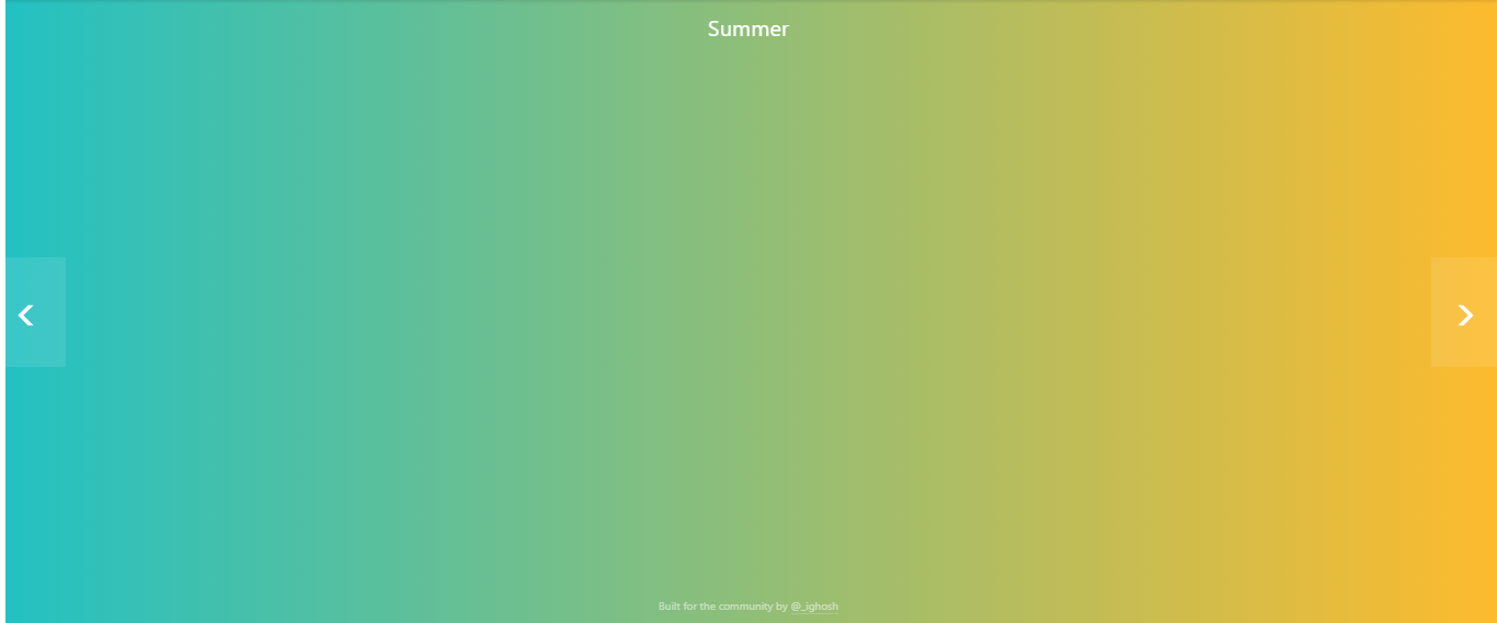
'#22c1c3' represents the color on the left, and '#fdbb2d' represents color on right. '90deg' tells us how the two colors will be angled to create a gradient.
The code snippet looks like this:
.container{

   background: linear-gradient(90deg, #22c1c3, #fdbb2d);

   height : 100vh;
}
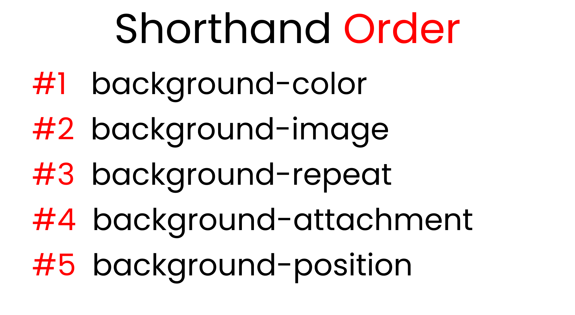
The short-hand for these CSS properties
This is the order of the shorthand for the background properties:
For this experiment, let's put kitty.png in our browser with a blue background at 200px on the X-Axis and 200px on the Y-axis. The code snippet looks like this:
.container{

   background-color : skyblue;
   background-image : url('kitty.png);
   background-repeat: no-repeat;
   background-attachment: fixed;
   background-position: 200px 200px;

   height : 100vh;
}
And here's the code snippet using the shorthand:
.container{

   background: skyblue url('kitty.png) no-repeat fixed 200px 200px;

   height : 100vh;
}
This shorthand really saves us time. If you want to skip one value, you can do it as long as you maintain the order of these properties.
Conclusion
Here's your medal for reading till the the end ❤️
Suggestions and criticisms are highly appreciated ❤️
Credits
- Cute Girl I have a crush on 🥰
- kitty Avatar
- Cute panda
- cute cat with duck
- cute girl illustration
- Rabbit with duck
- CSS-Tricks
YouTube / Joy Shaheb
Twitter / JoyShaheb
Instagram / JoyShaheb