

When you are designing a website, it is really important that your content looks good on all screen sizes.
In this article, I will talk about how to use responsive design and media queries to make this happen. I will also provide code examples for media queries using max and min screen widths.
What is Responsive Design?
Responsive Design is the practice of making sure your content looks good on all screen sizes. Everything in the website including layouts, fonts and images should automatically adapt to the user's device.
In the early 2000's, developers focused on making sure their websites looked good on larger screen sizes like laptops and desktop computers. In today's world, you have to consider devices like mobile phones, tablets, and even watches.
An important component of responsive design are media queries.
What is a Media Query?
In CSS, a media query is used to apply a set of styles based on the browser's characteristics including width, height, or screen resolution.
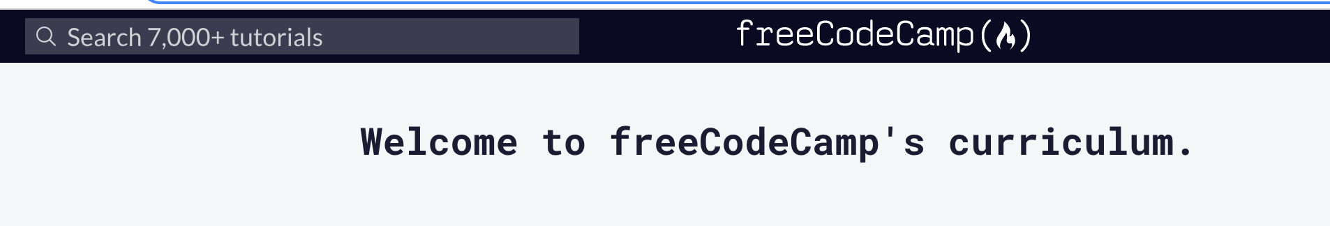
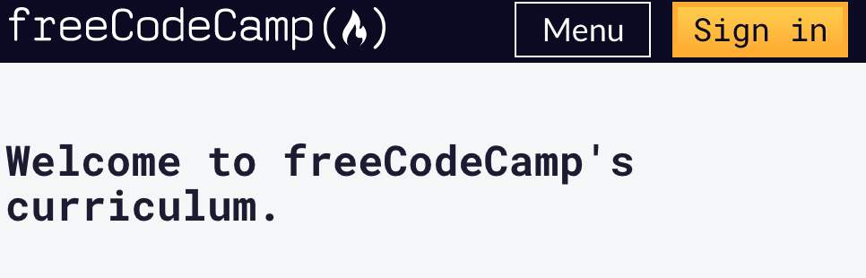
You can see an example of a media query on the freeCodeCamp learn page.
For large screen sizes like desktops, we can see a search menu in the upper left hand corner.
But on mobile devices, there is no search menu and we only have the menu options and sign in button.
Basic syntax of a media query
Here is the basic syntax for a media query in CSS:
@media media-type (media-feature){
/*Styles go here*/
}
Let's break down what this syntax means.
The @media is a type of At-rule in CSS. These rules will dictate what the CSS will look like based on certain conditions.
The media type refers to the category of media for the device. The different media types include all, print, screen and speech.
- all - works for all devices
- print - works for devices where the media is in print preview mode
- screen - works for devices with screens
- speech - works for devices like screen readers where the content is read out loud to the user
According to documentation,
Except when using the
notoronlylogical operators, the media type is optional and thealltype is implied.
You can choose to omit the media type and use this syntax instead.
@media (media-feature){
/*Styles go here*/
}
The media feature refers to the characteristics of the browser which include height and width of the viewport, orientation or aspect-ratio. For a complete list of the possible media features, please visit the MDN docs.
For this article, we are going to focus on the width media feature.
If you wanted to create more complex media queries, then you can use logical operators.
and- This operator is used to join multiple media features. If all of the media features are true then the styles inside the curly braces will be applied to the page.not- This operator reverses a true query into a false and a false query into a true.,(comma) - This operator will separate multiple media features by commas and apply the styles inside the curly brace if one of the conditions is true.
Media query examples
Let's take a look at a few examples that show how to use media queries in CSS.
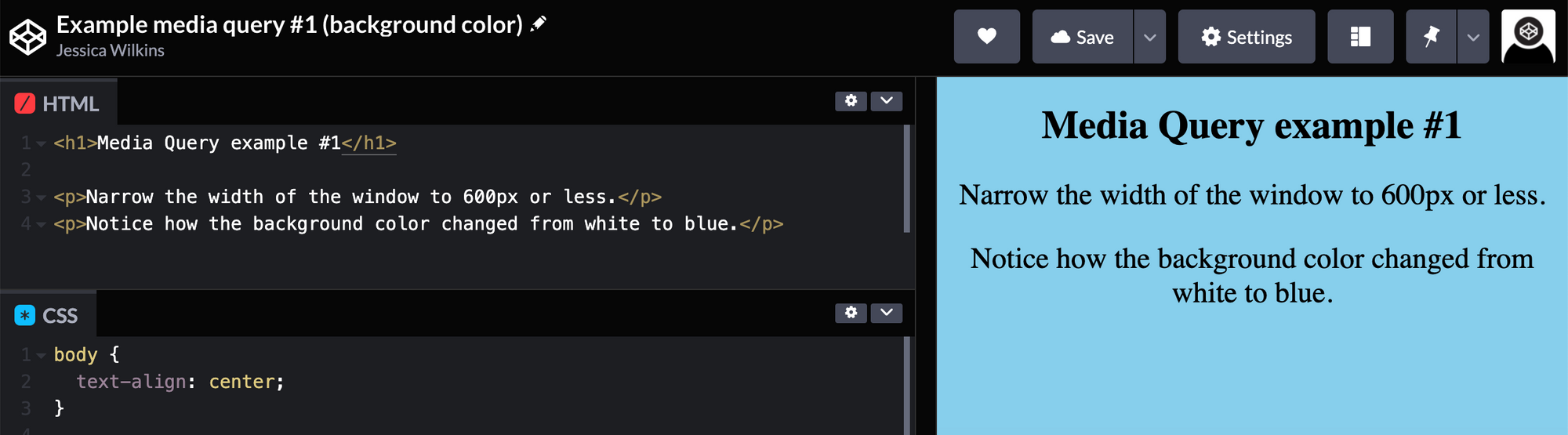
In this first example, we want the background color to change to blue when the width of the device is 600px or less.
In the CSS, we want to add a (max-width: 600px) for the media query which tells the computer to target devices with a screen width of 600px and less.
Inside the media query, we change the background styles for the body to background-color: #87ceeb;.
Here is the complete media query:
@media (max-width: 600px) {
  body {
    background-color: #87ceeb;
  }
}
Here is the CodePen example. If you click on the Edit on CodePen in the top right hand corner, you can test this out on Codepen.
In this second example, we want to change the background color from blue to red if the device has a width between 600 and 768px. We can use the and operator to accomplish this.
@media (min-width: 600px) and (max-width: 768px) {
  body {
    background-color: #de3163;
  }
}
Here is the complete CodePen example for you to try out:
When you test it out, you should see that the background color is blue if the width of the screen is below 600px or above 768px.
Should you write separate media queries for every single device on the market?
The short answer to that question is no.
There are way too many devices out on the market to try to write a media query for each device. Technology is always changing which means new devices will always be coming out.
It is more important that you target a range of devices using media queries. In Cem Eygi's freeCodeCamp article, he lists out some common breakpoints used for media queries.
- 320px — 480px: Mobile devices
- 481px — 768px: iPads, Tablets
- 769px — 1024px: Small screens, laptops
- 1025px — 1200px: Desktops, large screens
- 1201px and more — Extra large screens, TV
Conclusion
Responsive Design is the practice of making sure your content looks good on all screen sizes. Everything in the website including layouts, fonts and images should automatically adapt to the user's device.
In CSS, a media query is used to apply a set of styles based on the browser's characteristics including width, height, or screen resolution.
Here is the basic syntax for a media query in CSS.
@media media-type (media-feature){
/*Styles go here*/
}
The media type is optional unless you are using the not or only logical operators. If the media type is omitted then the media query will target all devices.
I hope you found this article helpful and best of luck on your CSS journey.