
Welcome to yet another tutorial where you will learn how to build a ⚽ scoreboard app in React. This time we will use Vite as our next generation frontend tooling and Vitest as a Vite-native unit testing framework.
You will also learn how to leverage React hooks, built as an abstraction of the native JavaScript timeouts and time intervals. For styling the application we will use CSS Modules with SASS.
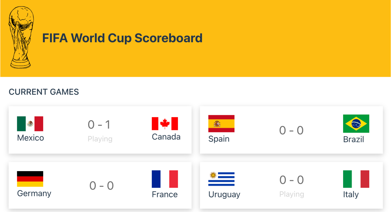
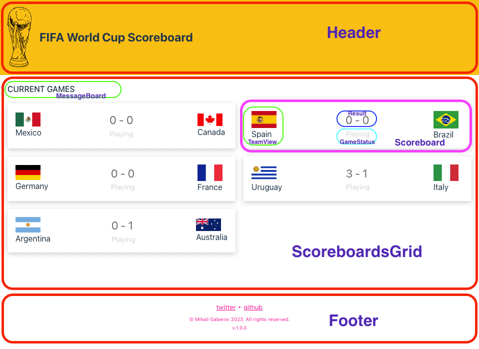
Here's what we'll be building:
Football live scoreboard - current games screen
💡If you want to skip the reading, 💁 here is the GitHub repository, and here you can see the live demo 📺.
What is a Scoreboard?

Football scoreboard
A live scoreboard is a digital sport scoreboard that automatically displays up-to-the-minute sports scores and data from a certain game – for example a football game. This way it’s much easier for the users to follow the game, make predictions or bets, and so on.
Our application is going to reflect such a board, but in the browser.
The Project
Our application has just a few dependencies and several components. It also uses JavaScript timeouts and intervals to simulate real-time score updates.
⚙️ Application features
Before going into the technical part of the tutorial, let's talk about the application features we will implement.
It’s always better (if possible, of course) to have clear project requirements laid out before writing a single line of code. But folks with some experience in the software engineering and development world know that the reality is often completely different.
The beauty of such small projects that you build for educational purposes is exactly this – you have the freedom to define your own requirements and to meet them in a feasible manner.
So here it the summary of the requirements/features:
Live Football World Cup Scoreboard that shows matches and scores.
The board supports the following operations:
Start a game. When a game starts, it should capture the home team and away team (with an initial score of 0 – 0).
Finish game. It will remove a match from the scoreboard.
Update score. Receiving the pair's score. When the home team or away team scores, it updates the game score.
Get a summary of games by total score. Those games with the same total score will be returned ordered by the most recently added to our system.
✍️ As an example, if this is the current data in the system:
a. Mexico - Canada: 0 - 5b. Spain - Brazil: 10 – 2c. Germany - France: 2 – 2d. Uruguay - Italy: 6 – 6e. Argentina - Australia: 3 - 1
The summary would give us the following information:
1. Uruguay 6 - Italy 62. Spain 10 - Brazil 23. Mexico 0 - Canada 54. Argentina 3 - Australia 15. Germany 2 - France 2
🏗️ Project Structure
Project Structure
Let me go through each of the files and give a short explanation of what they are and why we need them:
package.json – the configuration file of every Node.js app, created with npm or yarn, or any other package manager that uses the same approach.
README.md – not much to say here – it's a simple text file that uses Markdown and contains the description of the project, plus any other information you want to put there.
vite.config.js – the main configuration file that Vite uses, which you get when you do the installation from the previous step. The content of this file by default looks like this:
import { defineConfig } from 'vite'
import react from '@vitejs/plugin-react'

// <https://vitejs.dev/config/>
export default defineConfig({
  plugins: [react()],
})
But in my case, I had to add the test configurations so that we could run the tests. You will read more about this later in the article.
- setupTests.js – this one is used for configuring the unit tests. We put here any of the things we would like to have available in the tests we write.
For example, in order to be able to use unique keys when rendering multiple elements (because we React needs it), I am using the randomUUID()method of the Crypto interface to generate a v4 UUID using a cryptographically secure random number generator. And to make it available in my tests, I need to add it here, like this:
import { expect, afterEach } from 'vitest';
import { cleanup } from '@testing-library/react';
import matchers from '@testing-library/jest-dom/matchers';
import {randomUUID} from 'node:crypto';

// extends Vitest's expect method with methods from react-testing-library
expect.extend(matchers);

// runs a cleanup after each test case (e.g. clearing jsdom)
afterEach(() => {
    cleanup();
});

window.crypto.randomUUID = randomUUID;
yarn.lock – this is generated automatically when run yarn installation and lock the version of the packages being used.
.gitignore – comes out of the box from Vite installation. Here you define which files and folders you want Git to ignore, that is not get committed to your repo.
index.html – this the app’s entry point. It's a simple HTML document that has a few meta tags, and includes the logo and the main script file.
/src – contains a few different things we need to discuss:
First, it has the main.jsx file, which is where React and ReactDOM come in play. We also load here the default styles file I mentioned earlier.
It also has index.css which I have explained already.
Then we have App.jsx which is where our actual application code begins. This file can be considered as the main component in our application, as it contains all ‘inner’ parts of our app.
Then we have app.module.scss which contains styles for App component, using the CSS module convention to name the files with ‘module’ prefix and ‘scss’ extension.
Finally, we have App.test.jsx which contains a simple test for App component, using Vitest for testing framework.
🛠️ Components
Let me walk you quickly through each of the components in the application. They are located in the components folder.
/components folder contents:
Footer – self-explanatory, contains the footer part of the app.
GameStatus – used to show if a game has started, that is if it's being played.
Header – self-explanatory, contains the header part of the app.
MessageBoard – a small component used to display text messages that state when the games are starting or if we are looking at the “Summary” screen or the “Current Games”.
Result – another small component showing game scores.
Scoreboard – kind a parent component, serving as container that holds all the small ones in place.
ScoreboardGrid – this is the most important component in the app, as it contains all the logic related to the timers. It holds all child components and it’s responsible for passing the necessary data to them via their props.
TeamView – another small component serving as a representation of a team, which shows team’s flag and name.
⏱️ Timeouts
The timeouts – or more precisely the time intervals – in the application are implemented with the help of several React hooks. All of them are located in the hooks folder. I borrowed them from a very knowledgable and kinda famous guy named Josh W Comeau. I'll post the links in the end of the article.
So basically we use three hooks, one per type of time interval or timeout we need.
useInterval – this is based on the built-in JavaScript
setIntervalfunction and it's used for initial countdown, before the games startuseRandomInterval – this is an enhanced version of the previous one, and it’s used for randomly updating the score of the games, as well as randomly starting and stopping them
useTimeout – this is based on the built-in JavasScript
setTimeoutfunction and it’s used for deciding when to stop the playing time of the games and start finalizing them
🧾 How to Build the Project
By now you should have a decent understanding of what our application is and how its various parts are put together.
Let me now guide you, step-by-step, from the very beginning, and show you how I built it. I will add images where necessary, so that it’s easier for all of you to follow along.
📦 Dependencies
The dependencies we have are very few. Except Vite and Vitest, I have installed additionally only SASS, and the React Testing Library. Here is how my package.json file looks:
{
  "name": "scoreboard",
  "private": true,
  "version": "1.0.0",
  "type": "module",
  "author": "Mihail Gaberov",
  "scripts": {
    "dev": "vite",
    "test": "vitest",
    "build": "vite build",
    "preview": "vite preview"
  },
  "dependencies": {
    "react": "^18.2.0",
    "react-dom": "^18.2.0"
  },
  "devDependencies": {
    "@testing-library/jest-dom": "^5.16.5",
    "@testing-library/react": "^14.0.0",
    "@types/react": "^18.0.28",
    "@types/react-dom": "^18.0.11",
    "@vitejs/plugin-react": "^3.1.0",
    "jsdom": "^21.1.1",
    "sass": "^1.59.3",
    "vite": "^4.2.0",
    "vitest": "^0.29.7"
  }
}
🧑🏻💻 Installation
In this step I assume you are starting from scratch. We are going to use Vite for scaffolding the project. In order to do that you need to have Node.js installed on your system – at least version 14..18. I suggest that you update it to the latest stable version. And as a package manager you may go with either npm or yarn. In my case I use yarn.
In your terminal app run the following:
yarn create vite
And then follow the prompt.
Some of you may ask “Why Vite?” Here is a little praise of Vite that should answer that question.
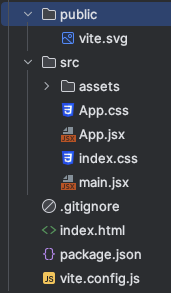
After doing the installation we have the bare skeleton of a React app that we can start building on. Here is how it looks:
Default Vite Project
💡 When starting such projects, I usually wipe off what’s there by default. Meaning that I delete the files I don’t plan to use, clean up App.jsx, and update the index.html file.
Another thing you may have noticed already is that the only pure CSS file I kept is index.css. This is one of the files that comes by default from Vite’s installation. I kept it as it is because it contains some basic styling that I didn’t want to move anywhere else.
After the initial cleaning and adding the files for styling and testing App.jsx, the project looks like this:
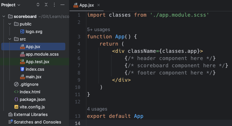
First steps of the project in App.jsx
In the screenshot above, you can see what the App.jsx file looks like after my changes. I placed comments as placeholders for where the components I need to create will be.
We are now ready to start building the components in question. Usually there are several different approaches you can take when deciding what to begin with. In this case, we'll start from top to bottom, create the header component, then jump to the scoreboard component, and in the end we'll build the footer component.
You could also decide to first build the essential part of the app, that is the scoreboard and in the end to add the “hat” and the “shoes”.
But in any case, what I recommend is to create empty components for each of the placeholders we have placed, based on the idea we have in mind about what our application will be.
Usually I use something called “Live Templates” in my IDE (in case you are using different IDE, I am sure there is an alternative for it) that can generate different types of a boilerplate code.
In our case I use it for generating empty functional React components. This comes in very handy at this stage of the development process, because we can quickly create our project's components, leaving them empty. Then later we can start filling them up with content.
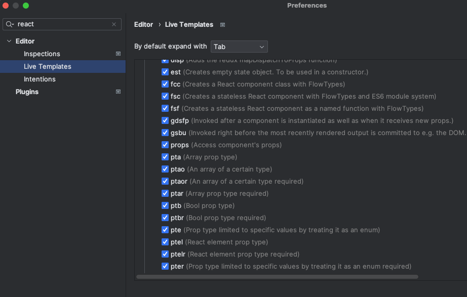
Live Templates in Webstorm
Generating boilerplate code for the components we will create
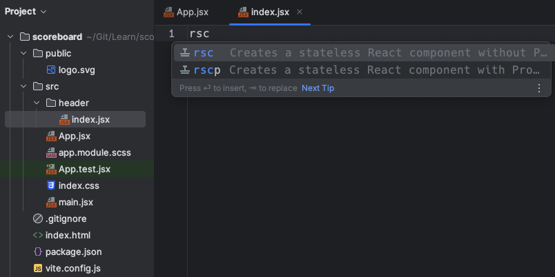
And this is what the result of the above looks like:
Generated boilerplate code for a functional component in React
🧩 How to Build the Header
In order to make the application to look more like a real-life one, I decided to add a small logo in the left part of the header, and a title next to it. Let’s see how it will look like in the browser and then how to implement it with code:

Application Header
First, I did a quick Google search and chose an appropriate image (the cup). I made sure to pick a SVG file for several reasons.
First and most important is the performance and the adjustability that come from it. And second, in the Vite default settings there is already an SVG logo added. So the only thing you need to do is to replace the existing one with yours. And then add some styling if necessary.
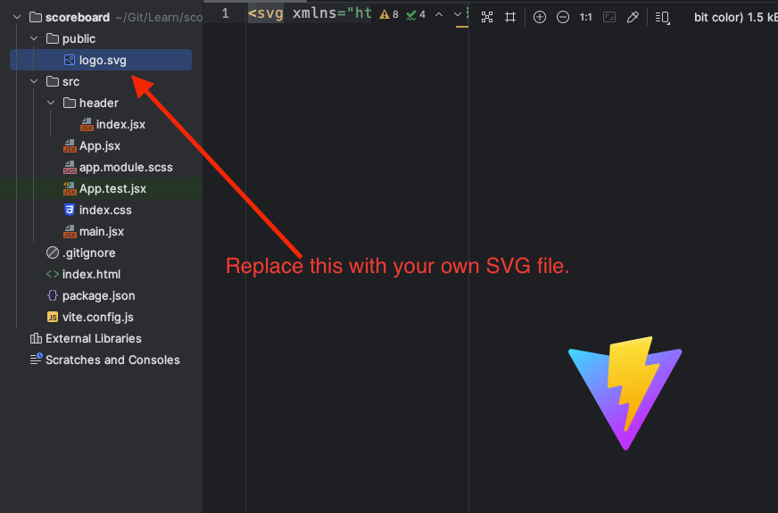
SVG logo
Let’s now look at the code of our brand new header component:
import './header.module.scss'
const Header = () => {
    return (
        <header>
            <img src='./logo.svg' alt='FIFA World Cup Scoreboard'/>
            <h2>FIFA World Cup Scoreboard</h2>
        </header>
    );
};

export default Header
If you keep the logo file in the public folder, you don’t need to worry about the path to the image. It’s taken care by Vite and you refer to it as it’s shown in the code above. The import statement in the beginning applies all styles to the header that make it looks like the picture.
header {
  display: flex;
  background-color: #fdbe11;
  justify-content: flex-start;
  align-items: center;

  img {
    width: 3rem;
    height: auto;
    margin: 1rem;
  }
}
After adding some tests, the content of the component folder looks like this:
Header component directory
I mentioned in the beginning of the article that we will use Vitest and React Testing Library to write the units/components tests for this application. Here is how the tests for the header look:
import { render, screen } from '@testing-library/react'
import { beforeEach, describe, expect, it } from 'vitest'
import Header from "./index"

describe('Header', () => {
    beforeEach(() => {
        render(<Header />)
    })
    it('renders correctly the app title', async () => {
        expect(screen.getByText(/FIFA World Cup Scoreboard/i)).toBeVisible()
    })

    it('renders correctly the app logo', async () => {
        const logo = screen.getByAltText('FIFA World Cup Scoreboard');
        expect(logo).toHaveAttribute('src', './logo.svg')
    })
})
As you probably can guess just by reading the tests, what we're doing here is checking for the app title and then the logo we saw on the left.
Congratulations 🎉 You just finished the implementation of the first building block of your application. Let’s continue now with the main area. This is where the essential functionality of the scoreboard will be.
🧩 How to Build the Scoreboard
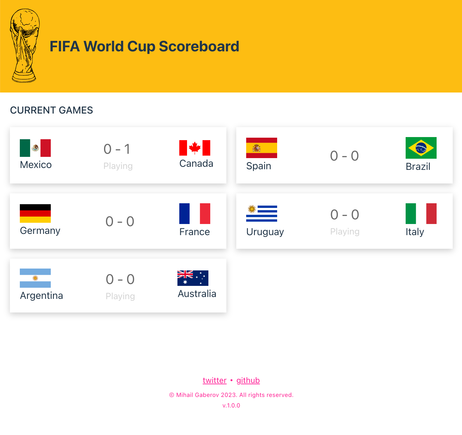
The scoreboard supports two screens: one showing the scores of the games that are currently being played, and another one showing a summary of the end results.
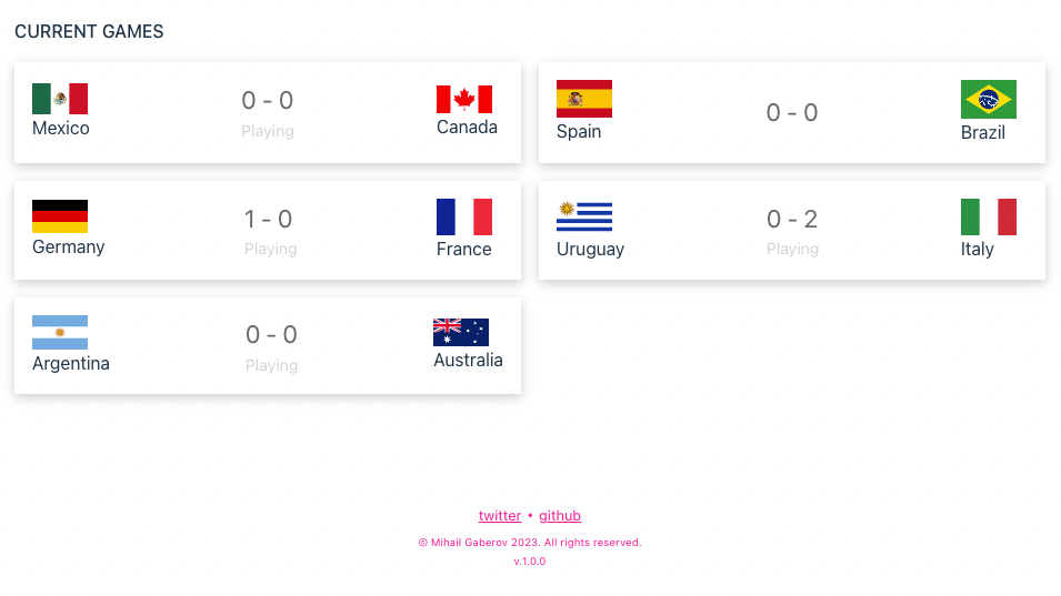
Current Games screen
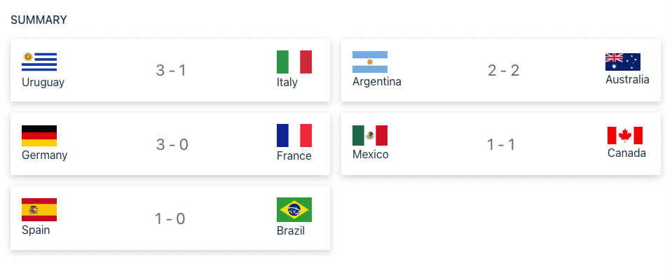
Summary screen
When I see this kind of layout design, I usually start thinking about a grid. Because, what’s a grid if not just rows and columns?
The modern CSS language has support for grid systems with just few lines of code, as you will see a bit later in this section. For example, to achieve this result I used the following styles:
.grid {
  list-style-type: none;
  margin: 1rem;
  display: grid;
  gap: 1rem;
  grid-template-columns: repeat(auto-fit, minmax(300px, 1fr));
}
Whenever I am about to implement a UI like this in a component based library such as React, I tend to mentally split it to separated blocks. These will turn into components.
Let me show you visually what I mean by this:
Thinking components - visual representation
I hope you can figure out what I am showing you on the picture above.
This is how I mentally split the design layout we have in place into representational components.
After defining the constituent parts of our application, it’s time to move forward and implement them in code.
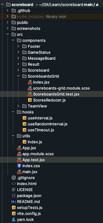
First we need the ScoreboardsGrid component that will hold all the smaller ones and will contain the logic for managing different events based on time.

ScoreboardsGrid component directory
As you may have noticed, in addition to the usual files, here we have one more – ScoresReducer.js. This is where our reducer logic lives. It’s responsible for manipulating the application state, depending on what actions are being triggered. In other words, this is where we actually update the score when a team scores, and also where we start and finish games.
In the return statement of the component we make use of the rest of the components we defined earlier.
...
...
...
return (
        <>
            {timeElapsed === 0 ?
                <>
                    <MessageBoard message={getScoreBoardStateMessage()}/>
                    <div className={classes.grid}>
                        {gamesToRender?.map(pairScore => (
                            <Scoreboard
                                key={crypto.randomUUID()}
                                pairScore={pairScore}
                                status={getGameStatus(pairScore.startedGame)}/>))}
                    </div>
                </> :
                <MessageBoard message={`Games are about to start in ${timeElapsed} seconds.`}/>
            }
        </>
    );
The rest of the code consists of a few helper methods, dispatch methods, and the logic for starting and stopping the timers.
From here, things become even easier. We just are going to use our smaller components for displaying different things in our scoreboard app.
For example, the MessageBoard component is just a container that shows in a stylistic way a bit of a string, passed via its props. Here is the implementation:
import classes from "./message-board.module.scss";

const Index = ({ message }) => {
    return (
        <div className={classes.message}>
            {message}
        </div>
    );
};

export default Index;
Same goes for the [GameStatus](https://github.com/mihailgaberov/scoreboard/tree/main/src/components/GameStatus) and [Result](https://github.com/mihailgaberov/scoreboard/tree/main/src/components/Result) components. The difference between the later ones is that Result gets two arguments – the name of each team in a game – and displays them with a dash (’-’) in the middle. GameStatus is just showing whatever we pass through via its props, which happens to be a string signifying that a game is playing at the moment.
The only component that is a bit different is TeamView, because it contains both an image and text, representing the teams. The code itself is far from complicated. See for yourself:
import classes from "./team-view.module.scss";

const TeamView = ({teamData}) => {
    return (
        <div className={classes.team}>
            <img src={`https://flagcdn.com/${teamData.countryCode}.svg`} width="50" alt={`${teamData.name}`}/>
            <span>{teamData.name}</span>
        </div>
    );
};

export default TeamView;
Here I used a regular HTML img tag, setting the width using inline styling. The rest is pretty straightforward.
With that, our coding job is more or less done. As you have probably seen, all the component have tests. These, in most cases, are just simple checks to see whether the component is being rendered correctly.
Maybe the most interesting tests to talk about are the ones we added for the ScoreboardGrid component.
This is so because we are using React Testing Library asynchronicity support to test the state of the component in different moments of the time. In this way we are able to test the initial timer ticking, before the games start. And after it expires, we can use it to check that our Current Games screen is displayed correctly. I'm pasting the code here as well, for easier reading.
import { render, screen } from '@testing-library/react'
import { describe, expect, it } from 'vitest'
import ScoreboardsGrid from "./index"

describe('ScoreboardsGrid', () => {
    it('renders correctly all available scoreboards', async () => {
        render(<ScoreboardsGrid />)

        expect(await screen.findByText(/Games are about to start in 3 seconds./i)).toBeVisible()
        expect(await screen.findByText(/Games are about to start in 2 seconds./i)).toBeVisible()
        expect(await screen.findByText(/Games are about to start in 1 seconds./i)).toBeVisible()
        expect(await screen.findByText(/Argentina/i)).toBeVisible()
        expect(await screen.findByText(/Australia/i)).toBeVisible()
        expect(await screen.findByText(/Spain/i)).toBeVisible()
        expect(await screen.findByText(/Brazil/i)).toBeVisible()
    })
})
After you've completed the implementation of the entire application and have a cup of ☕ or a glass of 🚰, it’s time to think about possible improvements.
For example, if we have more time to work on this project, what would we add or change, to make it an even better scoreboard app?
🧩 How to Build the Footer
To give the application a more complete look, I’ve decided to add a footer component as well. This is how it looks:

Footer Component
The implementation of it is pretty simple, too. We have two links to social platforms and a bit of copyright text. Here is how I coded it:
import classes from "./footer.module.scss";
import packageJson from '../../../package.json';
const Footer = () => {
const currentYear = new Date().getFullYear();
return (
<footer className={classes.footer} data-cy="footer">
<ul>
<li className={classes.footerLinks}>
<a
href="<https://twitter.com/mihailgaberov>"
target="_blank"
rel="noopener noreferrer"
data-cy="twitterLink"
>
twitter
</a>{" "}
•{" "}
<a
href="<https://github.com/mihailgaberov>"
target="_blank"
rel="noopener noreferrer"
data-cy="githubLink"
>
github
</a>
</li>
<li className={classes.footerCopyrights}>
© {packageJson.author} {currentYear}. All rights reserved.
</li>
<li>
<div className={classes.version}>v.{packageJson.version}</div>
</li>
</ul>
</footer>
);
};
export default Footer;
Again, in the component folder you will find the other files that are necessary for applying the styles and the tests for that component.
The code looks a bit cluttered because I used an unordered list and added the links and the text as a separated list elements. Then I used the tests to verify that the elements I want are rendered correctly.
Here is the essential part of the code that is doing this:
it('renders correctly social links', async () => {
    expect(screen.getByText(/twitter/i)).toBeVisible()
    expect(screen.getByText(/github/i)).toBeVisible()
  });

  it('has social links working correctly', async () => {
    expect(screen.getByText('twitter').closest('a')).toHaveAttribute('href', '<https://twitter.com/mihailgaberov>');
    expect(screen.getByText('github').closest('a')).toHaveAttribute('href', '<https://github.com/mihailgaberov>');
  });

  it("should contain copyright info", () => {
    expect(screen.getByText(/© Mihail Gaberov 2023. All rights reserved./i)).toBeVisible()
  });

  it("should contain version number", () => {
    expect(screen.getByText(/v.1.0.0/i)).toBeVisible()
  });
🚀 Possible Improvements
Add a clock under the game status, say counting down the seconds, to make it look more like a real-time app
Add some animation when updating the scores to make it easier for the user to spot the change
Add some interactivity in general:
Clicking on each game leads to a details pane with the match details
Option for selecting a favourite team
Add another page/tab where users can read a history summary of the past games
Conclusion
That was a fun challenge. Especially if you are a football fan, right? ⚽
We learned about several interesting topics.
First we learned what a scoreboard is, and the ‘why’ and the ‘how’ behind it.
Then we learned about Vite and Vitest, which I think are currently the best tools to use when making a React app – especially if you don’t want to start from scratch and deal with Webpack manually.
Then we saw how to leverage JavaScript timeouts with React hooks, and thus create some kind of time-based interactivity.
And last, but not least, we had fun, didn't we? 🕺🏻
Thanks for reading 🙏🏻
References:
Resources from Josh W. Comeau: for use-interval and use-timeout and use-random-interval
An article from Kent C. Dodds about common mistakes devs make with the React Testing Library