
By Black Raven
In this article, I will use some data related to life expectancy to evaluate the following models: Linear, Ridge, LASSO, and Polynomial Regression. So let's jump right in.
I was exploring the dengue trend in Singapore where there has been a recent spike in dengue cases – especially in the Dengue Red Zone where I am living. However, the raw data was not available on the NEA website.
I was wondering, has dengue affected the life expectancy of people in any country in particular? Do people in rich nations live longer? What are the factors affecting life expectancy of a country?
So I explored life expectancy and looked for data on the following aspects (features):
- Birth Rate
- Cancer Rate
- Dengue Cases
- Environmental Performance Index (EPI)
- Gross Domestic Product (GDP)
- Health Expenditure
- Heart Disease Rate
- Population
- Area
- Population Density
- Stroke Rate
The target is Life Expectancy, measured in number of years.
The assumptions are:
- These are country level averages
- There is no distinction between male and female
The Python code is available on my GitHub.
Data Science Process
I have used the following data science process in my analysis:
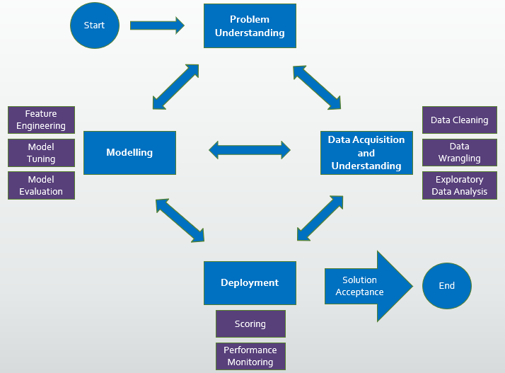
- data collection, data cleaning, Exploratory Data Analysis
- feature selection, feature engineering
- model selection, model tuning and hyperparameter tuning
- model optimization based on selected performance metric
Tools used for this analysis include:

- Python libraries, particularly Numpy and Pandas for manipulating data structures
- Matplotlib and Seaborn for visualization
- Scikit-Learn and Statsmodels for regression analysis
Exploratory Data Analysis
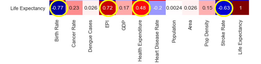
First I check for multi-collinearity between features.
sns.set(rc={'figure.figsize':(10,7)})sns.heatmap(df.corr(), cmap="seismic", annot=True, vmin=-1, vmax=1)
There seems to be some strong collinearity, denoted by boxes in dark red and dark blue as you can see in the image below.

For example, countries who spent more on healthcare have a higher EPI score. When health expenditures are higher, the stroke rate is also lower. And a larger area yields a higher population.
How about the correlation between features and target?
To live a long life, you should have a low stroke rate, high health expenditure, take good care of the environment, and have fewer babies (according to the correlation chart).
Let’s look at the initial pair plot.
sns.pairplot(df, height=1.5, aspect=1.5)

There seems to be a need to remove outliers in many features, for example, Dengue Cases, GDP, Population, Area, and Population Density.
Each outlier is replaced by the next highest value in the column. After removing the outliers, the plots are still skewed to the right (points are very concentrated on the left side). So this suggests that some transformation might be needed.
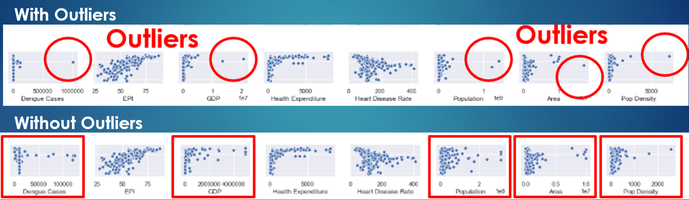
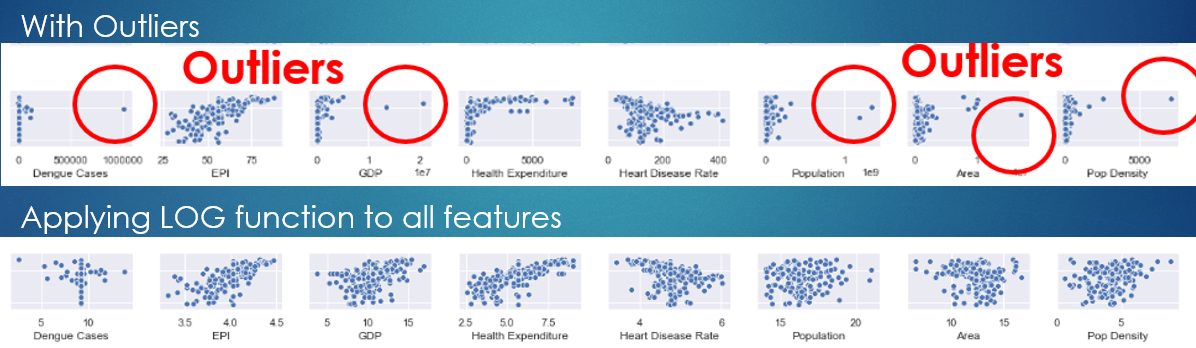
Another way to remove outliers is to use the LOG function, which helps to spread the concentrated data to the right.
Feature Selection
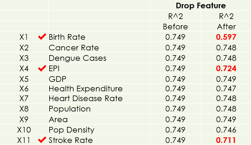
To look for significant features, I dropped one feature at a time to see its impact on the simple regression model. Looking at the R² Score, these 3 features (Birth Rate, EPI, Stroke Rate) are chosen, because the model will be adversely affected without them.
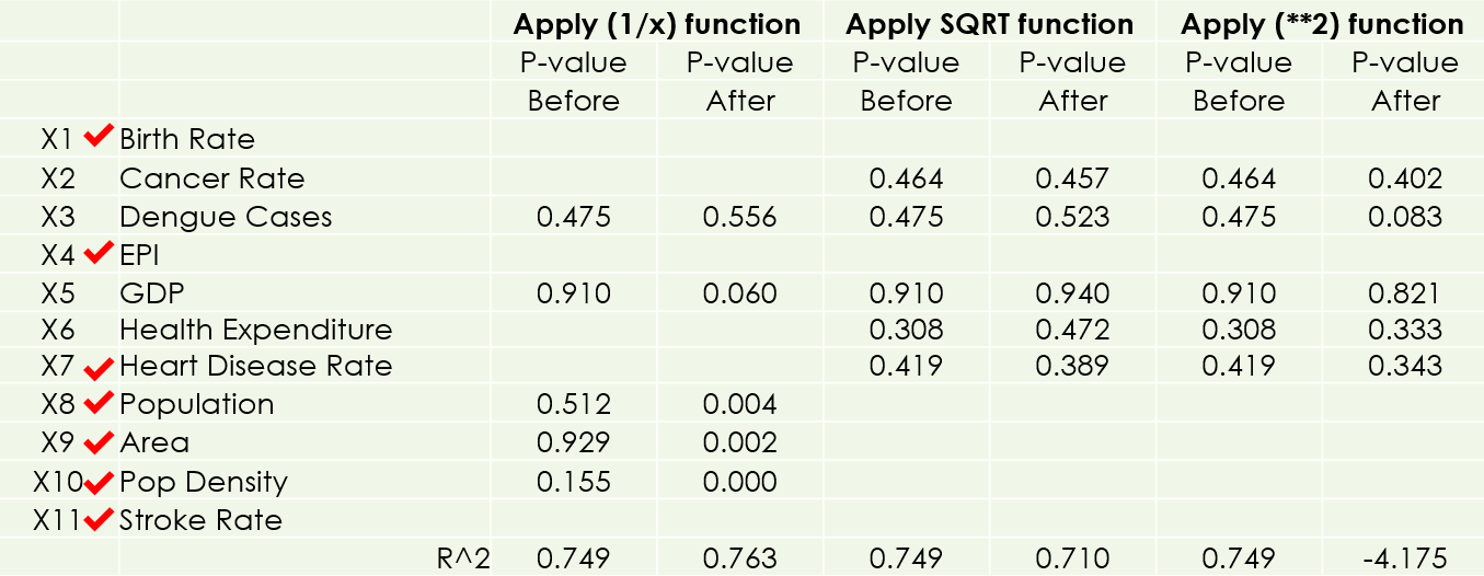
Next, I removed outliers and review the p-values on Statsmodels. I gained one more significant feature (Population Density). When the p-value of a feature is less than 0.05, it is considered a good feature, as I have chosen 5% as the significance level.

After that, I applied LOG functions to all features, and gained 4 more significant features (GDP, Heart Disease Rate, Population, and Area).

I have also done other transformations (Reciprocal, Power 2, Square Root) but there is no more improvement.
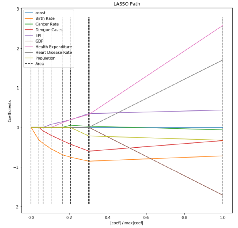
Features can also be selected using the LassoCV feature in SkLearn.
Finally I looked at the pair plot again with all significant features. The scatter plots are now nicely spread out with some clear trends.

Model Selection
I am now ready to fit the following models on the train data set:
- Linear Regression (a straight line which approximates the relationship between the dependent variables and the independent target variable)
- Ridge Regression (this reduces model complexity while keeping all coefficients in the model, known as L2 penalty)
- LASSO Regression (Least Absolute Shrinkage and Selection Operator reduces model complexity by penalizing model coefficients to zero, for example, L1 penalty)
- Degree 2 Polynomial Regression (a curve line to approximate the relationship between the dependent variables and the independent target variable)

I have also validated their performance on the validation data set. The simple linear regression model seems to have the potential to be the best performing model.
This is confirmed by Cross Validation using KFold (with 5 splits).

Finally, I checked the residue error against assumptions. The residue errors should be normally distributed with equal variance around the mean zero. The Normal Quartile-to-Quartile plot also looks acceptably normal.

Since I only have 250 rows (data limited by the number of countries in the world), I used the entire data set to simulate the test data set (note: this is done for academic purpose, not practical as it will lead to data leakage). I used KFold Cross Validation with 10 splits to evaluate the model performance.
from sklearn.model_selection import cross_val_score
from sklearn.model_selection import KFold
kf = KFold(n_splits=5, shuffle=True, random_state = 1)
lm = LinearRegression()
lm.fit(X_train, y_train)
cvs_lm = cross_val_score(lm, X, y, cv=kf, scoring='r2')
print(cvs_lm)
There is quite a bit of variation in the R² values from 0.49 to 0.82, but the average result is around 0.69, which is quite satisfactory.

How do we interpret the model?
df = pd.read_csv('df3.csv')
X = df[ ['Birth Rate', 'EPI', 'GDP', 'Heart Disease Rate', 'Population', 'Area', 'Pop Density', 'Stroke Rate'] ].astype(float)
X = np.log(X)
y = df[ "Life Expectancy" ].astype(float)
X = sm.add_constant(X)

model = sm.OLS(y, X)
results = model.fit()
results.summary()
If you're unaffected by the features, your life expectancy is 62 years. If your country has low birth rate, add 5 more years to your life. If the EPI (Environment Performance Index) is high, add 8 more years to your life. If you live in a rich country, add half a year to your life. Finally for every unit (or rather LOG unit) decrease in stroke rate, 5 more years could be added to your life.

Next Steps
I could possibly collect more data by expanding the scope to cities instead of countries, and exploring other features (factors) affecting life expectancy. Also, I could split the data into male and female categories for such life expectancy regression analysis.
To conclude, here are some interesting insights:
- Japan has the highest life expectancy (83.7 years). Central African Republic (49.5 years) and many countries in the African continent are at the bottom of scale. Singapore is ranked #5 (82.7 years).
2. Take good care of the environment. This has the largest coefficient (impact) on a country’s life expectancy.
The Python code for the above analysis is available on my GitHub – do feel free to refer to it.
https://github.com/JNYH/Project-Luther
Video presentation: https://youtu.be/gC2m_lvouu8
Thank you for reading.