

Imagine you're building a site for a client, a small mom-and-pop store, that only has two pages.
That's not a lot. So when you finish working on the landing page and start on the contact page, you just create a new HTML file and copy over all the code from the first page.
The header and footer are already looking good, and all you need to do is change the rest of the content.
But what if your client wants 10 pages? Or 20? And they request minor changes to the header and footer throughout development.
Suddenly any change, no matter how small, has to be repeated across all those files.
This is one of the major problems things like React or Handlebars.js solve: any code, especially structural things like a header or footer, can be written once and easily reused throughout a project.
Until recently it wasn't possible to use components in vanilla HTML and JavaScript. But with the introduction of Web Components, it's possible to create reusable components without using things like React.
What Are Web Components?
Web Components are actually a collection of a few different technologies that allow you to create custom HTML elements.
Those technologies are:
- HTML templates: Fragments of HTML markup using
<template>elements that won't be rendered until they're appended to the page with JavaScript. - Custom elements: Widely supported JavaScript APIs that let you create new DOM elements. Once you create and register a custom element using these APIs, you can use it similarly to a React component.
- Shadow DOM: A smaller, encapsulated DOM that is isolated from the main DOM and rendered separately. Any styles and scripts you create for your custom components in the Shadow DOM will not affect other elements in the main DOM.
We'll dive into each of these a bit more throughout the tutorial.
How to Use HTML Templates
The first piece of the puzzle is learning how to use HTML templates to create reusable HTML markdown.
Let's look at a simple welcome message example:
<!DOCTYPE html>
<html>
  <head>
    <meta charset="UTF-8">
    <meta name="viewport" content="width=device-width, initial-scale=1.0">
    <meta http-equiv="X-UA-Compatible" content="ie=edge">
    <link href="style.css" rel="stylesheet" type="text/css" />
    <script src="index.js" type="text/javascript" defer></script>
  </head>
  <body>
    <template id="welcome-msg">
      <h1>Hello, World!</h1>
      <p>And all who inhabit it</p>
    </template>
  </body>
<html>
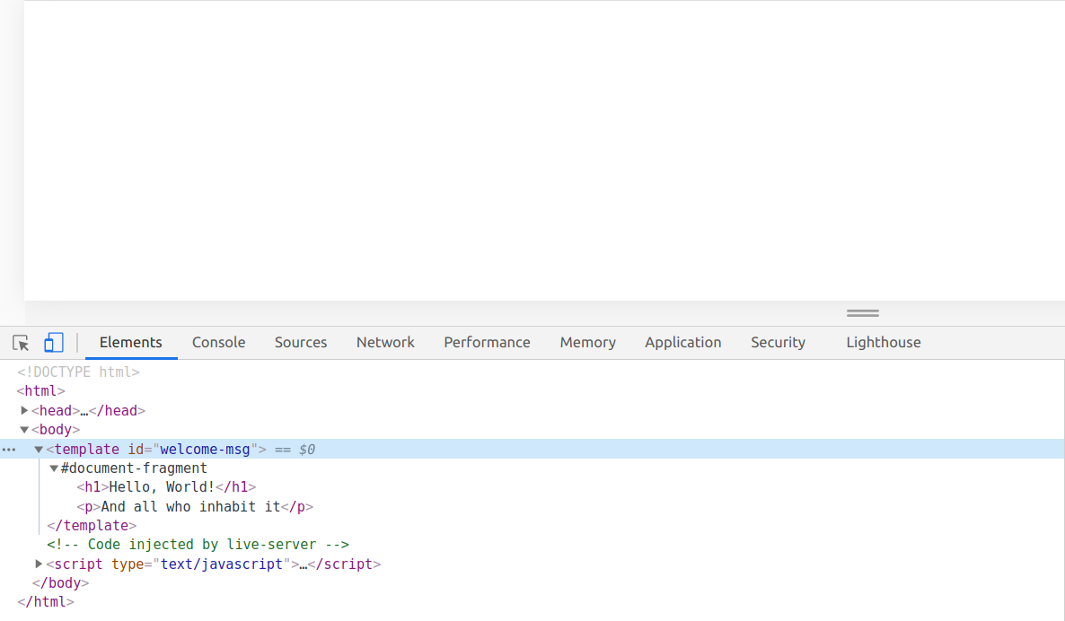
If you look at the page, neither the <h1> or <p> elements are rendered. But if you open the dev console, you'll see both elements have been parsed:
To actually render the welcome message, you'll need to use a bit of JavaScript:
const template = document.getElementById('welcome-msg');

document.body.appendChild(template.content);
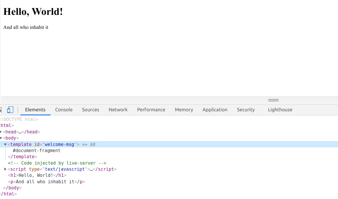
Even though this is a pretty simple example, you can already see how using templates makes it easy to reuse code throughout a page.
The main issue is that, at least with the current example, the welcome message code is mixed in with the rest of the page's content. If you want to change the welcome message later, you'll need to change the code across multiple files.
Instead, you can pull the HTML template into the JavaScript file, so any page the JavaScript is included in will render the welcome message:
<!DOCTYPE html>
<html>
  <head>
    <meta charset="UTF-8">
    <meta name="viewport" content="width=device-width, initial-scale=1.0">
    <meta http-equiv="X-UA-Compatible" content="ie=edge">
    <link href="style.css" rel="stylesheet" type="text/css" />
    <script src="index.js" type="text/javascript" defer></script>
  </head>
  <body>

  </body>
<html>
const template = document.createElement('template');

template.innerHTML = `
  <h1>Hello, World!</h1>
  <p>And all who inhabit it</p>
`;

document.body.appendChild(template.content);
Now that everything's in the JavaScript file, you don't need to create a <template> element – you could just as easily create a <div> or <span>.
However, <template> elements can be paired with a <slot> element, which allows you to do things like change the text for elements within the <template>. It's a bit outside the scope of this tutorial, so you can read more about <slot> elements over on MDN.
How to Create Custom Elements
One thing you might have noticed with HTML templates is that it can be tricky to insert your code in the right place. The earlier welcome message example was just appended to the page.
If there was content already on the page, say, a banner image, the welcome message would appear below it.
As a custom element, your welcome message might look like this:
<welcome-message></welcome-message>
And you can put it wherever you want on the page.
With that in mind, let's take a look at custom elements and create our own React-like header and footer elements.
Setup
For a portfolio site, you might have some boilerplate code that looks like this:
<!DOCTYPE html>
<html>
  <head>
    <meta charset="UTF-8">
    <meta name="viewport" content="width=device-width, initial-scale=1.0">
    <meta http-equiv="X-UA-Compatible" content="ie=edge">
    <link href="style.css" rel="stylesheet" type="text/css" />
  </head>
  <body>
    <main>
      <!-- Your page's content -->
    </main>
  </body>
<html>
* {
  margin: 0;
  padding: 0;
  box-sizing: border-box;
}

html, body {
  height: 100%;
}

body {
  color: #333;
  font-family: sans-serif;
  display: flex;
  flex-direction: column;
}

main {
  flex: 1 0 auto;
}
Each page will have the same header and footer, so it makes sense to create a custom element for each of those.
Let's start with the header.
Define a Custom Element
First, create a directory called components and inside that directory, create a new file called header.js with the following code:
class Header extends HTMLElement {
  constructor() {
    super();
  }
}
It's just a simple ES5 Class declaring your custom Header component, with the constructor method and special super keyword. You can read more about those on MDN.
By extending the generic [HTMLElement](https://developer.mozilla.org/en-US/docs/Web/API/HTMLElement) class, you can create any kind of element you want. It's also possible to extend specific elements like [HTMLParagraphElement](https://developer.mozilla.org/en-US/docs/Web/API/HTMLParagraphElement).
Register Your Custom Element
Before you can start using your custom element, you'll need to register it with the customElements.define() method:
class Header extends HTMLElement {
  constructor() {
    super();
  }
}

customElements.define('header-component', Header);
This method takes at least two arguments.
The first is a DOMString you'll use when adding the component to the page, in this case, <header-component></header-component>.
The next is the component's class that you created earlier, here, the Header class.
The optional third argument describes which existing HTML element your custom element inherits properties from, for example, {extends: 'p'}. But we won't be using this feature in this tutorial.
Use Lifecycle Callbacks to Add the Header to the Page
There are four special lifecycle callbacks for custom elements that we can use to append header markdown to the page: connectedCallback, attributeChangeCallback, disconnectedCallback, and adoptedCallback.
Of these callbacks, connectedCallback is one of the most commonly used. connectedCallback runs each time your custom element is inserted into the DOM.
You can read more about the other callbacks here.
For our simple example, connectedCallback is enough to add a header to the page:
class Header extends HTMLElement {
  constructor() {
    super();
  }

  connectedCallback() {
    this.innerHTML = `
      <style>
        nav {
          height: 40px;
          display: flex;
          align-items: center;
          justify-content: center;
          background-color:  #0a0a23;
        }

        ul {
          padding: 0;
        }

        a {
          font-weight: 700;
          margin: 0 25px;
          color: #fff;
          text-decoration: none;
        }

        a:hover {
          padding-bottom: 5px;
          box-shadow: inset 0 -2px 0 0 #fff;
        }
      </style>
      <header>
        <nav>
          <ul>
            <li><a href="about.html">About</a></li>
            <li><a href="work.html">Work</a></li>
            <li><a href="contact.html">Contact</a></li>
          </ul>
        </nav>
      </header>
    `;
  }
}

customElements.define('header-component', Header);
Then in index.html, add the components/header.js script and <header-component></header-component> just above the <main> element:
<!DOCTYPE html>
<html>
  <head>
    <meta charset="UTF-8">
    <meta name="viewport" content="width=device-width, initial-scale=1.0">
    <meta http-equiv="X-UA-Compatible" content="ie=edge">
    <link href="style.css" rel="stylesheet" type="text/css" />
    <script src="components/header.js" type="text/javascript" defer></script>
  </head>
  <body>
    <header-component></header-component>
    <main>
      <!-- Your page's content -->
    </main>
  </body>
<html>
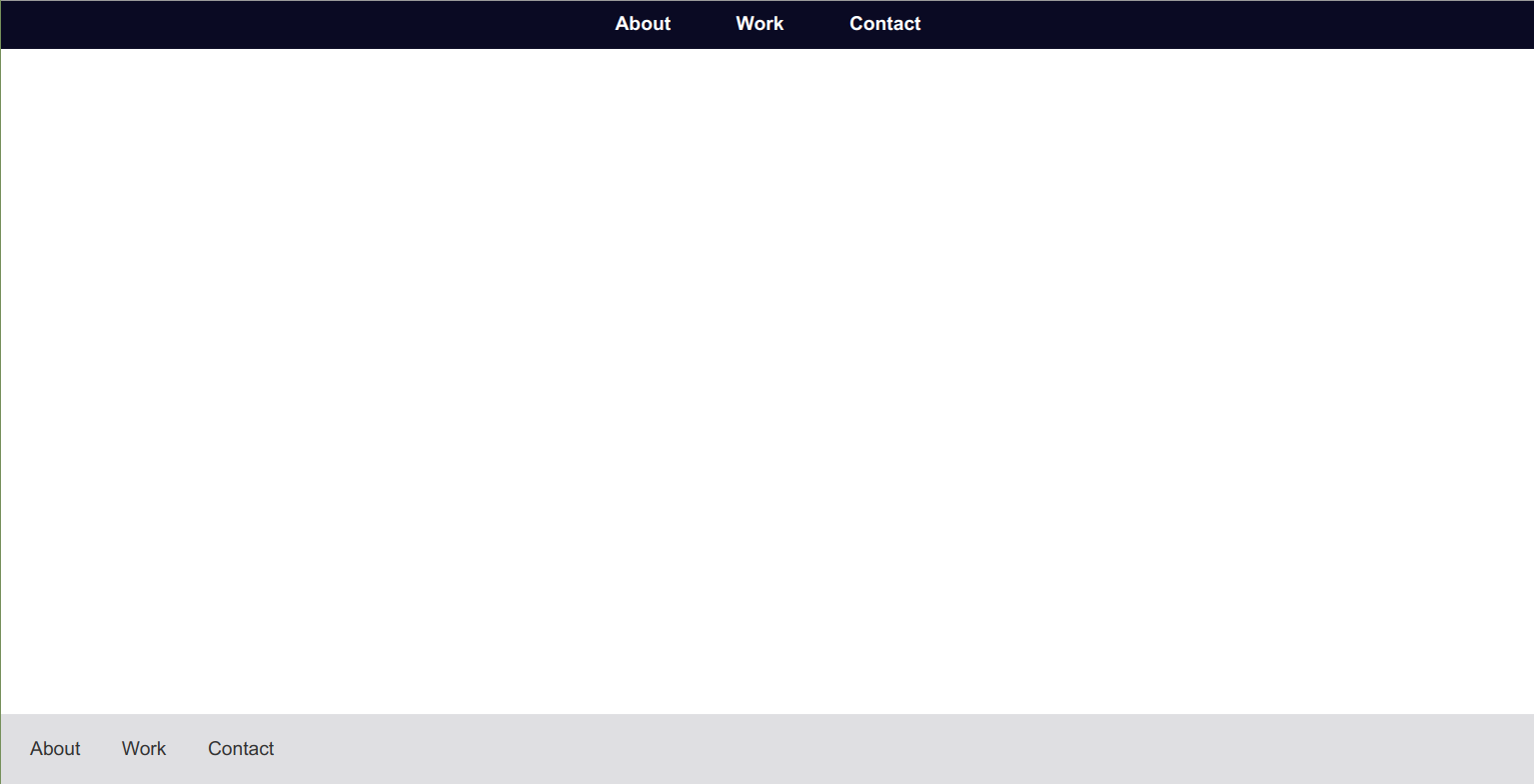
And your reusable header component should be rendered to the page:

Now adding a header to the page is as easy as adding a <script> tag pointing to components/header.js, and adding <header-component></header-component> wherever you want.
Note that, since the header and its styling are being inserted into the main DOM directly, it's possible to style it in the style.css file.
But if you look at the header styles included in connectedCallback, they're quite general, and can affect other styling on the page.
For example, if we add Font Awesome and a footer component to index.html:
<!DOCTYPE html>
<html>
  <head>
    <meta charset="UTF-8">
    <meta name="viewport" content="width=device-width, initial-scale=1.0">
    <meta http-equiv="X-UA-Compatible" content="ie=edge">
    <link rel="stylesheet" href="https://cdnjs.cloudflare.com/ajax/libs/font-awesome/5.15.1/css/all.min.css" integrity="sha512-+4zCK9k+qNFUR5X+cKL9EIR+ZOhtIloNl9GIKS57V1MyNsYpYcUrUeQc9vNfzsWfV28IaLL3i96P9sdNyeRssA==" crossorigin="anonymous" />
    <link href="style.css" rel="stylesheet" type="text/css" />
    <script src="components/header.js" type="text/javascript" defer></script>
    <script src="components/footer.js" type="text/javascript" defer></script>
  </head>
  <body>
    <header-component></header-component>
    <main>
      <!-- Your page's content -->
    </main>
    <footer-component></footer-component>
  </body>
<html>
class Footer extends HTMLElement {
  constructor() {
    super();
  }

  connectedCallback() {
    this.innerHTML = `
      <style>
        footer {
          height: 60px;
          padding: 0 10px;
          list-style: none;
          display: flex;
          justify-content: space-between;
          align-items: center;
          background-color: #dfdfe2;
        }

        ul li {
          list-style: none;
          display: inline;
        }

        a {
          margin: 0 15px;
          color: inherit;
          text-decoration: none;
        }

        a:hover {
          padding-bottom: 5px;
          box-shadow: inset 0 -2px 0 0 #333;
        }

        .social-row {
          font-size: 20px;
        }

        .social-row li a {
          margin: 0 15px;
        }
      </style>
      <footer>
        <ul>
          <li><a href="about.html">About</a></li>
          <li><a href="work.html">Work</a></li>
          <li><a href="contact.html">Contact</a></li>
        </ul>
        <ul class="social-row">
          <li><a href="https://github.com/my-github-profile"><i class="fab fa-github"></i></a></li>
          <li><a href="https://twitter.com/my-twitter-profile"><i class="fab fa-twitter"></i></a></li>
          <li><a href="https://www.linkedin.com/in/my-linkedin-profile"><i class="fab fa-linkedin"></i></a></li>
        </ul>
      </footer>
    `;
  }
}

customElements.define('footer-component', Footer);
Here's what the page would look like:

The styling from the footer component overrides the styling for the header, changing the color of the links. That's expected behavior for CSS, but it would be nice if each component's styling was scoped to that component, and wouldn't affect other things on the page.
Well, that's exactly where the Shadow DOM shines. Or shades? Anyway, the Shadow DOM can do that.
How to Use the Shadow Dom with Custom Elements
The Shadow DOM acts as a separate, smaller instance of the main DOM. Rather than act as a copy of the main DOM, the Shadow DOM is more like a subtree just for your custom element. Anything added to a Shadow DOM, especially styles, are scoped that particular custom element.
In a way, it's like using const and let rather than var.
Let's start by refactoring the header component:
const headerTemplate = document.createElement('template');

headerTemplate.innerHTML = `
  <style>
    nav {
      height: 40px;
      display: flex;
      align-items: center;
      justify-content: center;
      background-color:  #0a0a23;
    }

    ul {
      padding: 0;
    }

    ul li {
      list-style: none;
      display: inline;
    }

    a {
      font-weight: 700;
      margin: 0 25px;
      color: #fff;
      text-decoration: none;
    }

    a:hover {
      padding-bottom: 5px;
      box-shadow: inset 0 -2px 0 0 #fff;
    }
  </style>
  <header>
    <nav>
      <ul>
        <li><a href="about.html">About</a></li>
        <li><a href="work.html">Work</a></li>
        <li><a href="contact.html">Contact</a></li>
      </ul>
    </nav>
  </header>
`;

class Header extends HTMLElement {
  constructor() {
    super();
  }

  connectedCallback() {

  }
}

customElements.define('header-component', Header);
The first thing you need to do is to use the .attachShadow() method to attach a shadow root to your custom header component element. In connectedCallback, add the following code:
...
class Header extends HTMLElement {
  constructor() {
    super();
  }

  connectedCallback() {
    const shadowRoot = this.attachShadow({ mode: 'closed' });
  }
}

customElements.define('header-component', Header);
Notice that we're passing an object to .attachShadow() with an option, mode: 'closed'. This just means that the header component's shadow DOM is inaccessible from external JavaScript.
If you'd like to manipulate the header component's shadow DOM later with JavaScript outside the components/header.js file, just change the option to mode: 'open'.
Finally, append shadowRoot to the page with the .appendChild() method:
...

class Header extends HTMLElement {
  constructor() {
    super();
  }

  connectedCallback() {
    const shadowRoot = this.attachShadow({ mode: 'closed' });

    shadowRoot.appendChild(headerTemplate.content);
  }
}

customElements.define('header-component', Header);
And now, since the header component's styles are encapsulated in its Shadow DOM, the page should look like this:

And here's the footer component refactored to use the Shadow DOM:
const footerTemplate = document.createElement('template');

footerTemplate.innerHTML = `
  <style>
    footer {
      height: 60px;
      padding: 0 10px;
      list-style: none;
      display: flex;
      flex-shrink: 0;
      justify-content: space-between;
      align-items: center;
      background-color: #dfdfe2;
    }

    ul {
      padding: 0;
    }

    ul li {
      list-style: none;
      display: inline;
    }

    a {
      margin: 0 15px;
      color: inherit;
      text-decoration: none;
    }

    a:hover {
      padding-bottom: 5px;
      box-shadow: inset 0 -2px 0 0 #333;
    }

    .social-row {
      font-size: 20px;
    }

    .social-row li a {
      margin: 0 15px;
    }
  </style>
  <footer>
    <ul>
      <li><a href="about.html">About</a></li>
      <li><a href="work.html">Work</a></li>
      <li><a href="contact.html">Contact</a></li>
    </ul>
    <ul class="social-row">
      <li><a href="https://github.com/my-github-profile"><i class="fab fa-github"></i></a></li>
      <li><a href="https://twitter.com/my-twitter-profile"><i class="fab fa-twitter"></i></a></li>
      <li><a href="https://www.linkedin.com/in/my-linkedin-profile"><i class="fab fa-linkedin"></i></a></li>
    </ul>
  </footer>
`;

class Footer extends HTMLElement {
  constructor() {
    super();
  }

  connectedCallback() {
    const shadowRoot = this.attachShadow({ mode: 'closed' });

    shadowRoot.appendChild(footerTemplate.content);
  }
}

customElements.define('footer-component', Footer);
But if you check on the page, you'll notice that the Font Awesome icons are now missing:
Now that the footer component is encapsulated within its own Shadow DOM, it no longer has access to the Font Awesome CDN link in index.html.
Let's take a quick look at why this is, and how to get Font Awesome working again.
Encapsulation and the Shadow DOM
While the Shadow DOM does prevent styles from your components from affecting the rest of the page, some global styles can still leak through to your components.
In the examples above, this has been a useful feature. For example, the footer component inherits the color: #333 declaration that's set in style.css. This is because color is one of a handful of inheritable properties, along with font, font-family, direction, and more.
If you'd like to prevent this behavior, and style each component completely from scratch, you can do that with just a few lines of CSS:
:host {
  all: initial;
  display: block;
}
:host is a pseudo-selector that selects the element that's hosting the Shadow DOM. In this case, that's your custom component.
Then the all: initial declaration sets all CSS properties back to their initial value. And display: block does the same thing for the display property, and sets it back to the browser default, block.
For a full list of CSS inheritable properties, check out this answer on Stack Overflow.
How to Use Font Awesome With the Shadow DOM
Now you might be thinking, if font, font-family and other font-related CSS properties are inheritable properties, why doesn't Font Awesome load now that the footer component is using the Shadow DOM?
It turns out that, for things like fonts and other assets, they need to be referenced in both the main DOM and Shadow DOM to work properly.
Fortunately there are a few simple ways to fix this.
Note: All of these methods still require that Font Awesome is included in index.html with the link element as in the code snippets above.
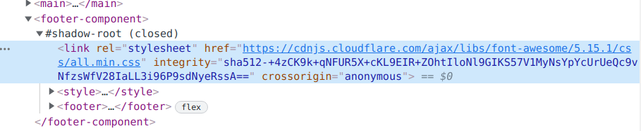
#1: Link to Font Awesome Within Your Component
The most straightforward way to get Font Awesome to work in your Shadow DOM component is to include a link to it within the component itself:
const footerTemplate = document.createElement('template');

footerTemplate.innerHTML = `
  <link rel="stylesheet" href="https://cdnjs.cloudflare.com/ajax/libs/font-awesome/5.15.1/css/all.min.css" integrity="sha512-+4zCK9k+qNFUR5X+cKL9EIR+ZOhtIloNl9GIKS57V1MyNsYpYcUrUeQc9vNfzsWfV28IaLL3i96P9sdNyeRssA==" crossorigin="anonymous" />
  <style>
    footer {
      height: 60px;
      padding: 0 10px;
      list-style: none;
...
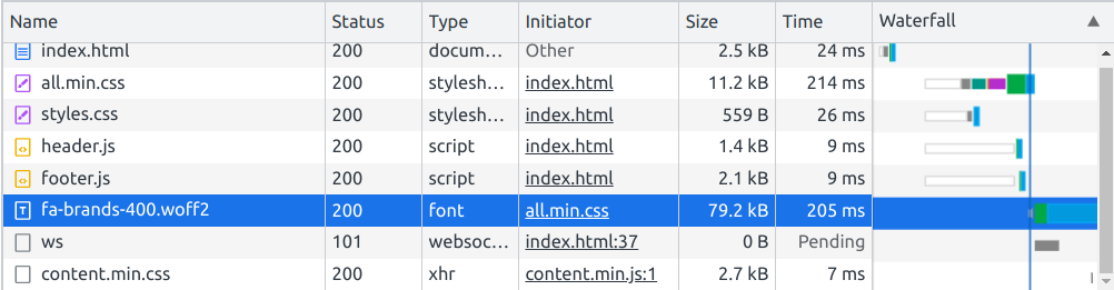
One thing to note is, while it seems like you're causing the browser to load Font Awesome twice (once for the main DOM and again for the component), browsers are smart enough not to fetch the same resource again.
Here's the network tab showing that Chrome only fetches Font Awesome once:
#2: Import Font Awesome Within Your Component
Next, you can use @import and url() to load Font Awesome into your component:
const footerTemplate = document.createElement('template');

footerTemplate.innerHTML = `
  <style>
    @import url("https://cdnjs.cloudflare.com/ajax/libs/font-awesome/5.15.1/css/all.min.css");

    footer {
      height: 60px;
      padding: 0 10px;
      list-style: none;
...
Note that the URL should be the same one you're using in index.html.
#3: Use JavaScript to Dynamically Load Font Awesome to Your Component
Finally, the DRYest way to load Font Awesome within your component is to use a bit of JavaScript:
...
class Footer extends HTMLElement {
  constructor() {
    super();
  }

  connectedCallback() {
    // Query the main DOM for FA
    const fontAwesome = document.querySelector('link[href*="font-awesome"]');
    const shadowRoot = this.attachShadow({ mode: 'closed' });

    // Conditionally load FA to the component
    if (fontAwesome) {
      shadowRoot.appendChild(fontAwesome.cloneNode());
    }

    shadowRoot.appendChild(footerTemplate.content);
  }
}

customElements.define('footer-component', Footer);
This method is based on this answer on Stack Overflow, and works pretty simply. When the component loads, if a link element pointing to Font Awesome exists, then it's cloned and appended to the component's Shadow DOM:
Final Code
Here's what the final code across all files looks like, and using method #3 to load Font Awesome into the footer component:
<!DOCTYPE html>
<html>
  <head>
    <meta charset="UTF-8">
    <meta name="viewport" content="width=device-width, initial-scale=1.0">
    <meta http-equiv="X-UA-Compatible" content="ie=edge">
    <link rel="stylesheet" href="https://cdnjs.cloudflare.com/ajax/libs/font-awesome/5.15.1/css/all.min.css" integrity="sha512-+4zCK9k+qNFUR5X+cKL9EIR+ZOhtIloNl9GIKS57V1MyNsYpYcUrUeQc9vNfzsWfV28IaLL3i96P9sdNyeRssA==" crossorigin="anonymous" />
    <link href="style.css" rel="stylesheet" type="text/css" />
    <script src="components/header.js" type="text/javascript" defer></script>
    <script src="components/footer.js" type="text/javascript" defer></script>
  </head>
  <body>
    <header-component></header-component>
    <main>
      <!-- Your page's content -->
    </main>
    <footer-component></footer-component>
  </body>
<html>
* {
  margin: 0;
  padding: 0;
  box-sizing: border-box;
}

html,
body {
  height: 100%;
}

body {
  color: #333;
  font-family: sans-serif;
  display: flex;
  flex-direction: column;
}

main {
  flex: 1 0 auto;
}
const headerTemplate = document.createElement('template');

headerTemplate.innerHTML = `
  <style>
    nav {
      height: 40px;
      display: flex;
      align-items: center;
      justify-content: center;
      background-color:  #0a0a23;
    }

    ul {
      padding: 0;
    }

    ul li {
      list-style: none;
      display: inline;
    }

    a {
      font-weight: 700;
      margin: 0 25px;
      color: #fff;
      text-decoration: none;
    }

    a:hover {
      padding-bottom: 5px;
      box-shadow: inset 0 -2px 0 0 #fff;
    }
  </style>
  <header>
    <nav>
      <ul>
        <li><a href="about.html">About</a></li>
        <li><a href="work.html">Work</a></li>
        <li><a href="contact.html">Contact</a></li>
      </ul>
    </nav>
  </header>
`;

class Header extends HTMLElement {
  constructor() {
    super();
  }

  connectedCallback() {
    const shadowRoot = this.attachShadow({ mode: 'closed' });

    shadowRoot.appendChild(headerTemplate.content);
  }
}

customElements.define('header-component', Header);
const footerTemplate = document.createElement('template');

footerTemplate.innerHTML = `
  <style>
    footer {
      height: 60px;
      padding: 0 10px;
      list-style: none;
      display: flex;
      flex-shrink: 0;
      justify-content: space-between;
      align-items: center;
      background-color: #dfdfe2;
    }

    ul {
      padding: 0;
    }

    ul li {
      list-style: none;
      display: inline;
    }

    a {
      margin: 0 15px;
      color: inherit;
      text-decoration: none;
    }

    a:hover {
      padding-bottom: 5px;
      box-shadow: inset 0 -2px 0 0 #333;
    }

    .social-row {
      font-size: 20px;
    }

    .social-row li a {
      margin: 0 15px;
    }
  </style>
  <footer>
    <ul>
      <li><a href="about.html">About</a></li>
      <li><a href="work.html">Work</a></li>
      <li><a href="contact.html">Contact</a></li>
    </ul>
    <ul class="social-row">
      <li><a href="https://github.com/my-github-profile"><i class="fab fa-github"></i></a></li>
      <li><a href="https://twitter.com/my-twitter-profile"><i class="fab fa-twitter"></i></a></li>
      <li><a href="https://www.linkedin.com/in/my-linkedin-profile"><i class="fab fa-linkedin"></i></a></li>
    </ul>
  </footer>
`;

class Footer extends HTMLElement {
  constructor() {
    super();
  }

  connectedCallback() {
    const fontAwesome = document.querySelector('link[href*="font-awesome"]');
    const shadowRoot = this.attachShadow({ mode: 'closed' });

    if (fontAwesome) {
      shadowRoot.appendChild(fontAwesome.cloneNode());
    }

    shadowRoot.appendChild(footerTemplate.content);
  }
}

customElements.define('footer-component', Footer);
In Closing
We've covered a lot here, and you might have already decided just to use React or Handlebars.js instead.
Those are both great options!
Still, for a smaller project where you'll only need a few reusable components, a whole library or templating language might be overkill.
Hopefully now you have the confidence to create your own reusable HTML components. Now get out there and create something great (and reusable).