

Shadcn is a collection of beautifully designed, accessible, and customizable React components that you can use to build modern web applications with Next.js. With Shadcn, you can quickly and easily create user interfaces that are both stylish and functional.
If you are looking for a way to build modern, stylish, and accessible web applications with Next.js, then Shadcn is a great option.
In this guide, you'll learn how to install and use Shadcn in your Next.js projects, how to style elements, and how to customize Shadcn components.
Table of Contents
- What is Shadcn?
- How to Install Next.js and Shadcn
- How to Install Next.js
- How to Install Shadcn
- How to Use Shadcn in Next.js
- How to Style a Button The Hard Way and The Shadcn Way
- How to Add a Component from Shadcn
- Styling a Button The Hard Way
- Styling a Button The Shadcn Way
- How to Customize Shadcn Components
- Conclusion
What is Shadcn?
Shadcn UI is not specifically a component library or UI framework. As stated in the documentation, it is described as "a compilation of reusable components that can be easily copied and pasted into our applications."
Shadcn leverages Tailwind CSS and Radix UI as its foundation. It presently offers compatibility with Next.js, Gatsby, Remix, Astro, Laravel, and Vite. There's a manual integration guide that can help you incorporate it with other technologies.
You can get the complete source code for this tutorial here.
How to Install Next.js and Shadcn
I'll follow the instructions in the Shadcn docs, so you can follow along if you like.
First, you have to choose what framework you are currently using. This article and the code in my repo above was written with Next.js in mind, so select the Next.js option.
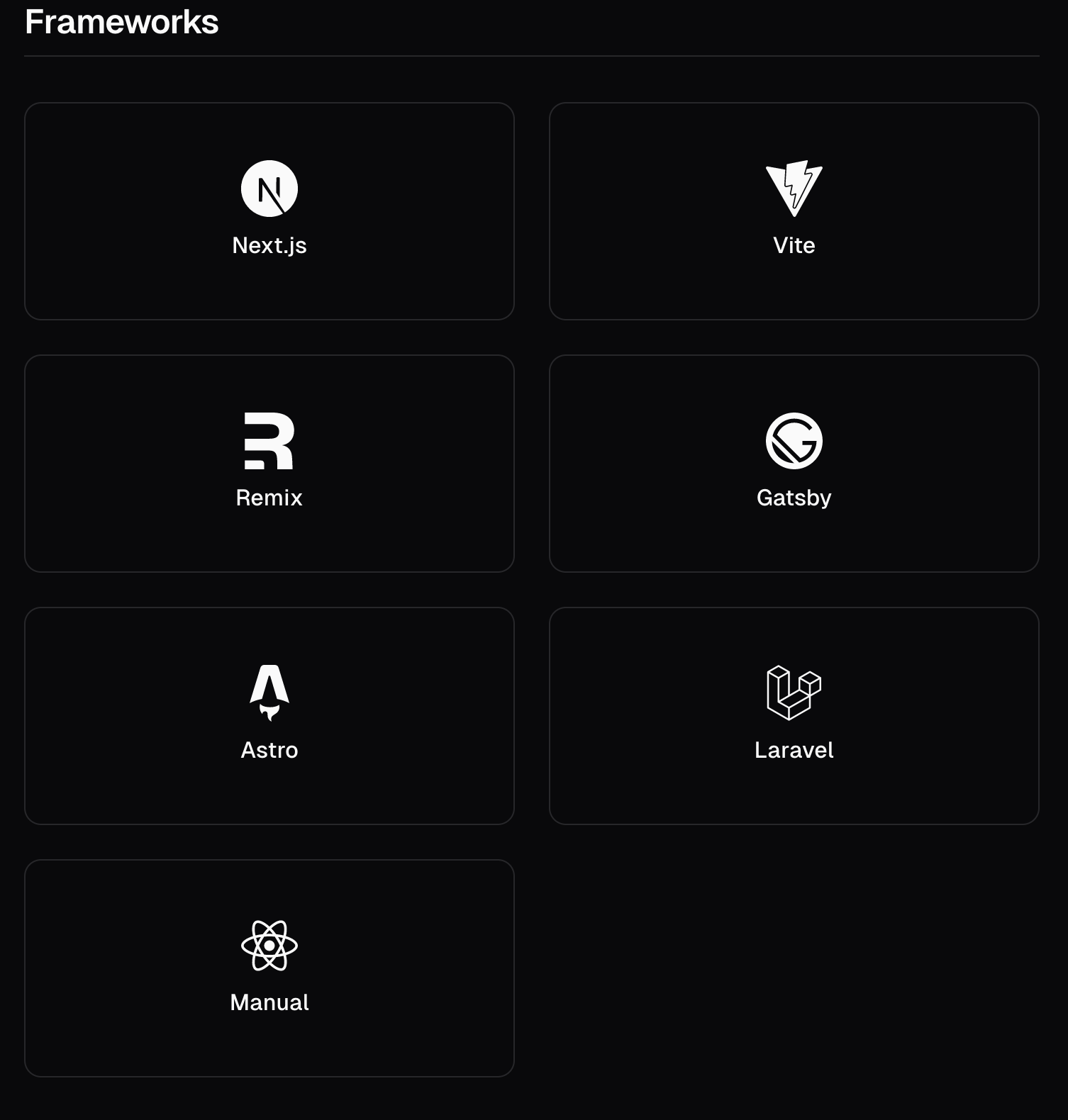 Choose a framework to set up Shadcn
Now, you need to install and configure a new Next.js project.
How to Install Next.js
I typically use npm, but if you use a different package manager, feel free to copy a command for your respective package manager below.
To install Next.js with npm:
npx create-next-app@latest my-app --typescript --tailwind --eslint
To install Next.js with yarn:
yarn create next-app@latest my-app --typescript --tailwind --eslint
To install Next.js with pnpm:
pnpm create next-app@latest my-app --typescript --tailwind --eslint
To install Next.js with bun:
bunx --bun create-next-app@latest my-app --typescript --tailwind --eslint
After running one of those commands, you'll see the following configuration questions:
Need to install the following packages:
create-next-app@14.1.0
Ok to proceed? (y) y
✔ Would you like to use `src/` directory? … No / Yes
✔ Would you like to use App Router? (recommended) … No / Yes
✔ Would you like to customize the default import alias (@/*)? … No / Yes
I selected "No" for the first question as I don't want to have a src directory inside my app directory.
I selected "Yes" for the second question because I want to use app router, which is the recommended way to go for Next.js 14.
Finally, I selected "No" for the third question because I like the way import works with @ in Next.js 14.
How to Install Shadcn
Before continuing, remember to go into the my-app directory in your terminal:
cd my-app
To initialize Shadcn with npm:
npx shadcn-ui@latest init
To initialize Shadcn with yarn:
npx shadcn-ui@latest init
To initialize Shadcn with pnpm:
pnpm dlx shadcn-ui@latest init
To initialize Shadcn with bun:
bunx --bun shadcn-ui@latest init
After running one of those commands you'll see some configuration questions again, but this time they're for Shadcn:
✔ Which style would you like to use? › New York
✔ Which color would you like to use as base color? › Slate
✔ Would you like to use CSS variables for colors? › yes
You can see the questions and my responses in the code above.
For the first question, there are two options, default and New York. I chose the "New York" style.
For the second question, there are five options Slate, Gray, Zinc, Neutral, Stone. I chose Slate because I like a minimalist black and white styling.
For the third question, I there are two options Yes and No. I chose yes, as I prefer to have CSS variables enabled for styling (although we won't be using this in this article).
You can read more about the style options, base options, and this configuration setup here.
And with that, you've set up a new Next.js 14 project with Shadcn.
Now you can see two new directories that have been added to your project directory, components and lib.
Notice that the components directory is currently empty, which means that Shadcn doesn't load up your project with any components you might not use. This gives you a lot of flexibility and keeps your project lightweight (so you can just add the components you need).
How to Use Shadcn in Next.js
First, let's remove all the boilerplate code from the my-app project's page.tsx file. (You only need to remove the boilerplate code from my-app/page.tsx.)
After removing all the boilerplate code from the page.tsx file inside the app directory, I'll add a simple hello world text.
Here's the updated page.tsx code:
export default function Home() {
  return (
    <>
      <h1>Hello World</h1>
    </>
  );
}
And here's what your project should look like in the browser:
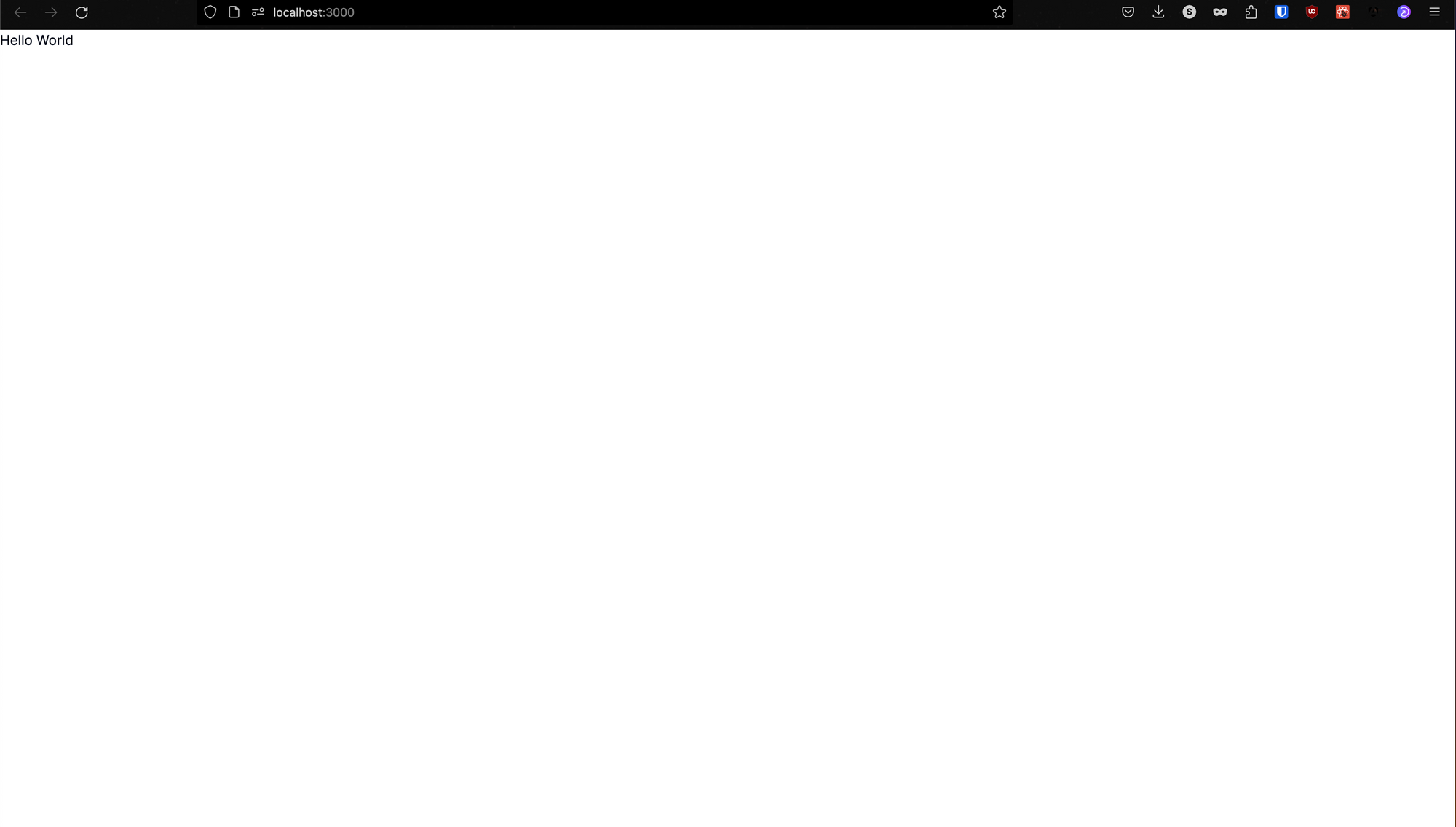 Hello World setup for the Next.js project
How to Style a Button the Hard Way and the Shadcn Way
Now, lets add two buttons to the page. One button will be simple with no styling, and the other will be a component from Shadcn.
How To Add a Component from Shadcn
Before we add our buttons, though, we have to learn how to add a component from Shadcn into our project. Here's how to do that:
- Go to the Shadcn docs.
- Click on whatever component you want to use.
- Then you'll see the command you should run to add that component to your project.
- Finally, import that component into your project and start using it.
To add the Button component from Shadcn, follow these steps:
- Go to the Button component page.
- Then run this command in your terminal:
npx shadcn-ui@latest add button. Note: This command is for npm – if you use a different package manager, you'll need to modify the command slightly. - Finally, import the button component in the file where you want to use it.
Now we'll see examples of adding a button in two different ways: using Tailwind CSS, and using Shadcn.
Styling a Button the Hard Way (Using Tailwind)
export default function Home() {
  return (
    <>
      <button className="p-2 bg-orange-400">Click me</button>
    </>
  );
}
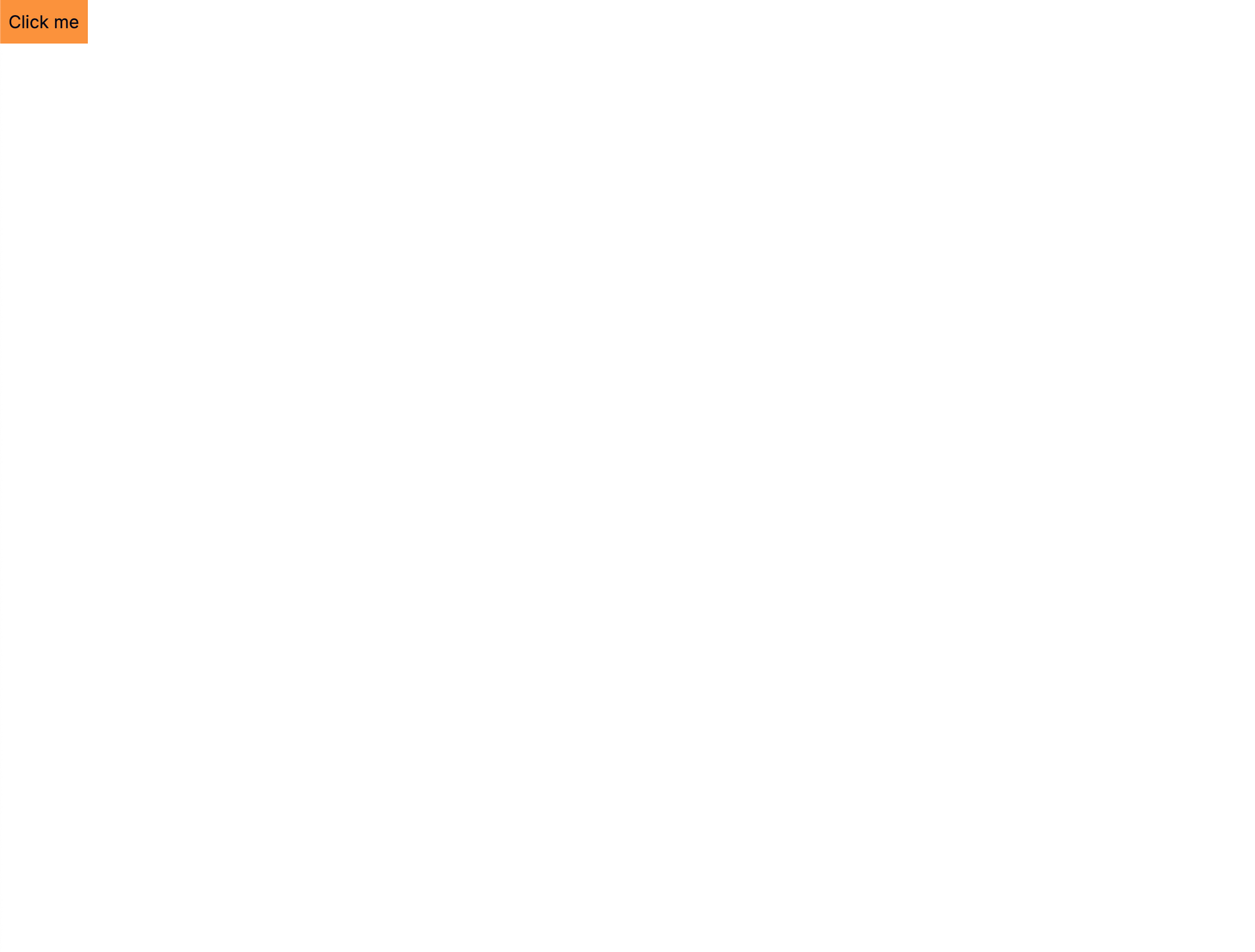 Custom button with orange background
I have created a button with an orange background having a padding of 2 units. You can see that it looks ugly and also doesn't have any hover effects by default.
Styling a Button the Shadcn Way
import { Button } from "@/components/ui/button";

export default function Home() {
  return (
    <>
      <Button variant="outline">Button</Button>
    </>
  );
}
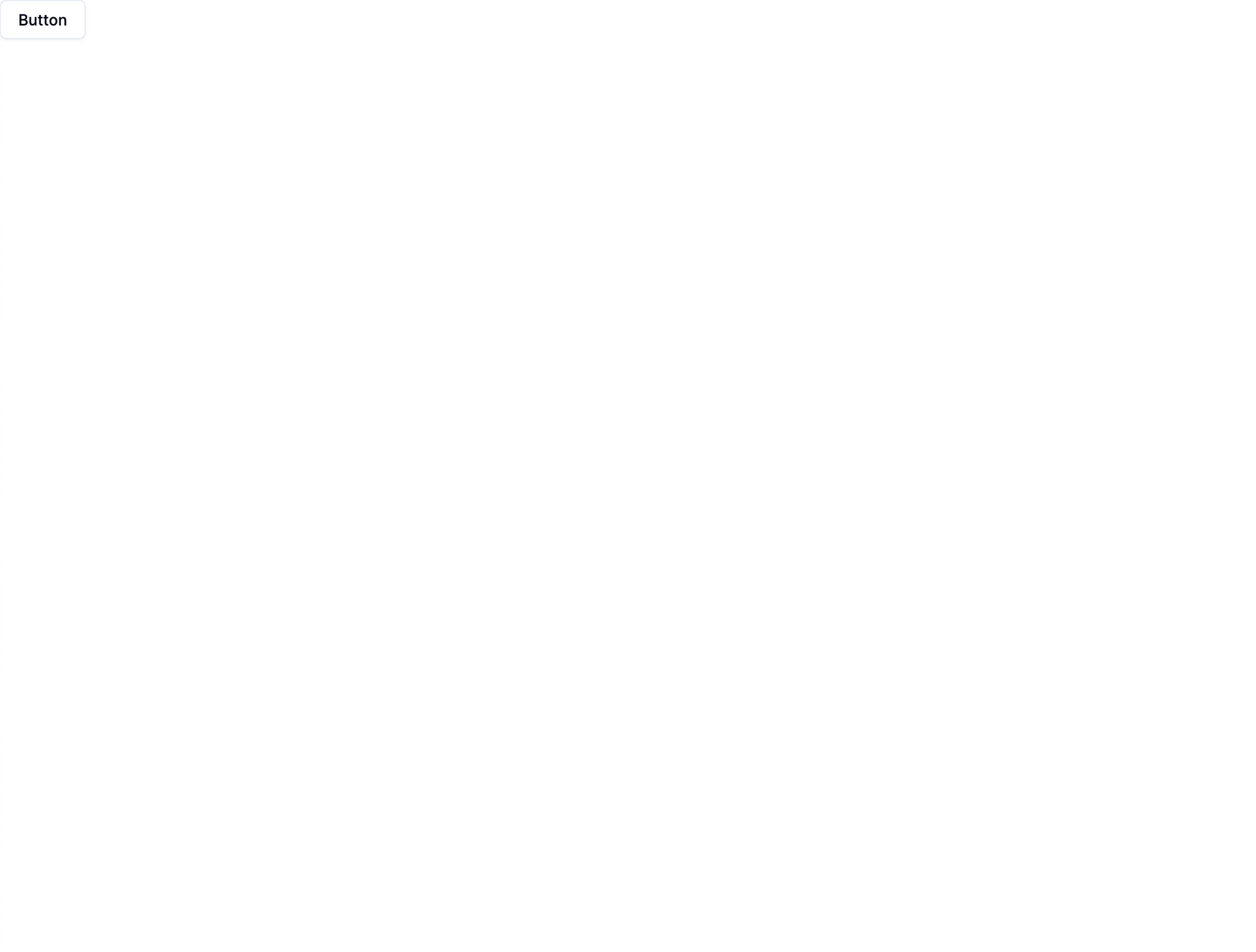 Shadcn default button
To use the Shadcn button, first import the Button component to the file where you want to use it – you don't need to add any styling to it (You can customize it, which you'll learn how to do in the next section). By default it looks good and it has hover effects. So just import the component and then you can use it.
You can also play around with the different options that Shadcn components give you. Either go to the docs page of that component and take a look at the options or open up the component's source code that is inside the components/ui directory.
Let's take a look at button.tsx source code to check how many variants of buttons you can create.
import * as React from "react";
import { Slot } from "@radix-ui/react-slot";
import { cva, type VariantProps } from "class-variance-authority";

import { cn } from "@/lib/utils";

const buttonVariants = cva(
  "inline-flex items-center justify-center whitespace-nowrap rounded-md text-sm font-medium transition-colors focus-visible:outline-none focus-visible:ring-1 focus-visible:ring-ring disabled:pointer-events-none disabled:opacity-50",
  {
    variants: {
      variant: {
        default:
          "bg-primary text-primary-foreground shadow hover:bg-primary/90",
        destructive:
          "bg-destructive text-destructive-foreground shadow-sm hover:bg-destructive/90",
        outline:
          "border border-input bg-background shadow-sm hover:bg-accent hover:text-accent-foreground",
        secondary:
          "bg-secondary text-secondary-foreground shadow-sm hover:bg-secondary/80",
        ghost: "hover:bg-accent hover:text-accent-foreground",
        link: "text-primary underline-offset-4 hover:underline",
      },
      size: {
        default: "h-9 px-4 py-2",
        sm: "h-8 rounded-md px-3 text-xs",
        lg: "h-10 rounded-md px-8",
        icon: "h-9 w-9",
      },
    },
    defaultVariants: {
      variant: "default",
      size: "default",
    },
  }
);

export interface ButtonProps
  extends React.ButtonHTMLAttributes<HTMLButtonElement>,
    VariantProps<typeof buttonVariants> {
  asChild?: boolean;
}

const Button = React.forwardRef<HTMLButtonElement, ButtonProps>(
  ({ className, variant, size, asChild = false, ...props }, ref) => {
    const Comp = asChild ? Slot : "button";
    return (
      <Comp
        className={cn(buttonVariants({ variant, size, className }))}
        ref={ref}
        {...props}
      />
    );
  }
);
Button.displayName = "Button";

export { Button, buttonVariants };
You can see that there's a variants object, and inside that there are multiple variants to choose from. Notice that there's a size object that allows you to choose different sizes for the button as well.
You can also see that there's a defaultVariants object that stores the default variant and the default size of the button.
How to Customize Shadcn Components
Remember that after installing Shadcn, the components directory was empty. But after adding the Button component, you can see that there's a ui directory inside components directory. And inside the ui directory you'll have the Button.tsx file, which is the code for the Button component.
If you open the Button.tsx file, you'll see that there are multiple variants of the Button component like default, destructive, outline, secondary, ghost, and link. There's also a default size, and other sizes to choose from:
import * as React from "react"
import { Slot } from "@radix-ui/react-slot"
import { cva, type VariantProps } from "class-variance-authority"

import { cn } from "@/lib/utils"

const buttonVariants = cva(
  "inline-flex items-center justify-center whitespace-nowrap rounded-md text-sm font-medium transition-colors focus-visible:outline-none focus-visible:ring-1 focus-visible:ring-ring disabled:pointer-events-none disabled:opacity-50",
  {
    variants: {
      variant: {
        default:
          "bg-primary text-primary-foreground shadow hover:bg-primary/90",
        destructive:
          "bg-destructive text-destructive-foreground shadow-sm hover:bg-destructive/90",
        outline:
          "border border-input bg-background shadow-sm hover:bg-accent hover:text-accent-foreground",
        secondary:
          "bg-secondary text-secondary-foreground shadow-sm hover:bg-secondary/80",
        ghost: "hover:bg-accent hover:text-accent-foreground",
        link: "text-primary underline-offset-4 hover:underline",
      },
      size: {
        default: "h-9 px-4 py-2",
        sm: "h-8 rounded-md px-3 text-xs",
        lg: "h-10 rounded-md px-8",
        icon: "h-9 w-9",
      },
    },
    defaultVariants: {
      variant: "default",
      size: "default",
    },
  }
)

export interface ButtonProps
  extends React.ButtonHTMLAttributes<HTMLButtonElement>,
    VariantProps<typeof buttonVariants> {
  asChild?: boolean
}

const Button = React.forwardRef<HTMLButtonElement, ButtonProps>(
  ({ className, variant, size, asChild = false, ...props }, ref) => {
    const Comp = asChild ? Slot : "button"
    return (
      <Comp
        className={cn(buttonVariants({ variant, size, className }))}
        ref={ref}
        {...props}
      />
    )
  }
)
Button.displayName = "Button"

export { Button, buttonVariants }
One of the best parts about Shadcn components is that you can customize them and remove variants that you won't use. You can also add your own variants to the component.
For example, say that you want to add the custom button we coded first as a Shadcn Button component variant. You can do that like this:
import * as React from "react";
import { Slot } from "@radix-ui/react-slot";
import { cva, type VariantProps } from "class-variance-authority";

import { cn } from "@/lib/utils";

const buttonVariants = cva(
  "inline-flex items-center justify-center whitespace-nowrap rounded-md text-sm font-medium transition-colors focus-visible:outline-none focus-visible:ring-1 focus-visible:ring-ring disabled:pointer-events-none disabled:opacity-50",
  {
    variants: {
      variant: {
        default:
          "bg-primary text-primary-foreground shadow hover:bg-primary/90",
        destructive:
          "bg-destructive text-destructive-foreground shadow-sm hover:bg-destructive/90",
        outline:
          "border border-input bg-background shadow-sm hover:bg-accent hover:text-accent-foreground",
        secondary:
          "bg-secondary text-secondary-foreground shadow-sm hover:bg-secondary/80",
        ghost: "hover:bg-accent hover:text-accent-foreground",
        link: "text-primary underline-offset-4 hover:underline",
        myButton: "p-2 bg-orange-400",
      },
      size: {
        default: "h-9 px-4 py-2",
        sm: "h-8 rounded-md px-3 text-xs",
        lg: "h-10 rounded-md px-8",
        icon: "h-9 w-9",
      },
    },
    defaultVariants: {
      variant: "default",
      size: "default",
    },
  }
);

export interface ButtonProps
  extends React.ButtonHTMLAttributes<HTMLButtonElement>,
    VariantProps<typeof buttonVariants> {
  asChild?: boolean;
}

const Button = React.forwardRef<HTMLButtonElement, ButtonProps>(
  ({ className, variant, size, asChild = false, ...props }, ref) => {
    const Comp = asChild ? Slot : "button";
    return (
      <Comp
        className={cn(buttonVariants({ variant, size, className }))}
        ref={ref}
        {...props}
      />
    );
  }
);
Button.displayName = "Button";

export { Button, buttonVariants };
Notice, I have added a new variant myButton and then simply pasted the styling that we used for the custom button. That's it and now you have your own custom button inside the Shadcn Button component.
Notice that the code now includes a new variant named myButton, and I simply pasted in the styling for the custom button from our ealier example. And that's it! Now you have your own custom Shadcn Button component variant.
Here's how you can use the custom myButton variant in your project:
import { Button } from "@/components/ui/button";
export default function Home() {
  return (
    <div className="flex justify-center items-center flex-col gap-10">
      <Button variant="outline" size="sm">
        sm button
      </Button>
      <Button variant="destructive" size="lg">
        large button
      </Button>
      <Button variant="ghost" size="lg">
        ghost button
      </Button>
      <Button variant="link" size="lg">
        link button
      </Button>
      <Button variant="myButton">My Button</Button>
    </div>
  );
}
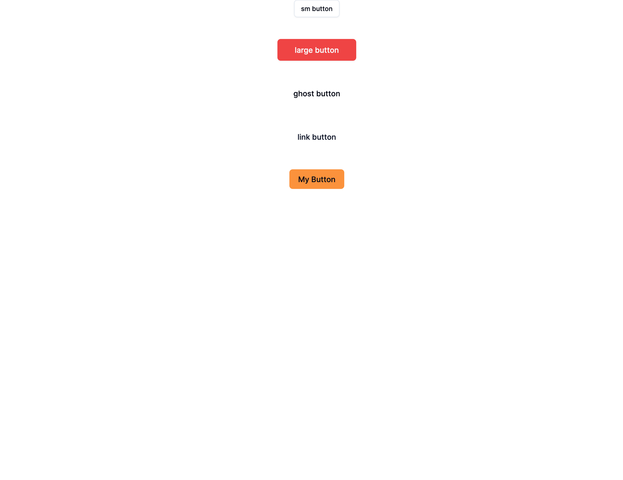 Shadcn multiple variants buttons
Note that I've added more variants of the Button component, just to show you that you can create multiple types of buttons with different sizes very easily.
The last button in the example above has the variant myButton, which is the custom variant you added to the Button.tsx file. But that just affects the styling, and you can add your own custom size if you'd like.
Conclusion
In this guide you learned how to integrate Shadcn in your Next.js projects. You can dive further into Shadcn's extensive component library and use them as-is, or you can customize them to your heart's content. The power to create your next app awaits – go build it!
If you have any feedback on this article, then please DM me on Twitter.