Styled-components is a library that allows you to write CSS in JS while building custom components in Reactjs.
There are multiple options you can go with to style a React application. But the CSS in JS technique is good approach, where you write the CSS code right in the JavaScript file. Styled-components takes this approach.
In this article, you will learn how to write CSS in JS.
Prerequisites
Before we go ahead with styled components, you should be familiar with React and CSS.
How to Create a Basic React App
Before getting started with styled components, let's start by creating a React app using create-react-app .
npx create-react-app APP_NAME
If you are not familiar with create-react-app, you can check here for more information.
Once you React boiler plate is set, remove all files from src folder except index.js and app.js.
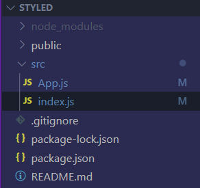
This is how your files should look like when you are done with the above steps. Now it's time to clean up app.js and index.js. Now index.js and app.js will have some default boiler code. We need to remove unnecessary stuff from these files. After removing unnecessary stuff you app.js and index.js should look like code below in respective files.
App.js
function App() {
    return(
        <div>
            App
        </div>
    )
}
index.js
import React from 'react'
import ReactDOM from 'react-dom/client'
import App from './App'

const root = ReactDom.createRoot(document.getElementById('root'))
root.render(
    <>
        <App />
    </>
)
Now open the command line or press ctrl + (backtick) to open it and typenpm start` to start your React app.
Once your app is running successfully, stop your server using ctrl + c and install styled-components. The command to install styled-components is below:
npm install styled-components
Let's Style Our First Component
We will create a basic setup to help you learn styled components. In app.js, create a heading using an
tag, a paragraph using a tag and a button using the tag.App.js function App() { return ( <div> <h1>Styled Components</h1> <p>Cillum culpa deserunt enim et eiusmod quis proident consequat tempor ipsum sunt esse.</p> <button>Click ME!</button> </div> ); } export default App;Before we style our component, we need to import styled-components into our app.js file:import styled from 'styled-components' function App() { return ( <div> <h1>Styled Components</h1> <p>Cillum culpa deserunt enim et eiusmod quis proident consequat tempor ipsum sunt esse.</p> <button>Click ME!</button> </div> ); } export default App;Now we will create our custom component called H1 and use it instead of the tag with custom styling.const H1 = styled.h1` color: red; font-size: 4rem; ` First we need give a custom name of our choice. Then we'll start with styled.<HTML Tag Name> and wrap the style in backticks. Now when we use this custom component it will have the <HTML Tag Name> property with styling.import styled from 'styled-components' const H1 = styled.h1` color: red; font-size: 4rem; ` function App() { return ( <div> <H1>Styled Components</H1> <p>Cillum culpa deserunt enim et eiusmod quis proident consequat tempor ipsum sunt esse.</p> <button>Click ME!</button> </div> ); } export default App;Voilà! Here we have our first custom styled component.NOTE: Always use uppercase letters to start your custom component name in React as it is React convention.Now if you inspect the page, you will see some gibberish class name. Styled components does this to avoid naming conflicts.Now let's style our button component:const DefaultButton = styled.button` background-color: #645cfc; border: none; padding: 10px; color: white; ` DefaultButton is our custom component name. After we style it, we can give it any HTML tag we desire so that this custom component will have that tag.Now we will use DefaultButton that we created above as our custom component in React.js – but behind the scenes it will be the button tag from HTML as we mentioned in styling using styled components.import styled from 'styled-components' const H1 = styled.h1` color: red; ` const DefaultButton = styled.button` background-color: #645cfc; border: none; padding: 10px; color: white; ` function App() { return ( <div> <H1>Styled Components</H1> <p>Cillum culpa deserunt enim et eiusmod quis proident consequat tempor ipsum sunt esse.</p> <DefaultButton>Click ME!</DefaultButton> </div> ); } export default App;We can also keep our files clean by making a different file for each different component in styled components. Yes! We can do that in here.We will make new folder called components in src and create the files Title.js and Buttons.js to separate the styling for title and buttons.We will copy the H1 style and paste it into Title.js and copy DefaultButton style and paste it in Buttons.js.In Title.js we will export it as default. But in Buttons.js we will name the export because we will create multiple button styles in here.When we are exporting a component as default, then its import is a regular import as shown below:import H1 from './components/Title'But when the export is a named export (you can see the named export in Button.js in the above image), then while importing that component we have to wrap the component name in curly braces ({}) as shown below:import {DefaultButton} from './components/Buttons'Now our App.js looks like this:import H1 from './components/Title' import {DefaultButton} from './components/Buttons' function App() { return ( <div> <H1>Styled Components</H1> <p>Cillum culpa deserunt enim et eiusmod quis proident consequat tempor ipsum sunt esse.</p> <DefaultButton>Click ME!</DefaultButton> </div> ); } export default App;Props in Styled ComponentsNow for those of you who know props from React, you're in luck – pops in styled components work similarly. If you don't know what props are, don't worry – I'll introduce them here.Now, we learned to create custom components in styled components. Those custom components can have attributes which we can access in components. It might be a bit confusing to beginners but let's see it in code:import H1 from './components/Title' import {DefaultButton} from './components/Buttons' function App() { return ( <div> <H1>Styled Components</H1> <p>Cillum culpa deserunt enim et eiusmod quis proident consequat tempor ipsum sunt esse.</p> <DefaultButton>Click ME!</DefaultButton> <DefaultButton red>Click ME!</DefaultButton> </div> ); } export default App;In the above code, I created one more Default button. But can you see difference between those 2 buttons. Yes! We have something written after DefaultButton, which is red. It's called an attribute.Now by accessing the attribute in DefaultButton we can change the styling based on these attributes. Let's do it!import styled from 'styled-components' export const DefaultButton = styled.button` background-color: ${(props) => (props.red && 'red') || '#645cfc'}; border: none; padding: 10px; color: white; ` We are already in a template literal (backticks). So we can write JavaScript inside it. We used the dollar ($) sign and curly braces to write the JavaScript. In those curly braces we declared an arrow function which has a props parameter which can access attributes of custom components.So the arrow function says that if the red attribute is given, then the background-color should be red or else it should be a blueberry color.App.jsimport H1 from './components/Title' import {DefaultButton} from './components/Buttons' function App() { return ( <div> <H1>Styled Components</H1> <p>Cillum culpa deserunt enim et eiusmod quis proident consequat tempor ipsum sunt esse.</p> <DefaultButton>Click ME!</DefaultButton> <DefaultButton red>Click ME!</DefaultButton> </div> ); } export default App;We can also destructure props by attribute name. Above, we gave DefaultButton an attribute of red and we accessed it with props.red.Instead of accessing it with props.red we could destructure the prop with {} and the attribute name. Refer to the below code to get a good understanding.import styled from 'styled-components' export const DefaultButton = styled.button` background-color: ${({red}) => (red && 'red') || '#645cfc'}; border: none; padding: 10px; color: white; ` Now we can access props directly as red rather that props.red.How to Extend Styles in Styled ComponentsWe know how to write custom styled components. But what if we want to use the DefaultButtons style that instead has 100% width of the button? We can do that using extended styles in styled components.It's simple: we just have to create a new component in Buttons.js . And we'll use styled.<html Tag>, instead of styled(DefaultButton). Now our new component will have added the styles of DefaultButton and some of new styles of its own.export const ExtendedButton = styled(DefaultButton)` display: block; width: 100vw; `App.jsimport H1 from './components/Title' import {DefaultButton, ExtendedButton} from './components/Buttons' function App() { return ( <div> <H1>Styled Components</H1> <p>Cillum culpa deserunt enim et eiusmod quis proident consequat tempor ipsum sunt esse.</p> <DefaultButton>Click ME!</DefaultButton> <ExtendedButton red>Click ME!</ExtendedButton> </div> ); } export default App;How to Nest Styles in Styled ComponentsWe can write more complex styles in React using one custom component. This will help you even more and make styling simple. Refer to the following code:import styled from 'styled-components' function App() { return ( <div> <Wrapper> <h1>Another heading</h1> <p>Another para</p> <button>Another button</button> </Wrapper> </div> ); } const Wrapper = styled.div` h1{ text-align: center; color: violet; } p{ font-size: 40px; } button{ background-color: pink; padding: 4px 8px; border: none; } ` export default App;When we implement the wrapper component, all paragraph tags inside the wrapper will have a font-size of 40px and the button will have background color of pink, padding as mentioned, and no border. This will help you tremendously when writing your code.How to Extend React ComponentsWe can also extend React components using styled components. It is pretty similar to nesting styles. Here's an example:import React from 'react' import styled from 'styled-components' const Newcom = () => { return ( <div> <h2>Heading 2</h2> <button>Click Me!</button> </div> ) } const Wrapper = styled(Newcom)` h2{ color: green; text-align: center; } button{ padding: 4px 10px; background-color: violet; border: none; } ` export default WrapperWhen we write styles using styled components, we have to just extend React components like extending styles. When we're extending styles, we write the name of the extended style. Here we will write the name of the component to extend as shown in the above code.But still it's not working. If we inspect we will see our HTML but with no class. In React components there is no class. So you need to add props to the React component and console.log() those props.You will see our gibberish class name with the key:value pair, like className : gibberish-classname. So now using that we will destructure the props and give a className to the div of that component of className. Refer to the below example:import React from 'react' import styled from 'styled-components' const Newcom = ({className}) => { return ( <div className={className}> <h2>Heading 2</h2> <button>Click Me!</button> </div> ) } const Wrapper = styled(Newcom)` h2{ color: green; text-align: center; } button{ padding: 4px 10px; background-color: violet; border: none; } ` export default WrapperEven after using styled components for styling you can use global styling.Just remember that if your global styling and styled component styling are the same, React will pick the styled component styling.CSS VariablesRepeating the same color is annoying. What if I have red in many places and now I want all that red changed to blue? It is a time consuming task to do manually, one by one.Luckily, CSS variables come to our rescue. Now create an index.css file in the src folder. Import it in index.js.import './index.css';Now we will write some CSS variable in index.css which are global styles accessible from everywhere. The most interesting thing is that we can have access to CSS variables in styled component as well.index.css:root{ --primary-color: #8F00FF }Now :root{} is just like selecting html{} in CSS. But :root{} has more specificity than html{}. We can now use this variable in our styled component:const Wrapper = styled(Newcom)` h2{ color: green; text-align: center; } button{ padding: 4px 10px; background-color: var(--primary-color); border: none; } ` How to Add a ThemeNowadays, light themes and dark themes are pretty popular. We can do this easily in styles components.First we need to import ThemeProvider from styled components. Then we will wrap the whole app in ThemeProvider with the theme attribute in which we will provide our theme. Then we can toggled it with React.import styled, {ThemeProvider} from 'styled-components' import Sample from "./components/Sample"; const baseTheme = { background: '#fff', color: '#222', } const darkTheme = { background: '#222', color: '#fff', } function App() { return ( <ThemeProvider theme={darkTheme}> <p>This is sample paragraph</p> </ThemeProvider> ); }Still, we don't get our dark theme. For that we need to add a new custom styled component. You can name it anything you want but, I'm gonna name it Container.In the container, we can access the theme and its properties and help the user change the background color and color of text. These are the only major things to switch in between dark and light mode.import styled, {ThemeProvider} from 'styled-components' import Sample from "./components/Sample"; const baseTheme = { background: '#fff', color: '#222', } const darkTheme = { background: '#222', color: '#fff', } const Container = styled.div` color: ${(props) => props.theme.color}; background-color: ${(props) => props.theme.background}; ` function App() { return ( <ThemeProvider theme={darkTheme}> <Container> <p>This is sample paragraph</p> </Container> </ThemeProvider> ); }Take a look at our Container. We are accessing the theme and changing the color and background-color when the theme changes. And here you go, a simple way to have themes on your next project.Animation in Styled ComponentsAnimation is important in frontend development. We will learn to implement animation in styled components with an example.First we have to import keyframes from styled-components. Once that's done we will use it to create animations.import styled, {keyframes} from 'styled-components' const spinner = keyframes` to{ transform: rotate(360deg); } ` const Loading = styled.div` width: 6rem; height: 6rem; border: 5px solid #ccc; border-radius: 50%; border-top-color: black; animation: ${spinner} 0.6s linear infinite; ` export default LoadingIn the above code, we have spinner in which we declared the animation and spinner is the animation name. In loading, we are using that spinner animation name so that Loading will use that animation. In loading I have use a shorthand property to declare the animation.How to Use as in Styled ComponentsIf I have a button and I give it an href attribute which we use to link to another website, it will not work. This is because the href attribute belongs to the anchor tag.import React from 'react' import {DefaultButton} from './components/Buttons' const App = () => { return ( <div> <DefaultButton href="https://www.google.com">Click</DefaultButton> </div> ) } export default AppBut in styles component using as we can make the given component act like an HTML tag provided as a value to as. Let's see it in action.import React from 'react' import {DefaultButton} from './components/Buttons' const App = () => { return ( <div> <DefaultButton as='a' href="https://www.google.com">Click</DefaultButton> </div> ) } export default AppNow DefaultButton is an anchor () tag. It will have text-decoration because in the default anchor tag it has text-decoration. But I am sure now you can work that out. When we click on our DefaultButton it will open Google.CSS and styled-componentsNow we can directly give styles to components using CSS as an object of the component called css props .import React from 'react' import styled from 'styled-components' const App = () => { return ( <div> <h2 css={`color: green`}>Hello World!!!</h2> </div> ) } export default AppBut the above code won't work. Because we need to import styled-components/macro to activate the styling method which uses Babel. Check out the complete code below:import React from 'react' import styled from 'styled-components/macro' const App = () => { return ( <div> <h2 css={`color: green`}>Hello World!!!</h2> </div> ) } export default AppCSS Helper Functions in Styled ComponentsWe have learned a lot about styled components. But there are more efficient ways to tackle some problems – and one of them is using a CSS helper function.Suppose you want a DefaultButton and a large DefaultButton. Based on what we've learned up until now, we would say we should give large as a prop and change the styling based on that prop.But think about it – we need to make changes to multiple properties. So a CSS helper function comes to our rescue.App.jsimport React from 'react' import styled from 'styled-components/macro' import {DefaultButton} from './components/Buttons' const App = () => { return ( <div> <DefaultButton>Hello</DefaultButton> <DefaultButton large>Hello</DefaultButton> </div> ) } export default AppButtons.jsimport styled, {css} from 'styled-components/macro' export const DefaultButton = styled.button` background-color: ${({red}) => (red && 'red') || '#645cfc'}; border: none; color: white; display: block; margin: 10px; ${({large}) => large? css` padding: 15px; font-weight: 800; ` : css` padding: 10px; font-weight: 400; `} ` Take a look at the above code. First we passed a prop as large from app.js in DefaultButton component. Then using the ternary operator in Button.js we styled the component. It says that if large is given a prop, implement the first styling or else implement the second styling. This follows the DRY (Don't Repeat Yourself) principle.Default Attributes (attrs) in Styled ComponentsWe have attributes on some elements in HTML. For example on button, we have type="submit" or type="button". But every time we have to set them manually.import React from 'react' import styled from 'styled-components' const Button = styled.button` border: none; padding: 5px 10px; background-color: #87CD11; margin: 10px; ` const App = () => { return ( <div> <Button type="button">Click!</Button> <Button type="submit">Submit</Button> </div> ) } export default AppHere, default attributes come in handy. We can pass an object or function to them. But if we pass objects to attributes, then they will be static. To have dynamic control, we will pass a function to the attribute.import React from 'react' import styled from 'styled-components' const Button = styled.button.attrs((props) => { return {type: props.type || "button"} })` border: none; padding: 5px 10px; background-color: #87CD11; margin: 10px; ` const App = () => { return ( <div> <Button>Click!</Button> <Button type="submit">Submit</Button> </div> ) } export default AppIn the above code, we set attributes to button. This says that if the type is given then it will set that type to the given props – or if no props are given it will set it to button by default.As a challenge, you can go ahead and use a CSS helper function to set a different style based on the type of button.Wrapping UpI hope you now understand how to use Styled Components in your projects. Do let me know what you think. Thank you for reading!You can follow me on:TwitterLinkedInInstagram