
Since SVG images can be inlined in HTML, we can manipulate them with JavaScript. This means that we can animate parts of an image from code, make it interactive, or turn things around and generate graphics from data.
In this example, we are going to create a watch. We will use SVG to paint the watch, and use JavaScript to animate the hands.
This tutorial is a bit more advanced, going in-depth with some of the less obvious SVG properties and focusing on animation with JavaScript. If you'd like to get a more general overview of SVGs, then check out my earlier article where we walk through the code of 7 simple SVG images.
You can also watch this article as a video with a bit more content. In the video we also cover interaction.
SVG in HTML
In the previous article, we learned that SVG images can be inlined in an HTML document. We talked about the SVG tag itself, which defines the size of the image, and the placement of the image elements.
Image elements are placed within the image by their position. The viewBox defines how these positions should be interpreted.
The first two numbers of the property set the position at the top-left corner. Together with the size defined by the last two numbers, they form a coordinate system.
<html>
<head>
<title>Watch</title>
<link rel="stylesheet" href="./index.css" />
</head>
<body>
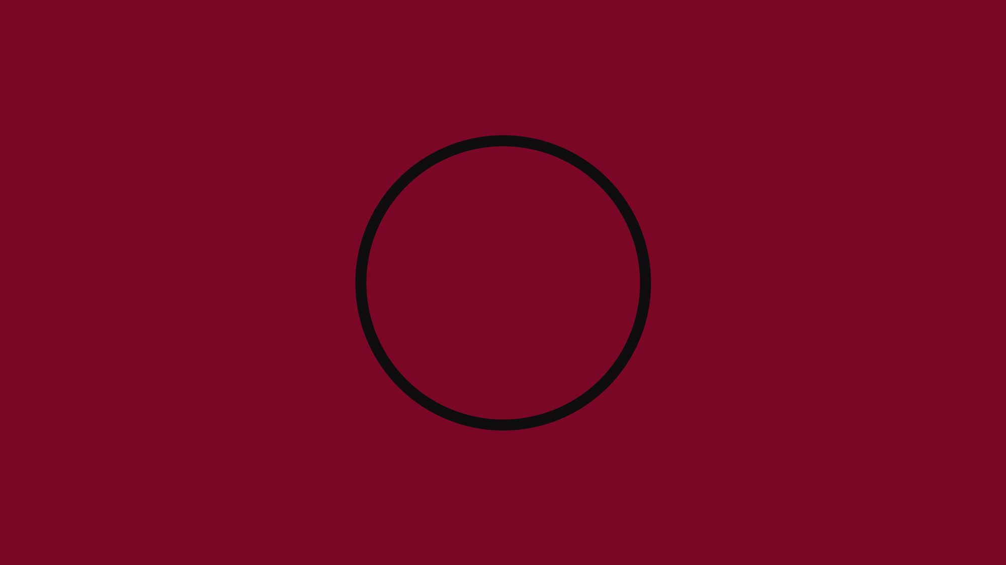
<svg width="200" height="200" viewBox="-100 -100 200 200">
<circle
cx="0"
cy="0"
r="90"
fill="transparent"
stroke="#f0f0c9"
stroke-width="7"
/>
</svg>
<script src="./index.js"></script>
</body>
</html>
In this example, we center the coordinate system. The 0,0 coordinate is in the middle of the image. We set with the viewBox that the top-left corner should be the -100,-100 coordinate and both the width and height should be 200 units.
In this example, the size defined by width and height and the size defined by viewBox are the same. This means that one unit within the image will be one pixel in the browser. This is not always true. If the two don't match then the image scales up or scales down.
How to Make the Watch's Minute and Hour Hands
Now that we've established our foundations, let's start coding the watch itself. We start with the minute and hour hands.
There are many ways to draw these little lines. We could draw each line one by one, but probably the most effective way to draw it is to draw a circle with a special dash property.
The circle tag in our initial example has a center position, a radius for the size, a fill and border color, and a border width.
SVG elements often have similar styling options as HTML elements with CSS. But these options have different property names. You can think of the fill property as background-color in CSS. And the stroke and stroke-width properties are also similar to the border-color and border-width properties. Just keep in mind that they are not exactly the same.
We will also use the fill property for setting text color, and we will use the stroke property to set the color of a line.
Now how do we turn a continuous circle into minute markers? You might be familiar with the border-style property in CSS. Mostly you would use a solid border, but you can also have a dotted or a dashed one. These border styles are not very common, as you don’t have that many options to fine-tune them in CSS.
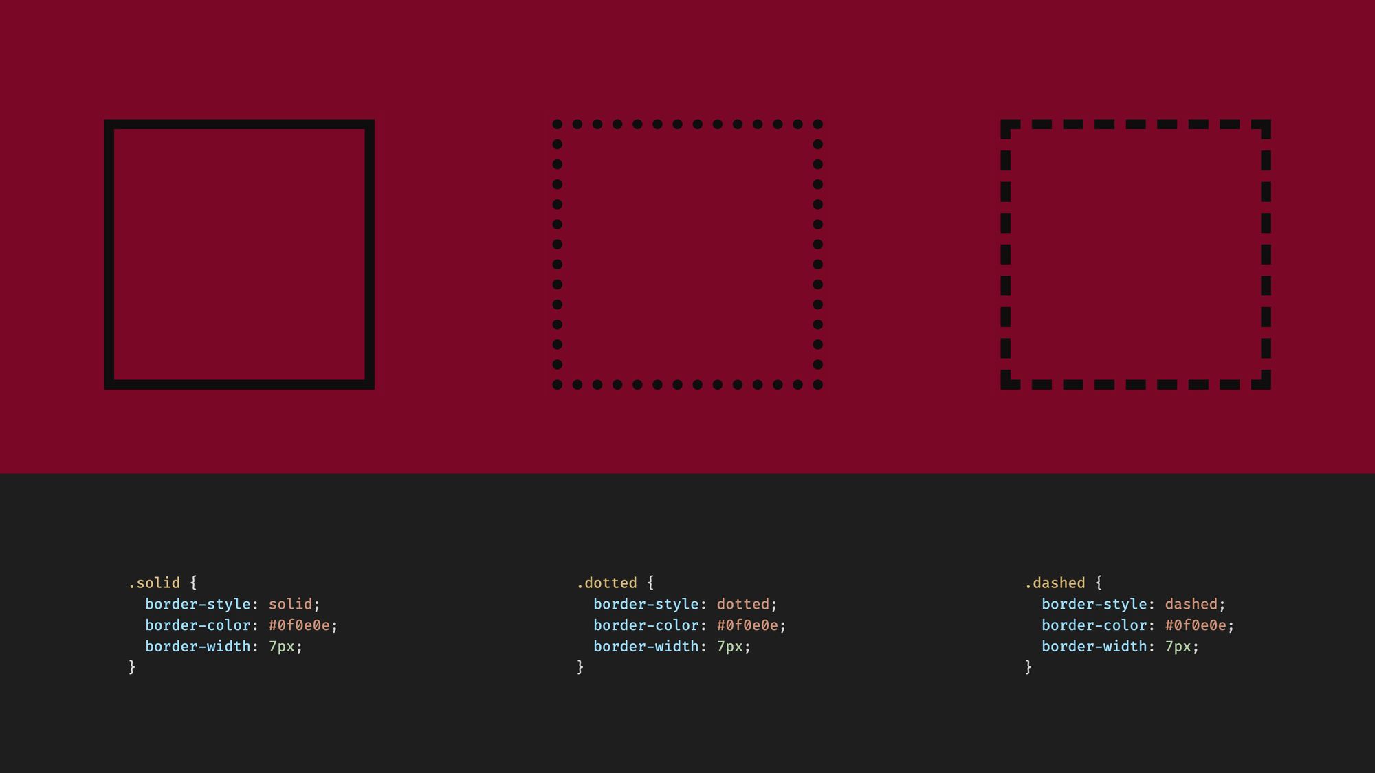 The
The border-style property in CSS for HTML elements
In SVG we have similar possibilities with much more customization options. We can use the stroke-dasharray, the stroke-dashoffset, and the pathLength properties.
Let’s have a few examples. In the first example, we set a single number as stroke-dasharray. This will result in a dashed border where the line segment and the gap both have the same length.
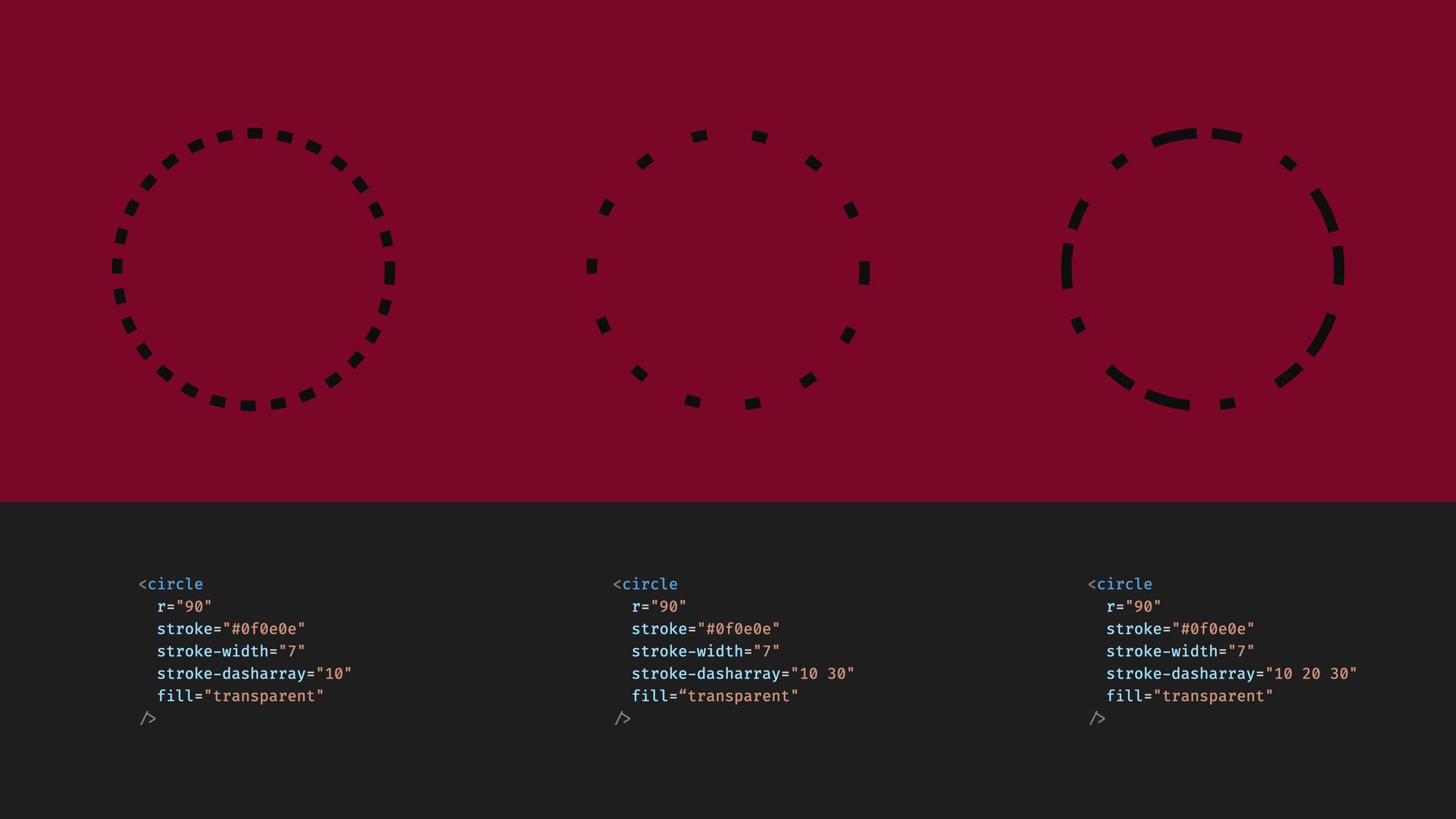 The
The stroke-dasharray property for SVG
This property is an array though. If we set two numbers, then the first one will be the length of the line segment, and the second will be the length of the gap. You can even set more than two numbers, and then the length of the line and the gap will always take the next number. Until it runs out of the array and then it starts at the beginning.
We will set two numbers. One for the length of the minute marker, and one for the gap between them. The sum of these two should be exactly the length of one minute on the circle. We know that one hour is 60 minutes. So we can calculate the circumference of the circle, then divide it by 60 to get the length of one minute.
But there’s a better way. Instead of calculating the circumference of the circle, we can go the other way. We can set the pathLength property.
This property is a bit tricky. It does not resize the circle but affects how the dasharray property is interpreted. The dashes will be drawn as if the circle had a circumference defined by pathLength.
So let’s set the pathLength to 60, representing 60 minutes. Now the sum of the line and gap segment has to be 1 in total. I set it to 0.2 and 0.8 in this example.
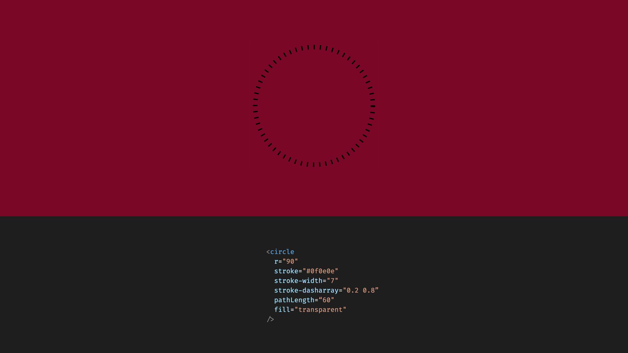 Using the
 pathLength property. Note that the sum of the two numbers at the stroke-dasharray property is one, matching the length of one minute.
Now we are almost done, but one little piece is still missing. The dashing starts at the wrong position. To fix it we have to shift it by half of the line segment’s length using the stroke-dashoffset property.
The dash offset property can be a bit counterintuitive, as a positive value here shifts the dashing backwards. You can also set it to a positive number to shift it forward.
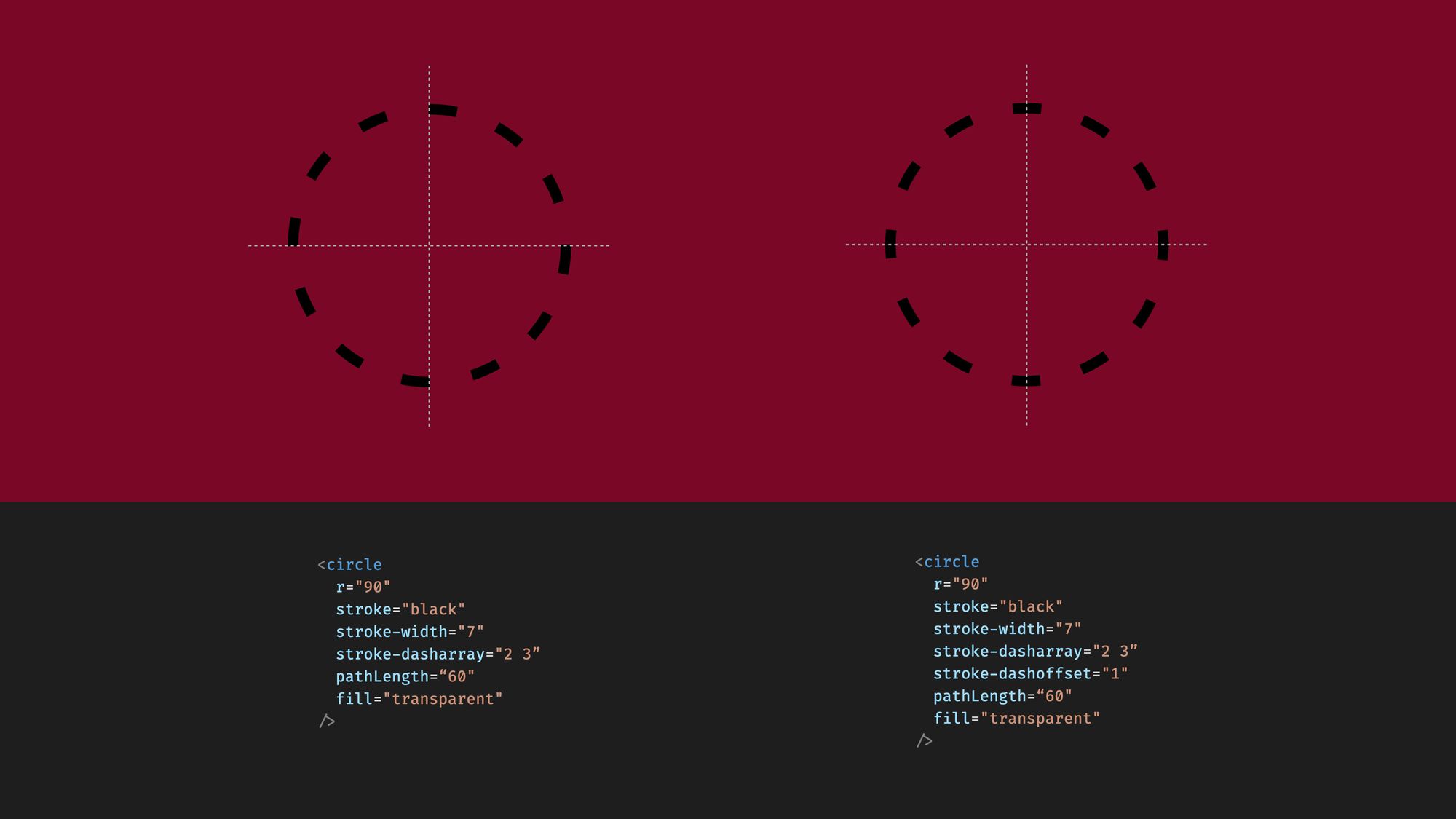 Example with and without
 stroke-dashoffset
In the same way, we can set an hour marker. We add a new circle tag with almost the same properties. The only thing that is different is the color and we have longer gaps in the dash array.
. . .

    <svg width="200" height="200" viewBox="-100 -100 200 200">
      <circle
        cx="0"
        cy="0"
        r="90"
        fill="transparent"
        stroke="#0f0e0e"
        stroke-width="7"
        stroke-dasharray="0.2 0.8"
        stroke-dashoffset="0.1"
        pathLength="60"
      />

      <circle
        cx="0"
        cy="0"
        r="90"
        fill="transparent"
        stroke="#f0f0c9"
        stroke-width="7"
        stroke-dasharray="0.2 4.8"
        stroke-dashoffset="0.1"
        pathLength="60"
      />
    </svg>

. . .
It's important to note here that layering in SVG matters. Tags added later in the document will be on top of the previous ones. If we add these two circles in the opposite order, then the minutes would fully cover the hour markers.
As SVG lives in HTML now, we can move some of these properties from CSS. We can’t move all the properties though. There’s a difference between properties defining the style and those defining the shape of an element.
The radius, for instance, defines the shape of the circle, so it has to stay with the SVG code. The fill and stroke properties on the other hand we can move.
. . .

    <svg width="200" height="200" viewBox="-100 -100 200 200">
      <circle class="minute_marker" r="90" pathLength="60" />
      <circle class="hour_marker" r="90" pathLength="60" />
    </svg>

. . .
.hour_marker {
  fill: transparent;
  stroke: #f0f0c9;
  stroke-width: 7;
  stroke-dasharray: 0.2, 4.8;
  stroke-dashoffset: 0.1;
}

.minute_marker {
  fill: transparent;
  stroke: #0f0e0e;
  stroke-width: 7;
  stroke-dasharray: 0.2, 0.8;
  stroke-dashoffset: 0.1;
}
How to Draw the Watch Hands
Let's add the hands that show the time. Initially, we draw these to point upwards, then turn them into position with JavaScript.
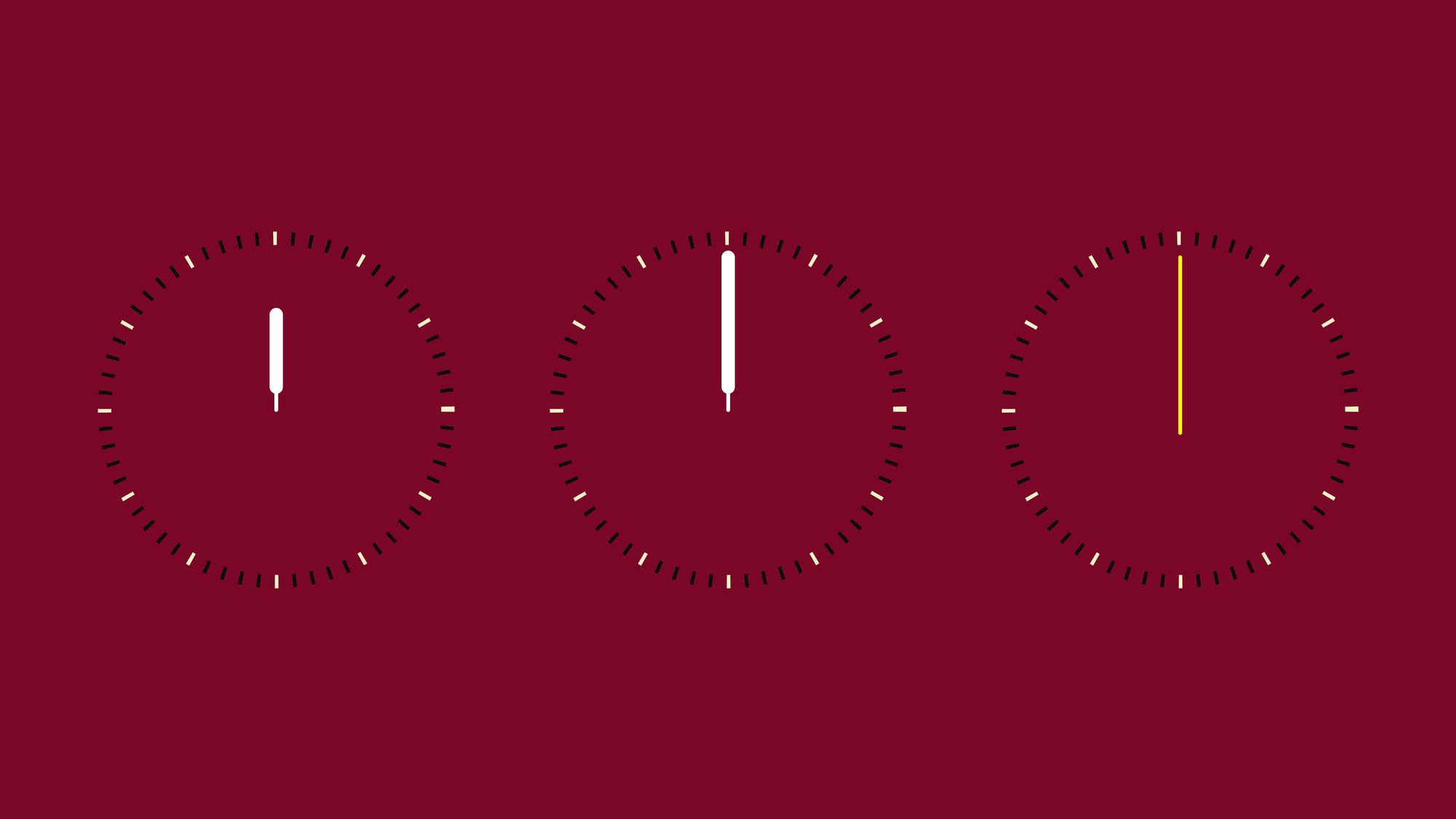
We use the line element to draw the hands. To define a line element we have to set the starting and ending coordinates, along with a stroke color and the stroke-width property.
To make things a bit nicer, we can also add the stroke-linecap property to have rounded line caps. These styling properties we add with CSS.
. . .

    <svg width="200" height="200" viewBox="-100 -100 200 200">
      <circle class="minute_marker" r="90" pathLength="60" />
      <circle class="hour_marker" r="90" pathLength="60" />

      <line class="hand" x1="0" y1="0" x2="0" y2="-50" />
      <line class="hand hand--thick" x1="0" y1="-12" x2="0" y2="-50" />

      <line class="hand" x1="0" y1="0" x2="0" y2="-80" />
      <line class="hand hand--thick" x1="0" y1="-12" x2="0" y2="-80" />

      <line class="hand hand--second" x1="0" y1="12" x2="0" y2="-80" />
    </svg>

. . .
. . .

.hand {
  stroke: #ffffff;
  stroke-width: 2;
  stroke-linecap: round;
}

.hand--thick {
  stroke-width: 7;
}

.hand--second {
  stroke: yellow;
}
How to Point the Watch Hands in the Right Direction
Now how do we turn these lines into position? If we assign an ID to an element we can access it and manipulate it from JavaScript.
Which element should we assign an ID, though? We have two elements for one hand. To solve this problem we can group these two line elements in a group tag. You can think of a group tag as the div element in HTML.
We can assign an ID to this group, then we can rotate the whole group into position from JavaScript.
. . .

    <svg width="800" height="800" viewBox="-100 -100 200 200">
      <circle class="minute_marker" r="90" pathLength="60" />
      <circle class="hour_marker" r="90" pathLength="60" />

      <g id="hour_hand">
        <line class="hand" x1="0" y1="0" x2="0" y2="-50" />
        <line class="hand hand--thick" x1="0" y1="-12" x2="0" y2="-50" />
      </g>

      <g id="minute_hand">
        <line class="hand" x1="0" y1="0" x2="0" y2="-80" />
        <line class="hand hand--thick" x1="0" y1="-12" x2="0" y2="-80" />
      </g>

      <g id="second_hand">
        <line class="hand hand--second" x1="0" y1="12" x2="0" y2="-80" />
      </g>
    </svg>

. . .
In the JavaScript file, first, we get the hand elements by ID. Then we create a Date object and we get the current hour, minute, and second. And finally, we set the elements' transform attribute based on these values.
const hoursElement = document.getElementById("hour_hand");
const minutesElement = document.getElementById("minute_hand");
const secondsElement = document.getElementById("second_hand");

const date = new Date();

const hour = date.getHours();
const minute = date.getMinutes();
const second = date.getSeconds();

hoursElement.setAttribute("transform", `rotate(${(360 / 12) * hour})`);
minutesElement.setAttribute("transform", `rotate(${(360 / 60) * minute})`);
secondsElement.setAttribute("transform", `rotate(${(360 / 60) * second})`);
The transform attribute can include multiple transformations like scaling, translating, or skewing.
We are setting the rotate transformation, which requires a number. This number is a rotation between 0 and 360 degrees. For the hour hand, we divide 360 by 12 to get how much rotation we need per hour and multiply it with the current hour. This should turn the hour hand towards the current hour.
For the minute and second hand, we do the same thing, except we divide 360 by 60, as one hour consists of 60 minutes and 1 minute is 60 seconds.
Luckily for us, the transformation center by default is the origin, the 0,0 coordinate. If this wouldn’t be the case we could set another transformation origin, but because of our viewBox settings, we don’t need that.
How to Animate the Watch Hands**
Now, this should already show the current time, but our image is static. To keep up with time we can use the requestAnimationFrame function to move the hands.
const hoursElement = document.getElementById("hour_hand");
const minutesElement = document.getElementById("minute_hand");
const secondsElement = document.getElementById("second_hand");

function animate() {
  const date = new Date();

  const hour = date.getHours() % 12;
  const minute = date.getMinutes();
  const second = date.getSeconds();

  hoursElement.setAttribute("transform", `rotate(${(360 / 12) * hour})`);
  minutesElement.setAttribute("transform", `rotate(${(360 / 60) * minute})`);
  secondsElement.setAttribute("transform", `rotate(${(360 / 60) * second})`);

  requestAnimationFrame(animate);
}

requestAnimationFrame(animate);
We move the rotation logic into an animate function, and use the requestAnimationFrame function.
First, we trigger it by calling requestAnimationFrame outside the animate function. Then, to keep on with the animation we also request another frame at the end of every animation cycle.
If you want to have a smoother animation, then you can refine the positioning. Instead of having discrete positions for the hands, we can define them in a way that they can point to split seconds, minutes, and hours.
const hoursElement = document.getElementById("hour_hand");
const minutesElement = document.getElementById("minute_hand");
const secondsElement = document.getElementById("second_hand");

function animate() {
  const date = new Date();

  const hour = date.getHours() + date.getMinutes() / 60;
  const minute = date.getMinutes() + date.getSeconds() / 60;
  const second = date.getSeconds() + date.getMilliseconds() / 1000;

  hoursElement.setAttribute("transform", `rotate(${(360 / 12) * hour})`);
  minutesElement.setAttribute("transform", `rotate(${(360 / 60) * minute})`);
  secondsElement.setAttribute("transform", `rotate(${(360 / 60) * second})`);

  requestAnimationFrame(animate);
}

requestAnimationFrame(animate);
The hour hand won’t get its position only based on the hour, but it will make a slight turn based on the current minutes as well.
The minute hand will consider the current second in its rotation. And the second hand will also consider milliseconds. This way our hands will have a continuous movement. They won’t jump from second to second, but they will animate.
Next steps – How to Make the Watch Interactive
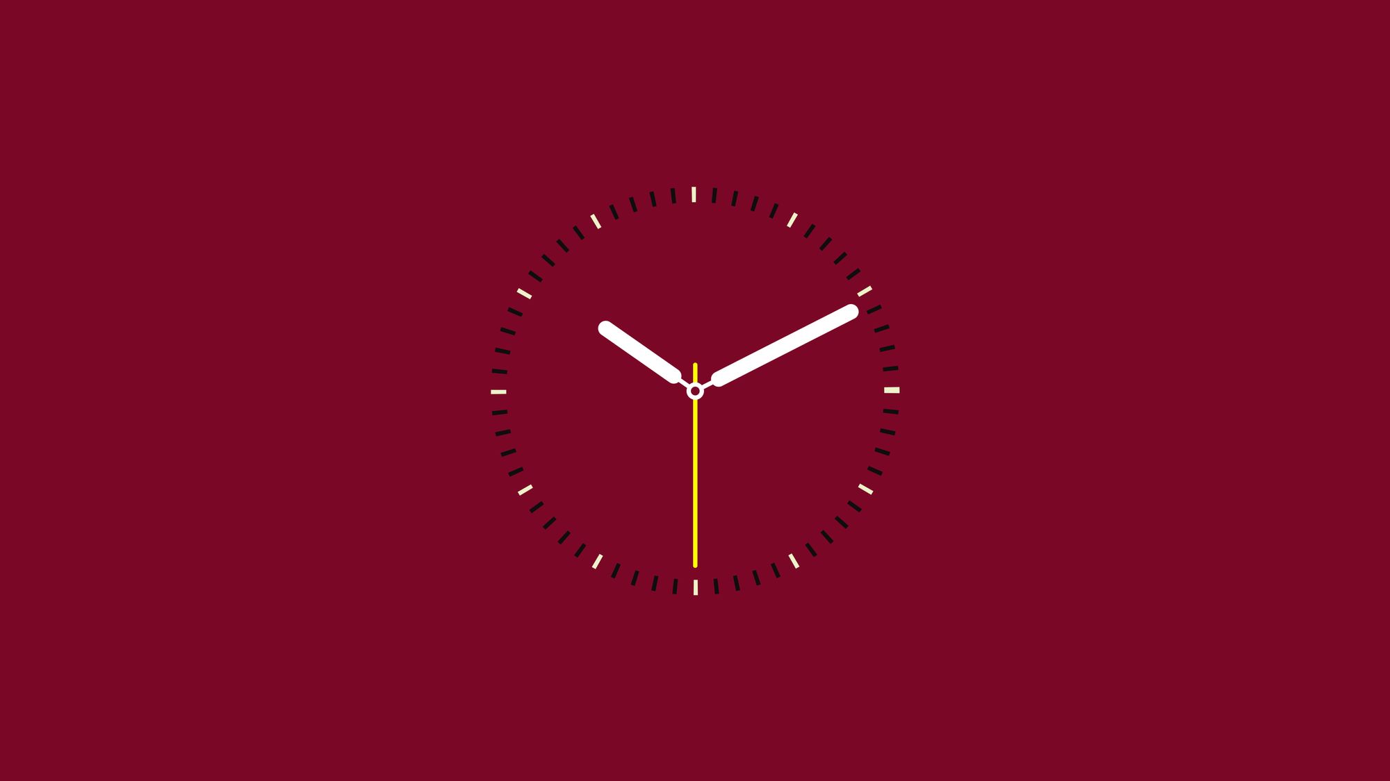
Now if we check the result, we should have a smoothly animated watch.
To go further, you can also add a calendar window showing the current date, with the text element. And to take it to the next level you can even add an event handler for this element, which toggles its content between the current date and the AM/PM indicator.
If you are stuck, check out the video below, where we also cover this part.
Mixing SVG with JavaScript opens up a lot of cool options. You can animate things, add interactions, and generate graphics. Can't wait to see what you come up with.